← OpenDesign CURATED · OPEN · FREE
Foundry Basement Studio
An expressive, brutalist type foundry catalog for designers
Typography Expressive Bold Typography Portfolio Dark Mode
01
Identity DNA
type foundry specimen industrial bold
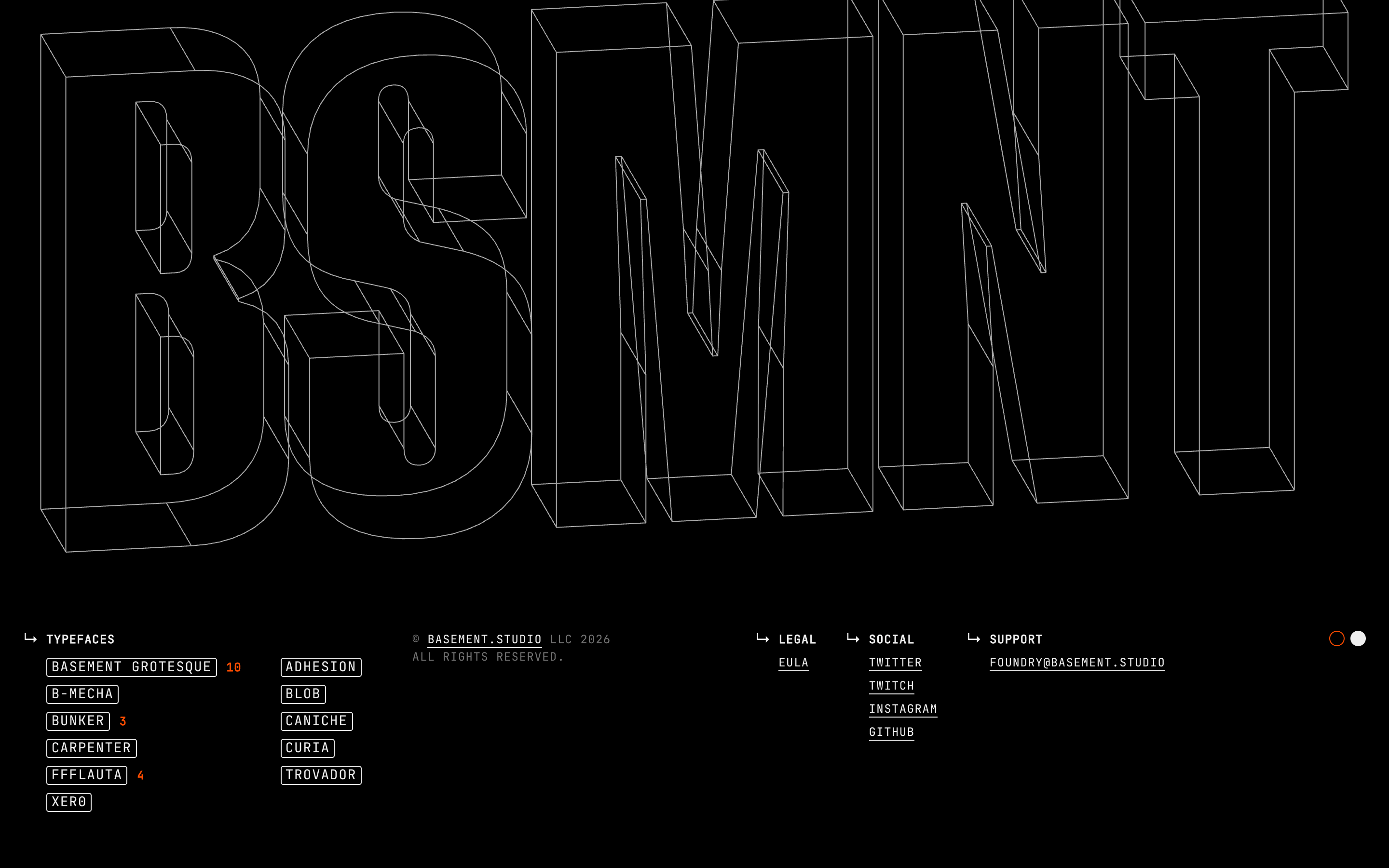
An underground workshop for crafting heavy-duty typefaces
02
Color
#FF4D00Accent
#EFEFEFInk
#000000BG
#121212BG soft
#747474Muted
rgba(226, 232, 240, 1.0)Line
Maximum contrast: pitch black canvas, white text, and a single blazing orange accent
03
Typography
grotesque-sans · monospace
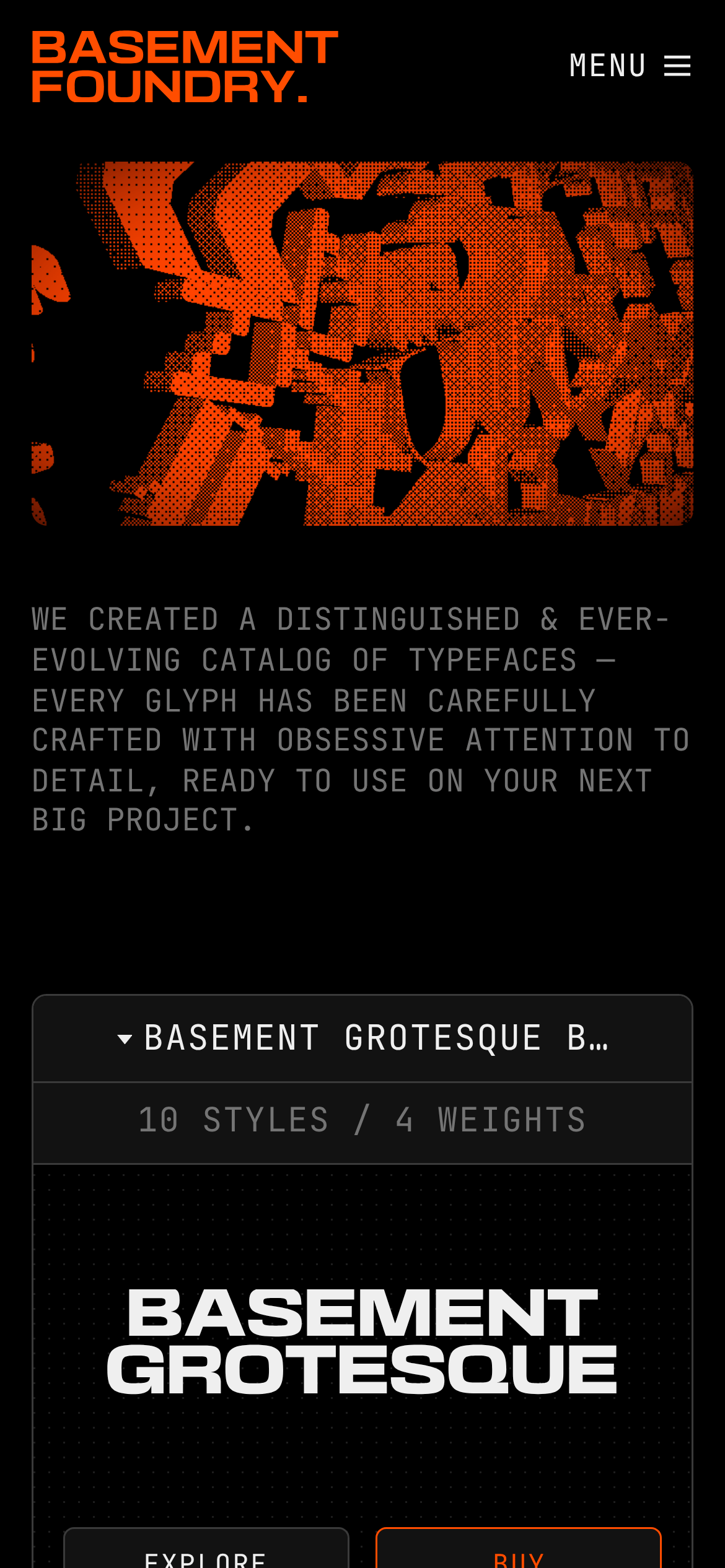
display 198px · 700heading 120px · 700body 16px · 400caption 14px · 400micro 12px · 400All text is uppercase · UI text uses monospace font · Exaggerated wide display fonts for specimens
04
Spacing
4px
8px
16px
24px
32px
48px
64px
90px
Strict vertical spacing with tight padding in UI elements and wide gaps in layout
05
Surfaces
sm · 2px
md · 6px
lg · 8px
pill · 999px
1px solid borders, often using muted grays or white
06
Layout
1280 container
12 columns
24px gutter
768 / 1024 breakpoints
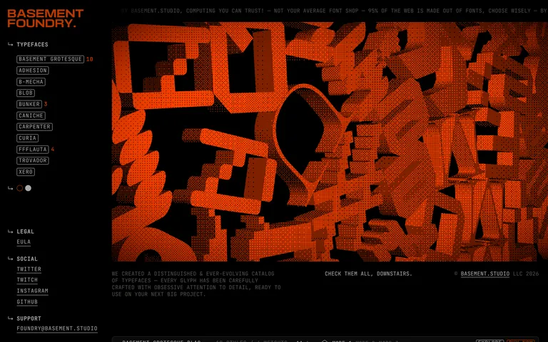
Persistent left sidebar on desktop, top navigation on mobile
07
Motion & Interaction
150ms micro
200ms small
400ms medium
cubic-bezier(0.4, 0, 0.2, 1) easing
Subtle background-color and border-color transitions · Opacity fades for state changes
Background-color and border-color changes with 150ms ease-in-out · Active state with reduced opacity
08
Components
button Bordered buttons with uppercase monospace text, often using accent colors card Dark panels with subtle borders containing type specimens chip Bordered rectangular tags with micro typography input Minimal, likely hidden in favor of custom UI elements hero Full-width, highly expressive typography display with background patterns 09
Voice & Don'ts
Tone Confident, bold, and slightly irreverent Headlines All-caps, highly expressive grotesque fonts CTAs Direct, uppercase commands like 'BUY NOW' or 'EXPLORE' Don't use lowercase text — screenshot shows everything is uppercase Don't use soft, pastel colors — screenshot shows high-contrast black, white, and orange Don't use sans-serif for UI text — screenshot uses monospace exclusively for navigation and labels Don't use thin, delicate fonts — screenshot features heavy, expanded grotesque fonts Don't use complex shadows — screenshot relies on flat borders for depth Don't use a light background — screenshot uses a deep black or dark gray background Avoid: Subtle gradients Avoid: Sans-serif body text Avoid: Light themes 10
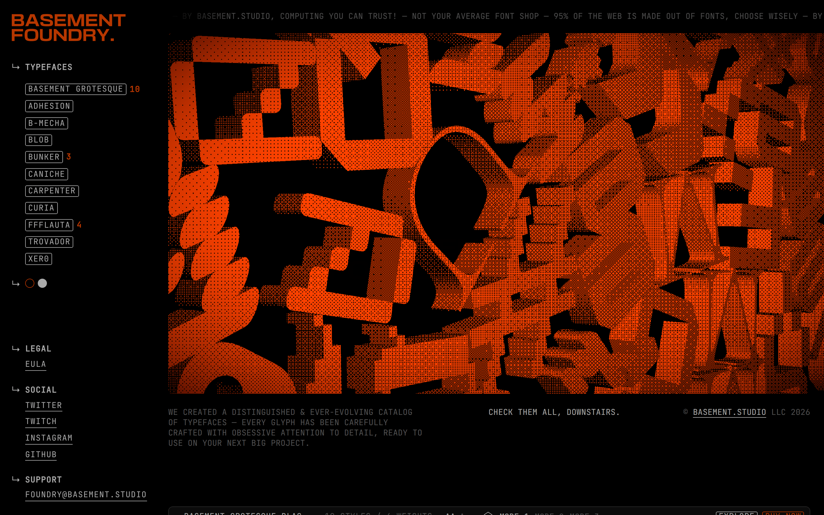
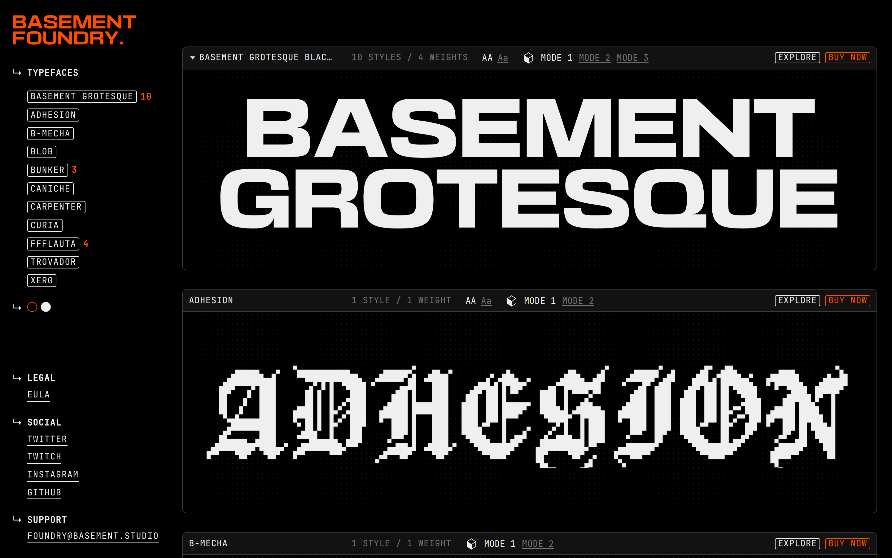
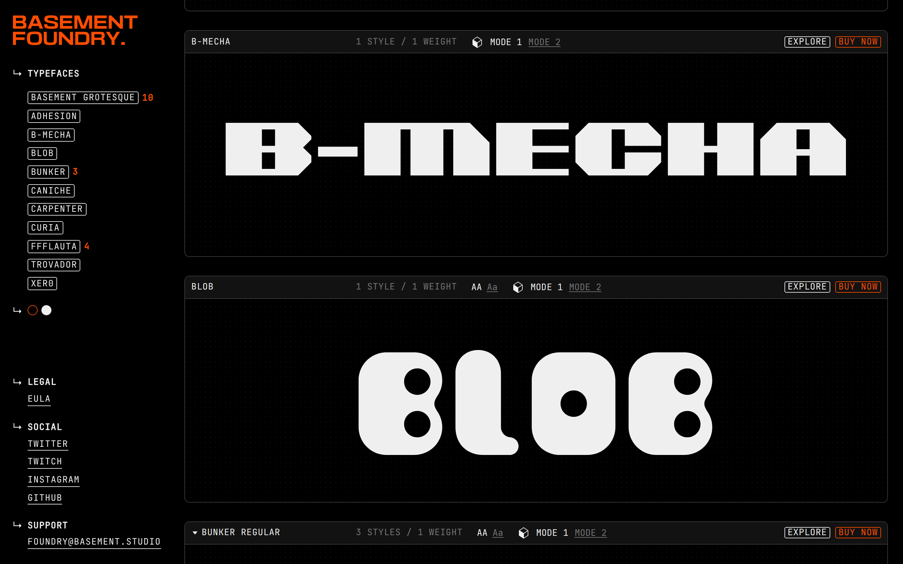
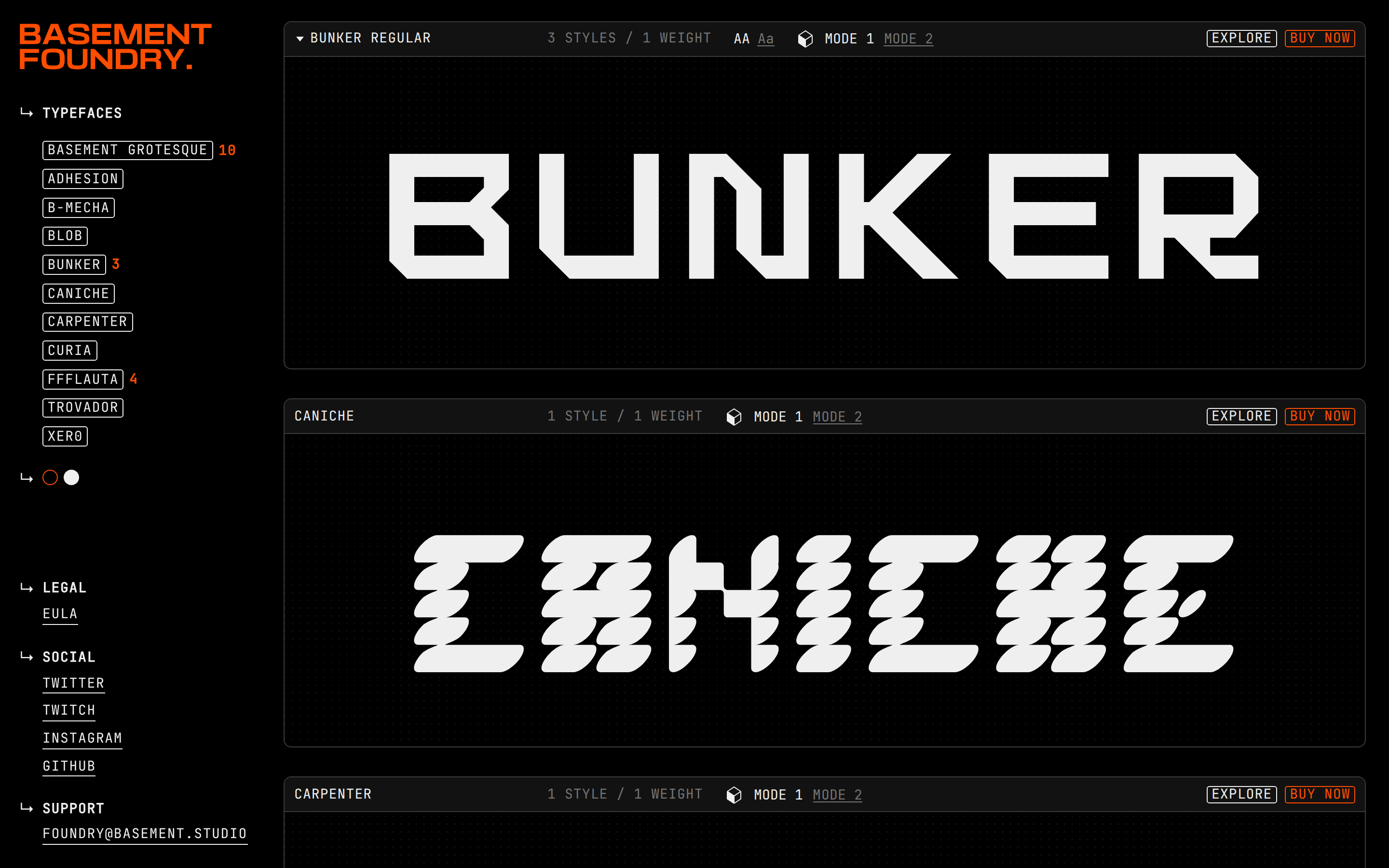
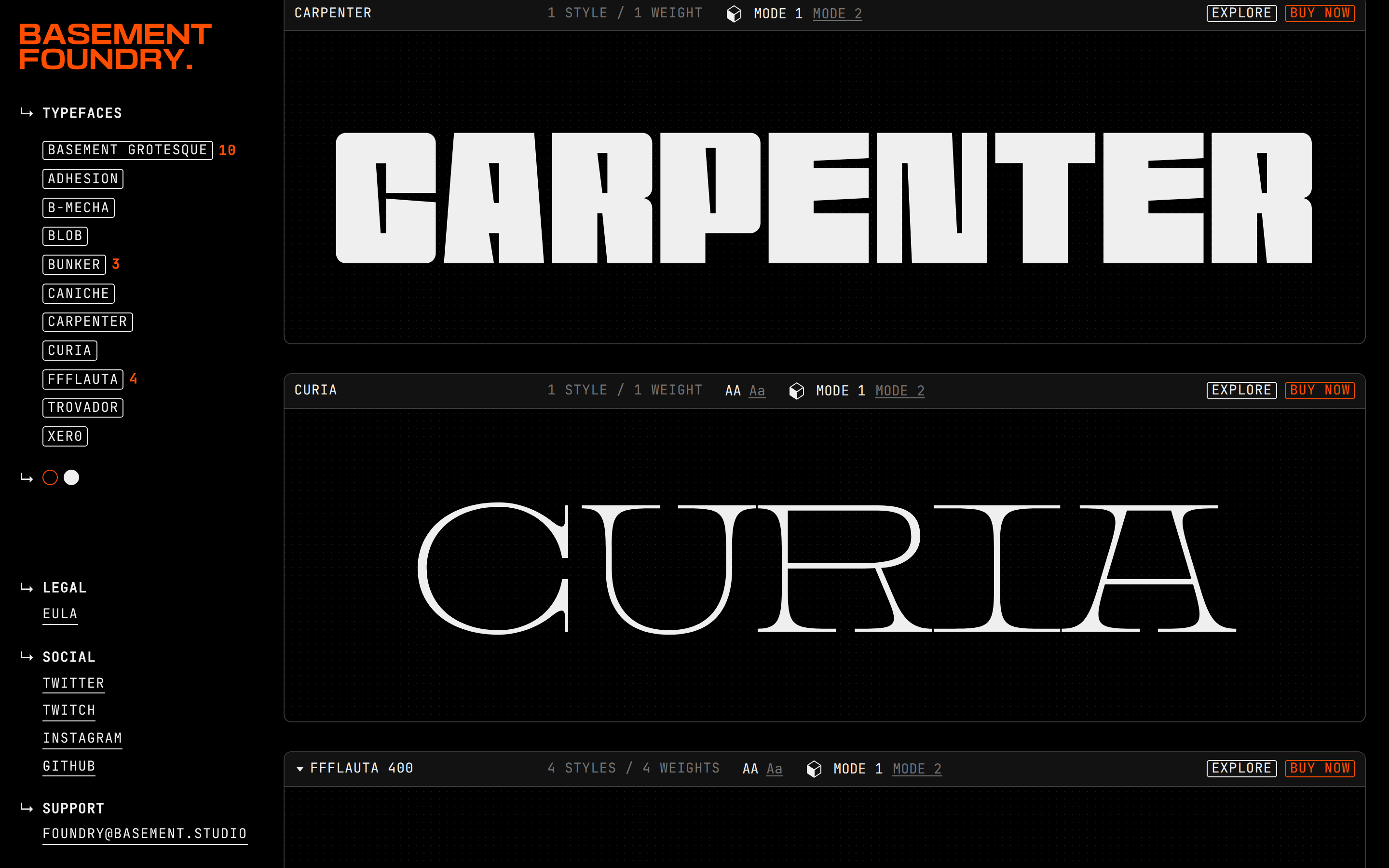
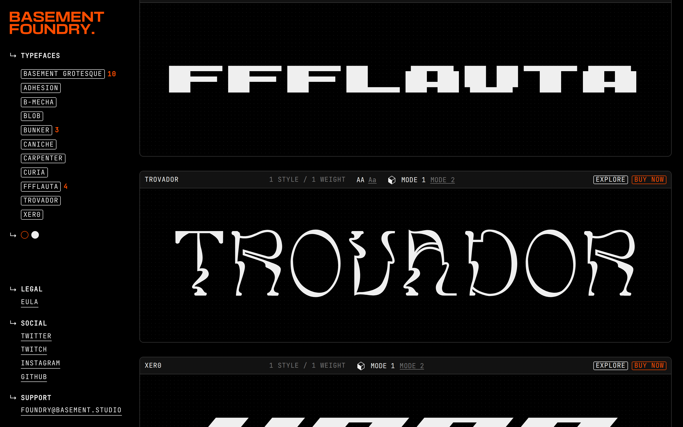
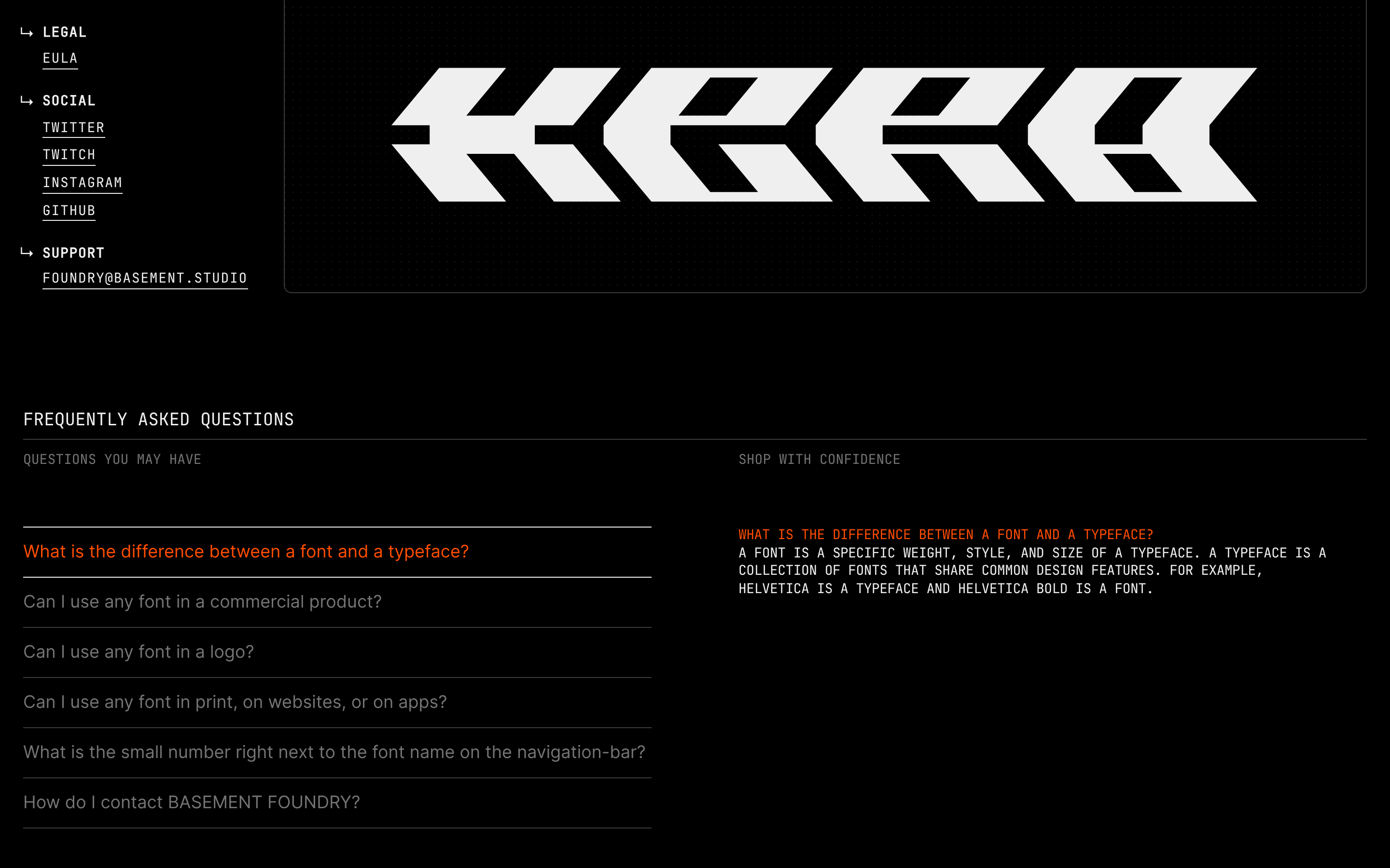
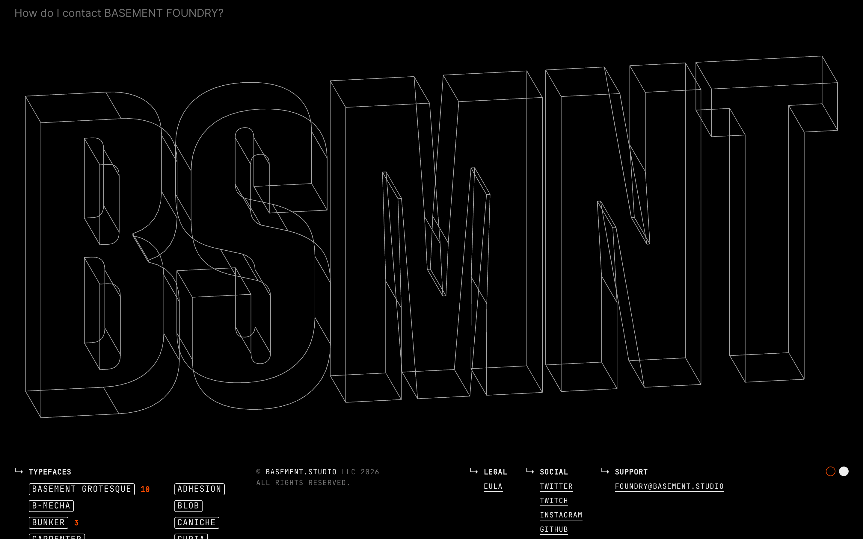
Inside the pack — real screenshots
桌面首屏(hero) 桌面滚动分段(90% viewport 步进,作为视觉证据) 桌面滚动分段(90% viewport 步进,作为视觉证据) 桌面滚动分段(90% viewport 步进,作为视觉证据) 桌面滚动分段(90% viewport 步进,作为视觉证据) 桌面滚动分段(90% viewport 步进,作为视觉证据) 桌面滚动分段(90% viewport 步进,作为视觉证据) 桌面滚动分段(90% viewport 步进,作为视觉证据) 桌面滚动分段(90% viewport 步进,作为视觉证据) 桌面滚动分段(90% viewport 步进,作为视觉证据) 移动首屏 Captured from the live site · real computed styles
11
System prompt
Basement Foundry is an expressive, brutalist type foundry catalog featuring a deep black background and a single blazing orange (#FF4D00) accent. Typography is the core of the identity, utilizing heavy grotesque fonts for display and monospace for UI elements, all presented in uppercase. Key colors are black (#000000), dark gray (#121212), white (#EFEFEF), and orange (#FF4D00). Critical design rules include: never use lowercase text, avoid light themes or pastel colors, and never use sans-serif for the UI layer. The layout features a persistent sidebar on desktop and focuses on large, expressive type specimens. Motion is subtle, focusing on 150ms color transitions for interactive elements.
More from the library en · zh-CN · zh-TW · ja · ko
OpenDesign · curated web aesthetics for AI-readable design DNA · opendesign.cc
Why we curated this: Worth including as a prime example of brutalist, typography-first design where the product (typefaces) dictates the entire visual language.