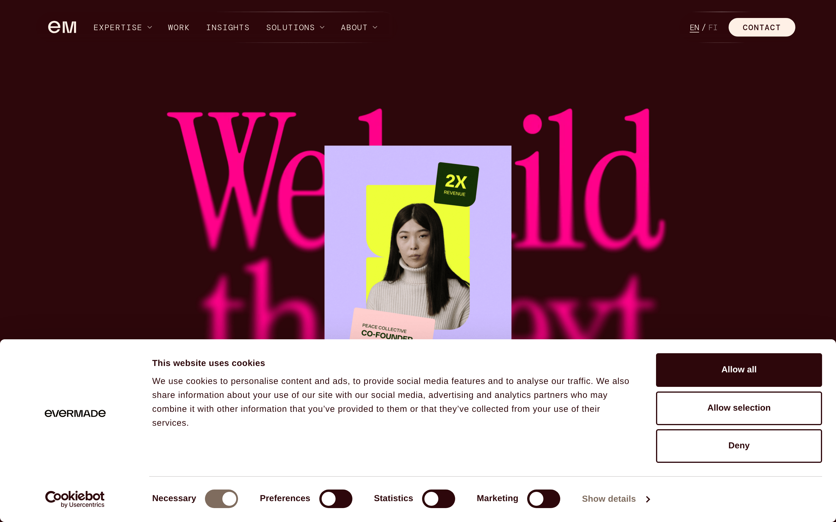
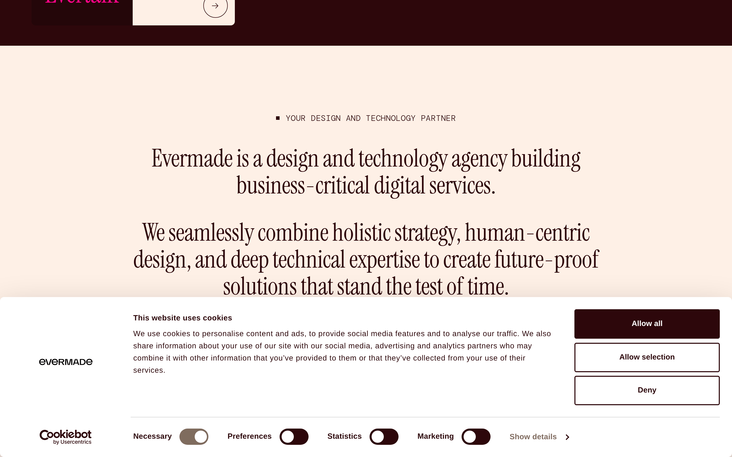
A bold fashion editorial meets a high-end digital agency portfolio.
02
Color
#FF0389Accent
#FFFFFFInk
#2D070BInk soft
#FEF0E6BG soft
#FFC7DEBG quiet
rgba(45,7,11,1.0)Line
High-contrast and expressive, using dark burgundy and soft peach as anchors for vibrant pink highlights.
03
Typography
didone-serif · geometric-sans · monospace
display48px · 400
Combine elegant, high-contrast serif display types with clean geometric sans-serif for body copy. · Use monospace fonts for metadata, labels, and secondary text. · Strictly use uppercase transforms for navigation and category labels.
04
Spacing
4px
8px
16px
24px
32px
48px
64px
96px
Generous whitespace and strict grid alignment.
05
Surfaces
sm · 0px
md · 0px
lg · 0px
pill · 9999px
Sharp, thin 1px borders often used in a subtle, semi-transparent manner.
Captured from the live site · real computed styles
11
System prompt
This design is a bold, expressive agency portfolio that leverages massive didone-serif typography and a high-contrast color palette. The primary anchors are dark burgundy (#2D070B) and soft peach (#FEF0E6), punctuated by a vibrant pink (#FF0389) accent. The typography strictly separates display (didone-serif) from body (geometric-sans) and metadata (monospace), creating a strong editorial hierarchy. Layouts are spacious and asymmetric, using a clean 12-column grid. Critical constraints: Never use rounded, soft UI shapes; strictly use sharp rectangular or full-pill forms. Never use casual or playful typography for display text; always lean into the formal, high-contrast serif. Avoid busy backgrounds; maintain the focus on massive type and clean imagery.
Bring this taste to your agent
Hand your AI agent a machine-readable spec of this design — tokens, type, motion, the whole DNA.