digital agencycreative studioinnovationmodernpremium
A high-end architectural firm for digital experiences, combining technical precision with creative boldness.
02
Color
#DCFF4FAccent
#FAF9F4Ink
#000000BG
#151515BG soft
#888888Muted
rgba(250,249,244,0.12)Line
High-contrast minimalism with a single vibrant accent for call-to-action, creating a bold, focused visual hierarchy.
03
Typography
geometric-sans
display56px · 400
h240px · 400
body16px · 400
caption12px · 400
Use geometric sans-serif for all primary text, maintaining a clean and modern aesthetic. · Keep headings large and bold with tight letter-spacing for impact. · Limit weight variations, relying primarily on weight 400 for a consistent, refined look.
04
Spacing
4px
8px
16px
24px
32px
48px
64px
96px
Consistent 8px base unit with generous whitespace to create a spacious, premium feel.
05
Surfaces
sm · 4px
md · 8px
lg · 24px
pill · 999px
Minimal borders, using subtle opacity changes or hairline dividers for separation.
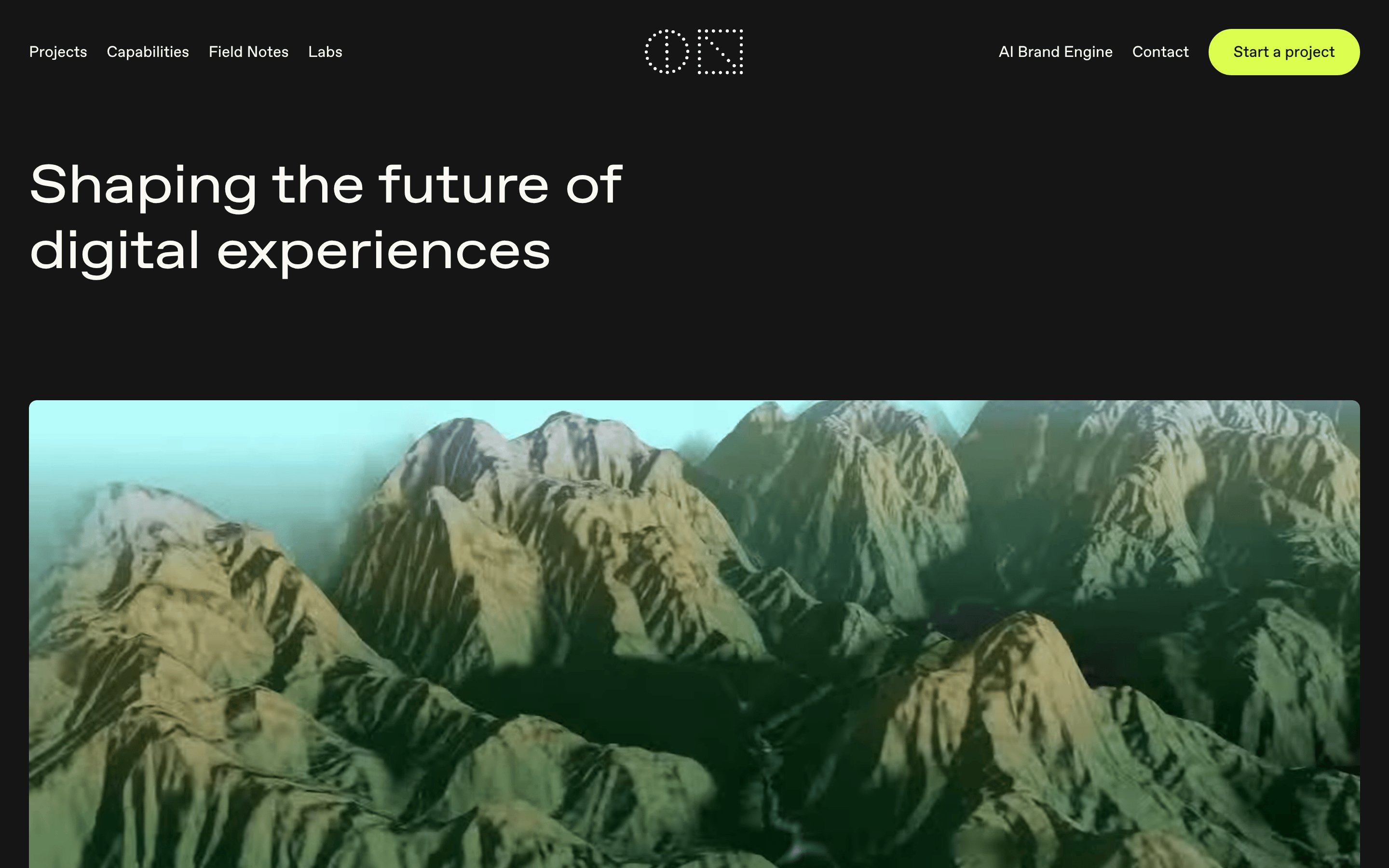
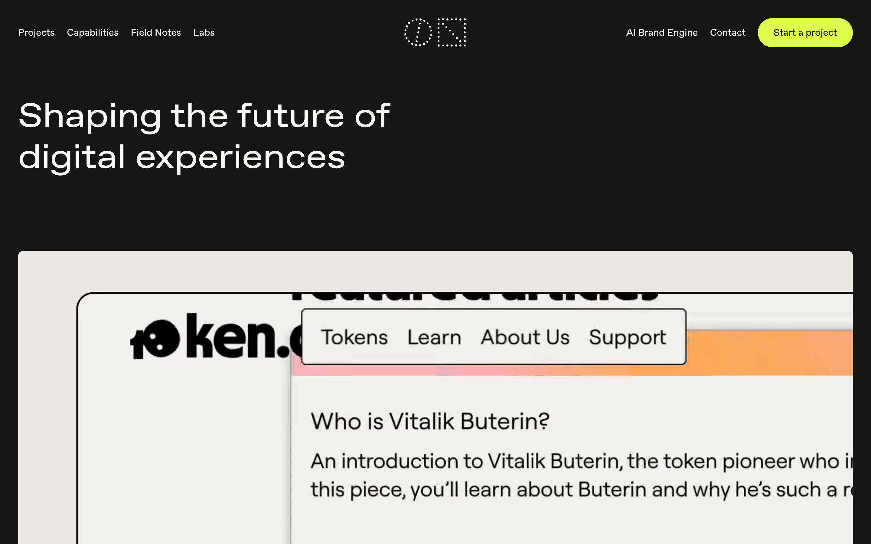
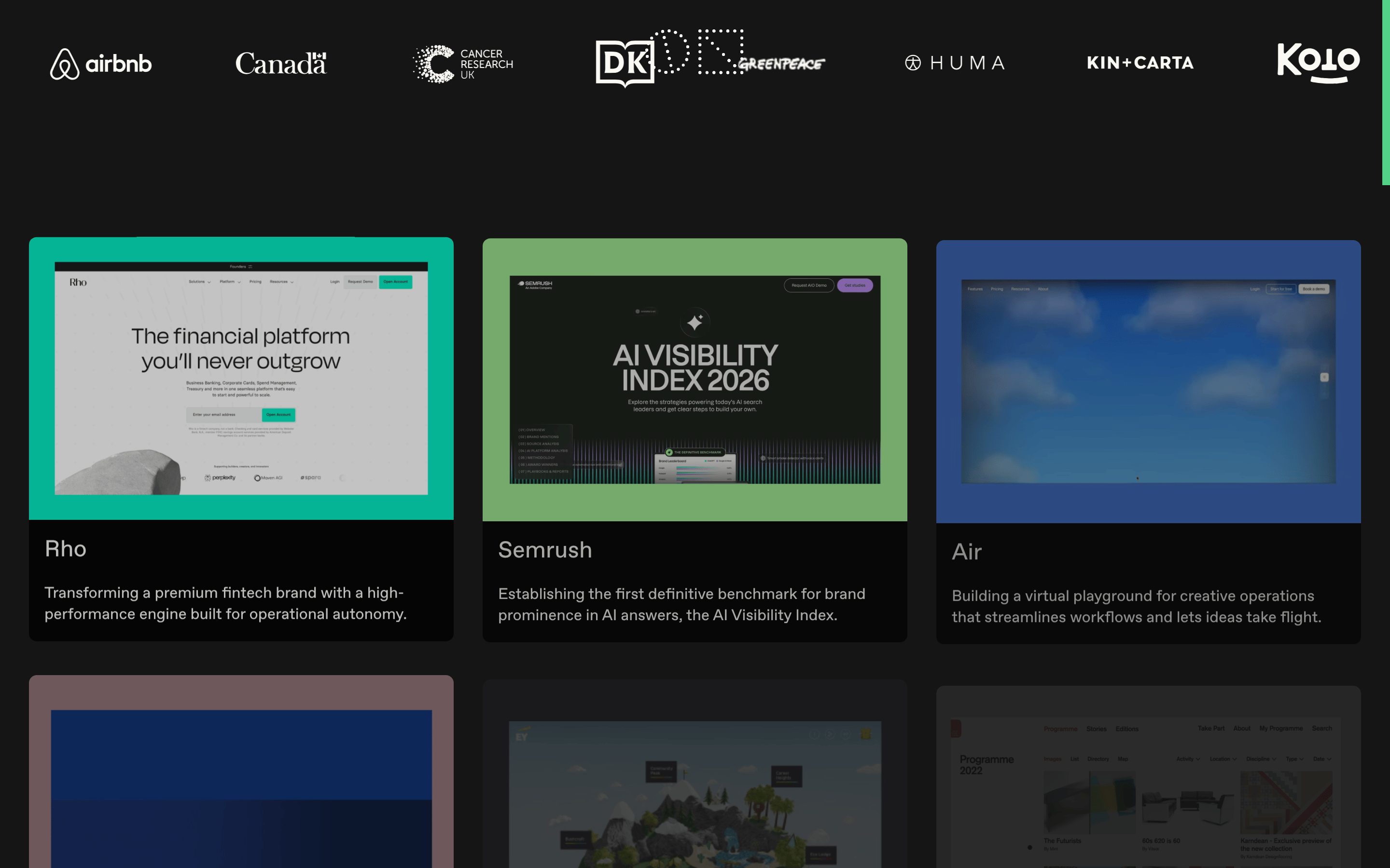
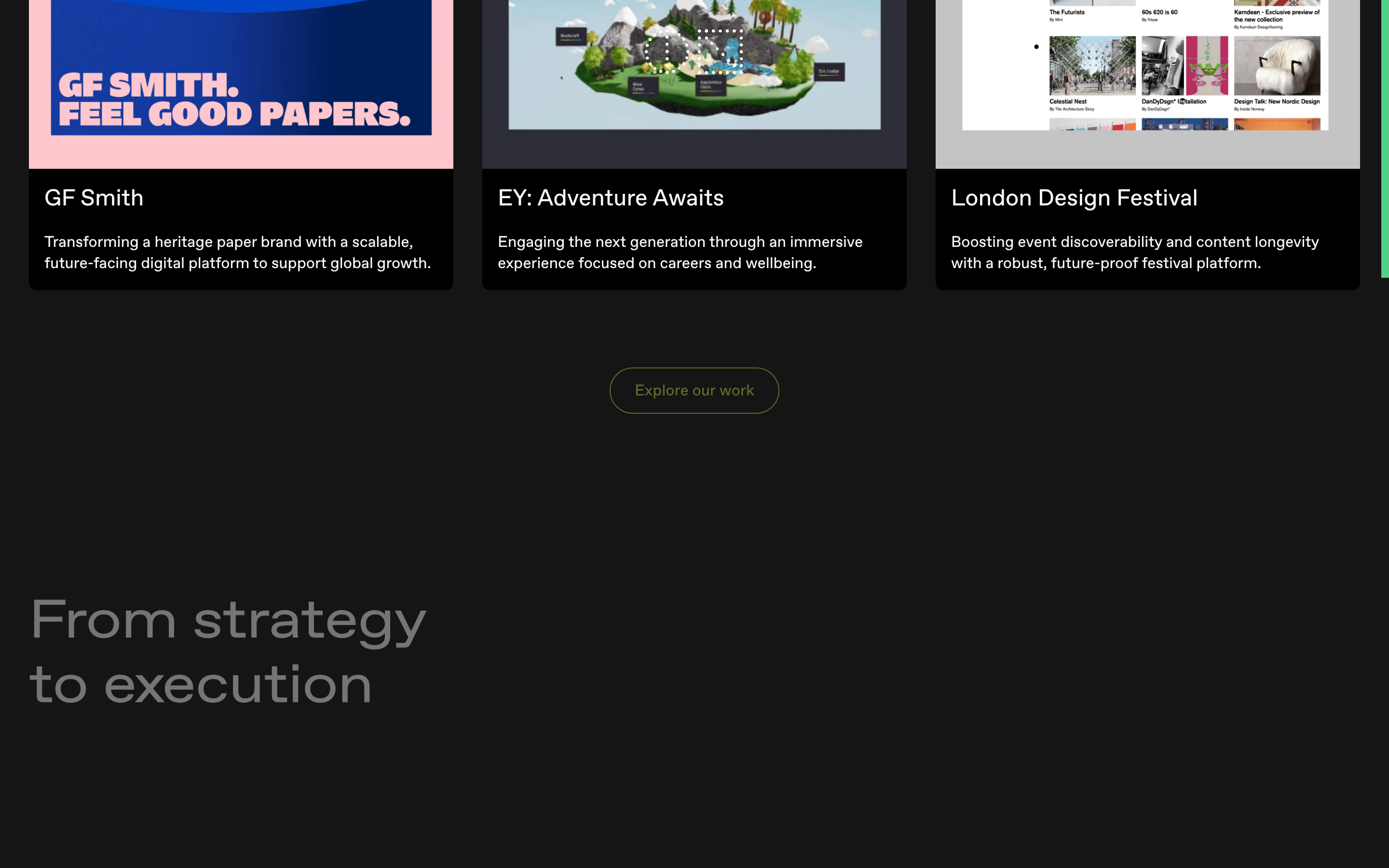
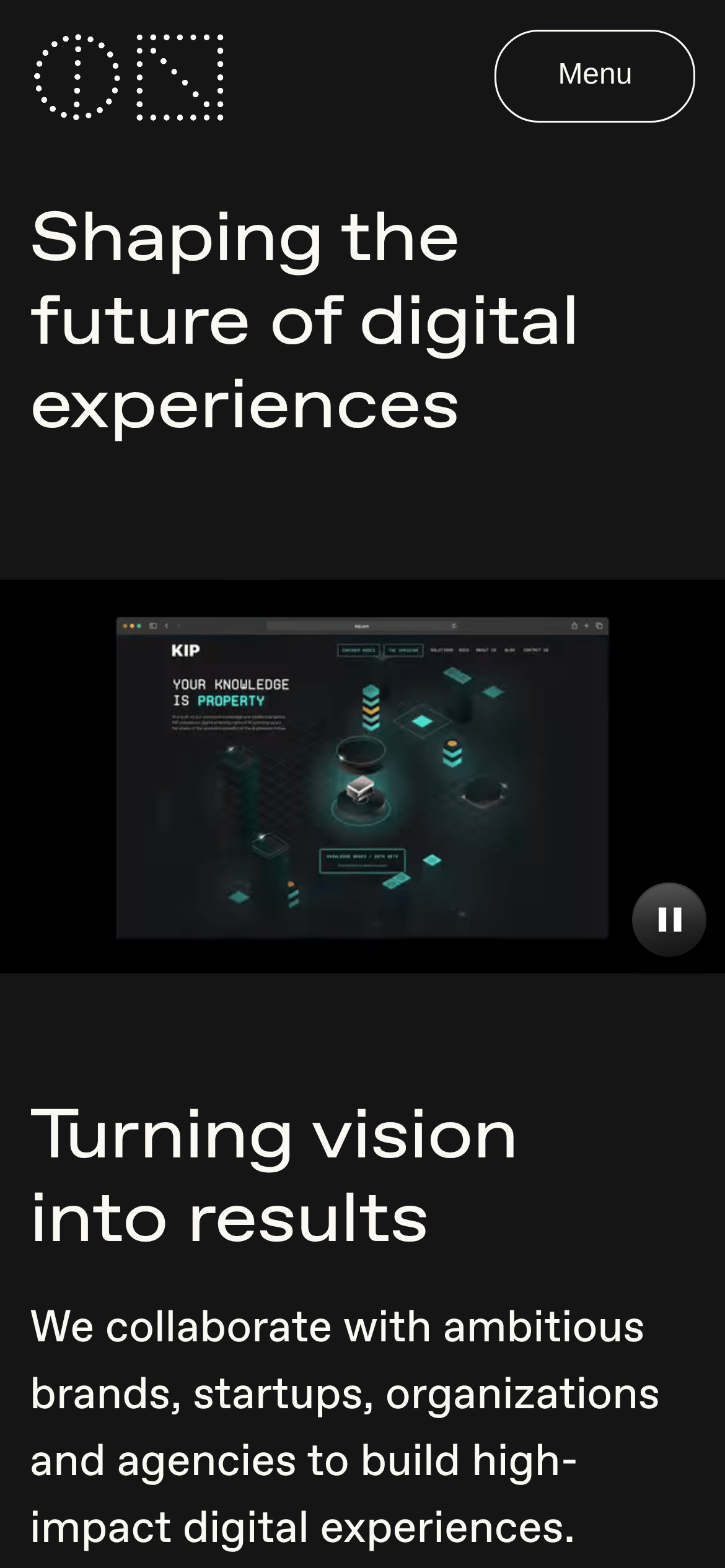
Left-aligned hero text with full-width visual element below, transitioning to grid-based project showcases.
07
Motion & Interaction
220msmicro
400mssmall
900msmedium
cubic-bezier(0.165, 0.84, 0.44, 1)easing
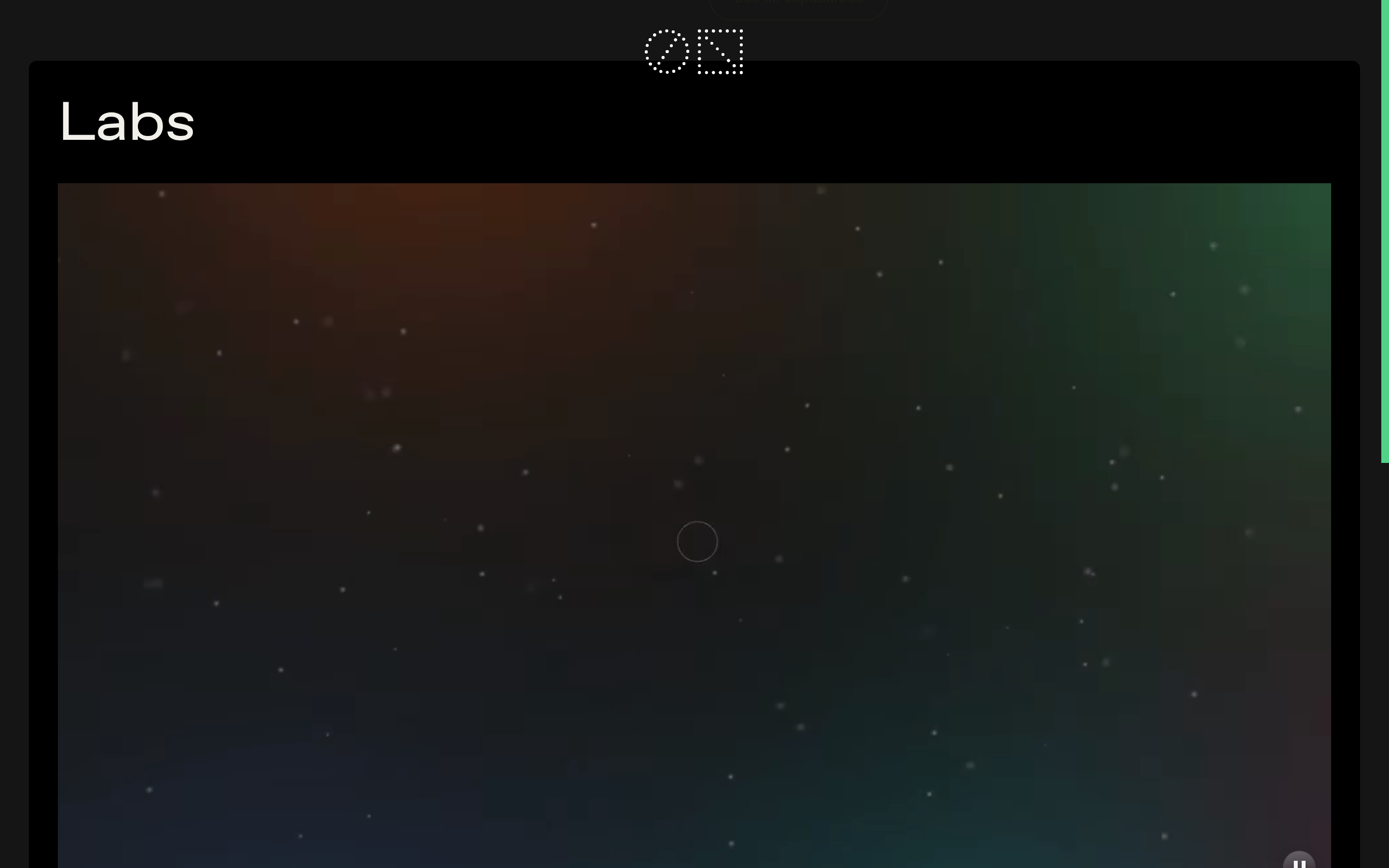
Smooth fade-in and transform animations for page elements. · Dynamic video backgrounds with subtle particle effects in experimental sections. · Hover transitions on interactive elements for enhanced feedback.
Subtle visual feedback through color changes, opacity adjustments, or slight transforms. · Immediate visual response with smooth transition states.
08
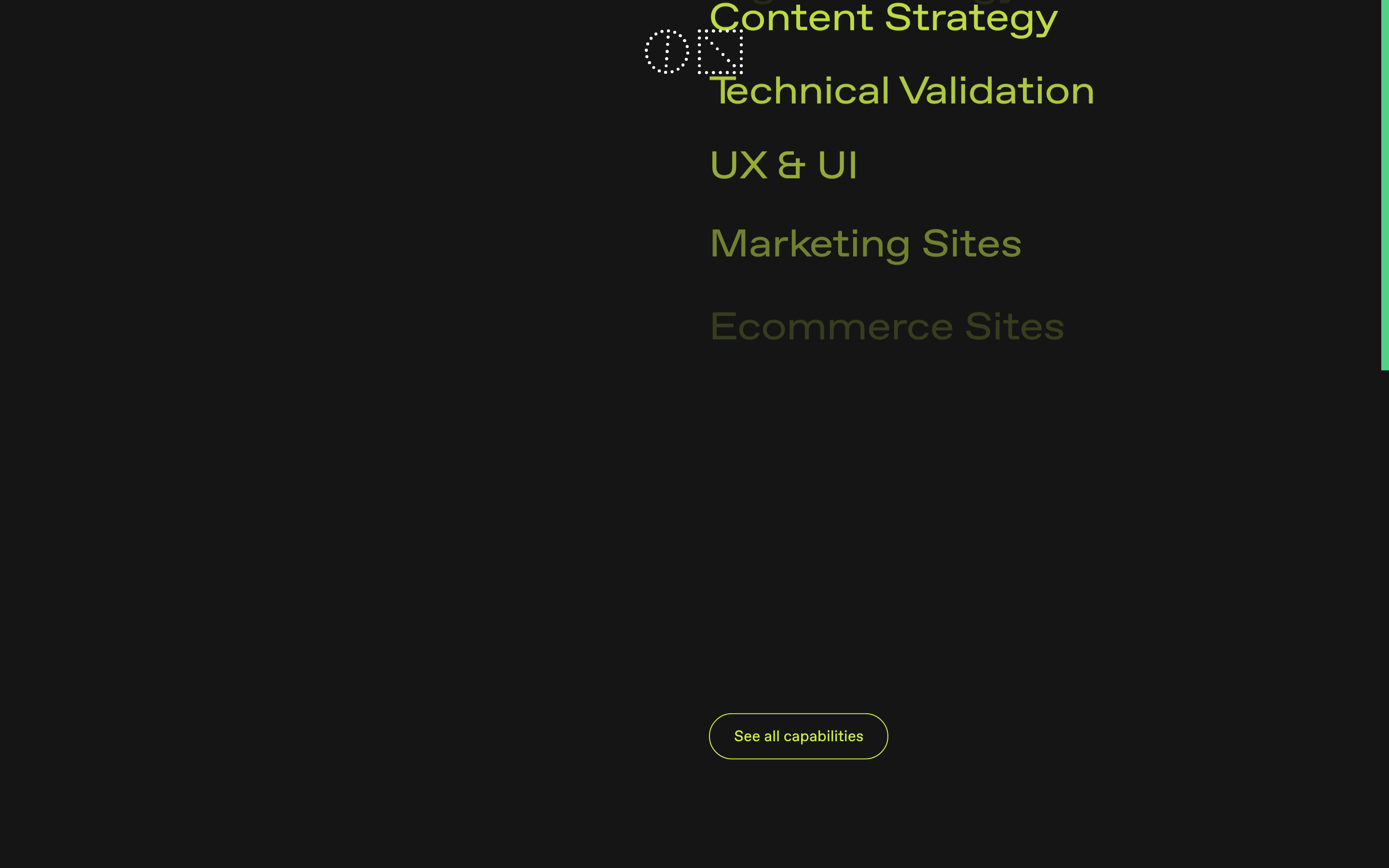
Components
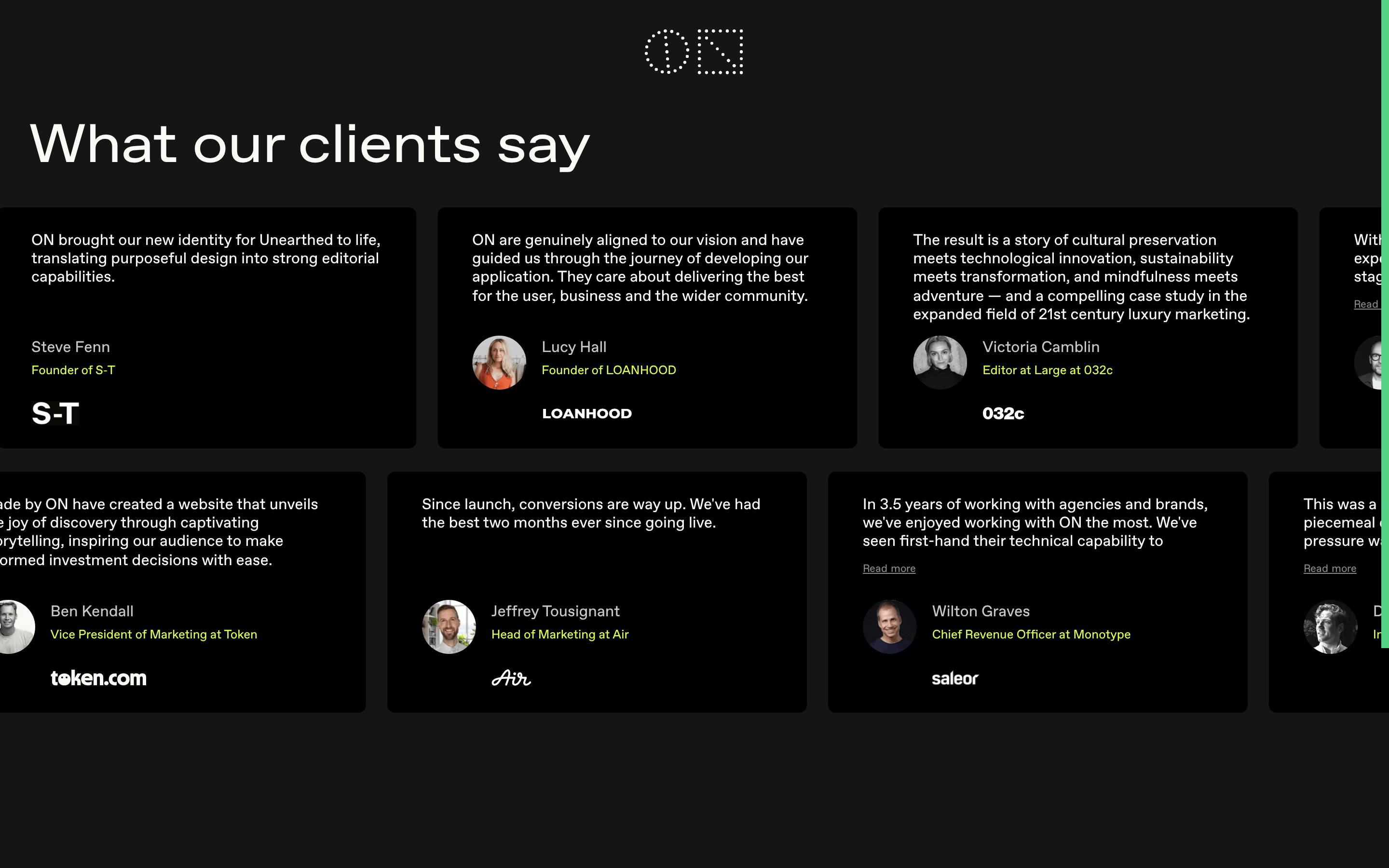
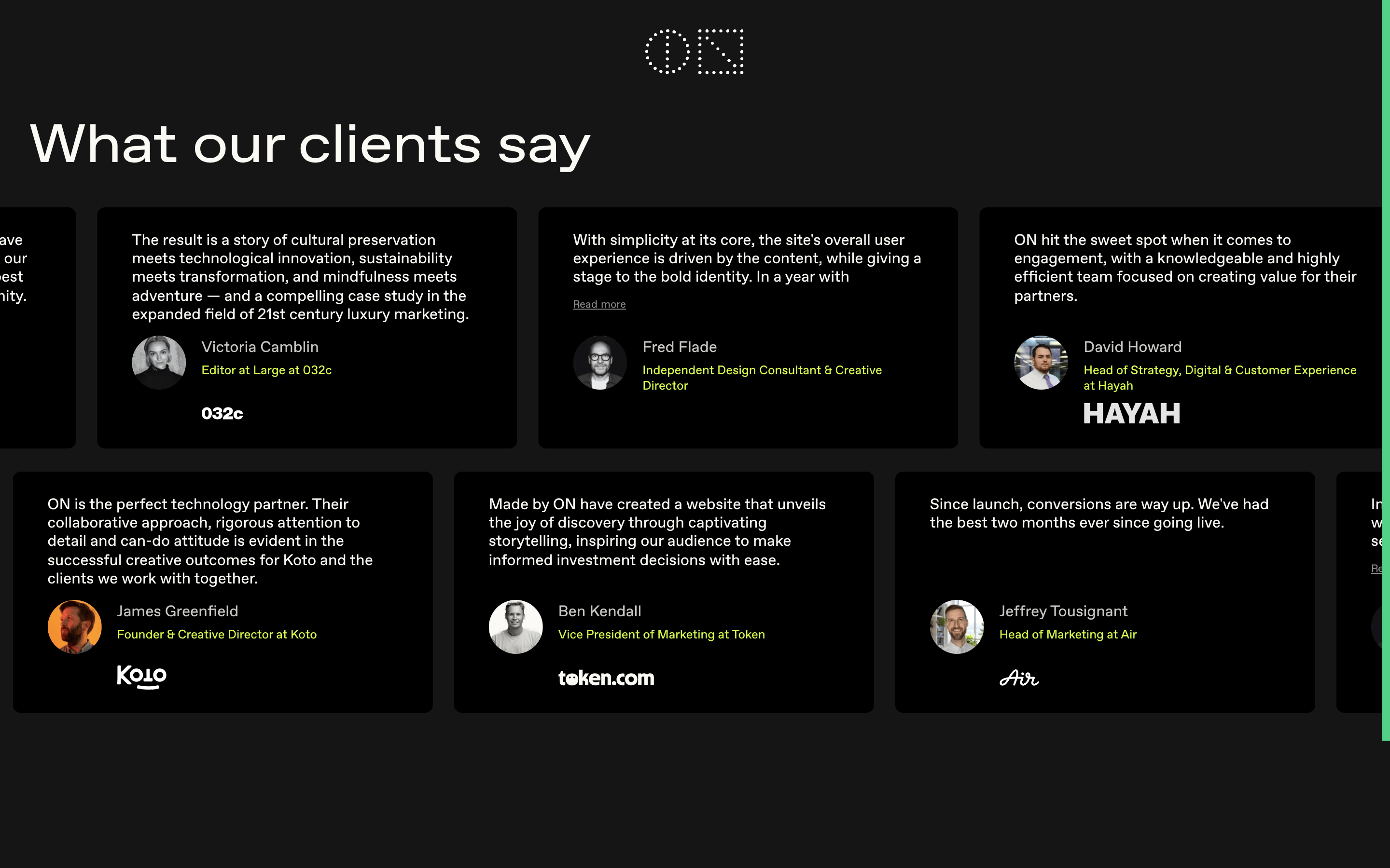
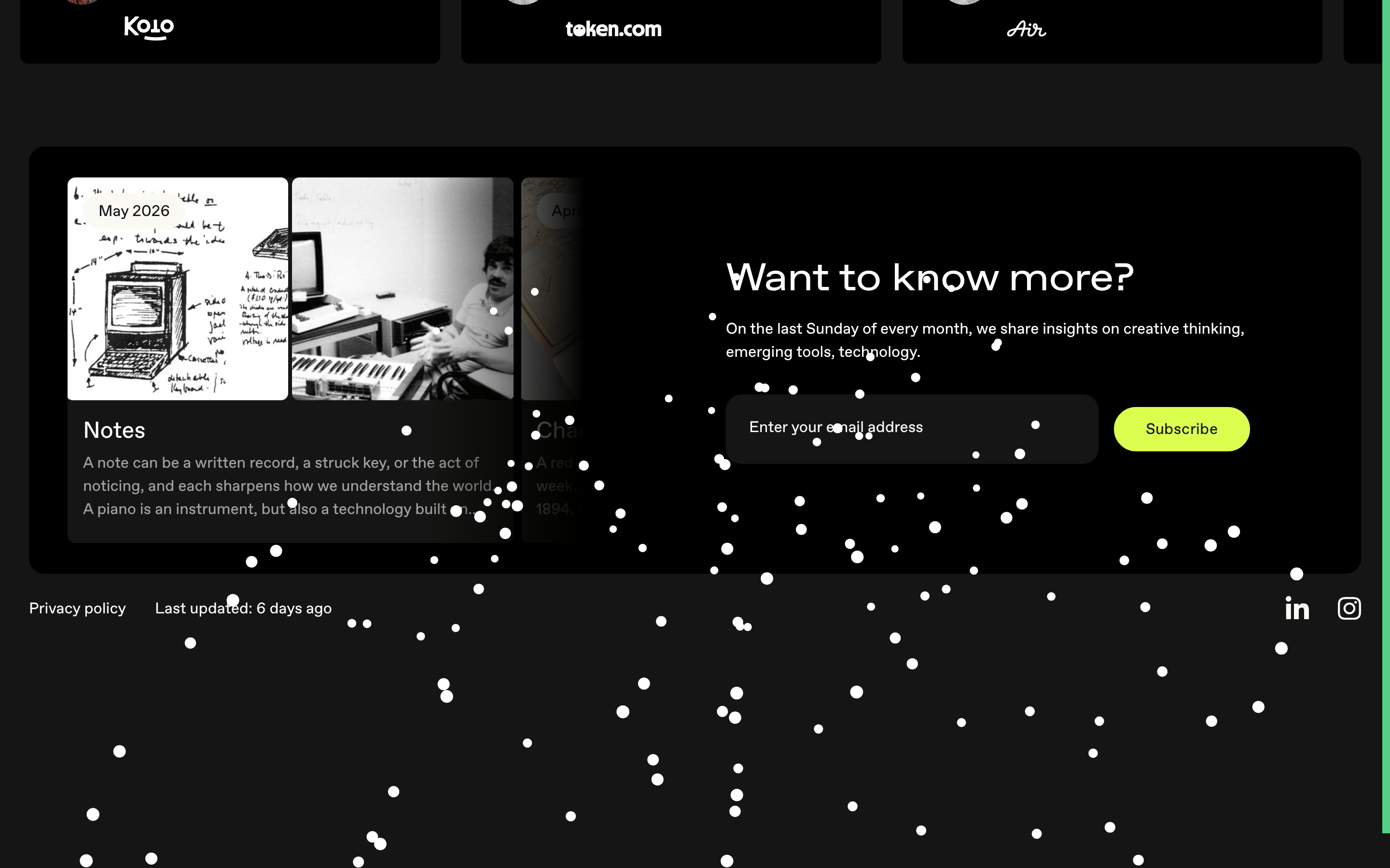
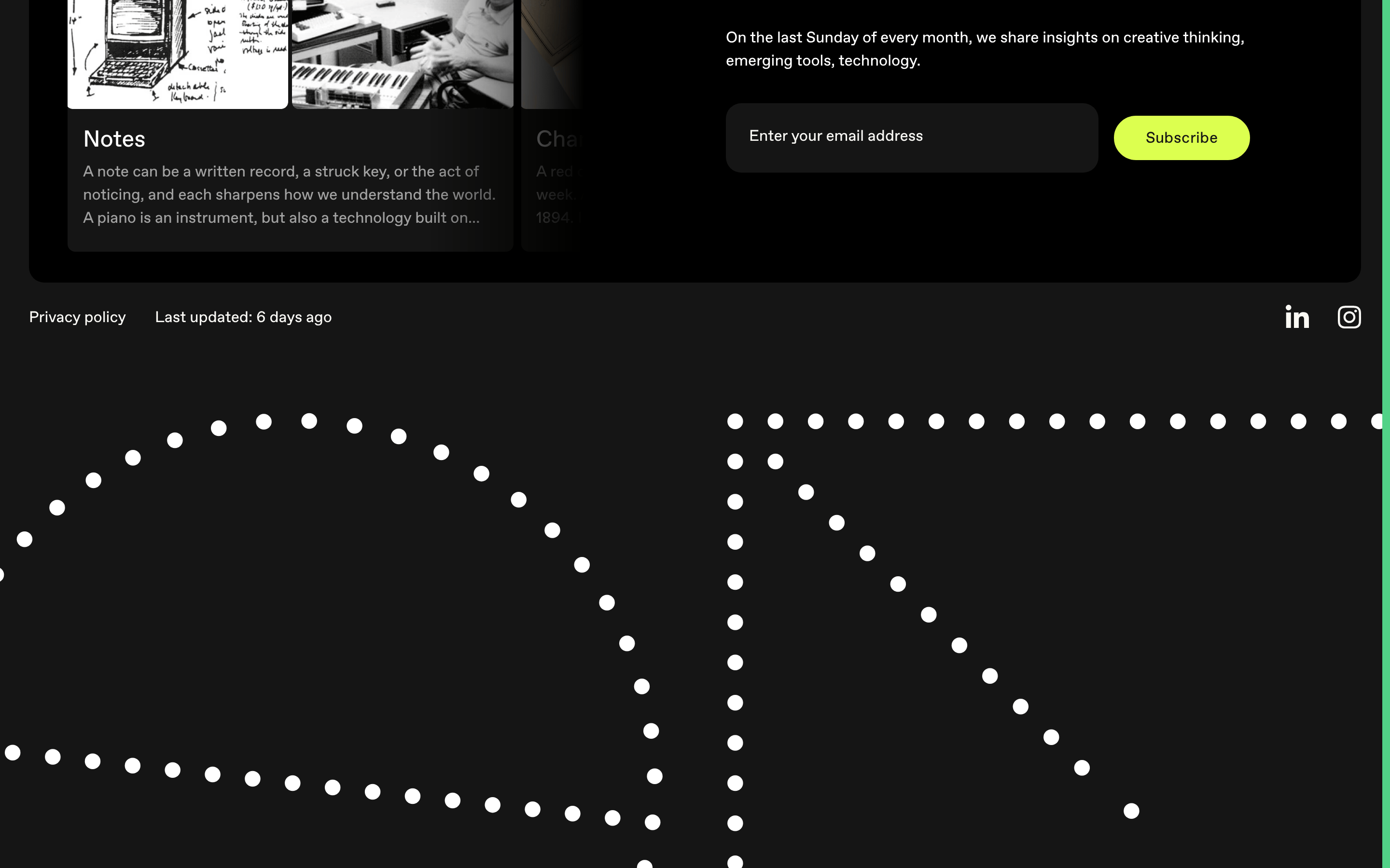
buttonHigh-contrast pill-shaped buttons with vibrant accent color (yellow) and black text, or outlined pill buttons with white text.
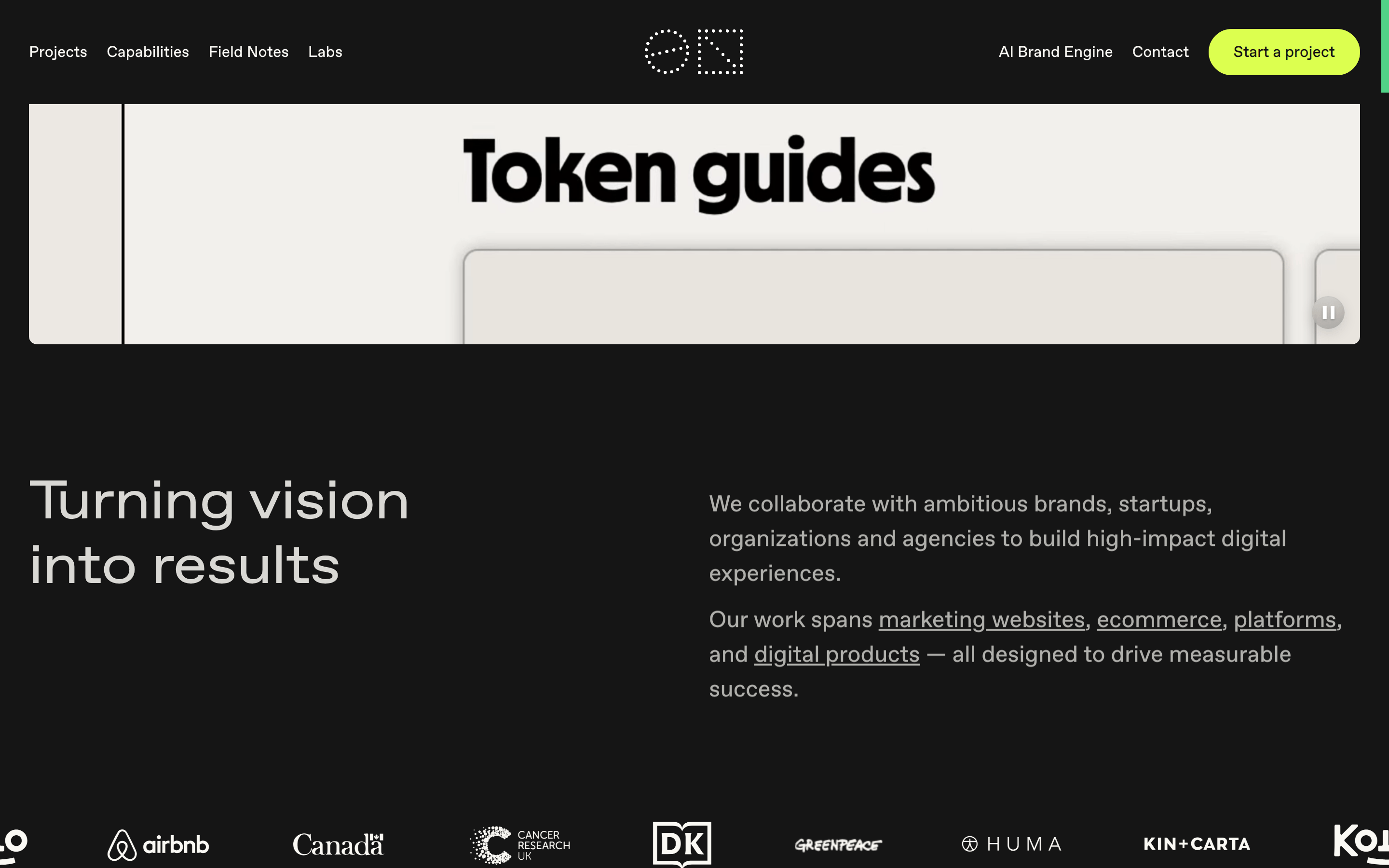
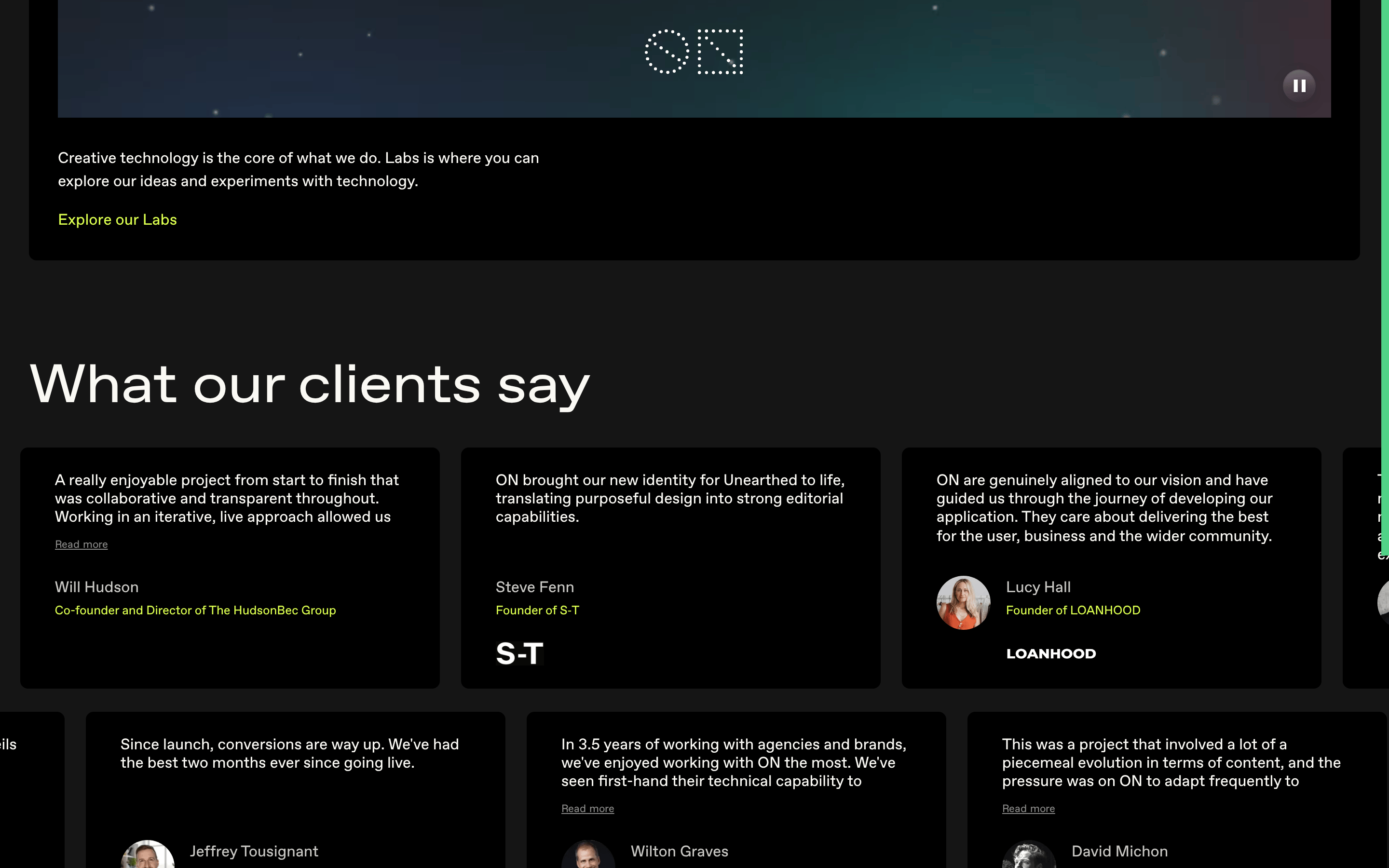
cardContent cards with generous padding, subtle background differentiation, and smooth hover transitions.
chipMinimal chips used for navigation or tags, often with a border or subtle background.
inputClean, minimal input fields with subtle borders and clear focus states.
heroFull-width, immersive hero sections with large typography and dynamic visual backgrounds (video/images).
09
Voice & Don'ts
ToneConfident, visionary, and professional with a forward-looking perspective.
HeadlinesBold, declarative statements using large, impactful typography.
CTAsDirect and action-oriented, using high-contrast buttons to drive engagement.
Don't use decorative or serif fonts — screenshot shows clean geometric sans-serif throughout.
Don't use multiple accent colors — screenshot shows only one dominant accent (yellow-green).
Don't clutter the interface with unnecessary elements — screenshot shows ample whitespace and minimal UI.
Don't use small, cramped typography — screenshot shows large, readable text with generous spacing.
Don't use rigid, boxy layouts — screenshot shows fluid, organic elements and rounded corners.
Don't rely on heavy borders for separation — screenshot shows subtle spacing and background differentiation instead.
Captured from the live site · real computed styles
11
System prompt
Premium digital agency website for Madebyon, featuring a dark, high-contrast aesthetic with geometric sans-serif typography. Primary colors are black (#000000) and off-white (#FAF9F4), with a vibrant yellow-green accent (#DCFF4F) for call-to-action elements. The design emphasizes bold, large typography with tight letter-spacing, generous whitespace, and immersive visual content including dynamic video backgrounds. Key principles include minimalism, confidence, and technical innovation. Critical don'ts: avoid decorative fonts, multiple accent colors, cluttered layouts, small text, rigid boxes, and heavy borders. The site positions itself as shaping the future of digital experiences through ambitious, high-impact collaborations.
Bring this taste to your agent
Hand your AI agent a machine-readable spec of this design — tokens, type, motion, the whole DNA.