A bespoke tailor for eyewear, blending modern minimalism with traditional craftsmanship.
02
Color
#0B0B0BInk
#FFFFFFBG
#F5F5F5BG soft
#7A7575Muted
rgba(11,11,11,0.15)Line
High-contrast minimalism where black ink anchors the space and warm grays provide subtle depth.
03
Typography
geometric-sans
display32px · 400
body16px · 400
caption12px · 400
Headlines use standard sentence case without excessive letter-spacing. · Body text maintains a consistent 400 weight for readability. · Small text is restricted to legal disclaimers and utility labels.
04
Spacing
4px
8px
16px
24px
32px
48px
64px
96px
A flexible 4px baseline grid adapted to 64px and 12px gutters for different layout densities.
05
Surfaces
sm · 4px
md · 24px
lg · 32px
pill · 999px
Thin 1px solid borders in #0B0B0B or #D8D8D8 define inputs and interactive areas.
0px 0px 30px 0px rgba(0, 0, 0, 0.15)
06
Layout
1280container
12columns
24pxgutter
768 / 1024breakpoints
A clean 12-column grid that prioritizes generous whitespace and centered content blocks.
07
Motion & Interaction
220msmicro
300mssmall
800msmedium
cubic-bezier(0.25, 0.1, 0.25, 1.0)easing
Smooth opacity and background-color transitions for interactive feedback. · Transform-based animations for larger structural shifts.
Subtle background-color changes or color inversions on buttons. · Immediate visual feedback via background darkening or structural shifts.
08
Components
buttonPill-shaped or rounded-rectangle buttons with black backgrounds and white text.
cardClean, borderless containers with subtle background shifts (#F5F5F5) for grouping content.
chipSmall, rounded pill components used for tagging or interactive toggles.
inputMinimal rectangular fields with thin borders and internal padding for a clean look.
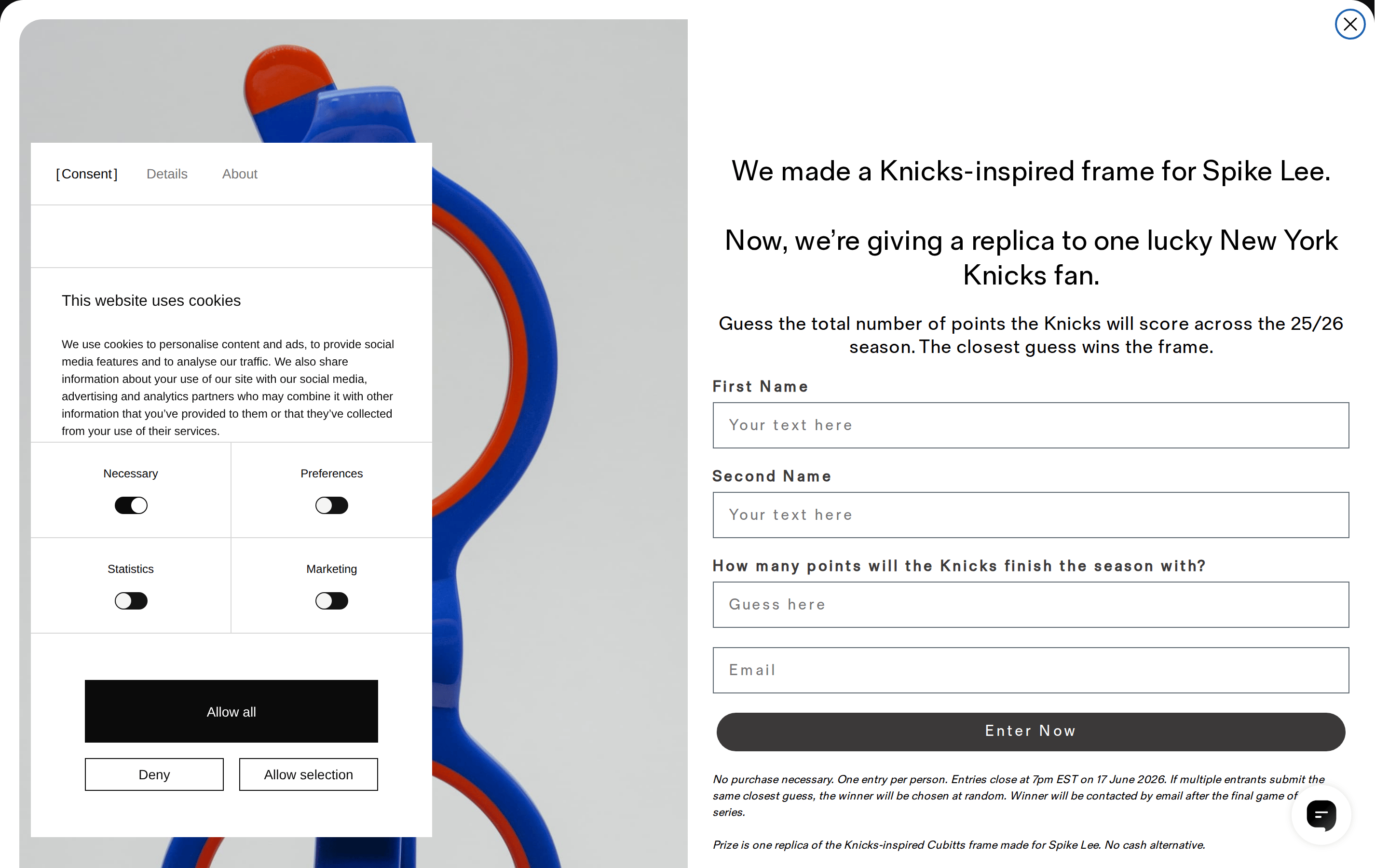
heroLarge split-layout or full-width image sections paired with prominent typography.
09
Voice & Don'ts
ToneRefined, confident, and informative, occasionally leaning into narrative storytelling.
HeadlinesConcise and direct, focusing on craftsmanship or specific brand stories.
CTAsAction-oriented and clear, often using standard verbs like 'Enter Now' or 'Allow all'.
Don't use overly decorative serifs — screenshot shows a dominant geometric sans-serif palette.
Don't rely on heavy drop shadows — screenshot shows only very subtle, large-radius shadows for depth.
Don't use a wide spectrum of vibrant colors — screenshot shows a near-monochrome palette with occasional product-derived accents.
Don't clutter the layout with dense information blocks — screenshot shows significant whitespace around elements.
Don't use sharp, square corners on primary interactive elements — screenshot shows consistent use of rounded or pill-shaped radii.
Don't use all-caps for large display headlines — screenshot shows sentence case for main titles.
Avoid: Avoid overly casual slang or aggressive marketing jargon.
Avoid: Avoid complex technical terminology unrelated to craft or optics.
Captured from the live site · real computed styles
11
System prompt
This design system represents a refined British eyewear brand (Cubitts) that blends minimalism with heritage. The visual language is anchored by a high-contrast monochrome palette of #0B0B0B ink on #FFFFFF backgrounds, with #F5F5F5 for soft surfaces and #7A7575 for muted utility text. The primary typography is a geometric sans-serif (Fold Grotesque) used across both display and body text with a 400 weight. Layout relies on generous whitespace and a 12-column grid. Critical donts include: avoid decorative serifs, avoid vibrant multi-color palettes, and avoid sharp square corners on interactive components. The system emphasizes a premium, curated feel through restraint and precise spacing.
Bring this taste to your agent
Hand your AI agent a machine-readable spec of this design — tokens, type, motion, the whole DNA.