A clean, standard system diagnostic panel or utility interface.
02
Color
#2F7BBFAccent
#404040Ink
#FFFFFFBG
#999999Muted
rgba(217, 217, 217, 1)Line
High-contrast neutrals with functional semantic colors for clear status communication.
03
Typography
system-ui
display60px · 400
h230px · 400
body16px · 400
Use system font stack for maximum compatibility and native feel · Keep headings unweighted (400) for a clean, non-aggressive look · Maintain clear hierarchy through size differences rather than weight
04
Spacing
4px
8px
16px
24px
32px
48px
64px
96px
Consistent 4px base rhythm with clear section separation
05
Surfaces
sm · 4px
md · 8px
lg · 12px
pill · 999px
Subtle 1px borders in muted grays for section separation
0 1px 3px rgba(0,0,0,0.1)
06
Layout
960container
12columns
24pxgutter
768 / 1024breakpoints
Centered single-column layout with clear vertical rhythm
07
Motion & Interaction
150msmicro
300mssmall
600msmedium
cubic-bezier(0, 0, 0.2, 1)easing
Subtle transitions on interactive elements
Color transition on links · Standard link behavior
08
Components
buttonStandard system links with minimal styling
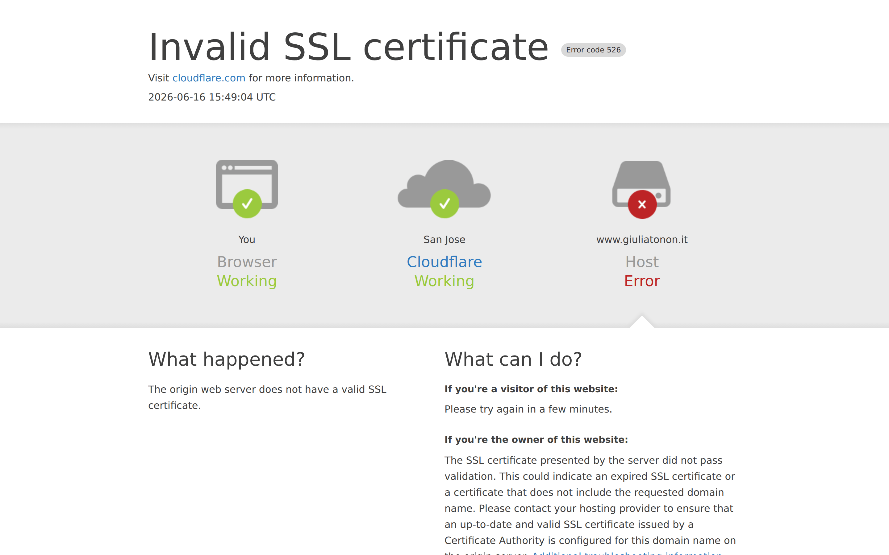
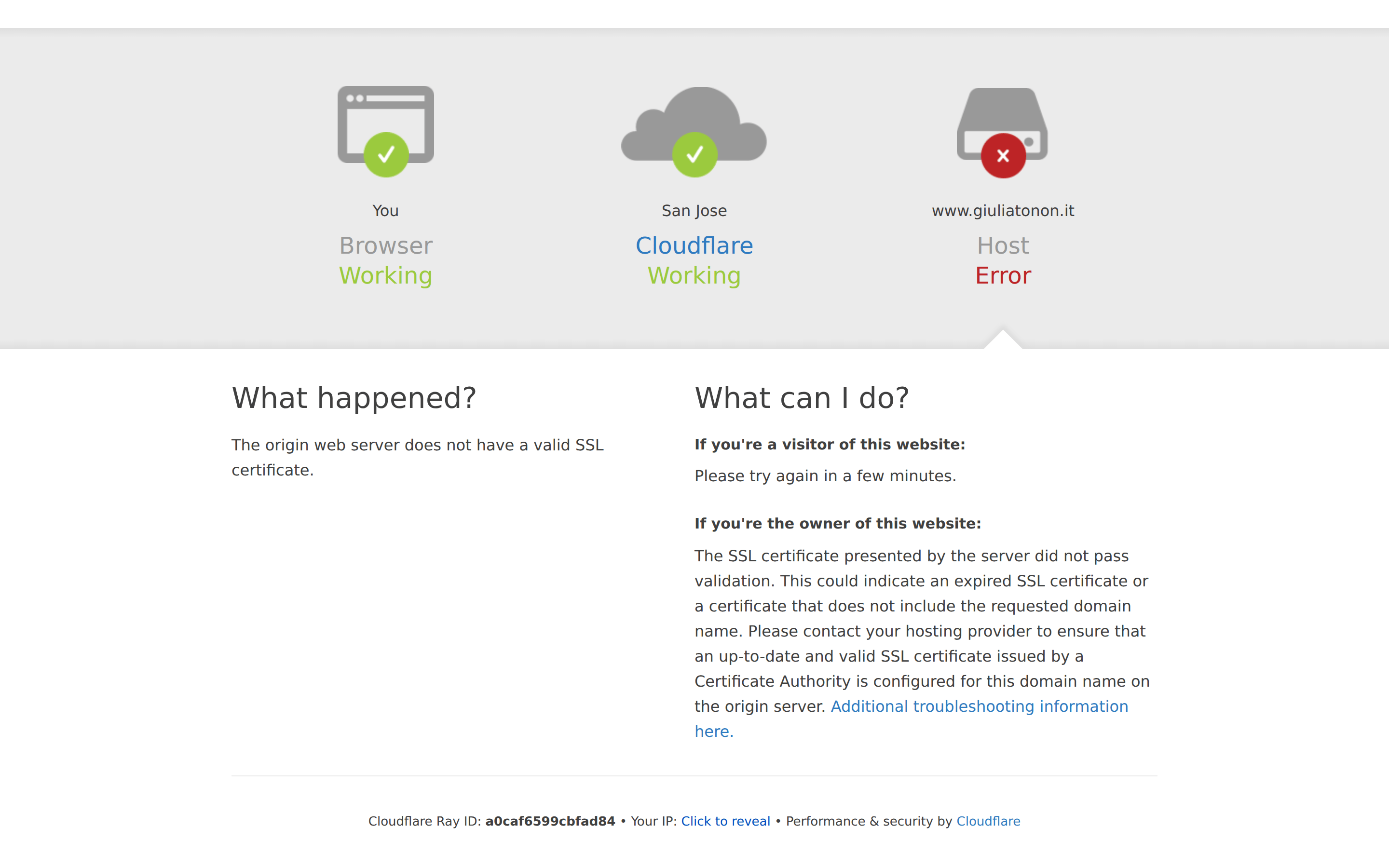
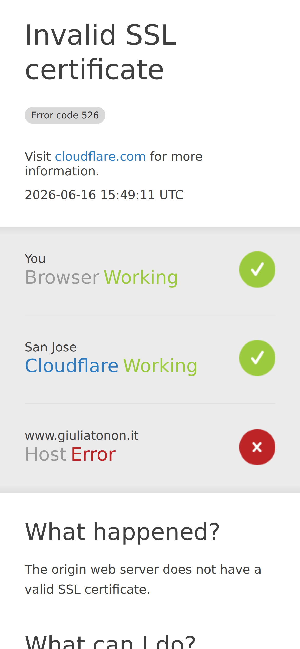
cardIcon-based status cards in a horizontal flow
chipMinimal inline status badges
inputNot present
heroLarge text-based error status with timestamp and reference link
09
Voice & Don'ts
ToneDirect, technical, and informative
HeadlinesClear, unambiguous status declaration
CTAsHelpful guidance split by user role (visitor vs owner)
don't use decorative fonts — screenshot shows system-ui stack
don't add rounded corners to main layout elements — screenshot shows sharp edges
don't use heavy font weights for headings — screenshot shows 400 weight throughout
don't introduce complex background patterns — screenshot shows solid white and simple gradients
don't use vibrant, non-functional accent colors — screenshot shows blue only for links and status
Captured from the live site · real computed styles
11
System prompt
This is a Cloudflare error page design for an Invalid SSL certificate. The design DNA is a minimal, utility-focused system diagnostic interface. The primary colors are clean white backgrounds (#FFFFFF) with dark gray text (#404040), using functional blue (#2F7BBF) for links, green (#9BCA3E) for success states, and red (#BD2426) for errors. The typography relies entirely on the system font stack (system-ui, -apple-system, etc.) with a clear hierarchy established through size rather than weight, using 60px for the main heading and 30px for subheadings. Critical constraints include avoiding decorative fonts, heavy font weights, complex backgrounds, and non-functional accent colors. The layout is a clean, single-column centered structure with generous spacing, prioritizing clarity and immediate comprehension of the technical status.
Bring this taste to your agent
Hand your AI agent a machine-readable spec of this design — tokens, type, motion, the whole DNA.