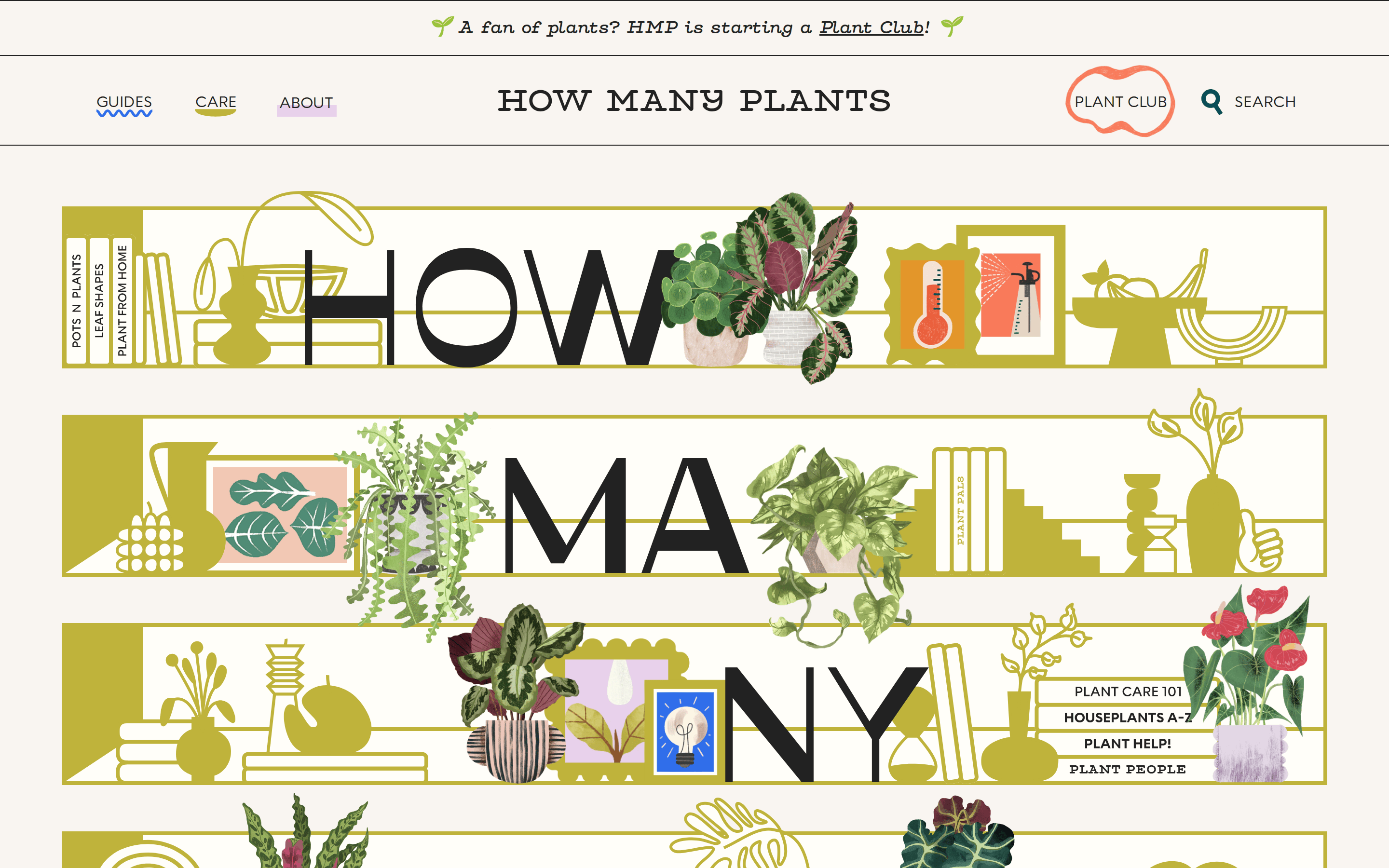
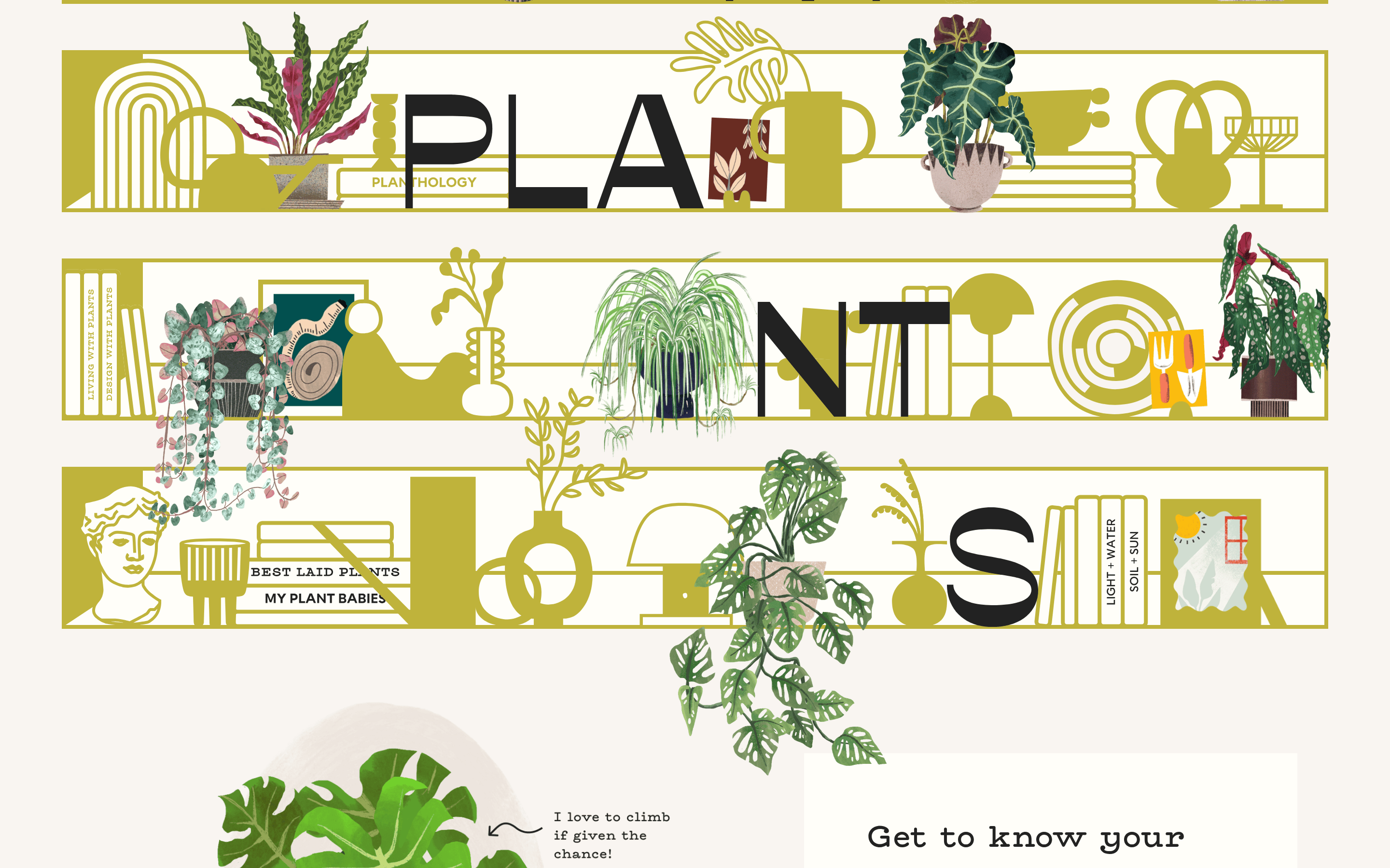
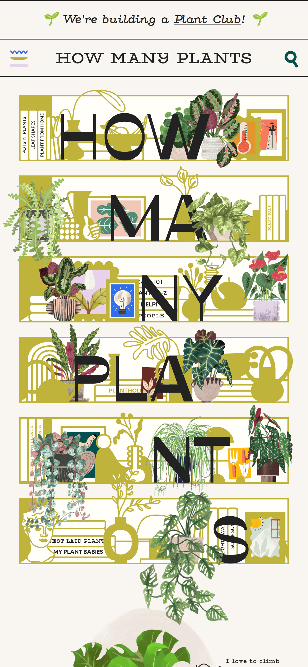
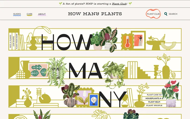
Uppercase navigation and sidebar labels create strong geometric rhythm. · Massive display text physically interacts with overlapping illustrations. · Mixing a geometric sans-serif with a typewriter-style serif adds editorial character.
04
Spacing
4px
8px
16px
24px
32px
48px
64px
80px
96px
Generous, spacious rhythm with generous side padding (64px) to frame the editorial content.
05
Surfaces
sm · 4px
md · 8px
lg · 12px
pill · 999px
Hard, solid borders (2px to 4px) in dark ink or olive gold, often used as playful offset drop shadows.
rgb(191, 179, 59) 6px 6px 0px 0px
06
Layout
1280container
12columns
32pxgutter
768 / 1024breakpoints
A masonry-like collage where text and custom illustrations physically overlap and break out of standard grid boundaries.
07
Motion & Interaction
220msmicro
400mssmall
800msmedium
cubic-bezier(0.4, 0.0, 0.2, 1)easing
Standard 220ms state transitions for basic interactivity.
A custom watering-can cursor appears globally, replacing the default pointer. · Standard pointer state for interactive elements.
08
Components
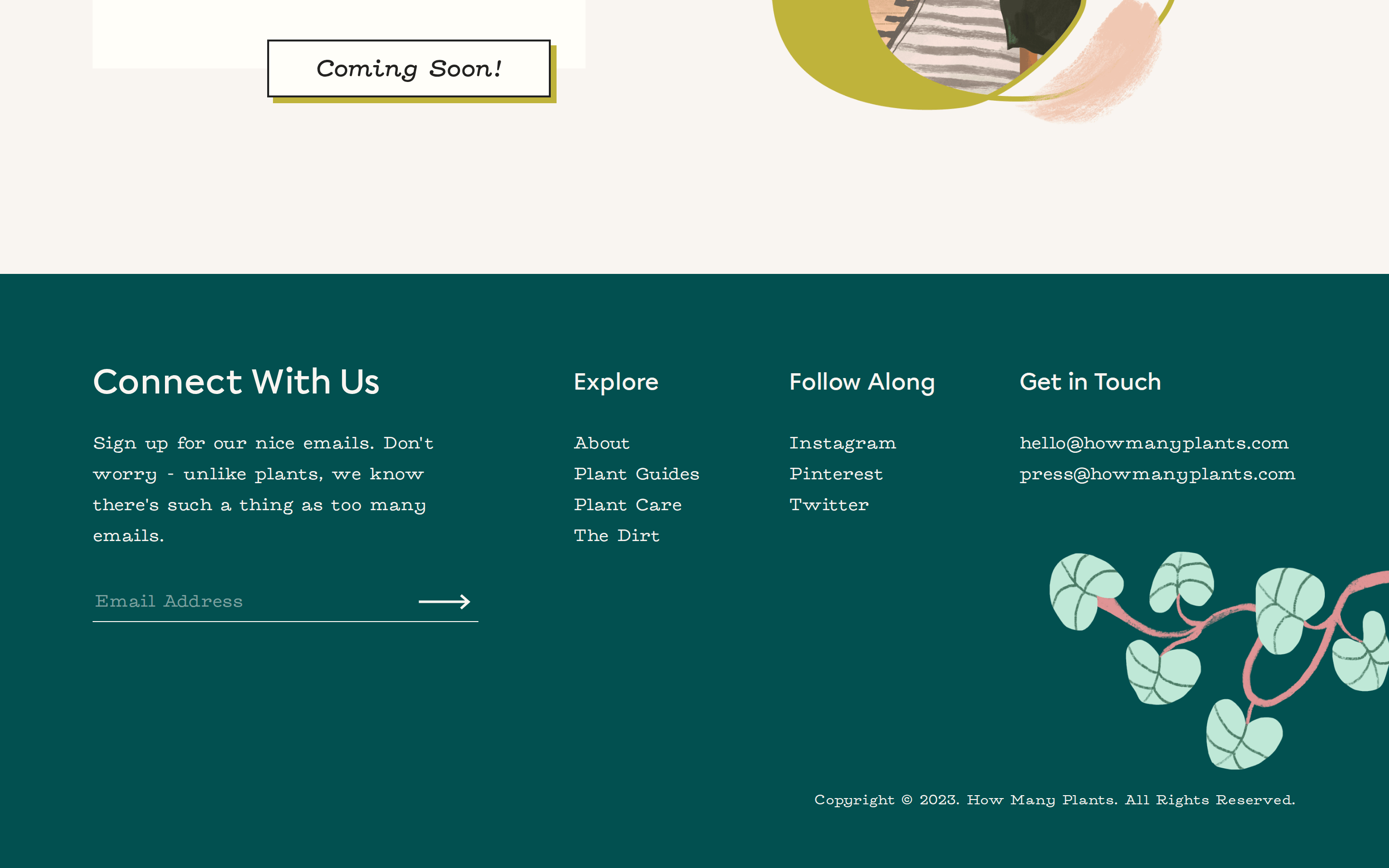
buttonText links styled with thick solid borders and an offset background drop shadow to create a tactile, 3D button effect.
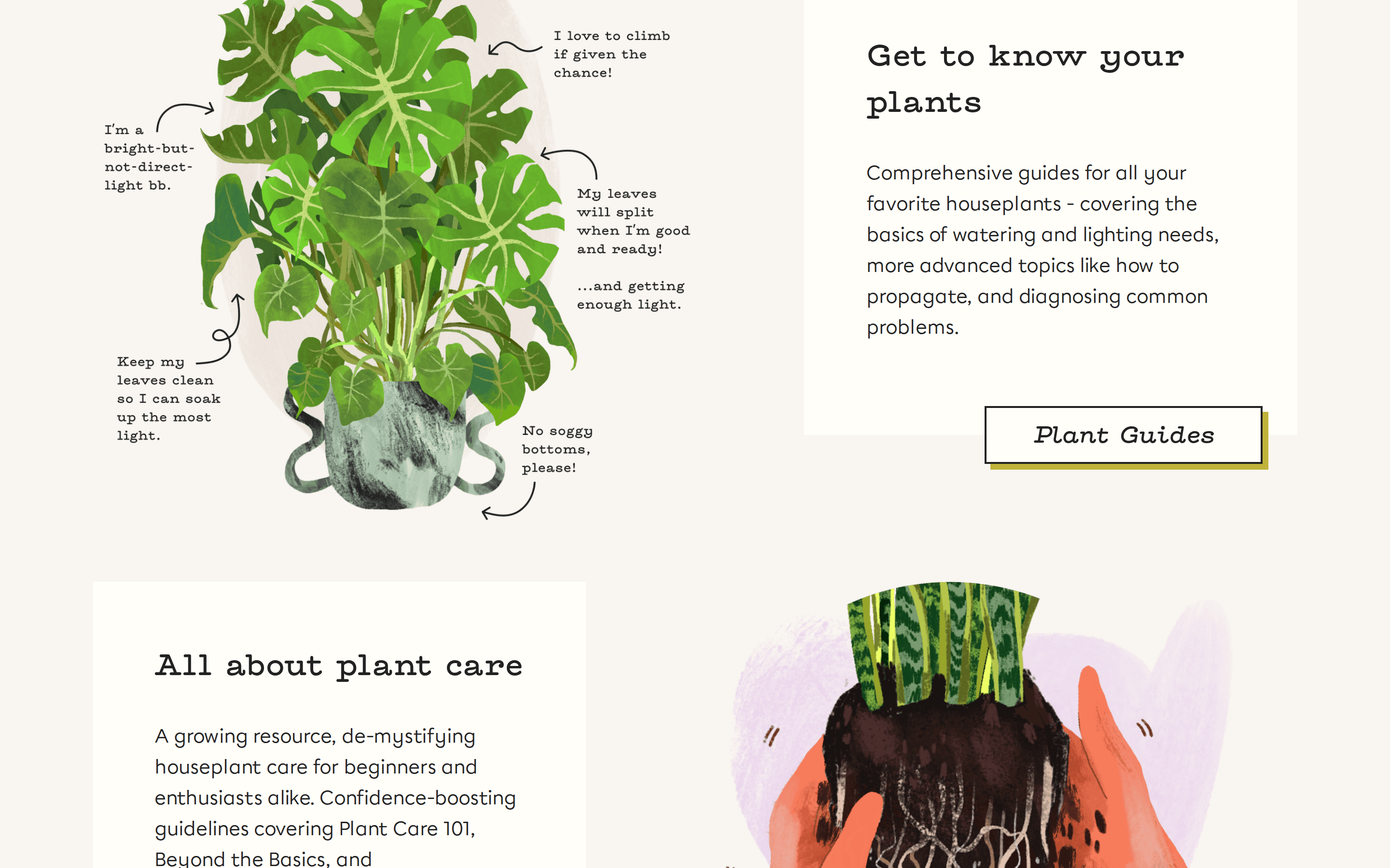
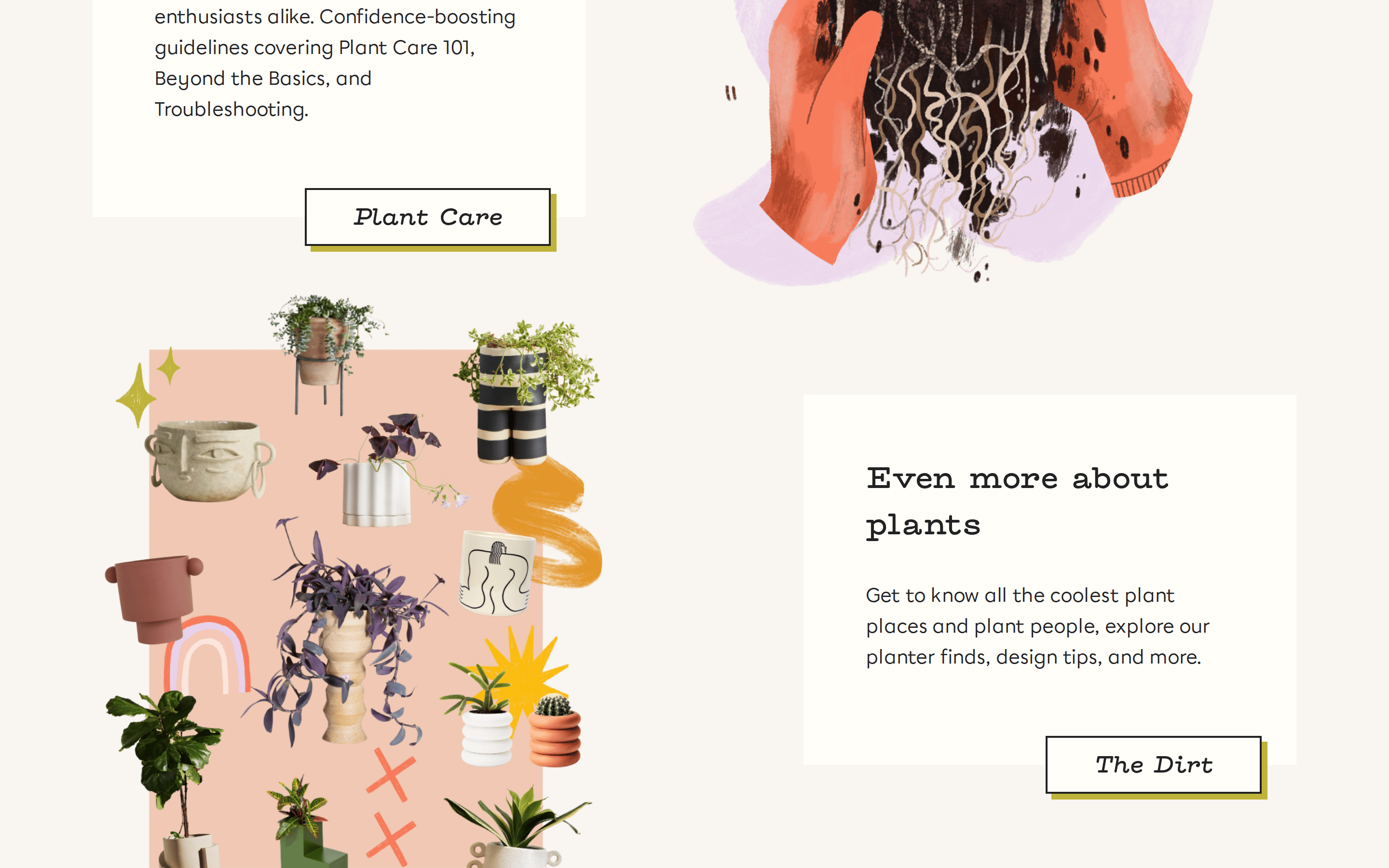
cardContent blocks defined by distinct background color rectangles or outlined frames, often layered with cut-out illustrations.
chipSmall, uppercase text labels used for categorization or navigation, relying on typography rather than filled containers.
inputMinimalist, borderless search interaction tucked into the primary navigation header.
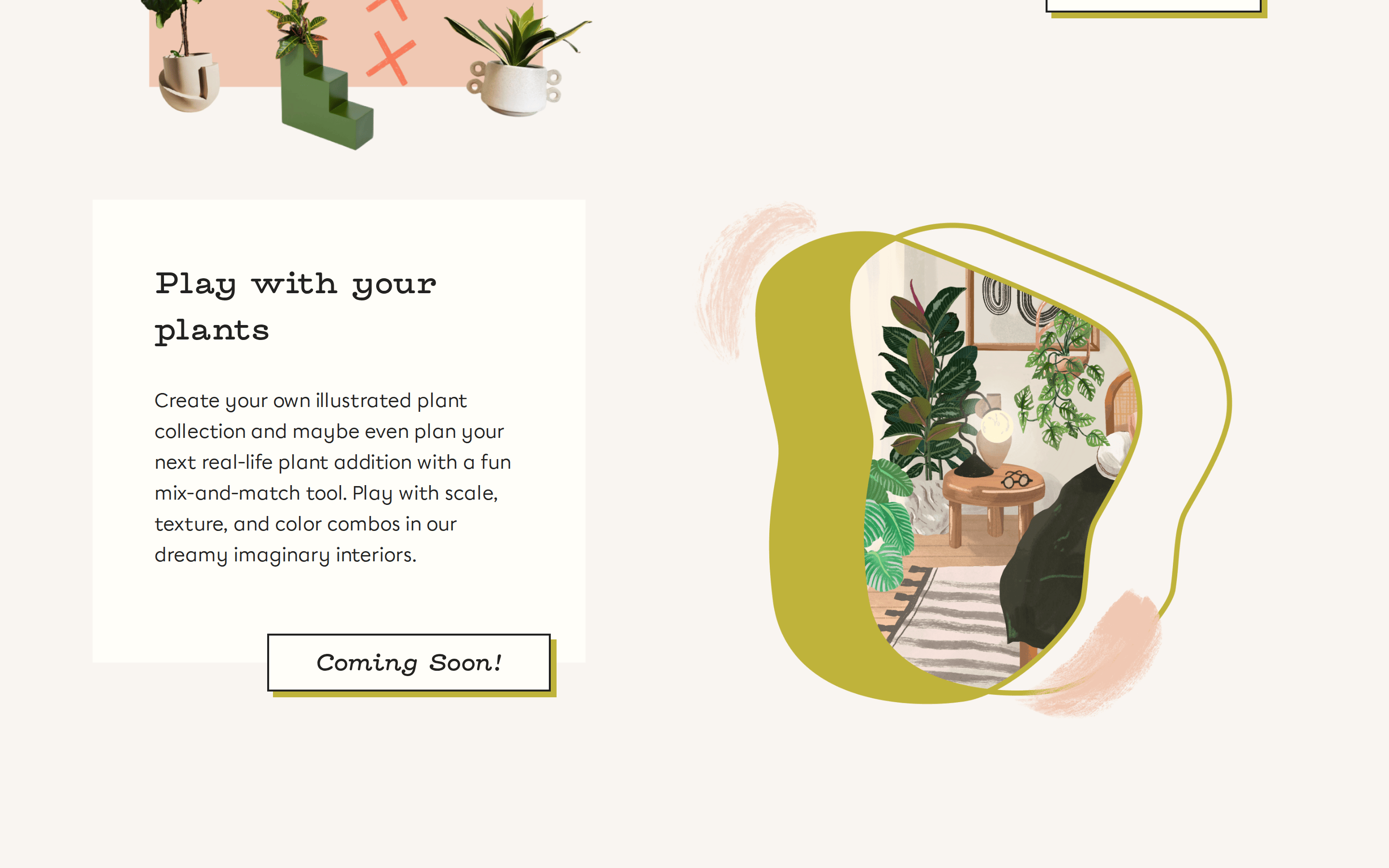
heroA dynamic, massive typographic composition where the headline spells out the brand name across illustrated shelves.
09
Voice & Don'ts
TonePlayful, encouraging, and warmly authoritative.
HeadlinesBold, conversational, and typographically expressive.
CTAsFramed in solid borders with a tactile drop shadow to mimic physical buttons.
Don't use clean, empty minimalism — the screenshot shows a dense, overlapping collage of illustrations and text.
Don't rely on subtle drop shadows — the screenshot shows thick, solid 6px offset block shadows.
Don't use dark mode or heavy gradients — the screenshot shows a light, near-white canvas with solid pastel accents.
Don't use standard UI grid layouts — the screenshot shows text and images physically overlapping and breaking boundaries.
Don't use standard system cursors globally — the screenshot shows a custom watering-can cursor.
Don't use purely typographic CTA buttons — the screenshot shows outlined boxes with solid offset background fills.
Captured from the live site · real computed styles
11
System prompt
This design is a warm, playful editorial platform for plant enthusiasts, built on a near-white canvas (#FFFEF9) with a prominent chartreuse-gold accent (#BFB33B) and dark ink (#222222). It features a dynamic mix of geometric sans-serif and typewriter-style serif typography. The layout uses a dense, overlapping collage approach where massive text and custom illustrations physically interact, breaking standard grid boundaries. Interaction is enhanced by a custom watering-can cursor and thick, solid block shadows on buttons. Critical constraints: NEVER use dark mode, minimal empty space, or subtle, realistic drop shadows. Always maintain the playful, illustrated, collage-like editorial character.
Bring this taste to your agent
Hand your AI agent a machine-readable spec of this design — tokens, type, motion, the whole DNA.