A modern, curated investment journal that blends classic editorial typography with clean digital card layouts.
02
Color
#56D270Accent
#433E3CInk
#EEE7E5BG
#F0E7E4BG soft
#9A9390Muted
rgba(67, 62, 60, 0.1)Line
A warm, muted neutral palette with a single bright green accent for interactive elements and tags.
03
Typography
didone-serif · humanist-sans
display56px · 400
h236px · 400
body16px · 400
small10px · 700
Use uppercase with wide letter-spacing for small UI elements and badges. · Keep body text highly legible with generous line height. · Reserve the large didone serif strictly for primary display text.
04
Spacing
4px
8px
12px
16px
20px
24px
32px
40px
60px
A 4px base unit ensures consistent padding across all card components.
05
Surfaces
sm · 8px
md · 12px
lg · 20px
pill · 999px
No visible hard borders on cards; depth is created through background contrast and generous rounded corners.
06
Layout
1280container
12columns
24pxgutter
768 / 1024breakpoints
A multi-column masonry-like grid of cards on desktop, stacking to a single column on mobile.
07
Motion & Interaction
220msmicro
400mssmall
800msmedium
cubic-bezier(0.25, 0.1, 0.25, 1)easing
CSS background-color and transform transitions on hover · Smooth opacity transitions for page reveals
Background color transitions and subtle element shifts. · Standard cursor pointer interactions across interactive elements.
08
Components
buttonPill-shaped buttons with uppercase text, 1px borders, and transparent backgrounds.
cardRounded corner containers with subtle background shifts (e.g., light vs. dark mode cards) and centered text.
chipSmall, brightly colored (green or purple) pill badges with uppercase, widely tracked text.
inputNot prominently featured in the provided view.
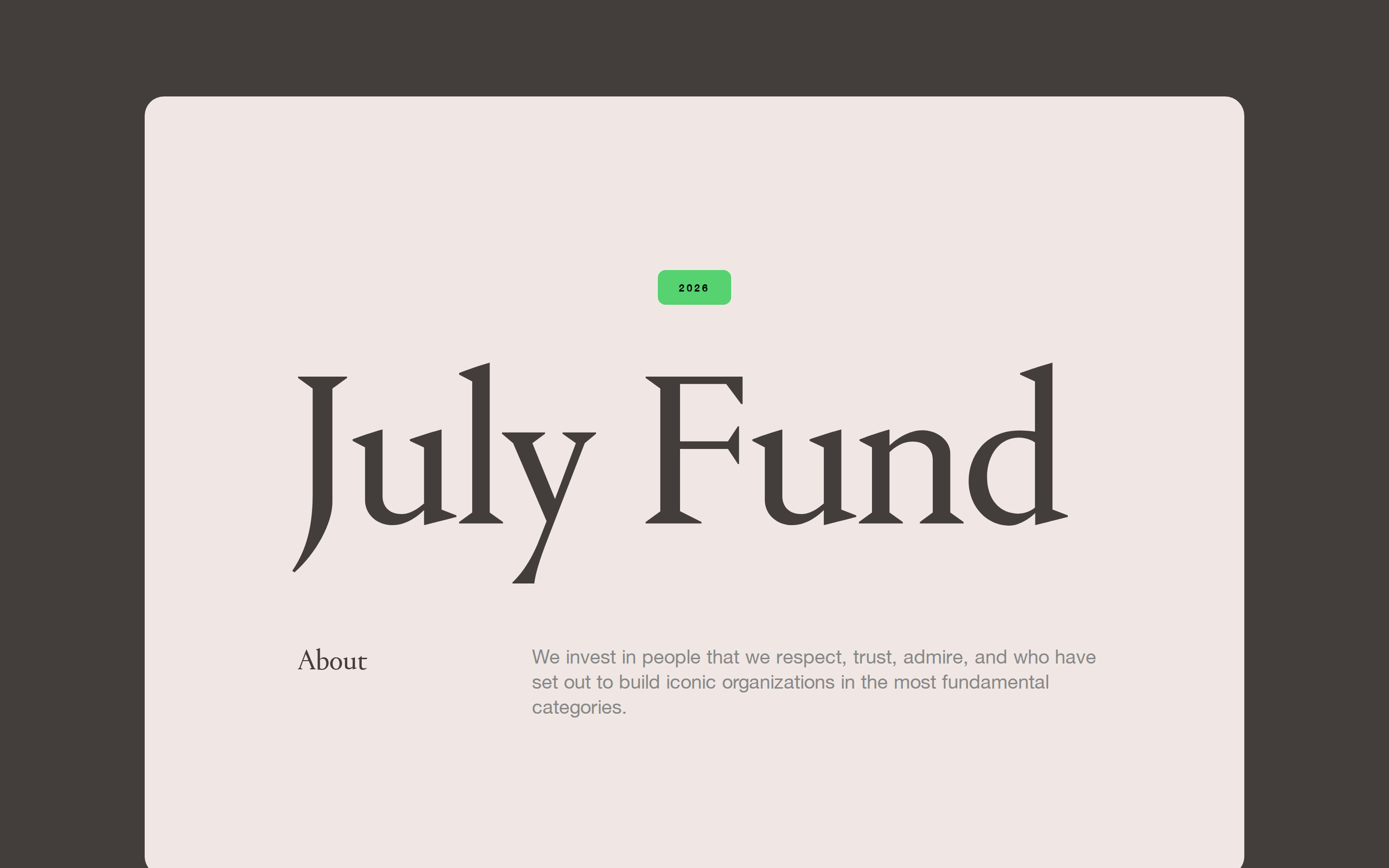
heroMassive serif wordmark centered over a short descriptive paragraph on a warm neutral background.
09
Voice & Don'ts
ToneAuthoritative yet accessible, blending high-end finance with modern tech.
HeadlinesLarge, classic serif wordmarks and lowercase news titles.
CTAsUnderstated, uppercase, pill-shaped buttons with thin borders.
Don't use sharp square corners — screenshot shows generous 20px rounded corners on cards.
Don't use all-caps for body text — screenshot shows all-caps reserved for small badges and dates.
Don't use heavy drop shadows — screenshot shows flat surfaces defined by background color contrast.
Don't use a cool, clinical blue palette — screenshot uses warm, earthy neutrals and a green accent.
Don't use grotesque sans-serifs for display text — screenshot uses a classic didone-serif.
Don't use high-contrast, multi-colored gradients — screenshot uses solid backgrounds and occasional soft image textures.
Avoid: Avoid cluttering the interface with multiple competing colors.
Avoid: Avoid using modern sans-serifs for primary headlines.
Avoid: Avoid harsh, square-edged corners on containers.
Captured from the live site · real computed styles
11
System prompt
This design system represents a refined, editorial-style venture capital fund website. It centers around a warm, muted neutral palette (#EEE7E5 backgrounds, #433E3C ink) contrasted with a vibrant green accent (#56D270) for status badges and tags. Typography is dominated by a large, elegant didone-serif for display elements and a clean humanist-sans for body copy. The layout is built on a card-based grid with generous 20px rounded corners, relying on background color shifts rather than shadows for depth. Buttons are understated, pill-shaped, and uppercase. Critical donts: Do not use sharp corners, do not apply heavy drop shadows, and do not use modern sans-serifs for large display headlines.
Bring this taste to your agent
Hand your AI agent a machine-readable spec of this design — tokens, type, motion, the whole DNA.