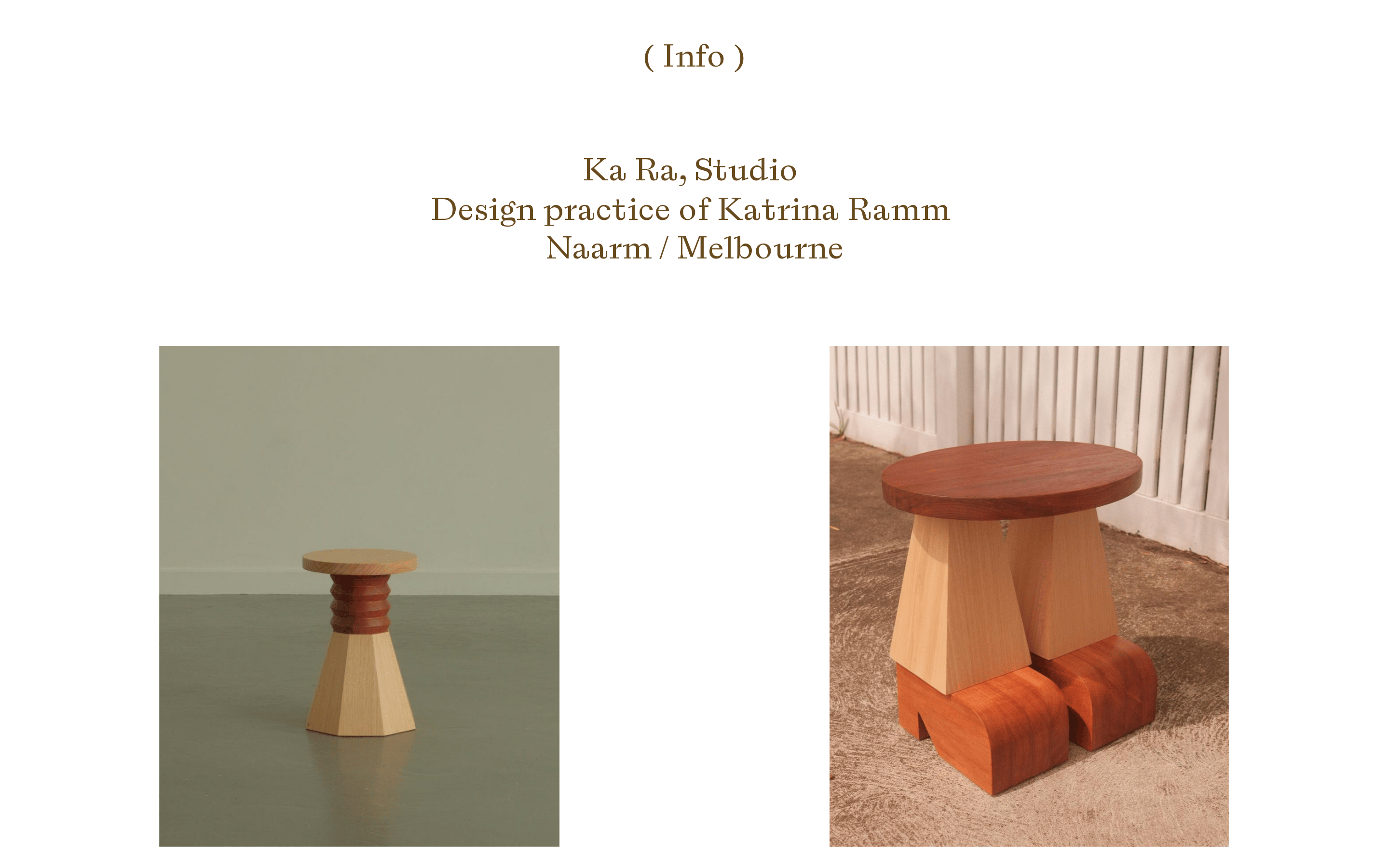
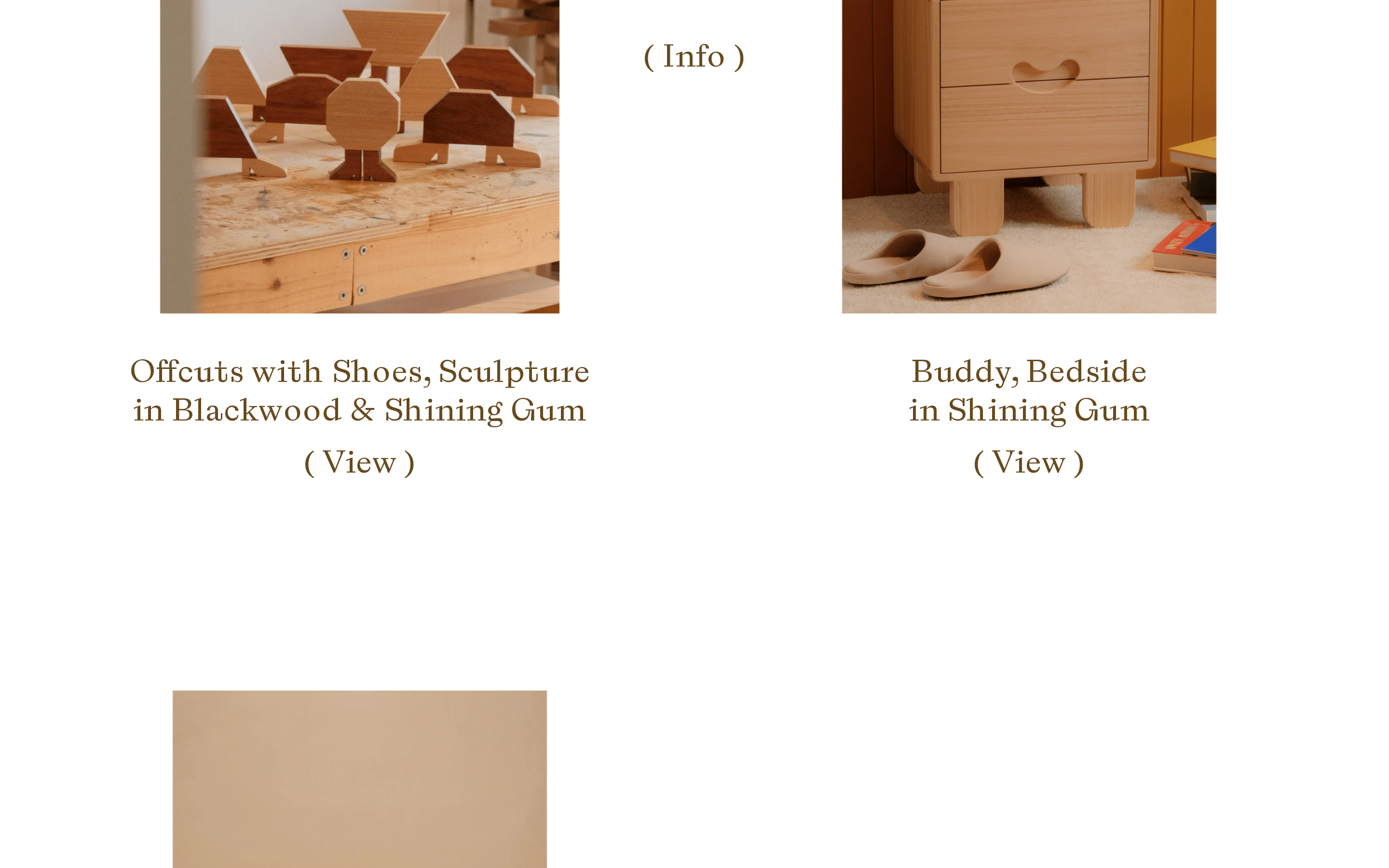
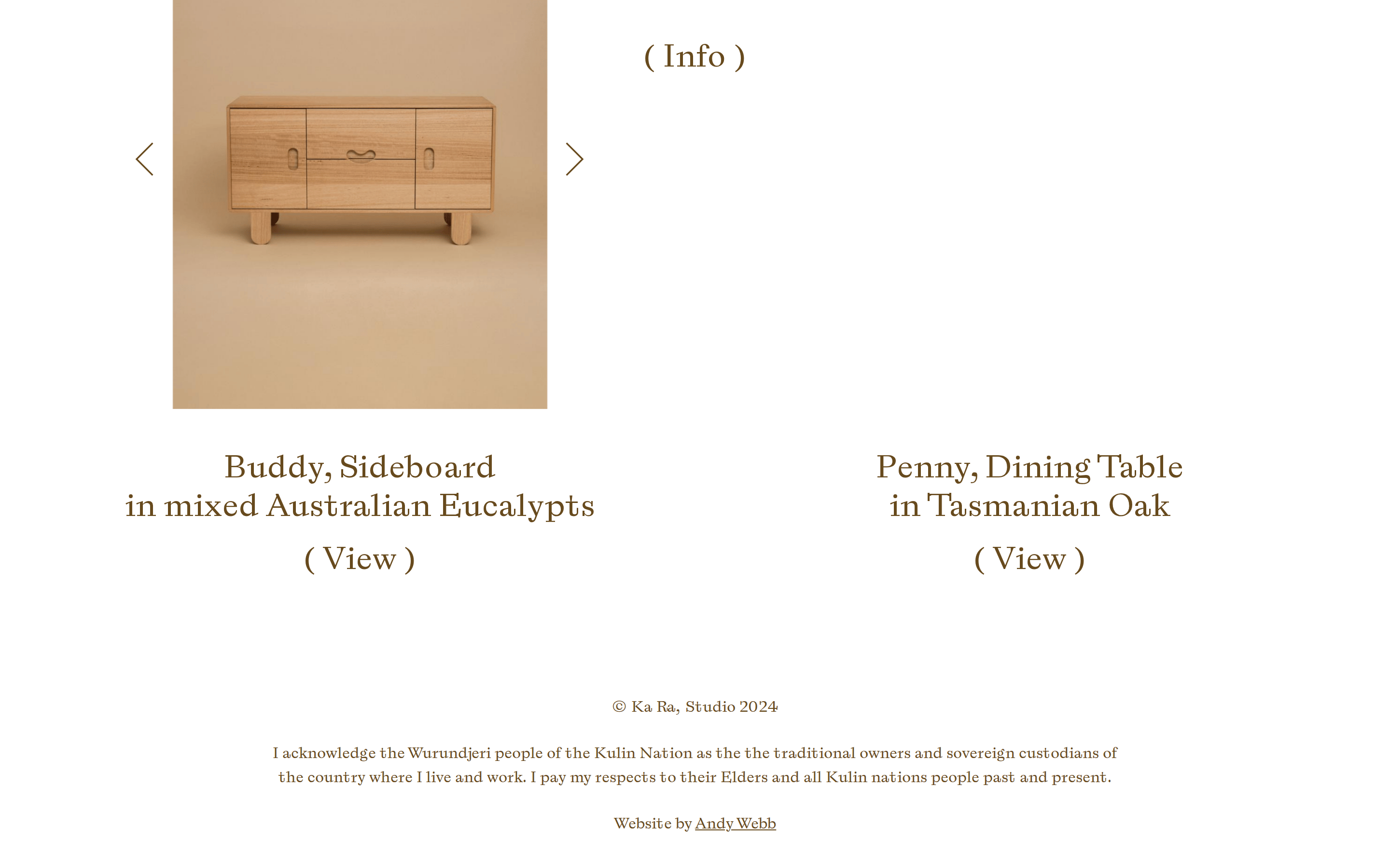
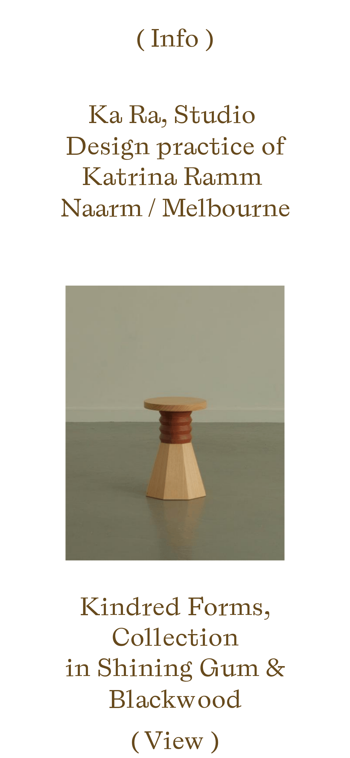
A curated gallery exhibition of bespoke wooden objects.
02
Color
#674A1DInk
#FFFFFFBG
rgba(103, 74, 29, 1)Line
Two-tone palette dominated by warm white and a rich, woody brown ink.
03
Typography
transitional-serif
display34px · 400
body15px · 400
The primary typeface 'A B C Laica' is used exclusively for all text elements. · All text maintains a uniform weight of 400. · Text color is strictly limited to a warm woody brown against a white background.
04
Spacing
4px
8px
16px
24px
32px
48px
64px
96px
Generous padding and margins create a calm, unhurried browsing experience.
05
Surfaces
sm · 0px
md · 0px
lg · 0px
pill · 999px
Borders use the primary ink color and are occasionally paired with a subtle gray for inactive states.
06
Layout
1280container
12columns
24pxgutter
768 / 1024breakpoints
A single-column, vertically scrolling layout with generous whitespace and center-aligned text.
07
Motion & Interaction
220msmicro
400mssmall
800msmedium
cubic-bezier(0.25, 0.1, 0.25, 1)easing
Subtle opacity transitions on hover for interactive elements.
Opacity reduction on text links to indicate interactivity. · Standard browser navigation.
08
Components
buttonText-based links wrapped in parentheses, relying on cursor changes and opacity transitions for interaction.
cardLarge, borderless photographic cards with centered text descriptions below.
heroA text-heavy introductory block followed by a grid or single large image.
09
Voice & Don'ts
ToneRefined, quiet, and confident.
HeadlinesDeclarative, often stating the object name and material.
CTAsSubtle, using parentheses to frame simple actions like 'View' or 'Info'.
Don't use a dark background — screenshot shows a clean white background.
Don't use sans-serif typography — screenshot shows a distinct transitional-serif face.
Don't use bright accent colors — screenshot uses a monochrome brown ink palette.
Don't use heavy drop shadows — screenshot shows completely flat surface treatment.
Don't use complex multi-column grids — screenshot shows a simple, centered vertical flow.
Don't use bold font weights — screenshot shows a uniform weight of 400 across all text.
Captured from the live site · real computed styles
11
System prompt
Position this as a refined, minimalist portfolio for a design studio. The key colors are a warm white background and a woody brown ink. The typography is exclusively a transitional serif, used in a single weight. Critical donts: do not introduce dark modes or black backgrounds, do not use sans-serif type, and do not add decorative drop shadows to components. Keep interactions subtle, relying on opacity changes and generous whitespace.
Bring this taste to your agent
Hand your AI agent a machine-readable spec of this design — tokens, type, motion, the whole DNA.