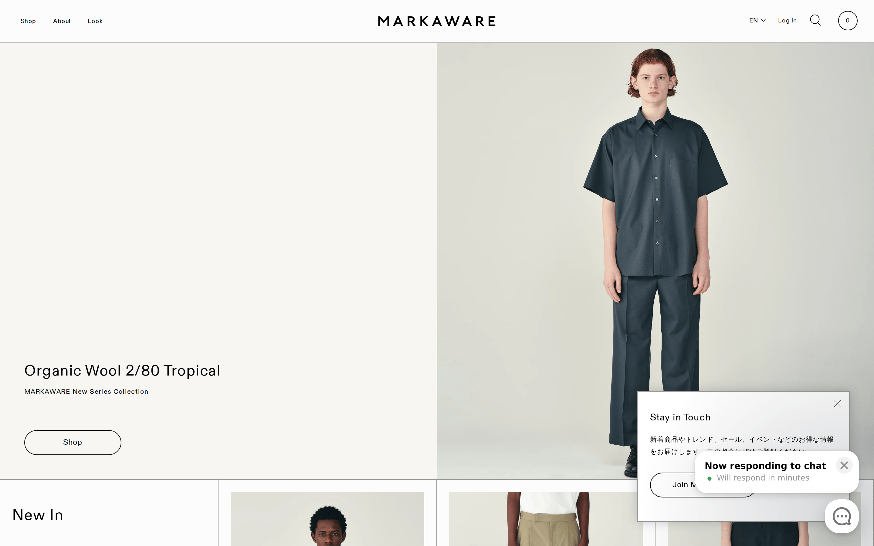
Neutral, high-key palette letting product photography provide all color and texture.
03
Typography
geometric-sans
display48px · 400
headline32px · 400
body14px · 400
All text uses a consistent geometric-sans (ABCDiatype) at weight 400. · Brand logo is set in wide-spaced uppercase tracking. · Body copy uses a slightly wider letter-spacing (0.4px) for enhanced readability.
04
Spacing
4px
8px
16px
20px
24px
32px
48px
64px
96px
Vertical rhythm is maintained by generous padding (398px to 70px) between hero images and content sections.
05
Surfaces
sm · 0px
md · 0px
lg · 0px
pill · 100px
1px solid black for all interactive elements and container boundaries, creating sharp structural definition.
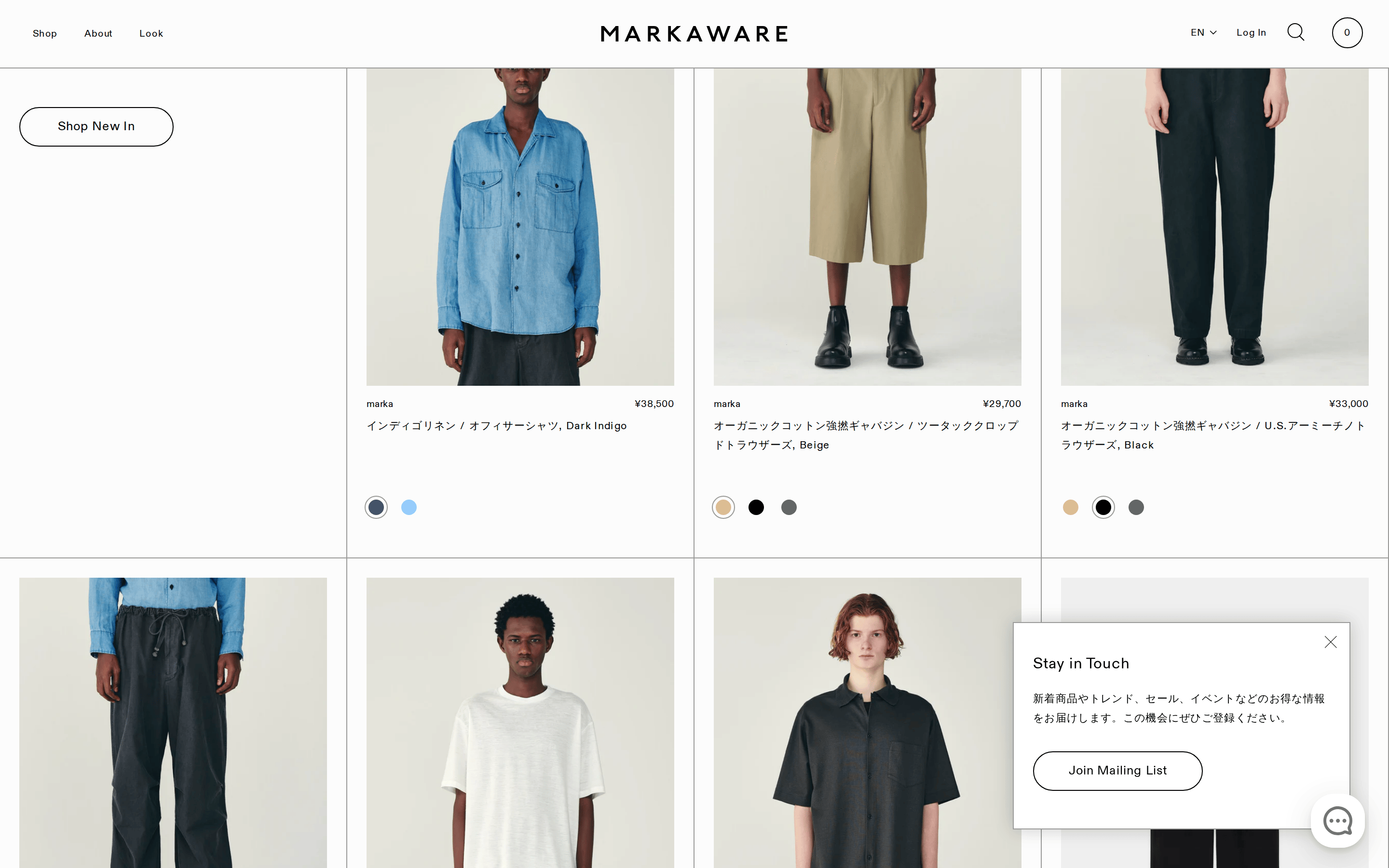
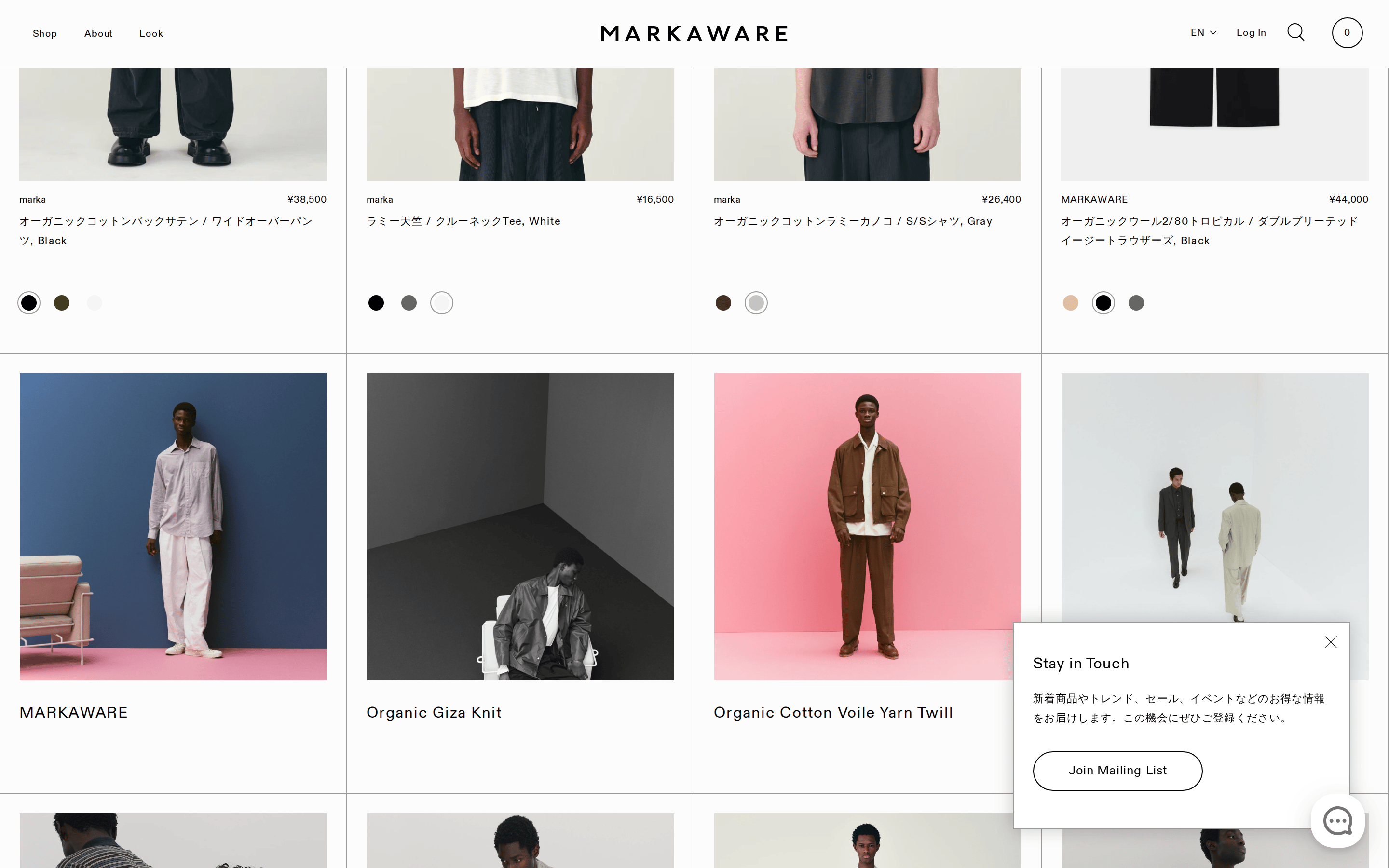
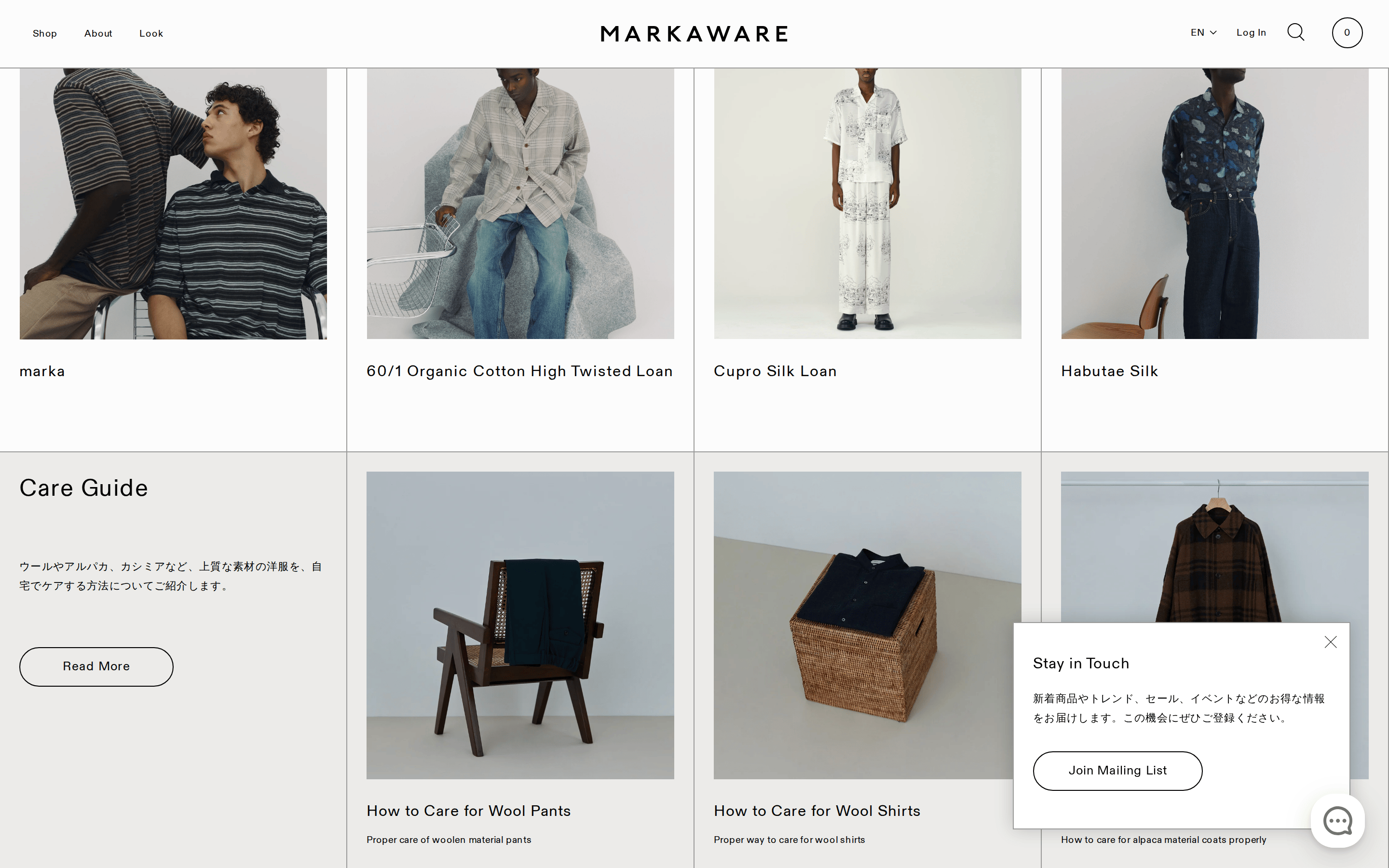
Full-bleed hero imagery paired with a 4-column product grid that maintains uniform 20px gutters.
07
Motion & Interaction
220msmicro
400mssmall
500msmedium
cubic-bezier(0.215, 0.61, 0.355, 1)easing
Smooth opacity and visibility transitions (0.5s) for overlays like the 'Stay in Touch' modal. · Width and max-width transitions (0.4s) using a standard cubic-bezier for UI element reveals.
Subtle color shifts or opacity changes, maintaining the site's overall restraint. · Instant feedback through page transitions or modal reveals.
08
Components
buttonPill-shaped outline buttons with black text and transparent background, using a 100px border-radius.
cardMinimal cards with a large product image and a small, left-aligned title below, separated by a light border.
chipSmall color swatches (black, beige, charcoal, white) used for product variant selection.
inputClean text input fields with minimal borders, often accompanied by a black underline or border.
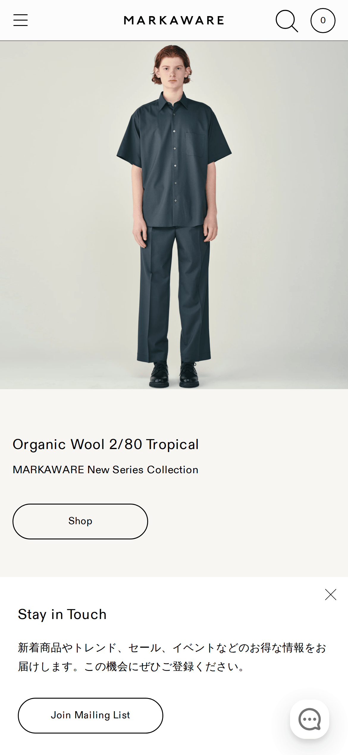
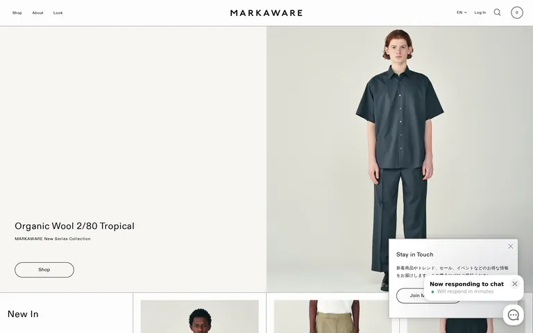
heroSplit-screen hero on desktop with an image taking up roughly 60% of the width, shifting to full-width on mobile.
09
Voice & Don'ts
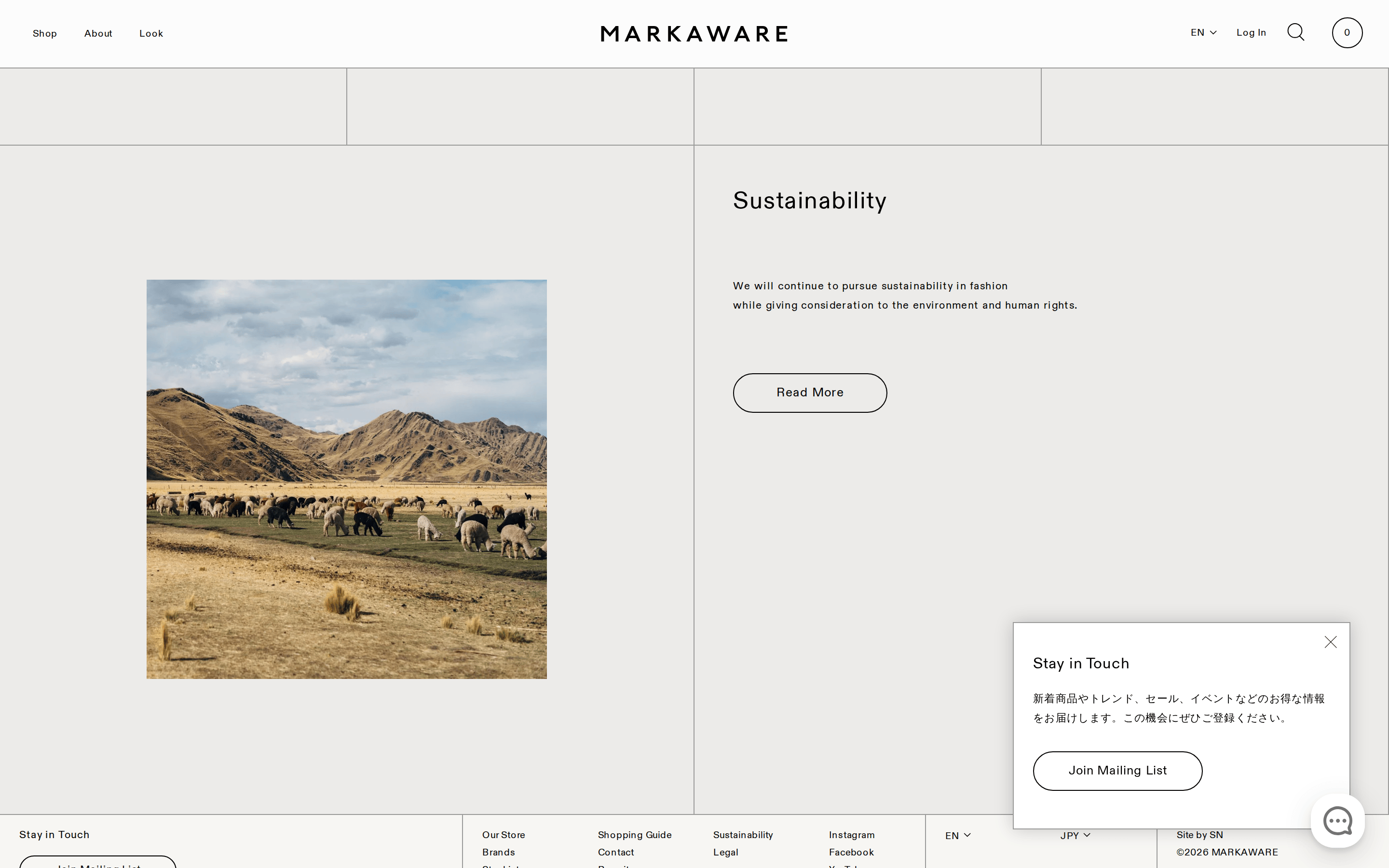
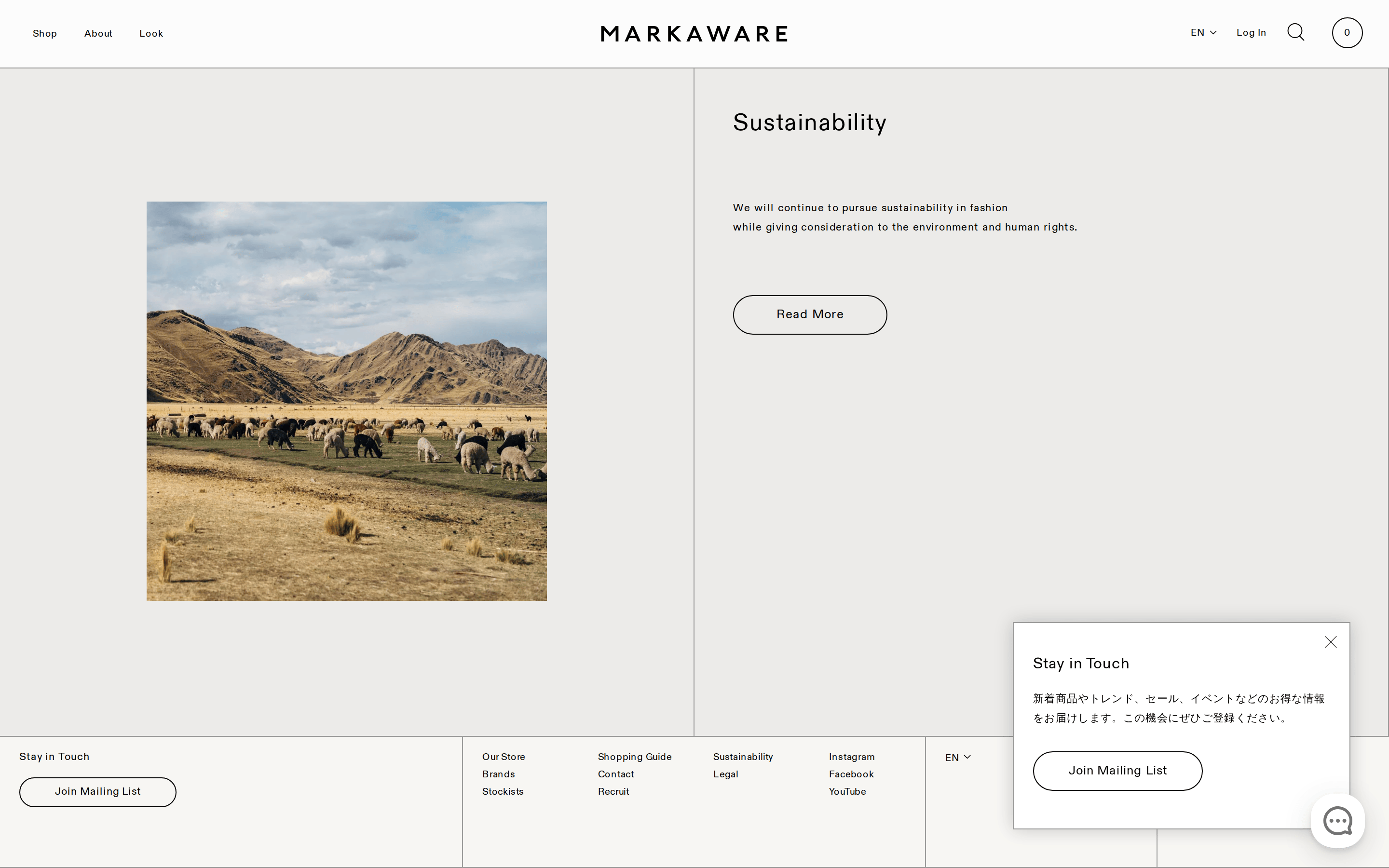
ToneQuiet, sophisticated, and informative, reflecting a focus on material quality and craftsmanship.
HeadlinesClear, descriptive, and often technical (e.g., 'Organic Wool 2/80 Tropical').
CTAsDirect and functional (e.g., 'Shop', 'Join Mailing List', 'Read More').
Don't use high-chroma accent colors — the palette is strictly monochrome and neutral.
Don't use heavy font weights — all visible typography is weight 400.
Don't use complex decorative backgrounds — the design relies on clean photography and white space.
Don't use rounded corners on primary UI elements — the site uses sharp edges for most containers, reserving pills for buttons.
Don't clutter the interface — the layout maintains generous, intentional spacing between all elements.
Don't use a busy or multi-colored palette — product colors and photography are the only sources of chromatic variety.
Avoid: Loud marketing jargon
Avoid: Aggressive sales language
Avoid: Excessive use of exclamation points
Avoid: Vague, flowery descriptions that distract from material specs
Captured from the live site · real computed styles
11
System prompt
MARKAWARE is a premium Japanese fashion brand with a refined, editorial e-commerce presence. The visual identity is built on a neutral, high-key palette (bg: #FCFCFC, ink: #000000, muted: #9B9B9A) that allows high-quality product photography to take center stage. Typography uses a geometric-sans (ABCDiatype) exclusively at weight 400, with generous letter-spacing for a sophisticated feel. Layouts are clean and structured, featuring a 4-column grid with 20px gutters and sharp 1px black borders for containers and buttons. Key elements include pill-shaped outline buttons (100px border-radius) and minimal, image-heavy product cards. Critical rules: never use high-chroma accents, never use heavy font weights (above 400), and never clutter the interface with unnecessary decorative elements. Prioritize breathing room and structural clarity to maintain the brand's quiet, premium aesthetic.
Bring this taste to your agent
Hand your AI agent a machine-readable spec of this design — tokens, type, motion, the whole DNA.