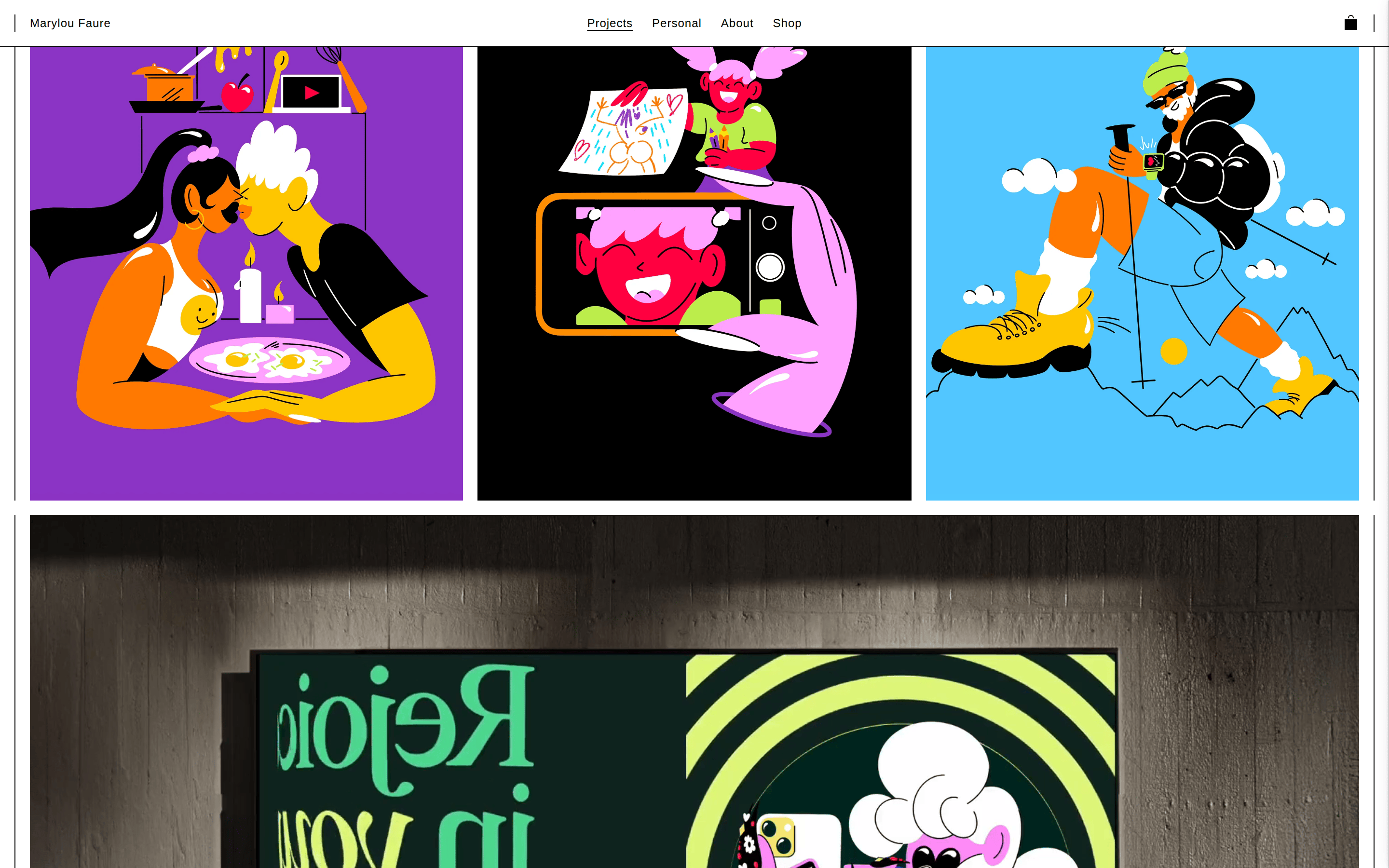
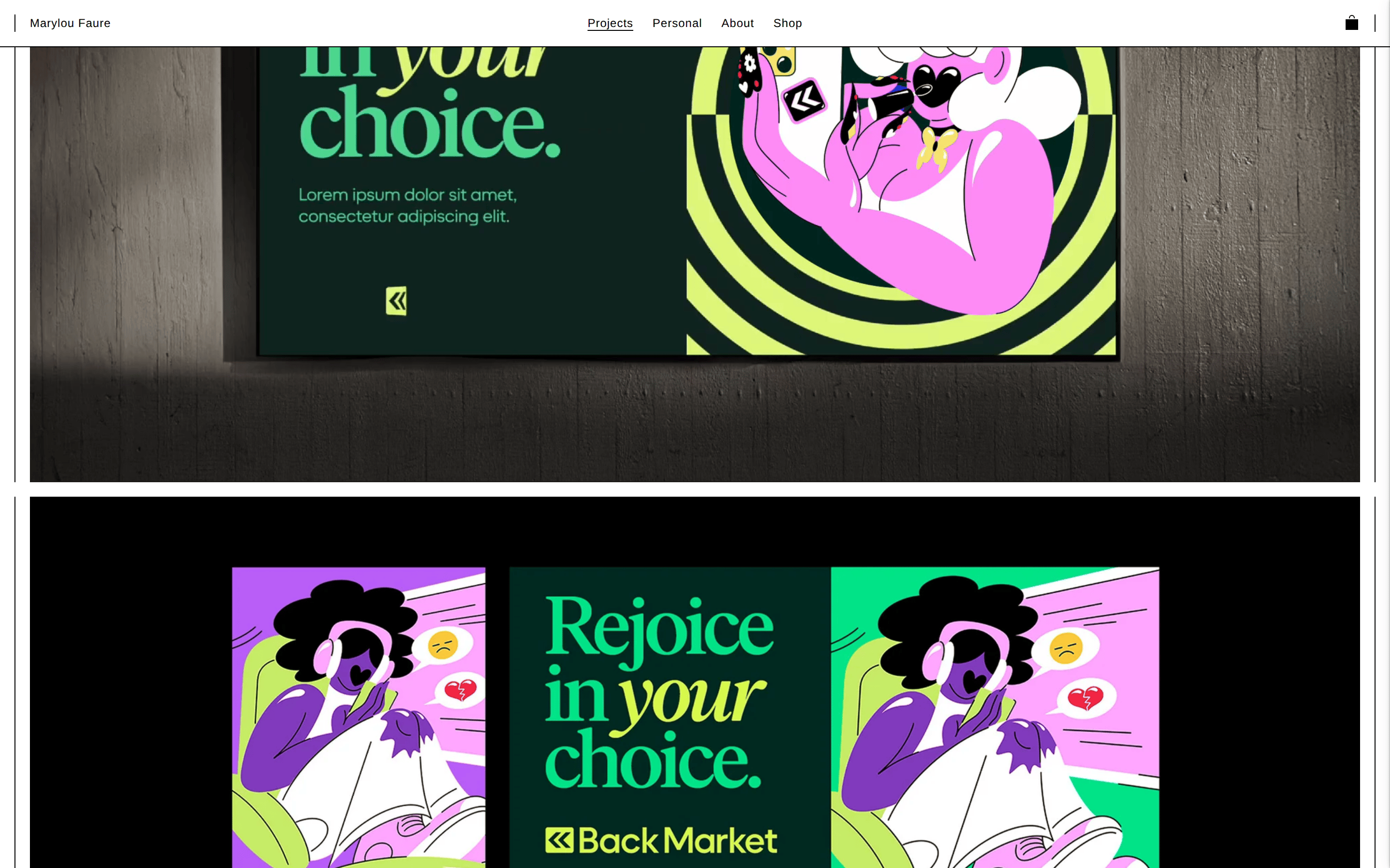
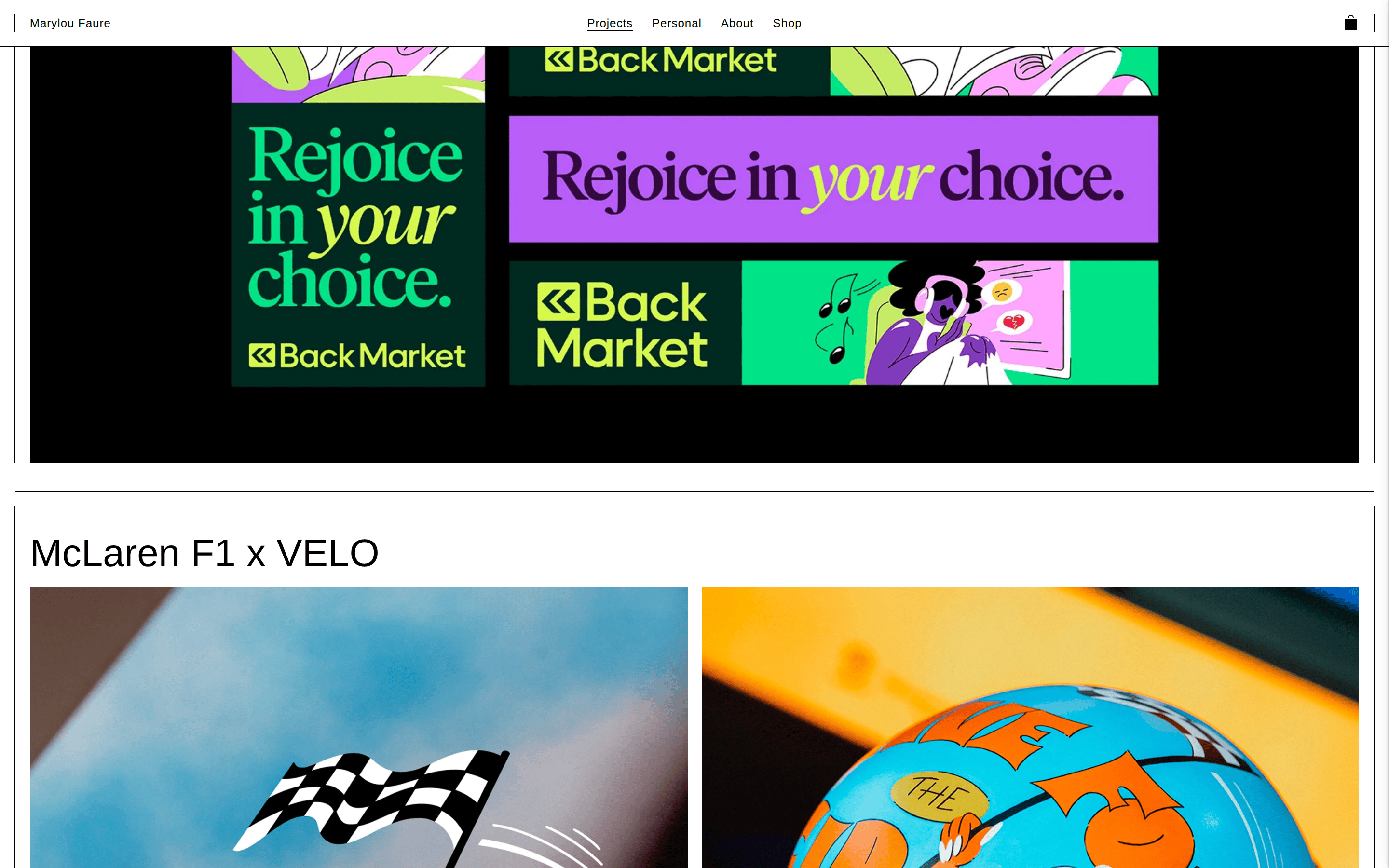
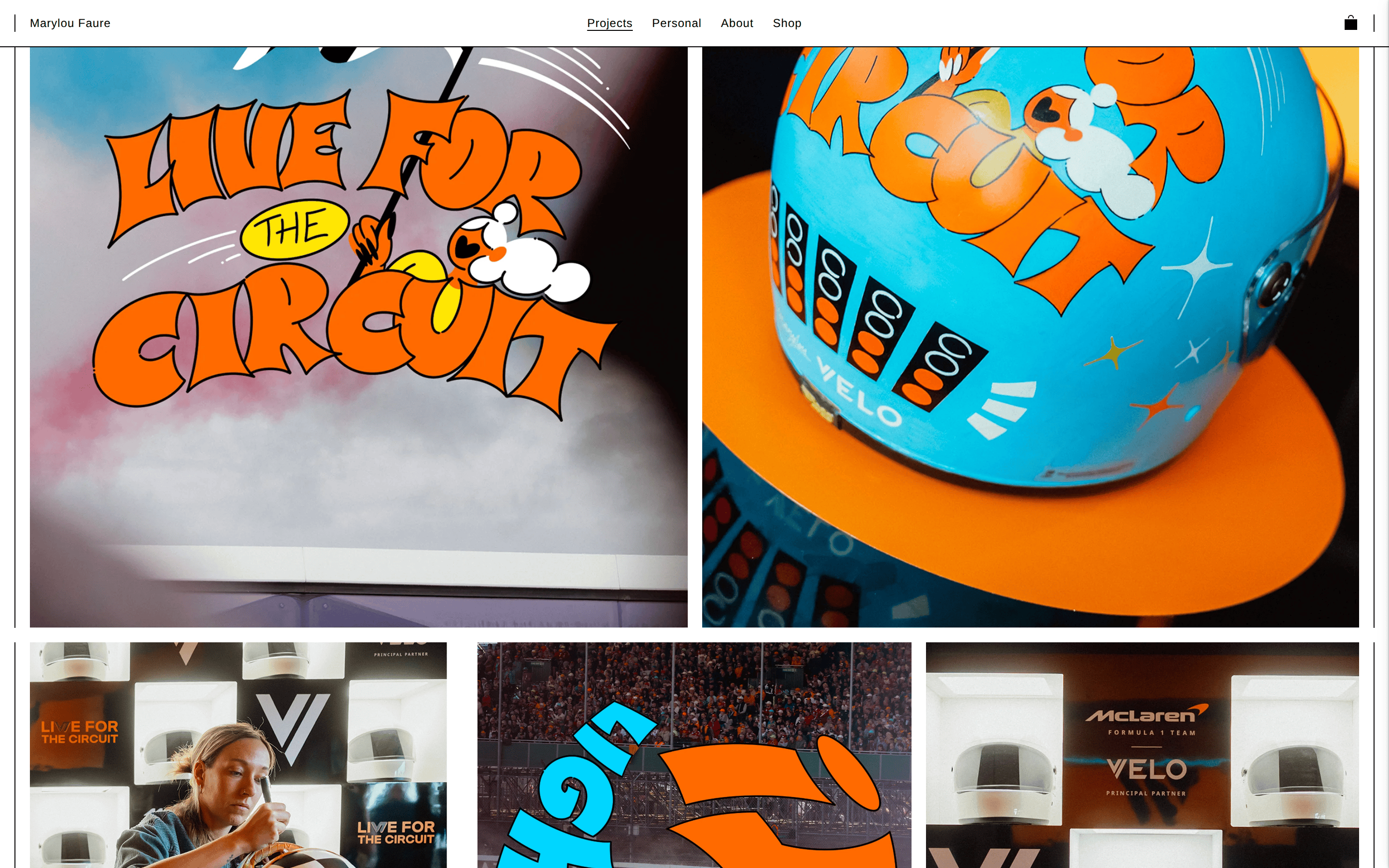
A bold, playful art gallery showcasing vibrant character-driven illustrations.
02
Color
#000000Ink
#FFFFFFBG
#868785Muted
rgba(0,0,0,0.2)Line
The UI is strictly neutral (black and white) so the artwork's bold colors can dominate the visual hierarchy.
03
Typography
grotesque-sans
display40px · 400
body16px · 400
label12px · 400
Use clean sans-serif typography to maintain a minimalist backdrop for the illustrations. · Apply tight letter-spacing (-0.5px) for large display titles. · Apply generous letter-spacing (0.5px) for small navigation and caption labels.
04
Spacing
4px
8px
16px
24px
32px
48px
64px
96px
Consistent padding of 15px creates a uniform margin for content blocks and navigation elements.
05
Surfaces
sm · 0px
md · 8px
lg · 0px
pill · 50px
1px solid rgba(0,0,0,0.2) used for horizontal separators and thin structural lines.
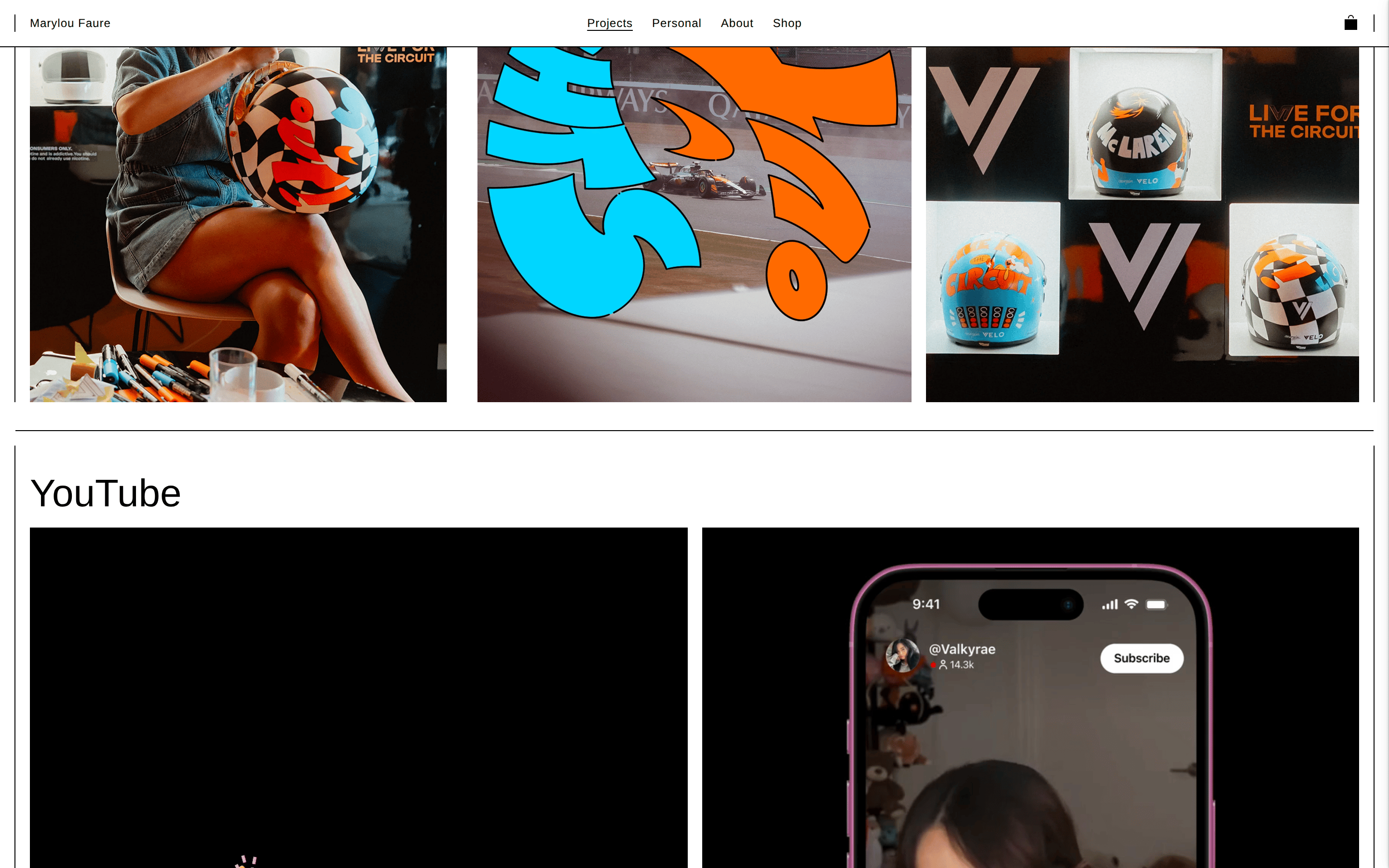
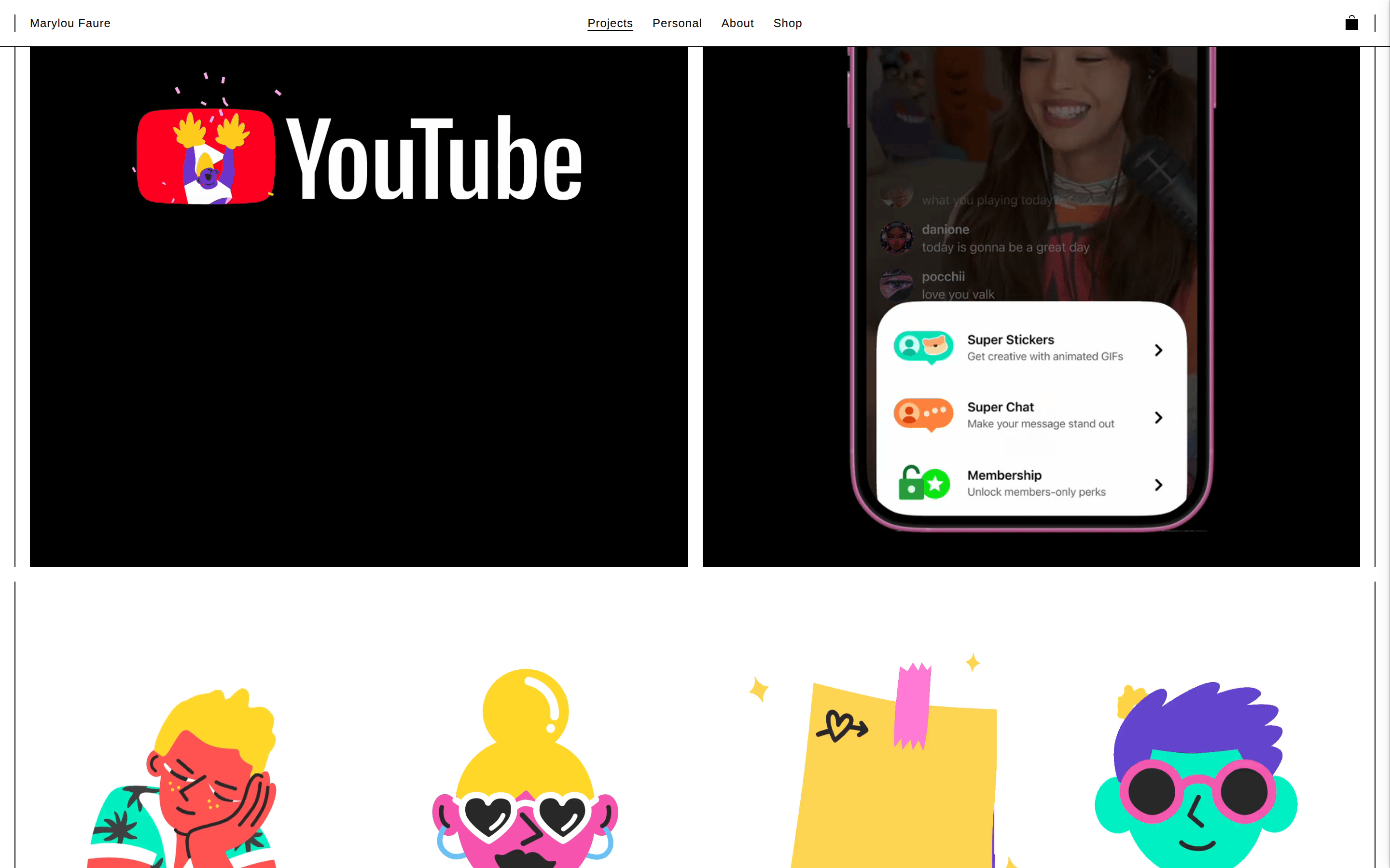
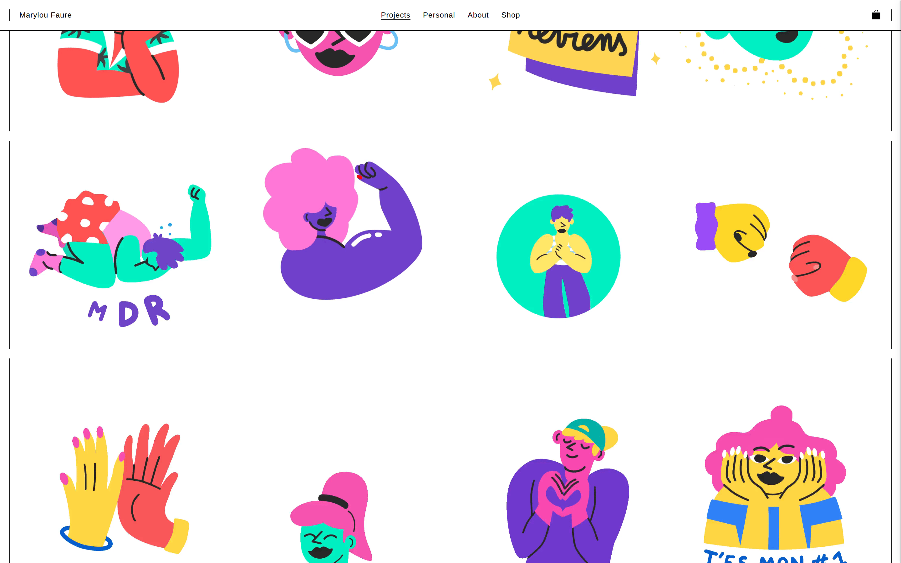
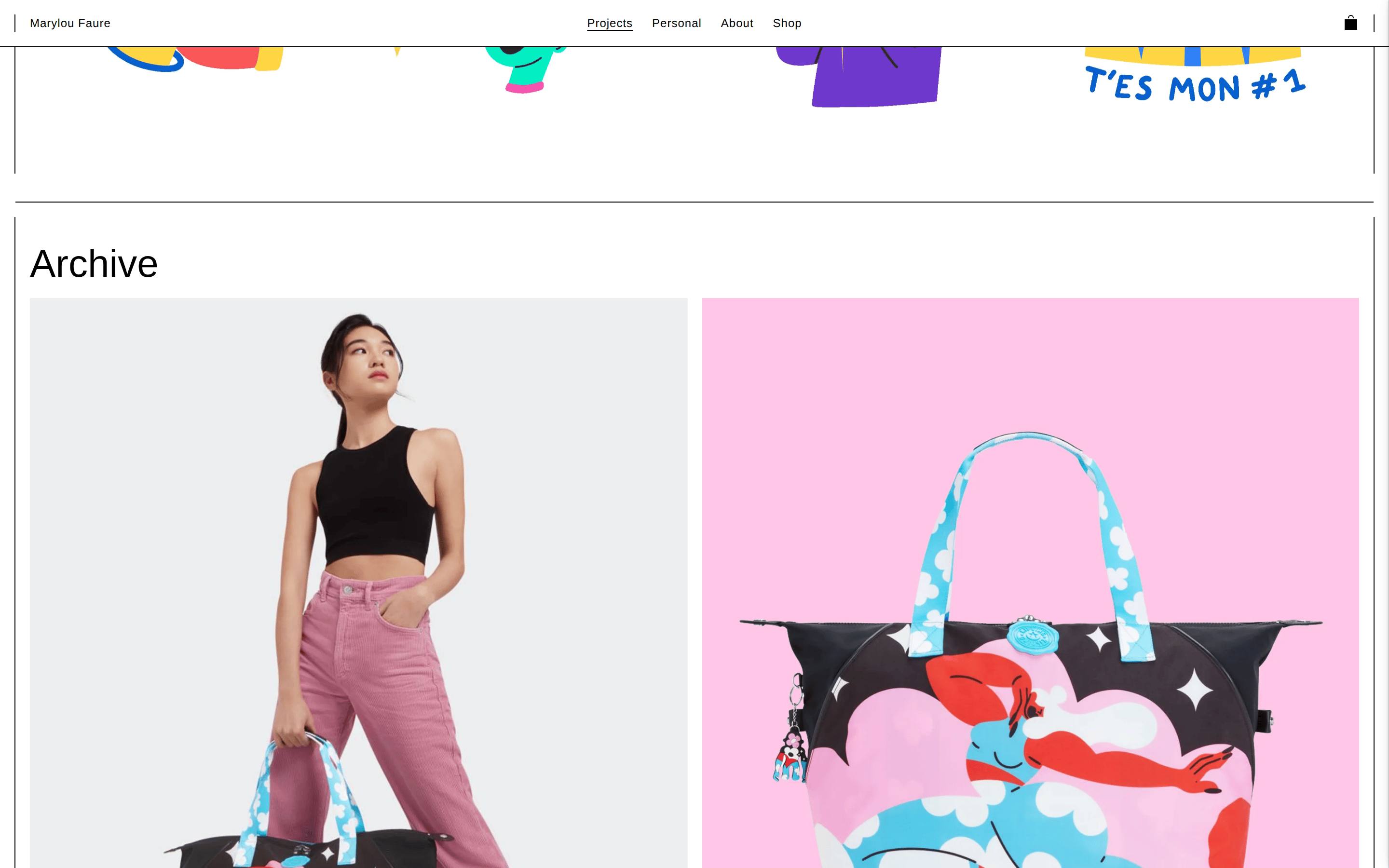
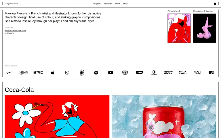
A full-width, single-column layout that alternates between wide descriptive text blocks and full-bleed, edge-to-edge image grids.
07
Motion & Interaction
100msmicro
200mssmall
500msmedium
ease-outeasing
Opacity fades (0.4s to 0.5s) for smooth transitions between states. · Text-decoration toggles for link hover interactions. · Transform and opacity shifts for hidden element reveals.
Text-decoration underline appears on links. · Standard pointer cursor on all clickable elements.
08
Components
buttonText-only navigation links with no background or border styling.
cardFull-width image blocks that alternate between single large images and split grids, separated by thin lines.
chipA simple horizontal list of black-and-white monochrome client logos.
inputText links for contact information, styled with underline on hover.
heroA split section featuring a block of descriptive text on the left and a grid of two thumbnail images on the right.
09
Voice & Don'ts
ToneConfident, professional, and subtly playful.
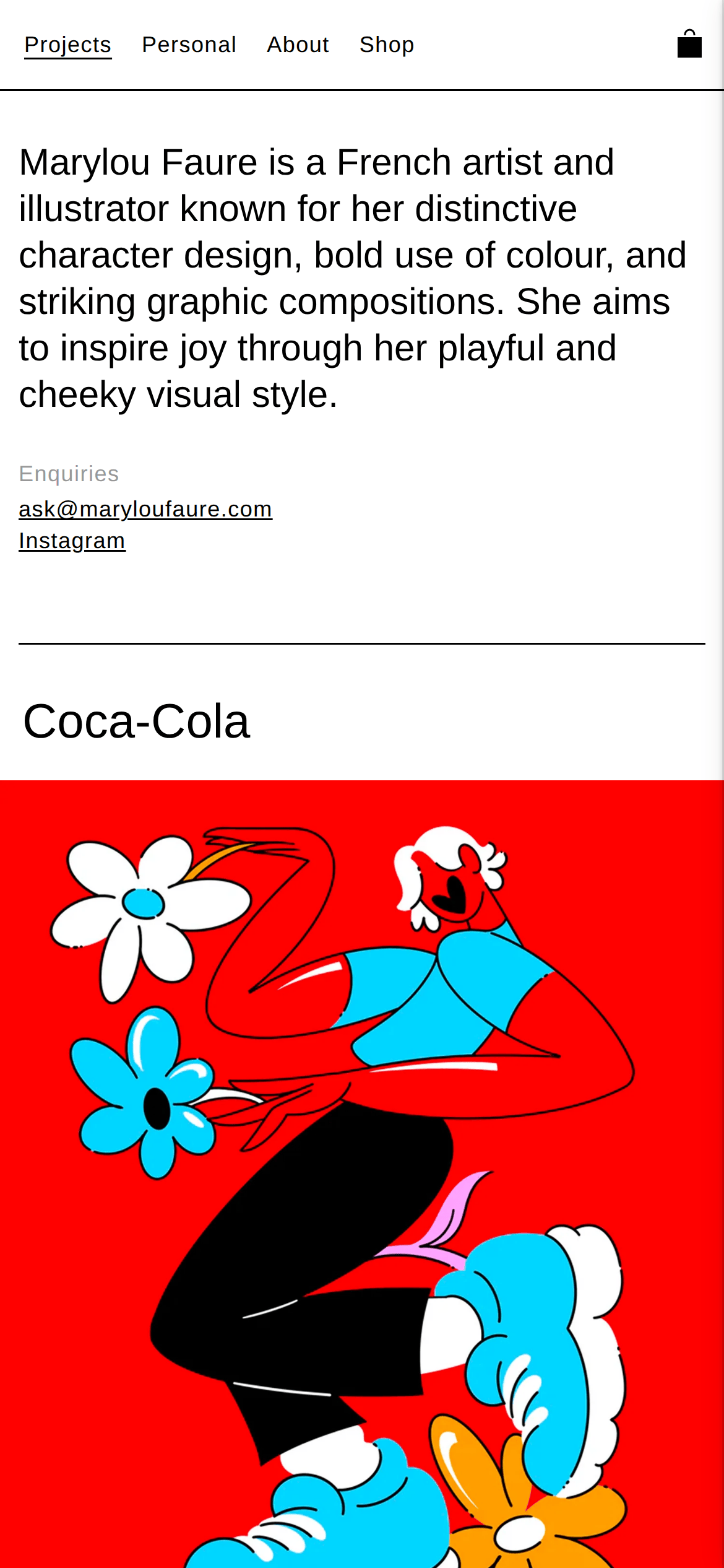
HeadlinesLarge, clean, and direct titles (e.g., 'Coca-Cola').
CTAsSubtle text-only links for navigation and contact.
Don't use decorative fonts — the screenshot shows a clean, standard grotesque sans-serif (Helvetica/Arial).
Don't add shadows or rounded corners to content cards — the screenshot shows flat, edge-to-edge images.
Don't use a single dominant accent color for UI — the screenshot shows a strictly black-and-white interface.
Don't use solid background colors for buttons — the screenshot shows text-only navigation links.
Don't use complex, cluttered layouts — the screenshot shows a simple, linear, single-column flow.
Don't use heavy typography weights — the screenshot shows a standard 400 weight throughout.
Avoid: Avoid decorative fonts or complex typography treatments.
Avoid: Avoid busy UI elements that compete with the artwork.
Avoid: Avoid using color in the UI elements; keep them strictly black and white.
Captured from the live site · real computed styles
11
System prompt
This is a minimalist artist portfolio site that acts as a clean, neutral canvas for vibrant, playful illustrations. The UI relies on a strict black-and-white color scheme (#000000 ink on #FFFFFF background) with #868785 for muted labels. Typography uses a standard grotesque sans-serif (Helvetica/Arial) at a consistent 400 weight, with tight tracking for large titles (-0.5px) and wide tracking for small labels (0.5px). Critical don'ts include: never use decorative fonts, never add UI shadows or rounded corners to content cards, and never introduce a dominant UI accent color. The layout is a simple, linear, single-column flow with full-bleed images separated by thin 1px lines.
Bring this taste to your agent
Hand your AI agent a machine-readable spec of this design — tokens, type, motion, the whole DNA.