← OpenDesign CURATED · OPEN · FREE
Cash
The bold, high-contrast face of a modern consumer finance app.
Fintech App UI Dark Mode Bold Typography Clean
01
Identity DNA
fintech app money instant modern
A sleek, confident fintech platform that blends dark luxury with vibrant, accessible green energy.
02
Color
#00E013Accent
#000000Ink
#FFFFFFBG soft
#F5F5F5BG quiet
#999999Muted
rgba(0,0,0,0.1)Line
Extreme high-contrast between deep blacks and vibrant neon green, with clean white for card surfaces.
03
Typography
humanist-sans · monospace
04
Spacing
4px
8px
16px
24px
32px
48px
64px
96px
Consistent 4px base with generous vertical padding (90px) for section separation.
05
Surfaces
sm · 4px
md · 20px
lg · 48px
pill · 999px
1px solid rgba(0,0,0,0.3)
rgba(0,0,0,0.1) 0px 8px 20px 0px · rgba(0,0,0,0.1) 0px 24px 48px 0px
06
Layout
1280 container
12 columns
24px gutter
768 / 1024 breakpoints
A symmetrical split-screen hero with centered content, transitioning to a stacked mobile layout.
07
Motion & Interaction
220ms micro
400ms small
800ms medium
cubic-bezier(0.4, 0, 0.2, 1) easing
Smooth color transitions · Subtle transform shifts
Subtle brightness or scale shifts on interactive elements. · Immediate visual feedback through color inversion or slight compression.
08
Components
button Rounded pill shapes, predominantly neon green with black text or black with white text. card Large, rounded white cards floating over dark backgrounds to showcase app UI. chip Simple rectangular tags or status indicators. input Minimal, borderless or subtly bordered fields focusing on clarity. hero A split-screen layout combining bold, left-aligned text with a dynamic, centered app mockup. 09
Voice & Don'ts
Tone Confident, modern, and direct. Headlines Punchy, short phrases that emphasize ease and disruption. CTAs Action-oriented with directional arrows, using high-contrast colors. Don't use muted, pastel color palettes — screenshot shows high-contrast black and vibrant neon green. Don't use complex serif typefaces — screenshot shows a clean, modern humanist-sans font. Don't clutter the layout with dense text — screenshot shows generous whitespace and a clear hierarchy. Don't use subtle, low-contrast borders — screenshot shows bold, clear surfaces and rounded corners. Don't use traditional, boxy button shapes — screenshot shows highly rounded, pill-shaped CTAs. Don't use dark grey instead of pure black — screenshot uses a solid, deep #000000 background. Avoid: Complex jargon Avoid: Cluttered layouts Avoid: Dull or muted palettes 10
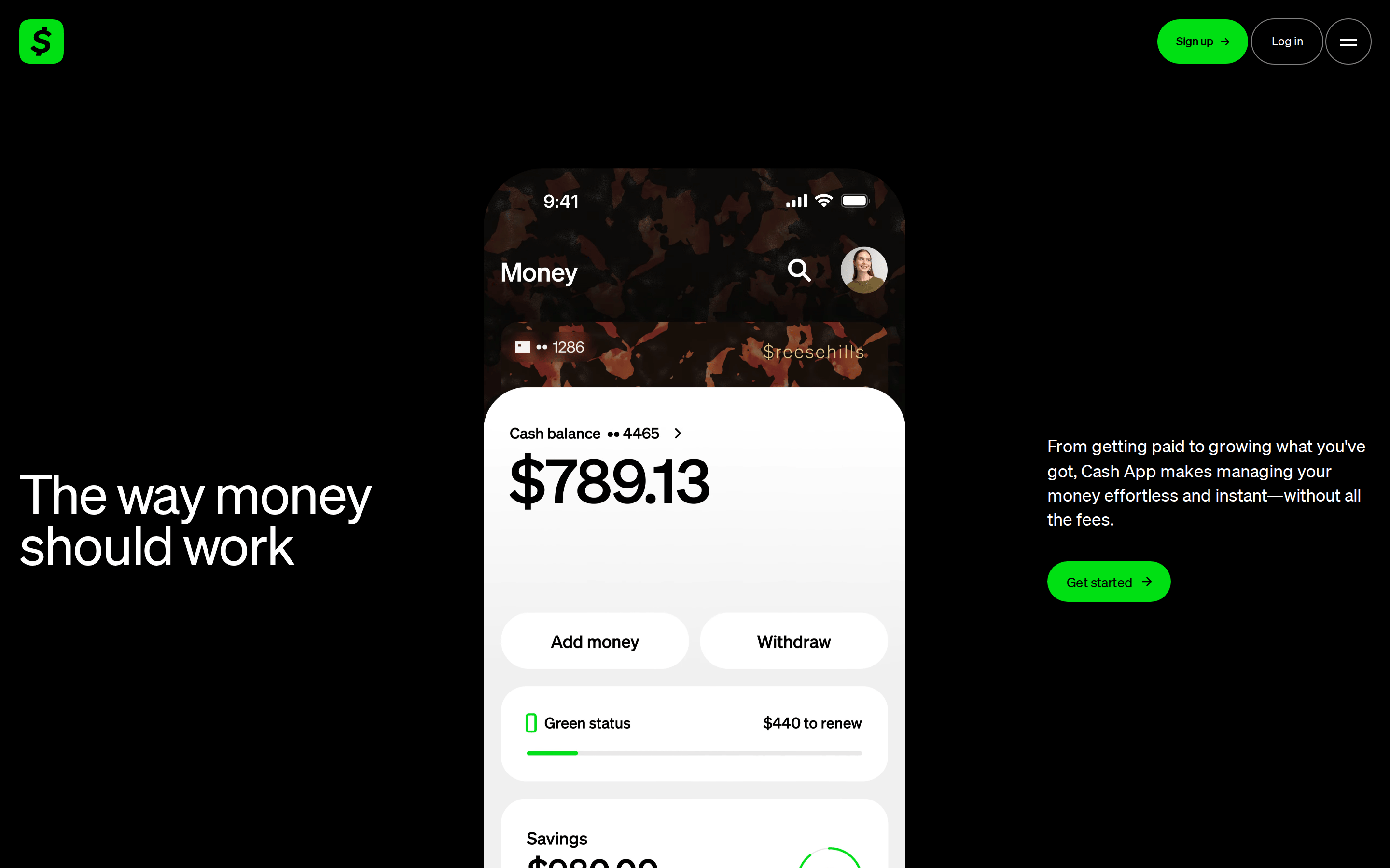
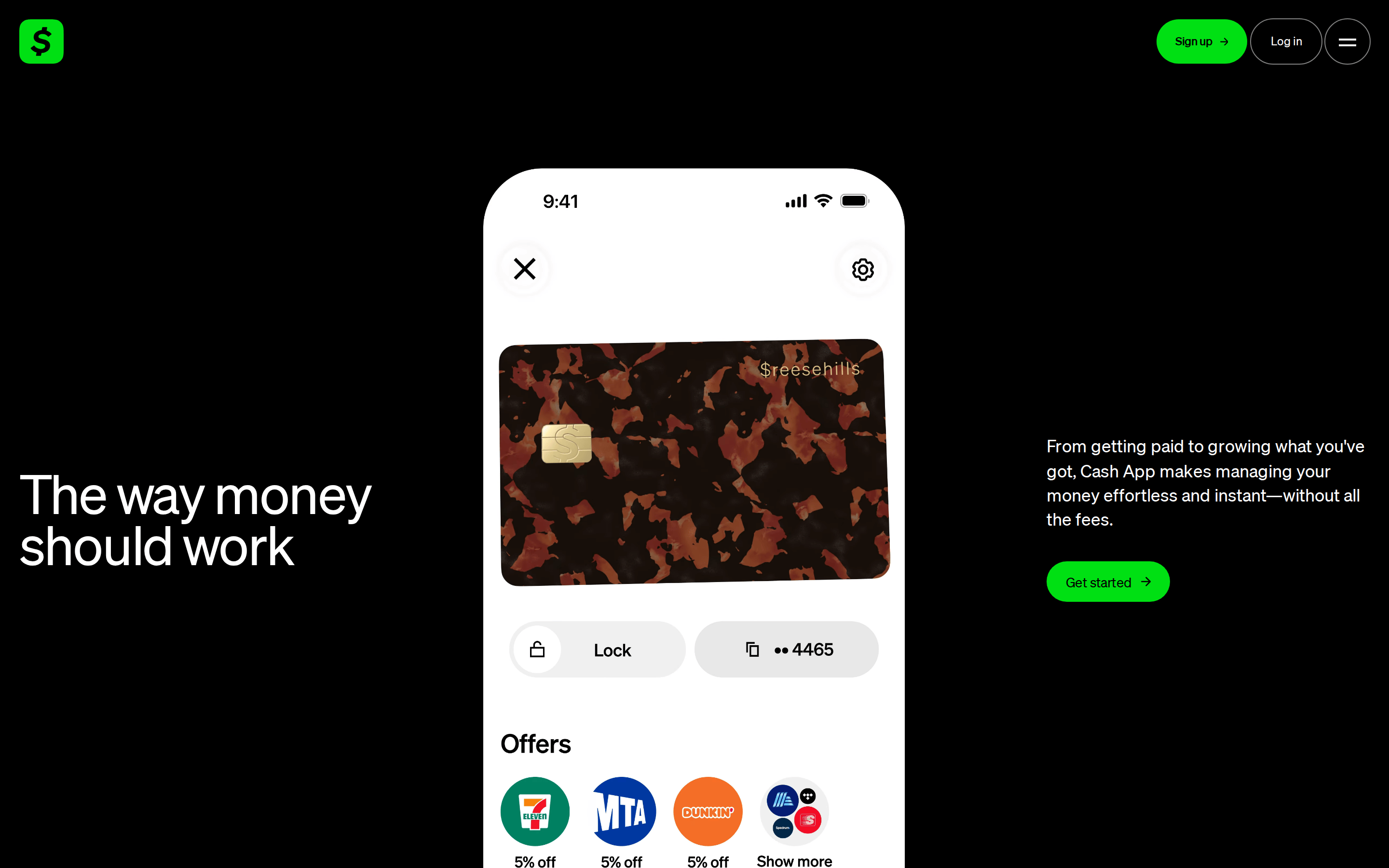
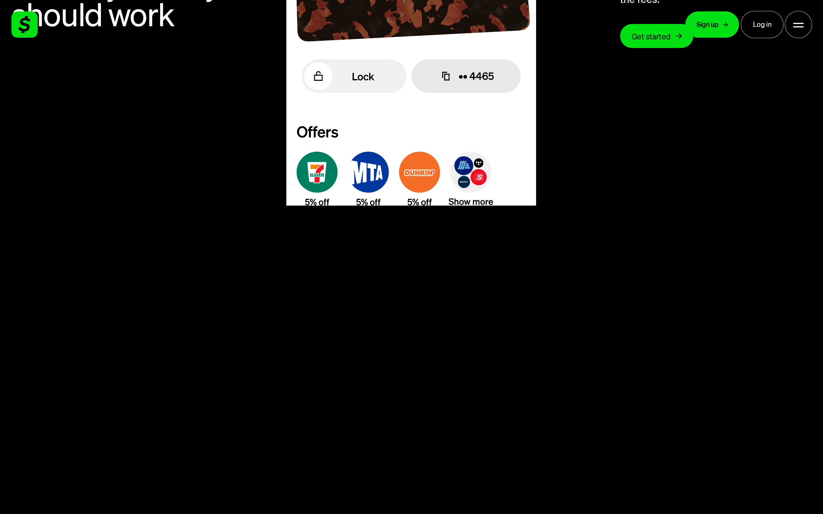
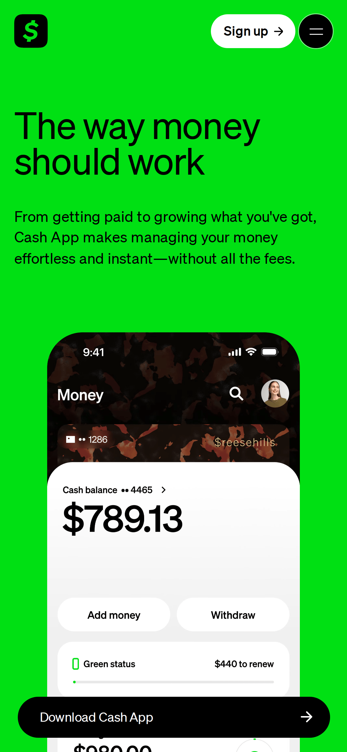
Inside the pack — real screenshots
桌面首屏(hero) 桌面滚动分段(90% viewport 步进,作为视觉证据) 桌面滚动分段(90% viewport 步进,作为视觉证据) 移动首屏 Captured from the live site · real computed styles
11
System prompt
This is a high-contrast fintech app landing page using a dark mode aesthetic. The palette is anchored by deep black (#000000) and vibrant neon green (#00E013), with clean white for app UI surfaces. Typography relies on a modern, clean humanist-sans category. Critical constraints: maintain the bold high-contrast aesthetic, use pill-shaped buttons for primary actions, and ensure the layout remains spacious and uncluttered with generous whitespace. Avoid any use of serif fonts, muted pastels, or boxy UI elements that would conflict with the sleek, modern identity.
More from the library en · zh-CN · zh-TW · ja · ko
OpenDesign · curated web aesthetics for AI-readable design DNA · opendesign.cc
Why we curated this: This site is an excellent example of a modern fintech brand using a dark, high-contrast aesthetic to convey both luxury and accessibility.