← OpenDesign CURATED · OPEN · FREE
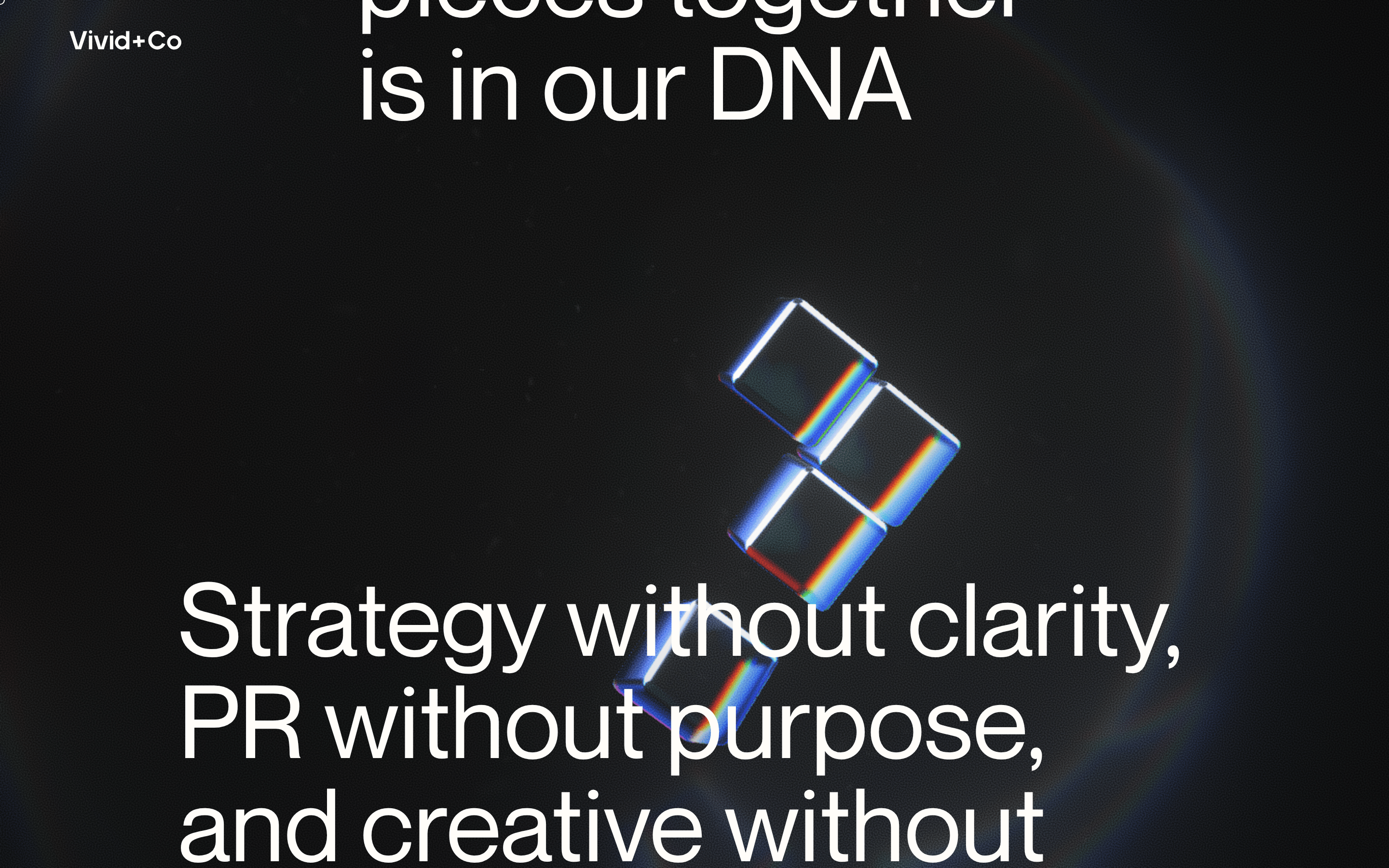
Vividand
A premium, dark-mode agency portfolio defined by bold typography and 3D glass accents.
Agency Premium Fintech Dark Mode Bold Typography
01
Identity DNA
premium strategic agency fintech bold
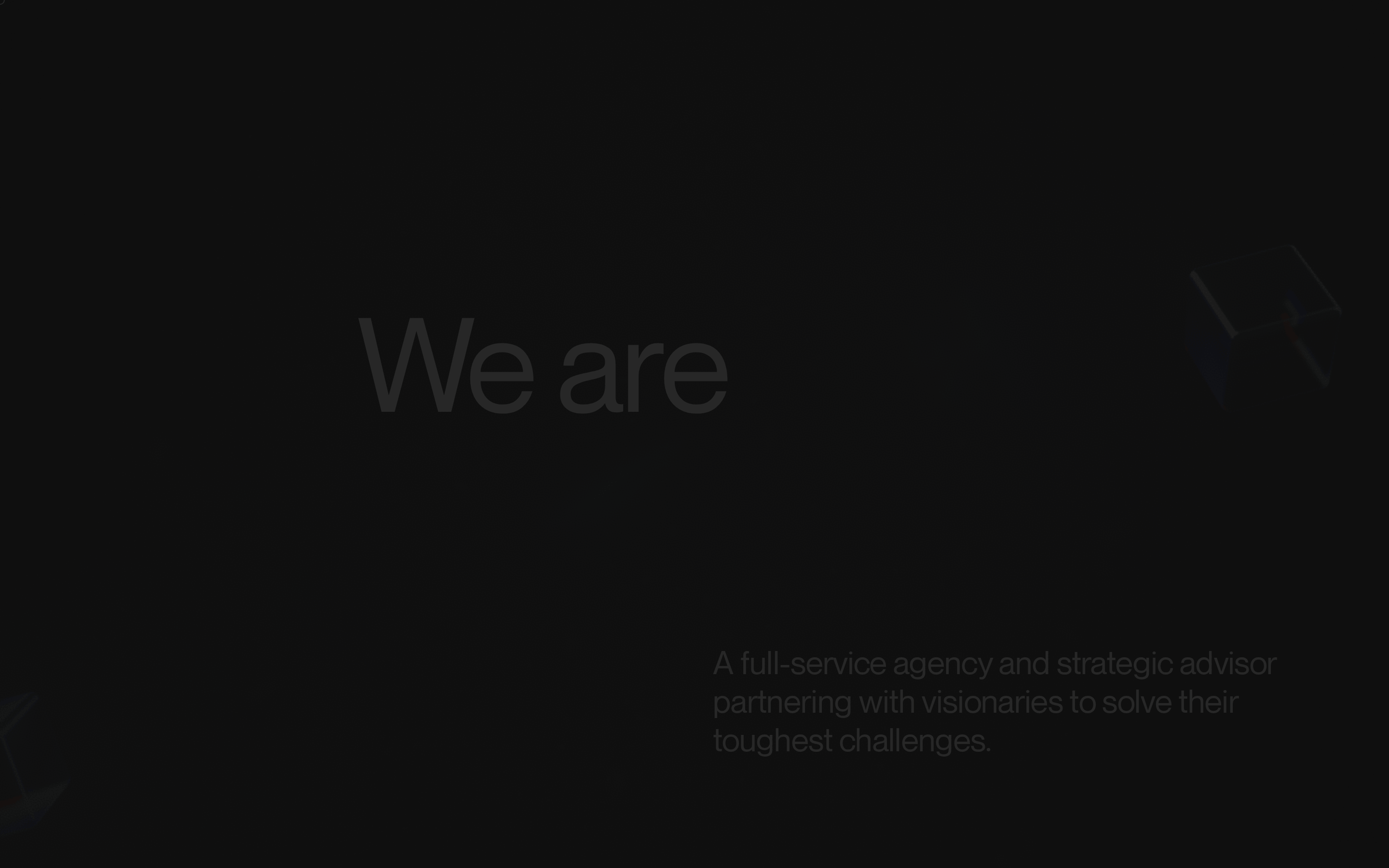
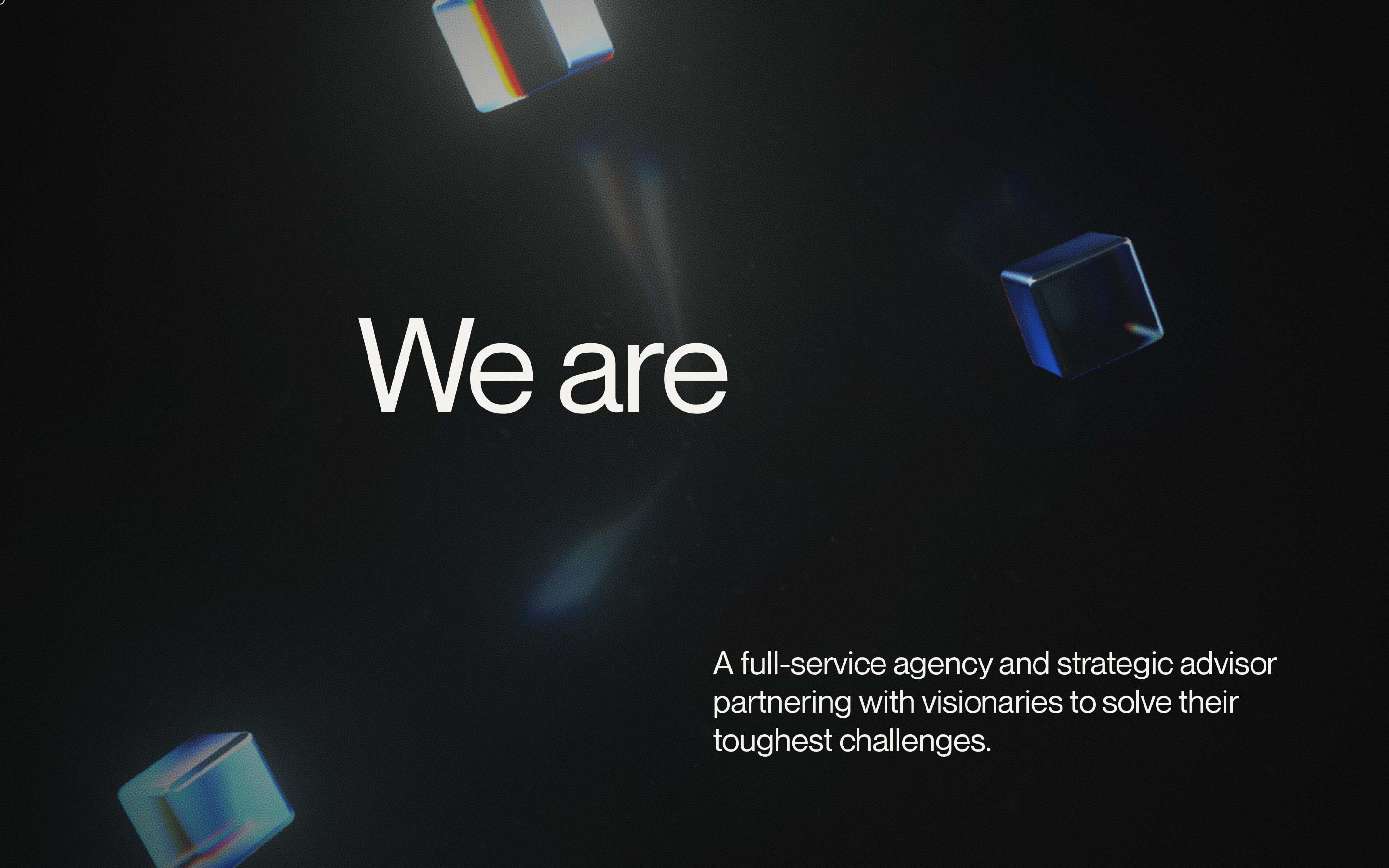
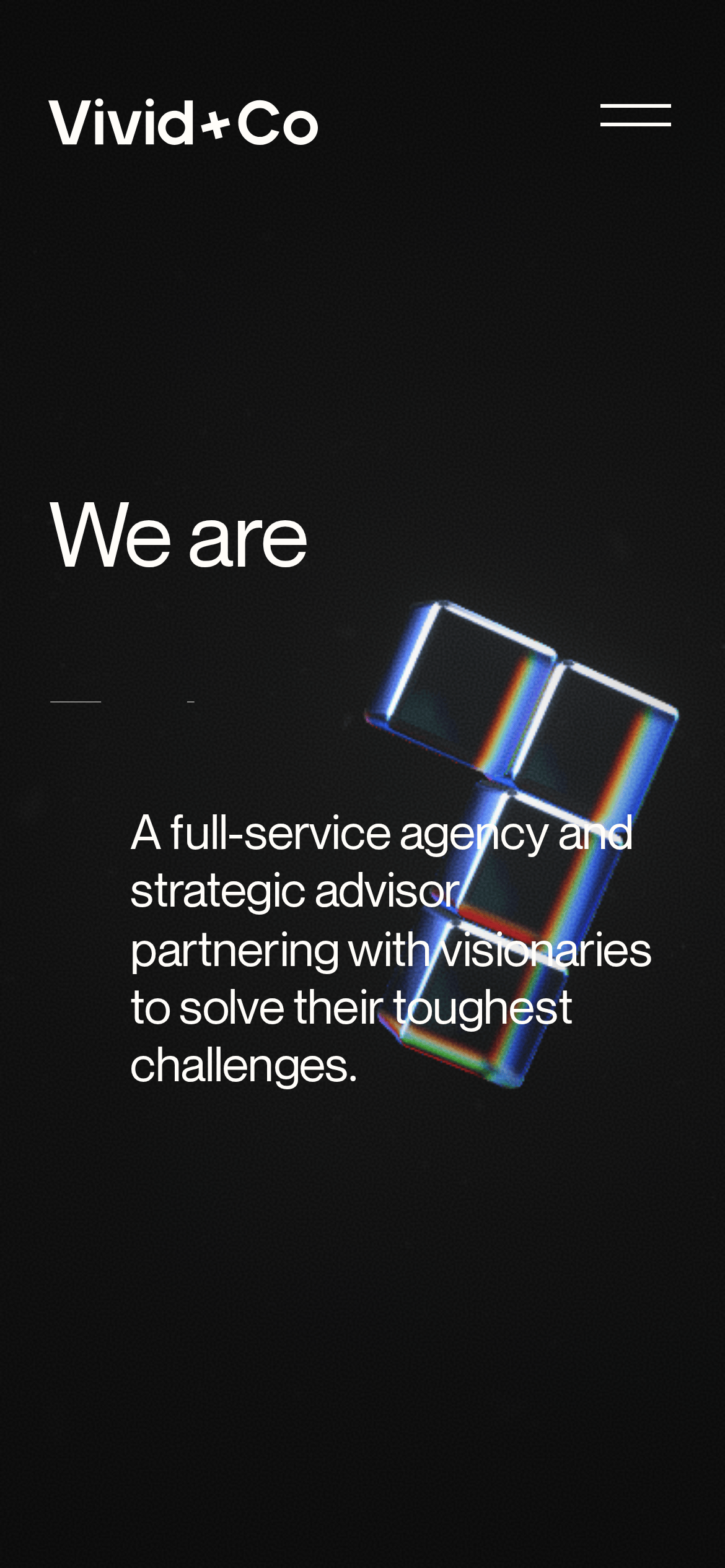
A high-end architectural studio that builds invisible frameworks.
02
Color
#FFFDF9Ink
#6F879CInk soft
#101010BG
#1a1a1aBG soft
rgba(255, 253, 249, 0.2)Line
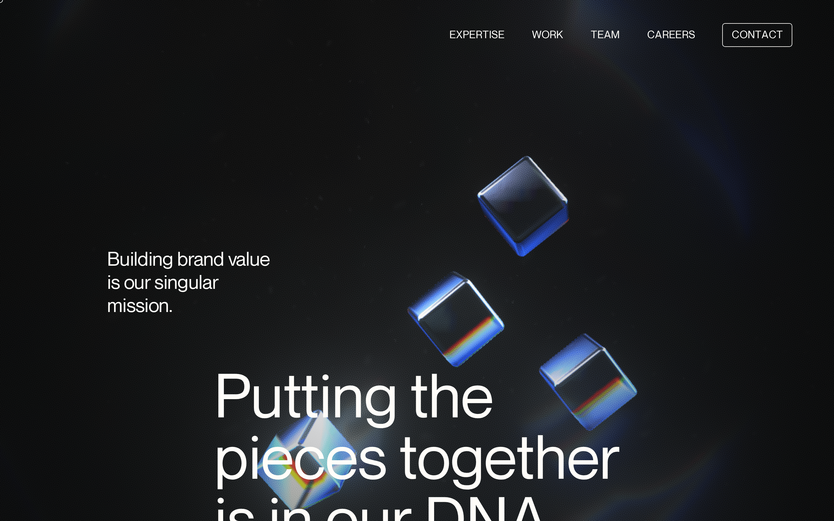
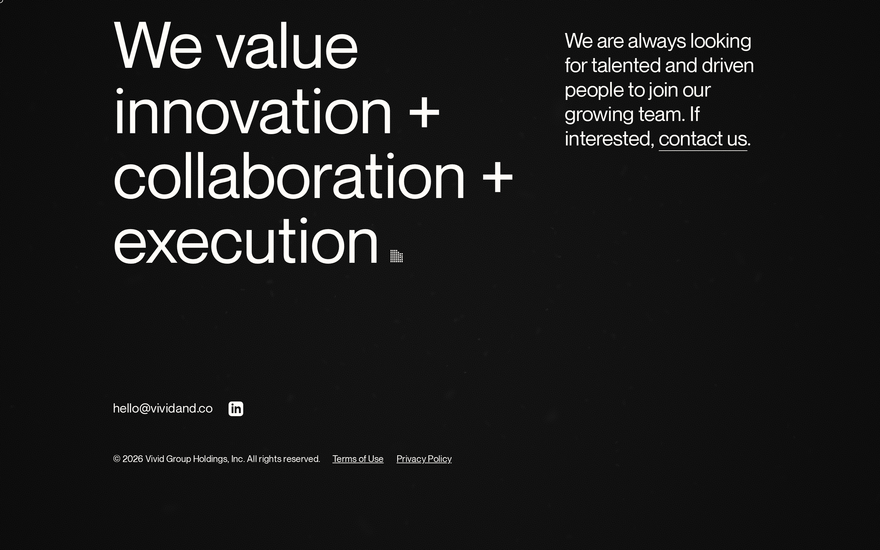
Deep charcoal grounds the layout, while high-contrast off-white text ensures absolute legibility and premium feel.
03
Typography
geometric-sans
display 105px · 700body 20px · 400Use uppercase for secondary navigation and labels · Maintain tight tracking for large display text
04
Spacing
4px
8px
16px
24px
32px
48px
64px
96px
Generous vertical spacing (48px-96px) between major sections creates a breathable, cinematic feel.
05
Surfaces
sm · 15px
md · 15px
lg · 15px
pill · 999px
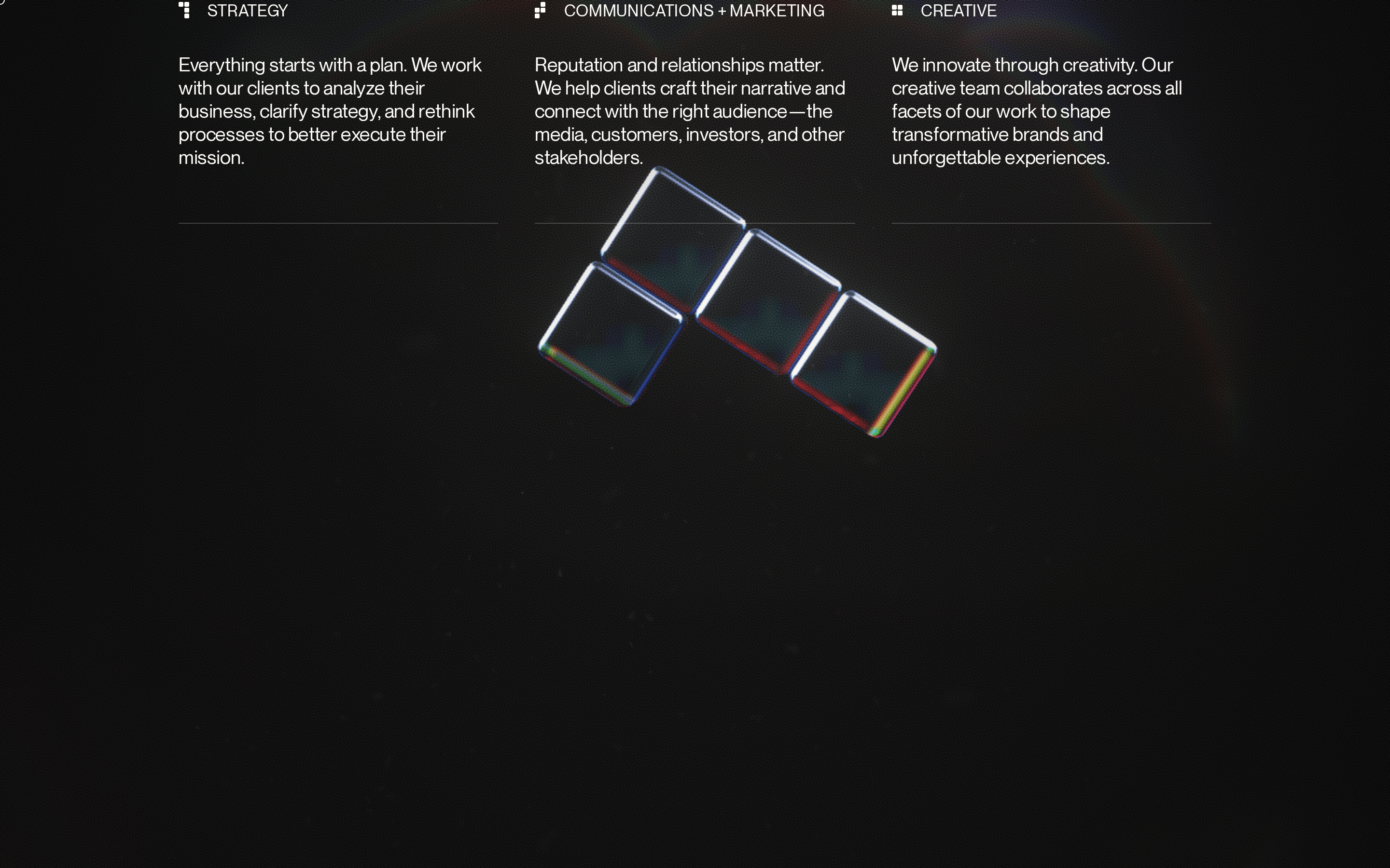
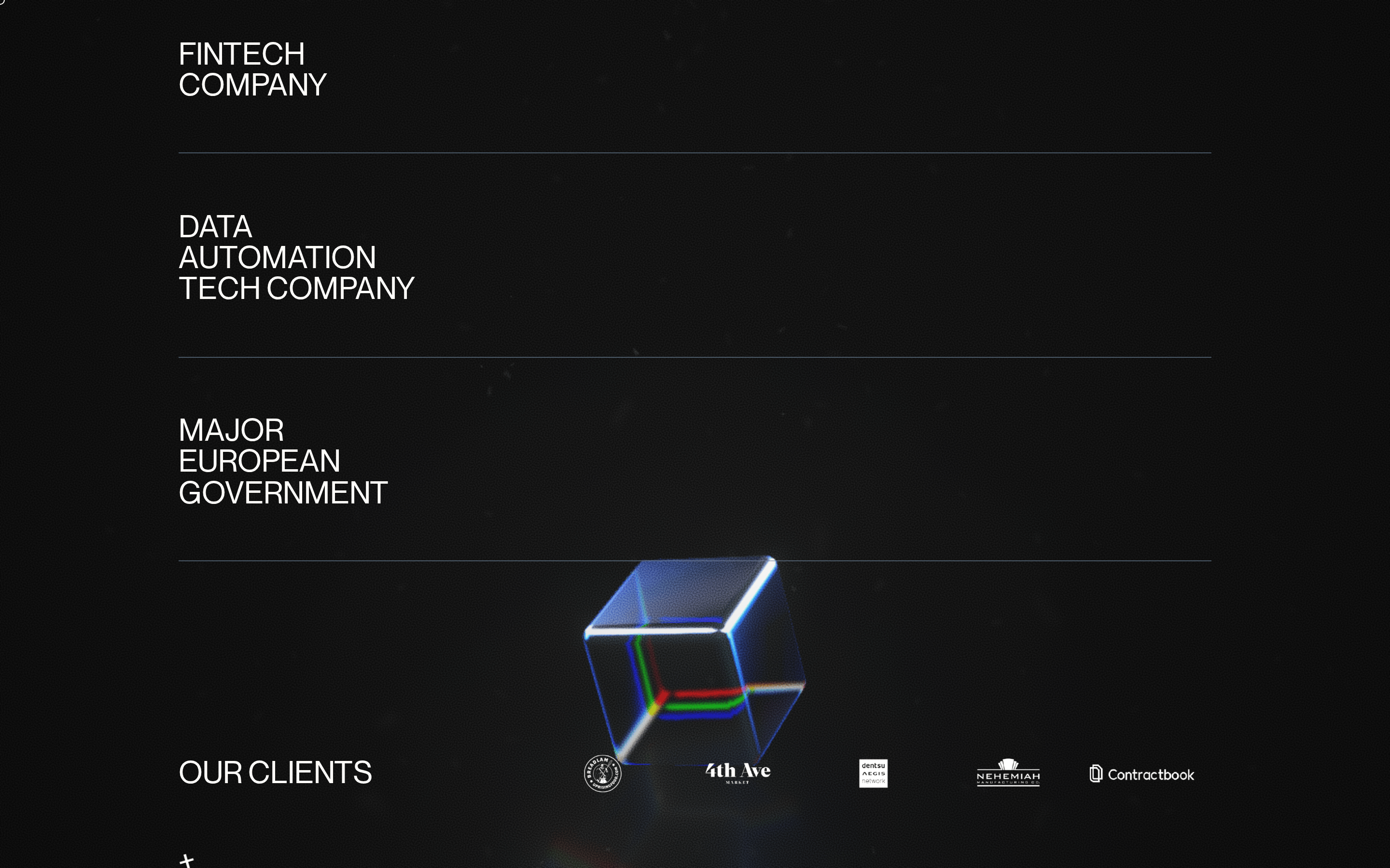
Minimal, 1px solid lines in low-opacity white are used strictly for horizontal dividers.
06
Layout
1280 container
12 columns
24px gutter
768 / 1024 breakpoints
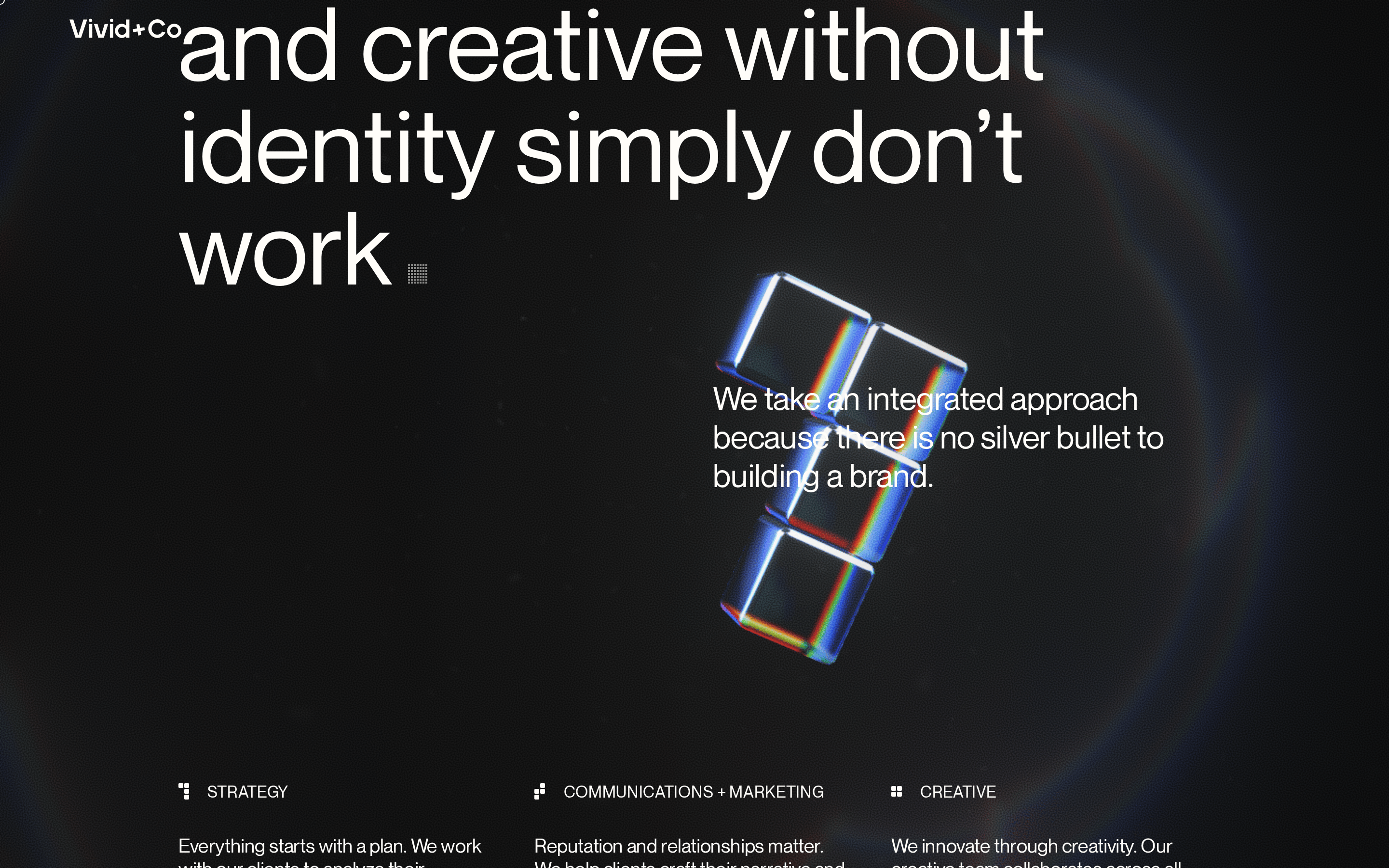
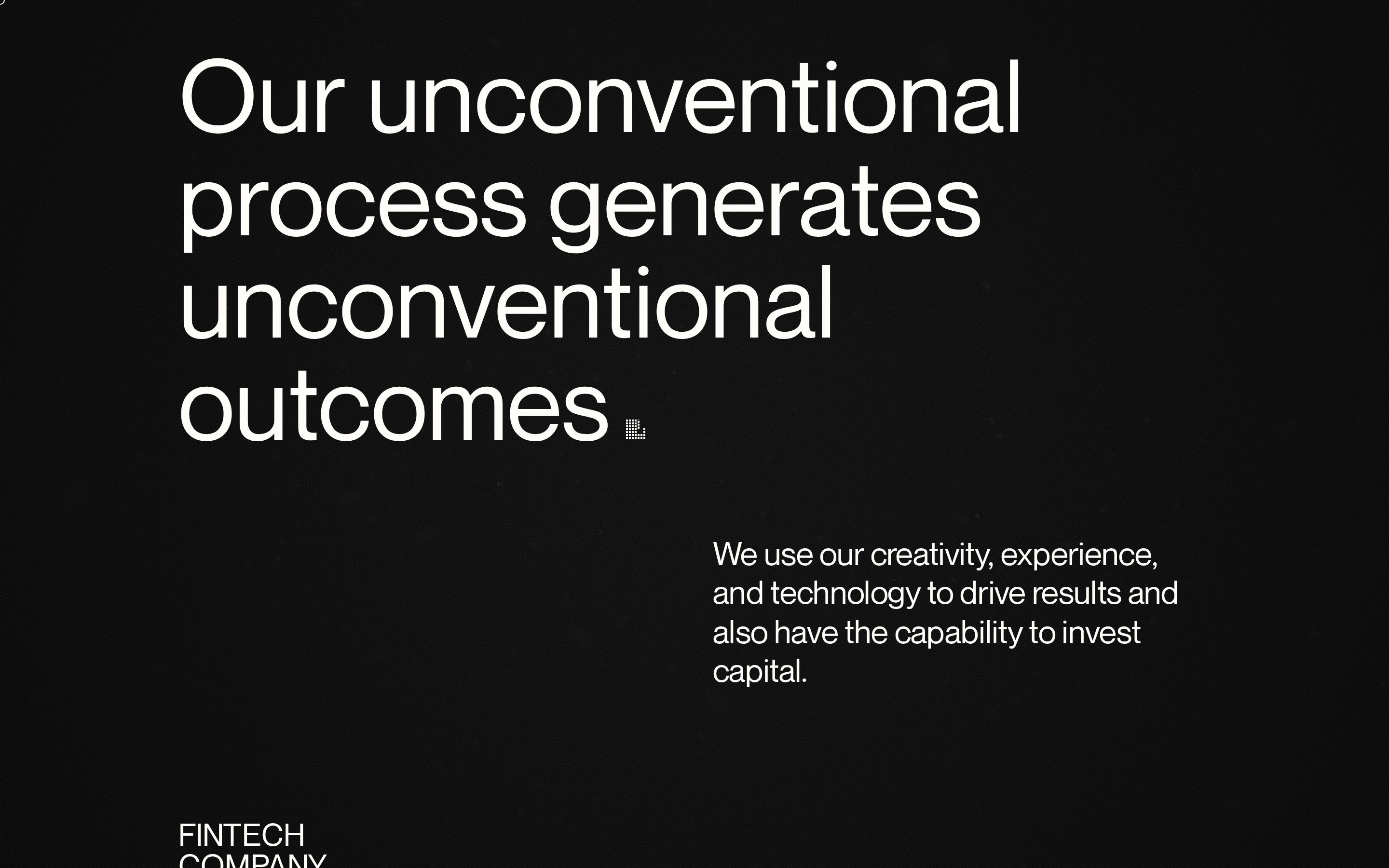
Asymmetric split layout in hero; full-width list with left-aligned text and horizontal separators.
07
Motion & Interaction
220ms micro
400ms small
800ms medium
cubic-bezier(0.52, 0.01, 0, 1) easing
Slow fade-ins for text blocks · Gentle cubic-bezier transforms for 3D elements · Crisp linear opacity changes for UI transitions
Subtle opacity changes on interactive elements. · Minimal visual feedback; relies on transition effects.
08
Components
button Minimalist text links or simple geometric shapes. card None visible; information is presented in clean list rows. chip None visible. input None visible. hero Large-scale typography paired with subtle 3D glass render elements on a dark background. 09
Voice & Don'ts
Tone Confident, direct, and understatedly authoritative. Headlines Short, punchy, and heavily stylized through typography. CTAs Minimalist, often just text or a subtle geometric prompt. Don't use bright accent colors — screenshot shows a strictly monochrome palette with muted blue-grey accents. Don't use serif fonts for headlines — screenshot shows exclusively geometric sans-serif typography. Don't apply heavy drop shadows — screenshot shows flat, clean surfaces without 3D depth shadows. Don't center-align all text — screenshot shows strong left-aligned typography for headings. Don't use busy background patterns — screenshot shows a solid, deep charcoal background. Don't use rounded corners on everything — screenshot shows sharp edges or very specific 15px border radii. Avoid: Clutter Avoid: Bright neon colors Avoid: Playful animations Avoid: Corporate jargon 10
Inside the pack — real screenshots
桌面首屏(hero) 桌面滚动分段(90% viewport 步进,作为视觉证据) 桌面滚动分段(90% viewport 步进,作为视觉证据) 桌面滚动分段(90% viewport 步进,作为视觉证据) 桌面滚动分段(90% viewport 步进,作为视觉证据) 桌面滚动分段(90% viewport 步进,作为视觉证据) 桌面滚动分段(90% viewport 步进,作为视觉证据) 桌面滚动分段(90% viewport 步进,作为视觉证据) 桌面滚动分段(90% viewport 步进,作为视觉证据) 桌面滚动分段(90% viewport 步进,作为视觉证据) 桌面滚动分段(90% viewport 步进,作为视觉证据) 桌面滚动分段(90% viewport 步进,作为视觉证据) 桌面滚动分段(90% viewport 步进,作为视觉证据) 移动首屏 Captured from the live site · real computed styles
11
System prompt
A premium agency portfolio for Vivid+Co, characterized by a dark charcoal background (#101010) and high-contrast off-white typography (#FFFDF9). The visual system uses geometric sans-serif fonts to create a bold, modern aesthetic. It features 3D glass-render accents and clean horizontal dividers. Critical constraints: avoid serif fonts, avoid bright accent colors, avoid heavy drop shadows, and maintain generous vertical spacing to preserve the cinematic, premium feel.
More from the library en · zh-CN · zh-TW · ja · ko
OpenDesign · curated web aesthetics for AI-readable design DNA · opendesign.cc
Why we curated this: This site is a masterclass in restrained, high-end agency design, using bold typography and a minimal dark-mode palette to convey authority and premium positioning.