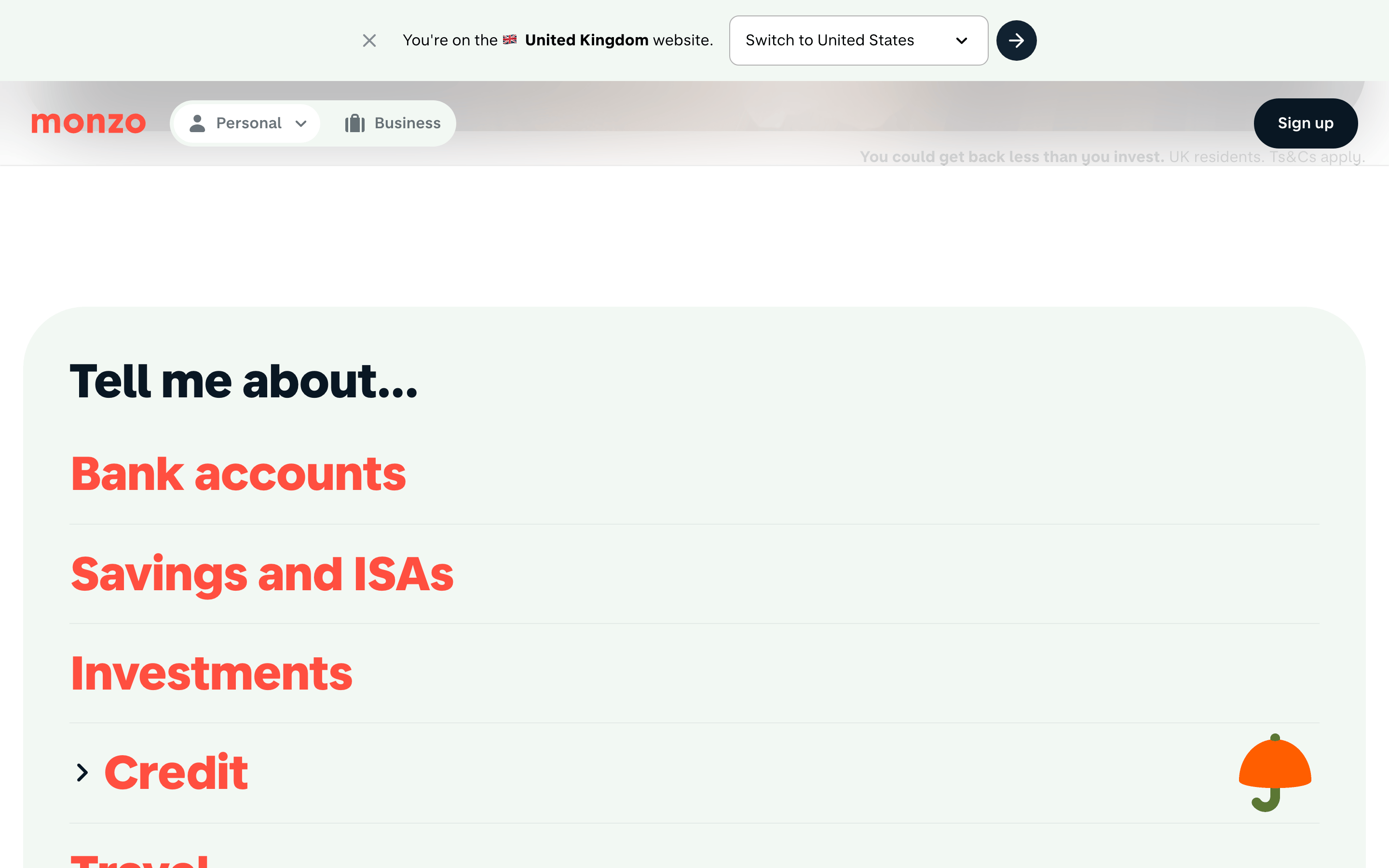
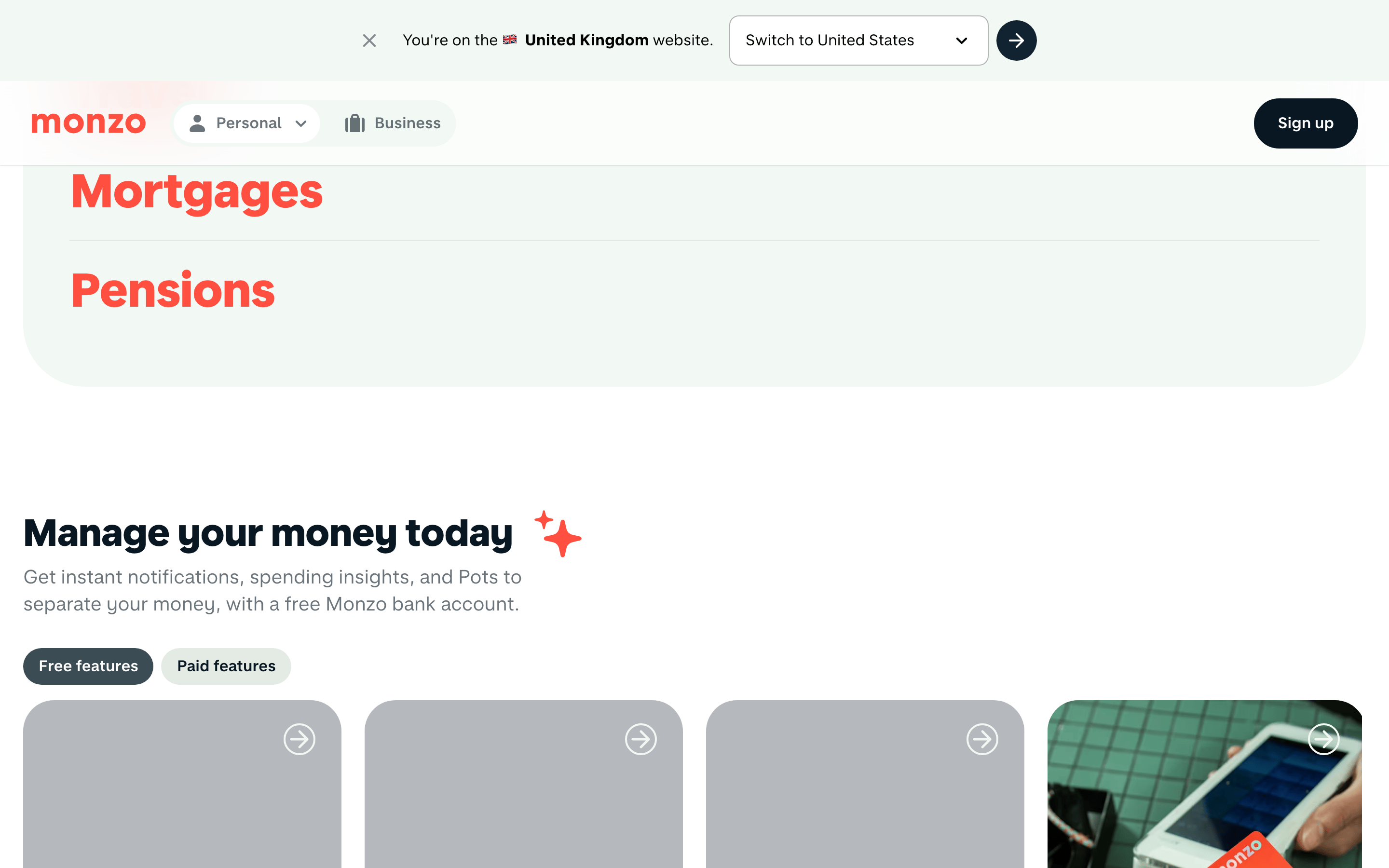
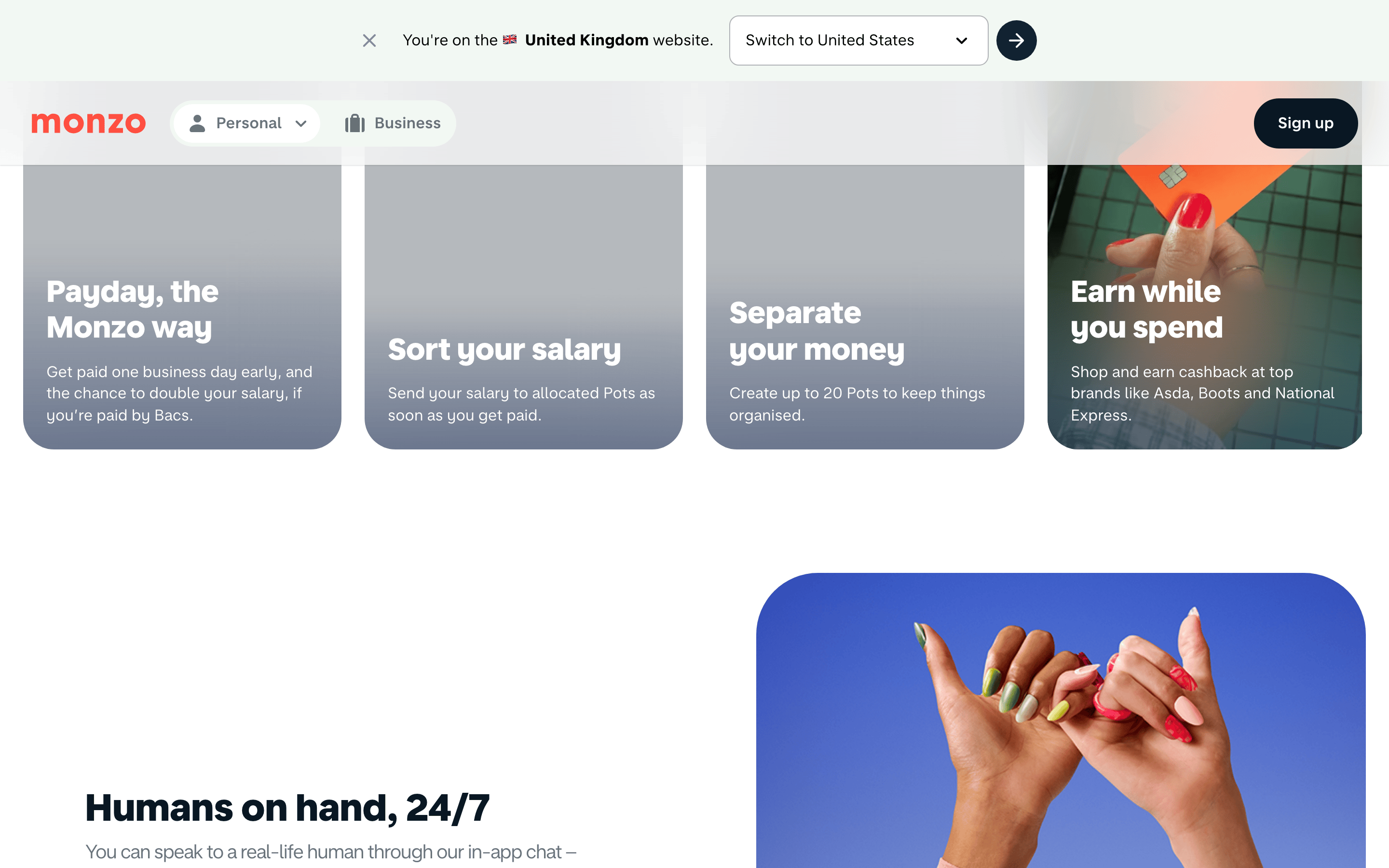
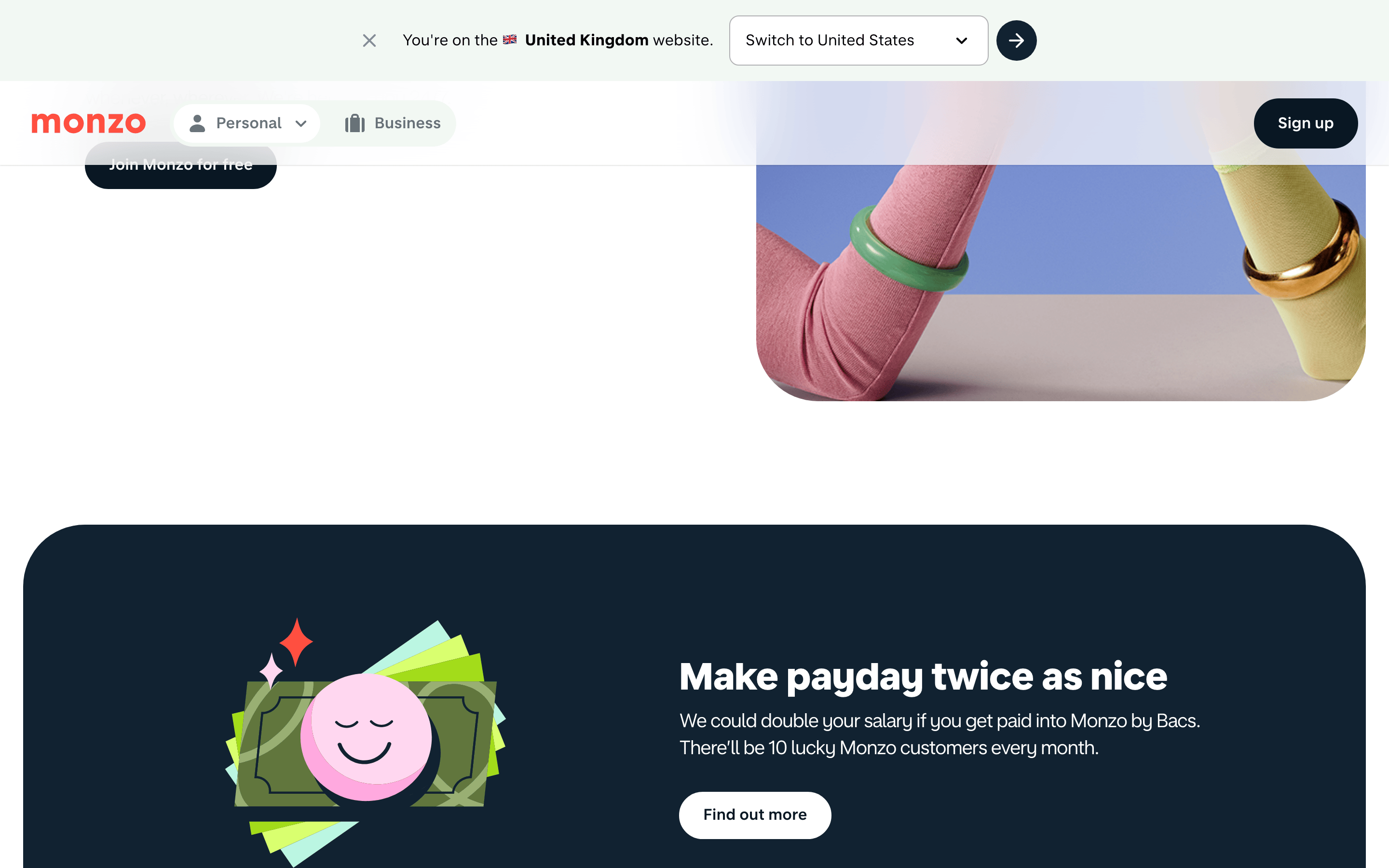
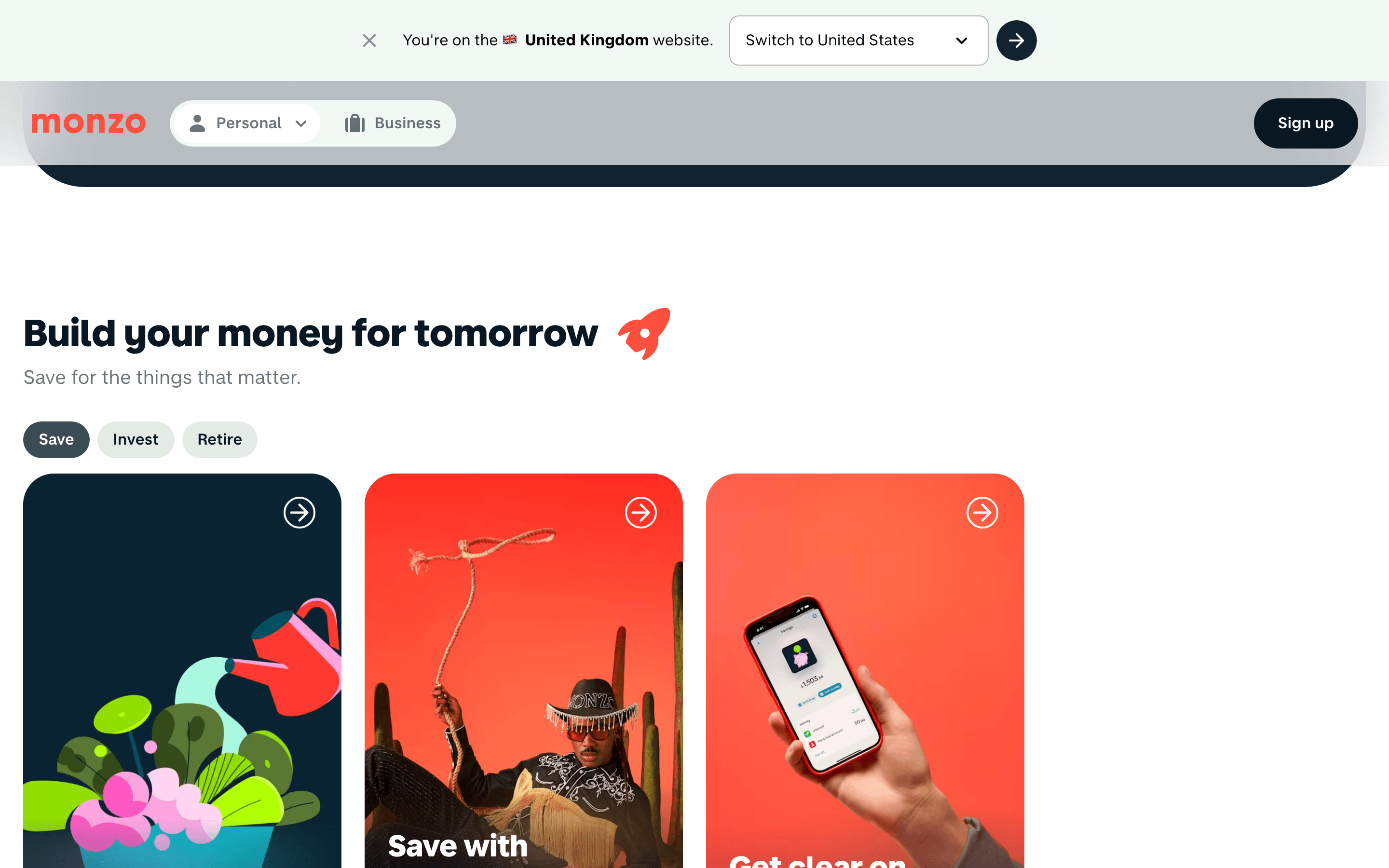
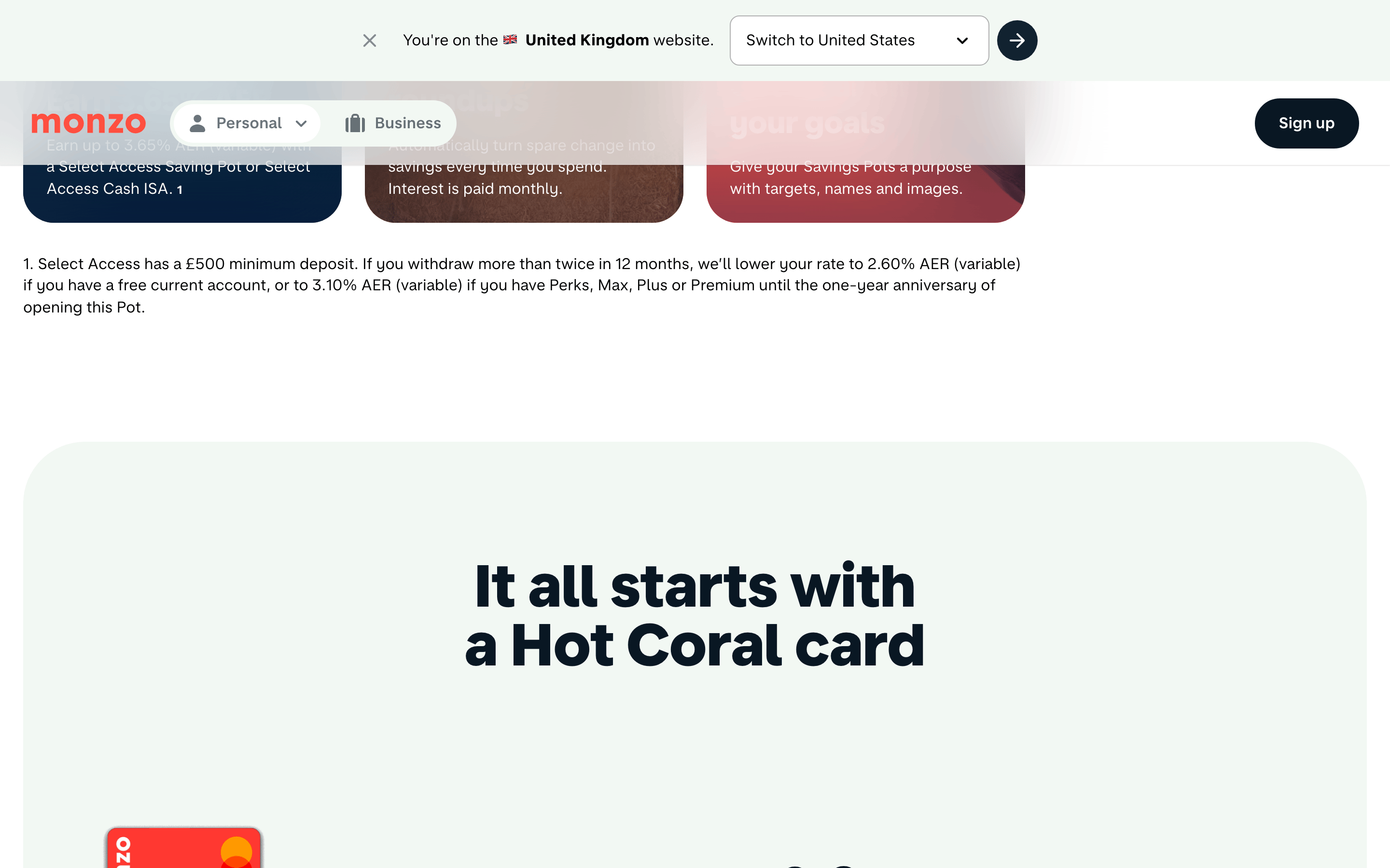
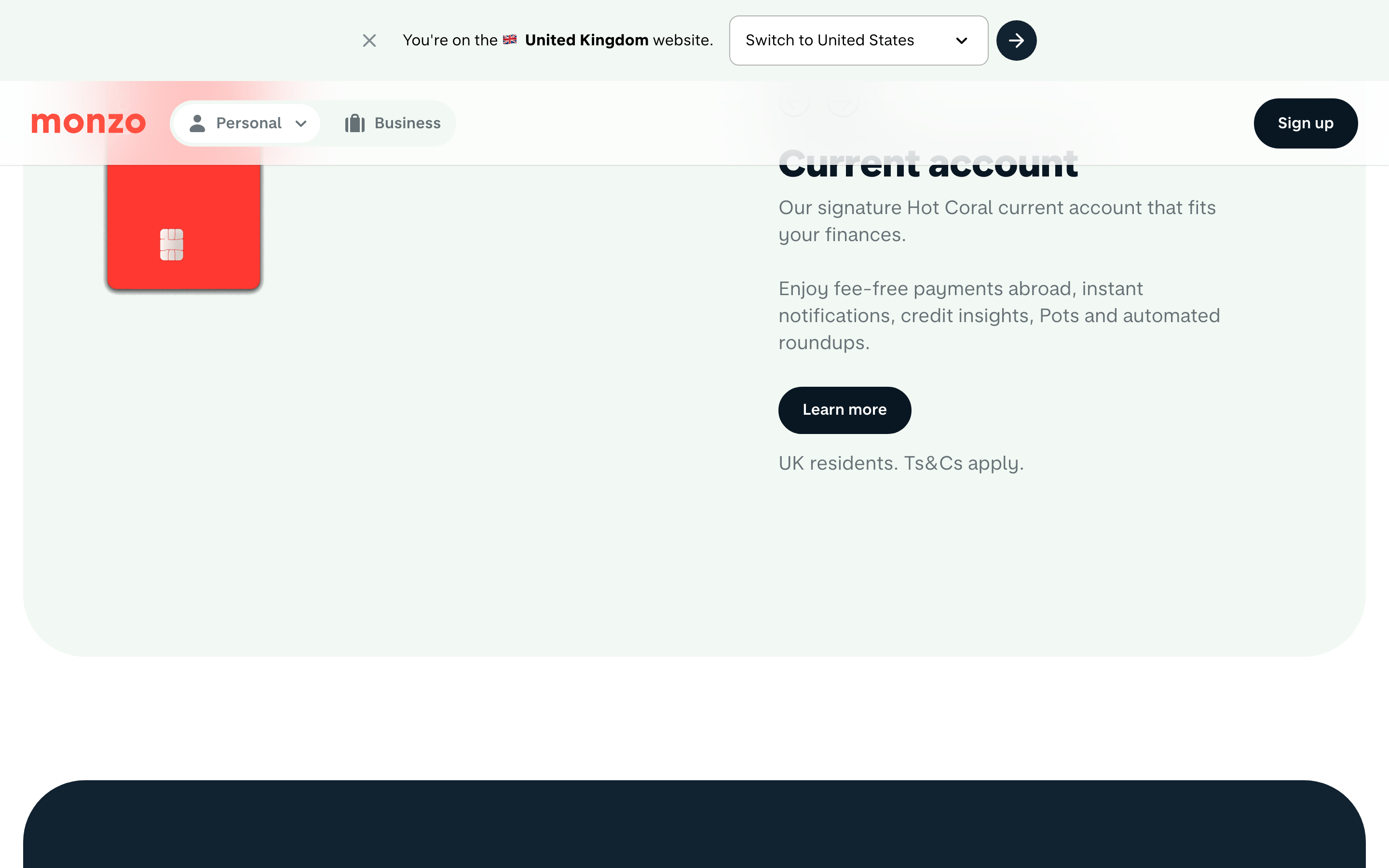
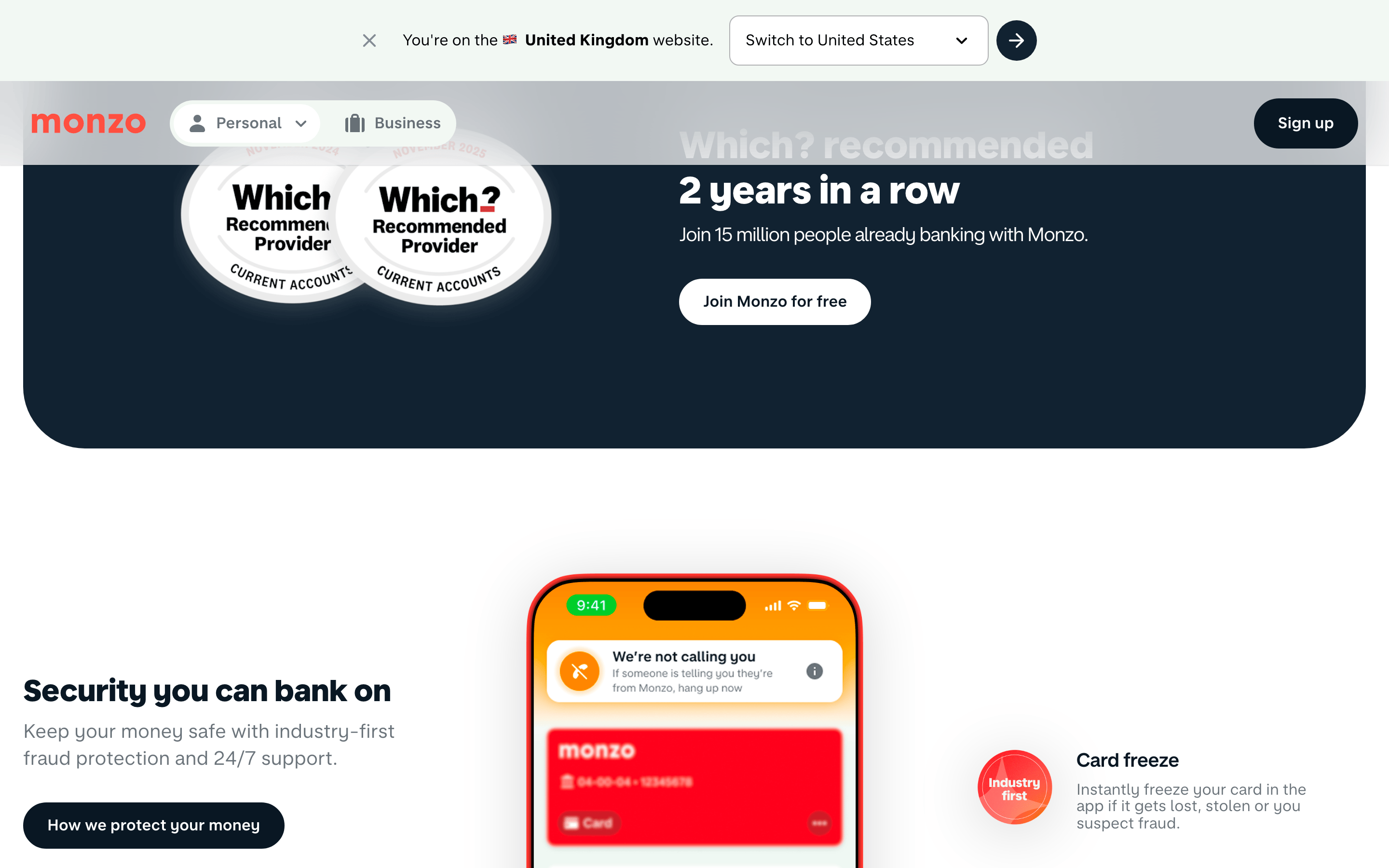
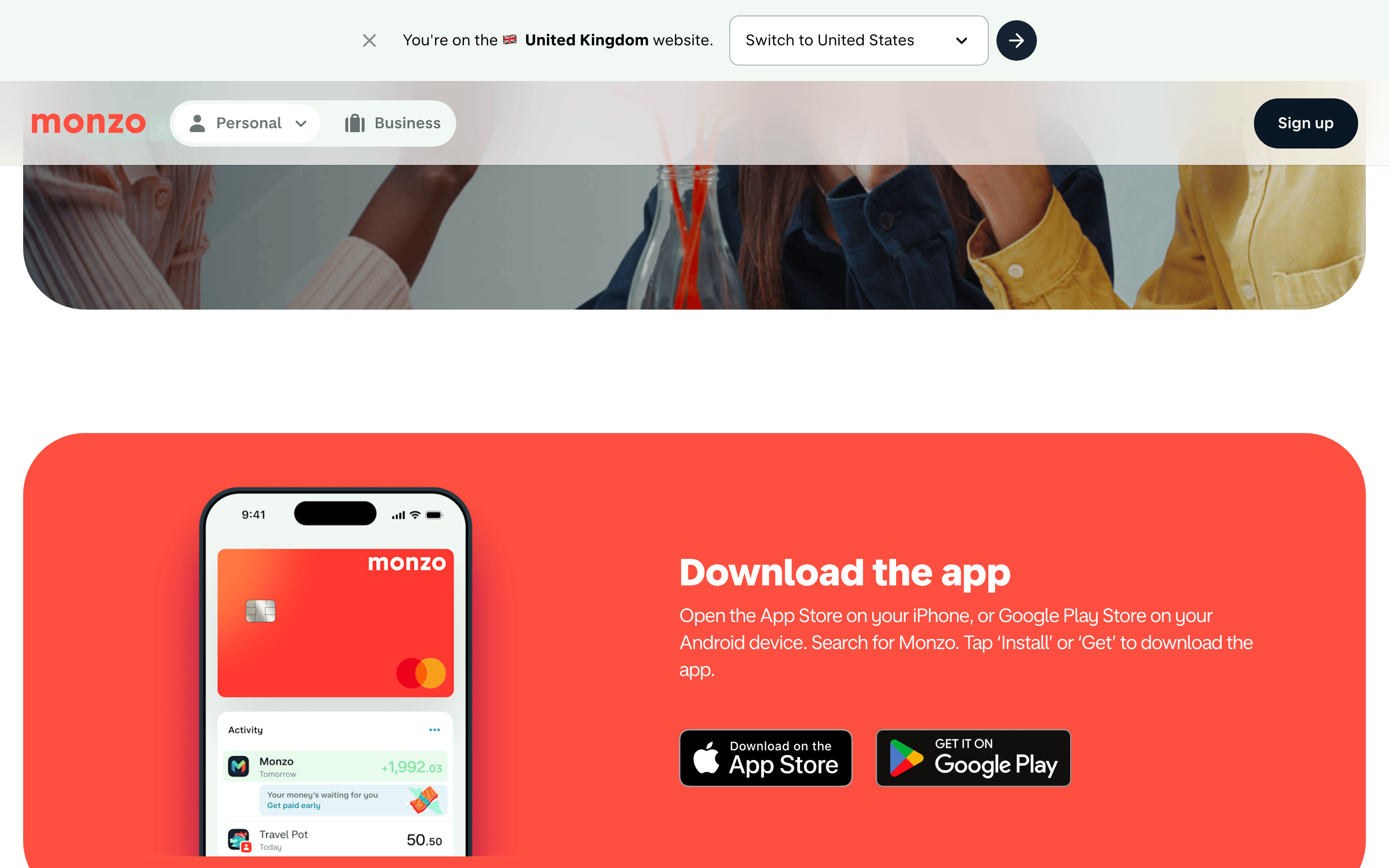
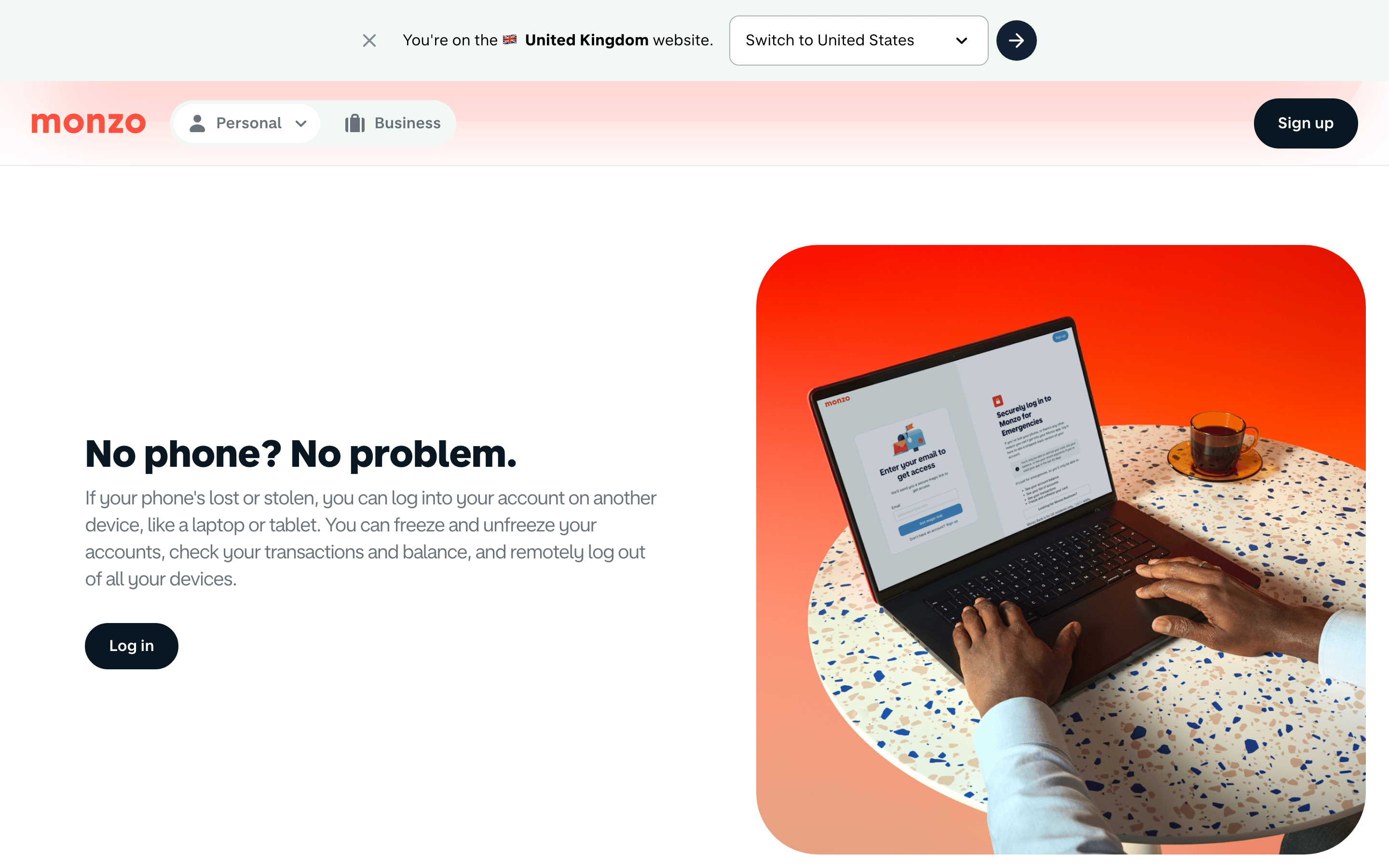
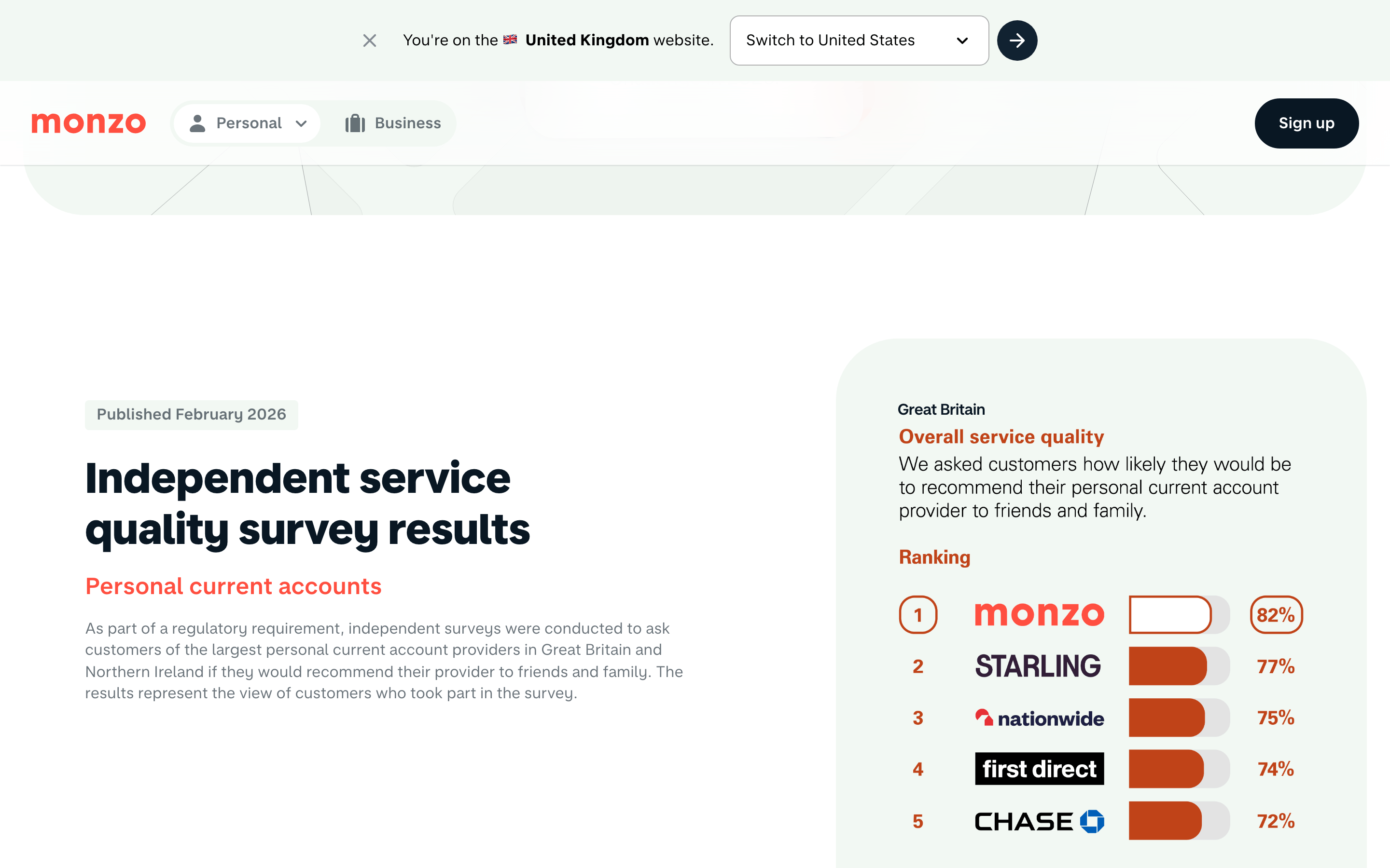
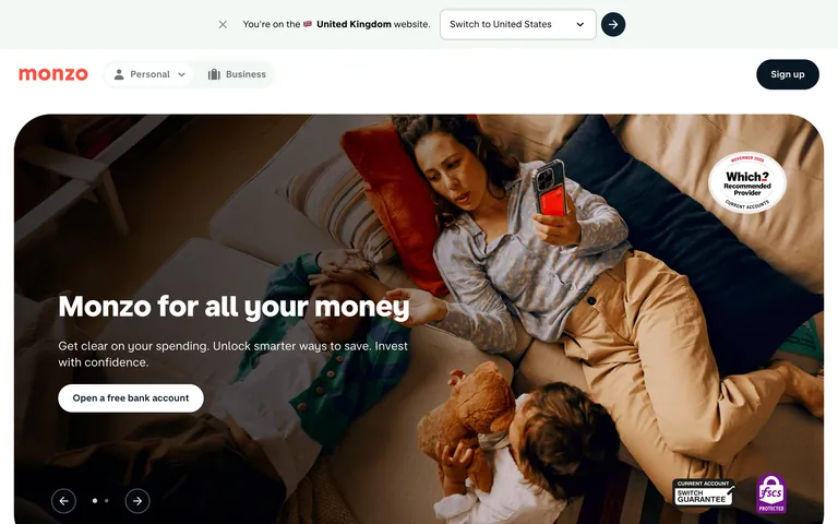
A modern, friendly banking app that feels as approachable as a chat with a trusted friend.
02
Color
#FF4F40Accent
#091723Ink
rgba(9,23,35,0.6)Ink soft
#FFFFFFBG
#F2F8F3BG soft
#E3EBE4BG quiet
rgba(9,23,35,0.1)Line
High-contrast, clean palette with a single vibrant coral accent for primary actions, ensuring clarity and trust.
03
Typography
humanist-sans · geometric-mono
display48px · 800
h239px · 800
h331px · 800
body16px · 400
body-lg20px · 400
Headlines use weight 800 for maximum impact and authority. · Body text uses a regular weight 400 for maximum readability. · Letter spacing is tightened on display text for a modern, cohesive look.
04
Spacing
4px
8px
16px
24px
32px
48px
64px
96px
128px
Consistent 4px base scale with generous vertical padding (64px) in content sections.
05
Surfaces
sm · 4px
md · 8px
lg · 12px
pill · 500px
1px solid rgba(9,23,35,0.1)
0px 0px 10px rgba(0, 0, 0, 0.1)
06
Layout
1280container
12columns
24pxgutter
768 / 1024breakpoints
Responsive grid with centered content and wide, immersive hero sections.
07
Motion & Interaction
200msmicro
300mssmall
800msmedium
cubic-bezier(0.22, 0, 0.12, 1)easing
Smooth fade-ins for UI elements. · Subtle background-color transitions on hover. · Transform animations for interactive states.
Subtle background-color changes and cursor updates. · Immediate visual feedback with state changes.
08
Components
buttonPill-shaped buttons with solid fills or white backgrounds, high contrast text.
cardCards with subtle shadows (0px 0px 10px rgba(0,0,0,0.1)) and generous internal padding.
chipSmall pill-shaped elements for secondary actions or tags.
inputClean inputs with clear borders and standard padding.
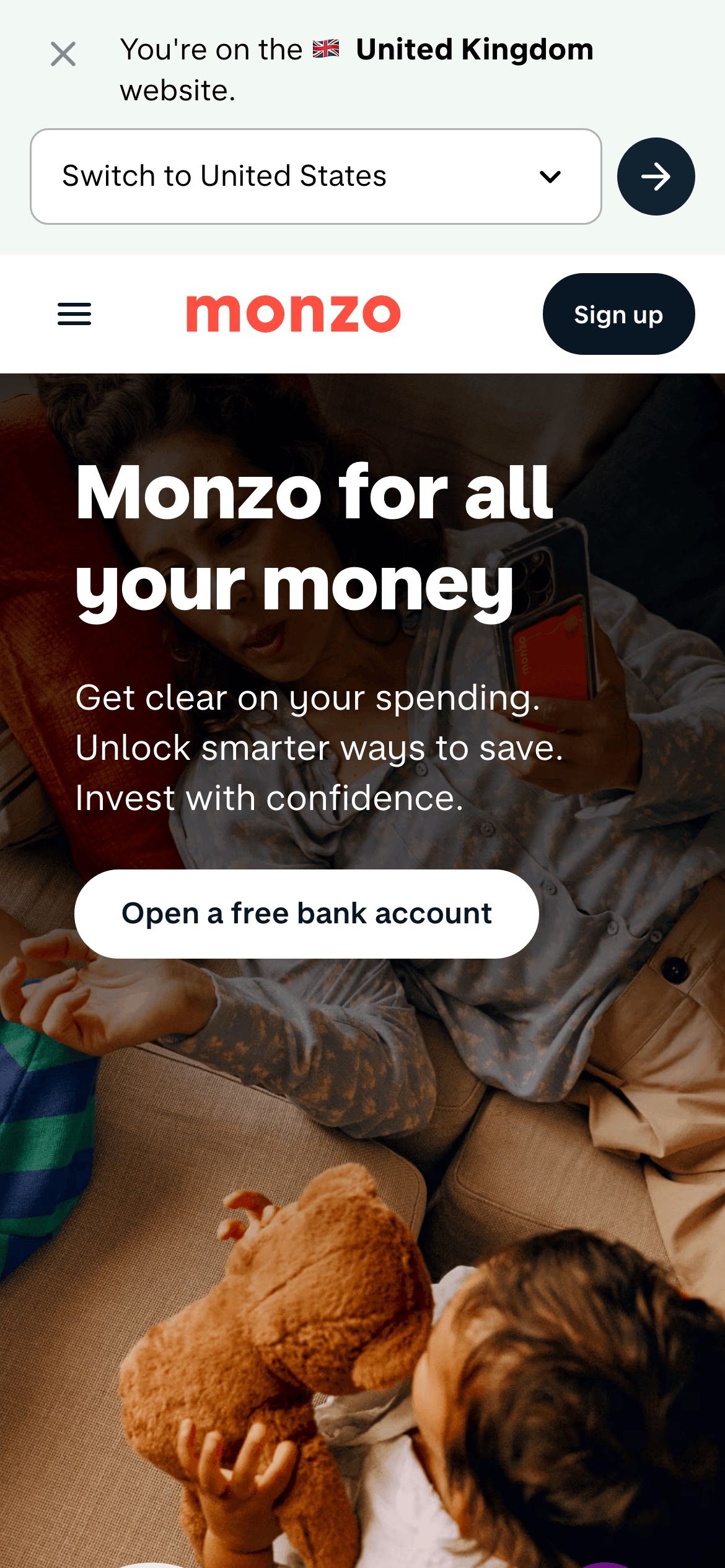
heroFull-width, edge-to-edge photographic hero with dark gradient overlay and left-aligned text.
09
Voice & Don'ts
ToneConfident, clear, and reassuring.
HeadlinesDirect, benefit-driven statements using bold, punchy language.
CTAsAction-oriented and encouraging, focusing on value (e.g., 'free').
Don't use serif fonts — screenshot shows a clean, humanist sans-serif system.
Don't use a muted or low-contrast palette — screenshot relies on deep navy (#091723) and white for maximum legibility.
Don't use sharp corners on primary buttons — screenshot shows pill-shaped (500px radius) buttons.
Don't use decorative backgrounds — screenshot uses clean solid colors or photographic imagery.
Don't use all-caps for body text — screenshot uses sentence case for readability.
Don't use thin, light font weights for headlines — screenshot uses a heavy weight (800) for all primary text.
Captured from the live site · real computed styles
11
System prompt
Monzo is a modern fintech bank website designed for clarity, trust, and ease of use. It features a clean, high-contrast palette dominated by deep navy (#091723) and bright white (#FFFFFF), with a single vibrant coral accent (#FF4F40) for primary actions. The typography is a custom, highly legible humanist sans-serif family, using heavy weights for headlines to convey authority and regular weights for body text. The layout is spacious and responsive, with generous padding and a centered content column. Key critical donts: don't use serif fonts, don't use low-contrast colors, don't use sharp corners on buttons. The overall feel is premium, approachable, and trustworthy.
Bring this taste to your agent
Hand your AI agent a machine-readable spec of this design — tokens, type, motion, the whole DNA.