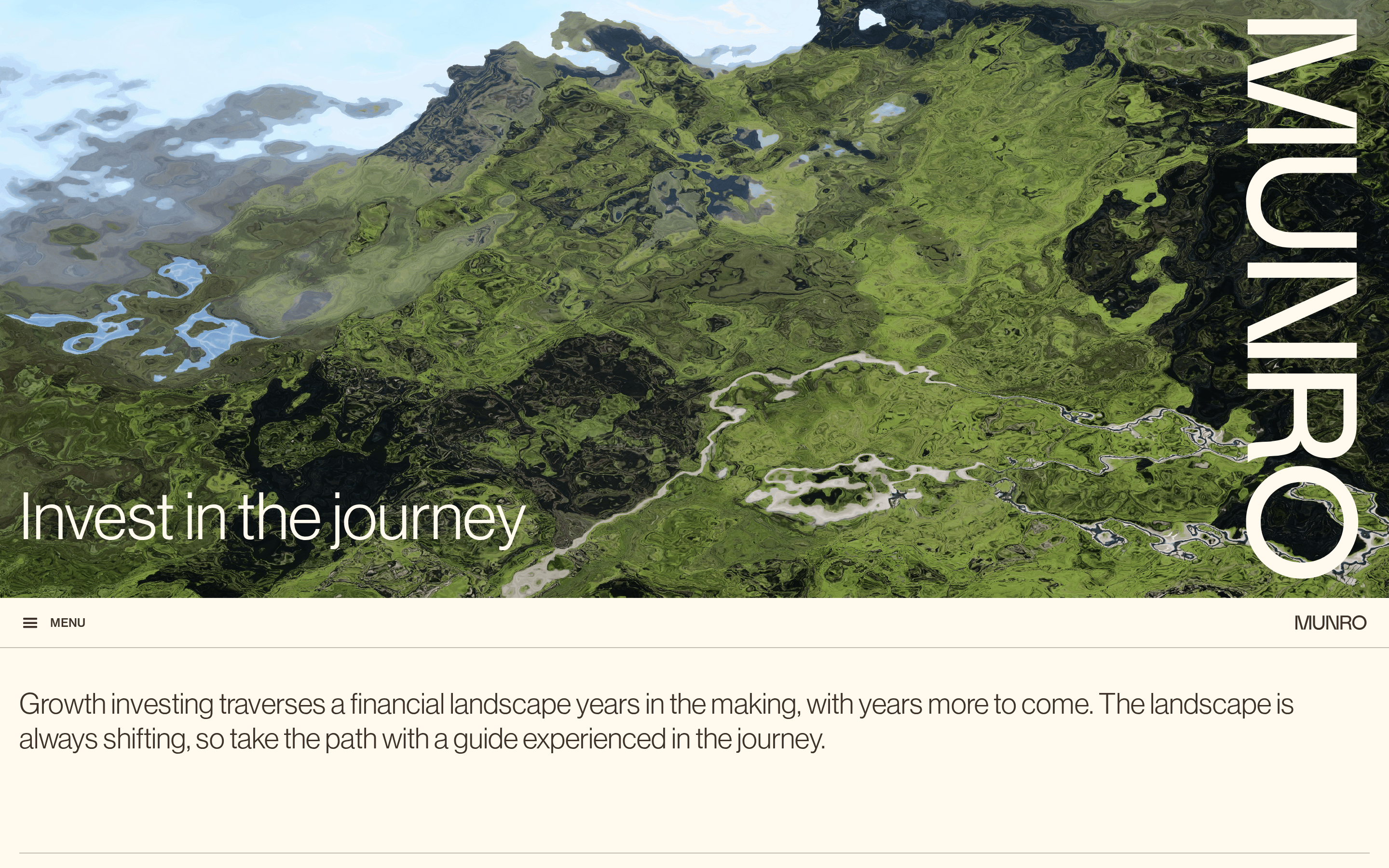
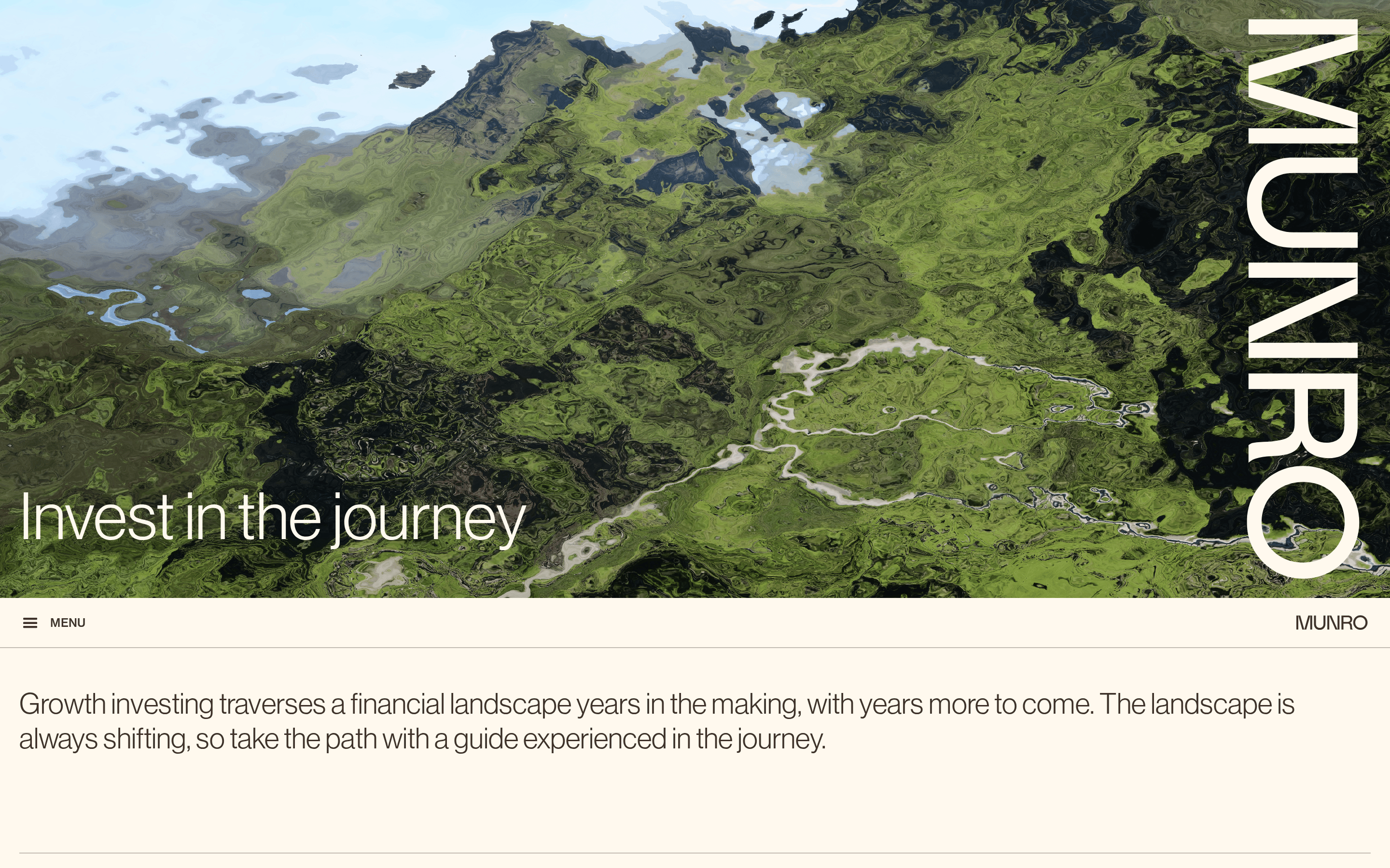
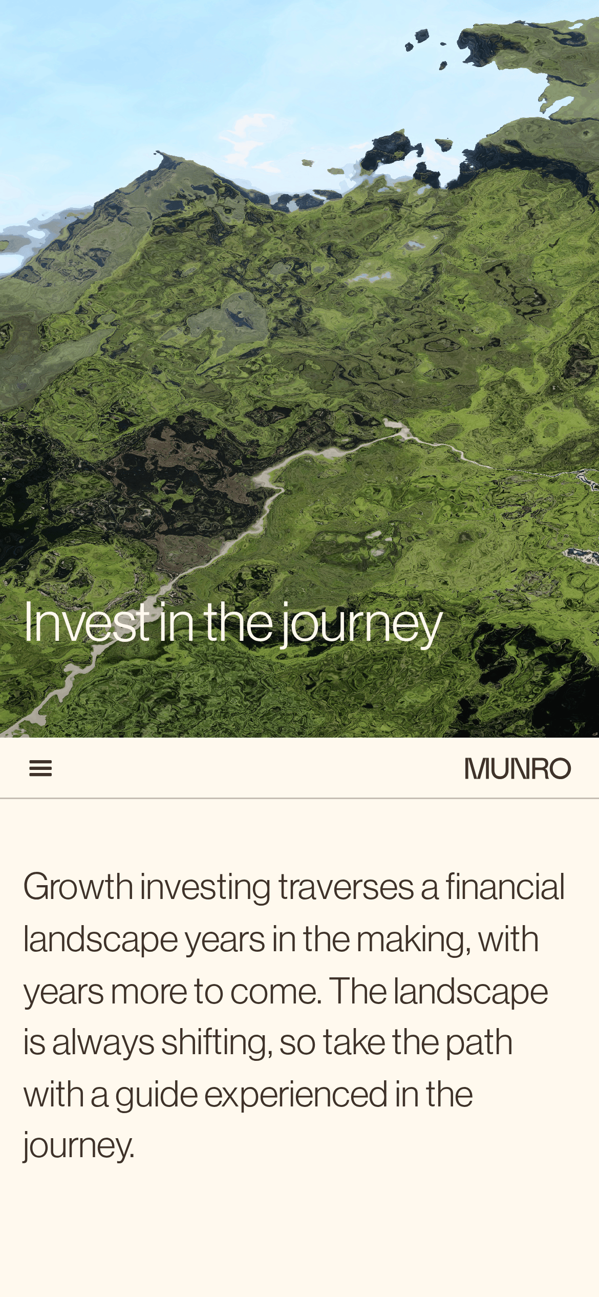
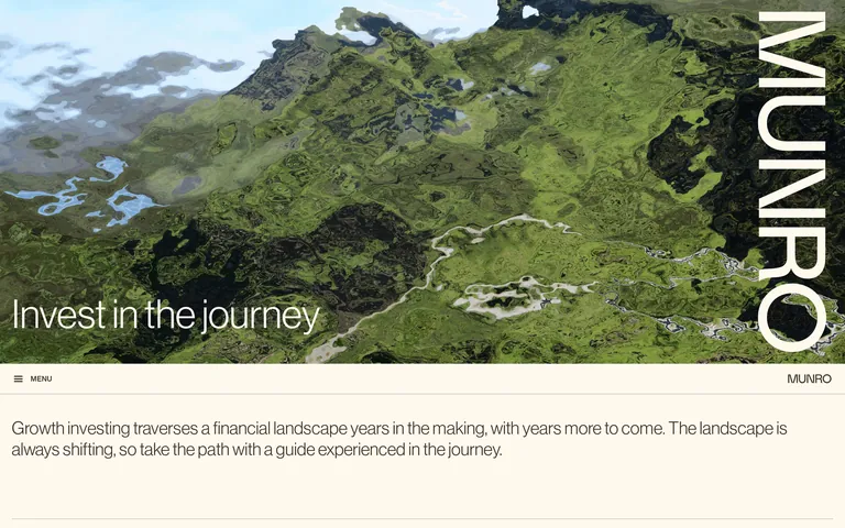
A topographic map guiding investors through a complex financial terrain.
02
Color
#3f322aInk
rgba(63,50,42,0.5)Ink soft
#fff9eeBG
rgba(63,50,42,0.1)Line
Warm, earthy neutrals that let the photographic hero drive visual interest while maintaining maximum readability for financial data.
03
Typography
grotesque-sans
display56px · 500
body22px · 400
small14px · 400
Use uppercase with wide tracking for secondary labels and table headers · Maintain a clean, neutral typographic hierarchy that prioritizes clarity for financial data · Reserve heavier weights strictly for emphasis or interactive states
04
Spacing
4px
8px
16px
24px
32px
48px
64px
96px
Generous vertical spacing that mirrors the open, expansive feeling of the landscape imagery.
05
Surfaces
sm · 2px
md · 15px
lg · 20px
pill · 999px
1px solid lines using a muted earthy brown to separate rows and define sections.
06
Layout
1280container
12columns
20pxgutter
768 / 1024breakpoints
Full-bleed hero followed by generous single-column content blocks with a clean horizontal tabular layout for financial data.
07
Motion & Interaction
200msmicro
300mssmall
400msmedium
lineareasing
Subtle linear transitions on interactive elements for a calm, steady feel.
Opacity changes or background-color shifts on a linear timeline. · Subtle visual feedback followed by smooth navigation.
08
Components
buttonUnderstated ghost buttons with uppercase labels, using muted borders and subtle hover transitions.
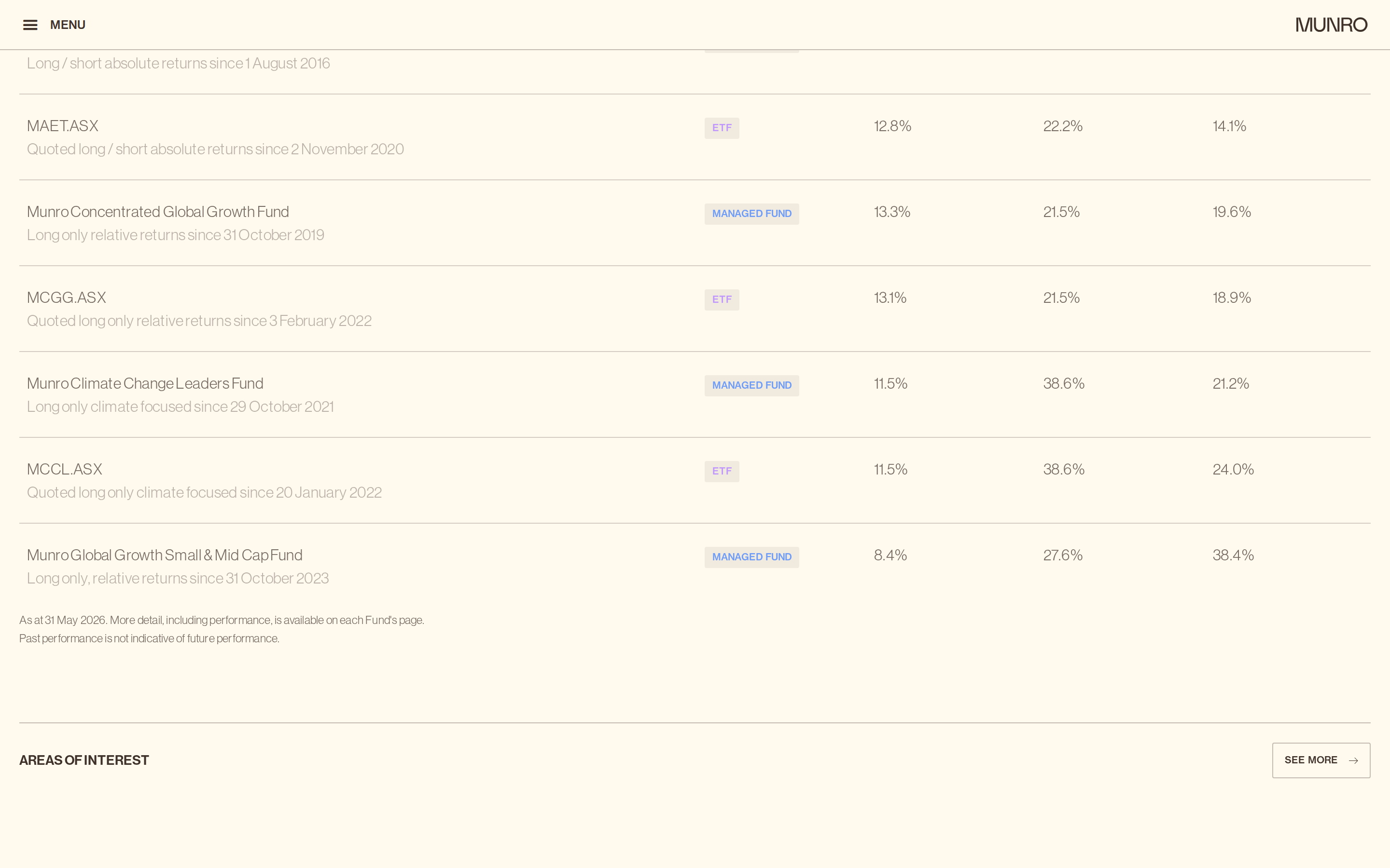
cardClean data rows separated by thin dividers rather than heavy containers.
chipSmall, uppercase text badges for 'ETF' and 'MANAGED FUND' using a subtle purple or teal accent.
inputMinimal text-based inputs focused on readability.
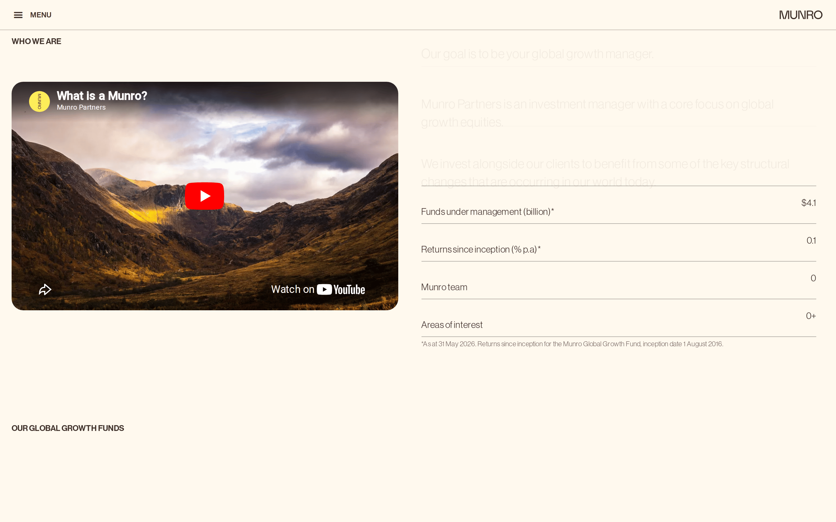
heroImmersive full-viewport photographic landscape with large overlaid typography.
09
Voice & Don'ts
ToneAuthoritative, calm, and reassuringly professional.
HeadlinesAspirational yet grounded, focusing on long-term perspective.
CTAsUnderstated and direct, relying on clear labels rather than aggressive styling.
Don't use bright, saturated accent colors — the screenshot shows a restrained palette of earthy browns and warm off-whites.
Don't use heavy drop shadows on components — the design relies on subtle borders and clean spacing for definition.
Don't use serif or decorative fonts — the screenshot exclusively uses a clean grotesque sans-serif typeface.
Don't crowd the interface with dense grids — the layout uses generous whitespace and a single-column narrative flow.
Don't use rounded pill buttons for primary actions — interactive elements appear as subtle text links or simple outlined rectangles.
Don't use stark, cold white backgrounds — the base background is consistently a warm, creamy off-white (#fff9ee).
Captured from the live site · real computed styles
11
System prompt
This is a premium wealth management website that visualizes financial growth through a journey metaphor. The design relies on a warm, earthy color palette anchored by a creamy off-white background (#fff9ee) and deep brown ink (#3f322a), allowing the large, dramatic landscape photography to be the primary visual focus. The typography is strictly modern grotesque sans-serif, creating a clean, objective, and highly readable interface for financial data. Critical constraints include avoiding overly bright accent colors, rejecting heavy shadows in favor of subtle border definitions, and maintaining generous spacing to reflect a calm, authoritative brand voice that prioritizes long-term perspective over urgent, aggressive conversion tactics.
Bring this taste to your agent
Hand your AI agent a machine-readable spec of this design — tokens, type, motion, the whole DNA.