CURATED · OPEN · FREE

N26

A clean, confident fintech UI that uses a signature teal accent to guide users toward a single primary action.

fintechbank
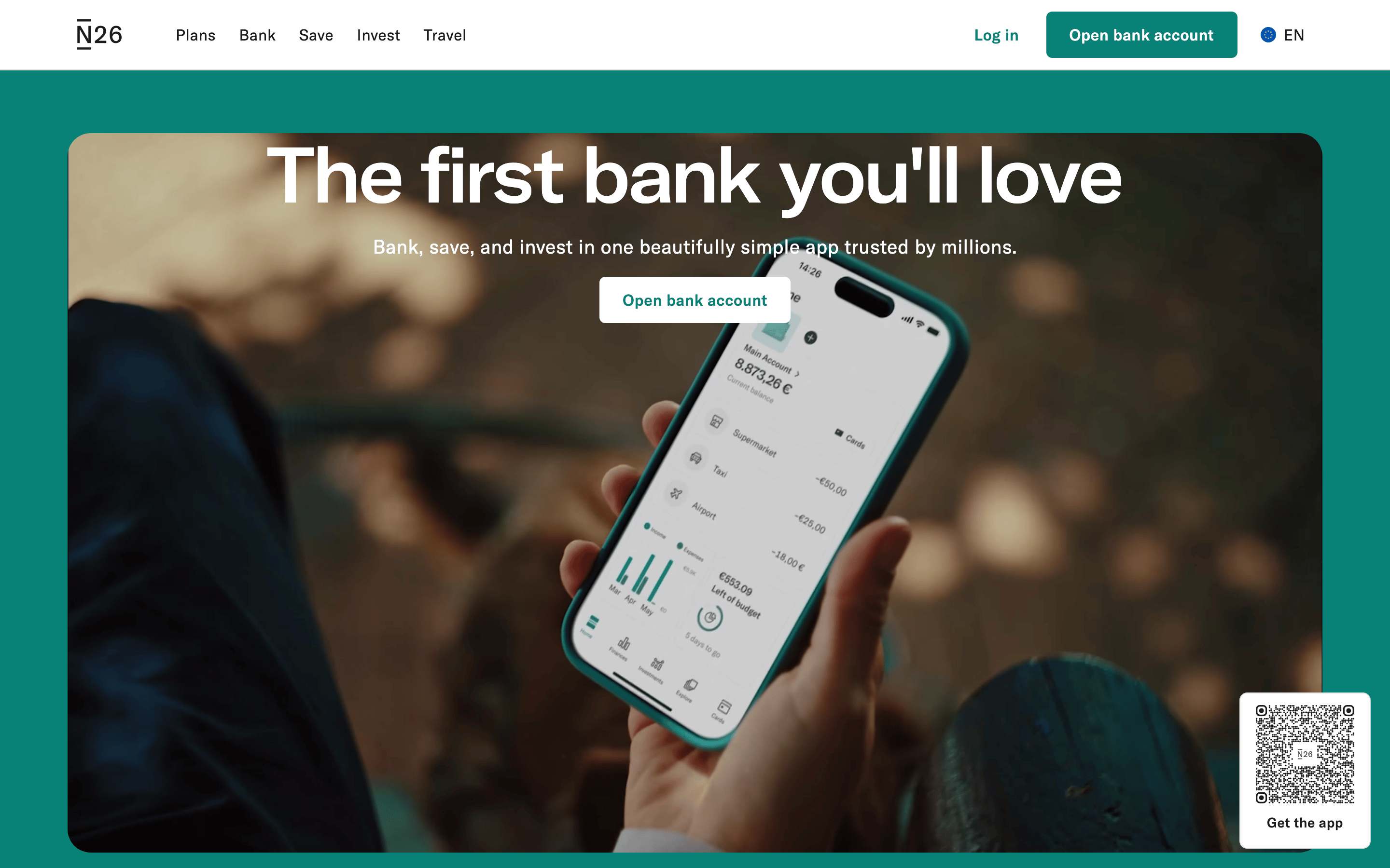
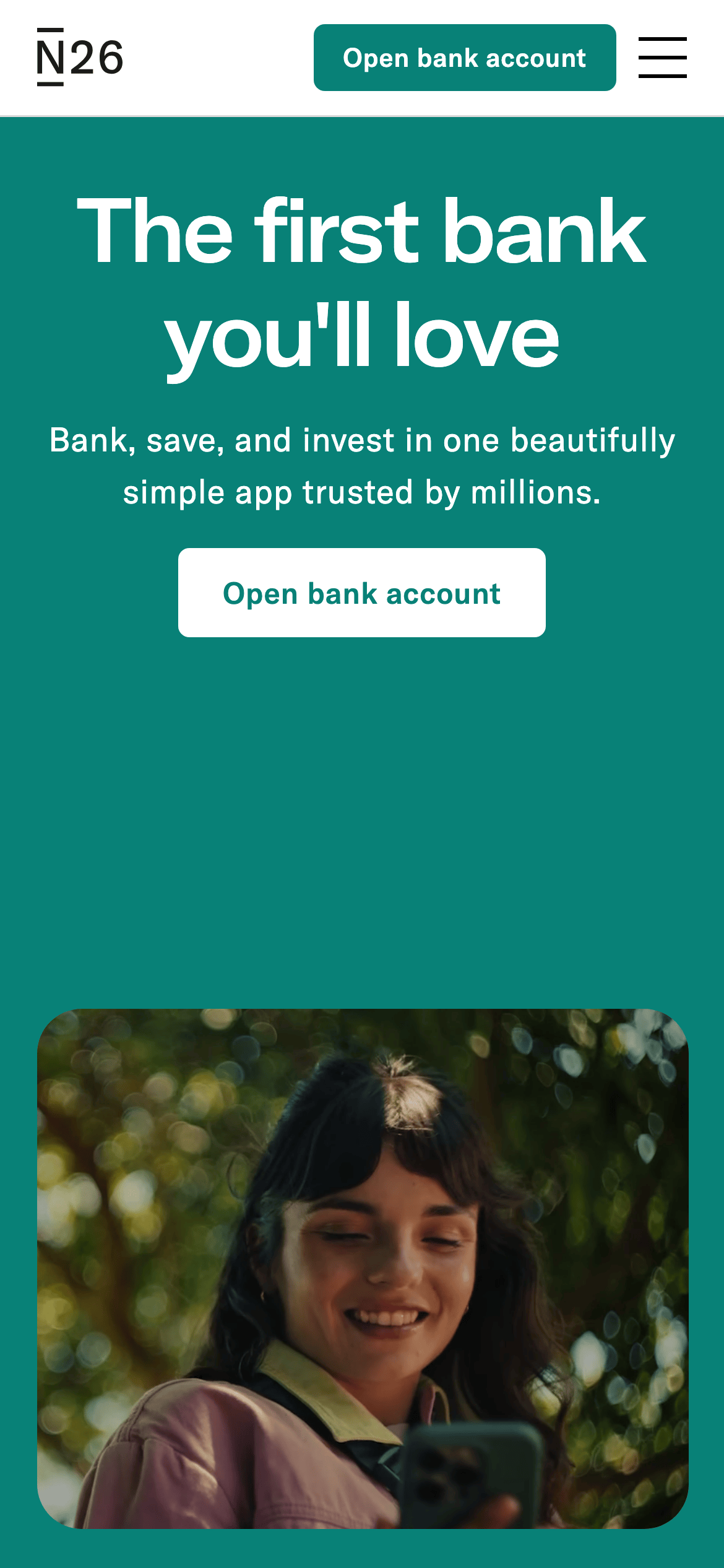
N26 screenshot
↓ Download design system (7 MB)Open in OpenDesign

Visit: https://n26.com

📦 Browse pack contents →

01

Identity DNA

bankingfintechmobile-firsttrustsimplicity

A modern, friendly bank branch in your pocket that prioritizes clarity and trust.

02

Color

#088177Accent
#1B1B1BInk
#FAF8F5BG
#6D6D6DMuted
rgba(233, 233, 233, 1.0)Line

A warm off-white background with a dominant teal accent creates a trustworthy, accessible contrast for financial actions.

03

Typography

geometric-sans

04

Spacing

4px
8px
12px
16px
24px
32px
40px
48px
64px
80px
96px

Standard 4px base grid with generous padding for breathing room

05

Surfaces

sm · 4px
md · 8px
lg · 24px
pill · 999px

Subtle 1px borders for structural separation and interactive elements

rgba(0, 0, 0, 0.2) 0px 4px 8px 0px

06

Layout

1280container
12columns
24pxgutter
768 / 1024breakpoints

Centered container with generous vertical whitespace between sections

07

Motion & Interaction

150msmicro
300mssmall
500msmedium
cubic-bezier(0.4, 0, 0.2, 1)easing

Smooth transitions on background-color, transform, and scale for interactive elements

Background-color or color shift with smooth transition · Scale or translate transform for immediate feedback

08

Components

09

Voice & Don'ts

10

Inside the pack — real screenshots

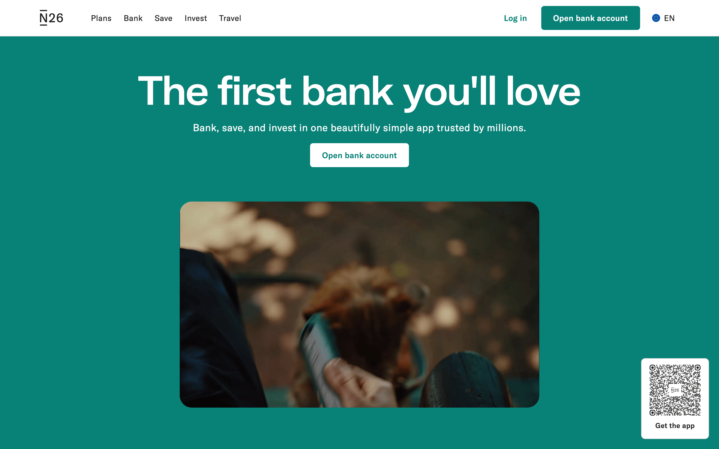
Captured from the live site · real computed styles

11

System prompt

N26 is a premium fintech banking platform that balances a friendly, accessible tone with professional trust. The visual identity is built around a signature teal accent (#088177) on a warm off-white background (#FAF8F5), creating a high-contrast yet welcoming environment for financial activities. The typography is a clean geometric sans-serif that prioritizes readability and a modern feel, using large display sizes for key headlines. Layouts are spacious and centered, relying on a consistent 4px base grid and generous padding to prevent information overload. A primary CTA with a pill-shaped border radius is the focal point of almost every section. The interaction design is subtle, using smooth 0.3s transitions on hover and click. Critical design constraints: never use multiple competing accent colors; never use pure white backgrounds; never use harsh square corners for main content cards; avoid dense, jargon-heavy text blocks; and maintain a single, strong primary call-to-action per section to preserve the clean, focused user experience.

Bring this taste to your agent

Hand your AI agent a machine-readable spec of this design — tokens, type, motion, the whole DNA.
OpenDesign skill ↗ · This pack for agents ↗

en · zh-CN · zh-TW · ja · ko