← OpenDesign CURATED · OPEN · FREE
Nan
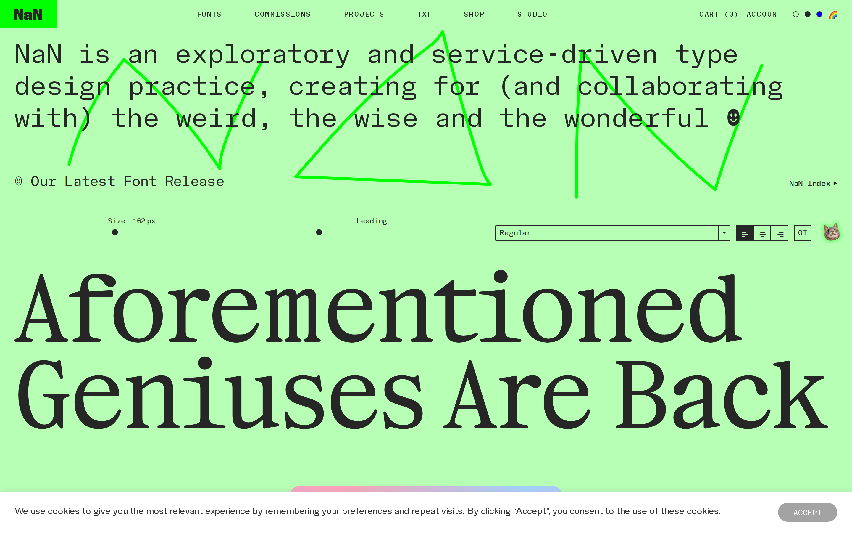
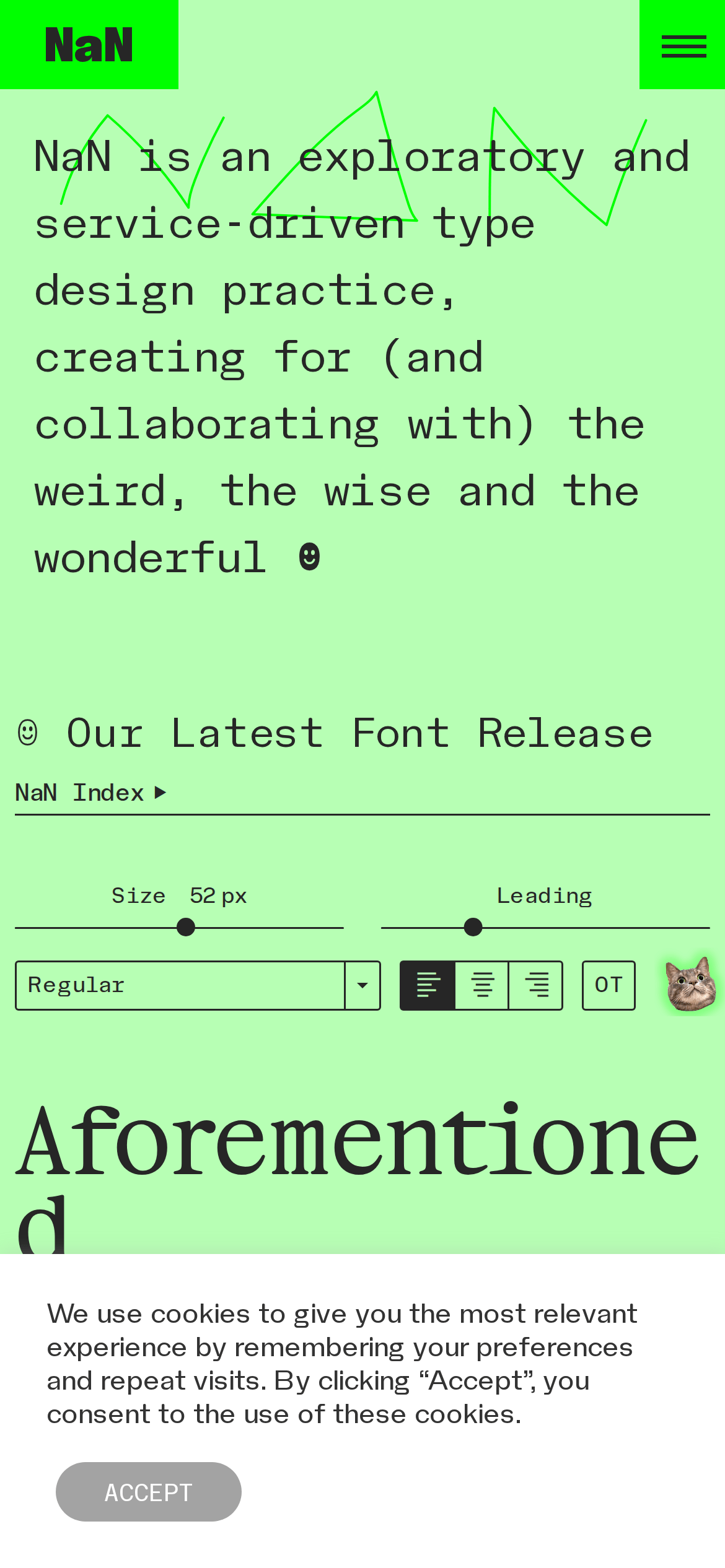
An exploratory and service-driven type design practice.
Typography Design Tools Studio Expressive Bold Typography
01
Identity DNA
exploratory service-driven type design weird wise wonderful
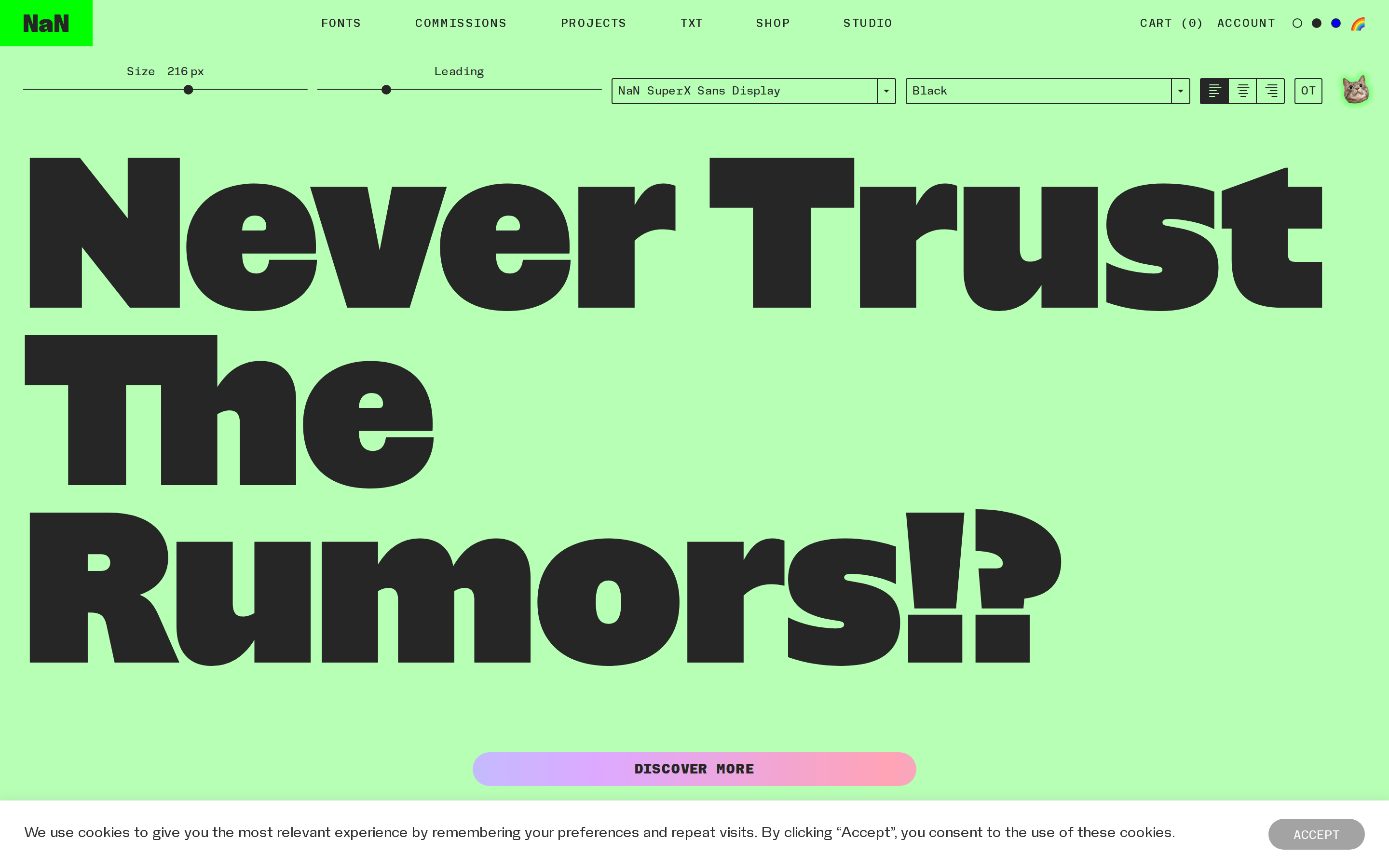
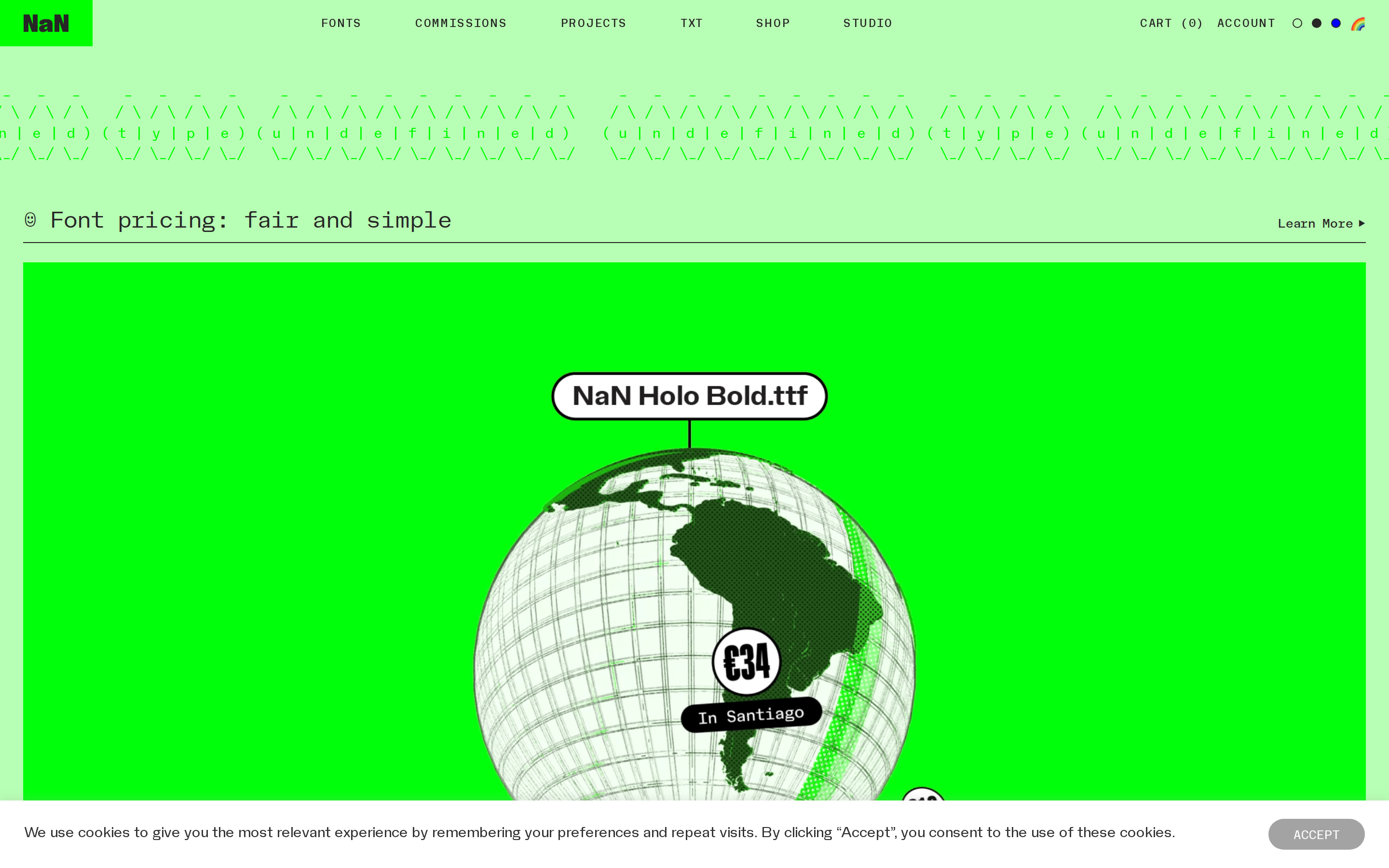
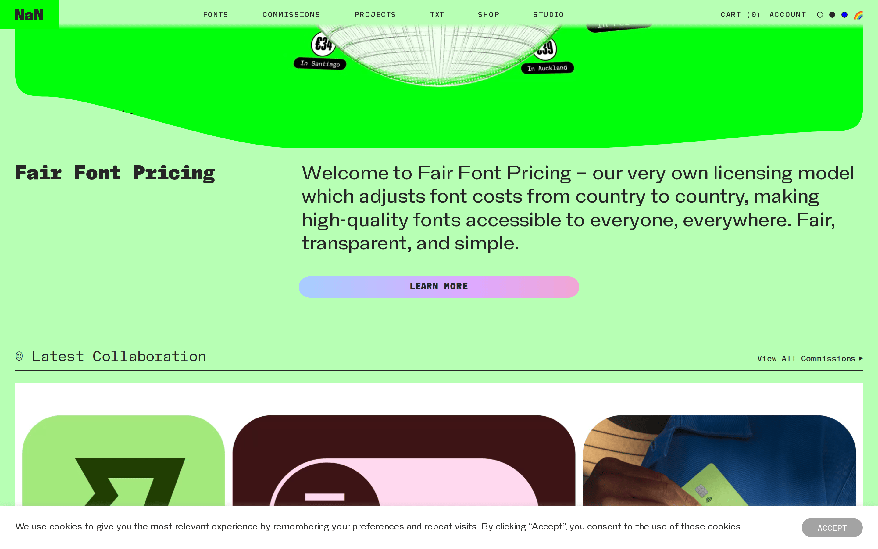
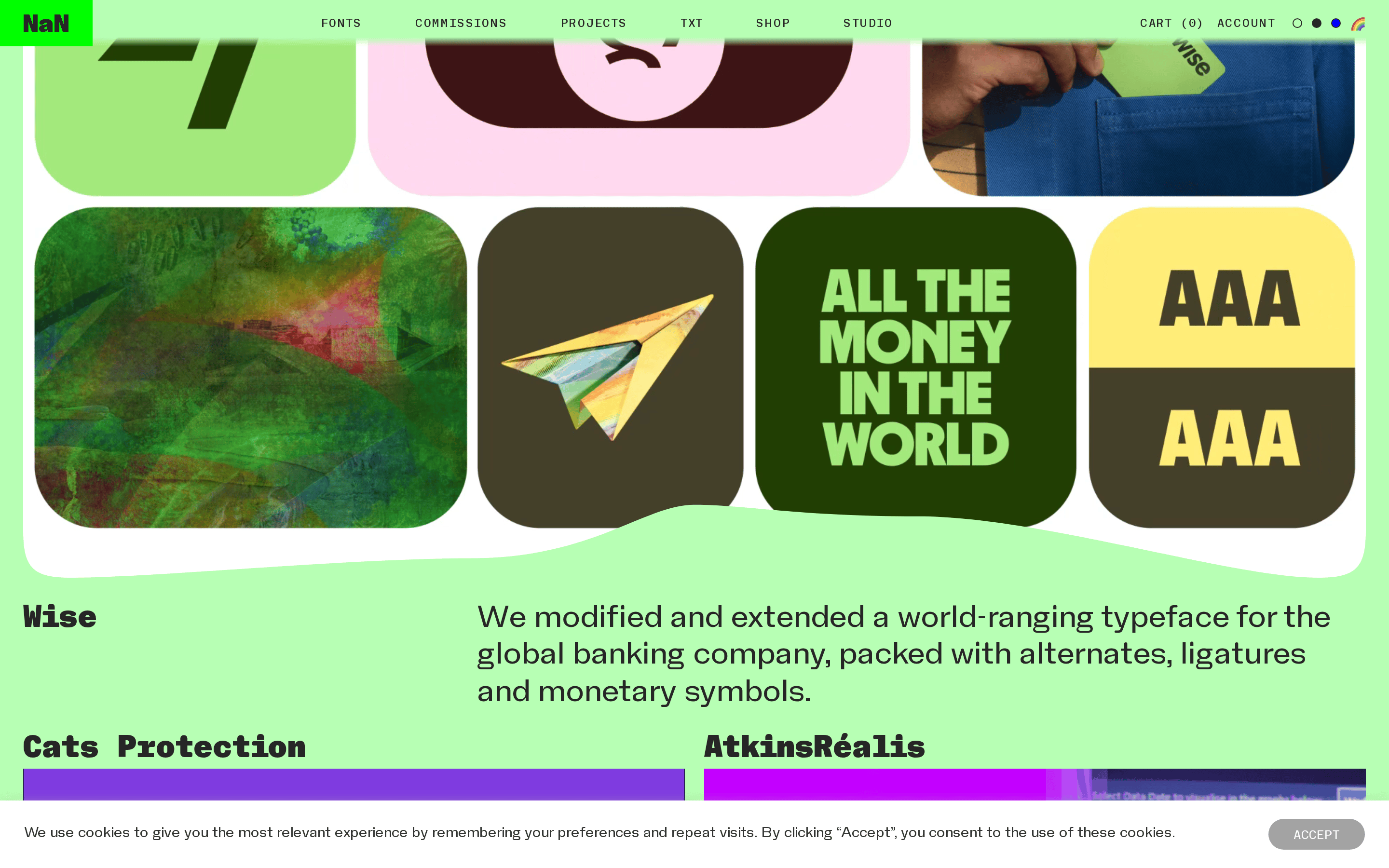
A bold, unconventional type foundry website.
02
Color
#262626Ink
#B7FFB4BG
#9D968EMuted
rgba(38, 38, 38, 0.2)Line
High-contrast neon green background with dark charcoal text for a raw, experimental aesthetic.
03
Typography
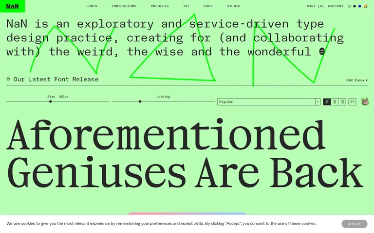
transitional-serif · geometric-sans · mono-linear
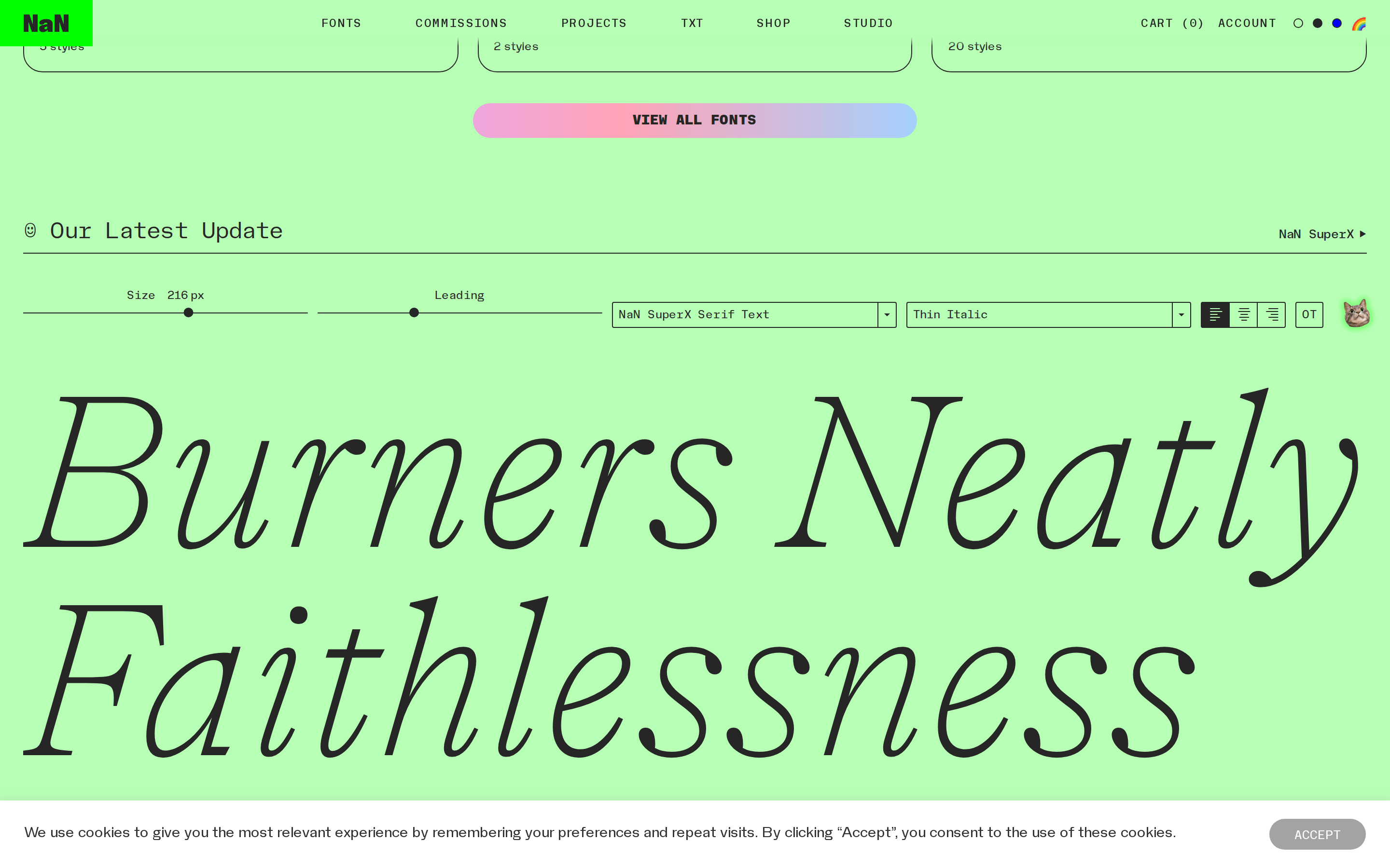
display 162px · 500body 16px · 400mono 13px · 400Use high-contrast sizes for dramatic typographic hierarchy. · Mono fonts are strictly for UI and metadata.
04
Spacing
4px
8px
16px
24px
32px
48px
64px
96px
8px vertical rhythm.
05
Surfaces
sm · 2px
md · 8px
lg · 18px
pill · 999px
1px solid #262626
0px -1px 10px 0px rgba(172, 171, 171, 0.3)
06
Layout
1280 container
12 columns
24px gutter
768 / 1024 breakpoints
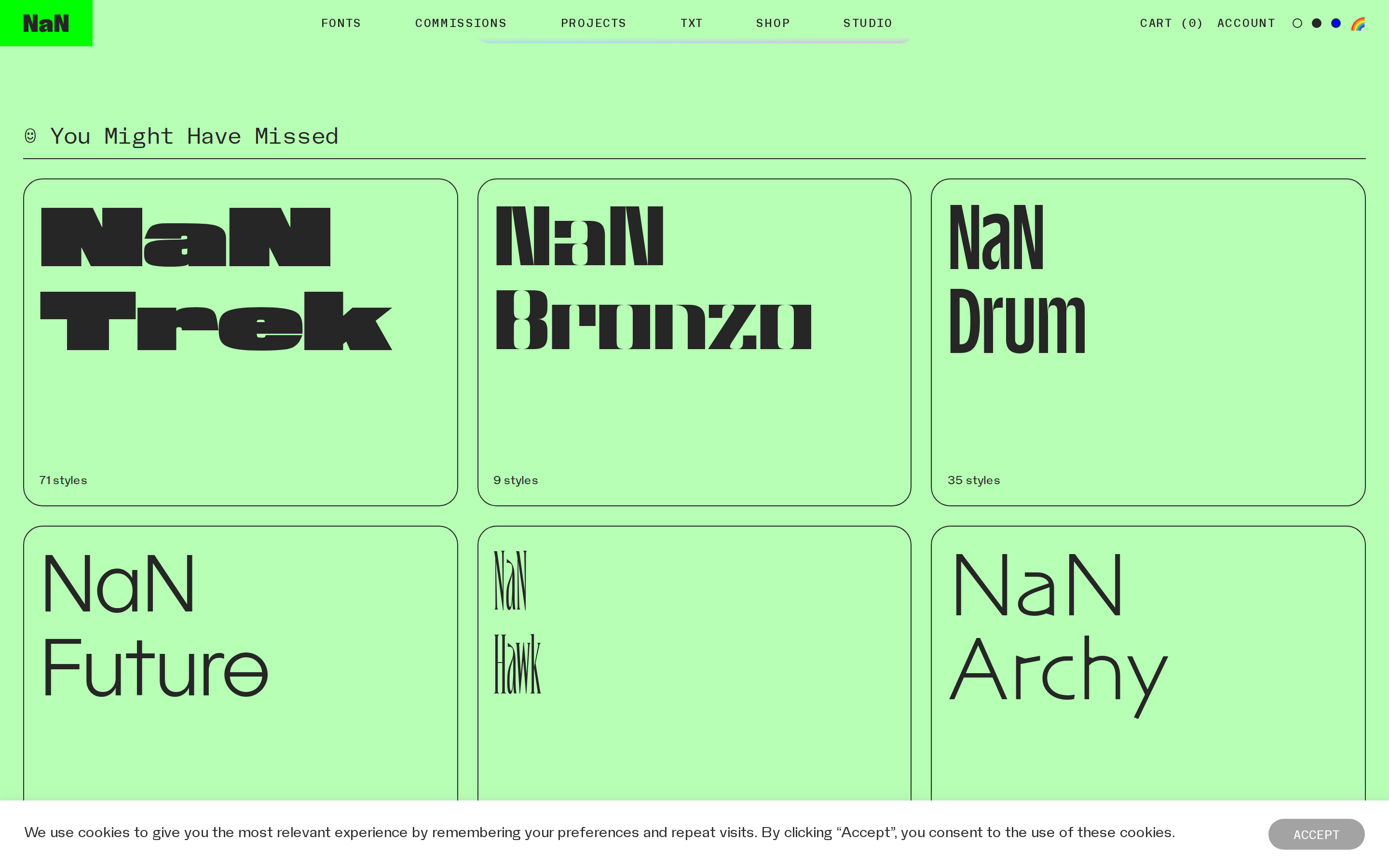
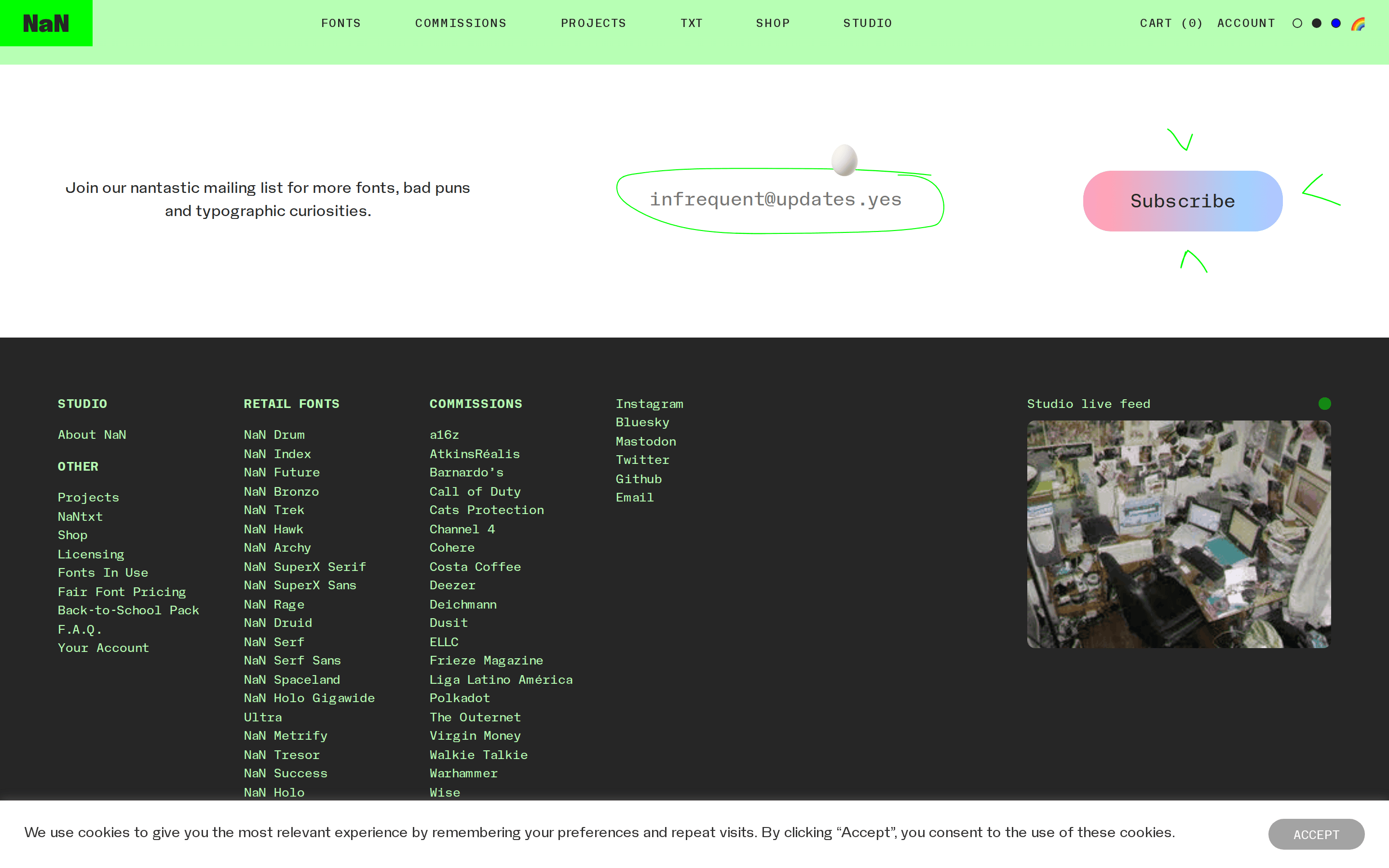
Asymmetric, bold grid with large type blocks and stark color fields.
07
Motion & Interaction
100ms micro
200ms small
400ms medium
cubic-bezier(0.25, 0.1, 0.25, 1.0) easing
Smooth opacity fades for hover states. · Subtle transforms on interactive elements.
Opacity reduces or color shifts. · Immediate visual feedback.
08
Components
button Minimal borders or solid fills, often small and functional. card Large, color-saturated blocks with bold typography overlays. chip Small bordered tags or labels. input Styled with sharp borders and specific mono fonts. hero Maximalist, oversized typography dominating the viewport. 09
Voice & Don'ts
Tone Playful, experimental, and confident. Headlines Extremely large, tight-tracking, and bold. CTAs Straightforward, often underlined or bordered. Don't use soft, rounded corners — screenshot shows sharp 2px borders. Don't use subtle pastel backgrounds — screenshot shows a vivid #B7FFB4 green. Don't use a standard sans-serif for everything — screenshot shows a distinct transitional serif for headlines. Don't hide the type — screenshot shows typography as the primary visual element. Don't use complex drop shadows — screenshot shows flat, high-contrast surfaces. Don't use small font sizes for emphasis — screenshot shows oversized display text. Avoid: Overly corporate language Avoid: Complex gradients Avoid: Standard corporate layouts 10
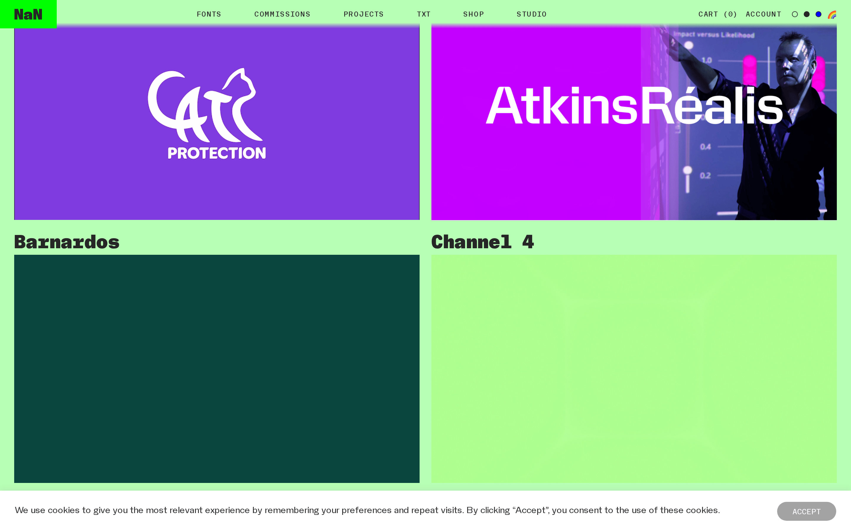
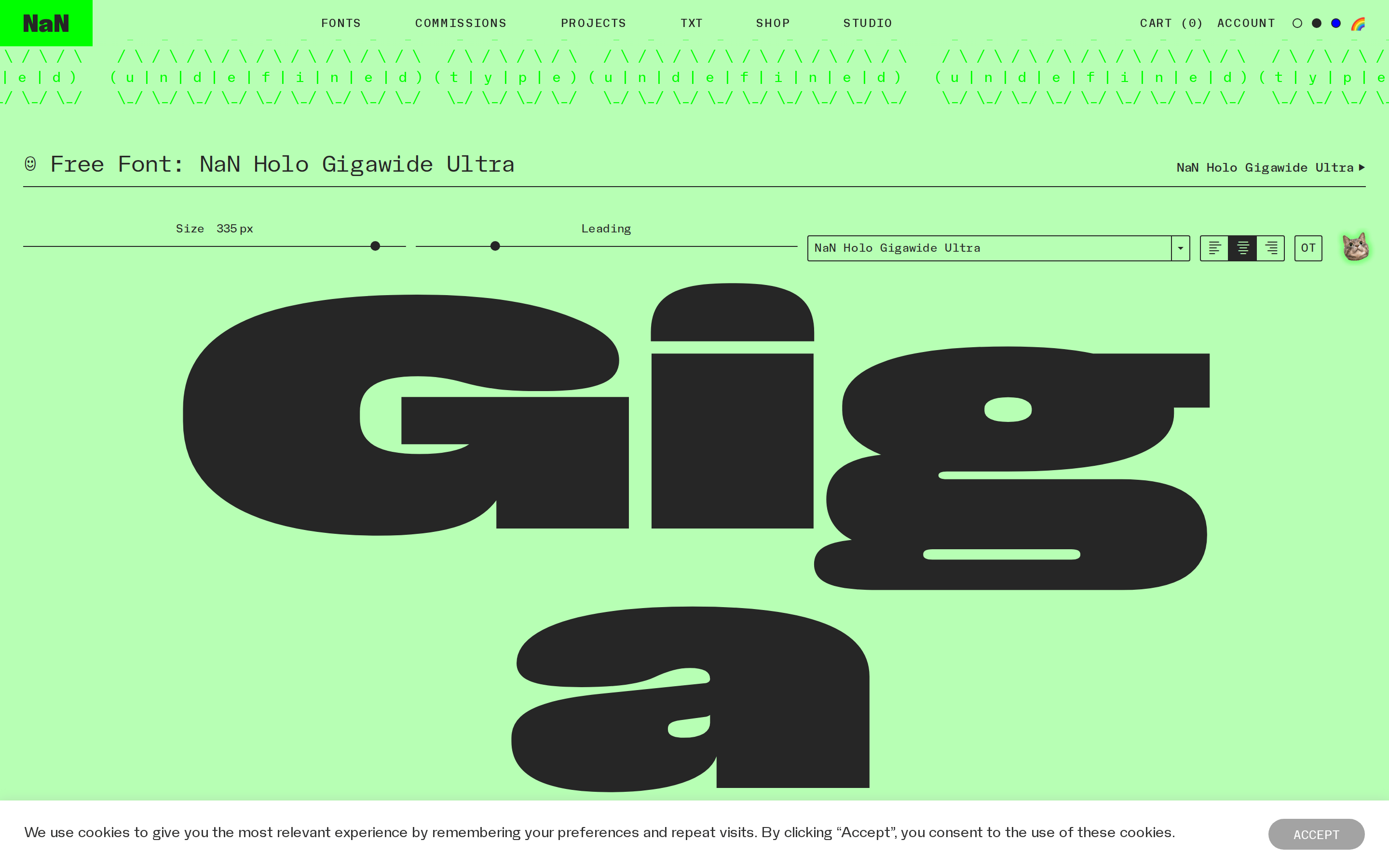
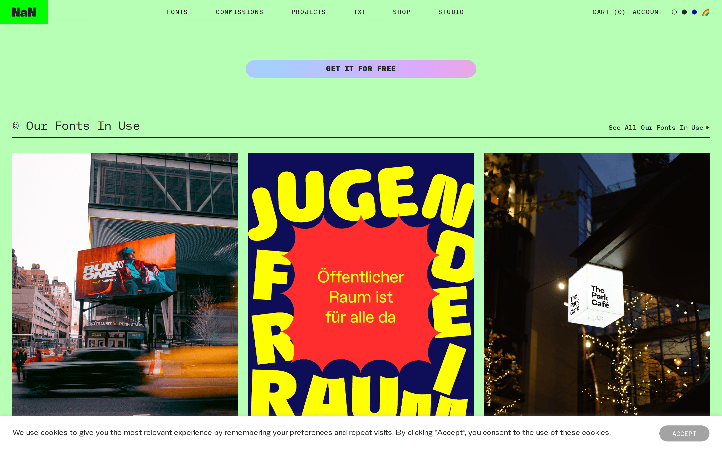
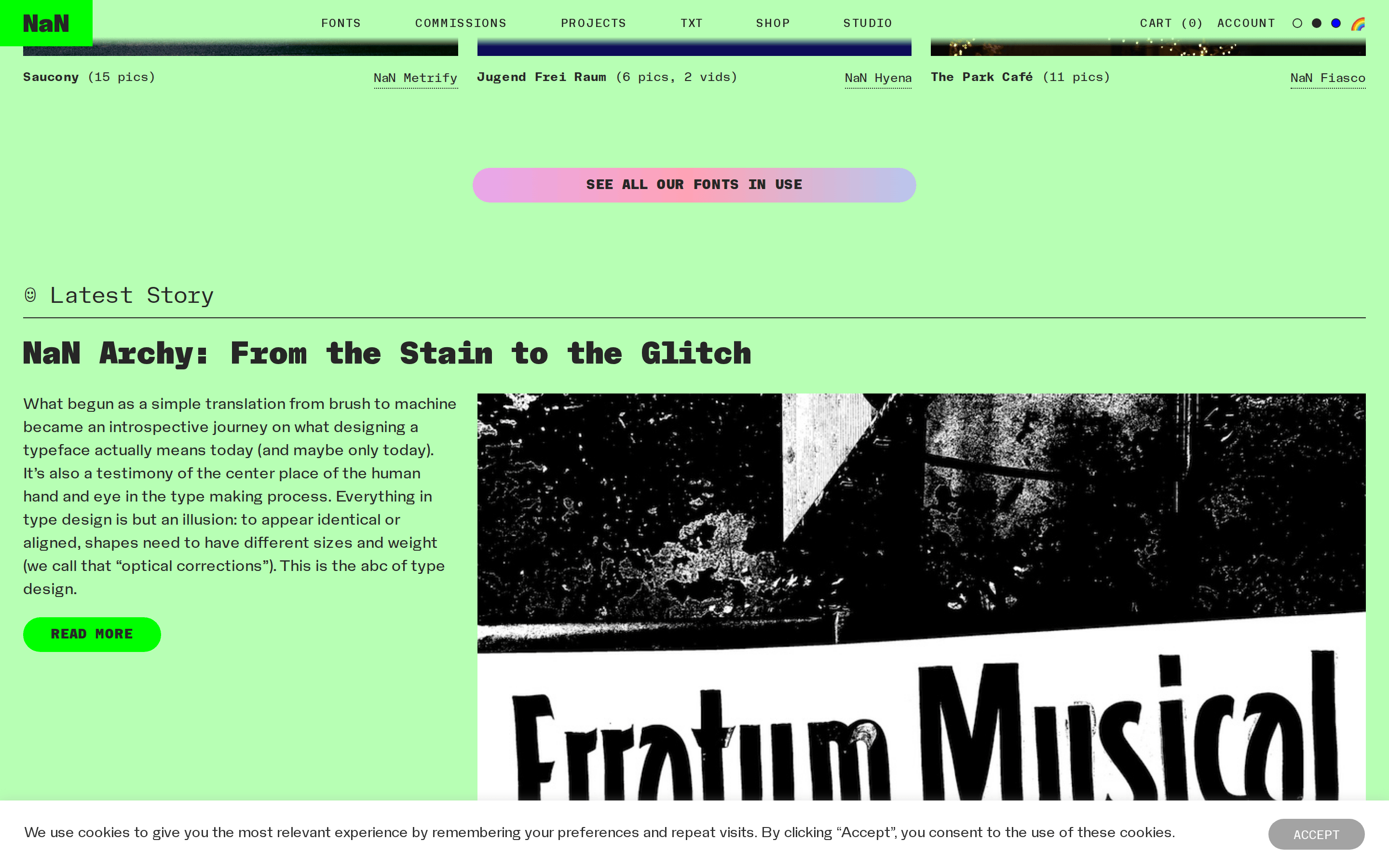
Inside the pack — real screenshots
桌面首屏(hero) 桌面滚动分段(90% viewport 步进,作为视觉证据) 桌面滚动分段(90% viewport 步进,作为视觉证据) 桌面滚动分段(90% viewport 步进,作为视觉证据) 桌面滚动分段(90% viewport 步进,作为视觉证据) 桌面滚动分段(90% viewport 步进,作为视觉证据) 桌面滚动分段(90% viewport 步进,作为视觉证据) 桌面滚动分段(90% viewport 步进,作为视觉证据) 桌面滚动分段(90% viewport 步进,作为视觉证据) 桌面滚动分段(90% viewport 步进,作为视觉证据) 桌面滚动分段(90% viewport 步进,作为视觉证据) 桌面滚动分段(90% viewport 步进,作为视觉证据) 桌面滚动分段(90% viewport 步进,作为视觉证据) 桌面滚动分段(90% viewport 步进,作为视觉证据) 桌面滚动分段(90% viewport 步进,作为视觉证据) 桌面滚动分段(90% viewport 步进,作为视觉证据) 移动首屏 Captured from the live site · real computed styles
11
System prompt
NaN is a bold, type-driven design practice with a raw, experimental aesthetic. The core palette features a vibrant neon green (#B7FFB4) background contrasted with dark charcoal (#262626) text. Typography is the hero, using a transitional serif for massive display headlines and a geometric sans/mono for UI. Critical donts: do not use soft or corporate visuals, avoid small type sizes for emphasis, and never hide the typographic personality behind standard templates. This system supports expressive, unconventional layouts where type is the primary visual tool.
More from the library en · zh-CN · zh-TW · ja · ko
OpenDesign · curated web aesthetics for AI-readable design DNA · opendesign.cc
Why we curated this: A standout example of how typography can define an entire brand identity and user experience.