High-contrast monochromatic palette with deep black backgrounds and stark white typography
03
Typography
geometric-sans
display87px · 400
body12px · 400
Tight letter-spacing for large display headlines · Heavy reliance on Helvetica Now Display for both headlines and body · Minimal typographic hierarchy primarily driven by scale contrast
04
Spacing
4px
8px
12px
16px
24px
32px
48px
64px
96px
Irregular grid-based rhythm driven by project imagery rather than strict vertical spacing
05
Surfaces
sm · 2px
md · 4px
lg · 7px
pill · 26px
1px solid black borders on primary elements
0 4px 12px rgba(0,0,0,0.15) on floating UI elements
06
Layout
1400container
12columns
8pxgutter
768 / 1024breakpoints
Asymmetric masonry grid with large hero imagery and floating text overlays
07
Motion & Interaction
220msmicro
400mssmall
800msmedium
cubic-bezier(0.87, 0, 0.13, 1)easing
Smooth entrance transitions for sliding UI panels · Opacity fades for overlay elements · Subtle hover state transitions on interactive elements
Subtle opacity or transform shifts on interactive elements · Smooth panel transitions
08
Components
buttonSmall rounded pill buttons for navigation tabs
cardImage-dominant project cards with metadata overlays
chipSmall bordered metadata tags
inputMinimal text inputs with thin borders
heroFull-width or half-width cinematic project imagery with overlaid metadata
Captured from the live site · real computed styles
11
System prompt
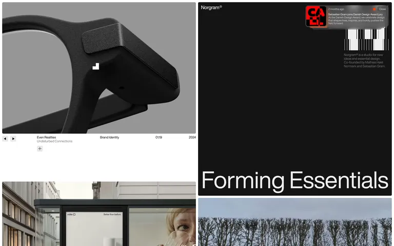
Norgram is a premium design studio portfolio characterized by a stark monochromatic palette and geometric sans-serif typography. The primary background is deep charcoal #1a1a1a with stark white #ffffff or solid black #000000 text. Key font category is geometric-sans, specifically Helvetica Now Display, used for both massive display headlines and tiny metadata. The layout relies on an asymmetric grid with large, cinematic project imagery and floating text overlays. Critical donts: Do not introduce bright accent colors; maintain the strict monochrome aesthetic. Do not use serif typefaces; the identity is built on geometric sans. Do not apply wide letter-spacing; the design uses tight tracking even at display sizes. The motion is subtle, using ease-in-out and cubic-bezier transitions for panel slides and opacity fades. The overall feel is refined, essential, and highly controlled.
Bring this taste to your agent
Hand your AI agent a machine-readable spec of this design — tokens, type, motion, the whole DNA.