← OpenDesign CURATED · OPEN · FREE
Pad Dotincorp
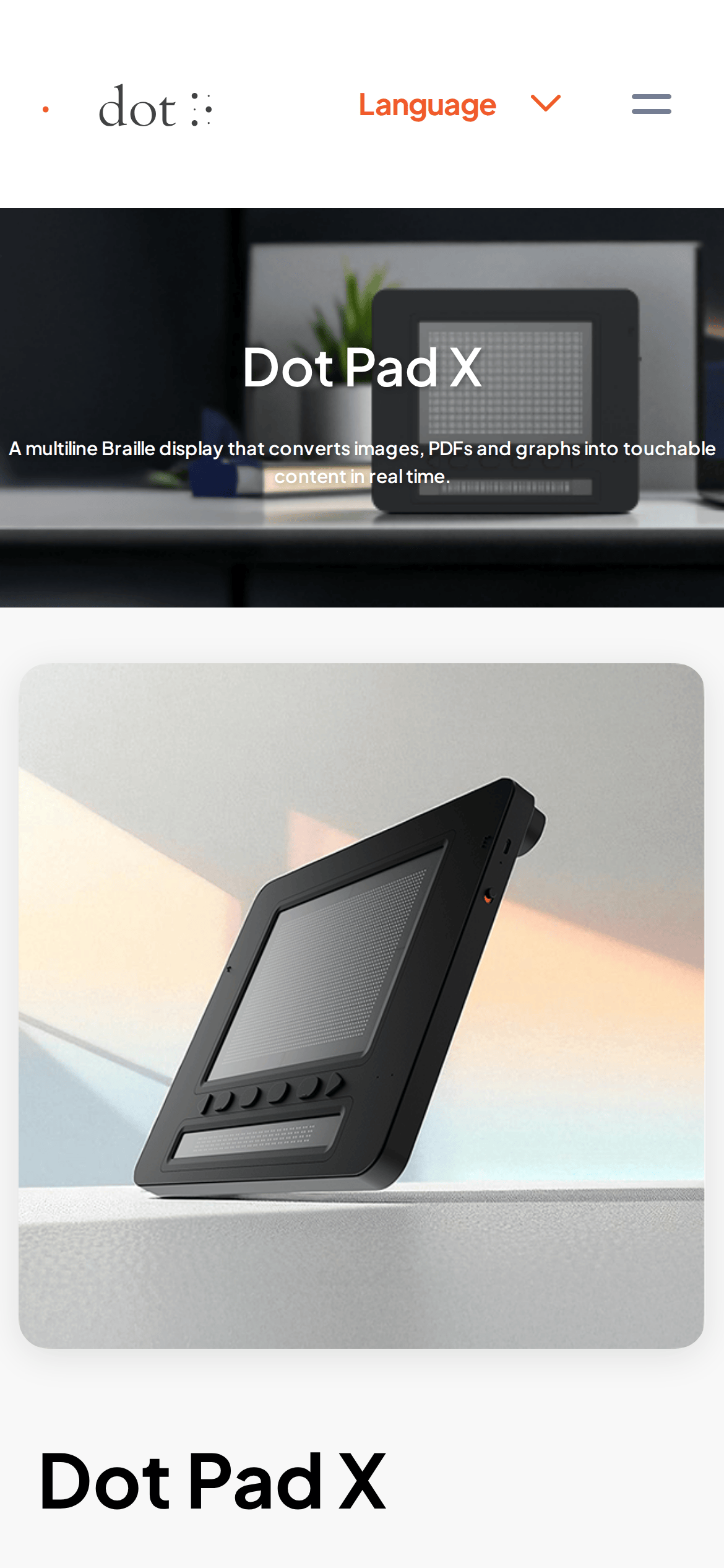
A clean, professional product showcase for a tactile braille display device.
Hardware Product Clean Calm Refined
01
Identity DNA
accessibility tactile braille assistive technology hardware
A sleek hardware product page that feels like a clean, premium tech documentation site.
02
Color
#FF5A2FAccent
#1F1F1FInk
#333333Ink soft
#FFFFFFBG
#F5F5F5BG soft
#707070Muted
rgba(229, 231, 235, 1)Line
High contrast and clean white space to emphasize the hardware product.
03
Typography
humanist-sans
display 56px · 700heading 32px · 700body 15px · 600Use humanist sans-serif for all text. · Maintain a base size of 15px for body text. · Use bold weights (600-700) for emphasis and headings.
04
Spacing
4px
8px
16px
24px
32px
48px
64px
96px
Consistent use of 40px and 60px gaps for major layout sections.
05
Surfaces
sm · 8px
md · 18px
lg · 20px
pill · 100px
1px solid rgba(229, 231, 235, 1)
0px 4px 10px rgba(0, 0, 0, 0.25) · 0px 5.87px 17.6px rgba(25, 33, 61, 0.06)
06
Layout
1280 container
12 columns
24px gutter
768 / 1024 breakpoints
Full-width hero banner followed by a multi-column feature grid.
07
Motion & Interaction
150ms micro
300ms small
400ms medium
cubic-bezier(0.25, 0.1, 0.25, 1) easing
Opacity fade for content transitions · Transform for hover states
Subtle opacity or background color changes on interactive elements. · Standard pointer cursor on all interactive elements.
08
Components
button Primary buttons with high-chroma orange backgrounds and rounded corners. card Clean cards with subtle shadows and rounded corners for features. hero Full-width photographic hero with centered text overlay and rounded bottom corners. 09
Voice & Don'ts
Tone Professional, informative, and clear. Headlines Direct and descriptive, focusing on the product name and its main benefit. CTAs Clear and action-oriented, using high-contrast colors. Don't use decorative or script fonts — screenshot shows a clean humanist sans-serif. Don't use a dark background as the primary canvas — screenshot shows a predominantly white background. Don't use a wide variety of colors — screenshot shows a strict palette of white, black, and a single orange accent. Don't use thin font weights for important text — screenshot shows weights of 600 and 700. Don't use sharp, square corners on cards and buttons — screenshot shows rounded corners (18px-20px). Don't use complex or busy background patterns — screenshot shows solid colors or clean photographic backgrounds. Avoid: Informal language Avoid: Overly technical jargon without explanation Avoid: Cluttered layouts 10
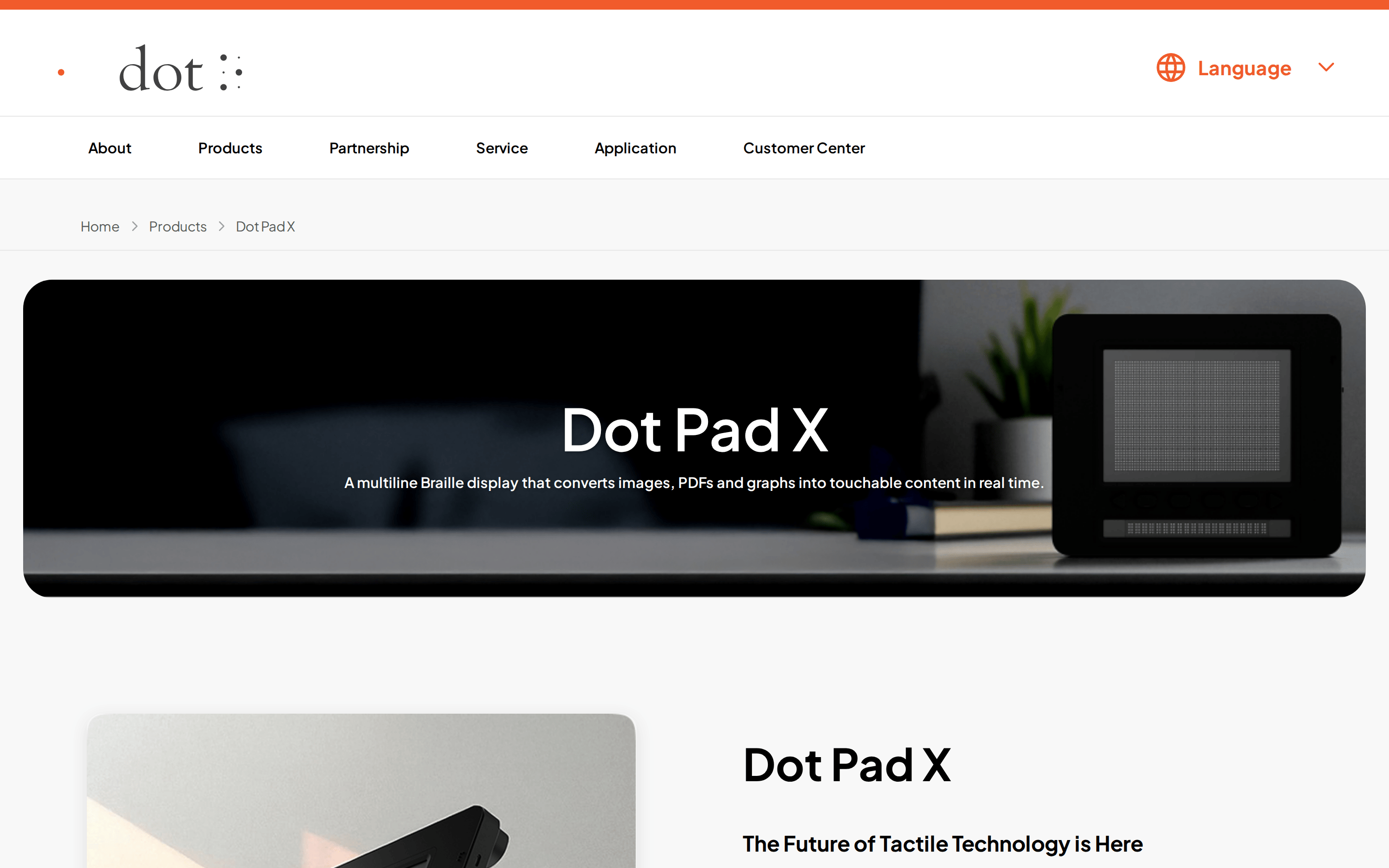
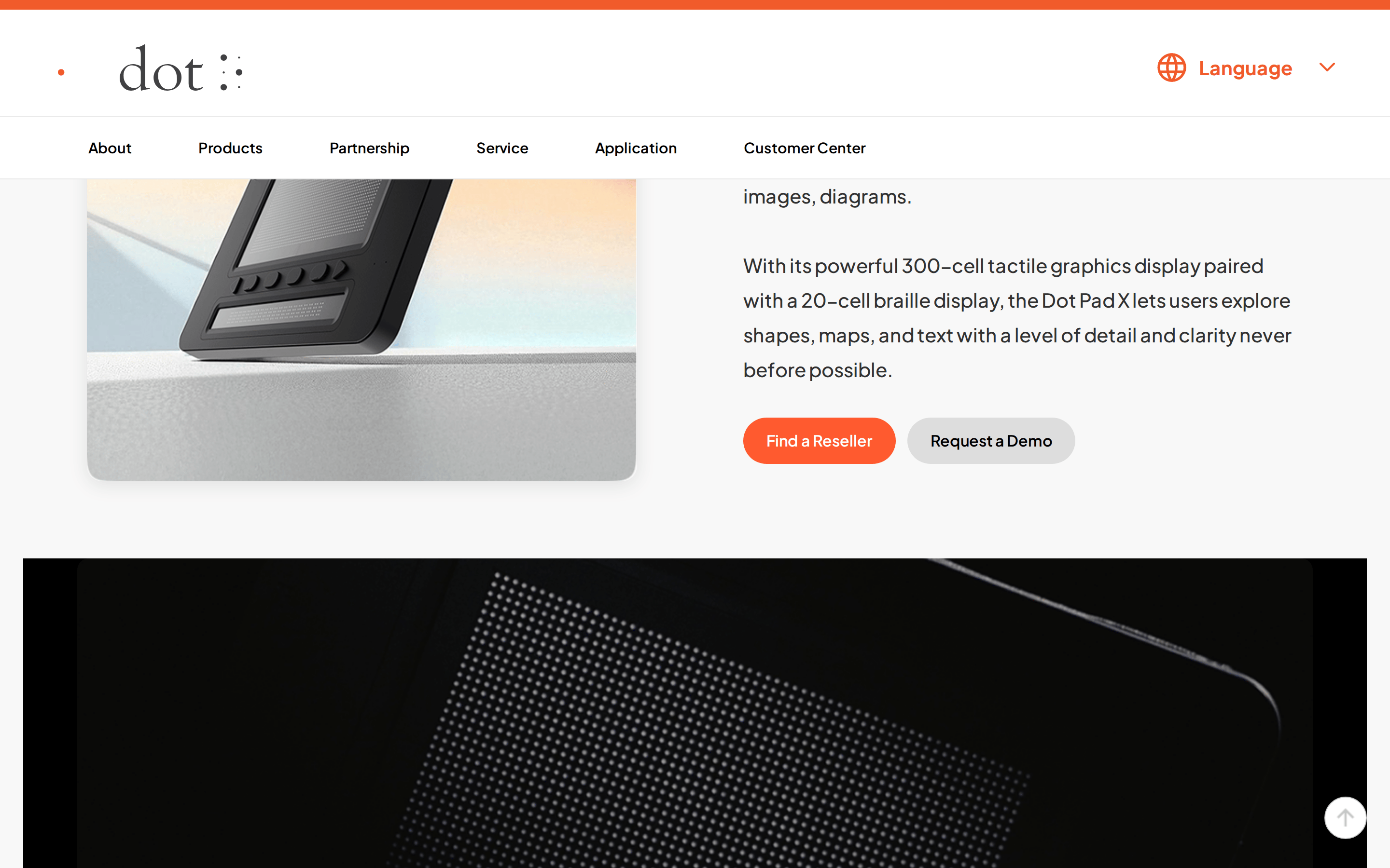
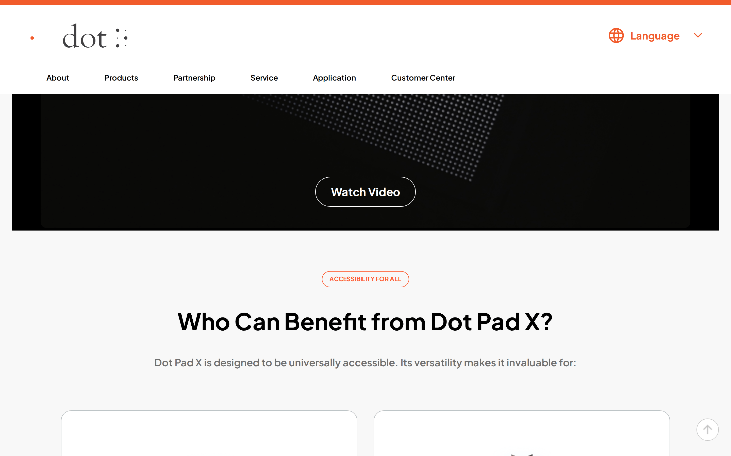
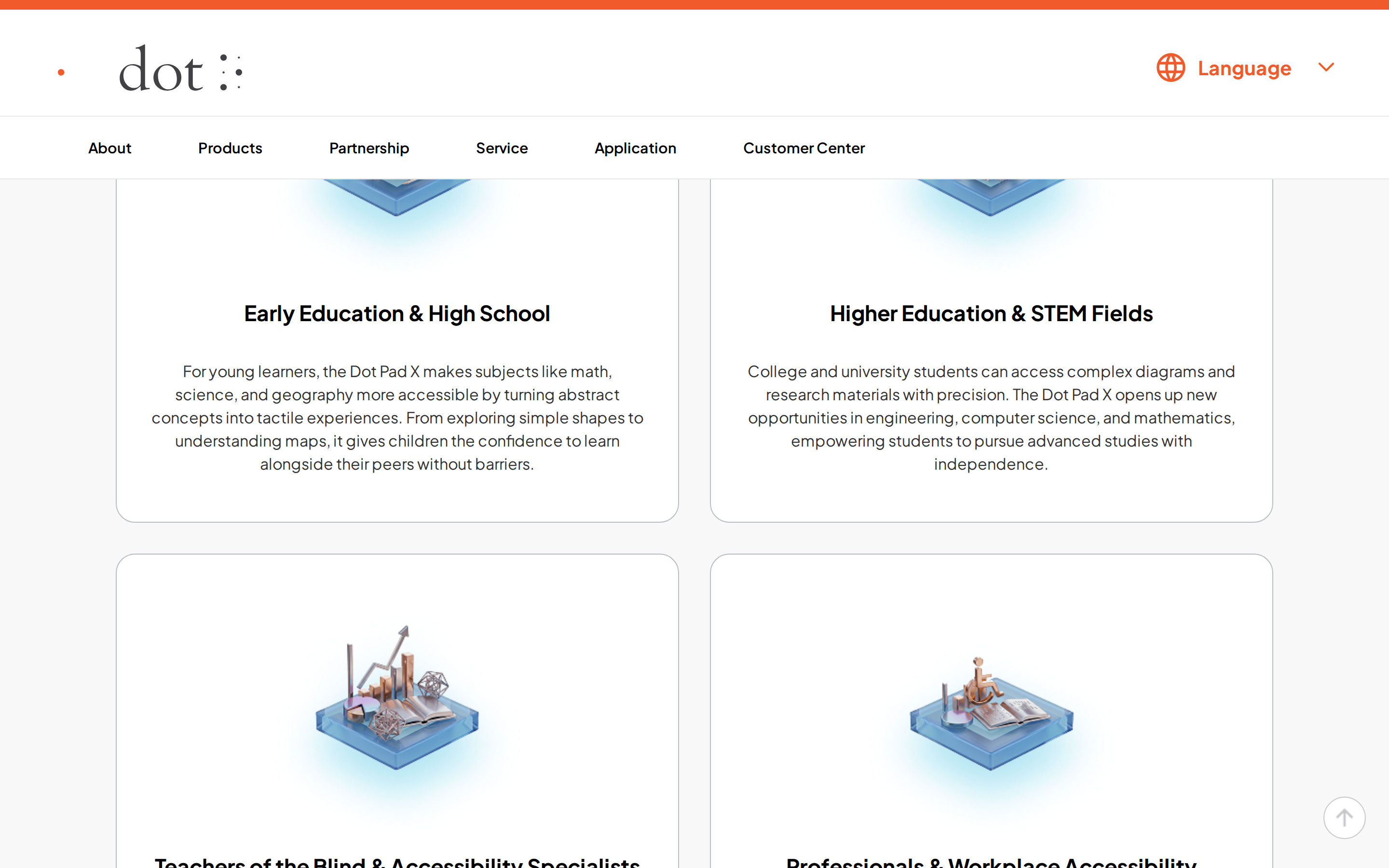
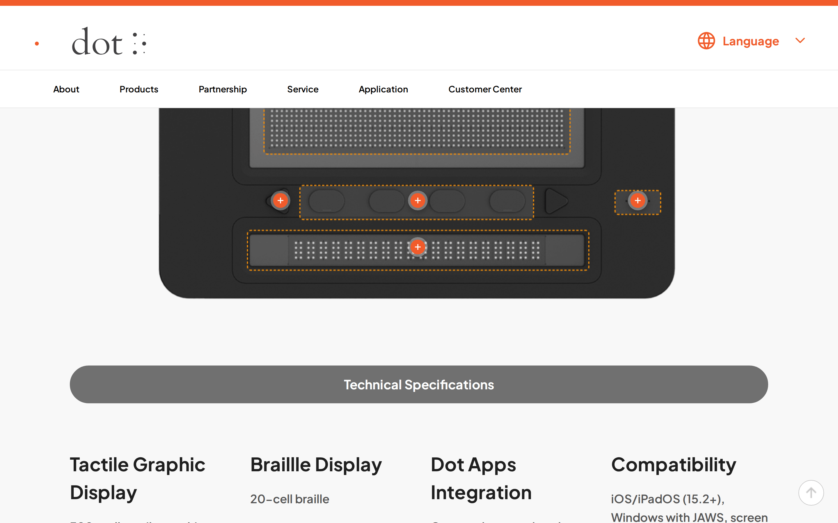
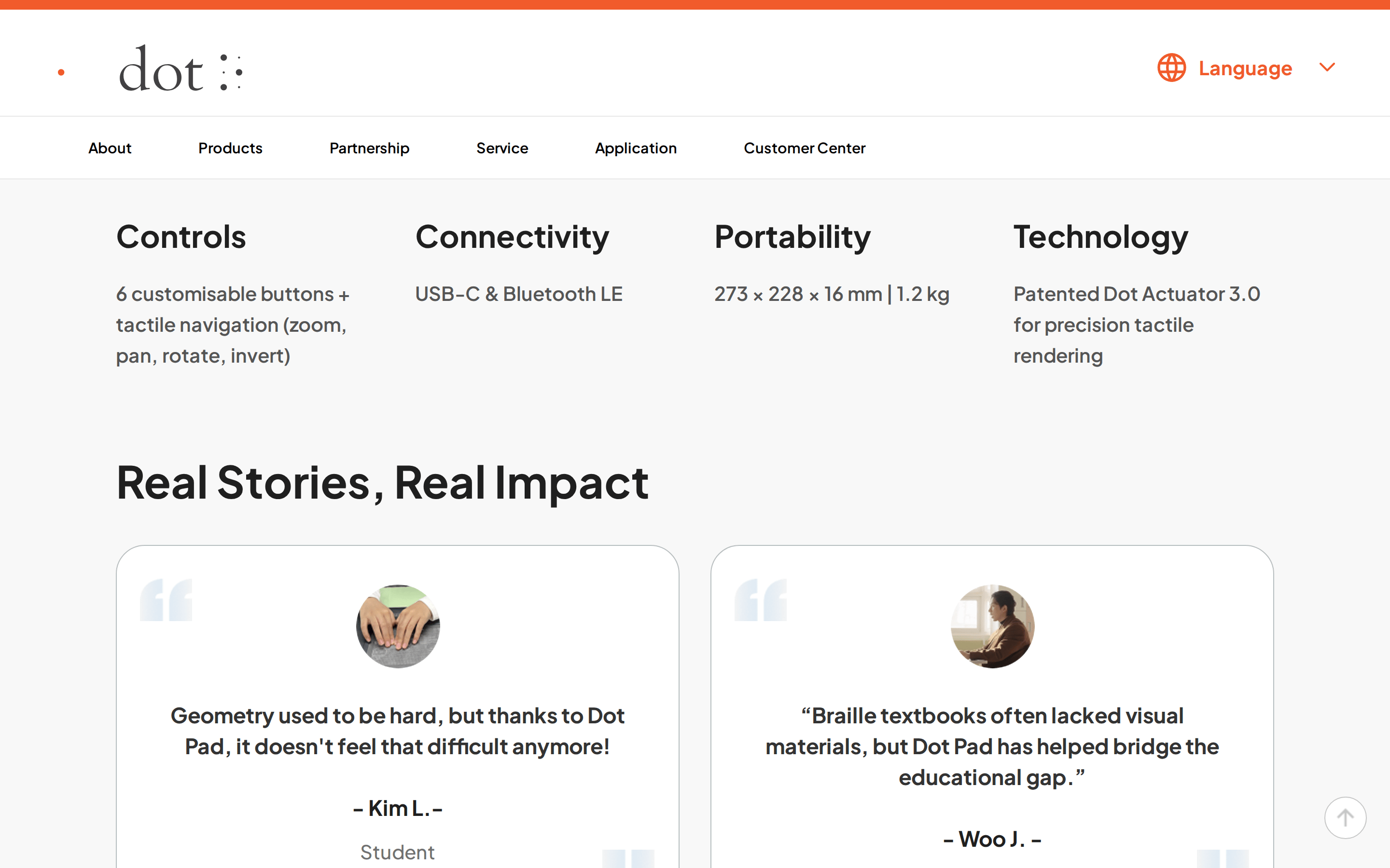
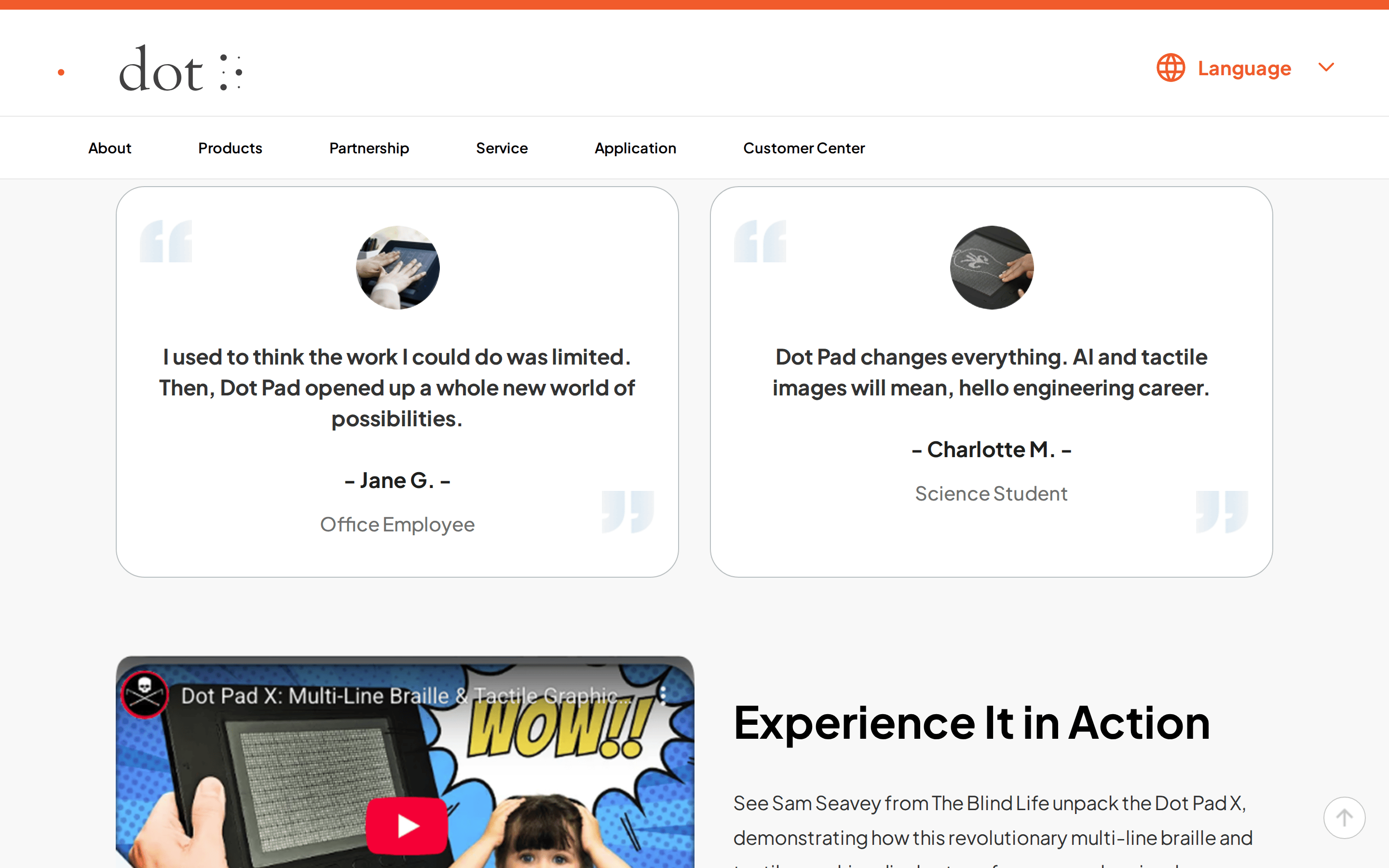
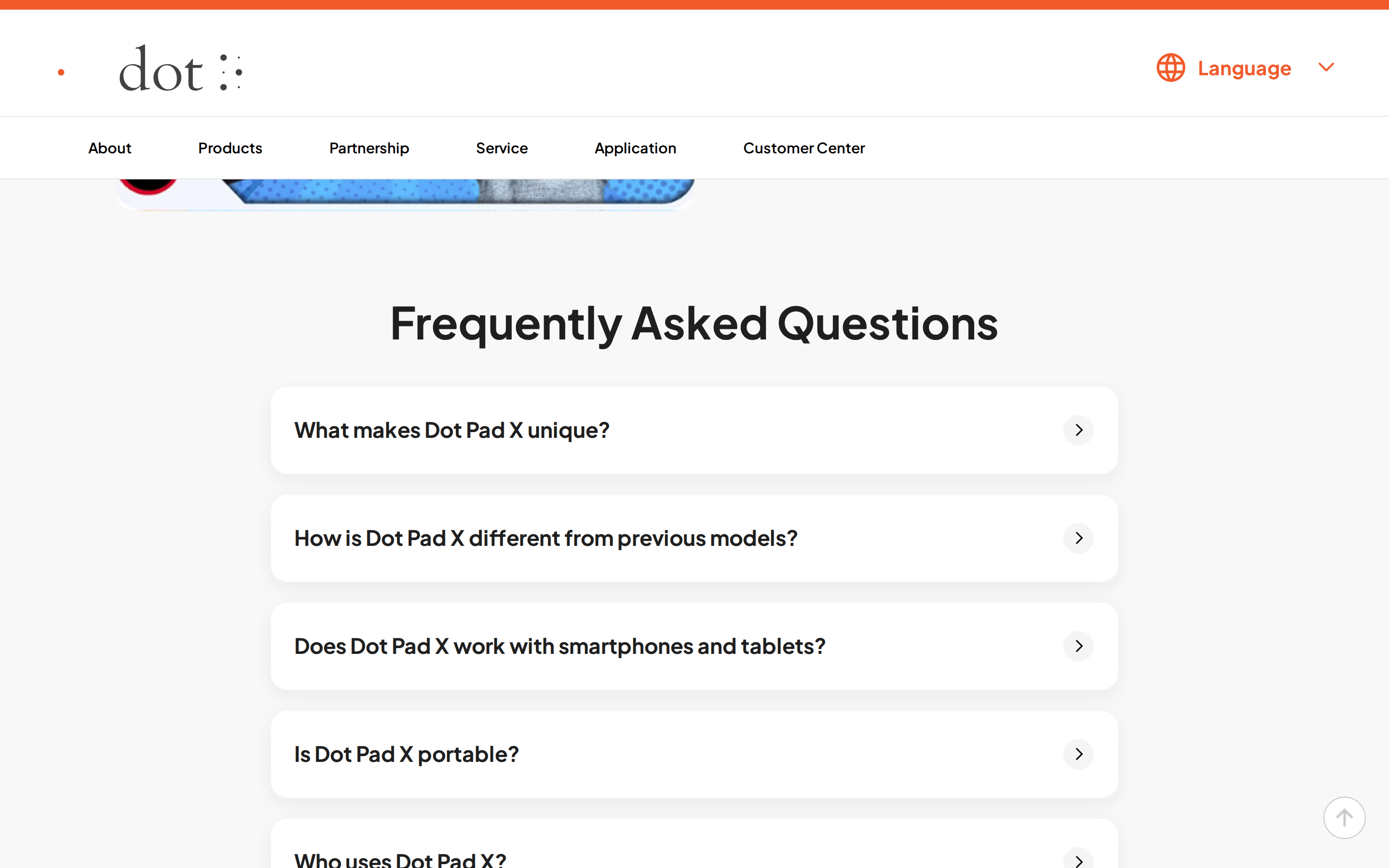
Inside the pack — real screenshots
桌面首屏(hero) 桌面滚动分段(90% viewport 步进,作为视觉证据) 桌面滚动分段(90% viewport 步进,作为视觉证据) 桌面滚动分段(90% viewport 步进,作为视觉证据) 桌面滚动分段(90% viewport 步进,作为视觉证据) 桌面滚动分段(90% viewport 步进,作为视觉证据) 桌面滚动分段(90% viewport 步进,作为视觉证据) 桌面滚动分段(90% viewport 步进,作为视觉证据) 桌面滚动分段(90% viewport 步进,作为视觉证据) 桌面滚动分段(90% viewport 步进,作为视觉证据) 桌面滚动分段(90% viewport 步进,作为视觉证据) 桌面滚动分段(90% viewport 步进,作为视觉证据) 桌面滚动分段(90% viewport 步进,作为视觉证据) 桌面滚动分段(90% viewport 步进,作为视觉证据) 桌面滚动分段(90% viewport 步进,作为视觉证据) 桌面滚动分段(90% viewport 步进,作为视觉证据) 桌面滚动分段(90% viewport 步进,作为视觉证据) 移动首屏 Captured from the live site · real computed styles
11
System prompt
This design is a clean, professional product showcase for an assistive technology device. It uses a high-contrast palette of white (#FFFFFF), near-black (#1F1F1F), and a single high-chroma orange accent (#FF5A2F). The typography is a humanist sans-serif at a 15px base, with bold weights (600-700) for headings and navigation. Key interactions are subtle, with 0.3s transitions on hover. Critical constraints include maintaining a predominantly white background, using rounded corners (18px-20px) for major surfaces, and avoiding decorative fonts or busy layouts.
More from the library en · zh-CN · zh-TW · ja · ko
OpenDesign · curated web aesthetics for AI-readable design DNA · opendesign.cc
Why we curated this: A great example of a clean, accessible hardware product page that prioritizes clarity and function.