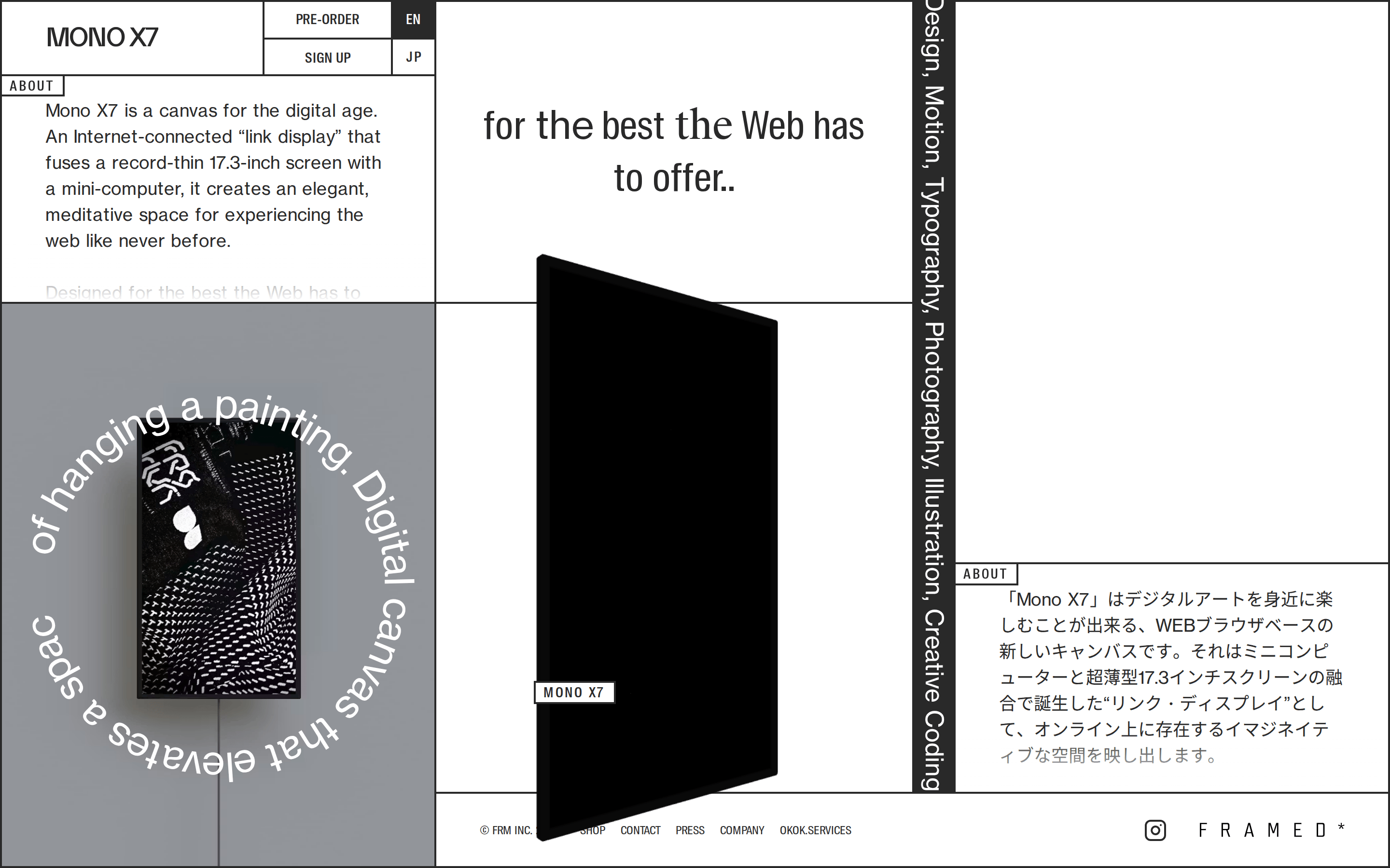
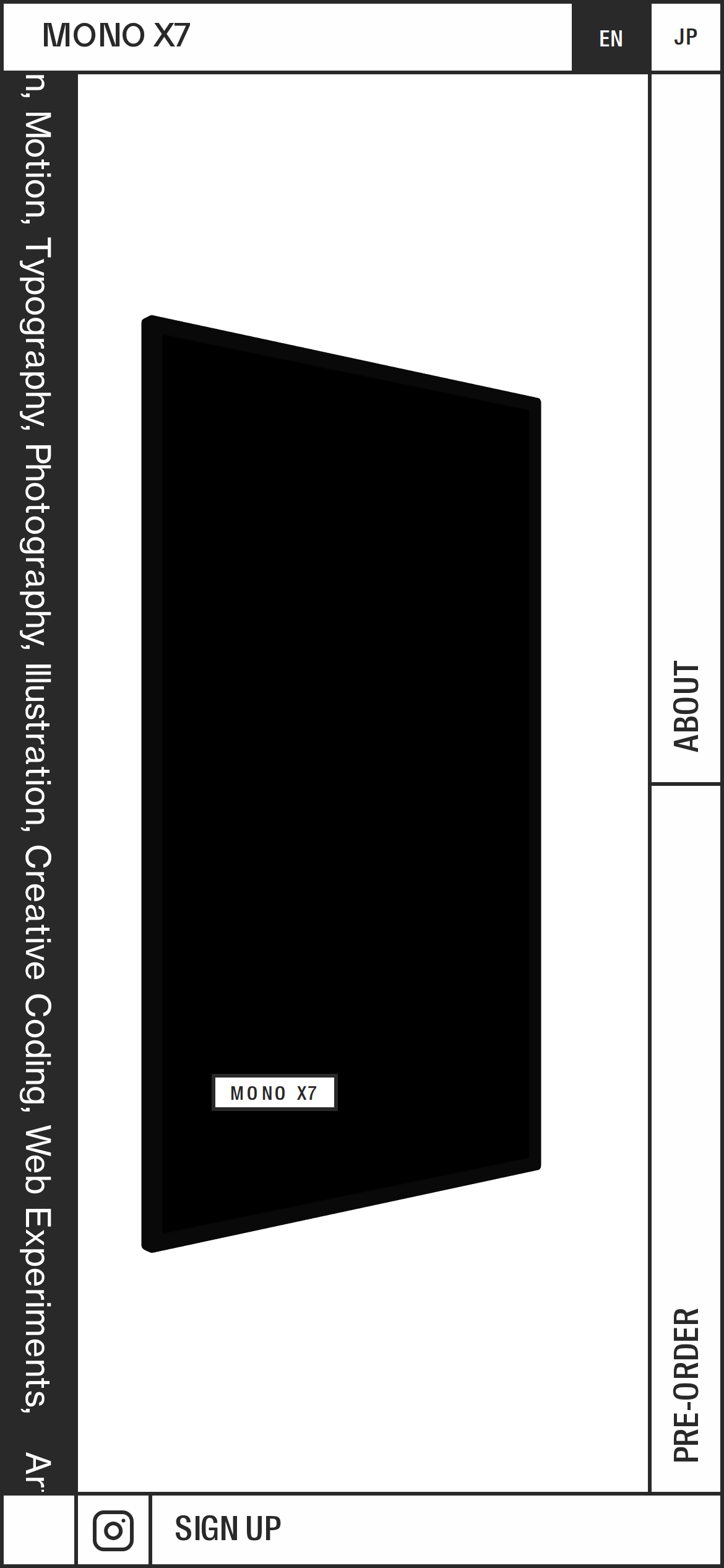
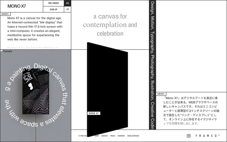
A gallery exhibition catalog for a piece of modern hardware.
02
Color
#292929Ink
#FFFFFFBG
#FEFEFEBG soft
rgba(41,41,41,1)Line
High-contrast monochromatic palette with sharp black borders defining the grid.
03
Typography
grotesque-sans · humanist-sans
display43px · 300
heading39px · 300
subhead25px · 300
body16px · 300
caption12px · 300
Use light font weights (300) for almost all text, including headlines. · Use uppercase for buttons and labels. · Maintain tight vertical rhythm with generous line-heights.
04
Spacing
4px
8px
16px
24px
32px
48px
64px
96px
A consistent 4px base grid governs all spacing, with large padding blocks for the main grid cells.
05
Surfaces
sm · 0px
md · 0px
lg · 0px
pill · 0px
2px solid #292929
06
Layout
1920container
12columns
768 / 1024breakpoints
Strict, asymmetric CSS Grid with heavy 2px black borders separating every single element.
07
Motion & Interaction
220msmicro
300mssmall
600msmedium
cubic-bezier(0.55, 0.085, 0.68, 0.53)easing
Rotating circular text animation · Smooth height transitions for content reveals
Minimal visual feedback; interactions are focused on revealing content rather than state changes. · Triggers content expansion or navigation.
08
Components
buttonMinimalist outline button with no border-radius, uppercase text, and light font weight.
cardStrictly rectangular containers defined by the layout grid borders, no drop shadows or rounded corners.
heroA multi-panel asymmetric layout combining a product shot, descriptive text, and a rotating circular text element.
09
Voice & Don'ts
ToneContemplative, elegant, and refined.
HeadlinesPoetic and aspirational, using light font weights.
CTAsDirect, uppercase, and understated.
Don't use rounded corners — screenshot shows sharp 90-degree edges on all elements.
Don't use drop shadows — screenshot relies entirely on solid borders for depth.
Don't use bold font weights — screenshot uses exclusively light (300) weights.
Don't use vibrant accent colors — screenshot adheres to a strict monochrome palette.
Don't use organic or asymmetrical padding — screenshot uses rigid 4px-based grid spacing.
Don't use fluid or gradient backgrounds — screenshot uses solid #FFFFFF and #292929 blocks.
Captured from the live site · real computed styles
11
System prompt
A premium hardware showcase website for the Mono X7 display. The design DNA is a strict, gallery-like grid system defined by 2px solid black borders (#292929) on a pure white background (#FFFFFF). Typography relies on light-weight grotesque and humanist sans-serif categories, using uppercase for navigation and labels. The layout is an asymmetric, multi-panel grid with large containers and no rounded corners or drop shadows. Key critical donts: 1) Never use rounded corners or soft radii. 2) Avoid any use of bold font weights (keep everything at 300). 3) Do not introduce colorful accents or gradients; stick to the monochrome palette. 4) Avoid complex shadows; use solid borders to define depth and structure.
Bring this taste to your agent
Hand your AI agent a machine-readable spec of this design — tokens, type, motion, the whole DNA.