High-contrast, monochromatic palette that lets photography dominate.
03
Typography
grotesque-sans
display72px · 500
h148px · 500
body15px · 400
Use MediumLLWeb (grotesque-sans) as the primary typeface · Apply uppercase transformation to navigation and labels · Maintain a consistent, wide letter-spacing for body text
04
Spacing
4px
8px
12px
16px
24px
32px
48px
64px
96px
Consistent 4px base unit for all spacing and sizing
05
Surfaces
sm · 0px
md · 4px
lg · 0px
pill · 999px
1px solid #000000
0px 2px 80px 1px rgba(0,0,0,0.2)
06
Layout
1280container
12columns
24pxgutter
768 / 1024breakpoints
Full-width imagery with centered content blocks and a top-aligned navigation bar.
07
Motion & Interaction
220msmicro
400mssmall
800msmedium
cubic-bezier(0.25, 0.1, 0.25, 1.0)easing
Fade-in and slide-up for content loading · Smooth transitions for hover states on navigation and buttons
Subtle color change or opacity shift on interactive elements. · Immediate visual feedback with no significant animation.
08
Components
buttonMinimalist outline and solid buttons with sharp corners.
cardNo border-radius, image-driven cards with a focus on photography.
chipSimple, uppercase text labels with minimal styling.
inputClean input fields with 1px solid borders.
heroFull-screen photographic background with centered text overlay.
09
Voice & Don'ts
ToneSophisticated, understated, and authoritative.
HeadlinesShort, impactful, and often uppercase.
CTAsDirect and action-oriented (e.g., '→ DISCOVER NOW').
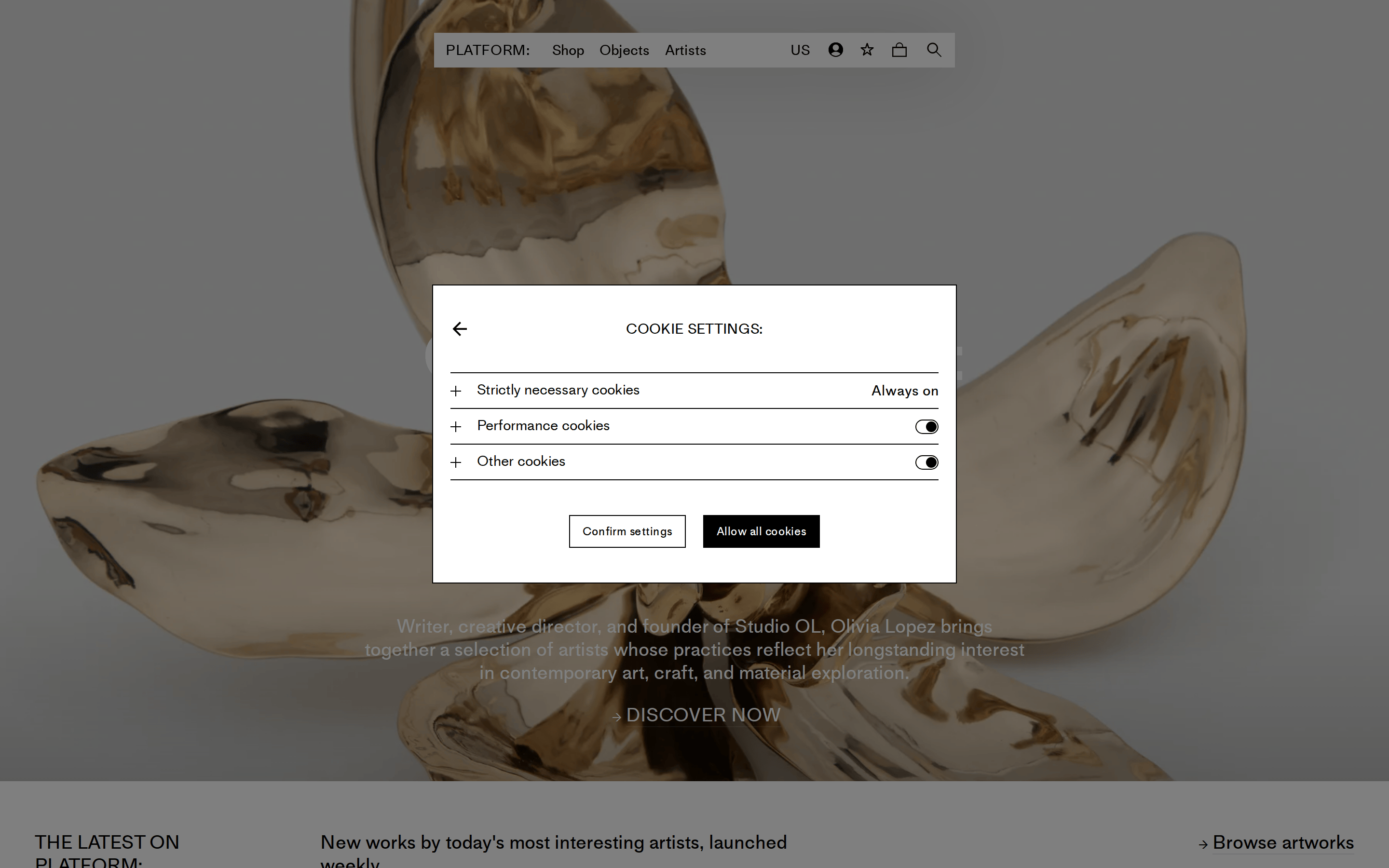
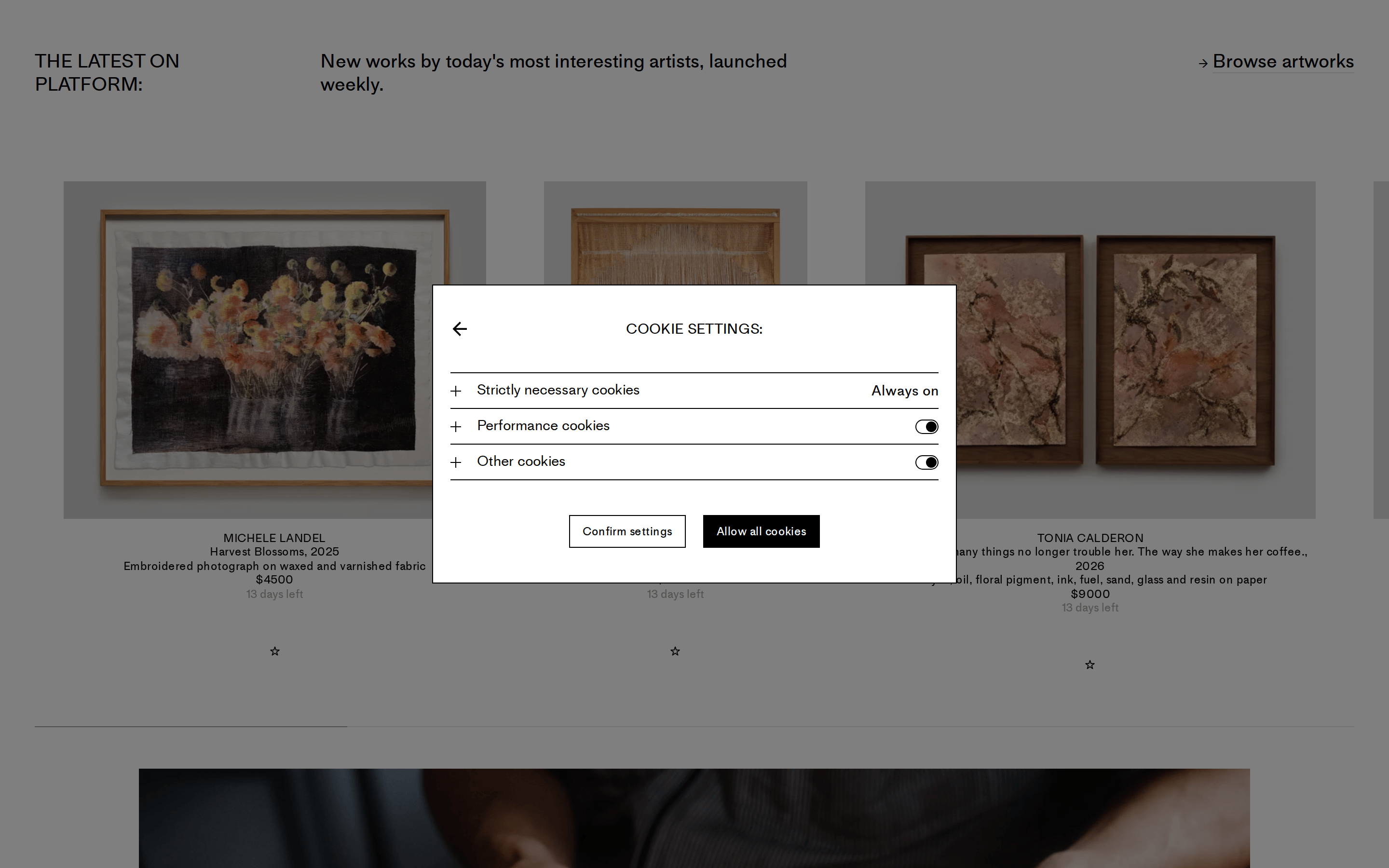
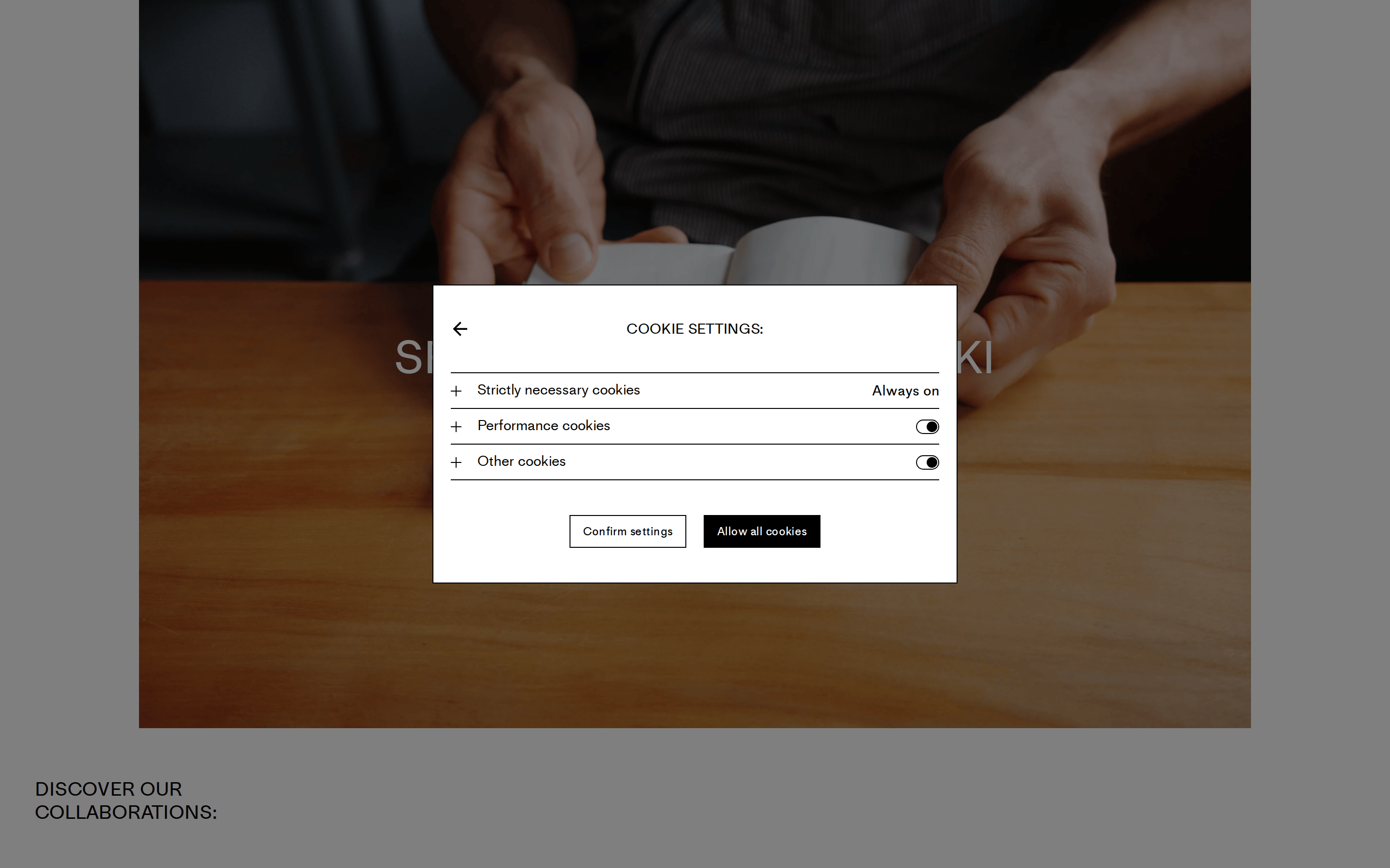
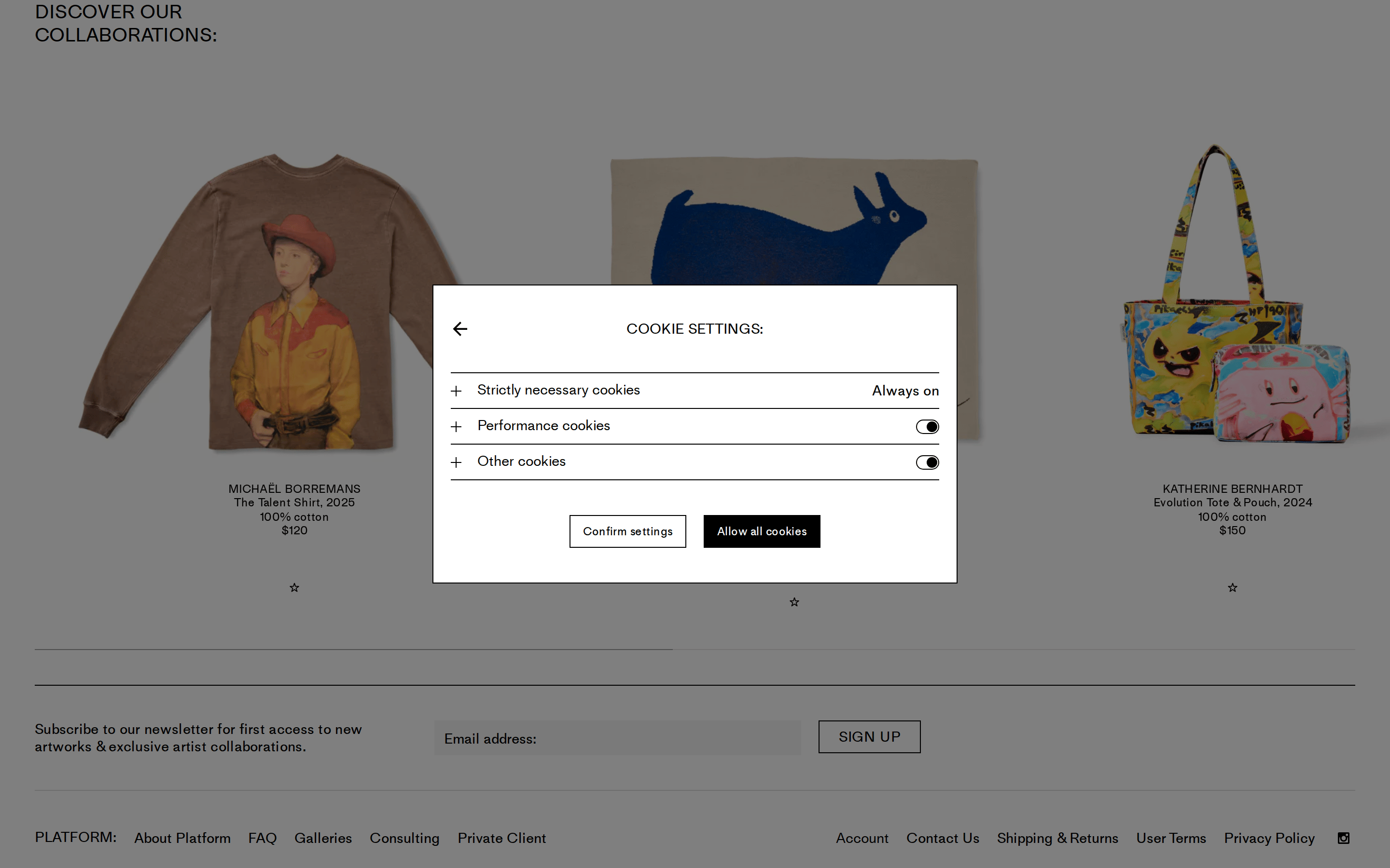
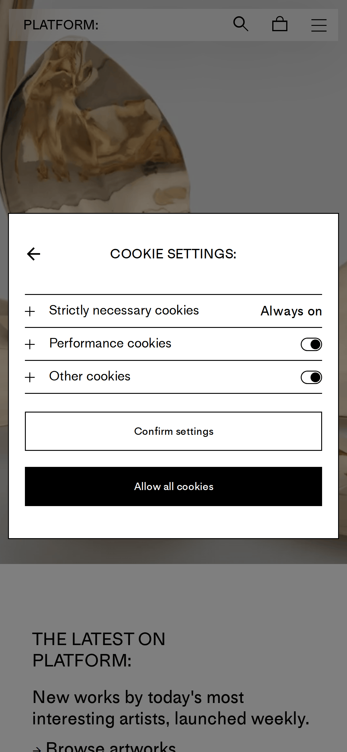
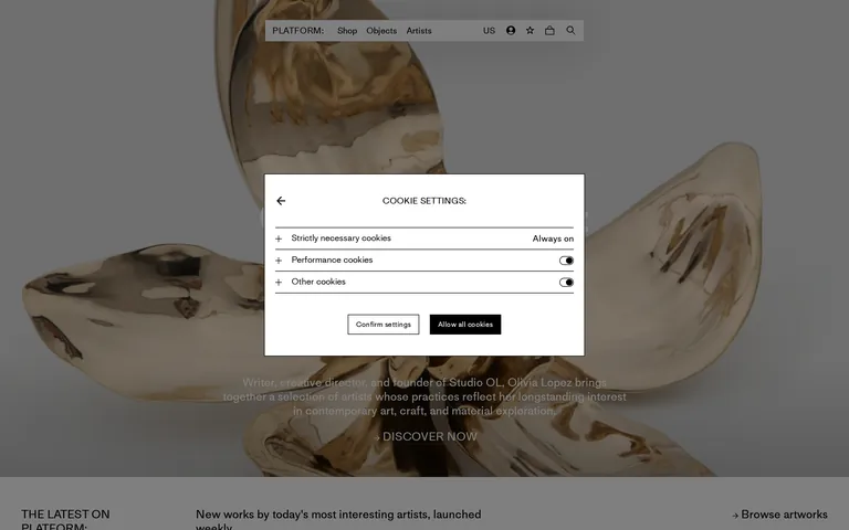
Don't use rounded corners on containers or buttons — screenshot shows sharp, square edges.
Don't use multiple brand colors — screenshot shows a strictly monochromatic black/white palette.
Don't use serif fonts — screenshot shows a consistent use of MediumLLWeb (grotesque-sans).
Don't use drop shadows on all elements — screenshot shows a single, very large shadow on the cookie modal.
Don't use small, cramped spacing — screenshot shows generous padding and clear visual hierarchy.
Don't use lowercase for navigation — screenshot shows 'PLATFORM:', 'Shop', 'Objects', 'Artists' in a specific mixed-case/uppercase style.
Avoid: Don't use excessive exclamation points
Avoid: Don't use overly casual or slang language
Avoid: Don't clutter the interface with unnecessary elements
Captured from the live site · real computed styles
11
System prompt
This is a premium art platform (platformart.com) with a minimalist, editorial design. The site uses a strict monochromatic palette of black (#000000) and white (#FFFFFF), with a secondary gray (#AAAAAA) for muted text. The primary font is a grotesque sans-serif (MediumLLWeb). Navigation is top-aligned with uppercase labels. The layout is centered on large-scale photography with generous spacing (4px base unit). Key features include full-screen hero images, a sharp-cornered cookie settings modal with a distinct drop shadow, and minimal UI components. Avoid rounded corners, multiple colors, or serif typography. The voice is sophisticated and understated, with direct calls to action.
Bring this taste to your agent
Hand your AI agent a machine-readable spec of this design — tokens, type, motion, the whole DNA.