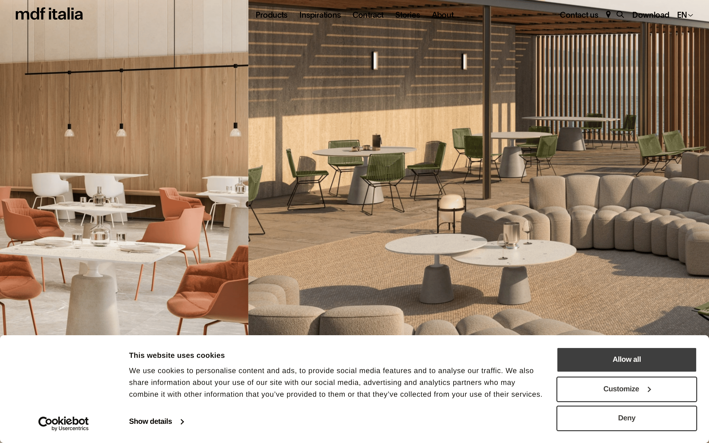
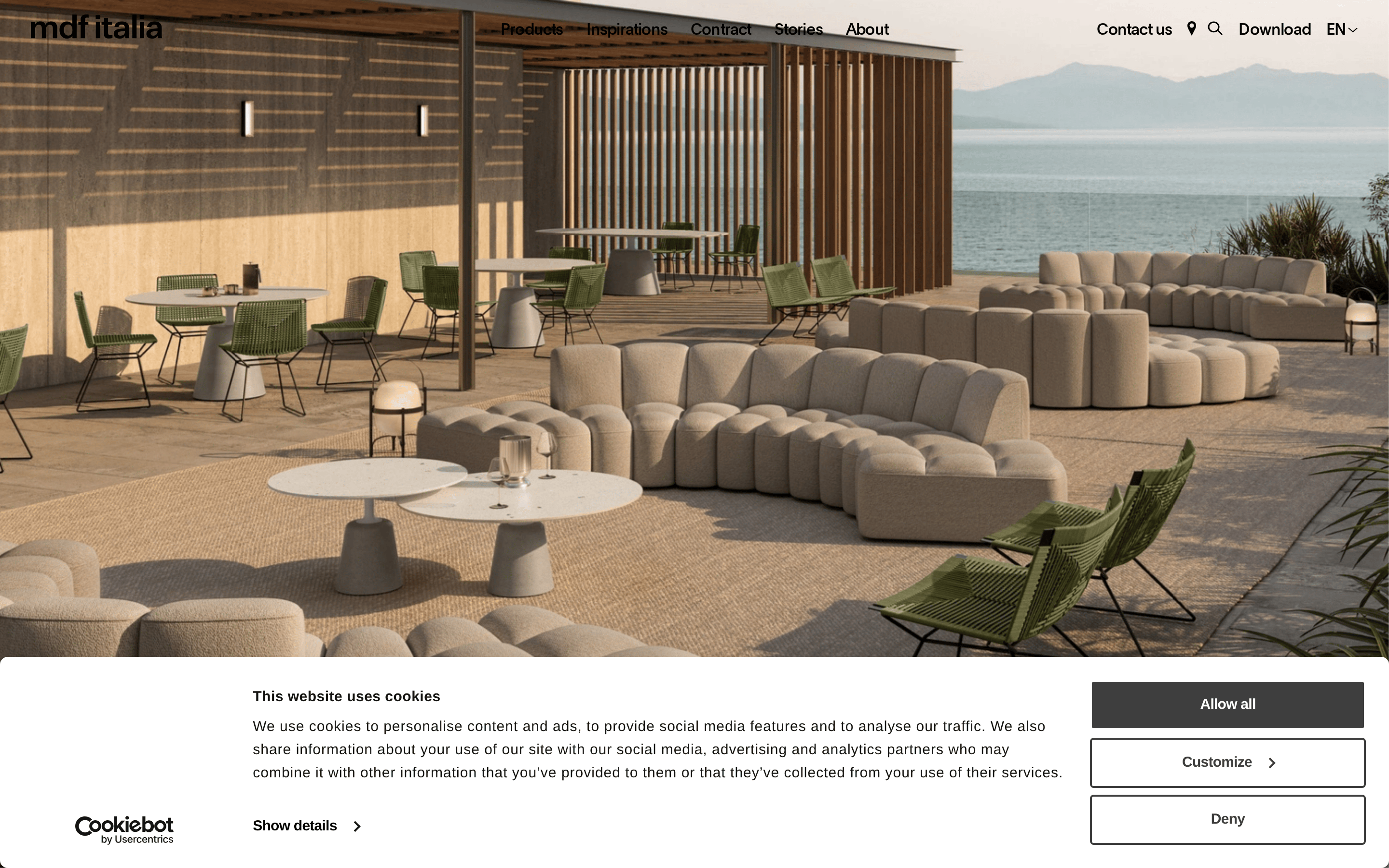
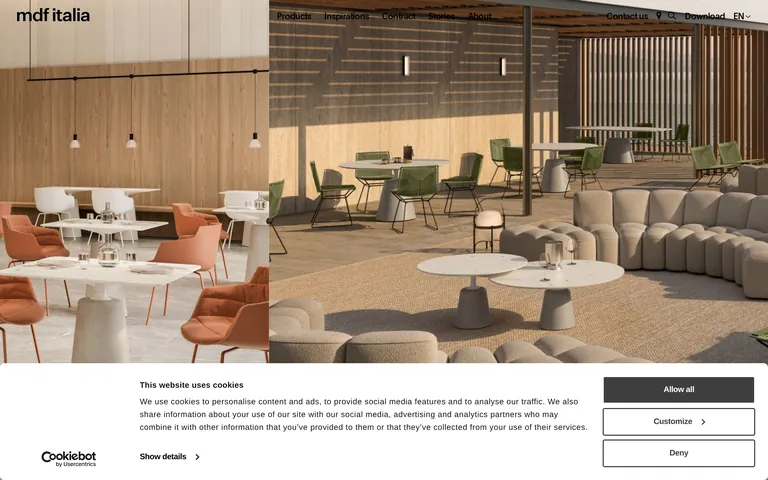
A serene, high-end furniture showroom that prioritizes atmospheric photography over cluttered UI.
02
Color
#000000Ink
#141414Ink soft
#FFFFFFBG
#F6F6F6BG soft
#3E3E3EMuted
rgba(229, 231, 235, 1)Line
A high-contrast, neutral palette that lets the product photography dictate the visual warmth.
03
Typography
geometric-sans
display100px · 500
heading50px · 500
subheading24px · 500
body16px · 500
small15px · 400
Headings use tight tracking (e.g., -0.4px to -1px) for a refined, modern look. · Body text weight is predominantly 500, creating a denser, more structured feel than standard regular weight.
04
Spacing
4px
8px
16px
24px
32px
48px
64px
96px
A tight, efficient spacing system that prioritizes compact layout over generous whitespace.
A full-bleed photography layout with a clean, top-aligned navigation and minimal UI elements.
07
Motion & Interaction
200msmicro
300mssmall
500msmedium
cubic-bezier(0.4, 0, 0.2, 1)easing
Smooth opacity and transform transitions for subtle UI interactions.
Subtle opacity changes or minor spatial shifts to indicate interactivity without distracting from the imagery. · Immediate, clean feedback with no heavy animation.
08
Components
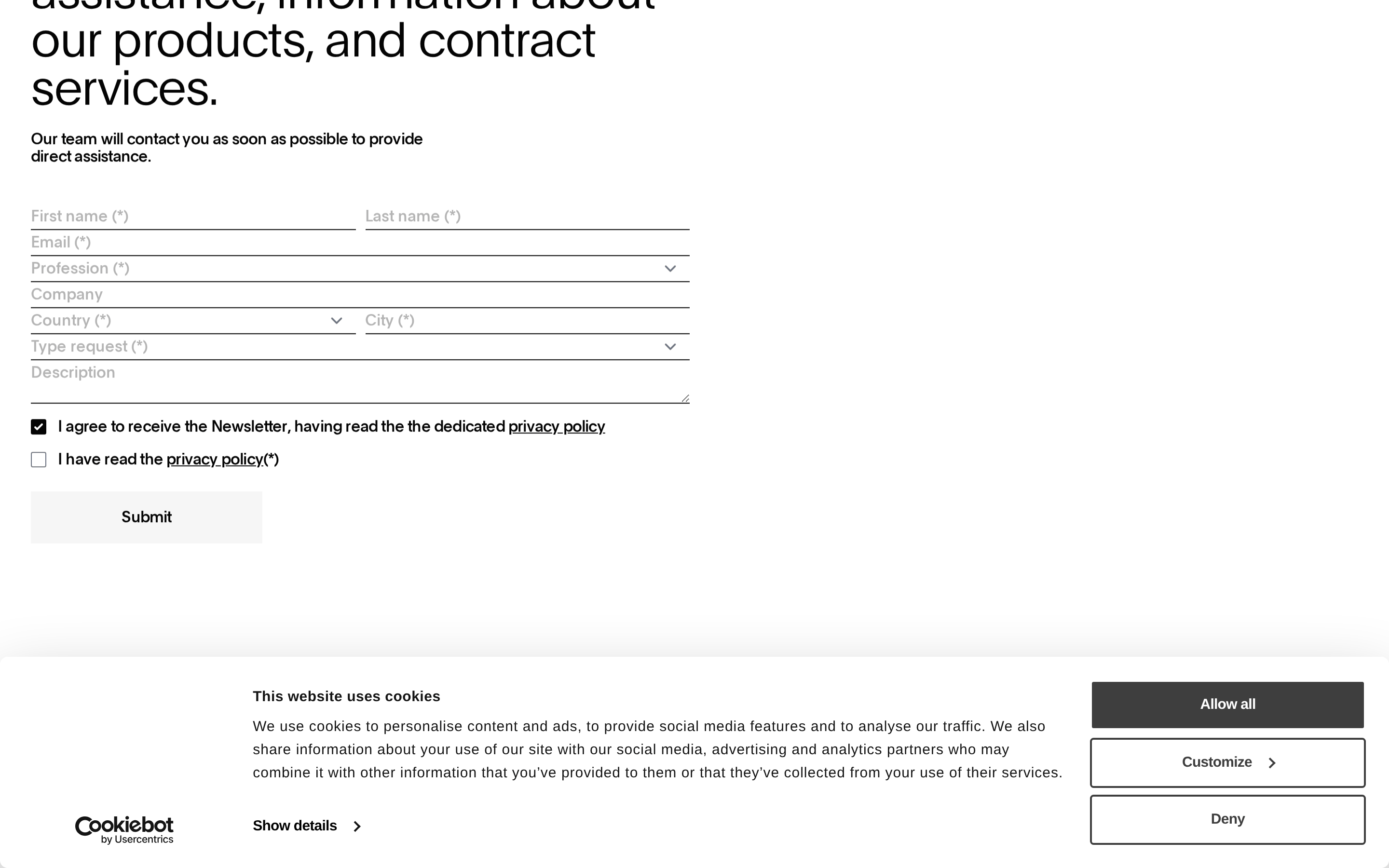
buttonMinimalist, often borderless or outlined buttons with precise, small padding and tight tracking.
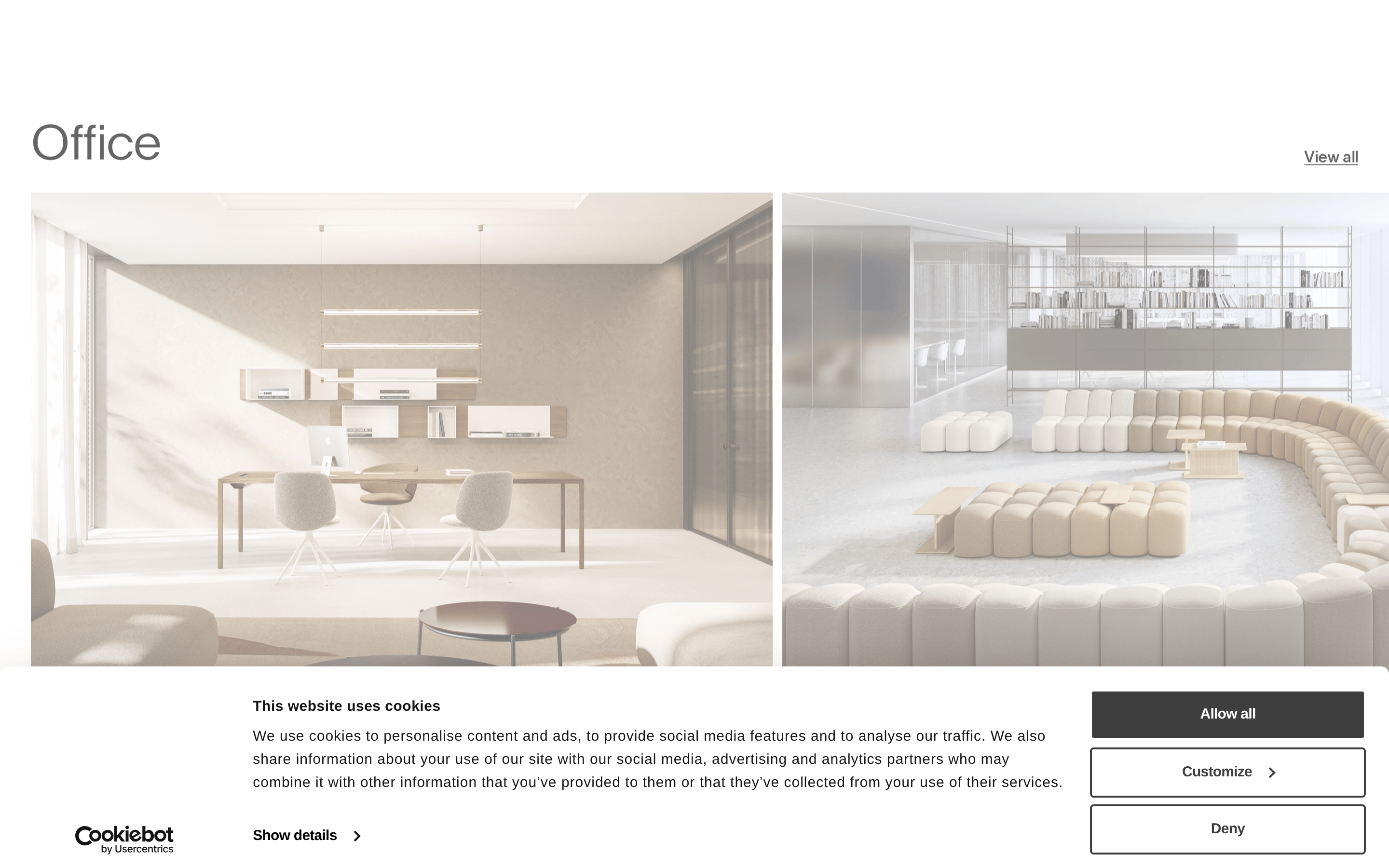
cardClean, borderless cards that rely heavily on high-quality photography with tight text overlays.
inputMinimal form inputs with thin, subtle borders and no background fill.
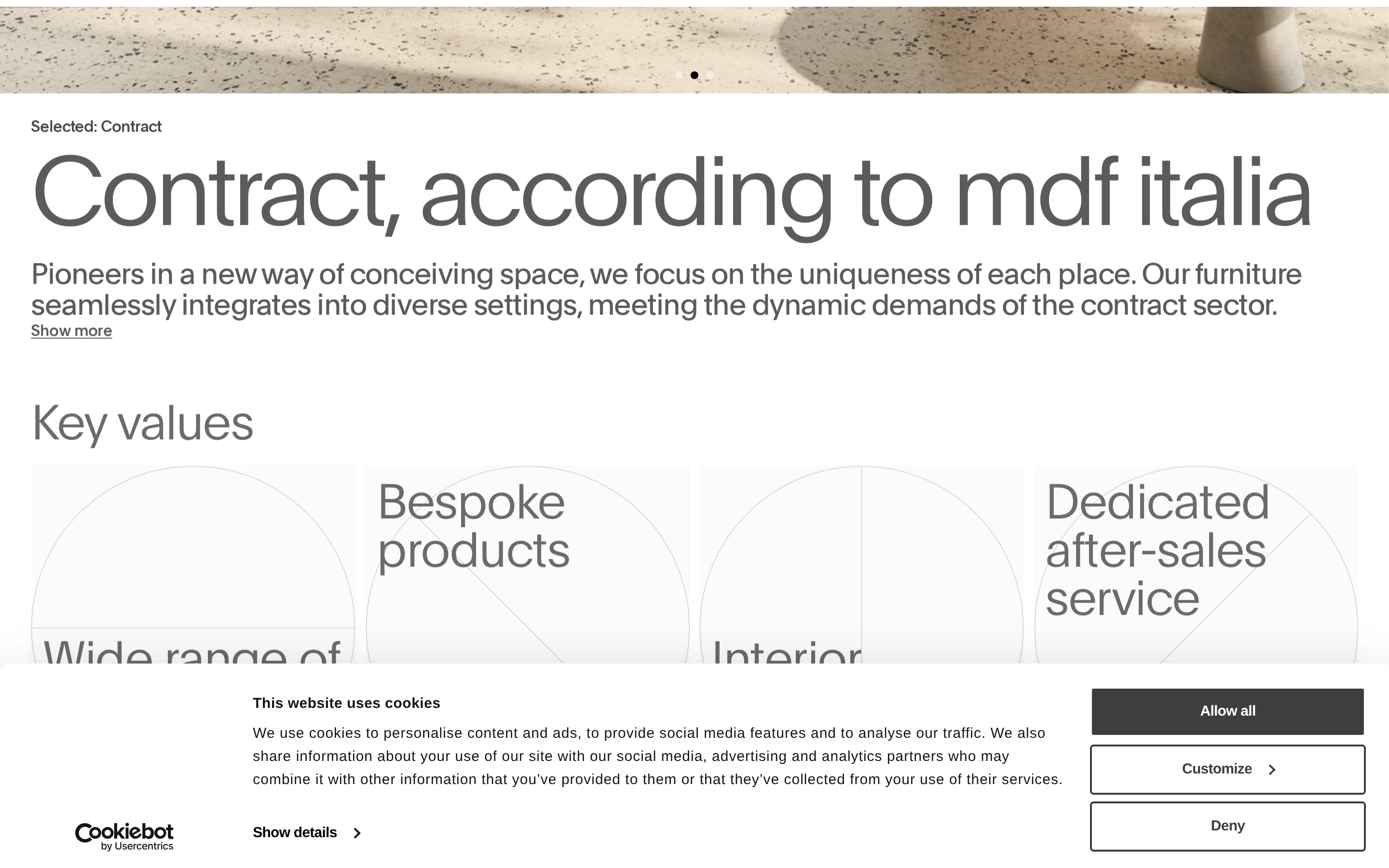
heroA dominant, full-viewport photographic hero that sets an atmospheric, immersive tone.
09
Voice & Don'ts
ToneSophisticated, professional, and understated, letting the product speak for itself.
HeadlinesConcise, modern, and heavily reliant on strong visual photography to convey the message.
CTAsDirect and unobtrusive, often presented as simple text links or minimal outlined buttons.
Don't use bright primary colors — screenshot shows a strictly monochrome base palette.
Don't use heavy, ornate borders — screenshot shows borderless or very thin, subtle dividers.
Don't use overly wide or loose letter-spacing — screenshot shows tight tracking on all headings.
Don't use large, busy UI patterns — screenshot shows a restrained, photography-focused layout.
Don't use heavy drop shadows on cards — screenshot shows very subtle, soft elevation shadows.
Don't use playful, rounded UI elements — screenshot shows sharp, clean, rectangular or minimally rounded components.
Avoid: Avoid bright, saturated accent colors that clash with the product photography.
Avoid: Avoid heavy drop shadows or complex UI decorations that distract from the layout's minimalism.
Avoid: Avoid overly decorative or script typefaces that conflict with the geometric sans-serif system.
Captured from the live site · real computed styles
11
System prompt
This design is for a premium furniture contract website, prioritizing atmospheric, full-bleed photography over complex UI. The palette is strictly monochrome, using #FFFFFF and #F6F6F6 for backgrounds, #000000 for primary text, and #3E3E3E for muted elements. Typography uses a clean, geometric sans-serif with tight negative letter-spacing for a sophisticated, modern feel. Critical donts include avoiding bright accent colors, avoiding heavy UI borders or drop shadows, and avoiding loose or playful typography. The layout is expansive and clean, letting the product imagery dominate the visual hierarchy.
Bring this taste to your agent
Hand your AI agent a machine-readable spec of this design — tokens, type, motion, the whole DNA.