← OpenDesign CURATED · OPEN · FREE
Guillermo Rauch
A hyper-clean, typography-driven personal archive of a prominent tech figure.
portfolio dev
01
Identity DNA
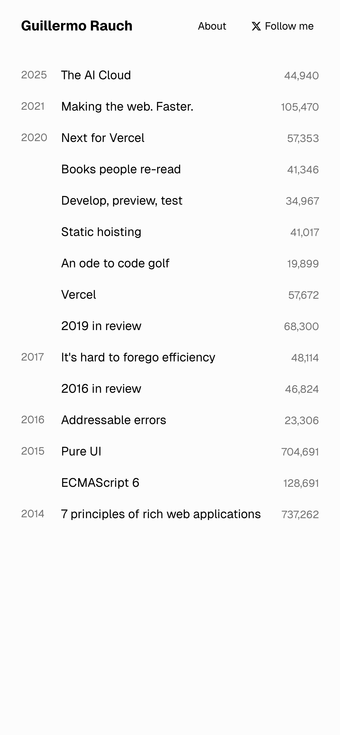
Personal Developer Portfolio Blog Chronological
A minimalist technical journal or a clean, academic reading list.
02
Color
#000000Ink
#fcfcfcBG
#737373Muted
rgba(229,231,235,1)Line
Extreme restraint using high-contrast black-on-white with subtle gray for metadata.
03
Typography
geometric-sans · monospace
display 18px · 700body 14px · 400caption 12px · 40004
Spacing
4px
8px
16px
24px
32px
48px
64px
96px
Strict vertical spacing based on 4px increments, primarily using 8px and 24px for list items and sections.
05
Surfaces
sm · 2px
md · 8px
lg · 12px
pill · 999px
Subtle 1px solid borders used primarily on tags, defined by rgb(229,231,235).
06
Layout
900 container
12 columns
24px gutter
768 / 1024 breakpoints
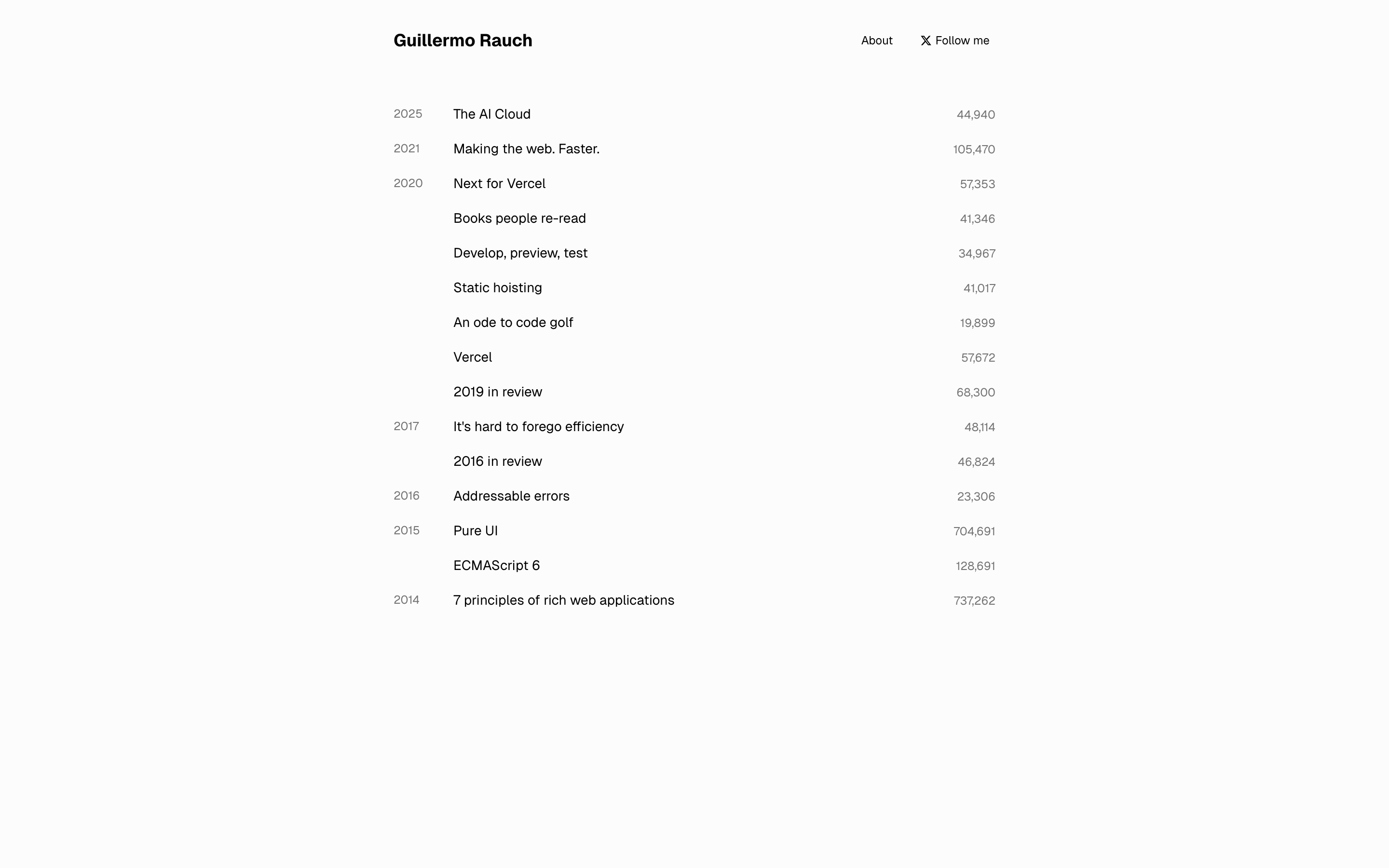
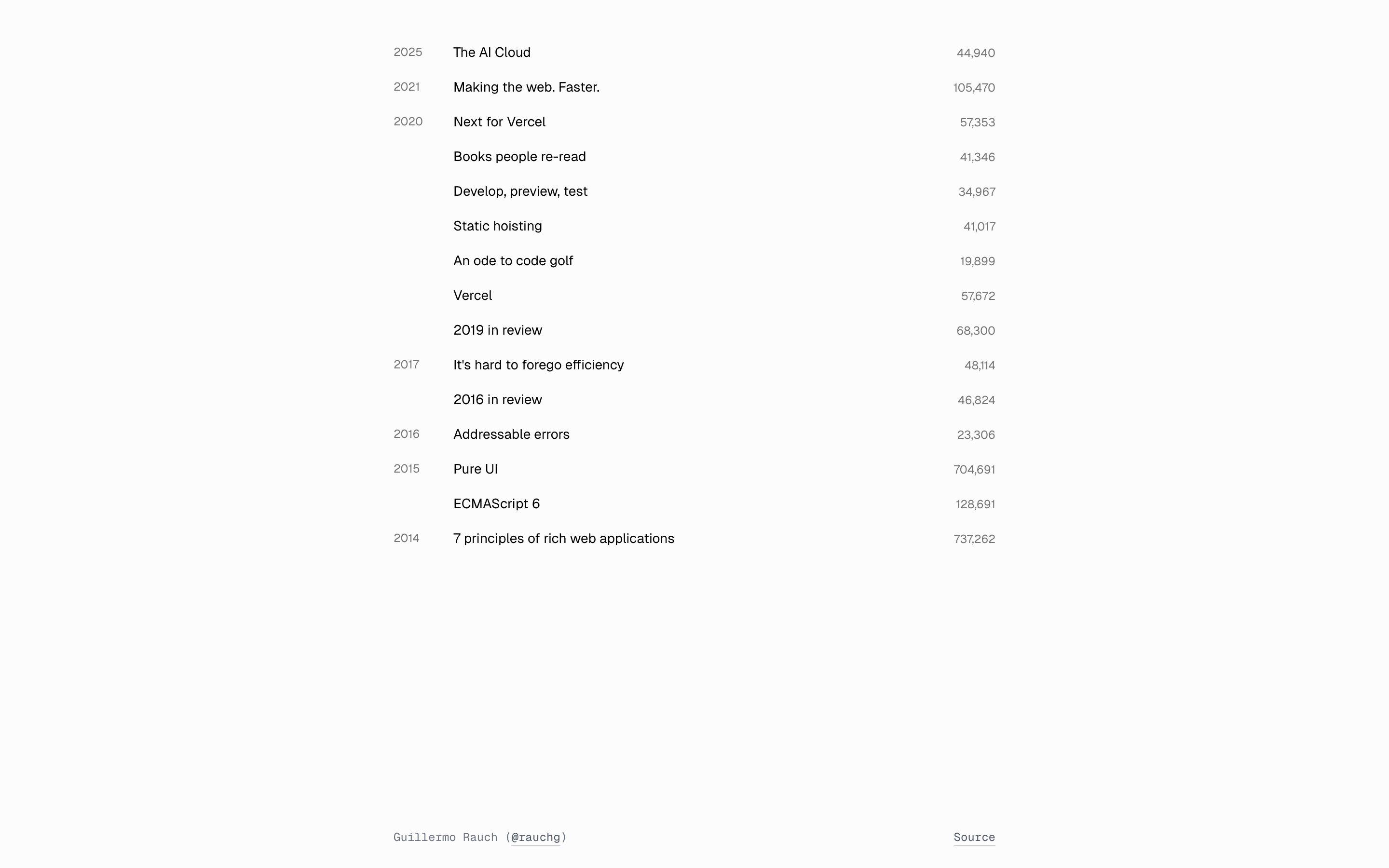
A strict 3-column table-like layout for the list items: year (left), title (center), count (right).
07
Motion & Interaction
150ms micro
150ms small
150ms medium
cubic-bezier(0.4, 0, 0.2, 1) easing
Subtle transitions on all elements (0.15s) for hover states and border-color changes.
Cursor changes to pointer, with a subtle 0.15s transition. · Standard link navigation.
08
Components
button Minimal text links with no visible padding or background unless in a tag format. card A conceptual card formed by a row containing year, title, and count. chip Small pill-shaped tags with 1px border and slight padding, seen in the footer. input No input components visible. hero A simple header with the site title on the left and navigation links on the right. 09
Voice & Don'ts
Tone Professional, direct, and understated. Headlines Simple, bold, and left-aligned. CTAs Subtle text links, often with an icon (like X). don't use multiple colors — screenshot shows a strictly monochromatic black/white/gray palette. don't add drop shadows to cards or containers — screenshot shows a completely flat, shadowless design. don't use decorative borders or heavy dividers — screenshot uses vertical spacing and alignment instead. don't use complex grids or overlapping elements — screenshot shows a rigid, linear, 3-column list layout. don't use bold text excessively — screenshot uses weight 700 only for the main site title. don't use rounded corners on primary containers — screenshot uses sharp edges for the main list. Avoid: Loud marketing language Avoid: Visual clutter Avoid: Decorative imagery 10
Inside the pack — real screenshots
桌面首屏(hero) 桌面滚动分段(90% viewport 步进,作为视觉证据) 桌面滚动分段(90% viewport 步进,作为视觉证据) 移动首屏 Captured from the live site · real computed styles
11
System prompt
This is a hyper-minimalist personal portfolio and blog archive. It uses a strict monochromatic palette: #000000 ink on a #fcfcfc background, with #737373 for muted metadata. The typography is a clean geometric sans-serif (categorized as geometric-sans) at 14px body and 12px for metadata. The layout is a centered, narrow container with a rigid 3-column list structure (year, title, count). Critical donts: Do not use accent colors, add shadows, or use rounded corners on main containers. Do not use decorative borders or complex grids. Do not use bold text anywhere except the site title. The voice is direct and professional, relying entirely on typography and spacing for hierarchy.
More from the library en · zh-CN · zh-TW · ja · ko
OpenDesign · curated web aesthetics for AI-readable design DNA · opendesign.cc
Why we curated this: A perfect example of extreme minimalist design where content and typography are the sole focus, making it a valuable reference for restraint.