← OpenDesign CURATED · OPEN · FREE
Format
A premium portfolio builder for artists and creative businesses.
design portfolio
01
Identity DNA
creative portfolio builder professional artists
A sleek, high-end gallery entrance for digital creatives.
02
Color
#E9EE64Accent
#FFFFFFInk
#404040Ink soft
#171223BG
#262134BG soft
#532C8AMuted
rgba(255,255,255,0.1)Line
Deep purple-black base contrasted with high-chroma neon yellow and medium chroma purple.
03
Typography
grotesque-sans · humanist-sans
display 72px · 700h2 32px · 500body 16px · 40004
Spacing
4px
8px
16px
24px
32px
48px
64px
96px
Standard 4px grid with larger jumps for section padding.
05
Surfaces
sm · 4px
md · 8px
lg · 48px
pill · 999px
1px solid rgba(255,255,255,0.1)
rgba(0, 0, 0, 0.3) 0px 20px 40px 0px · rgba(0, 0, 0, 0.3) 0px 32px 68px 0px
06
Layout
1280 container
12 columns
24px gutter
768 / 1024 breakpoints
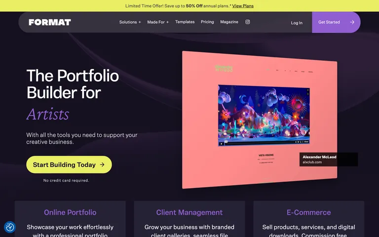
Standard split hero with text on left, mockup on right. Grid-based feature sections below.
07
Motion & Interaction
220ms micro
400ms small
800ms medium
cubic-bezier(0.4, 0, 0.2, 1) easing
Subtle hover transitions on buttons and links, smooth background fades.
Background color shifts or subtle opacity changes on interactive elements. · Immediate visual feedback via scale or color change.
08
Components
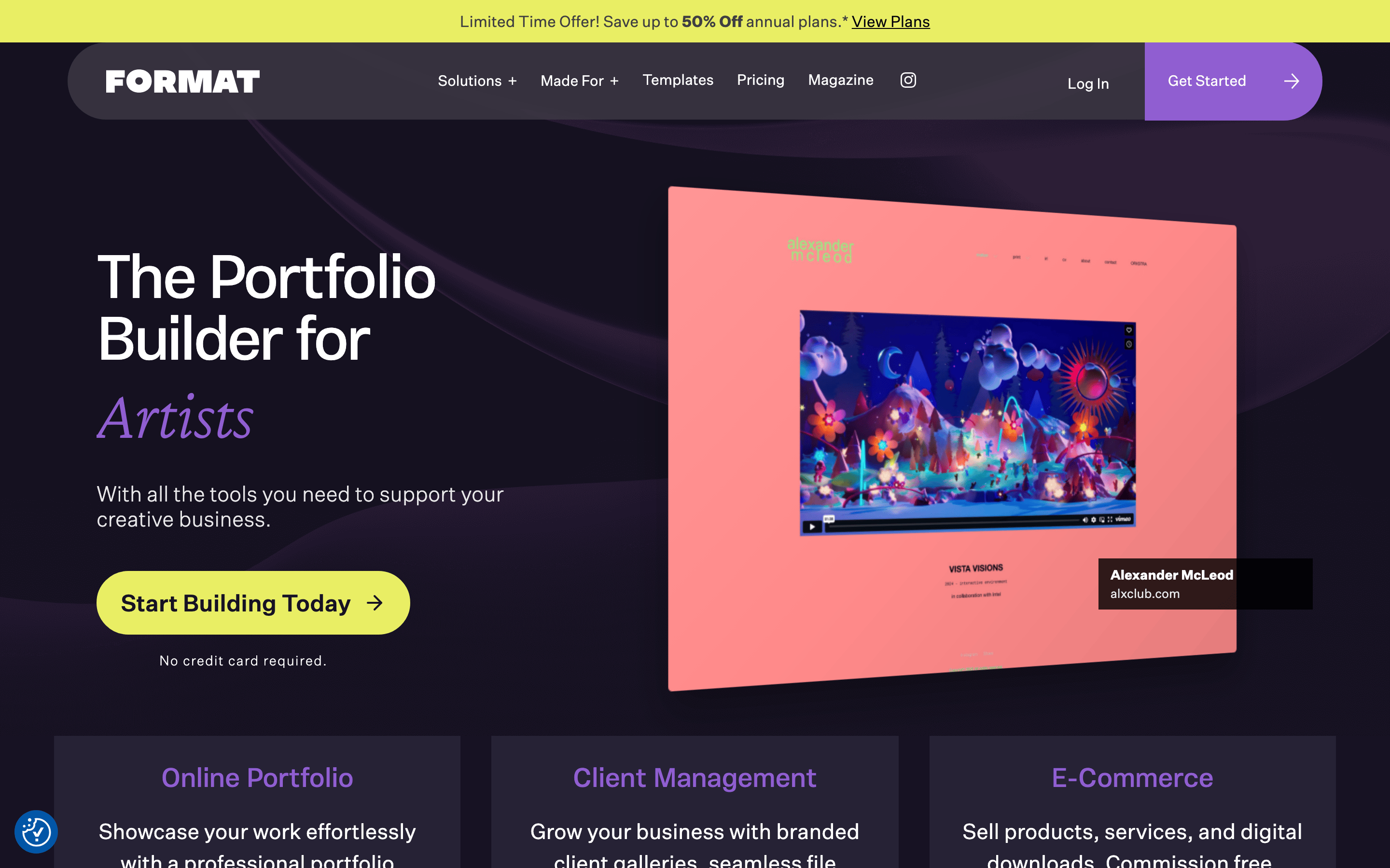
button High-chroma yellow pill-shaped buttons with dark text, or dark text-only links. card Feature cards with subtle background and large display typography. input Clean text inputs with minimal borders. hero Full-width dark hero with large typography, purple accent, and a tilted portfolio mockup. 09
Voice & Don'ts
Tone Professional, empowering, and creative. Headlines Bold, direct, and benefit-oriented. CTAs Clear, action-driven, and encouraging (e.g., 'Start Building Today'). don't use a light background — screenshot shows a deep purple-black (#171223) base. don't use serif fonts for headings — screenshot shows a clean grotesque-sans. don't use low-chroma accents — screenshot shows high-chroma yellow (#E9EE64) and purple (#905ED1). don't use sharp corners on primary buttons — screenshot shows a pill-shaped border-radius (48px+). don't use small hero text — screenshot shows large 72px display typography. don't use busy grid layouts for features — screenshot shows generous whitespace and focused columns. Avoid: Technical jargon Avoid: Corporate stiffness Avoid: Cluttered layouts 10
Inside the pack — real screenshots
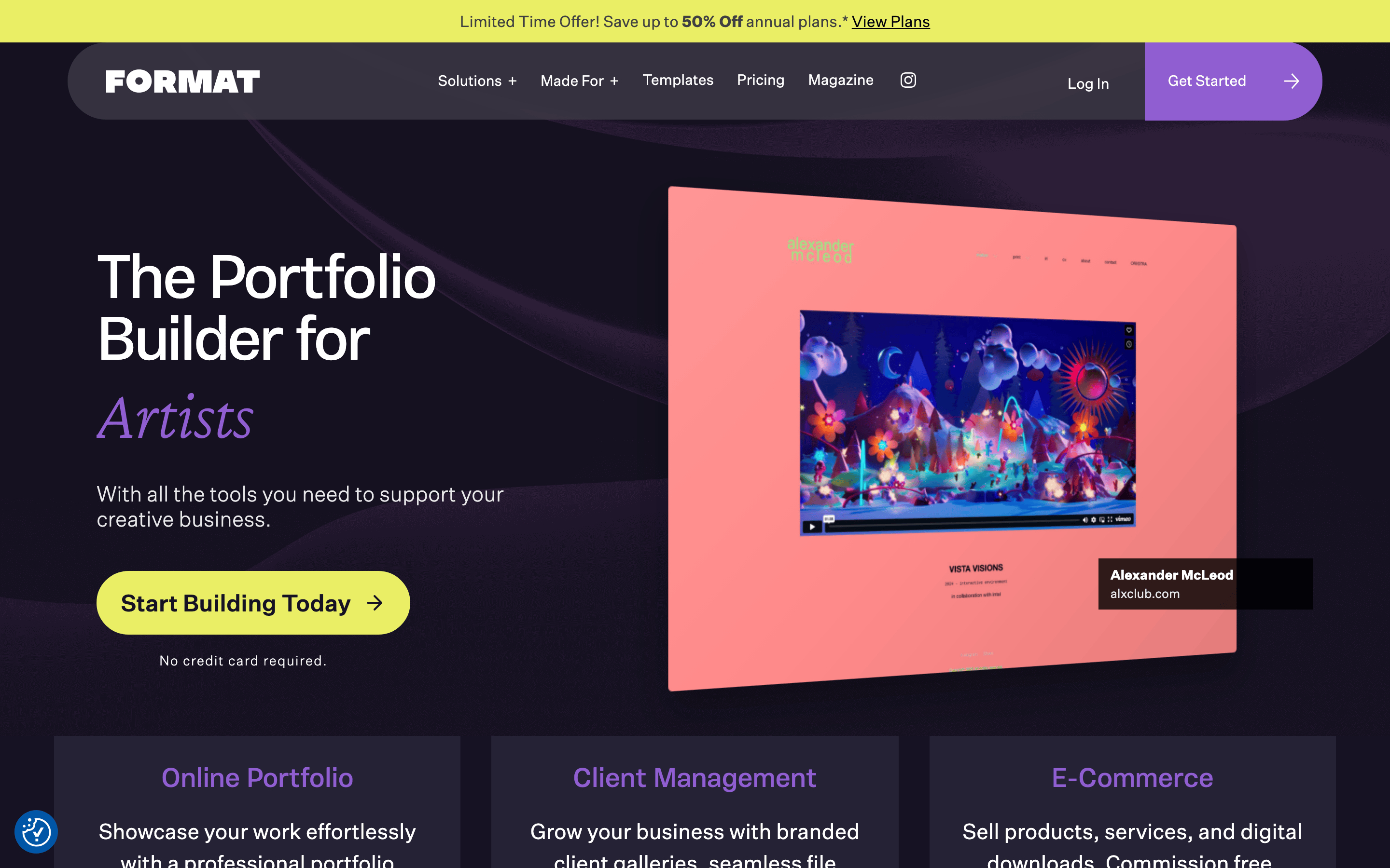
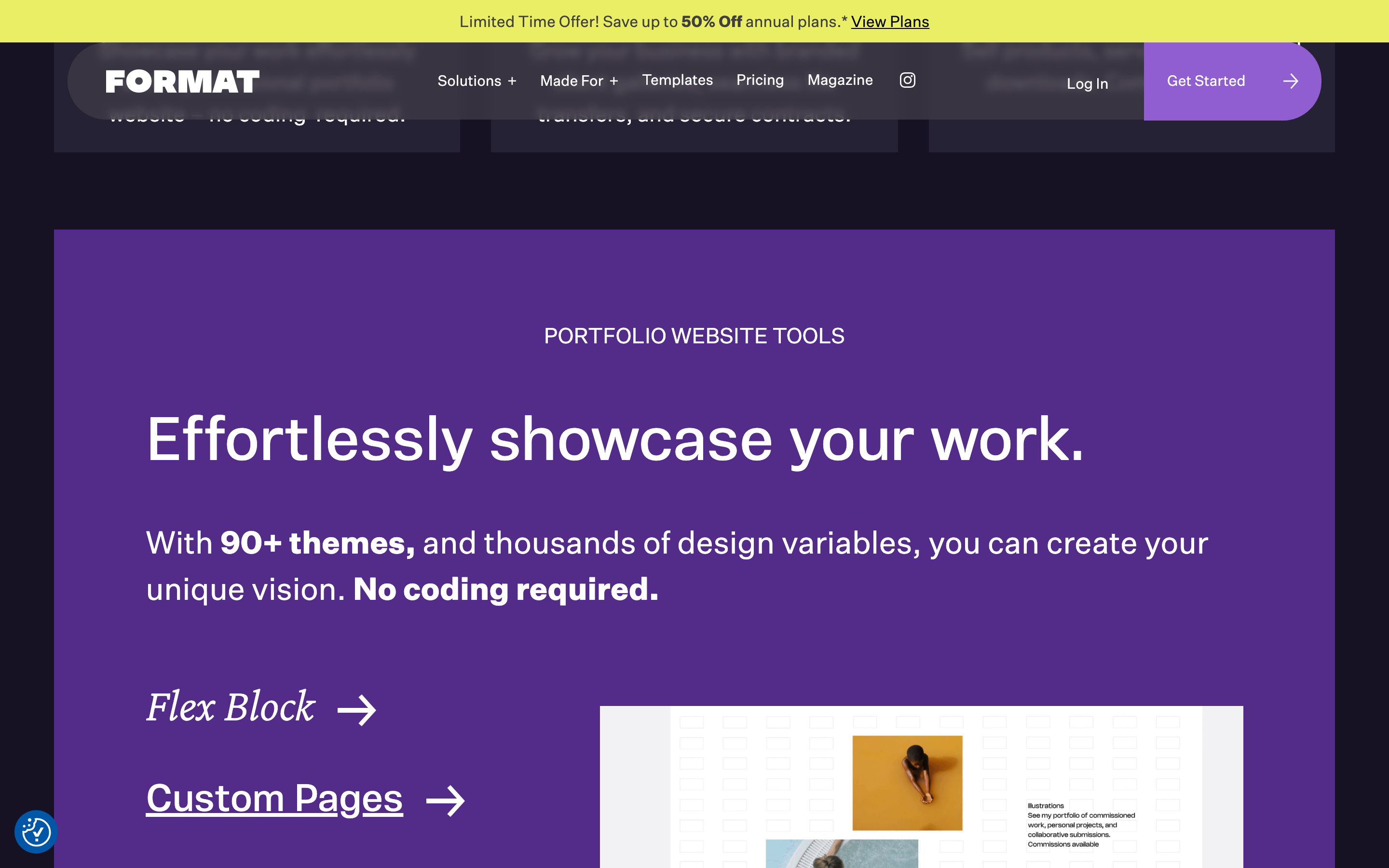
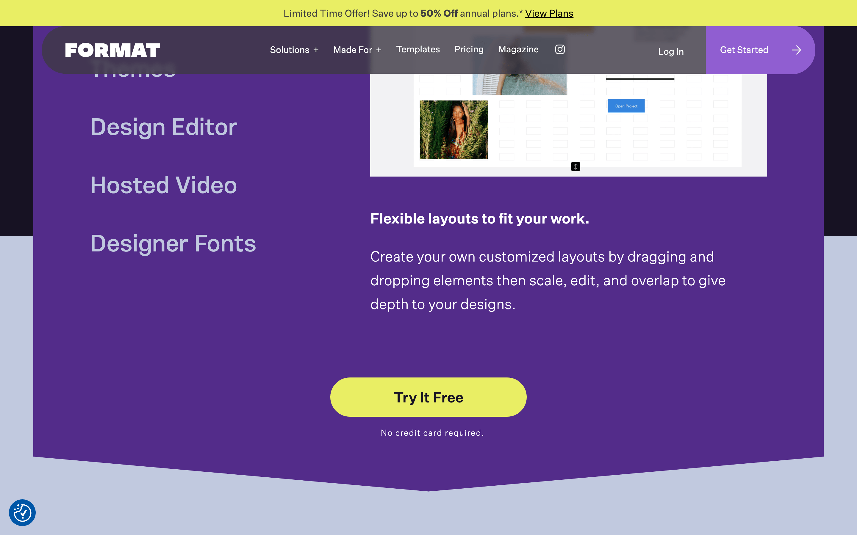
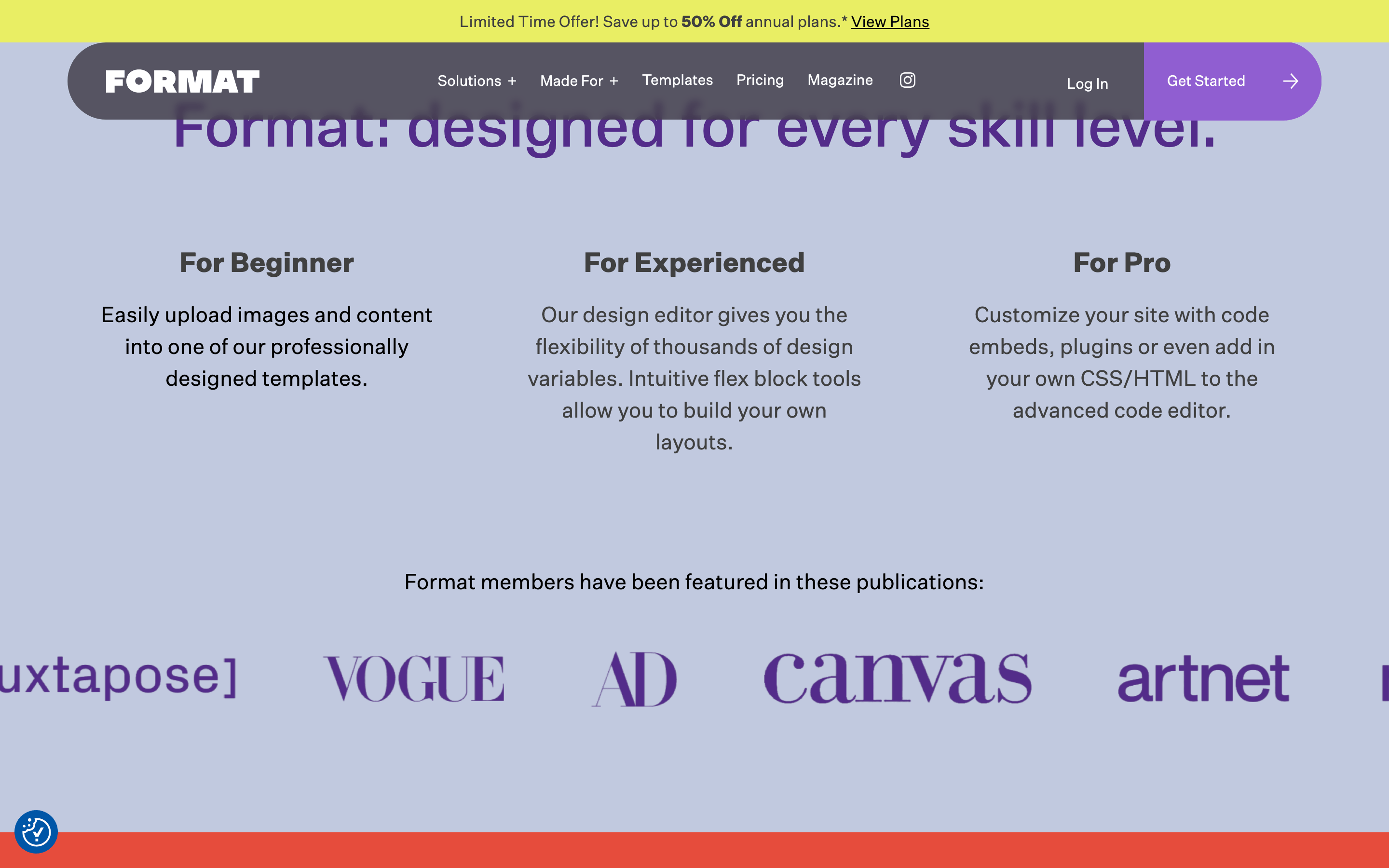
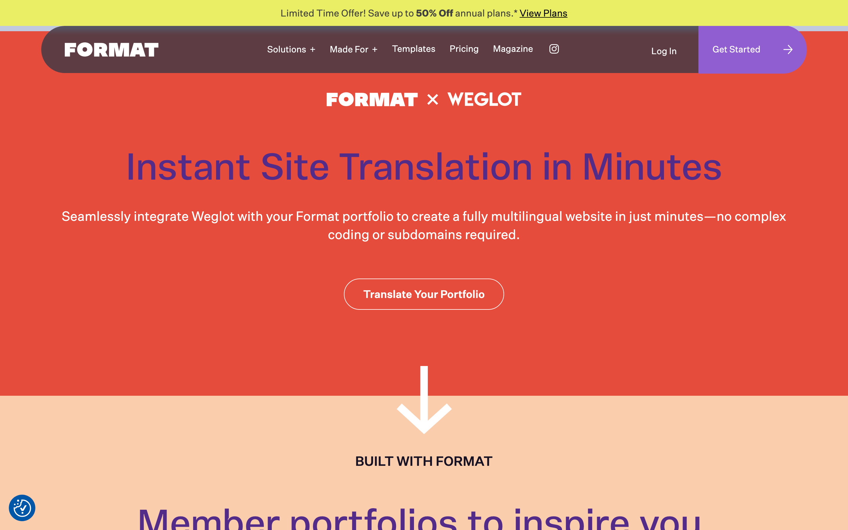
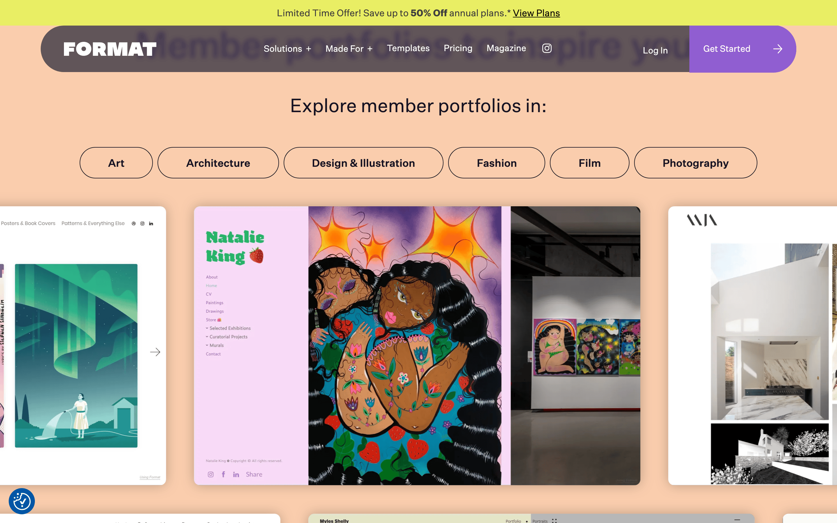
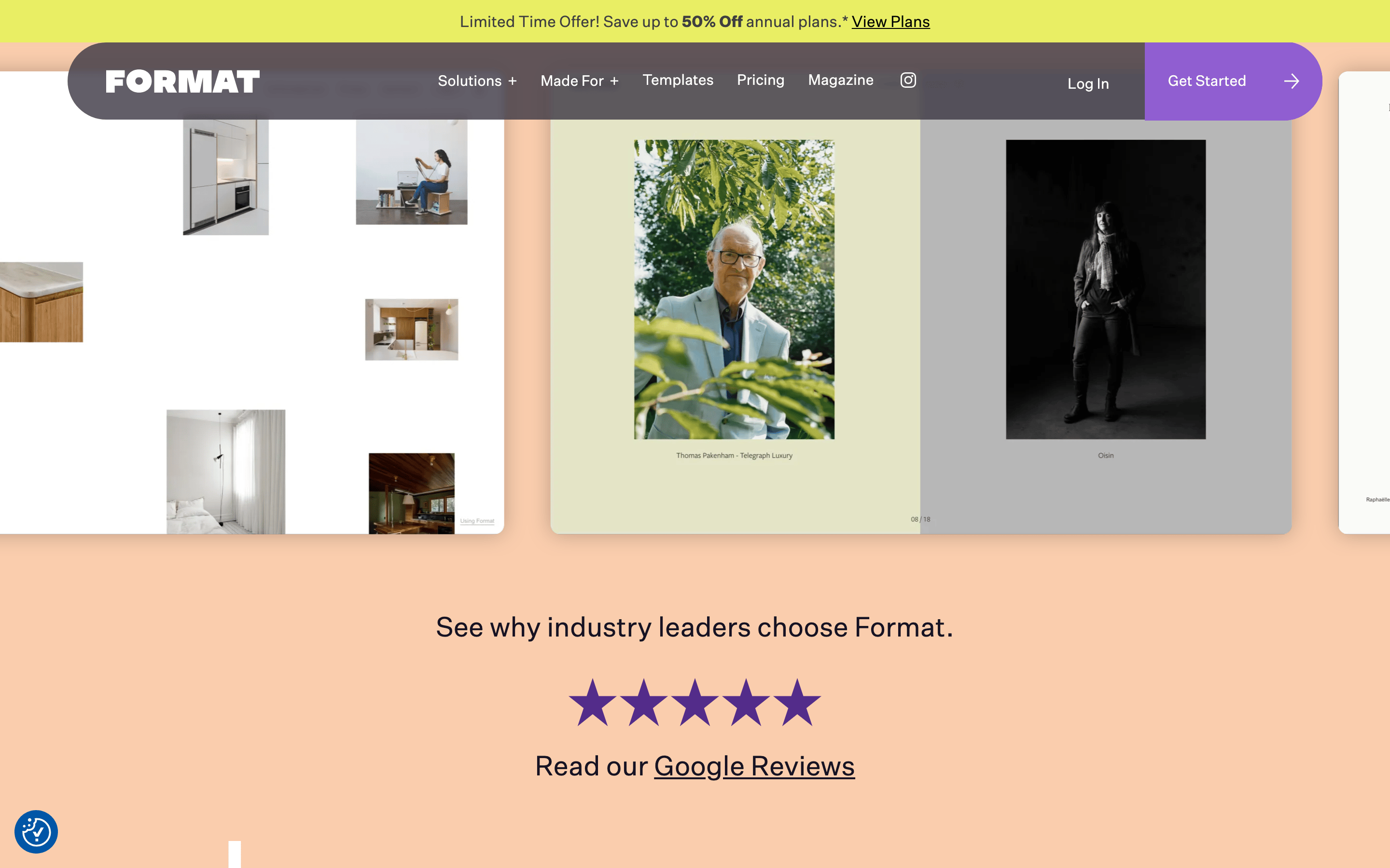
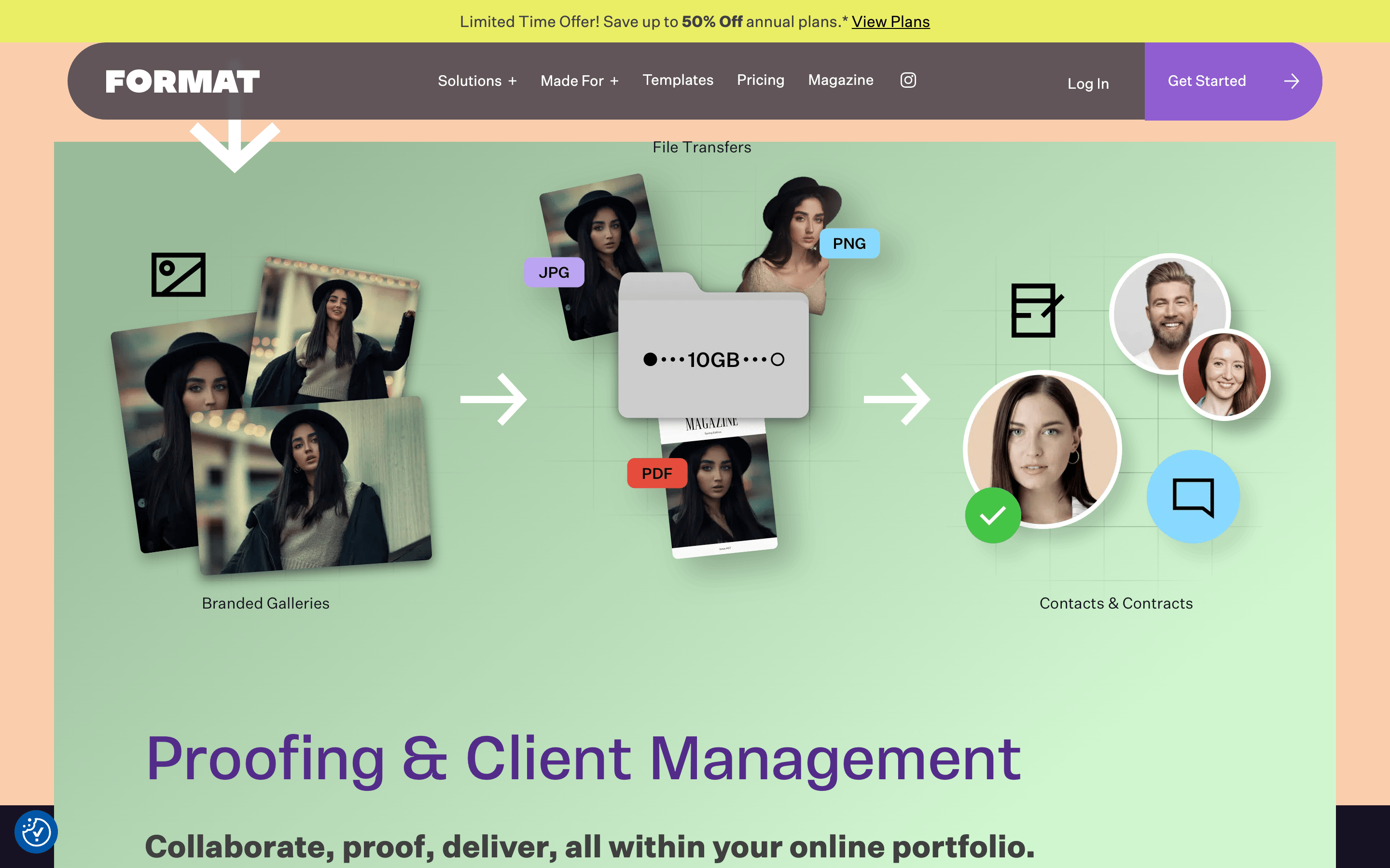
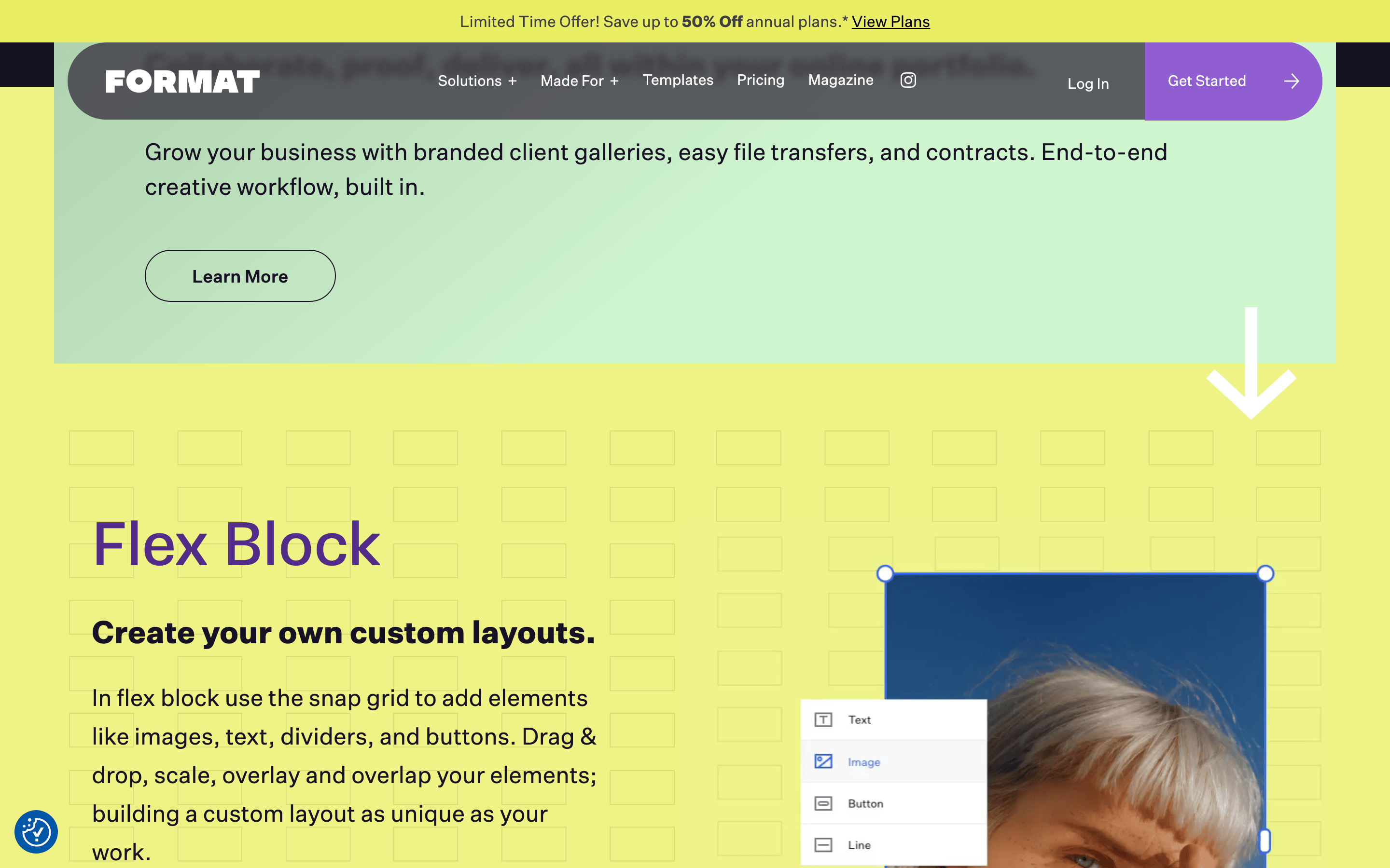
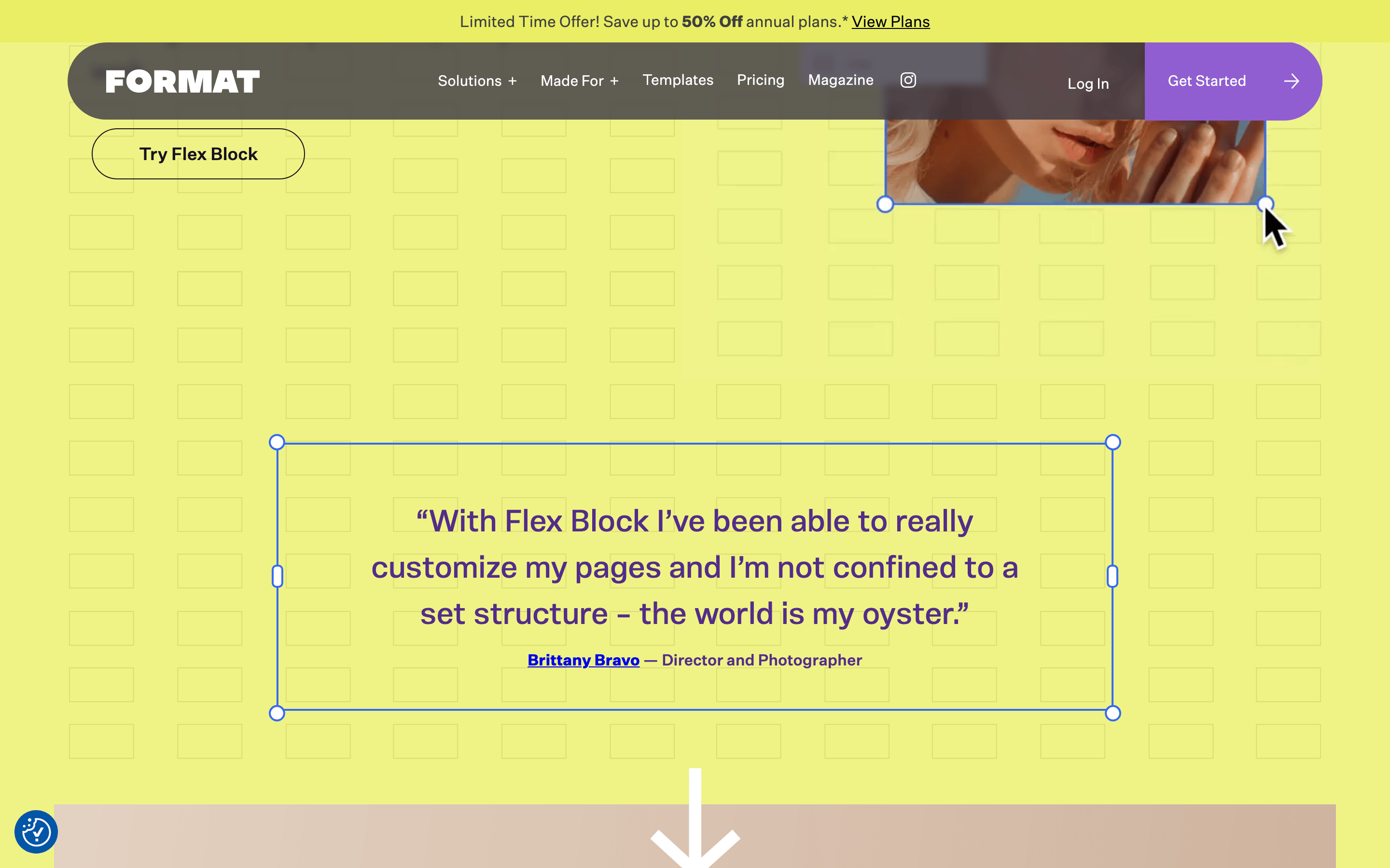
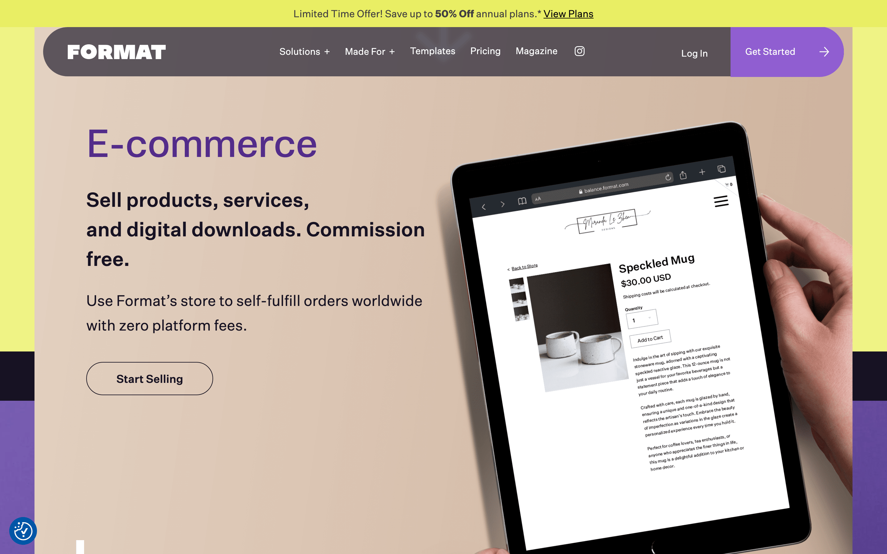
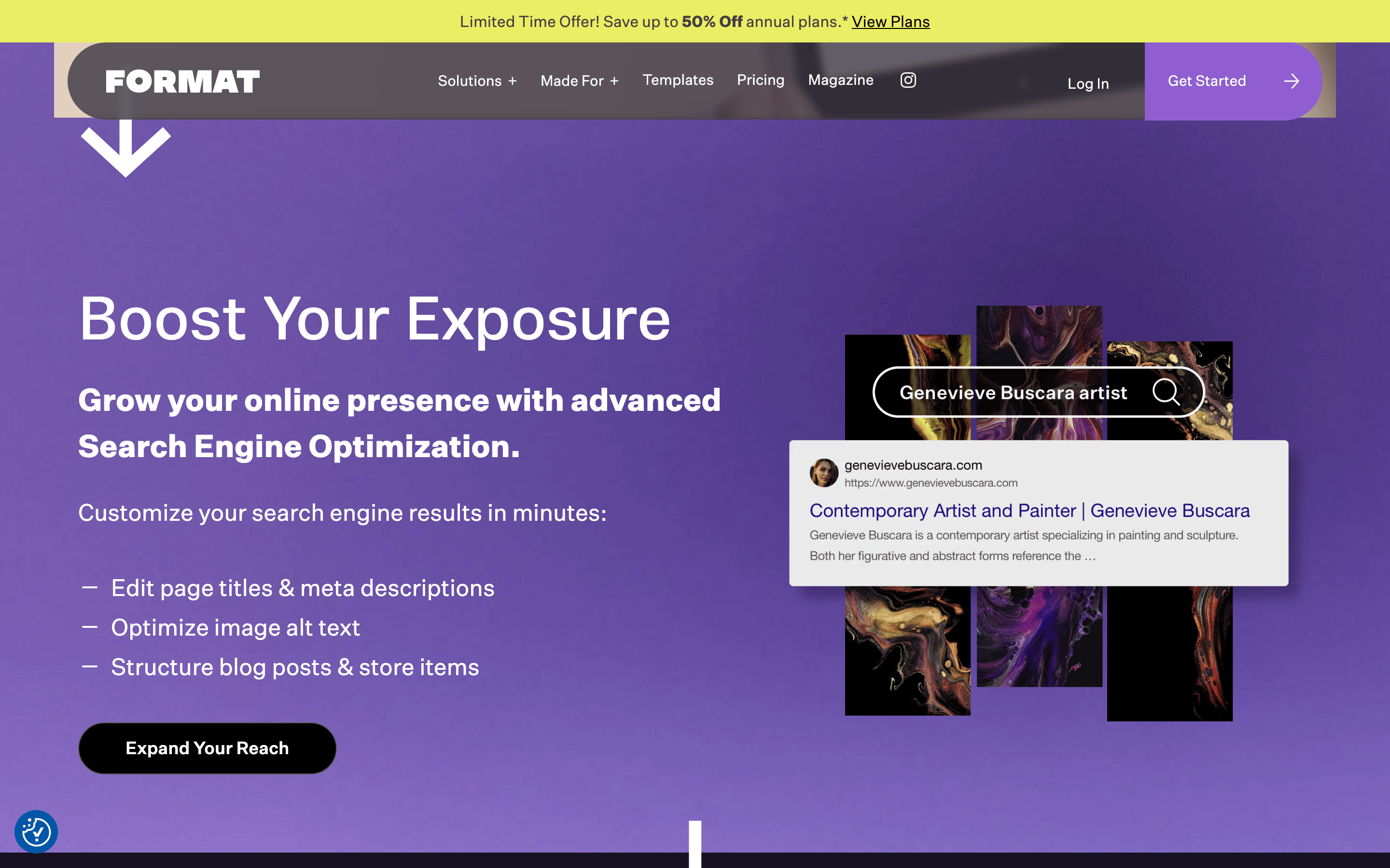
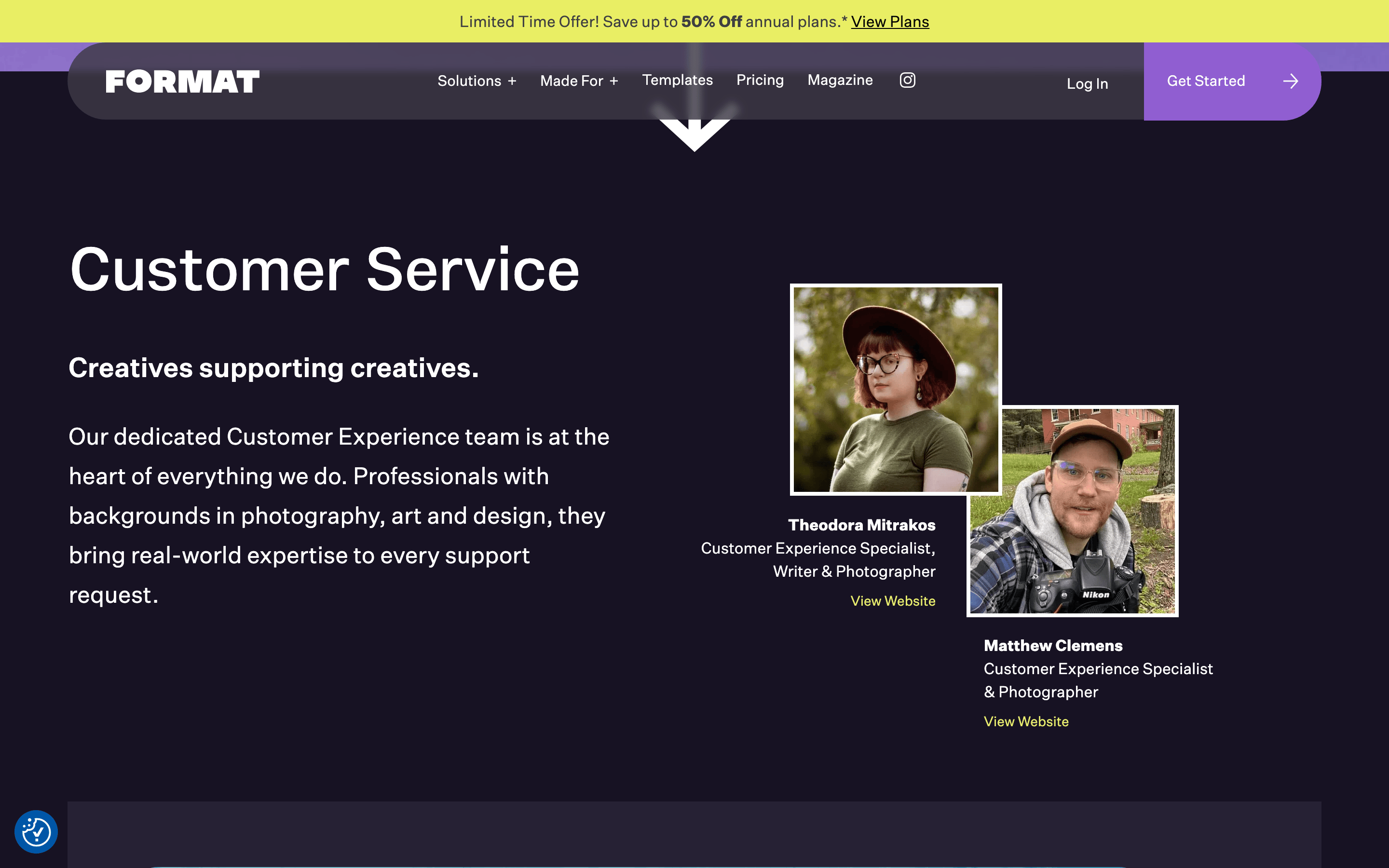
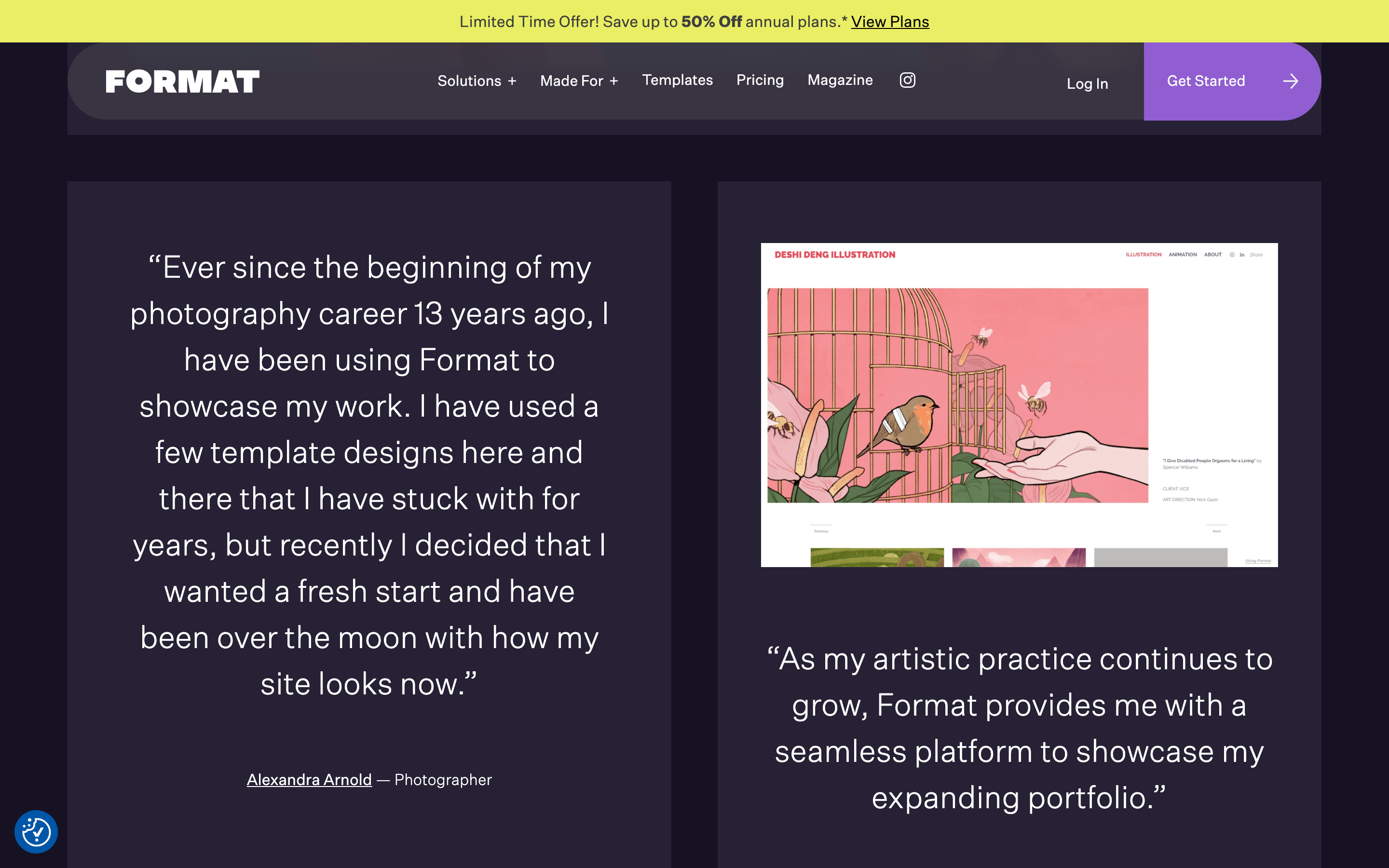
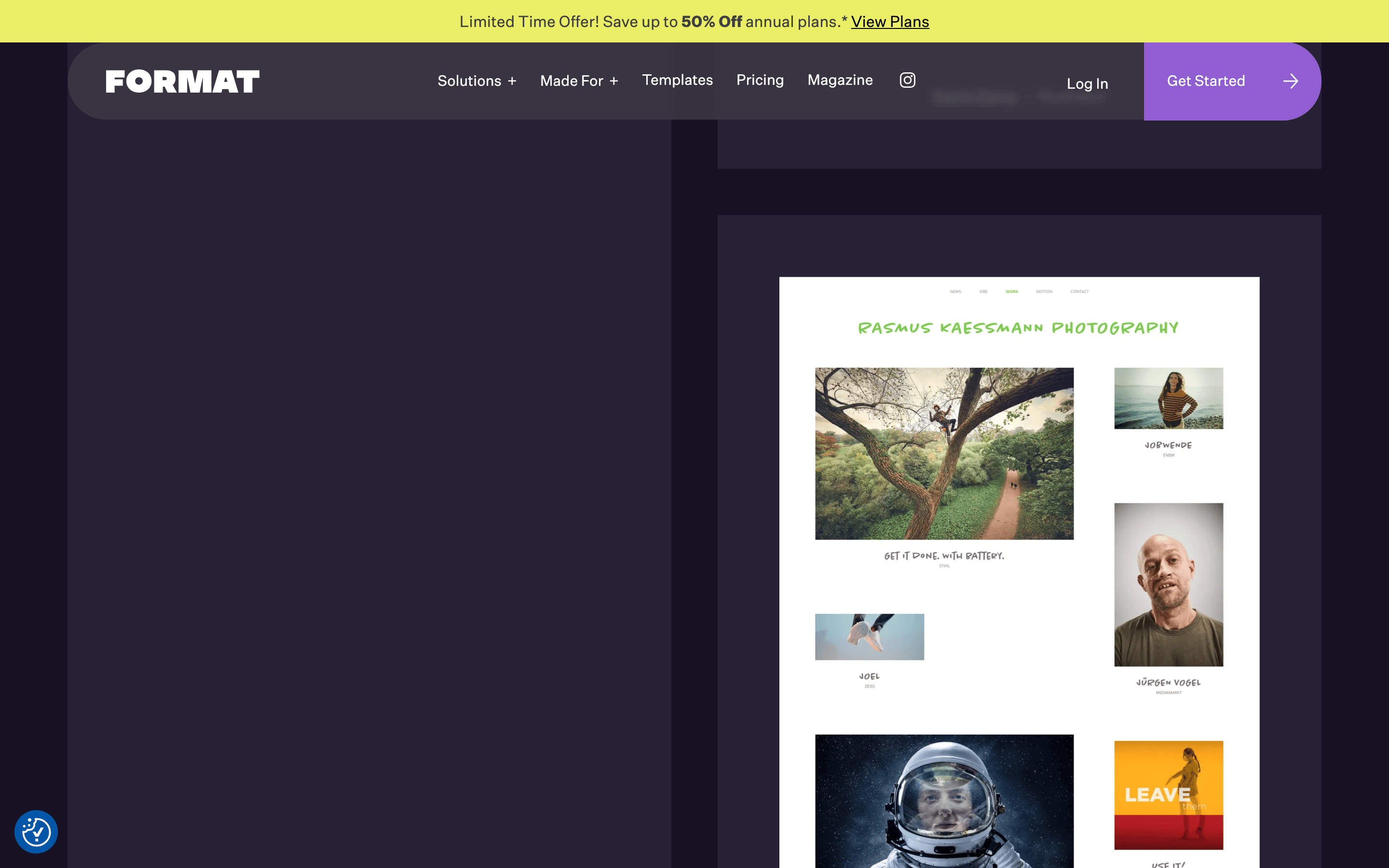
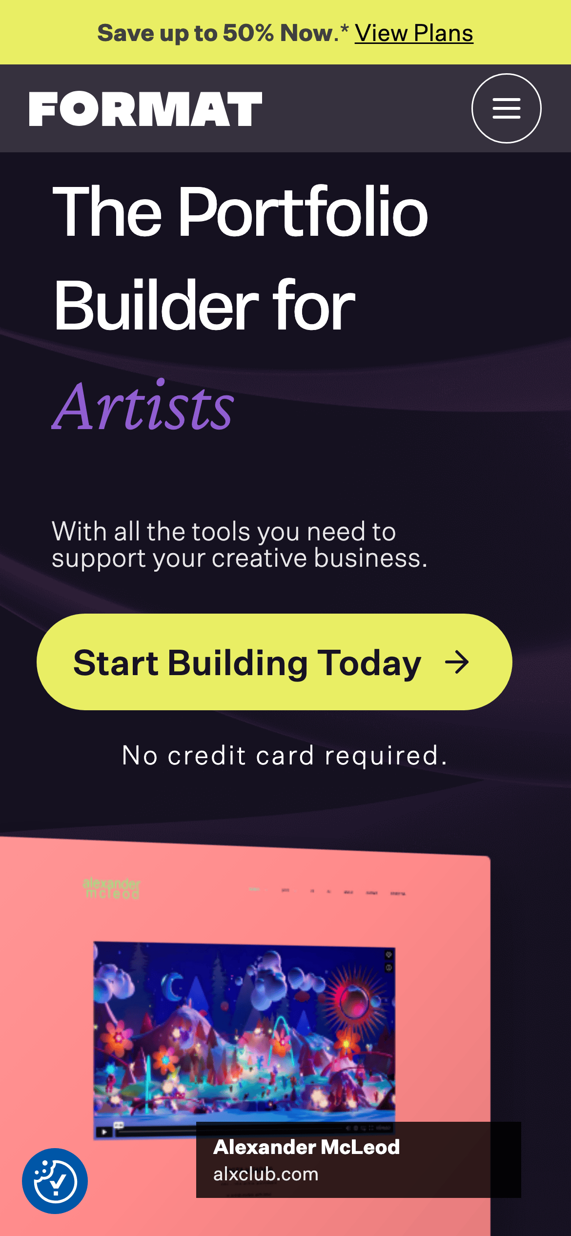
桌面首屏(hero) 桌面滚动分段(90% viewport 步进,作为视觉证据) 桌面滚动分段(90% viewport 步进,作为视觉证据) 桌面滚动分段(90% viewport 步进,作为视觉证据) 桌面滚动分段(90% viewport 步进,作为视觉证据) 桌面滚动分段(90% viewport 步进,作为视觉证据) 桌面滚动分段(90% viewport 步进,作为视觉证据) 桌面滚动分段(90% viewport 步进,作为视觉证据) 桌面滚动分段(90% viewport 步进,作为视觉证据) 桌面滚动分段(90% viewport 步进,作为视觉证据) 桌面滚动分段(90% viewport 步进,作为视觉证据) 桌面滚动分段(90% viewport 步进,作为视觉证据) 桌面滚动分段(90% viewport 步进,作为视觉证据) 桌面滚动分段(90% viewport 步进,作为视觉证据) 桌面滚动分段(90% viewport 步进,作为视觉证据) 桌面滚动分段(90% viewport 步进,作为视觉证据) 桌面滚动分段(90% viewport 步进,作为视觉证据) 移动首屏 Captured from the live site · real computed styles
11
System prompt
Format.com is a premium portfolio builder targeting creative professionals, specifically artists. It uses a dark, sophisticated color palette with a deep purple-black (#171223) background, accented by high-chroma neon yellow (#E9EE64) for calls to action and medium chroma purple (#905ED1) for highlights. The typography is clean and modern, featuring grotesque-sans for displays and humanist-sans for body text. Critical design rules: never use a light background, avoid low-chroma accents, and ensure all primary buttons are pill-shaped with high contrast. The layout is spacious and focused, emphasizing large, bold headlines and high-quality portfolio mockups to inspire creativity and professionalism.
More from the library en · zh-CN · zh-TW · ja · ko
OpenDesign · curated web aesthetics for AI-readable design DNA · opendesign.cc
Why we curated this: The site effectively uses high-contrast typography and a bold color palette to appeal to creative professionals.
浙ICP备2021038972号-5