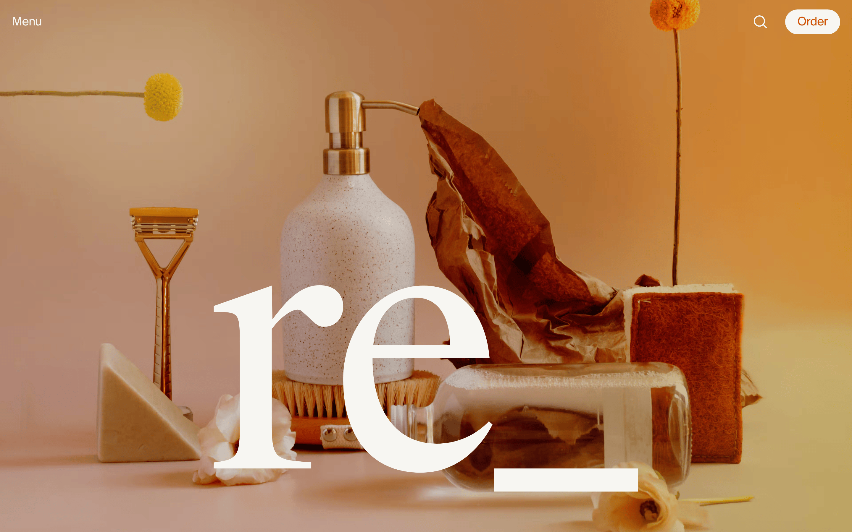
A high-end editorial magazine for eco-conscious consumers
02
Color
#F74C25Accent
#211D1CInk
#F7F6F2BG
#EFEDF7BG soft
rgba(247, 76, 37, 1.0)Line
Warm neutrals provide a clean, organic foundation, while a single high-energy orange-red drives action.
03
Typography
didone-serif · humanist-sans
display100px · 400
heading30px · 400
body20px · 400
Tight letter-spacing on display and heading levels for a refined, modern feel · Serif fonts are reserved exclusively for large, expressive headlines · Sans-serif handles all functional and navigational text
04
Spacing
4px
8px
10px
16px
20px
30px
40px
95px
Generous whitespace is used to let photography and typography breathe
05
Surfaces
sm · 4px
md · 8px
lg · 999px
pill · 999px
Thin 1px solid lines in the primary accent color
0px 0px 20px 0px rgba(0,0,0,0.05)
06
Layout
1280container
12columns
20pxgutter
768 / 1024breakpoints
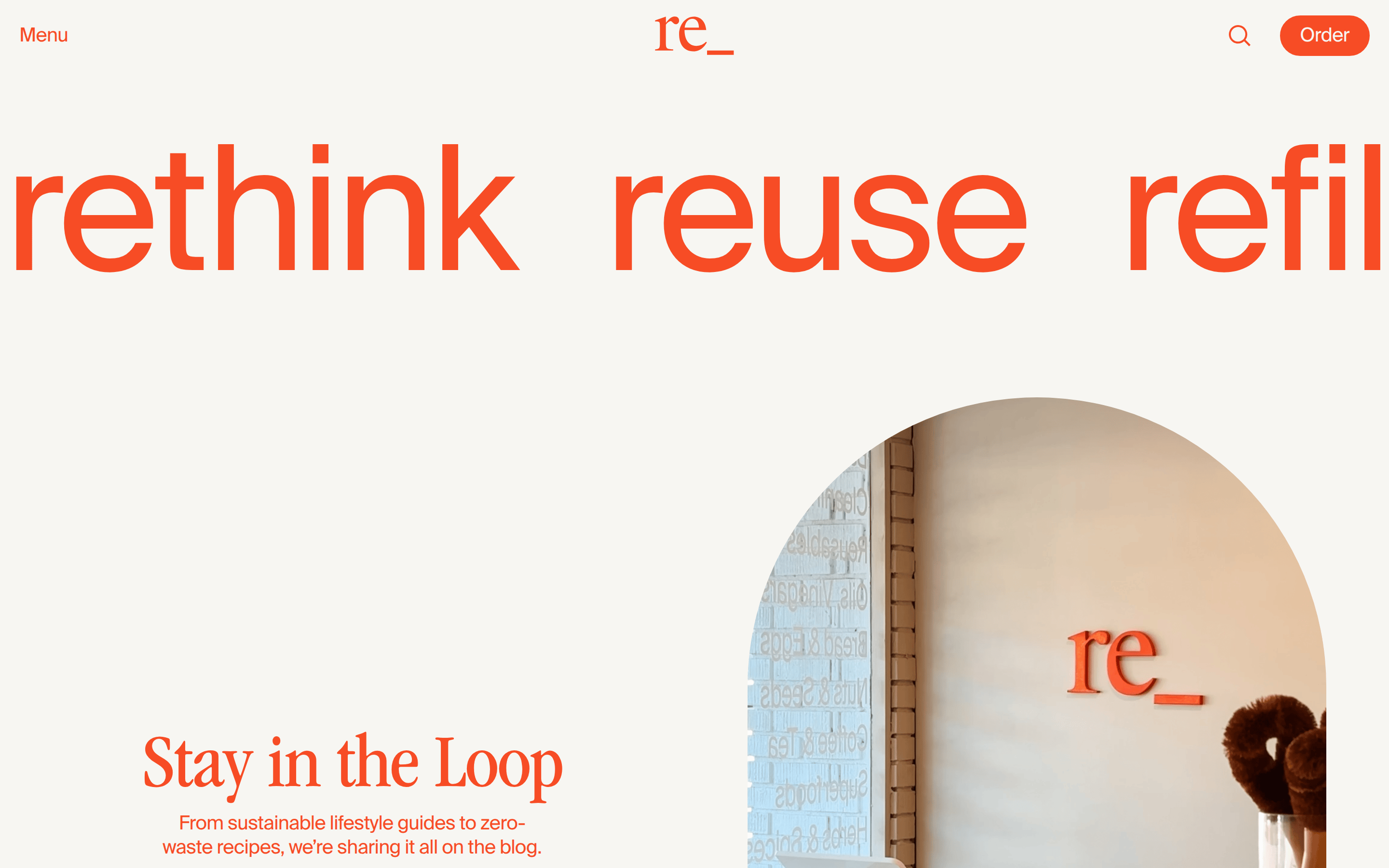
Asymmetric splits with large photographic hero areas paired with centered or left-aligned text blocks
07
Motion & Interaction
220msmicro
400mssmall
800msmedium
cubic-bezier(0.22, 1, 0.36, 1)easing
Smooth, organic transitions on hover states · Background-color transitions with custom easing
Subtle color shifts and background transitions on interactive elements · Immediate visual response with pointer cursor on all clickable items
08
Components
buttonPill-shaped buttons with thin borders and high contrast accent colors
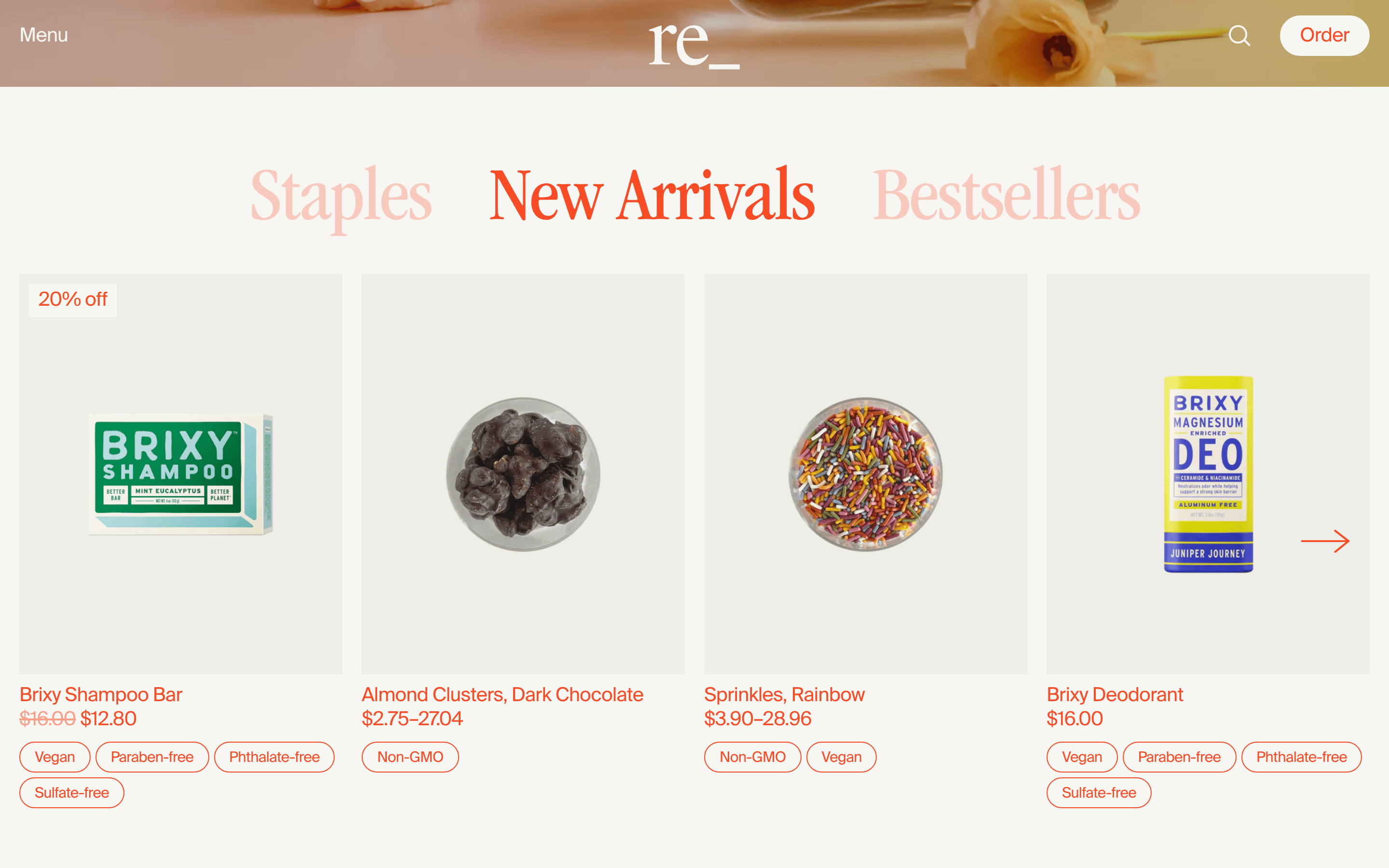
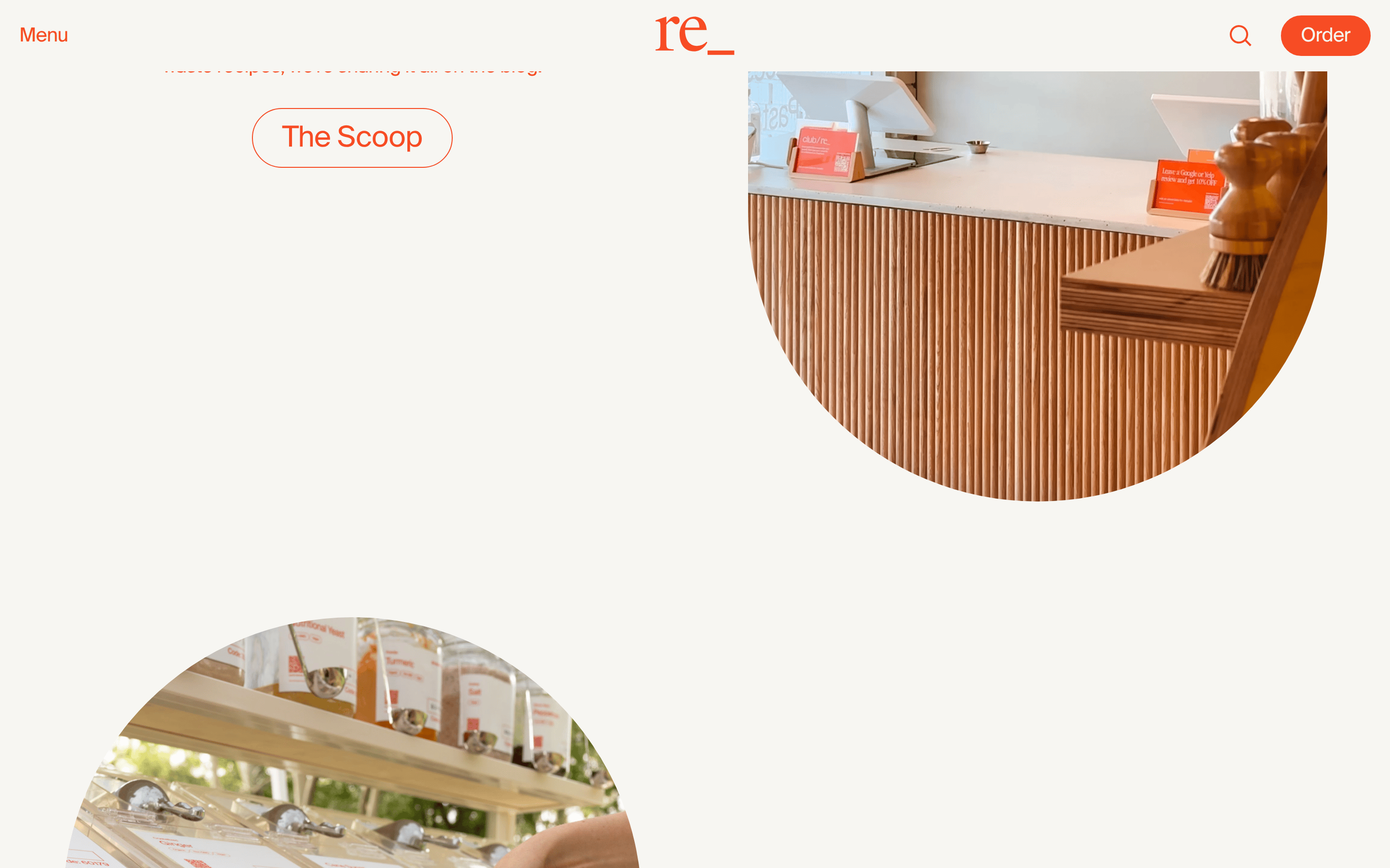
cardRounded image containers that break the grid with organic shapes
heroFull-bleed immersive photography overlaid with massive display typography
09
Voice & Don'ts
ToneConfident, refined, and sustainability-focused
HeadlinesShort, impactful phrases with expressive serif typography
CTAsDirect and action-oriented, often using pill-shaped outline buttons
Don't use a cluttered layout — screenshot shows generous whitespace and large imagery
Don't use purely geometric sans-serif for headlines — screenshot shows expressive didone-serif
Don't use harsh primary colors — screenshot shows a specific warm orange-red accent
Don't use square corners for buttons — screenshot shows pill-shaped rounded borders
Don't hide the navigation — screenshot shows a clean, persistent top bar
Don't use flat, clinical backgrounds — screenshot shows warm off-white and subtle gradients
Captured from the live site · real computed styles
11
System prompt
Regrocery is a premium zero-waste grocery platform with a refined, editorial aesthetic. It uses warm off-white (#F7F6F2) and light gray (#EFEDF7) backgrounds contrasted with a bold orange-red (#F74C25) accent and deep brown-black (#211D1C) ink. Typography combines a humanist-sans for clean navigation and body text with a large, expressive didone-serif for impactful headlines. The layout emphasizes generous whitespace and full-bleed photography. Critical constraints: Never use cluttered layouts; avoid using sans-serif for display headlines; do not replace the signature warm orange-red accent with generic colors; never use square corners for interactive buttons; avoid cold, clinical white backgrounds; and do not use generic corporate typography or language.
Bring this taste to your agent
Hand your AI agent a machine-readable spec of this design — tokens, type, motion, the whole DNA.