A friendly, approachable wellness companion that uses warm, inviting design to make mental health feel less intimidating and more accessible to everyone.
02
Color
#FFCE00Accent
#2D2C2BInk
#4B4C4DInk soft
#F9F4F2BG
#44433FMuted
rgba(75,76,77,0.3)Line
Warm off-white base with high-chroma yellow and orange accents paired with deep charcoal text for maximum readability and warmth.
03
Typography
humanist-sans · geometric-mono
display56px · 700
h148px · 700
h232px · 700
body16px · 400
caption12px · 400
Use tight line-heights (1.0-1.2) for headlines to maintain compact, modern feel · Use negative letter-spacing on larger text for tighter typographic presence · Body text uses standard 16px base with slightly tighter leading than default
04
Spacing
4px
8px
16px
24px
32px
48px
64px
96px
Consistent 4px base grid with generous section spacing (48-64px) and comfortable inner padding (24-32px) creating breathable layouts
05
Surfaces
sm · 8px
md · 16px
lg · 32px
pill · 999px
Minimal borders; cards use subtle shadows instead. When present, borders use 2px solid with muted charcoal tones.
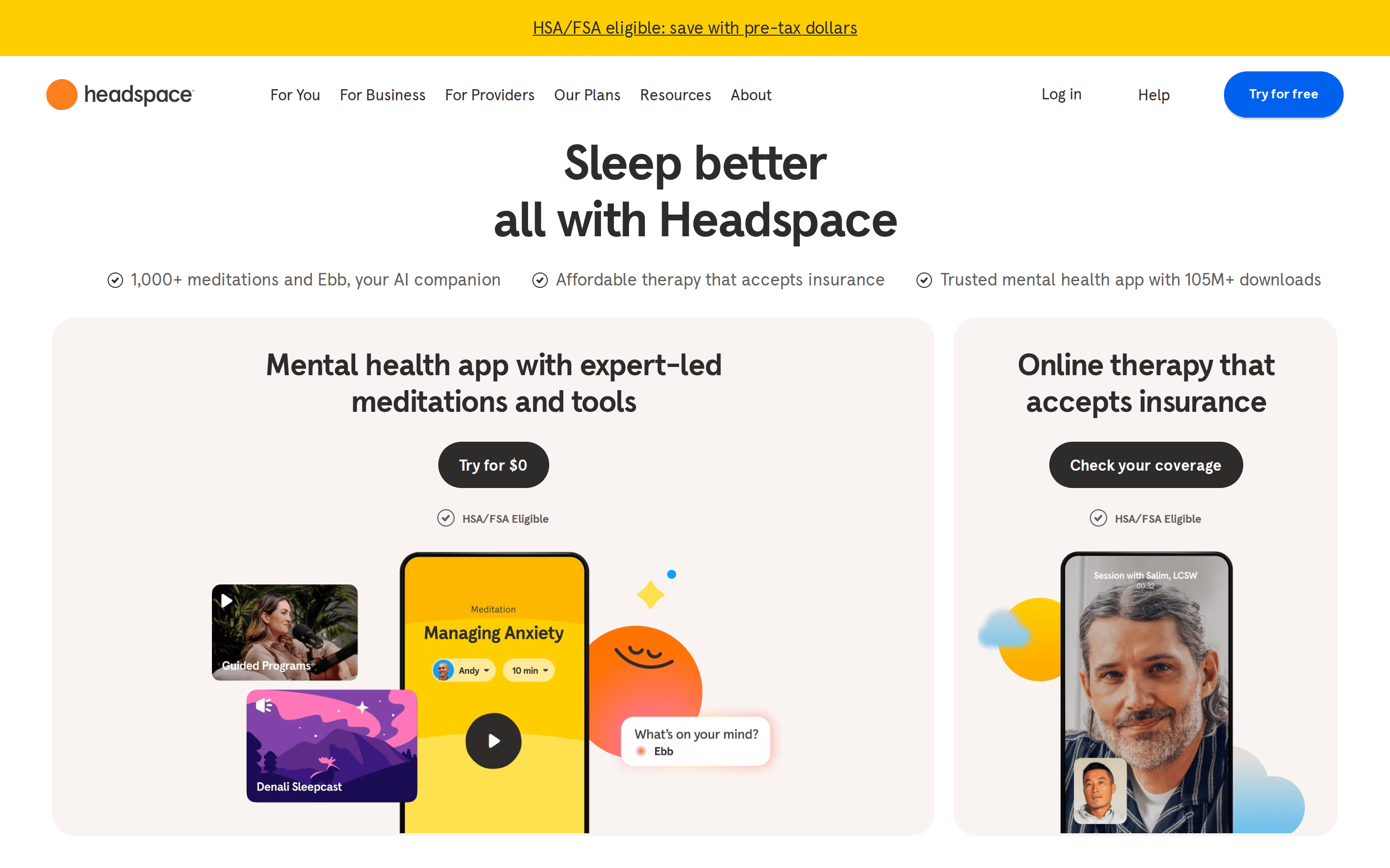
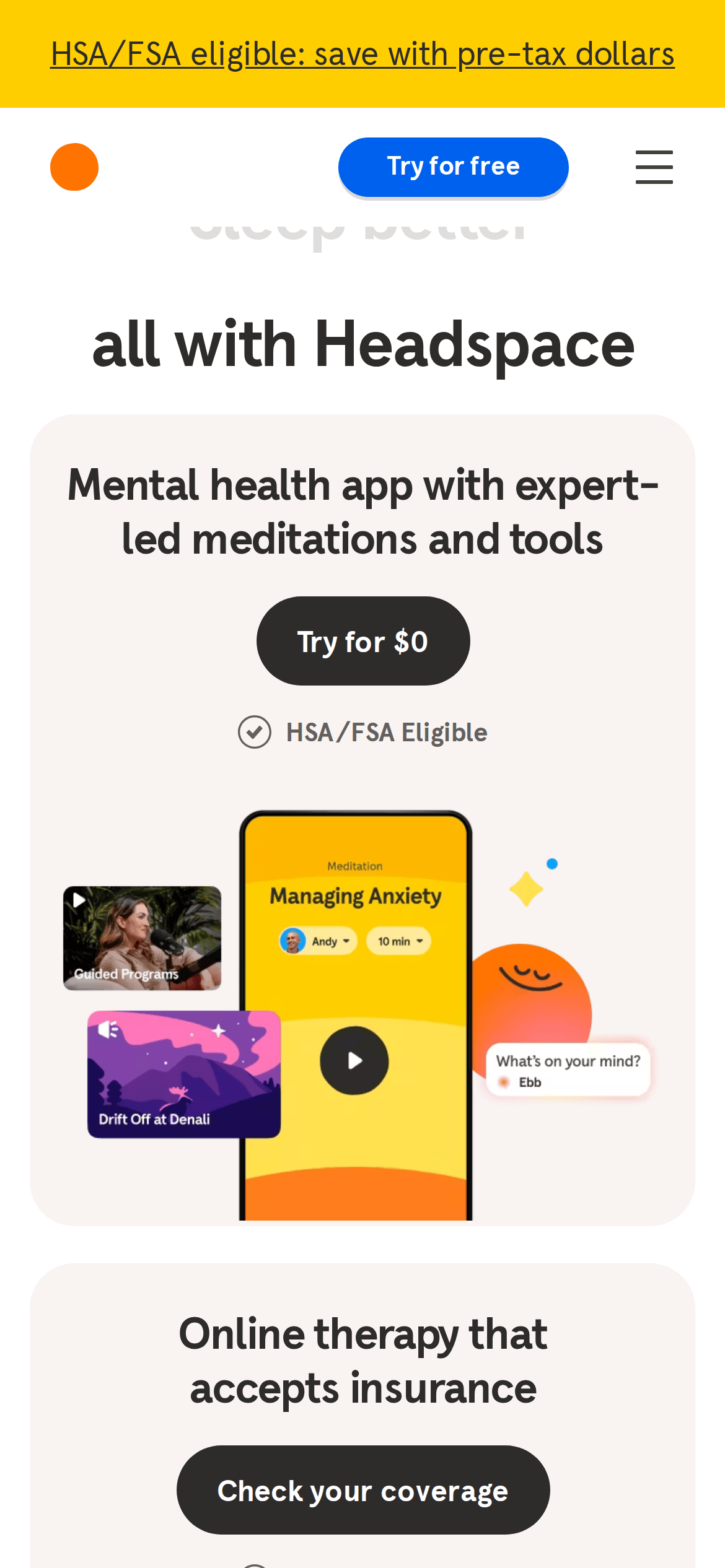
Centered single-column hero with large typography, followed by two-column card layout, then full-width scrolling banner and grid sections
07
Motion & Interaction
150msmicro
300mssmall
400msmedium
cubic-bezier(0.32, 0.94, 0.6, 1)easing
Color and background transitions on interactive elements · Transform transitions for hover states · Opacity fades for content reveals
Subtle background-color and color shifts with 0.15s ease timing · Immediate visual feedback through transform and color changes
08
Components
buttonPill-shaped buttons with generous padding (16-24px). Primary: bright blue (#0061EF) with white text. Secondary: dark charcoal (#2D2C2B) with white text. High border-radius (32px+).
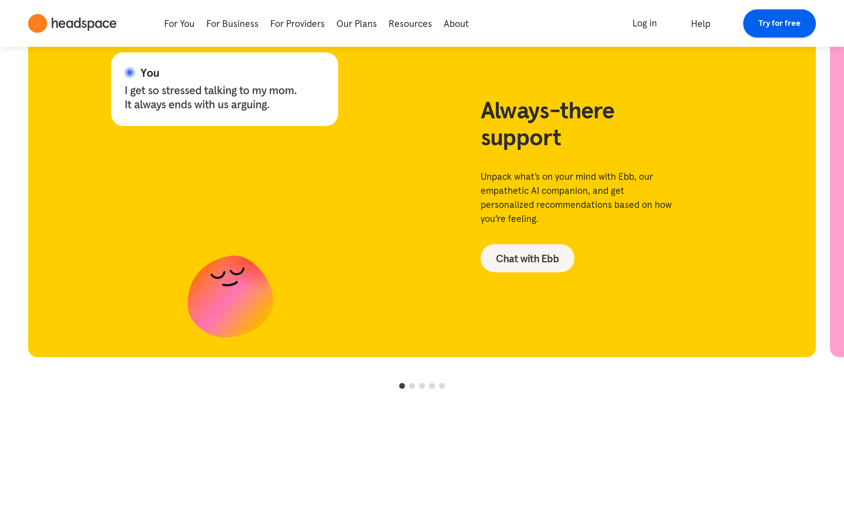
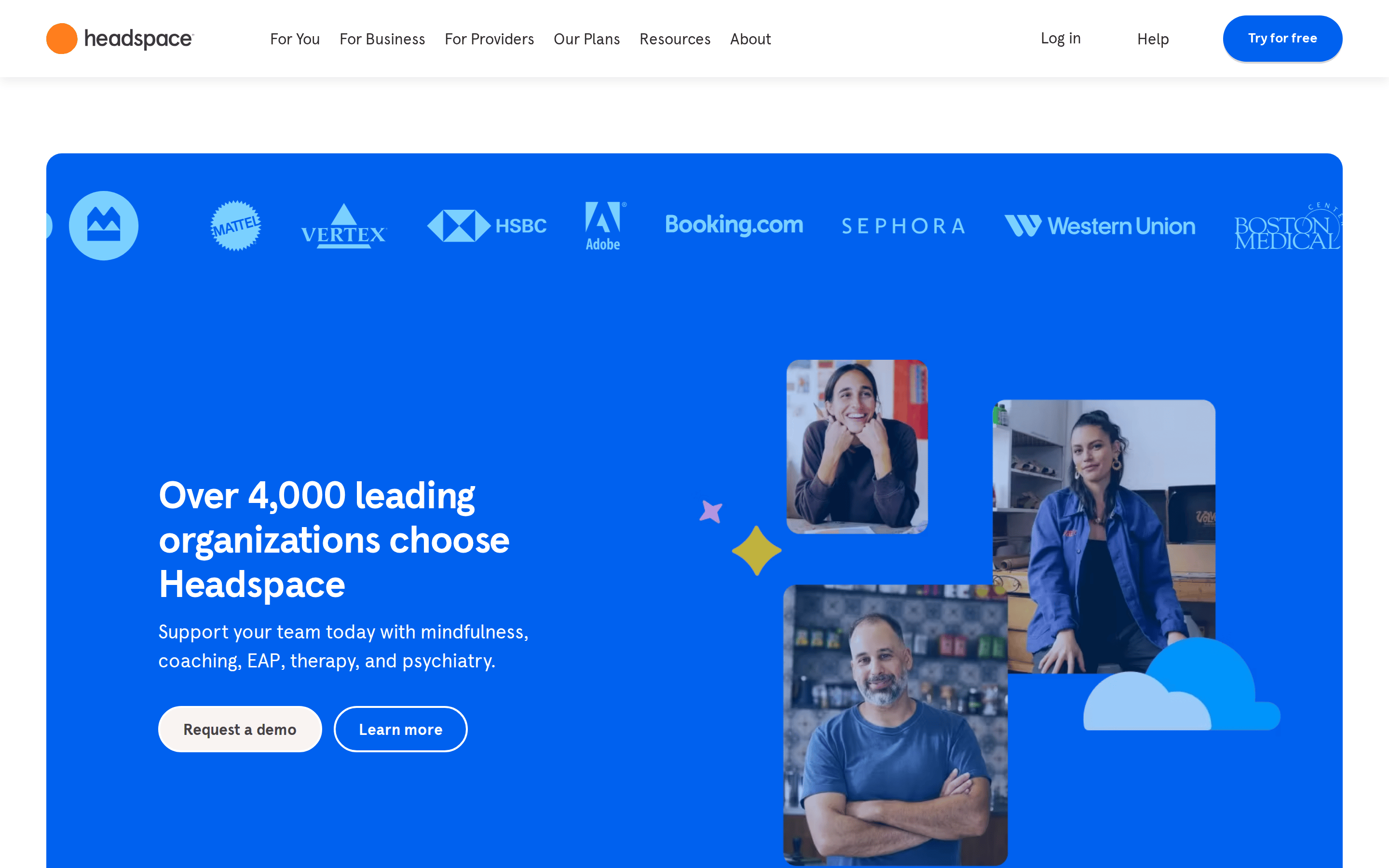
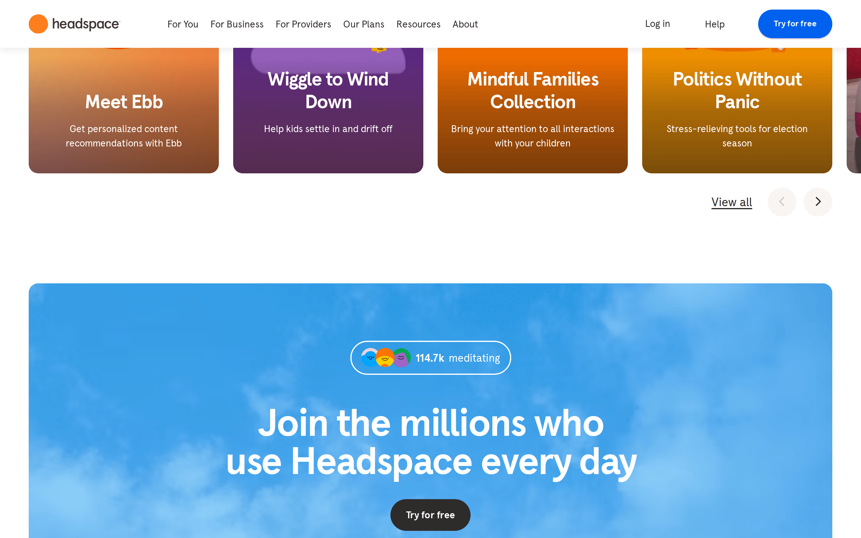
cardLarge rounded cards (16-32px radius) with soft off-white background, subtle shadow, containing mixed media (illustrations, photos, UI mockups) in playful compositions.
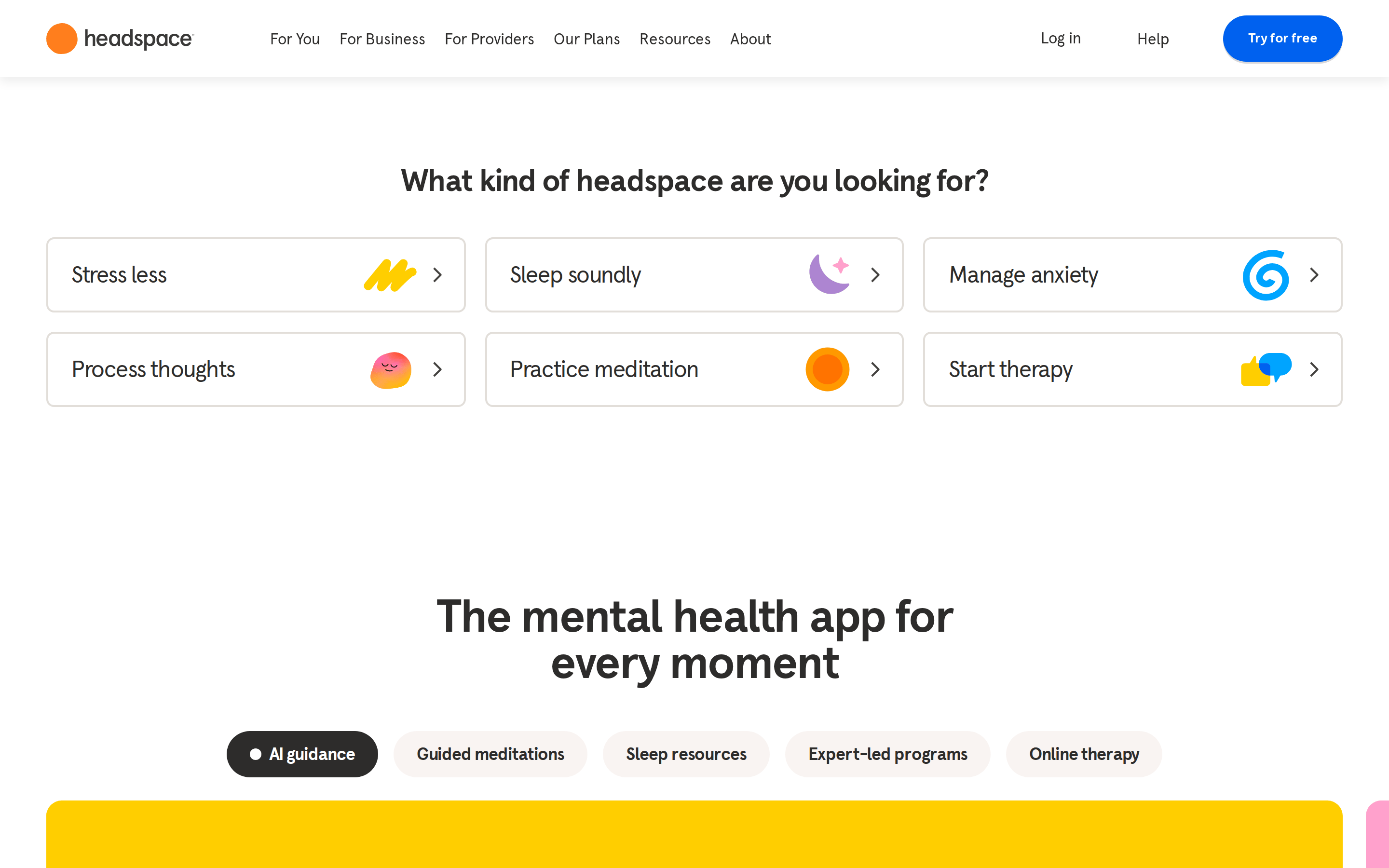
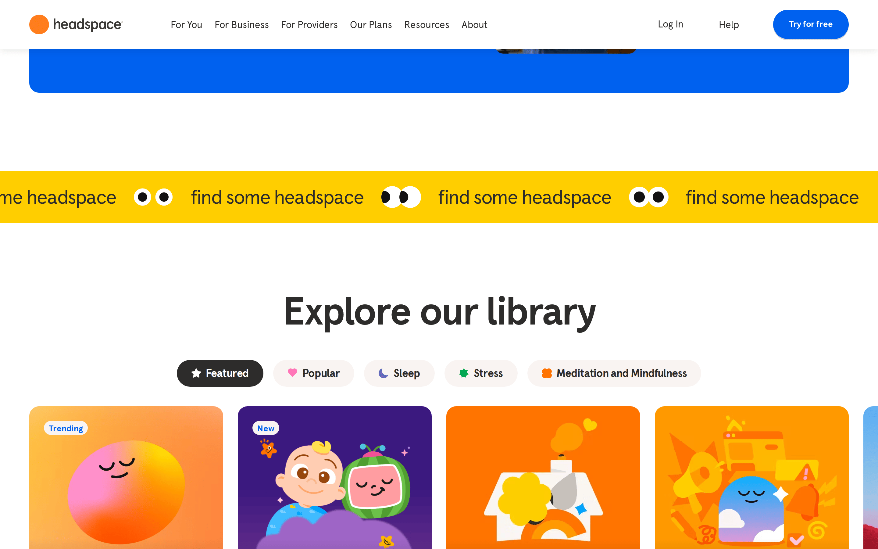
chipPill-shaped filter chips with rounded borders, light background, and small emoji icons. Active state uses darker fill.
inputForm inputs implied through clean, minimal styling consistent with the overall restrained aesthetic.
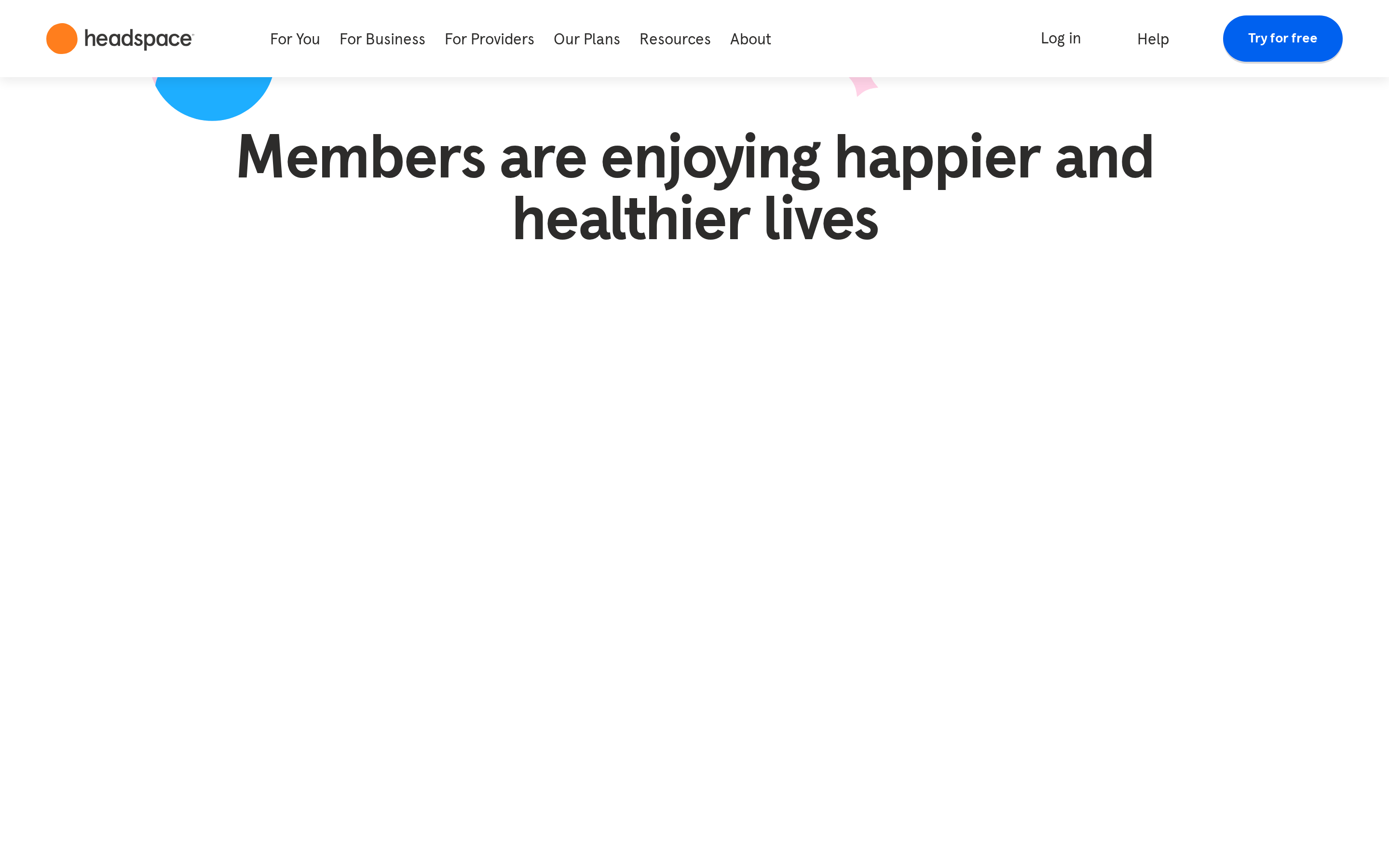
heroFull-width centered layout with oversized display type (56px+), supporting checkmark list, and large illustration/card showcase below.
09
Voice & Don'ts
ToneWarm, encouraging, and approachable without being clinical or preachy
HeadlinesConversational, benefit-focused statements with large friendly type
CTAsDirect action phrases like 'Try for free', 'Check your coverage', and 'Try for $0' emphasizing low barrier to entry
Don't use sharp, angular shapes — screenshot shows rounded corners (16-32px radius) on all cards and buttons
Don't use cold blue-gray backgrounds — screenshot shows warm off-white (#F9F4F2) as primary background
Don't use serif or decorative fonts — screenshot shows clean humanist sans-serif throughout
Captured from the live site · real computed styles
11
System prompt
Headspace is a consumer mental health app positioned as a friendly, accessible wellness companion. The design uses a warm off-white background (#F9F4F2) with charcoal text (#2D2C2B) and bright yellow (#FFCE00) and blue (#0061EF) accents. Typography is humanist sans-serif with bold, tight-set headlines and generous body text. Layouts are centered with large display type and playful illustration compositions. Critical don'ts: never use cold grays or blues as backgrounds, avoid clinical/medical visual language, don't create cramped or dense layouts, avoid thin font weights for headlines, don't skip illustrations in favor of plain UI, and never use aggressive or dark color schemes. The overall feel should be warm, inviting, and psychologically safe.
Bring this taste to your agent
Hand your AI agent a machine-readable spec of this design — tokens, type, motion, the whole DNA.