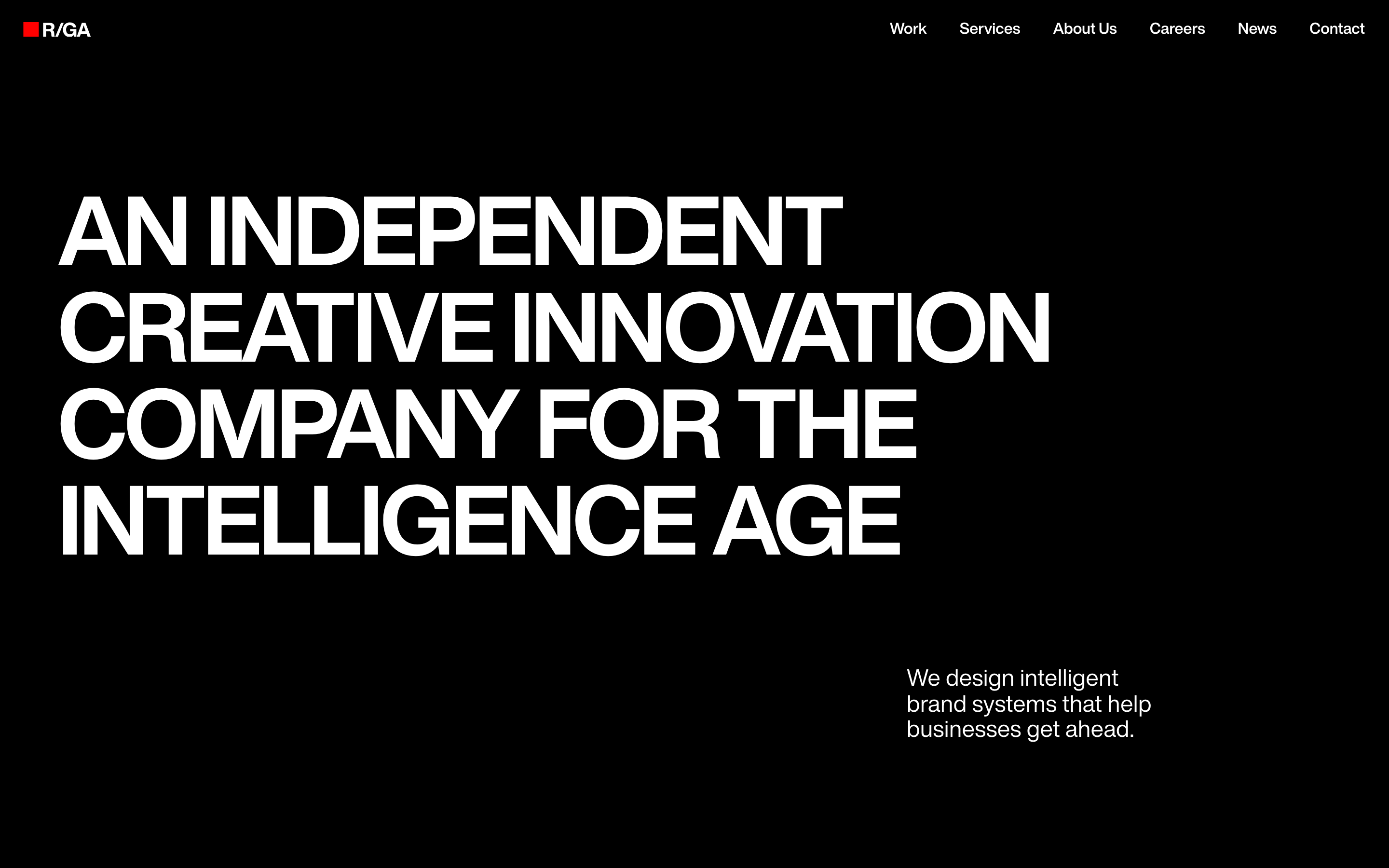
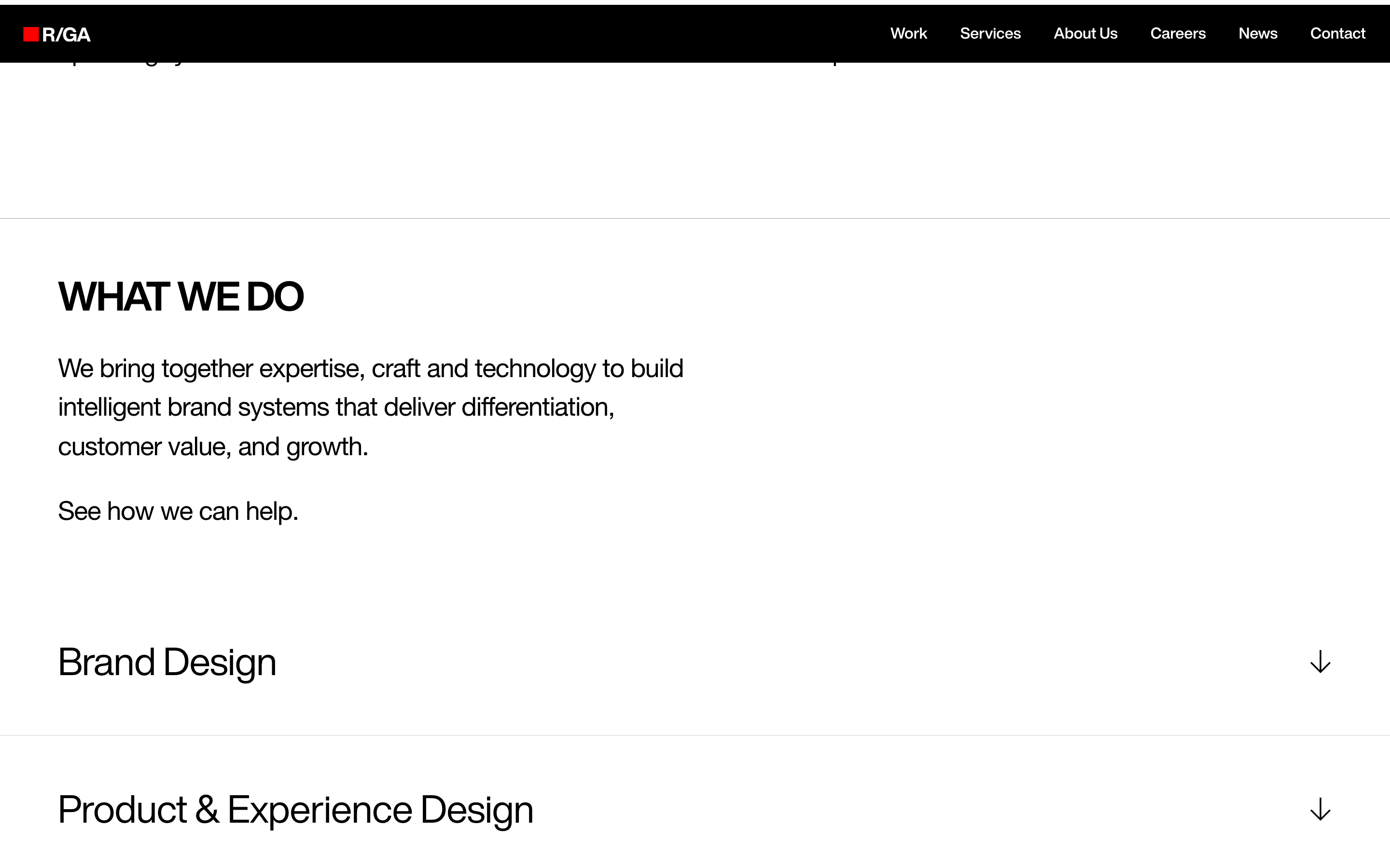
A bold, high-contrast agency site that uses massive typography and a strict monochrome palette to project creative authority and technological confidence.
Extreme contrast between absolute black and white, with a single sharp red accent.
03
Typography
grotesque-sans
display120px · 700
heading27px · 700
body16px · 400
Hero text is set in all-caps with tight tracking and heavy weight. · Body text uses a clean, readable grotesque-sans. · Line heights are tight on large display type, comfortable on body text.
04
Spacing
4px
8px
16px
24px
32px
48px
64px
96px
Generous vertical spacing between major sections and tight grouping within content blocks.
05
Surfaces
sm · 0px
md · 0px
lg · 0px
pill · 999px
Minimal, typically 1px lines in light gray (#E6E6E6) for dividers.
06
Layout
1440container
12columns
24pxgutter
768 / 1024breakpoints
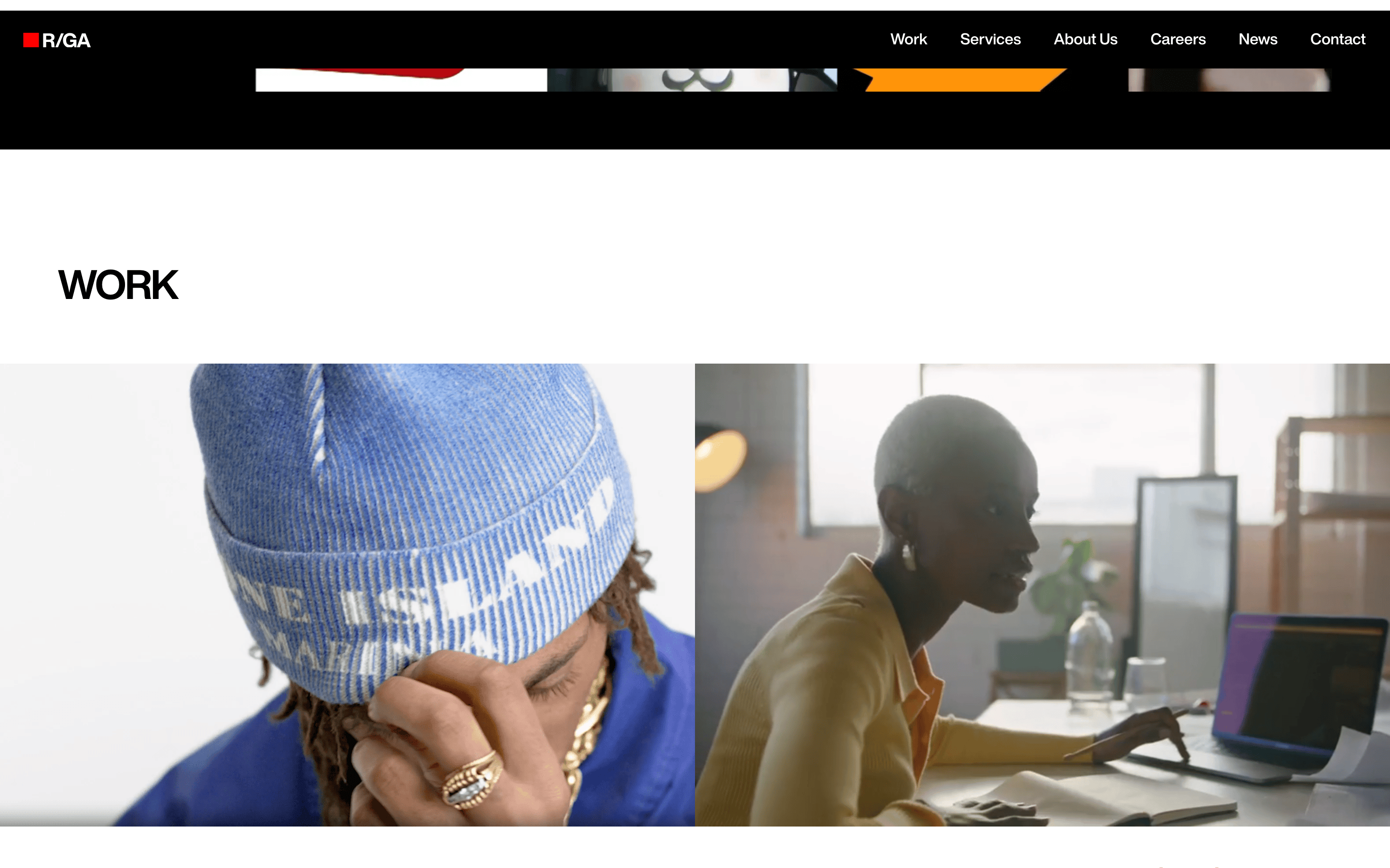
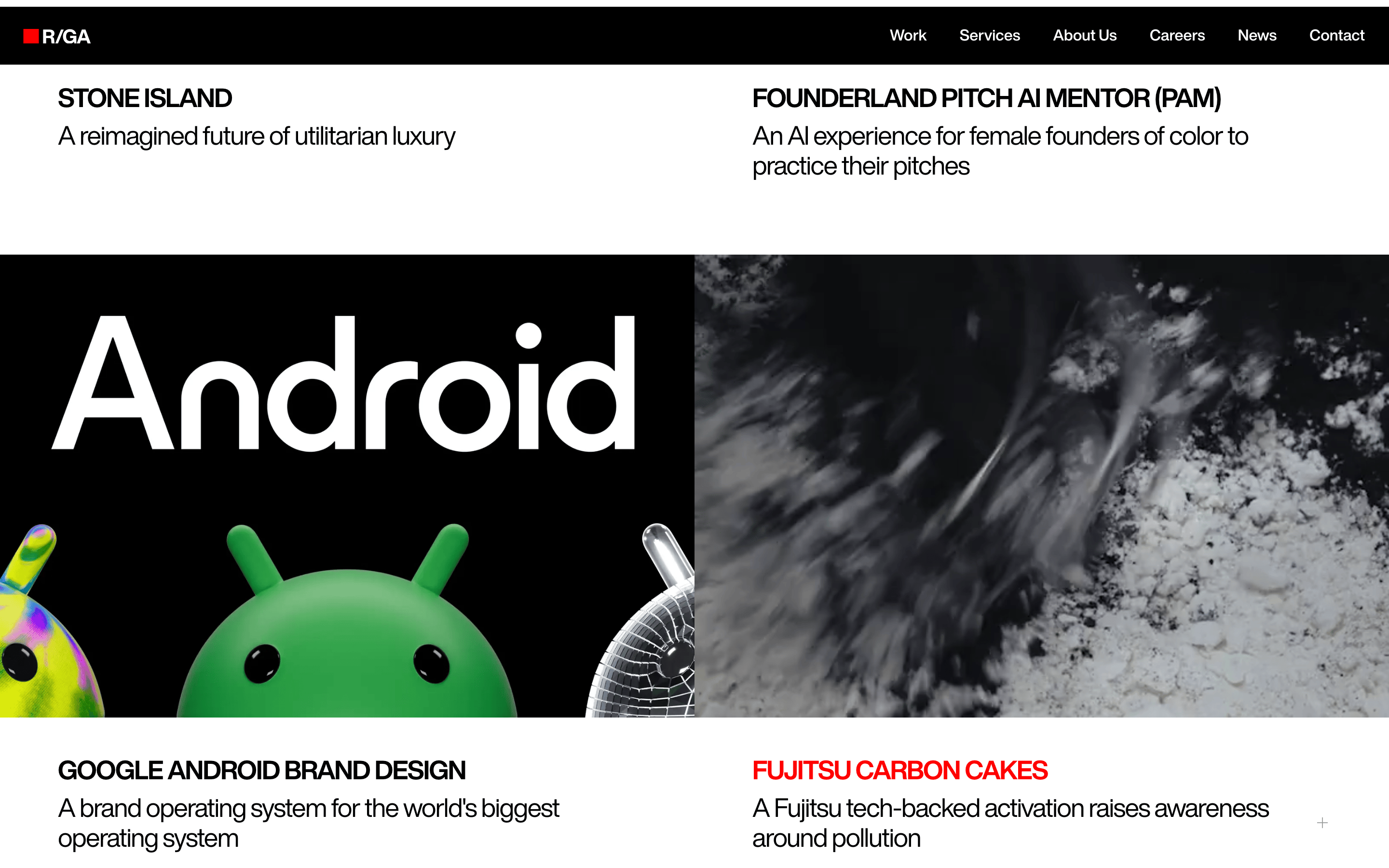
Full-width hero sections followed by clean, left-aligned content blocks on a white background.
07
Motion & Interaction
250msmicro
300mssmall
300msmedium
cubic-bezier(0.4, 0.0, 0.2, 1)easing
Color and opacity transitions on interactive elements.
Color transitions (0.3s ease-in-out) on navigation links. · Standard pointer cursor on all interactive elements.
08
Components
buttonClean text-based navigation links, uppercase in header.
cardNone visible, layout is section-based.
chipNone visible.
inputNone visible.
heroMassive, full-viewport black section with dominant all-caps white typography.
09
Voice & Don'ts
ToneConfident, authoritative, and forward-looking.
HeadlinesDeclarative, all-caps statements about capability and purpose.
CTAsSimple, direct invitations like 'See how we can help'.
Don't use gradients — the design uses solid, flat blocks of color.
Don't use soft shadows — surfaces are defined by contrast and clean lines.
Don't use rounded corners on major containers — the aesthetic is sharp and rectangular.
Don't use muted, low-contrast colors — the palette is strictly black, white, and a single red accent.
Don't use decorative illustrations in the main layout — typography is the primary visual element.
Don't use center-aligned text — headlines and body text are left-aligned.
Avoid: Cutesy or overly casual language.
Avoid: Decorative or overly complex visual elements.
Captured from the live site · real computed styles
11
System prompt
A high-end digital agency website for R/GA. It positions itself as a creative innovation company for the intelligence age. The visual system is built on extreme contrast: a solid black (#000000) background for hero sections and crisp white (#FFFFFF) for content areas. The primary typography is a bold, tight-tracked grotesque-sans (Helvetica variable) in all-caps for headlines, with a clean sans-serif for body text. A single, sharp red (#FF0000) accent is used sparingly in the logo. Critical donts: never use gradients or drop shadows, never round major corners, and avoid any low-contrast or muted color combinations. The layout is spacious and left-aligned, emphasizing the massive, dominant typography.
Bring this taste to your agent
Hand your AI agent a machine-readable spec of this design — tokens, type, motion, the whole DNA.