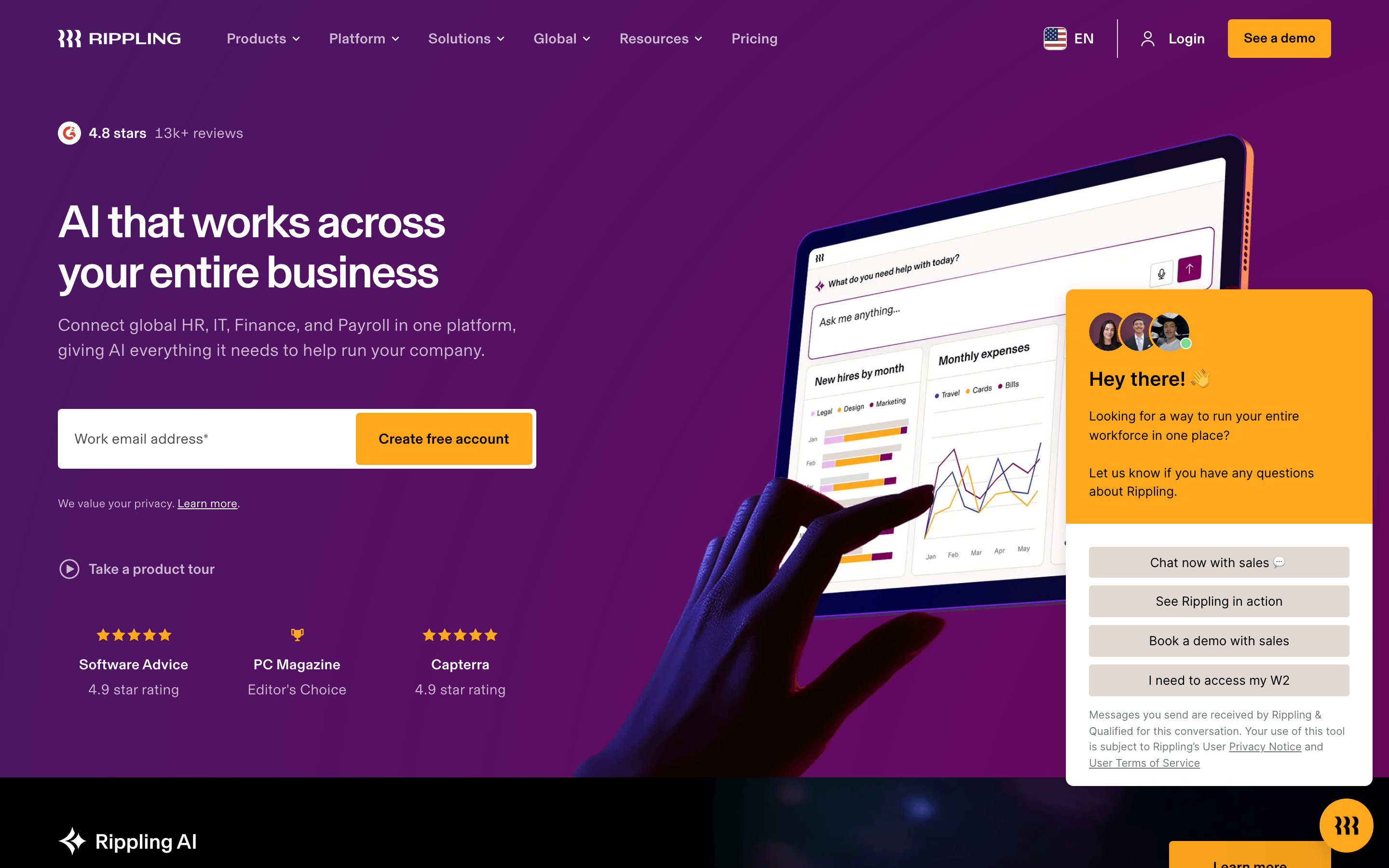
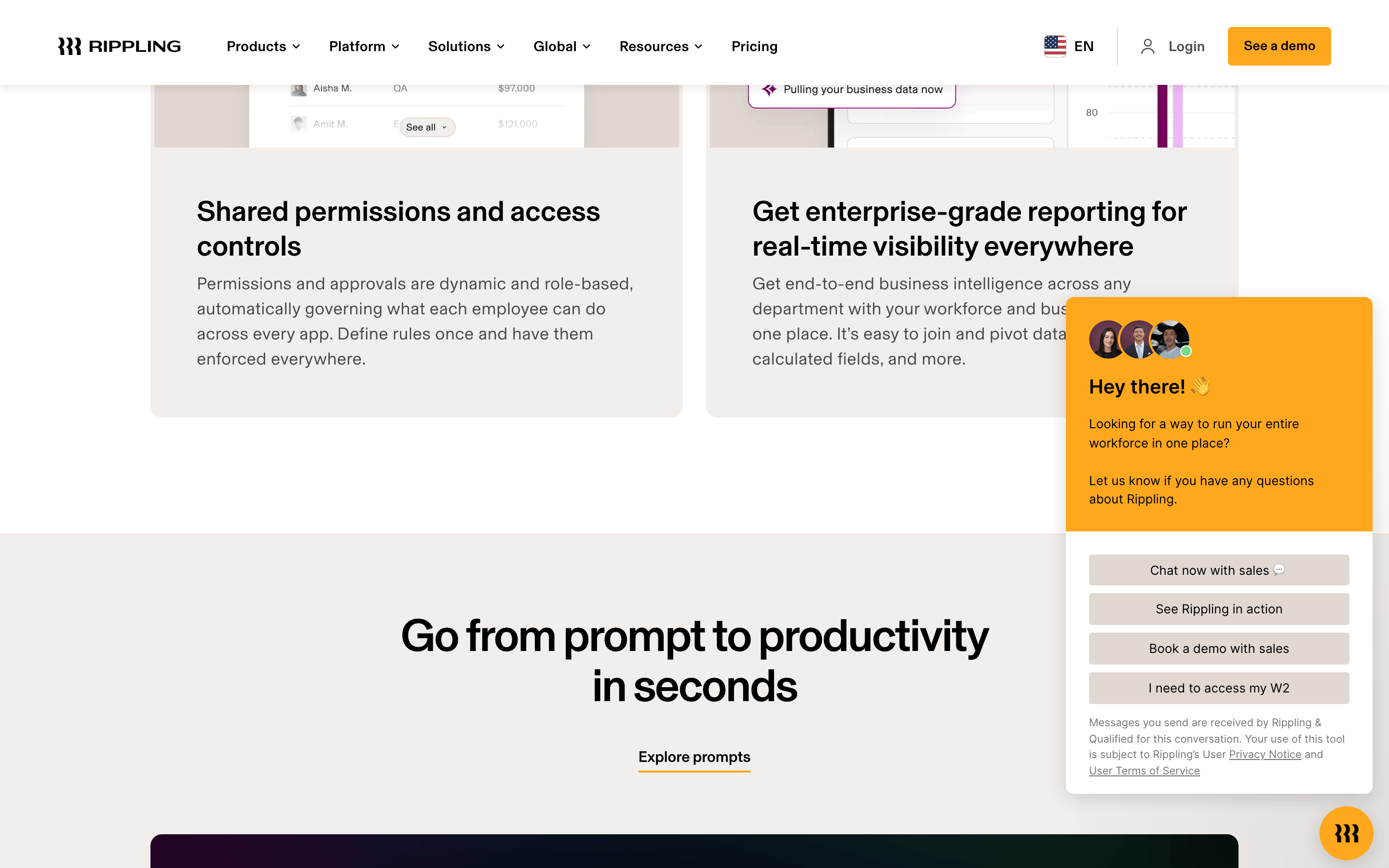
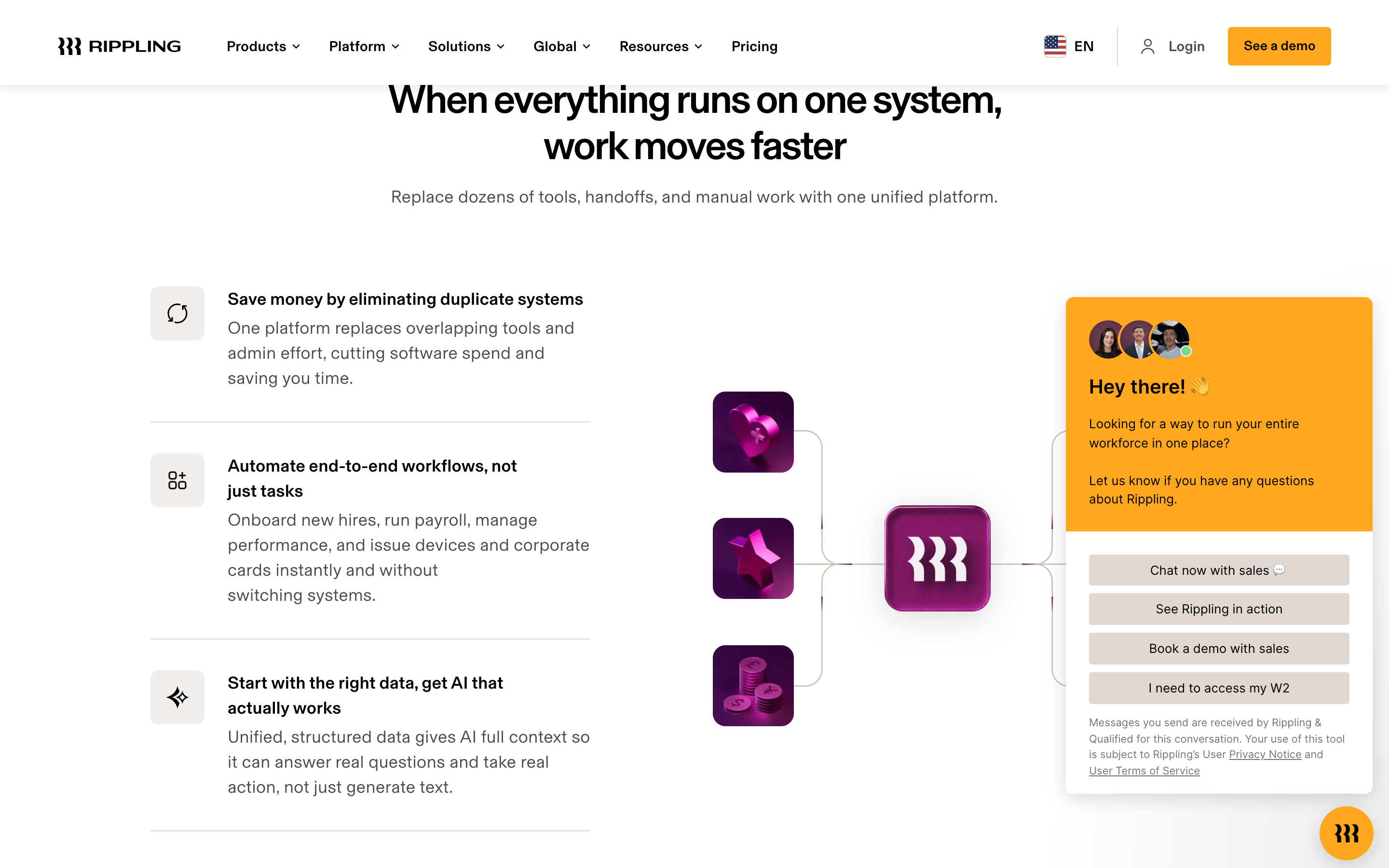
A single nervous system for a company, replacing dozens of fragmented tools.
02
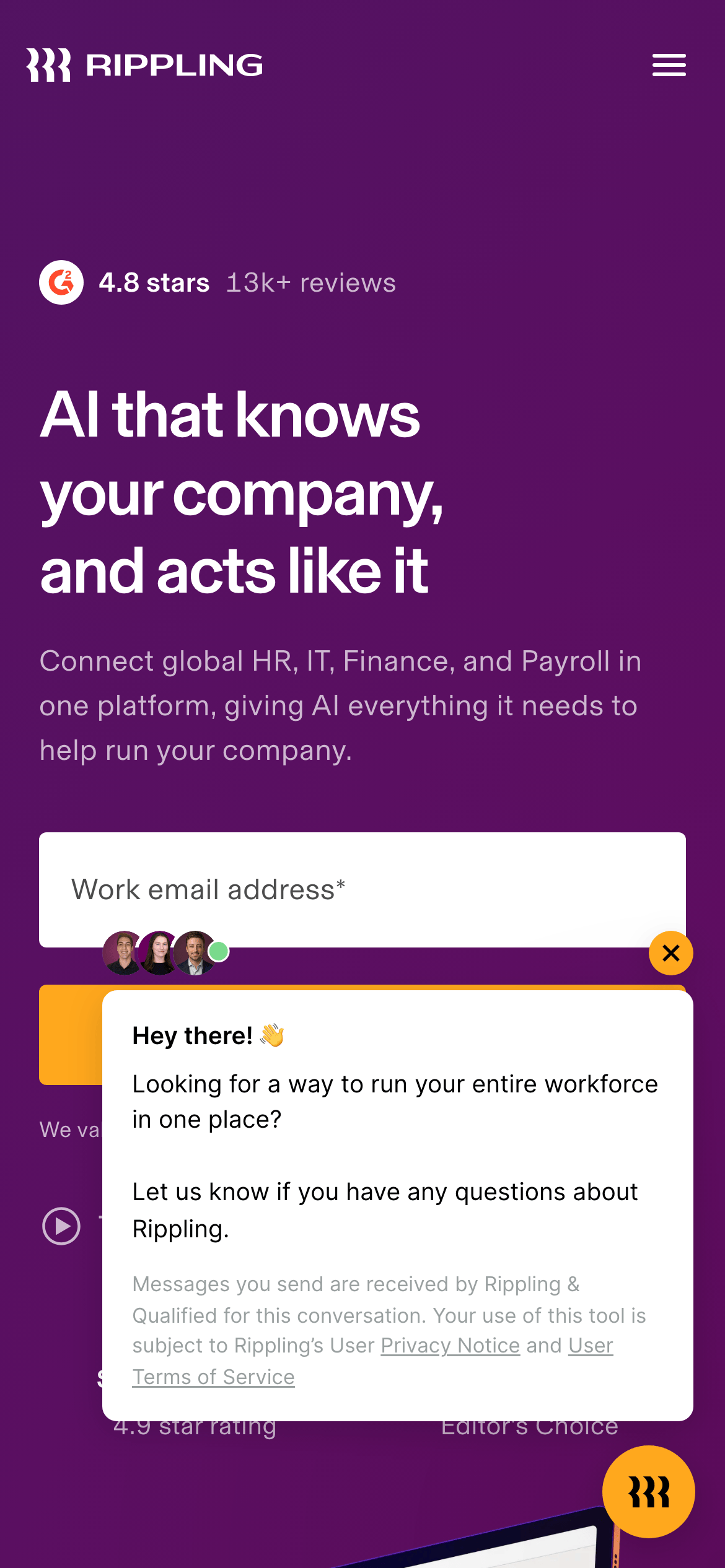
Color
#FFA81DAccent
#000000Ink
rgba(0,0,0,0.7)Ink soft
#7A005DBG
#E1D8D2BG soft
#FFFFFFBG quiet
#383838Muted
rgba(255,255,255,0.15)Line
High contrast between a deep, saturated purple hero and a clean, white content area, anchored by a vibrant orange accent.
03
Typography
geometric-sans · humanist-sans · monospace
display48px · 500
heading32px · 500
body16px · 400
small14px · 400
micro12px · 400
Use tight tracking for large display headlines. · Use slightly loose tracking (0.25px) for small UI text. · Maintain a clear weight hierarchy between headings (500) and body (400).
04
Spacing
4px
8px
12px
16px
24px
32px
48px
64px
96px
Consistent vertical rhythm based on 4px increments, with generous whitespace (40px-64px) between major content sections.
05
Surfaces
sm · 4px
md · 8px
lg · 12px
pill · 9999px
Minimal use of borders; separation is achieved through spacing and subtle color shifts. The primary border color is rgb(229, 231, 235).
A centered, max-width container with a clear two-column structure in the hero (content left, visual right) and a full-width centered column for content sections.
07
Motion & Interaction
150msmicro
200mssmall
300msmedium
cubic-bezier(0.4, 0, 0.2, 1)easing
Subtle fade and color transitions for interactive elements. · Smooth background-color and opacity changes on hover.
Subtle color transitions (0.15s) on text and background-color for interactive elements. · Immediate visual feedback, often a subtle scale or color shift.
08
Components
buttonSolid orange (accent) buttons with rounded corners (pill) for primary actions; text links with underline for secondary actions.
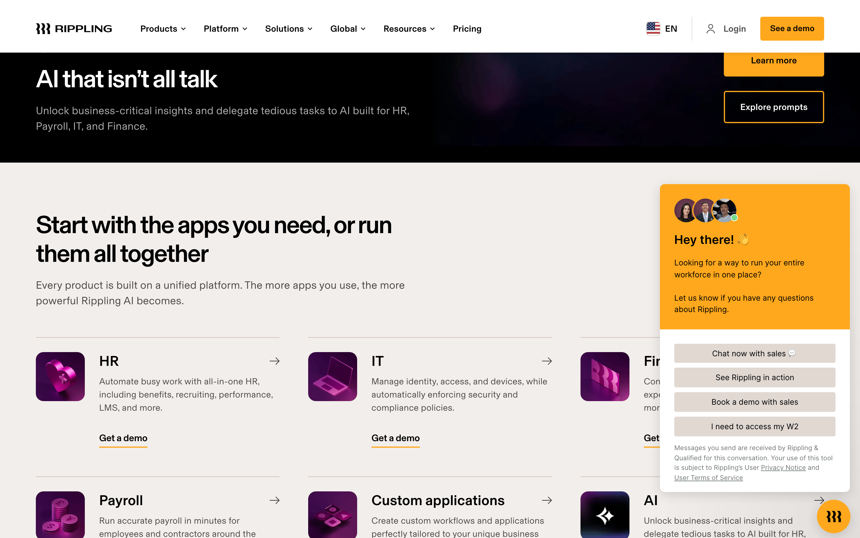
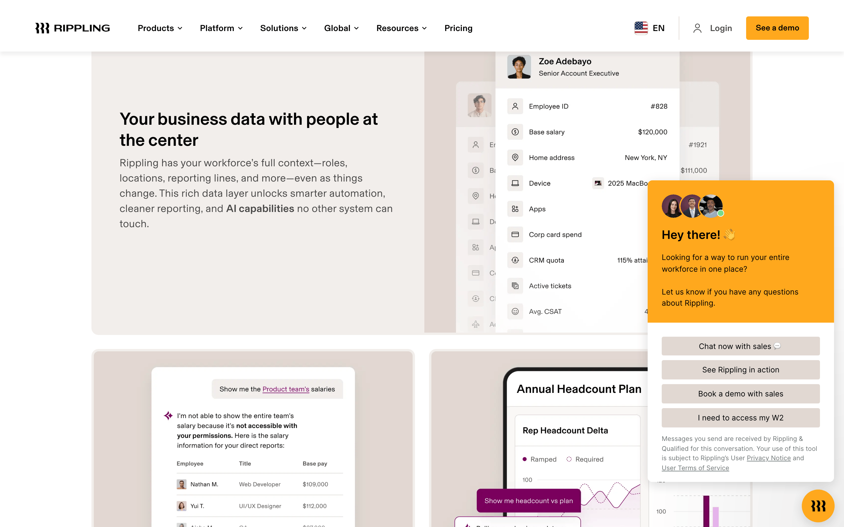
cardLight beige/gray (bgSoft) cards with subtle shadows and rounded corners (md).
chipUsed for navigation and categorization, often with a light background and subtle border.
inputWhite background input fields with subtle borders and rounded corners (md), often stacked vertically.
heroFull-width section with deep purple background, large display headline, and a prominent email capture form.
09
Voice & Don'ts
ToneConfident, authoritative, and benefit-driven.
HeadlinesShort, bold, and declarative, focusing on the core value proposition.
CTAsDirect and action-oriented, using a bright, high-contrast button.
Don't use a low-contrast color for primary text on the purple background — screenshot shows high-contrast white and black text.
Don't use a wide variety of font weights — screenshot shows a strict hierarchy between weight 400 and 500.
Don't use sharp, square corners on buttons or cards — screenshot shows rounded corners (8px, 12px, or pill).
Don't use a busy, multi-color palette — screenshot shows a focused palette of deep purple, orange, black, white, and beige.
Don't use dense, compact layouts — screenshot shows generous spacing (24px-64px) between elements.
Don't use decorative serif fonts — screenshot shows clean, geometric and humanist sans-serif categories.
Captured from the live site · real computed styles
11
System prompt
This is Rippling, a B2B SaaS platform. Its design DNA is premium, clean, and authoritative, focusing on unifying complex business operations. The primary colors are a deep purple (#7A005D) for hero sections, a vibrant orange (#FFA81D) for accents and calls-to-action, and a clean white/beige for content areas. Typography uses geometric and humanist sans-serif categories with a clear weight hierarchy (500 for headlines, 400 for body). Critical donts: avoid low-contrast text on the purple background, do not use a wide variety of font weights, and avoid sharp corners on UI elements. The layout is spacious and centered, using a 12-column grid with a maximum width of 1280px.
Bring this taste to your agent
Hand your AI agent a machine-readable spec of this design — tokens, type, motion, the whole DNA.