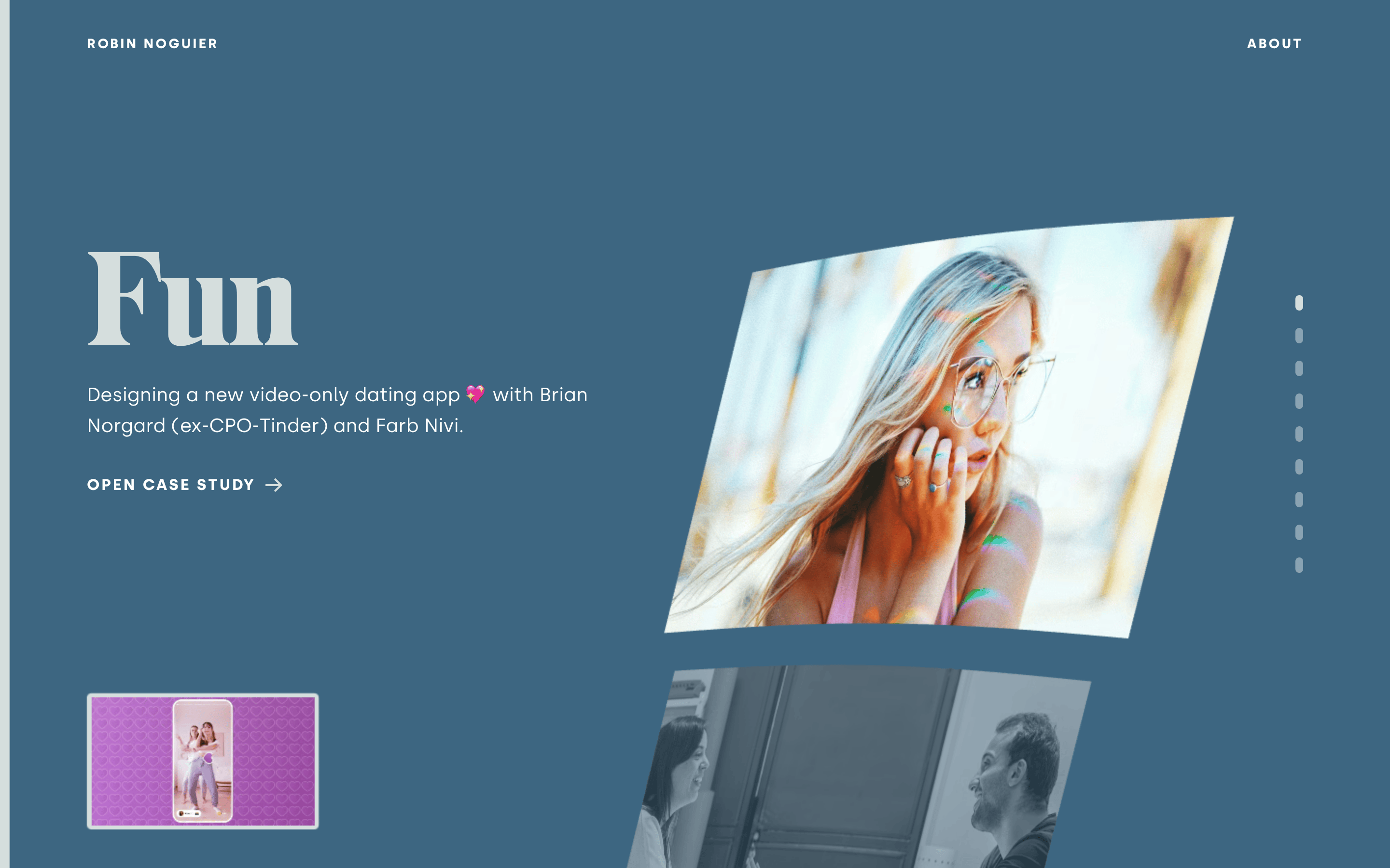
A sophisticated, muted blue palette provides a calm backdrop for high-contrast white text and vibrant photographic content.
03
Typography
didone-serif · geometric-sans
display135px · 400
body16px · 400
label14px · 700
Use uppercase and wide letter-spacing for navigation and action labels · Pair high-contrast display serif with clean geometric sans-serif · Keep body text light and readable against the dark background
04
Spacing
4px
8px
16px
24px
32px
48px
64px
96px
A consistent 4px base unit drives vertical and horizontal rhythm, with generous padding around content.
05
Surfaces
sm · 4px
md · 8px
lg · 12px
pill · 999px
Subtle white borders on image elements
0 4px 24px rgba(0, 0, 0, 0.15)
06
Layout
1440container
12columns
24pxgutter
768 / 1024breakpoints
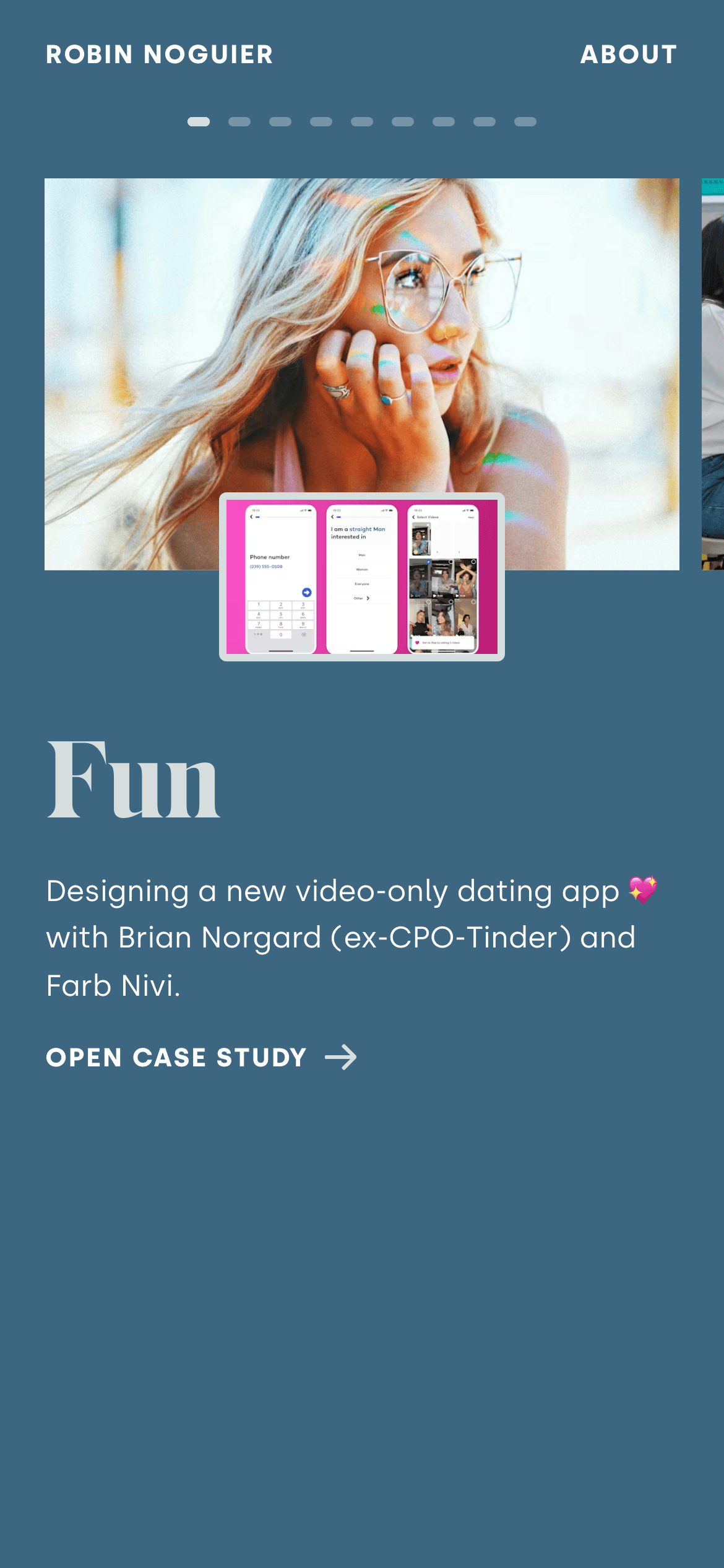
Asymmetrical split layout with large typography on one side and dynamic imagery on the other, shifting to a stacked layout on mobile.
07
Motion & Interaction
220msmicro
400mssmall
800msmedium
cubic-bezier(0.25, 0.1, 0.25, 1.0)easing
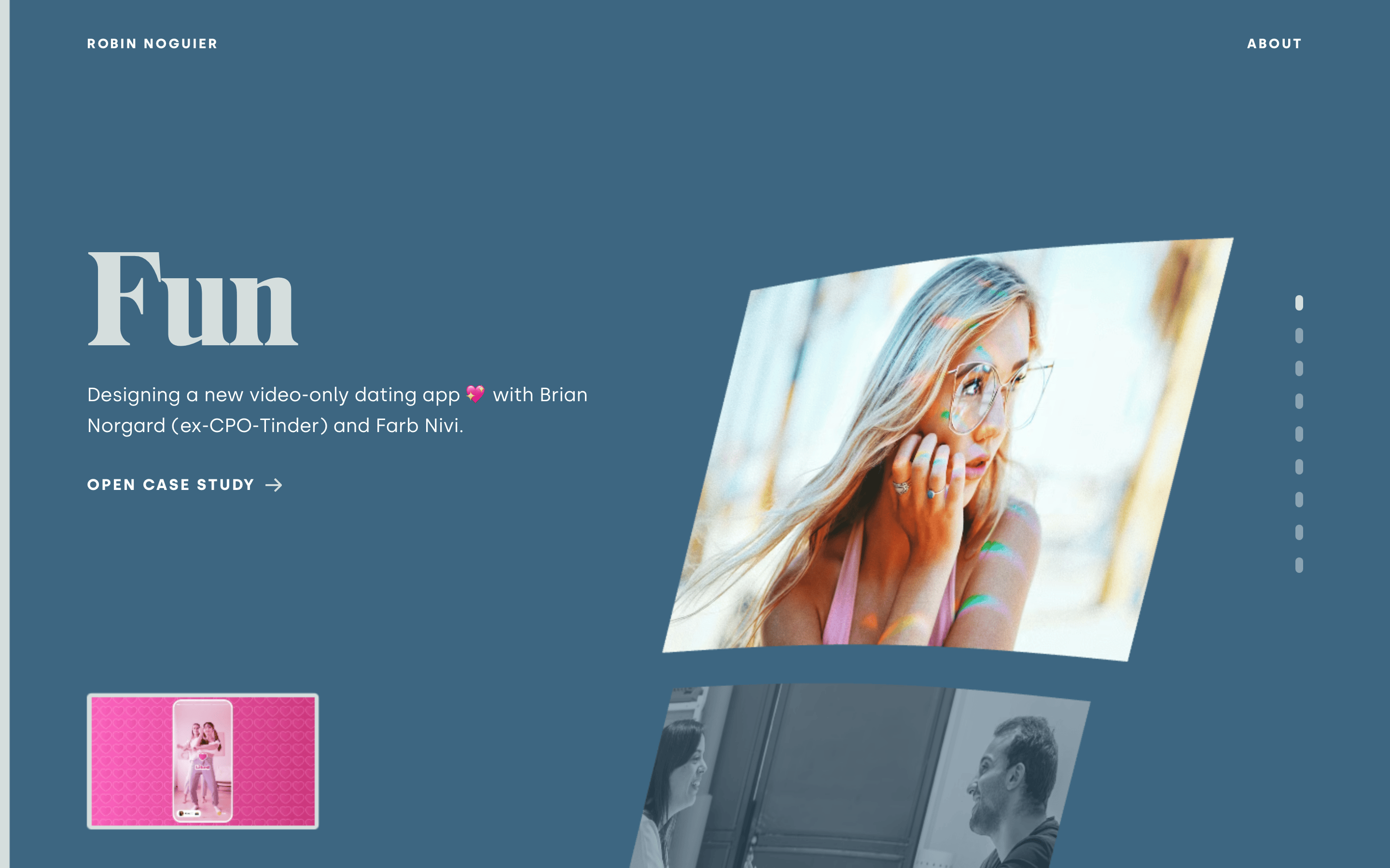
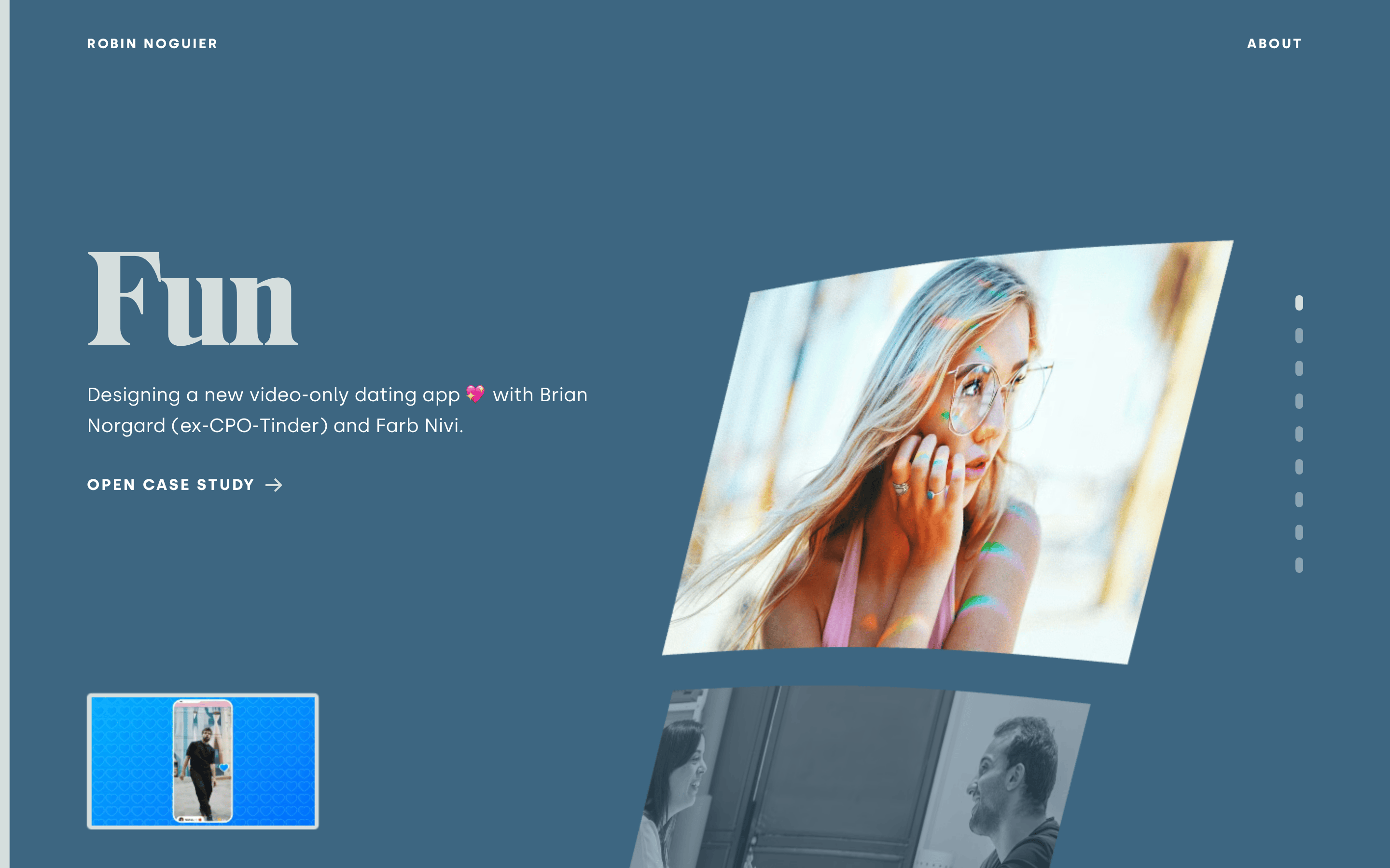
Smooth scroll-based transformations for parallax effects · Subtle hover transitions on interactive elements
Subtle cursor changes and potential opacity shifts on interactive elements · Direct navigation to case study details
08
Components
buttonUppercase text button with generous horizontal padding and a right-pointing arrow icon
cardDynamic image cards with slight rotation and white borders
heroA bold typographic introduction paired with a dynamic, rotated image
09
Voice & Don'ts
ToneConfident, minimalist, and professional
HeadlinesLarge, elegant serif typography with a focus on impact
CTAsClear, uppercase, and action-oriented
don't use rounded corners on main containers — screenshot shows square image frames
don't use a complex grid with many gutters — screenshot shows a clean, flexible layout
don't use bright, saturated accent colors — screenshot relies on white and muted blue
don't use lowercase for navigation — screenshot shows uppercase for 'ABOUT'
don't use heavy drop shadows on every element — screenshot shows minimal, soft shadows
don't use playful, rounded sans-serifs — screenshot uses a structured, geometric sans
Captured from the live site · real computed styles
11
System prompt
This is a refined portfolio website for a designer, characterized by a calm, muted blue background and bold, high-contrast white typography. It uses a large didone-serif for project titles and a clean geometric-sans for body text and navigation. The layout is asymmetrical, featuring dynamic, slightly rotated image cards that create a sense of depth and movement. Navigation is minimal and uppercase, with generous letter-spacing. Critical design principles include maintaining a clean, uncluttered aesthetic, using large-scale typography for impact, and ensuring images are the focal point without heavy shadows or borders. Avoid using bright accent colors, rounded corners on main elements, or complex grid systems.
Bring this taste to your agent
Hand your AI agent a machine-readable spec of this design — tokens, type, motion, the whole DNA.