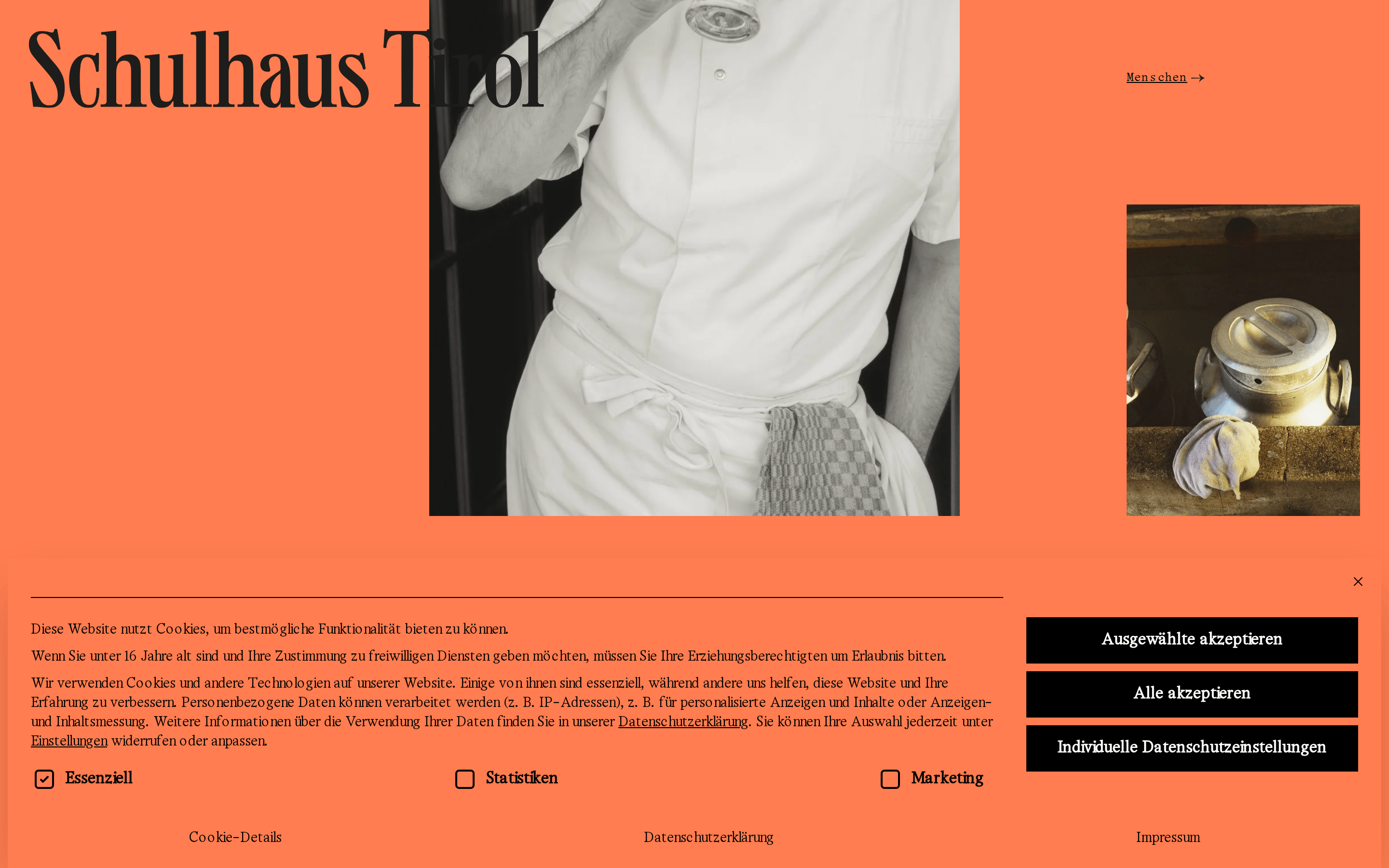
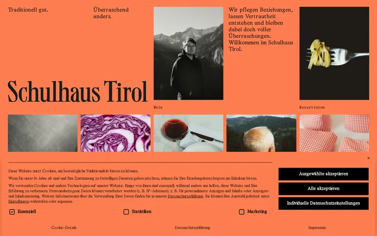
A traditional Tyrolean alpine inn reimagined with modern editorial design.
02
Color
#000000Ink
#FF7D50BG
rgba(0,0,0,0.25)Line
A bold, warm terracotta dominates the canvas, paired with stark black typography and imagery.
03
Typography
transitional-serif · monospace
display80px · 400
h226px · 400
body16px · 400
caption12px · 400
Use monospaced typography for small labels, navigation links, and technical details. · Use serif typography for large display headlines, body copy, and all primary text. · Maintain generous letter-spacing for monospaced text to ensure high legibility.
04
Spacing
4px
8px
12px
16px
24px
32px
48px
64px
96px
Generous whitespace is used to separate visual blocks and emphasize the large typography.
05
Surfaces
sm · 4px
md · 0px
lg · 0px
pill · 999px
Thin 1px solid lines for cookie consent dividers; 2px solid borders for checkboxes.
0px 25px 50px -12px rgba(0, 0, 0, 0.25)
06
Layout
1280container
12columns
24pxgutter
768 / 1024breakpoints
An asymmetric, editorial grid where large text blocks and images are placed in unconventional positions.
07
Motion & Interaction
220msmicro
400mssmall
800msmedium
cubic-bezier(0.4, 0, 0.2, 1)easing
Smooth 0.4s color and background transitions for interactive elements.
Subtle color transitions triggered by the cubic-bezier easing function. · Standard pointer cursor for interactive elements, default for static text.
08
Components
buttonSolid black rectangular buttons with white text, no border-radius.
cardImages presented in a grid layout without borders or padding.
chipMonospaced text labels floating above or below images.
inputSimple black-and-white checkboxes with monospaced labels.
heroA massive serif title 'Schulhaus Tirol' placed directly over or adjacent to black-and-white photography.
09
Voice & Don'ts
ToneWarm, welcoming, yet sophisticated and surprising.
HeadlinesLarge, classic serif typography that feels editorial and timeless.
CTAsDirect, bold, and functional using monospaced text for buttons and links.
Don't use sans-serif typography — screenshot shows a classic transitional serif used for all primary text.
Don't use multiple vibrant accent colors — screenshot shows a strict two-tone palette of terracotta and black.
Don't use rounded corners on buttons or cards — screenshot shows sharp, rectangular edges.
Don't use heavy box shadows for elevation — screenshot shows a flat, layout-driven hierarchy.
Don't center-align all content — screenshot shows a mix of left-aligned and floating text blocks.
Captured from the live site · real computed styles
11
System prompt
Schulhaus Tirol is a premium gastronomy website that uses an editorial layout to present traditional Tyrolean dining with a surprising, modern twist. The design is dominated by a warm terracotta background (#FF7D50) paired with stark black (#000000) typography and imagery. Typography relies heavily on a classic transitional serif for display and body text, complemented by a functional monospaced font for labels and links. Critical design rules include avoiding sans-serif fonts, rejecting rounded corners in favor of sharp geometric shapes, and maintaining a flat visual hierarchy without heavy shadows. The layout uses an asymmetric grid that allows text and images to overlap, creating a curated, gallery-like feel that emphasizes craftsmanship and tradition.
Bring this taste to your agent
Hand your AI agent a machine-readable spec of this design — tokens, type, motion, the whole DNA.