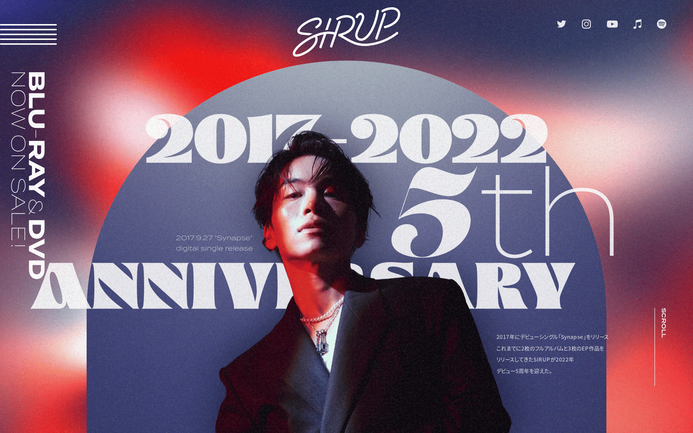
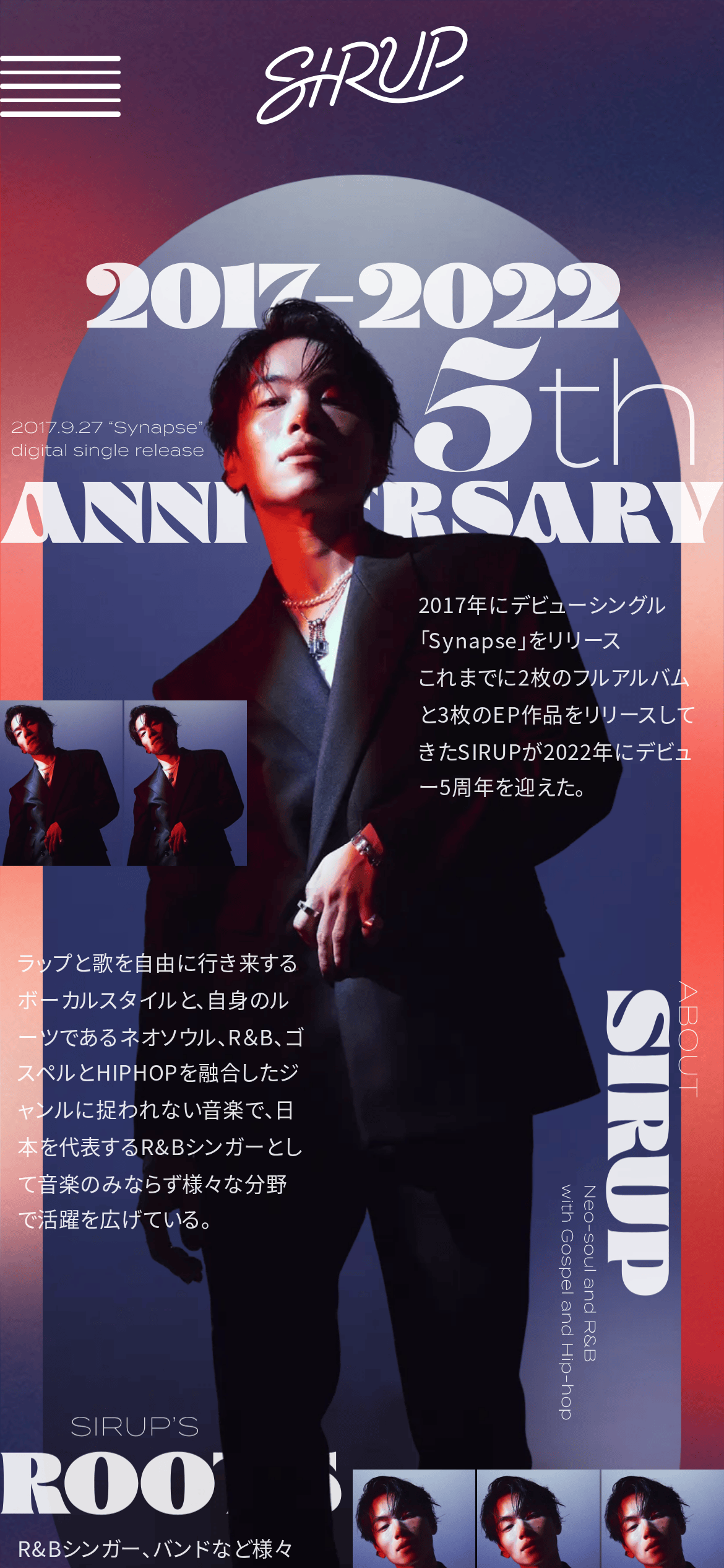
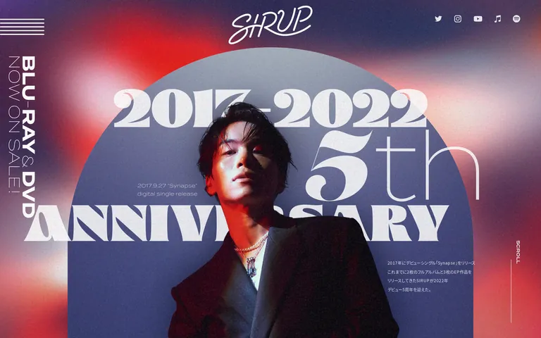
A high-fashion magazine cover for a music artist's milestone.
02
Color
#000000Ink
#ffffffBG
#4554acMuted
rgba(255, 255, 255, 0.88)Line
Monochromatic text on complex photographic or gradient backgrounds, relying on contrast and scale for hierarchy.
03
Typography
transitional-serif · humanist-sans
display120px · 700
body16px · 400
Display font is a high-contrast transitional serif used in massive scale. · Body font is a neutral humanist sans-serif. · Vertical text uses sans-serif for readability. · Kerning is tight on display text.
04
Spacing
4px
8px
16px
24px
32px
48px
64px
96px
Asymmetric, layout-driven spacing defined by overlapping elements.
05
Surfaces
sm · 0px
md · 0px
lg · 0px
pill · 999px
Minimal, relying on overlapping photographic layers.
06
Layout
1920container
12columns
24pxgutter
768 / 1024breakpoints
Full-bleed photographic hero with layered typography and absolute positioning.
07
Motion & Interaction
125msmicro
250mssmall
500msmedium
cubic-bezier(0.215, 0.61, 0.355, 1)easing
Linear transitions for scroll-based reveals. · Cubic-bezier easing for interactive elements.
Cursor changes to pointer on interactive elements. · Standard navigation links.
08
Components
buttonNo distinct button components visible; interactions are via links or icons.
cardOverlapping image cards with no background, featuring artist portraits.
chipNo chips visible.
inputNo input fields visible.
heroMassive typographic anniversary hero with a central portrait and overlapping text.
09
Voice & Don'ts
ToneConfident, sophisticated, and celebratory.
HeadlinesBold, expressive, and dramatically scaled.
CTAsSubtle, integrated as text links or minimal icons.
Don't use small, tight display text — screenshot shows massive, overlapping typography.
Don't use flat, solid backgrounds — screenshot shows complex photographic and gradient backdrops.
Don't use standard grid-based card layouts — screenshot shows overlapping, asymmetrical photo placements.
Don't use subtle color palettes — screenshot shows high-contrast text over vibrant imagery.
Don't use standard, centered UI components — screenshot uses absolute positioning and vertical text.
Don't use friendly, rounded aesthetics — screenshot shows a sharp, premium editorial style.
Avoid: Avoid generic or overly playful sans-serif headlines.
Avoid: Avoid cluttered layouts that obscure the central imagery.
Captured from the live site · real computed styles
11
System prompt
This is a premium, editorial-style artist website celebrating a 5th anniversary. It features massive, high-contrast transitional serif display typography (like 'Glodok' or 'Termina') layered over dramatic photographic and gradient backgrounds. The primary colors are black and white text over complex backdrops, with muted blue accents (#4554ac). Body text uses a neutral humanist sans-serif. Key critical don'ts: don't use standard grid layouts, don't use friendly or rounded UI elements, and don't use small display text. The layout is highly asymmetrical with overlapping elements and vertical text, creating a sophisticated, magazine-like experience.
Bring this taste to your agent
Hand your AI agent a machine-readable spec of this design — tokens, type, motion, the whole DNA.