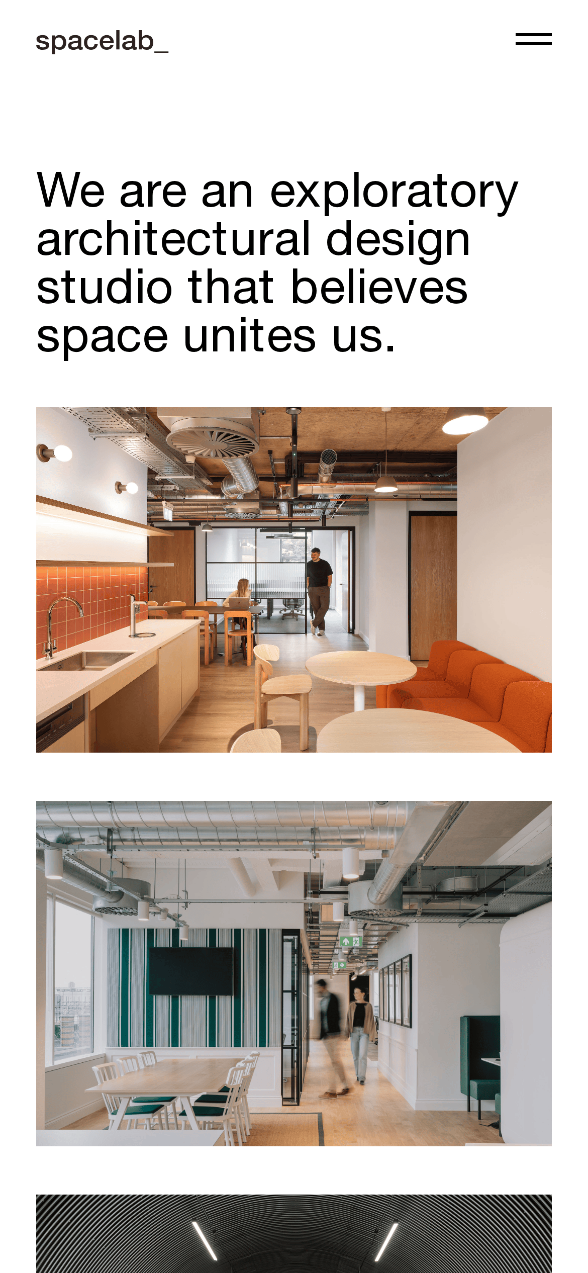
An open-plan studio where light, space, and structural honesty define the environment.
02
Color
#2C2222Ink
#B2B4B1Ink soft
#FFFFFFBG
rgba(255,255,255,0)Line
Strict monochrome palette where photography provides all color.
03
Typography
grotesque-sans
display62px · 400
heading30px · 400
body21px · 400
Use a uniform font-weight of 400 across all sizes · Maintain a tight line-height of 1.05 to 1.2 for clean vertical rhythm · Use slight positive letter-spacing for clarity
04
Spacing
4px
8px
16px
21px
32px
42px
84px
Based on a 4px baseline, with prominent use of 21px (1.5rem) and 42px (3rem) increments.
05
Surfaces
sm · 4px
md · 0px
lg · 0px
pill · 999px
No visible borders; relies on spacing and high-contrast photography.
06
Layout
1280container
12columns
42pxgutter
768 / 1024breakpoints
Asymmetrical split layout with a fixed left navigation column and a fluid right content area.
07
Motion & Interaction
250msmicro
400mssmall
800msmedium
cubic-bezier(0.25, 0.1, 0.25, 1.0)easing
Standard 0.4s fade and color transitions for UI interactions
Subtle color shifts (0.4s transition) on navigation links. · Standard link navigation.
08
Components
buttonMinimal text links without borders or backgrounds.
cardNo traditional cards; content is presented as full-bleed architectural photography.
chipNone.
inputNone.
heroA massive typographic manifesto statement followed by a full-width hero image.
09
Voice & Don'ts
ToneDirect, confident, and minimalist.
HeadlinesBold, declarative, and typographically dominant.
CTAsQuiet and functional text links.
don't use bold font-weights — screenshot shows all text in a regular 400 weight
Captured from the live site · real computed styles
11
System prompt
A minimalist, photo-led portfolio for an architectural design studio. Positioning: High-end architectural studio. Key hex colors: #FFFFFF background, #2C2222 ink, #B2B4B1 muted. Font categories: Grotesque sans-serif at a uniform 400 weight. Critical donts: Do not use bold font-weights; do not add decorative UI borders; do not use vibrant accent colors; do not use serif fonts; do not use drop shadows. The design prioritizes massive typography and full-bleed photography over traditional UI components, creating a clean, spacious feel.
Bring this taste to your agent
Hand your AI agent a machine-readable spec of this design — tokens, type, motion, the whole DNA.