← OpenDesign CURATED · OPEN · FREE
Standards
A clean, typographic-first SaaS interface for managing dynamic brand guidelines.
SaaS Design Tools Clean Productivity Premium
01
Identity DNA
standards brand guidelines modern automation clarity
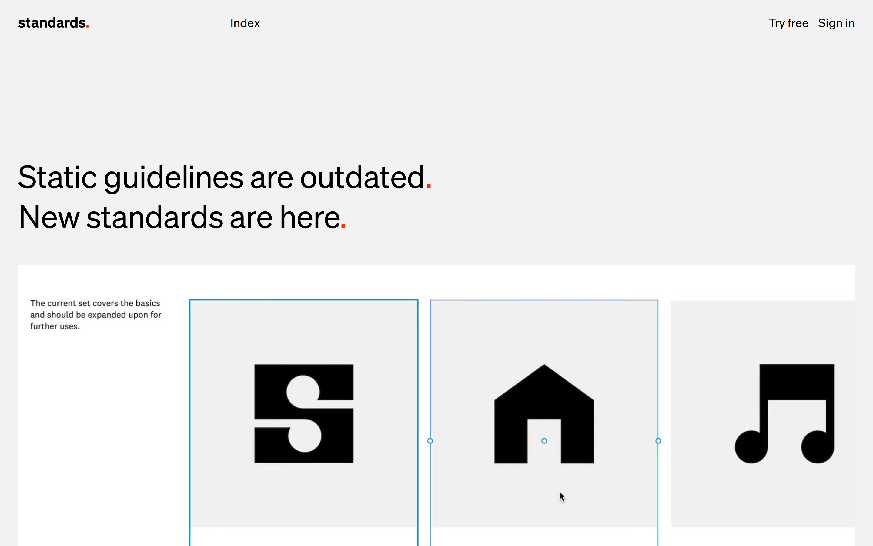
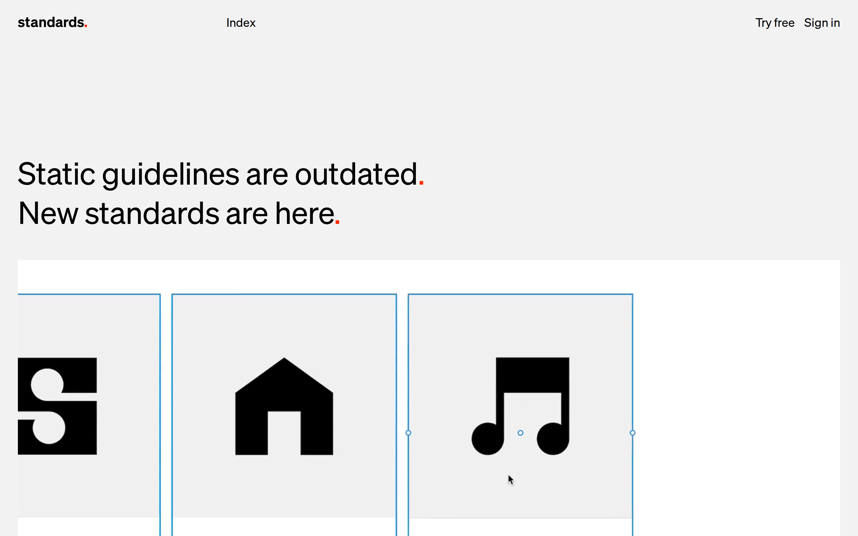
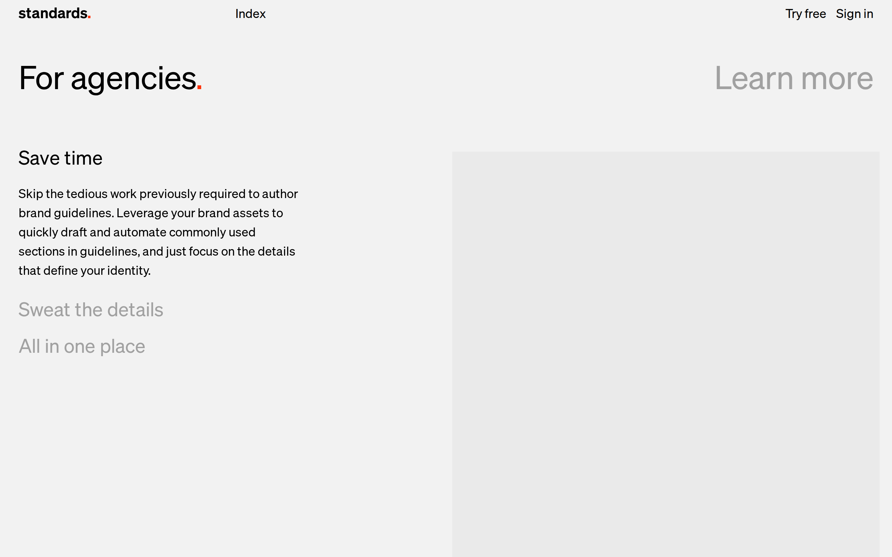
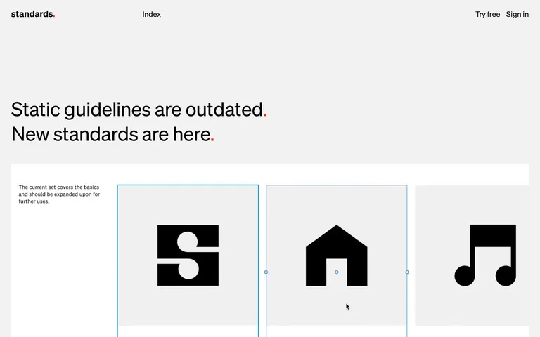
A digital design system tool that replaces static PDF guidelines with interactive, automated brand standards.
02
Color
#FF2E00Accent
#000000Ink
#EAEAEABG
#F2F2F2BG soft
#A1A1A1Muted
rgba(0,0,0,0.1)Line
A strictly monochromatic palette (black, white, grey) punctuated by a single, high-chroma red accent used sparingly for branding and emphasis.
03
Typography
grotesque-sans
display 52px · 400heading 31px · 400body 20px · 400caption 14px · 400Use weight 400 for all text · Tighten letter-spacing on larger display sizes · Maintain generous line-height for body copy
04
Spacing
4px
8px
16px
24px
32px
48px
64px
96px
Generous whitespace with consistent 30px horizontal padding in containers, maintaining a clean and open layout.
05
Surfaces
sm · 0px
md · 4px
lg · 0px
pill · 999px
Subtle 1px borders and thin outlines are used to define card boundaries and interactive states, avoiding heavy shadows.
06
Layout
1280 container
12 columns
24px gutter
768 / 1024 breakpoints
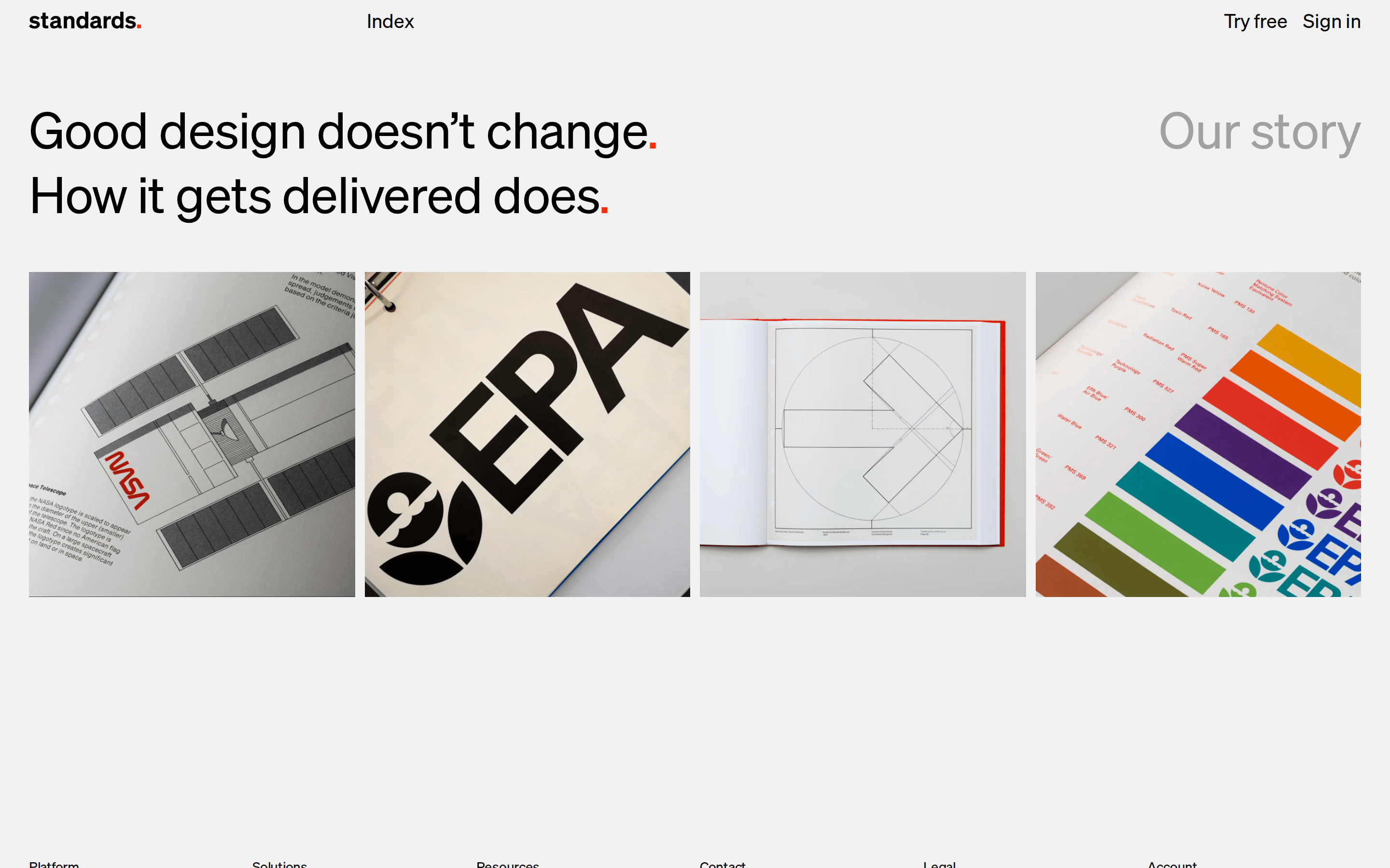
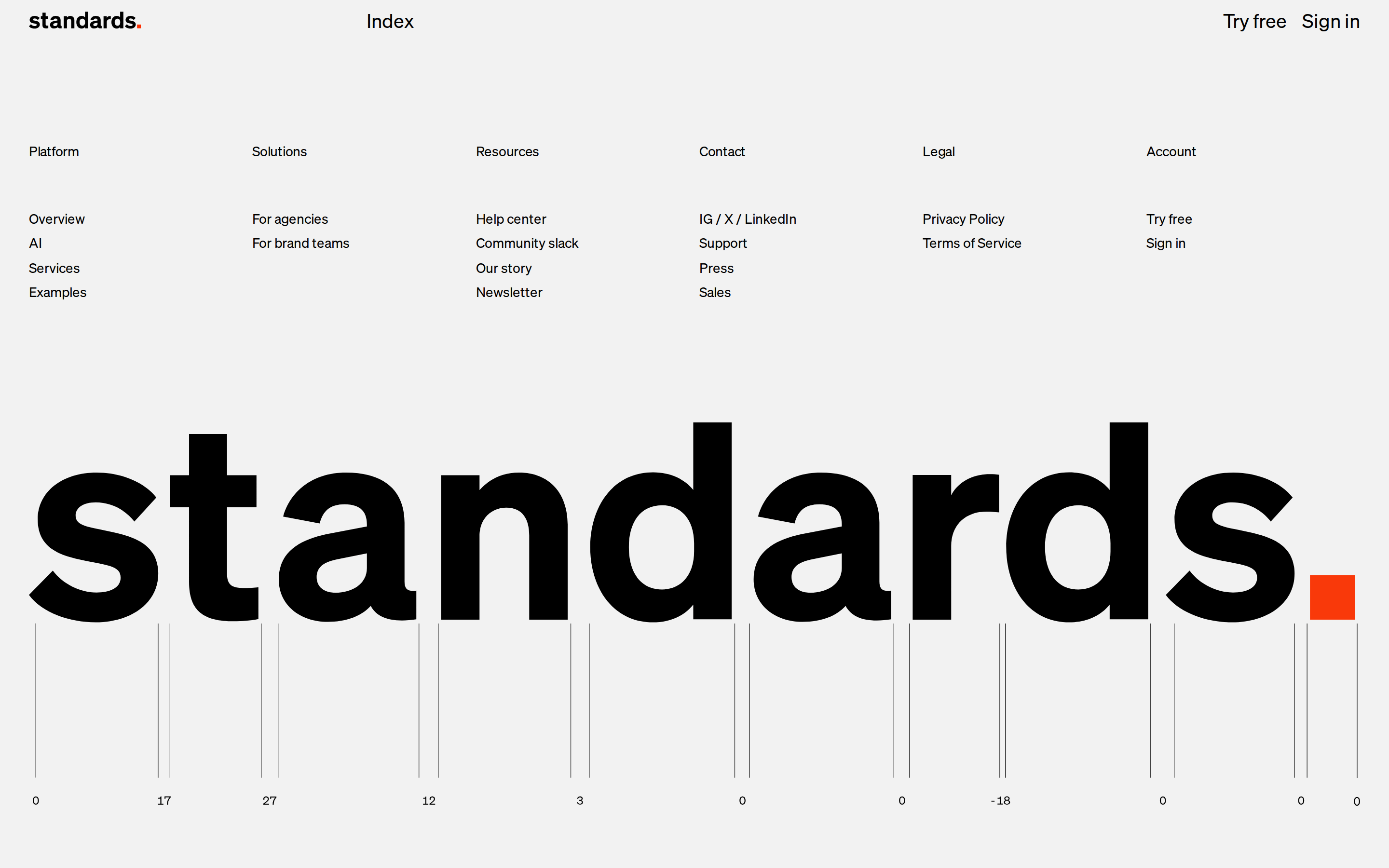
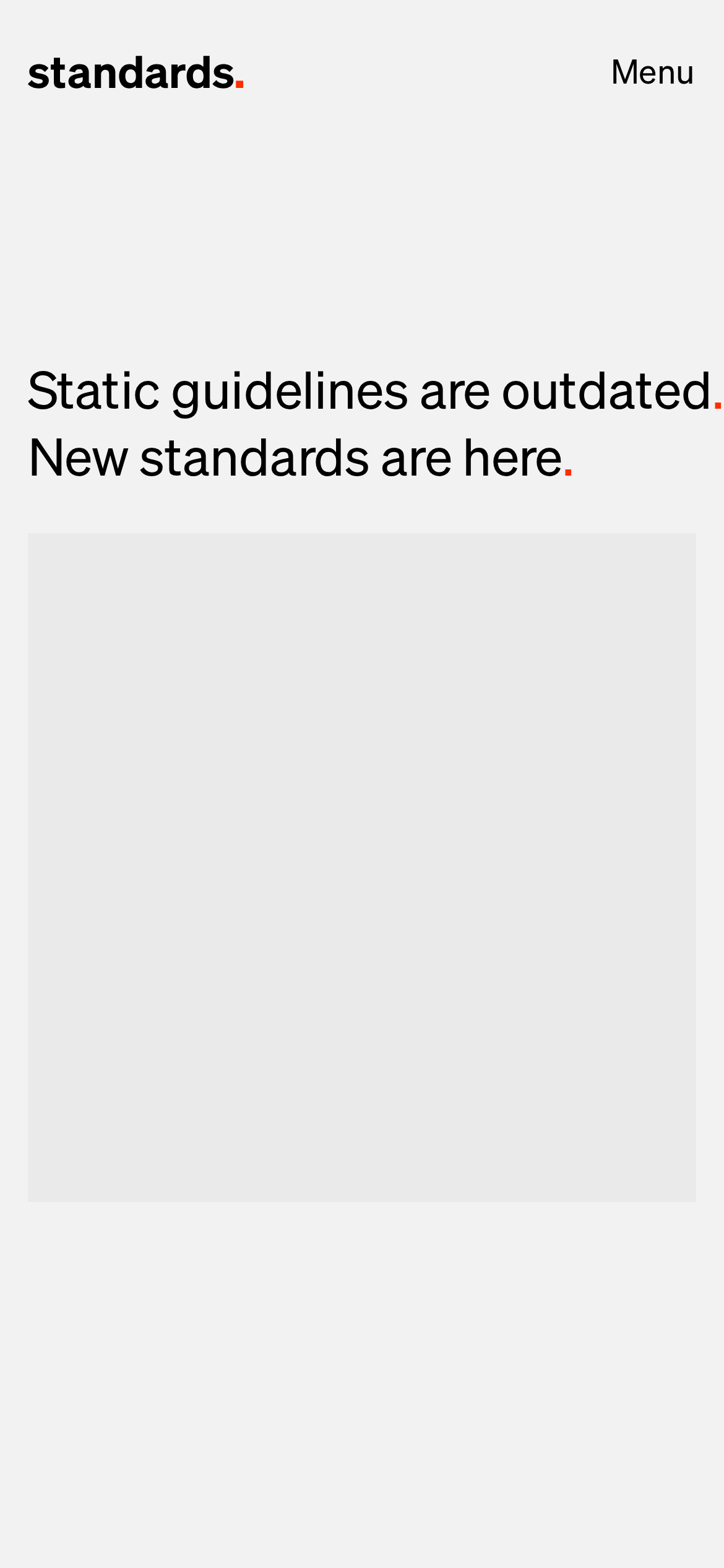
A multi-column layout that shifts to a single column on mobile, featuring a prominent left-aligned hero and alternating content sections.
07
Motion & Interaction
200ms micro
400ms small
800ms medium
cubic-bezier(0.25, 0.1, 0.25, 1) easing
Subtle opacity transitions for hover states · Smooth border color changes on focus · Transform movements for interactive elements
Changes in text color to muted grey or subtle shifts in background/opacity. · Immediate response with cursor state changes and focus ring activations.
08
Components
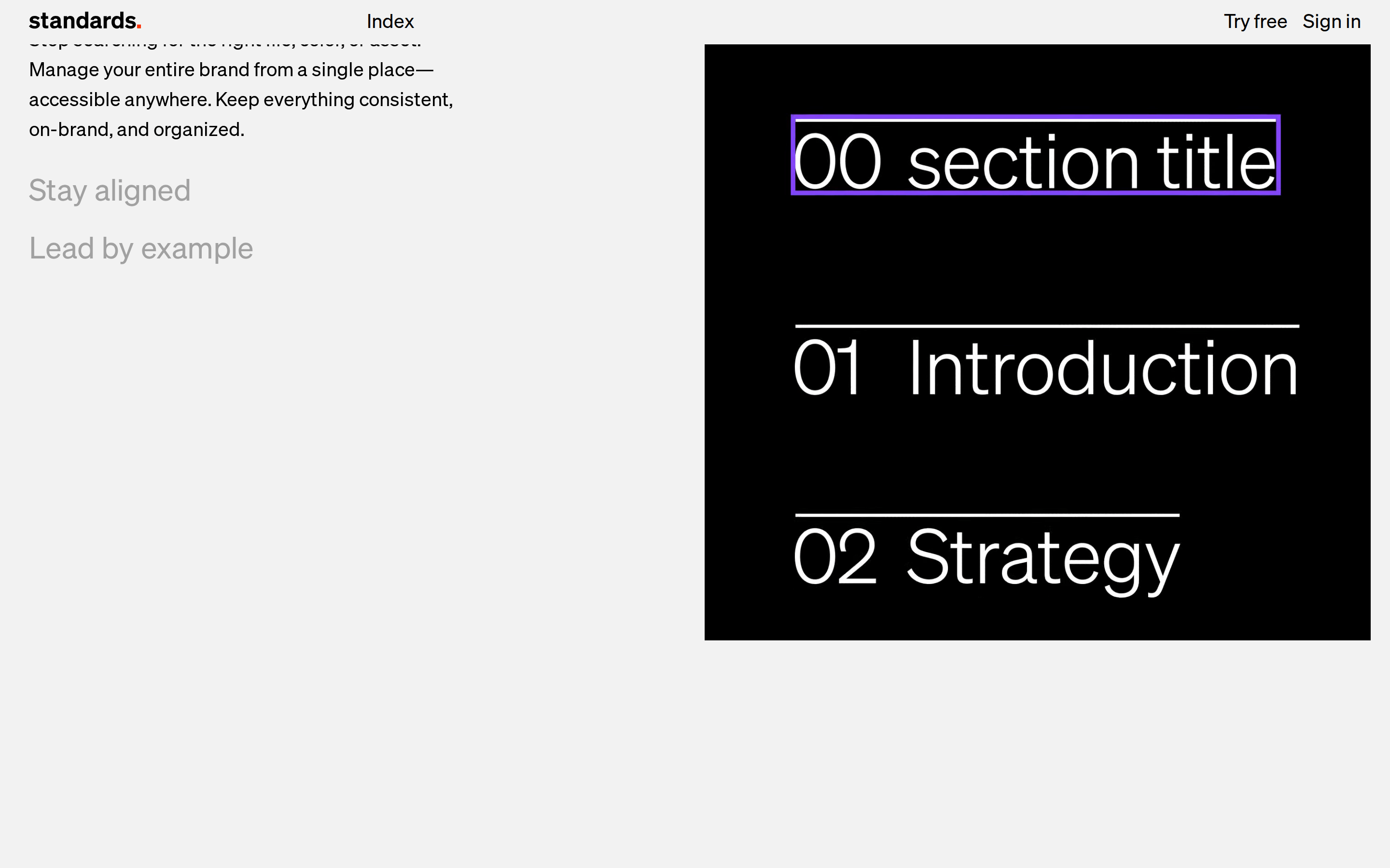
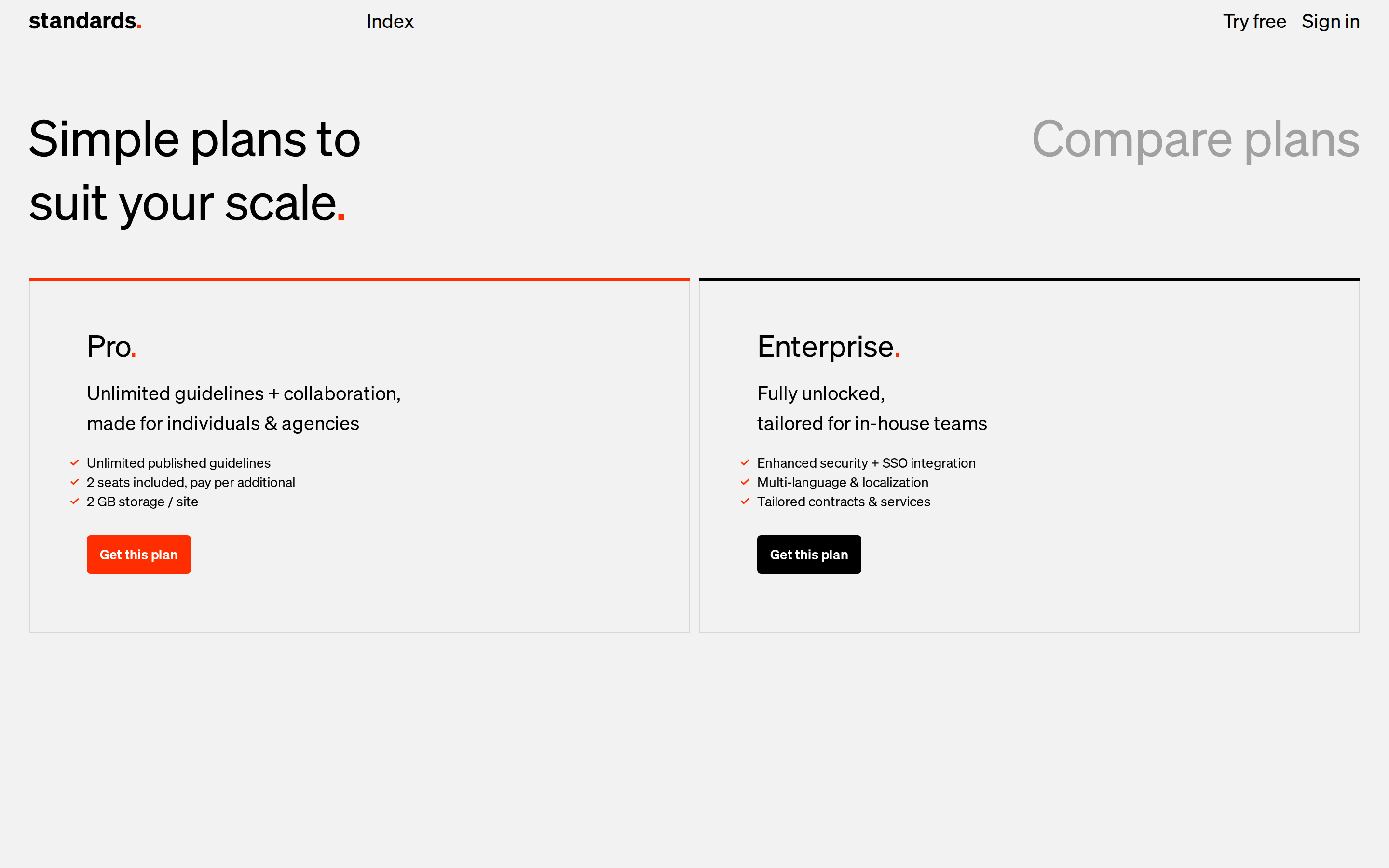
button Minimal text-based buttons and ghost buttons with simple hover states, sometimes paired with a red accent dot. card Light grey rectangular containers with thin blue selection outlines in editing states, focusing on content over decoration. chip Simple inline text elements or tags without heavy background fills. input Clean, borderless text fields or standard form inputs that blend into the background. hero A massive left-aligned typographic statement with a subtle red dot accent, followed by a visual preview of the product. 09
Voice & Don'ts
Tone Confident, direct, and authoritative. Headlines Short, punchy statements that challenge the status quo (e.g., 'Static guidelines are outdated.'). CTAs Action-oriented and simple (e.g., 'Try free', 'Learn more'). Don't use heavy drop shadows or gradients — screenshot shows flat, matte surfaces with subtle borders. Don't use serif or script fonts — screenshot shows a consistent, neutral grotesque sans-serif system. Don't use multiple bright accent colors — screenshot shows a strict monochrome palette with only one high-chroma red (#FF2E00). Don't use rounded containers or cards — screenshot shows strict rectangular geometry with minimal or zero border-radius. Don't clutter the layout with dense text — screenshot shows generous whitespace and short, impactful copy. Don't use heavy, bold font weights for body text — screenshot shows a consistent weight of 400 across almost all elements. Avoid: Overly corporate jargon Avoid: Complex sentence structures Avoid: Excessive use of exclamation points Avoid: Vague promises 10
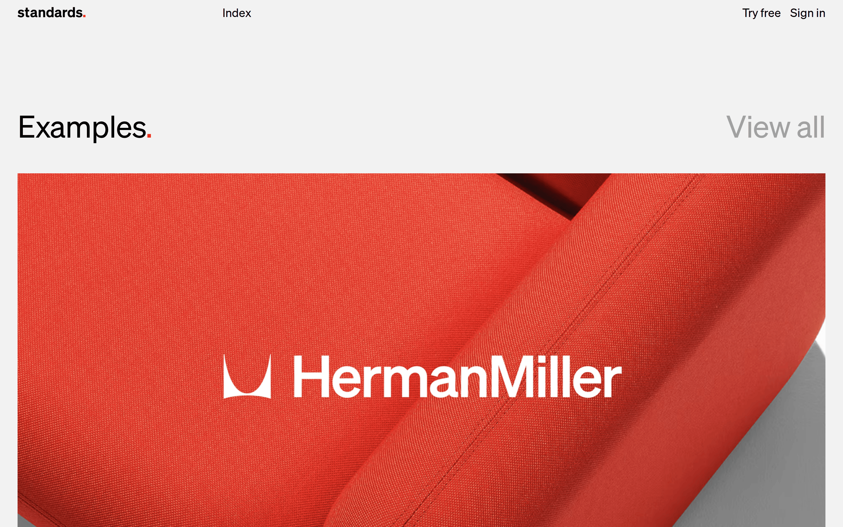
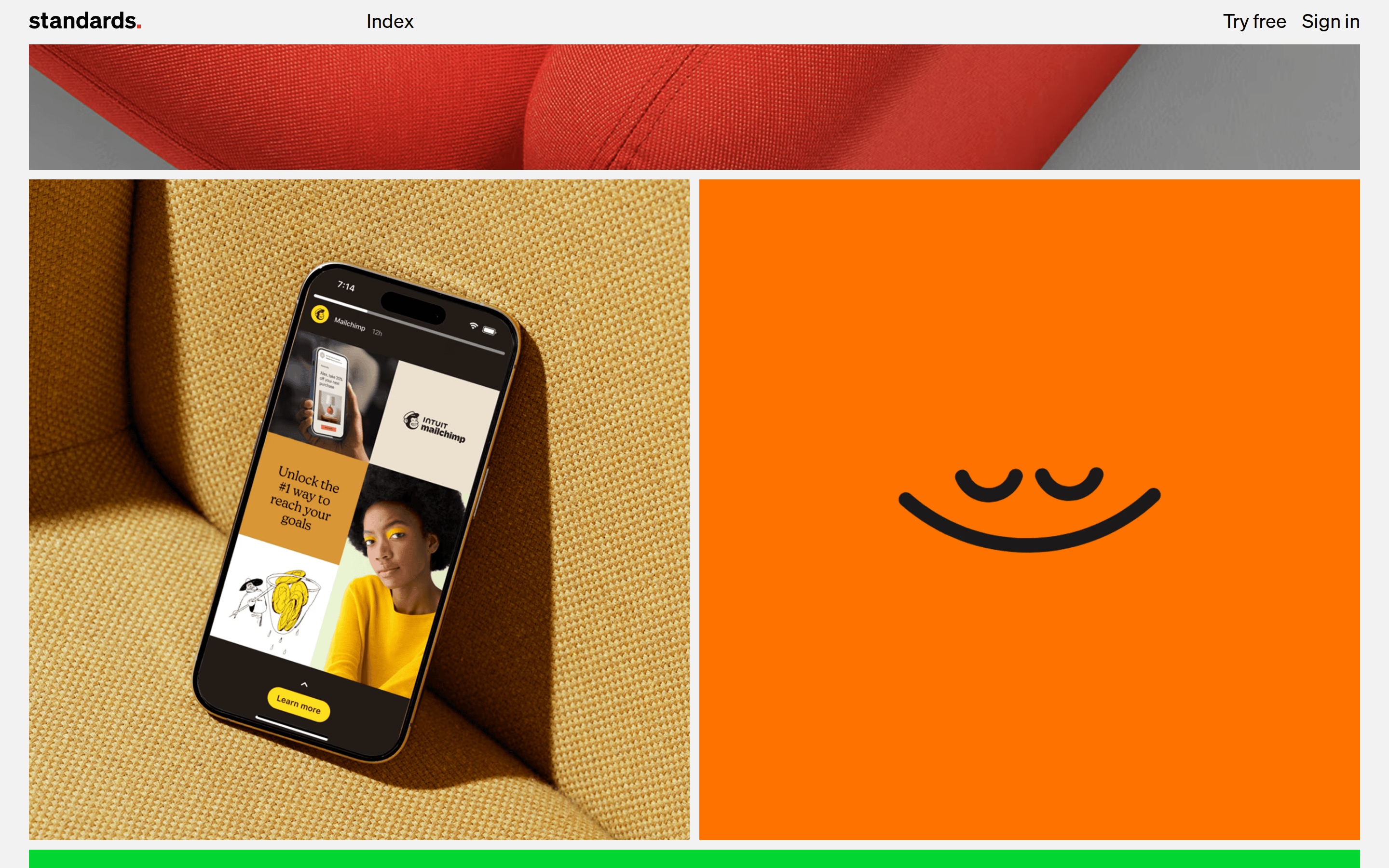
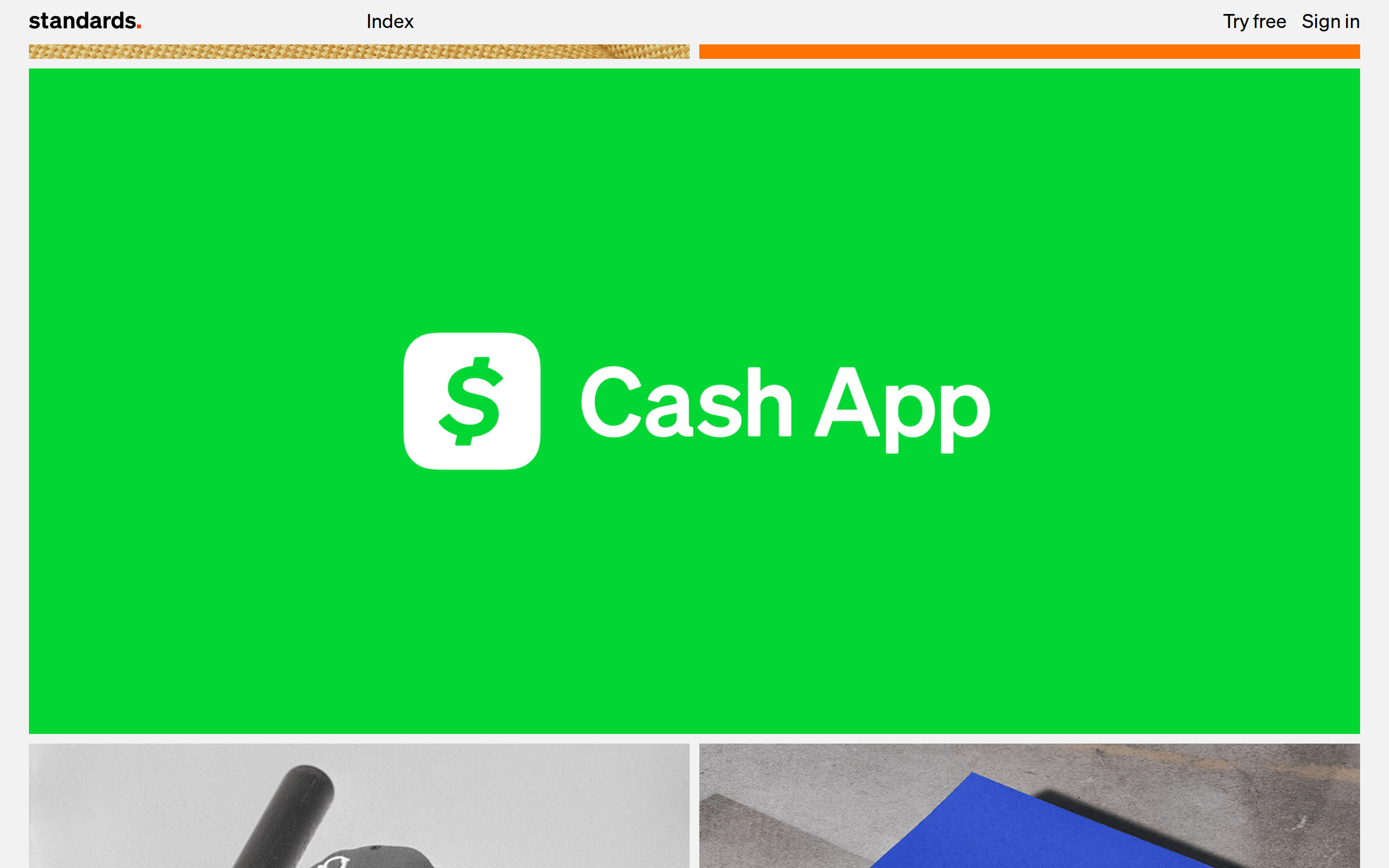
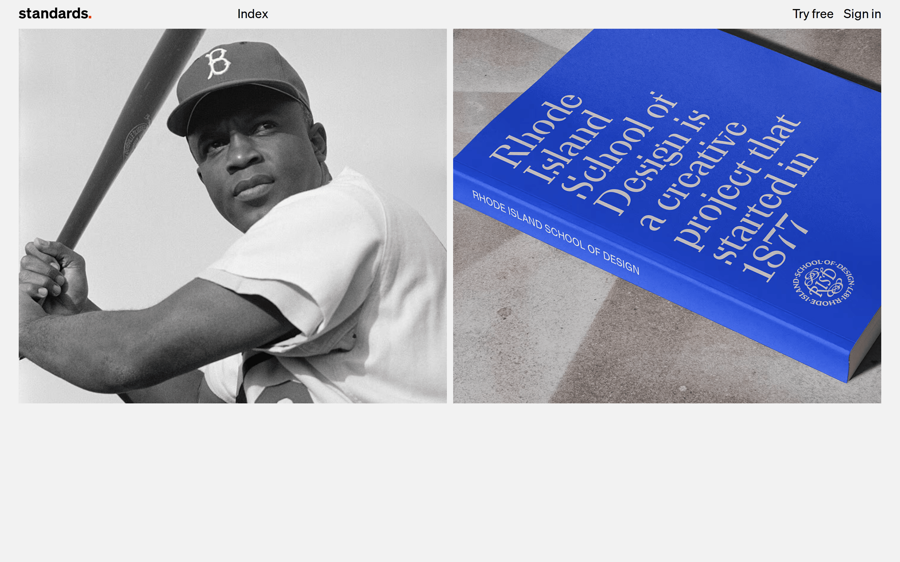
Inside the pack — real screenshots
桌面首屏(hero) 桌面滚动分段(90% viewport 步进,作为视觉证据) 桌面滚动分段(90% viewport 步进,作为视觉证据) 桌面滚动分段(90% viewport 步进,作为视觉证据) 桌面滚动分段(90% viewport 步进,作为视觉证据) 桌面滚动分段(90% viewport 步进,作为视觉证据) 桌面滚动分段(90% viewport 步进,作为视觉证据) 桌面滚动分段(90% viewport 步进,作为视觉证据) 桌面滚动分段(90% viewport 步进,作为视觉证据) 桌面滚动分段(90% viewport 步进,作为视觉证据) 桌面滚动分段(90% viewport 步进,作为视觉证据) 桌面滚动分段(90% viewport 步进,作为视觉证据) 桌面滚动分段(90% viewport 步进,作为视觉证据) 桌面滚动分段(90% viewport 步进,作为视觉证据) 桌面滚动分段(90% viewport 步进,作为视觉证据) 桌面滚动分段(90% viewport 步进,作为视觉证据) 移动首屏 Captured from the live site · real computed styles
11
System prompt
Design a clean, confident SaaS interface for a design tool that emphasizes clarity and automation. Use a monochromatic palette with an off-white background (#EAEAEA), solid black text (#000000), and a single high-chroma red accent (#FF2E00) for branding. Utilize a neutral grotesque-sans font family at weight 400 with tight letter-spacing for large display sizes. The layout should be spacious, using generous whitespace and simple rectangular containers with minimal border-radius. Critical rules: Do not use drop shadows or gradients; do not use multiple accent colors; do not use serif or overly decorative fonts; do not clutter the interface with dense information; do not use heavy font weights for long-form text.
More from the library en · zh-CN · zh-TW · ja · ko
OpenDesign · curated web aesthetics for AI-readable design DNA · opendesign.cc
Why we curated this: This site is a perfect example of a modern, typography-driven SaaS interface that uses restraint and a single bold accent to achieve a premium, authoritative feel.