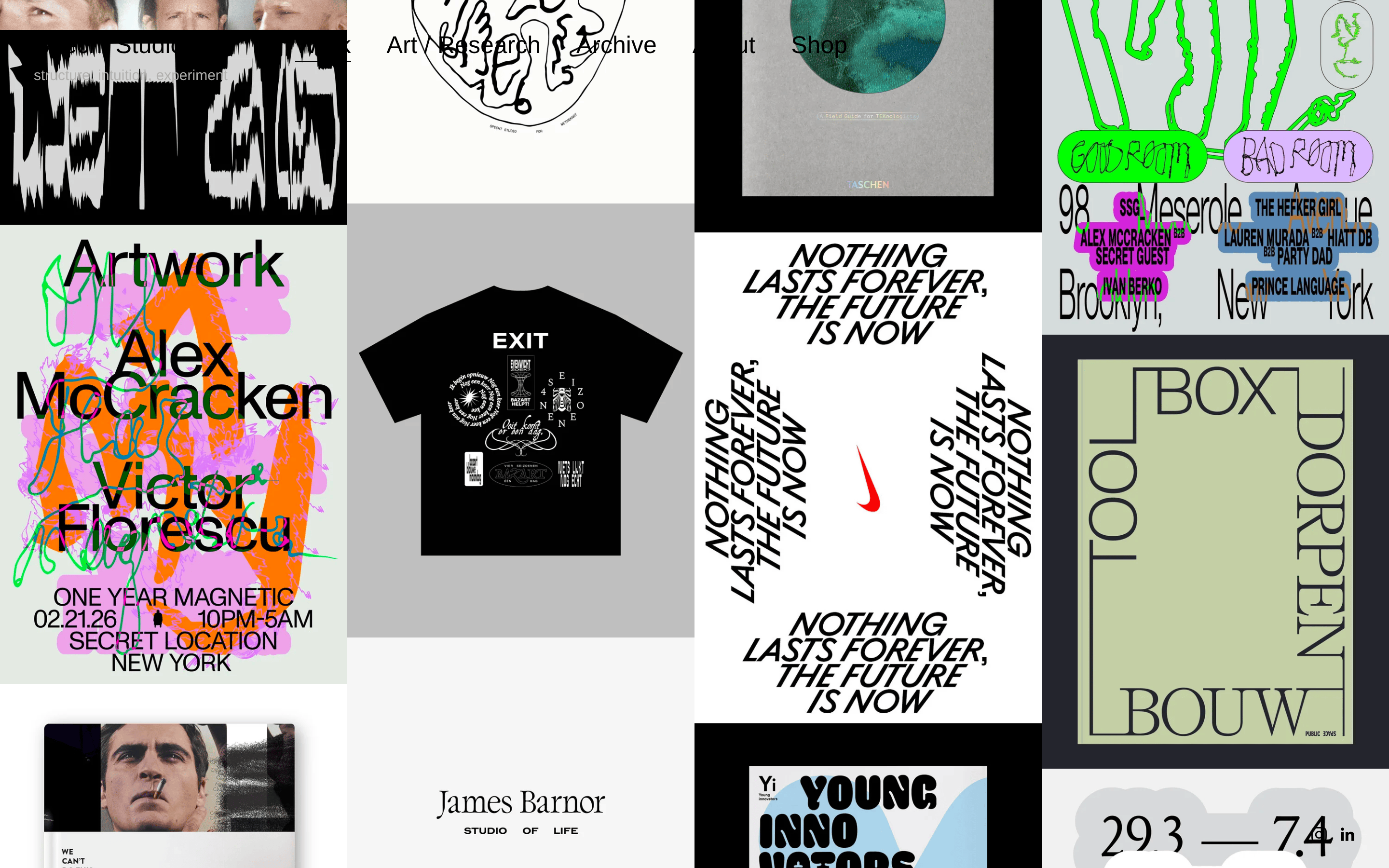
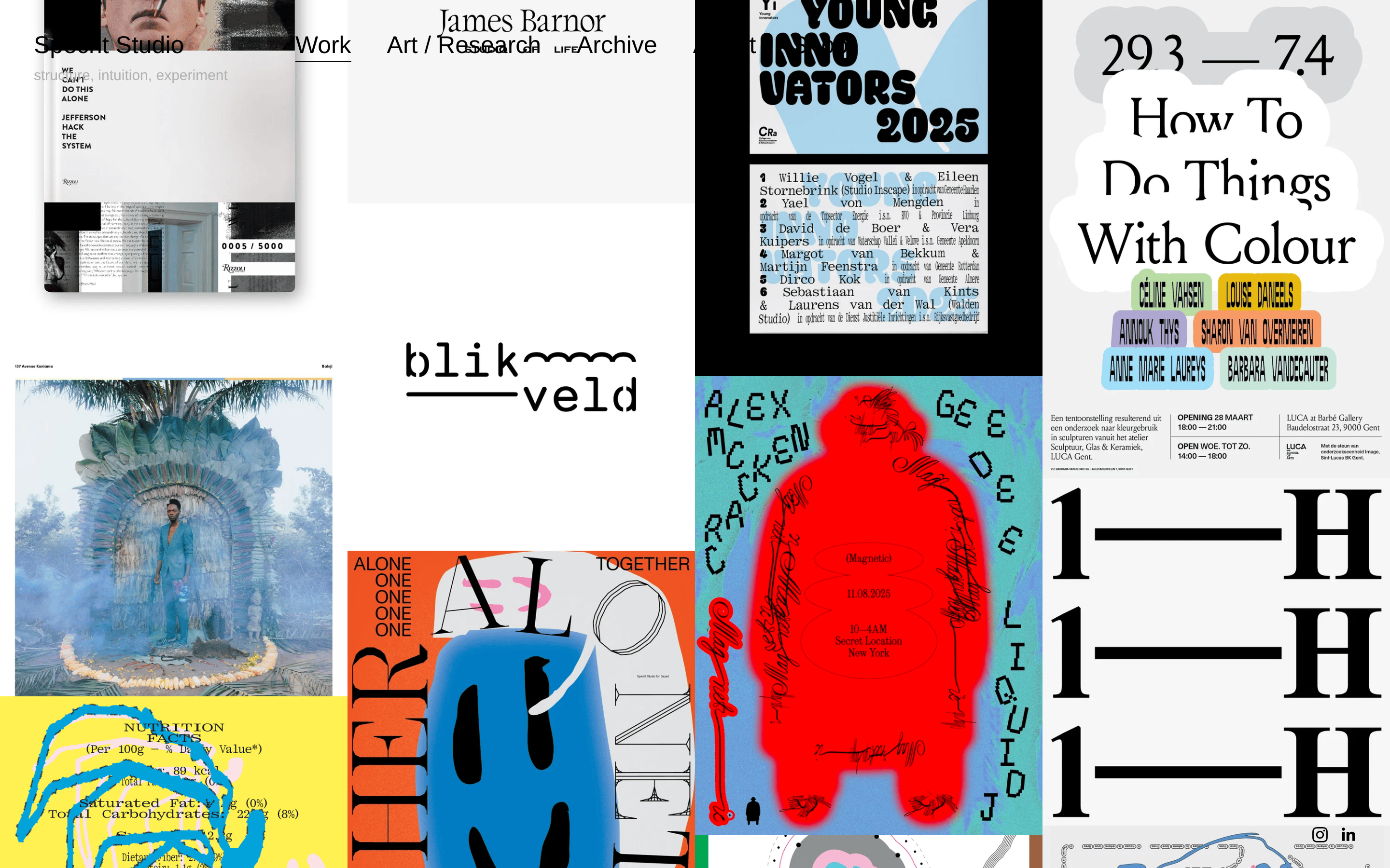
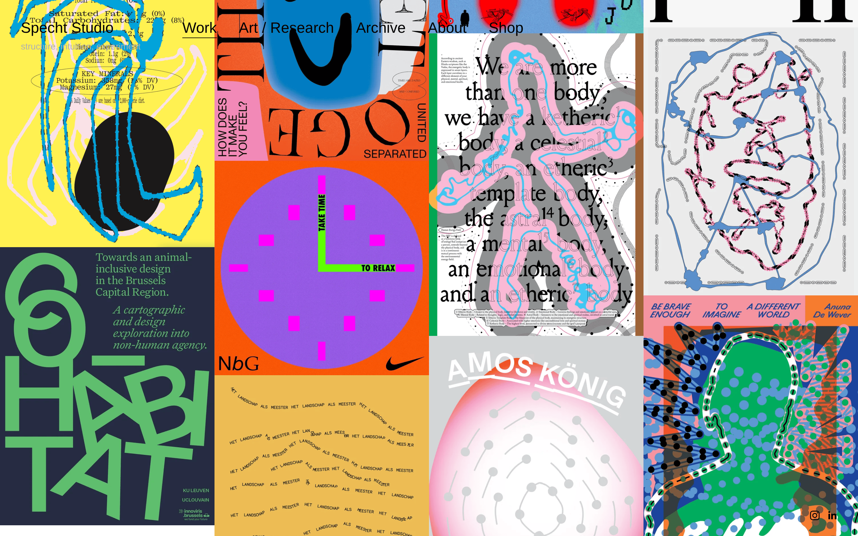
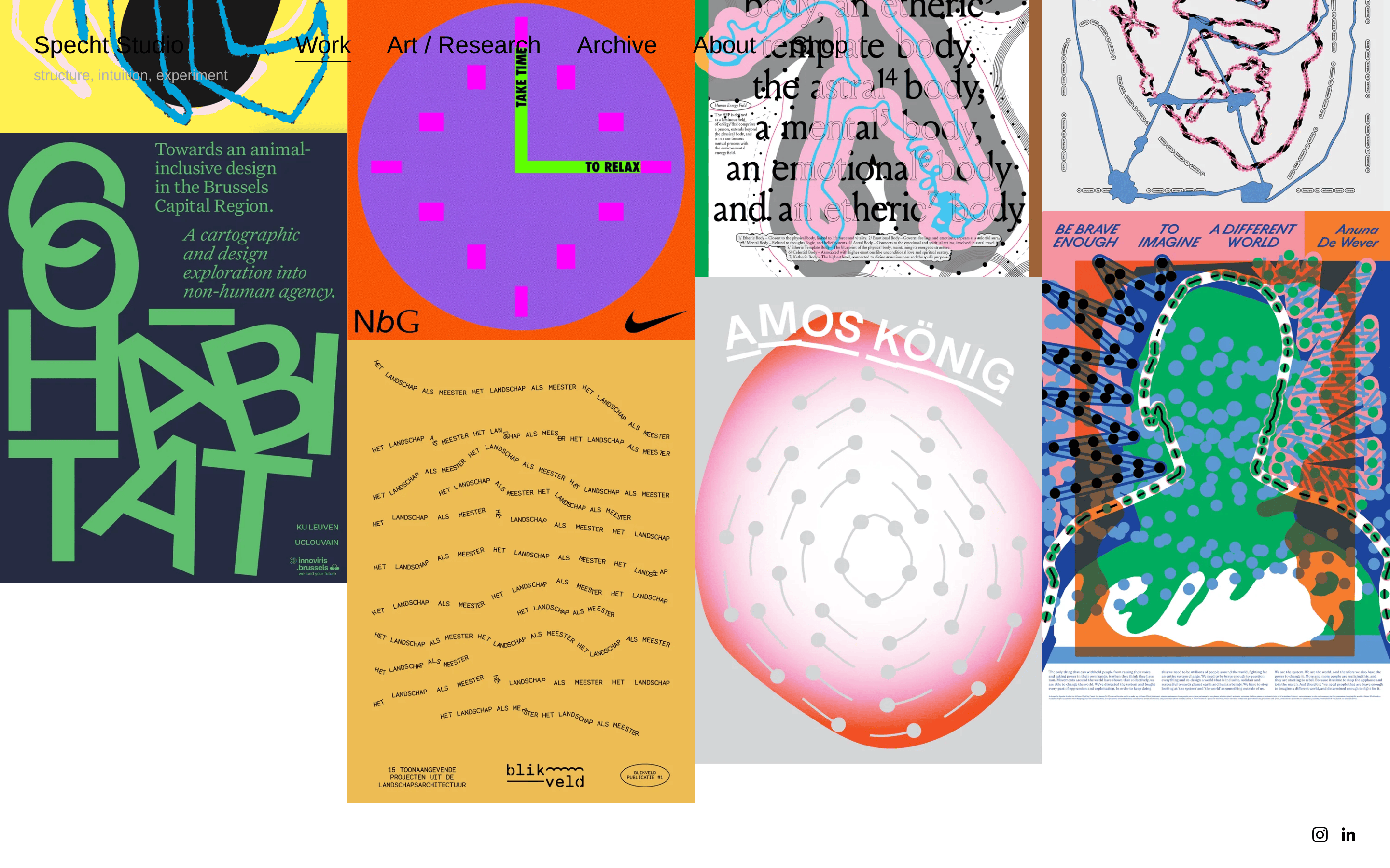
A digital exhibition space for a graphic design studio
02
Color
#000000Ink
rgba(0,0,0,0.6)Ink soft
#FFFFFFBG
#FEFEFEBG soft
#E6E6E6BG quiet
#B0B0B0Muted
rgba(0,0,0,0.1)Line
Strict monochromatic base to let the colorful project imagery dominate.
03
Typography
humanist-sans · geometric-sans
display32px · 700
title25px · 400
body16px · 400
caption12px · 400
Default font stack is 'Helvetica Neue', Arial, sans-serif · Strict adherence to 400 and 700 font weights · Minimalist typography to avoid competing with project visuals
04
Spacing
4px
8px
14px
16px
24px
32px
48px
Consistent padding of 24px used in project containers and navigation.
05
Surfaces
sm · 5px
md · 5px
lg · 0px
pill · 999px
Subtle 1px borders or bottom-borders for separation
rgba(0, 0, 0, 0.05) 0px 1px 3px 0px
06
Layout
1280container
12columns
24pxgutter
768 / 1024breakpoints
A dense, masonry-style grid that adapts from single column to multi-column.
07
Motion & Interaction
220msmicro
400mssmall
800msmedium
ease-outeasing
Smooth opacity transitions on hover for navigation elements · Subtle border transitions for interactive states
Opacity changes on navigation links and project images · Direct navigation to project detail pages
08
Components
buttonText-based navigation links with hover states
Captured from the live site · real computed styles
11
System prompt
This is a design studio portfolio site for Specht Studio. The design DNA is rooted in a raw, experimental aesthetic that prioritizes project imagery over interface decoration. The core palette is strictly monochromatic, using white (#FFFFFF) for the background, black (#000000) for ink, and a light gray (#E6E6E6) for secondary surfaces. The typography relies on a standard humanist-sans stack (Helvetica Neue, Arial, sans-serif), using bold weights only for the studio name and a regular weight for all navigation and body text. The layout is a dense, masonry-like grid of full-bleed project images. Critical constraints: 1) Never introduce a dominant accent color; let the work provide all chromatic variation. 2) Never use decorative typography or complex font pairings; keep the interface strictly functional. 3) Avoid adding heavy UI elements like large buttons or complex cards; the work should be the primary focus.
Bring this taste to your agent
Hand your AI agent a machine-readable spec of this design — tokens, type, motion, the whole DNA.