A bold, modern skincare brand that combines clinical efficacy with a playful, inclusive, and high-fashion editorial aesthetic.
02
Color
#FF454EAccent
#FFFFFFInk
#131212BG
#F6F6F6BG soft
#818181Muted
rgba(19, 18, 18, 1)Line
A high-contrast palette anchored by deep charcoal and crisp white, with a vibrant coral-red accent that provides energetic focal points.
03
Typography
geometric-sans · humanist-sans
display120px · 700
heading42px · 500
body14px · 400
label12px · 500
Use geometric sans-serif for massive display text and primary headlines. · Use humanist sans-serif for body text and UI elements to maintain readability. · Apply tight letter-spacing to large display text for a compact, impactful look. · Ensure body text remains legible with a size of 14px or larger.
04
Spacing
4px
8px
10px
12px
16px
20px
24px
30px
48px
64px
A combination of tight, 4px-based spacing for UI elements and generous whitespace for editorial sections.
05
Surfaces
sm · 2px
md · 4px
lg · 8px
pill · 999px
Borders are primarily used to define input states or button edges, typically 1px solid black.
06
Layout
1440container
12columns
24pxgutter
768 / 1024breakpoints
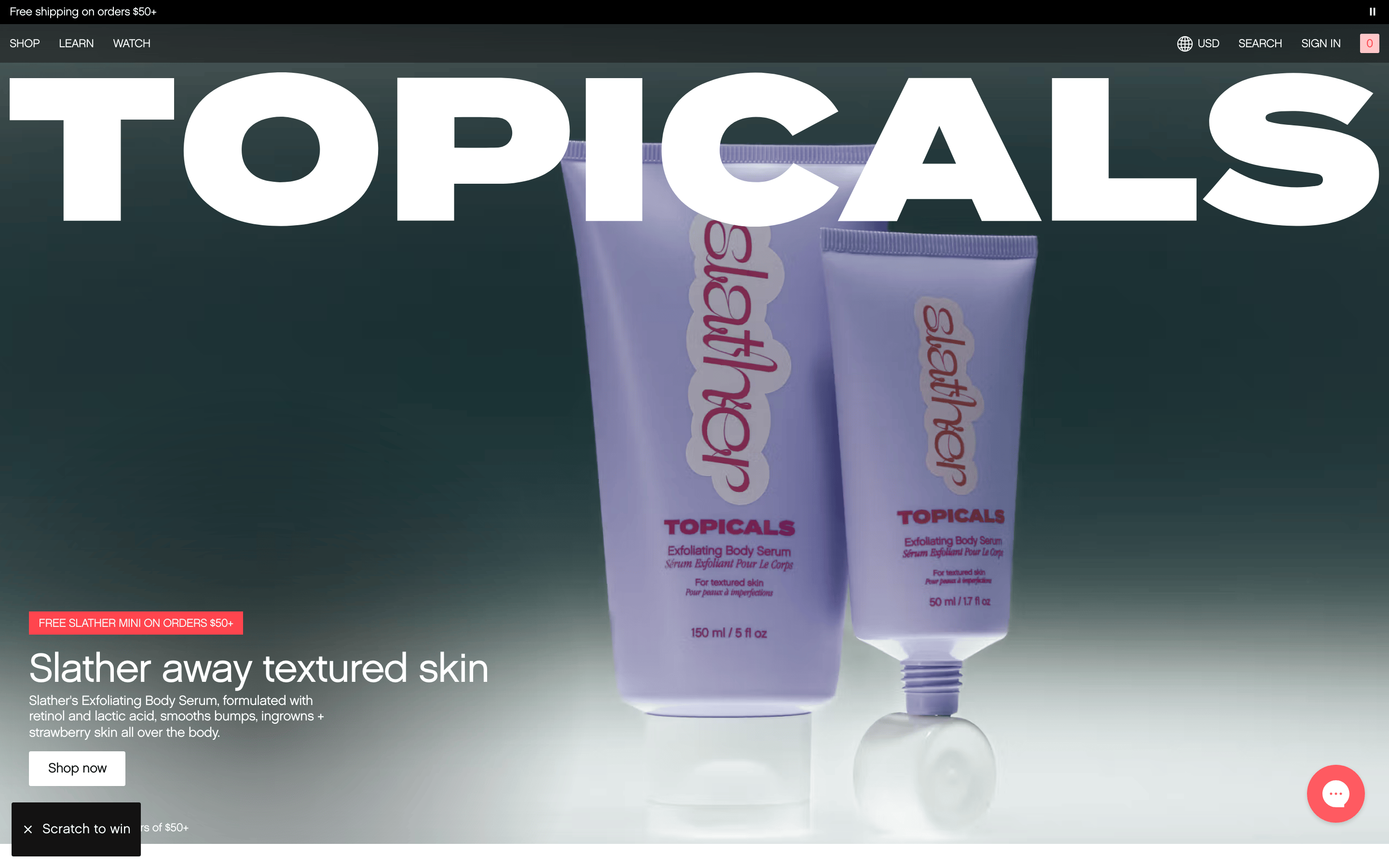
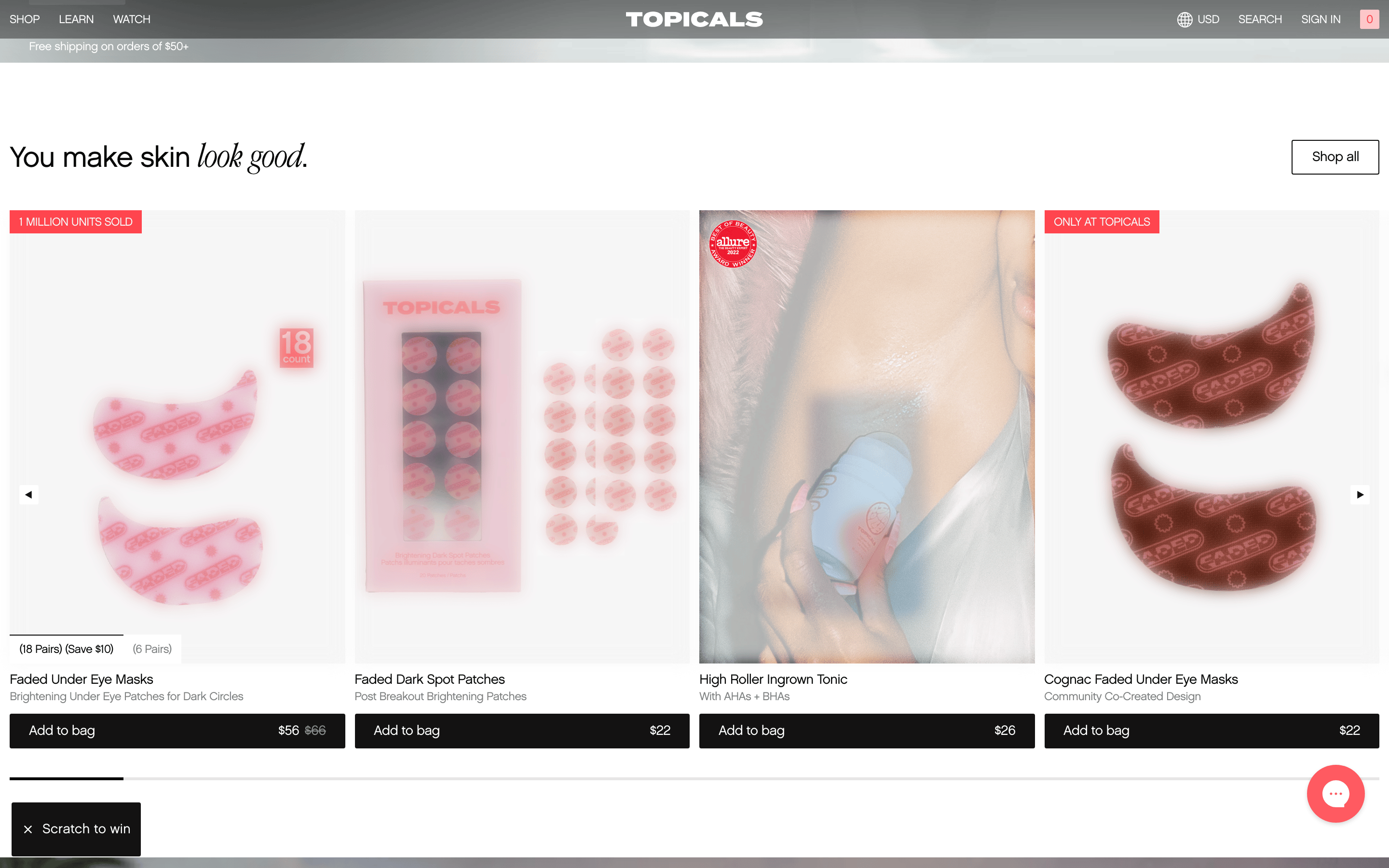
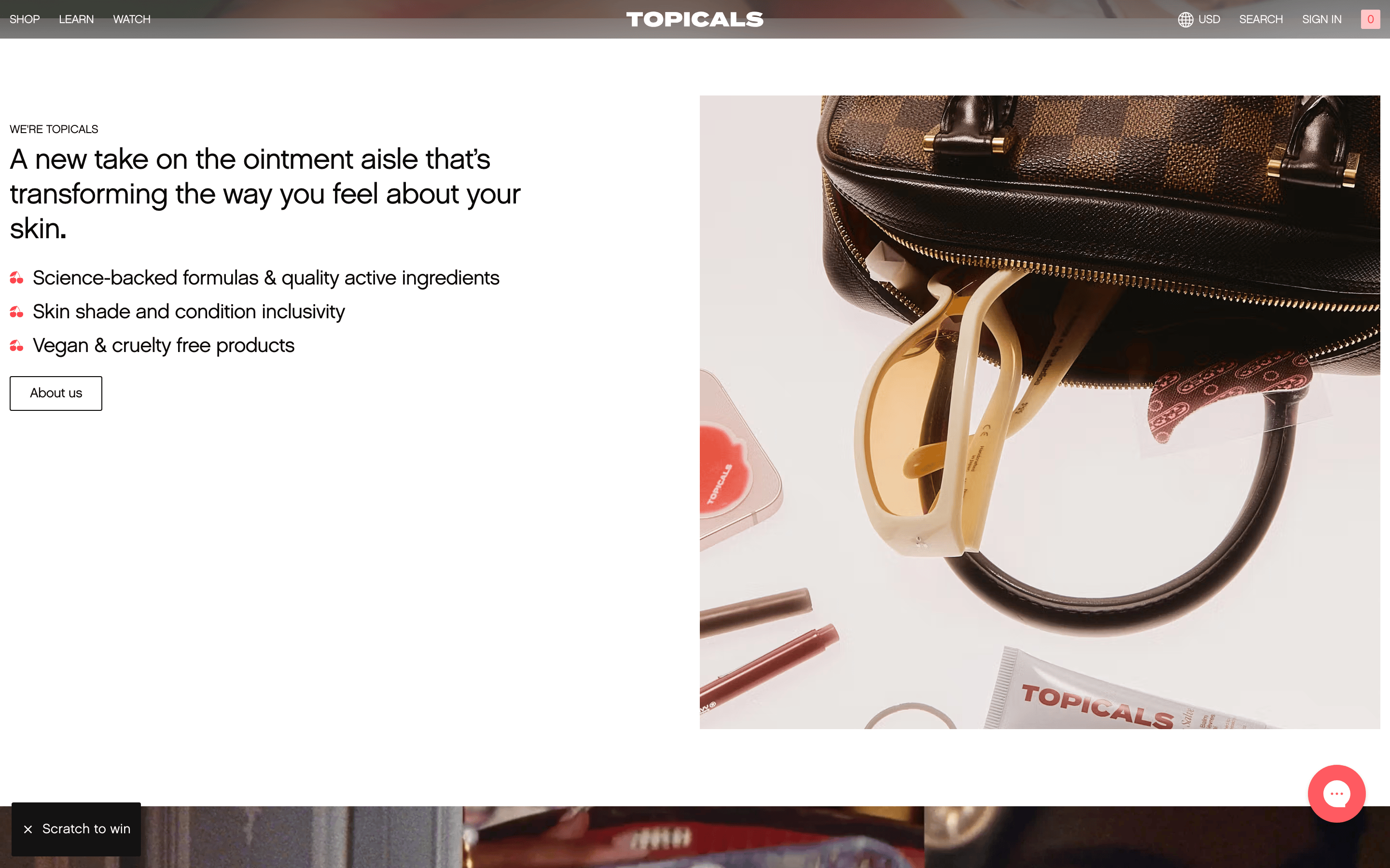
A full-bleed hero section dominated by a massive typographic wordmark and a large product photograph, followed by a two-column editorial section.
07
Motion & Interaction
200msmicro
400mssmall
800msmedium
cubic-bezier(0, 0, 0.2, 1)easing
Fade-in animations for content elements. · Smooth color transitions for interactive elements. · Linear transitions for text and background color changes.
Interactive elements like buttons and links change background or text color with a smooth 0.2s linear transition. · A subtle change in background or border color indicates the active state.
08
Components
buttonButtons feature a clean, minimal design with a 2px border-radius, 14px sans-serif text, and a transparent background that fills with a solid color on hover.
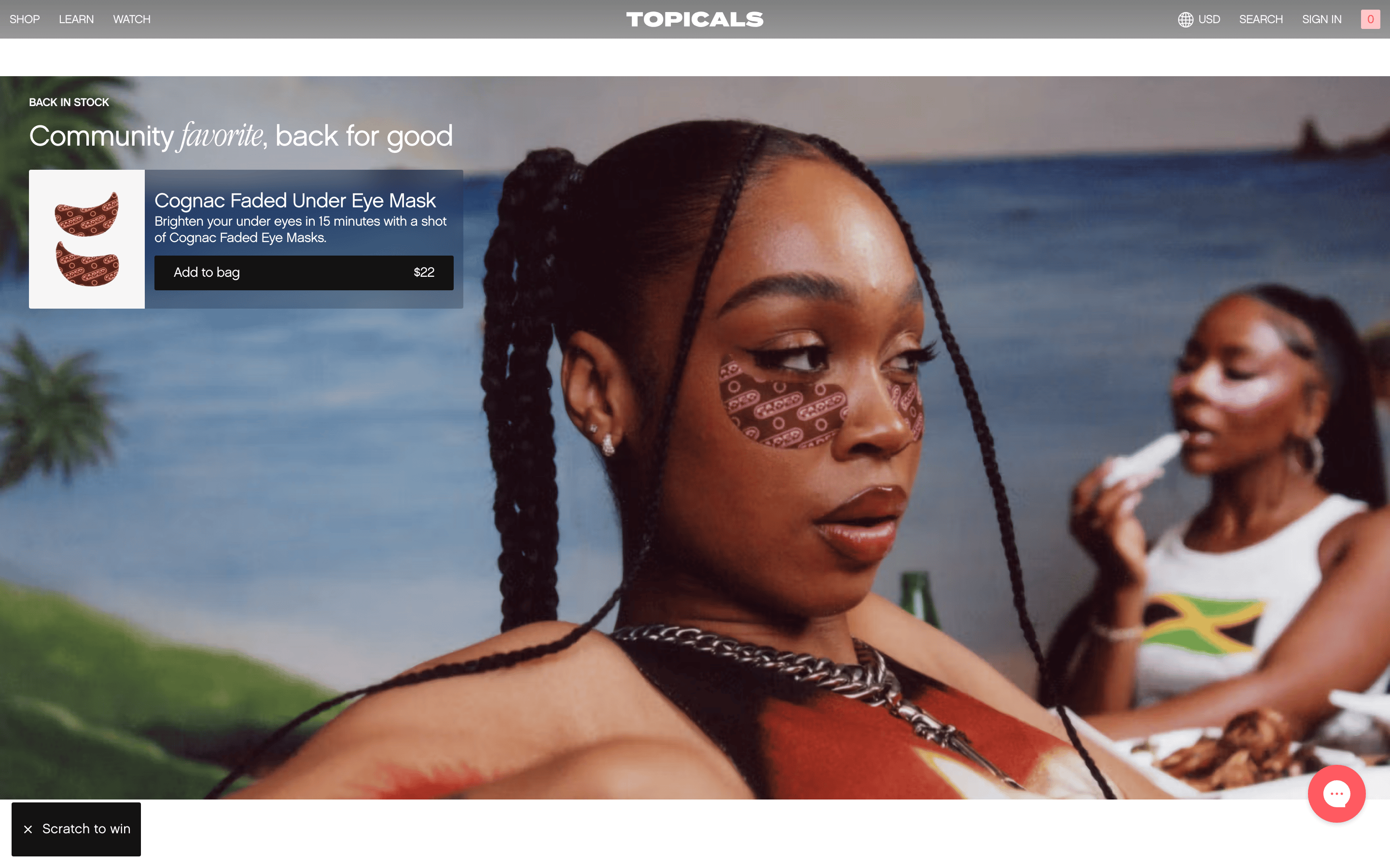
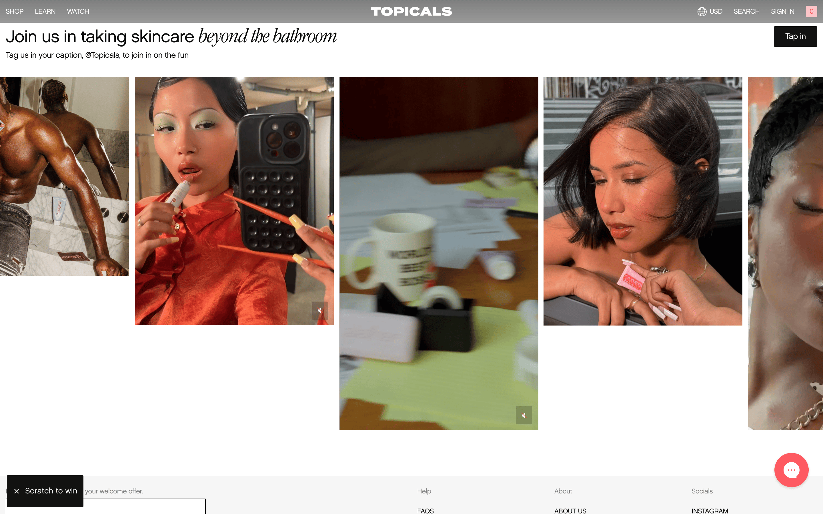
cardContent cards rely on high-quality photography and generous whitespace rather than traditional card boundaries or shadows.
chipSmall, uppercase labels with a 1px border and rounded corners are used for tags and secondary information.
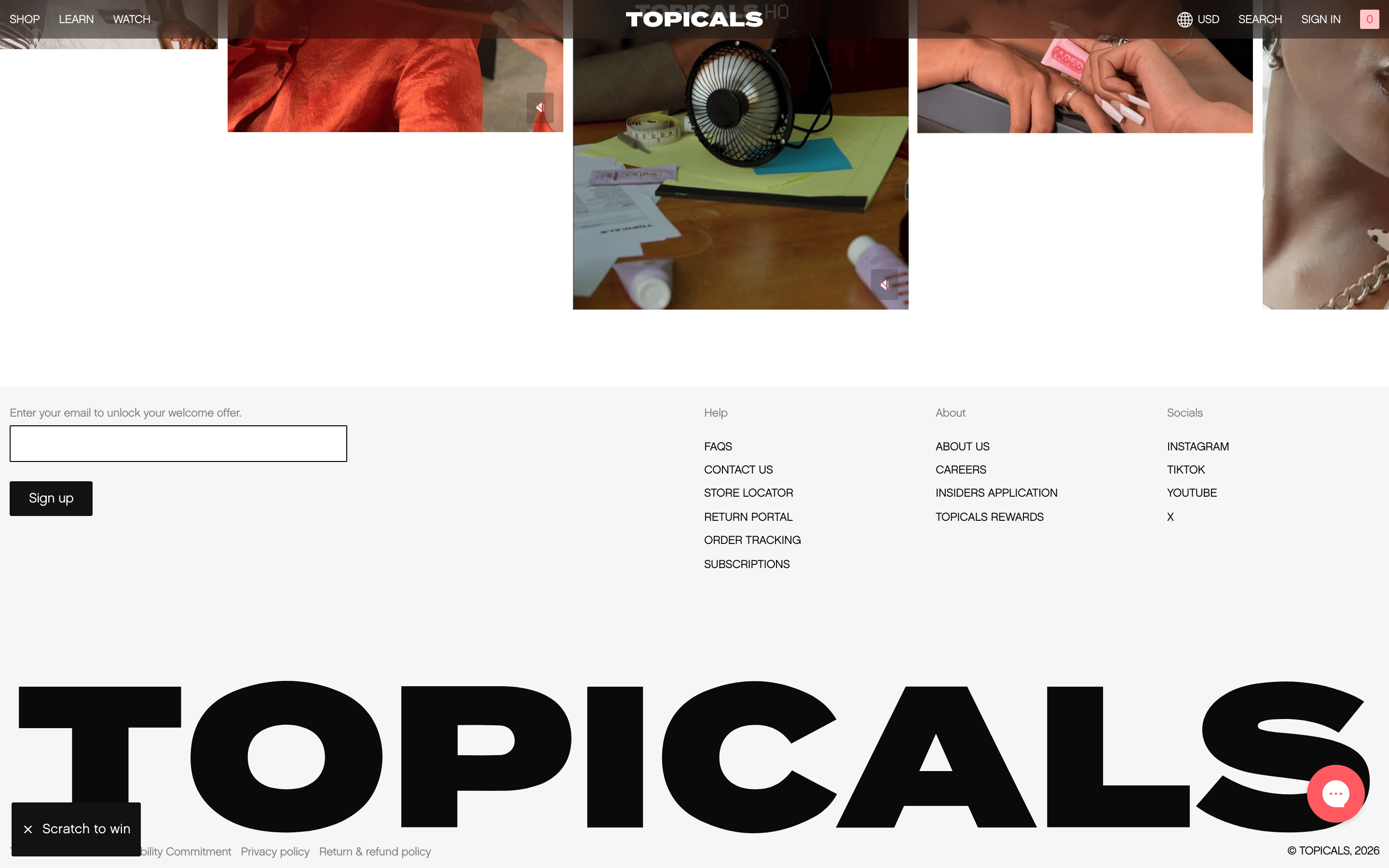
inputInput fields use a simple 1px border with a 2px border-radius, maintaining a clean and functional appearance.
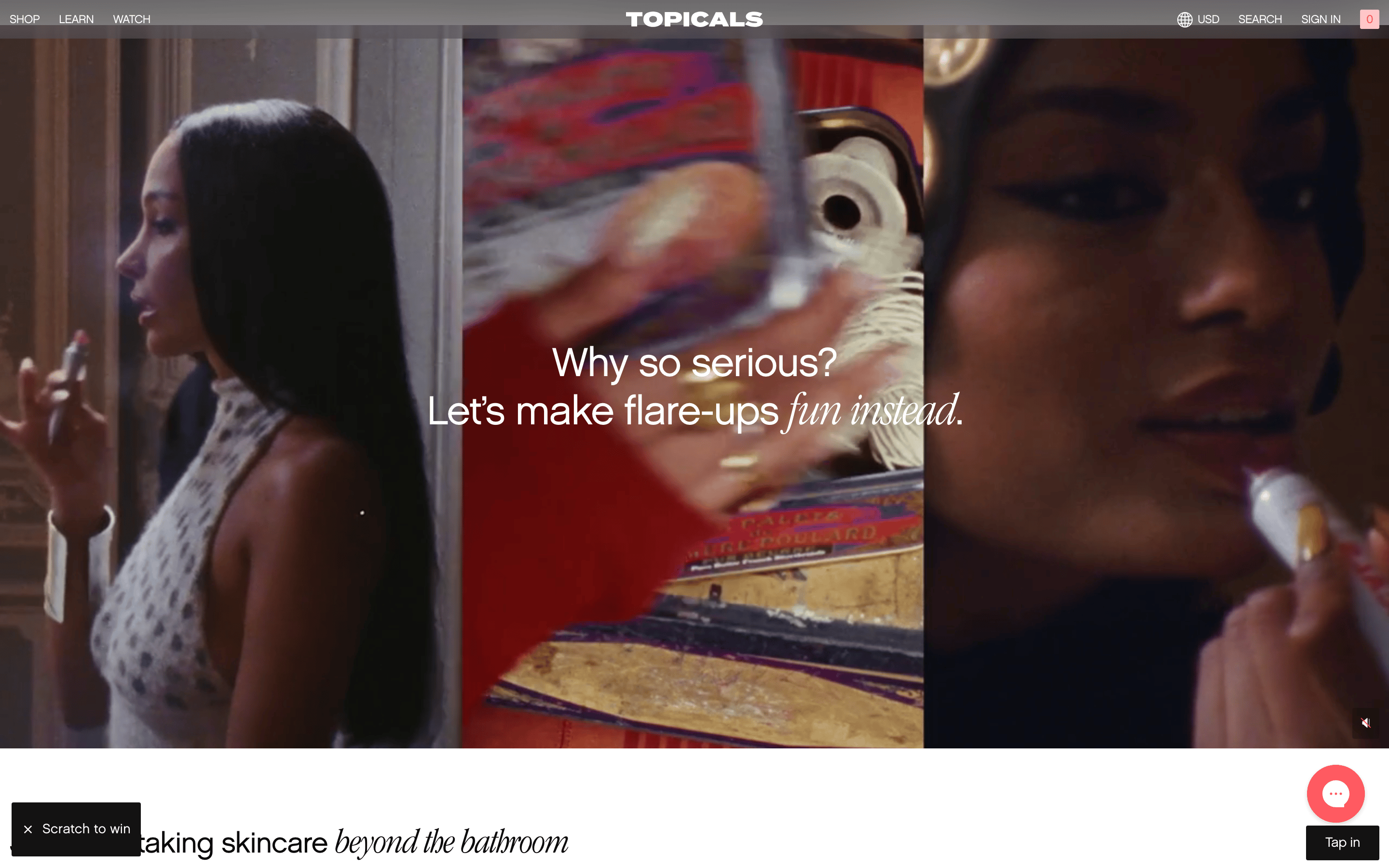
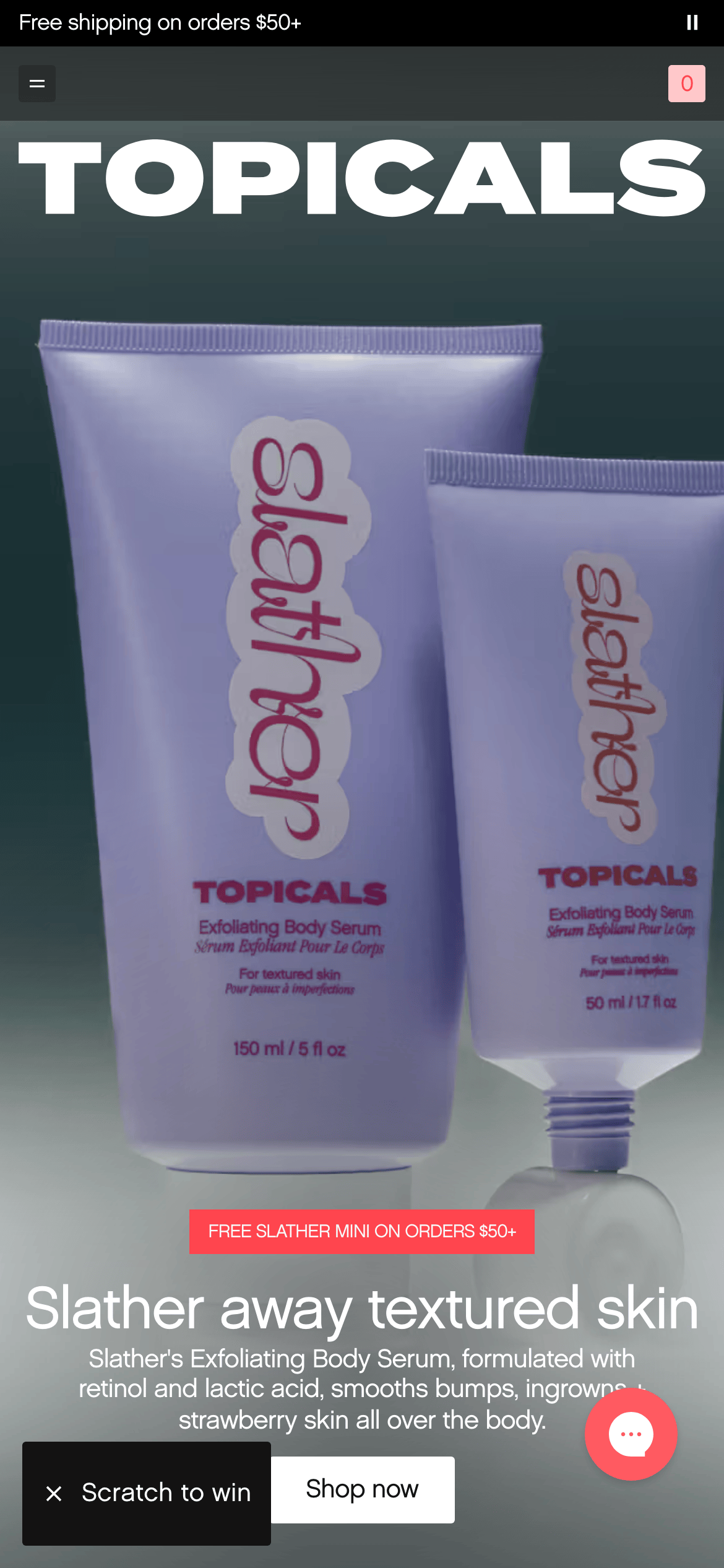
heroA full-viewport hero section featuring an oversized typographic wordmark and a central product shot against a dark background.
09
Voice & Don'ts
ToneConfident, inclusive, and scientifically grounded, with a touch of playfulness.
HeadlinesBold, oversized, and direct, often using a single word or a short, impactful phrase.
CTAsSimple and action-oriented, using a clean sans-serif font and a transparent button style.
Don't use decorative or script fonts — the screenshot shows a consistent use of clean, geometric and humanist sans-serif typefaces.
Don't use a light or colorful background for the hero section — the screenshot shows a dark charcoal background with white text.
Don't use excessive shadows or borders on cards — the screenshot shows a clean, photography-driven layout without heavy containers.
Don't use a multi-color palette — the screenshot shows a focused palette of black, white, and a single vibrant coral accent.
Don't use large, rounded corners on buttons or inputs — the screenshot shows a 2px border-radius for a sharper, more tailored look.
Don't use a small, cluttered layout — the screenshot shows massive typography and generous whitespace to create an editorial feel.
Avoid: Avoid overly technical jargon, overly decorative elements, or a clinical, sterile aesthetic.
Captured from the live site · real computed styles
11
System prompt
This is a premium skincare brand website that uses bold, oversized typography and high-contrast photography to create a modern, editorial feel. The primary colors are a deep charcoal (#131212) and crisp white (#FFFFFF), with a vibrant coral-red (#FF454E) accent for key CTAs and interactive elements. The typography combines geometric sans-serifs for display and humanist sans-serifs for body text, with very tight letter-spacing on large headlines. Key design rules include: never use decorative or script fonts; avoid light backgrounds in the hero section; use a 2px border-radius for all components; and maintain a high-contrast, photography-driven layout with generous whitespace. The tone is confident, inclusive, and scientifically grounded.
Bring this taste to your agent
Hand your AI agent a machine-readable spec of this design — tokens, type, motion, the whole DNA.