← OpenDesign CURATED · OPEN · FREE
Tparkes
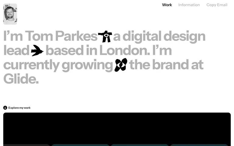
A personal digital design lead portfolio showcasing brand and website work.
Portfolio Studio Clean Bold Typography Restraint
01
Identity DNA
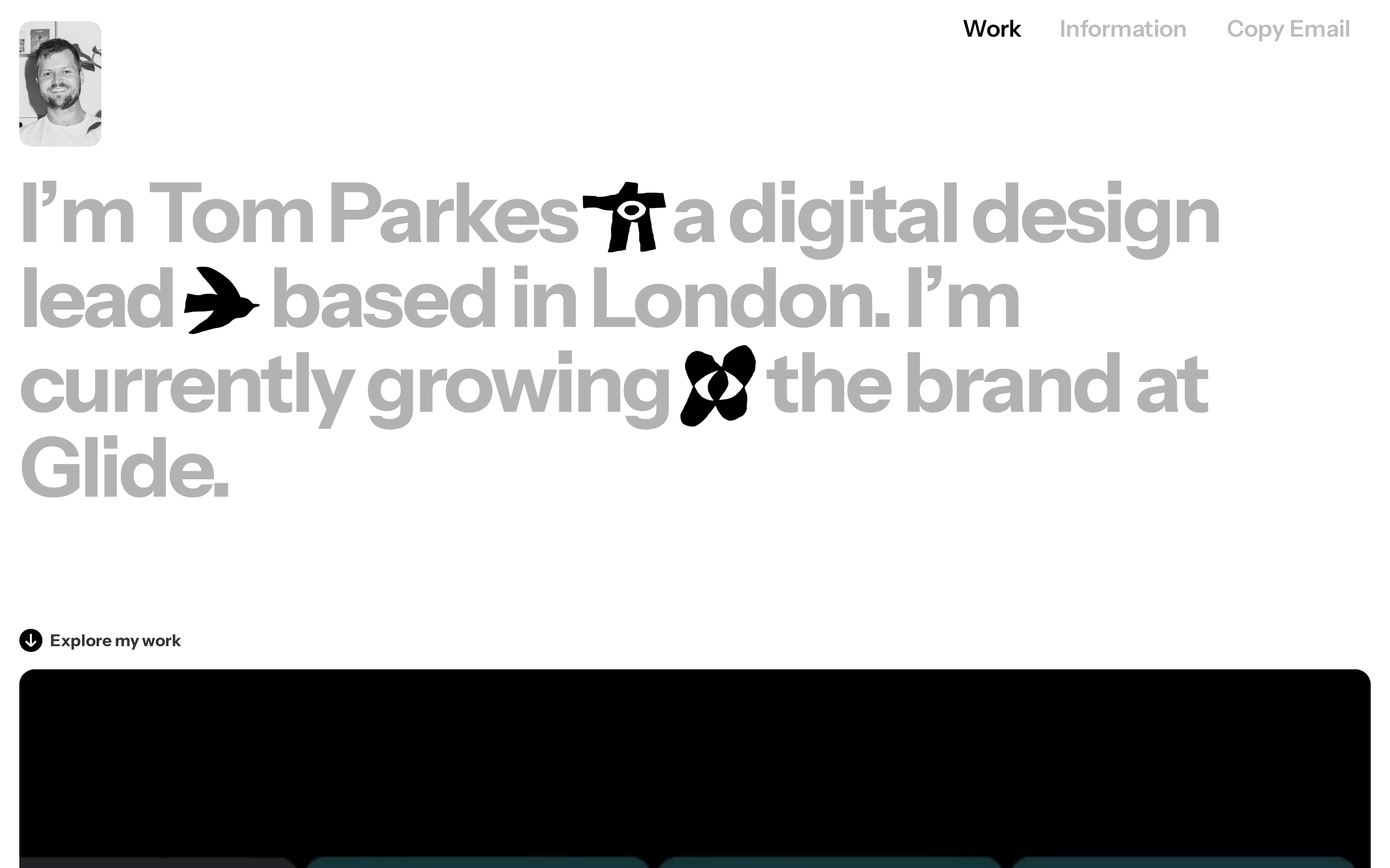
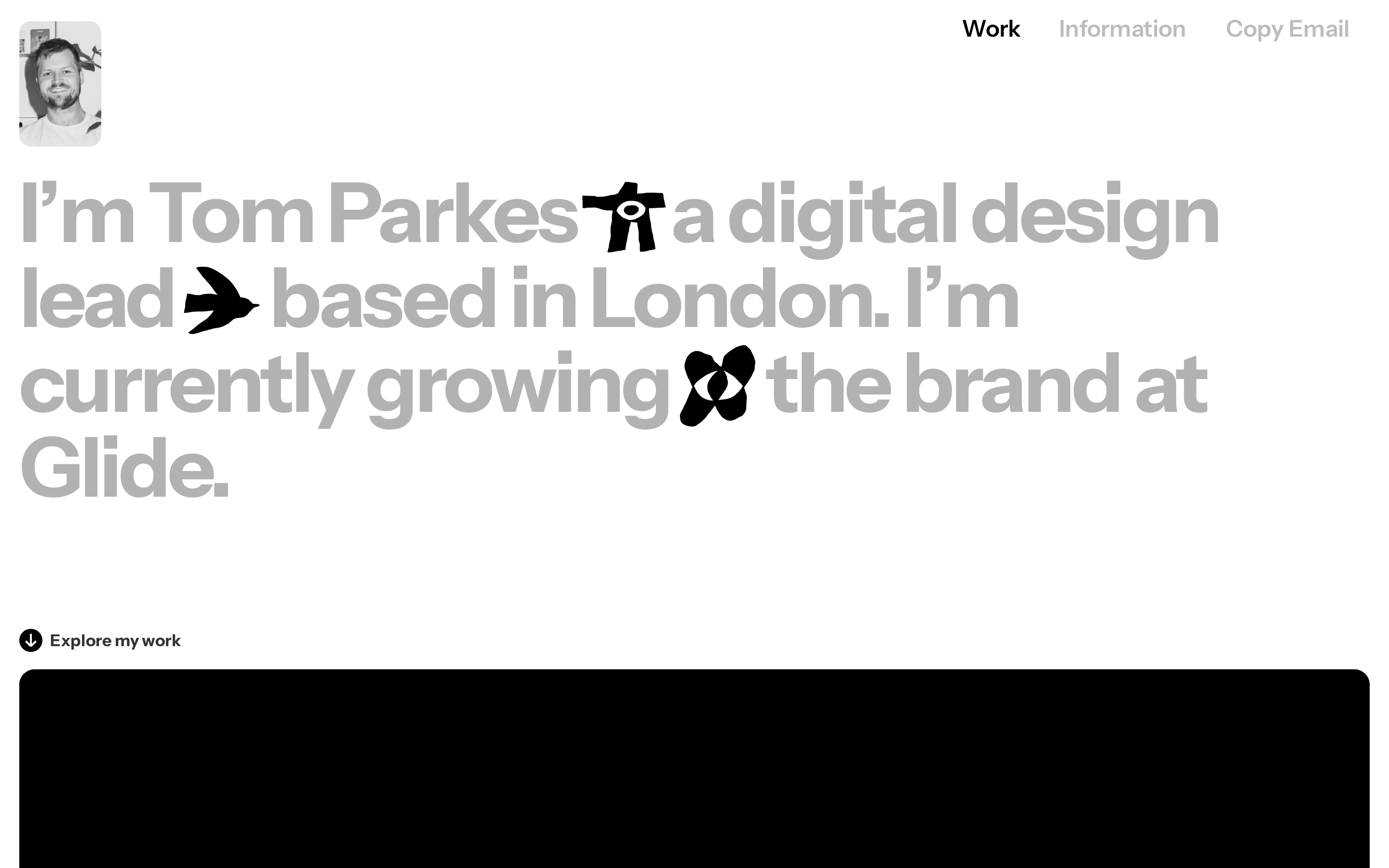
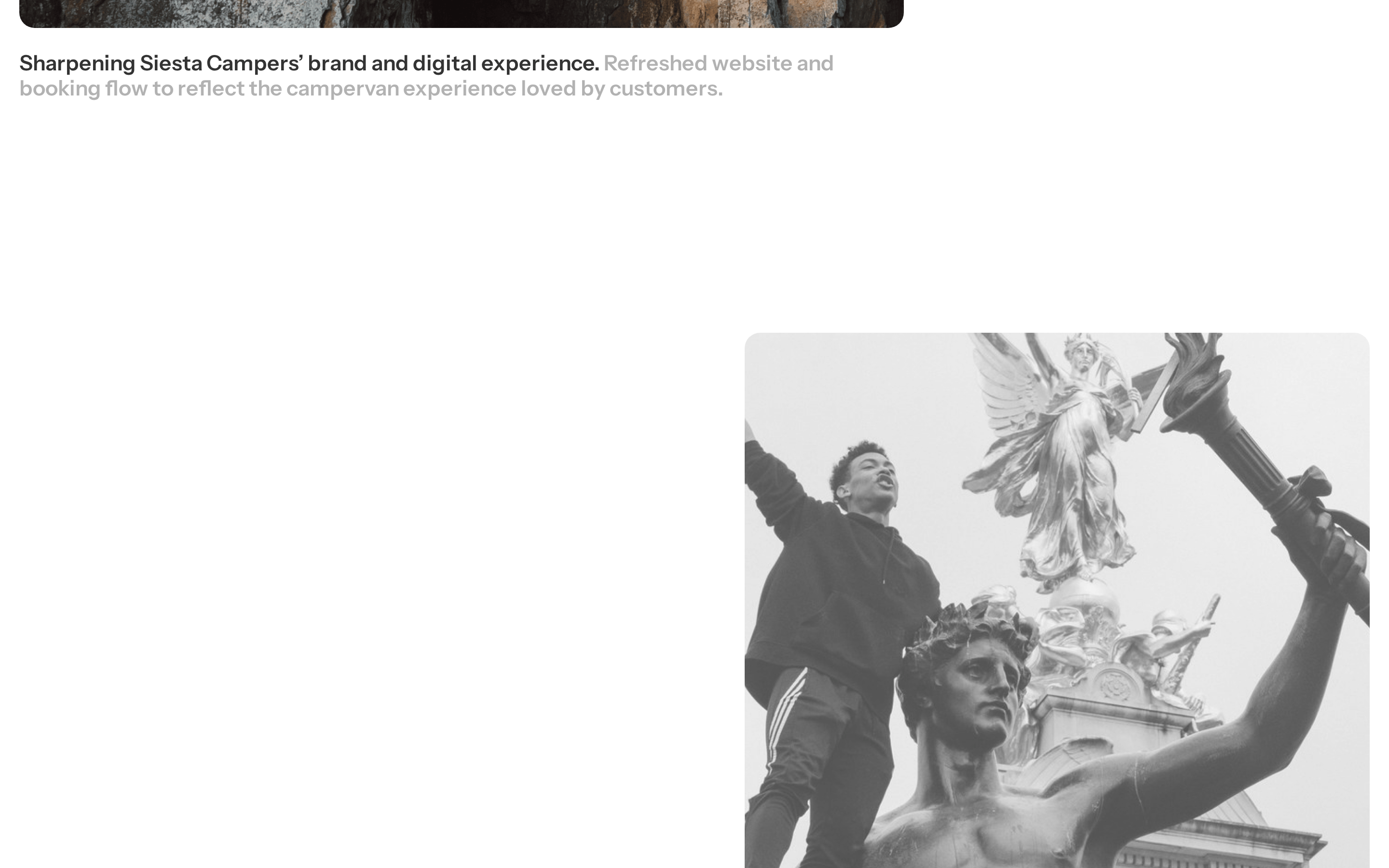
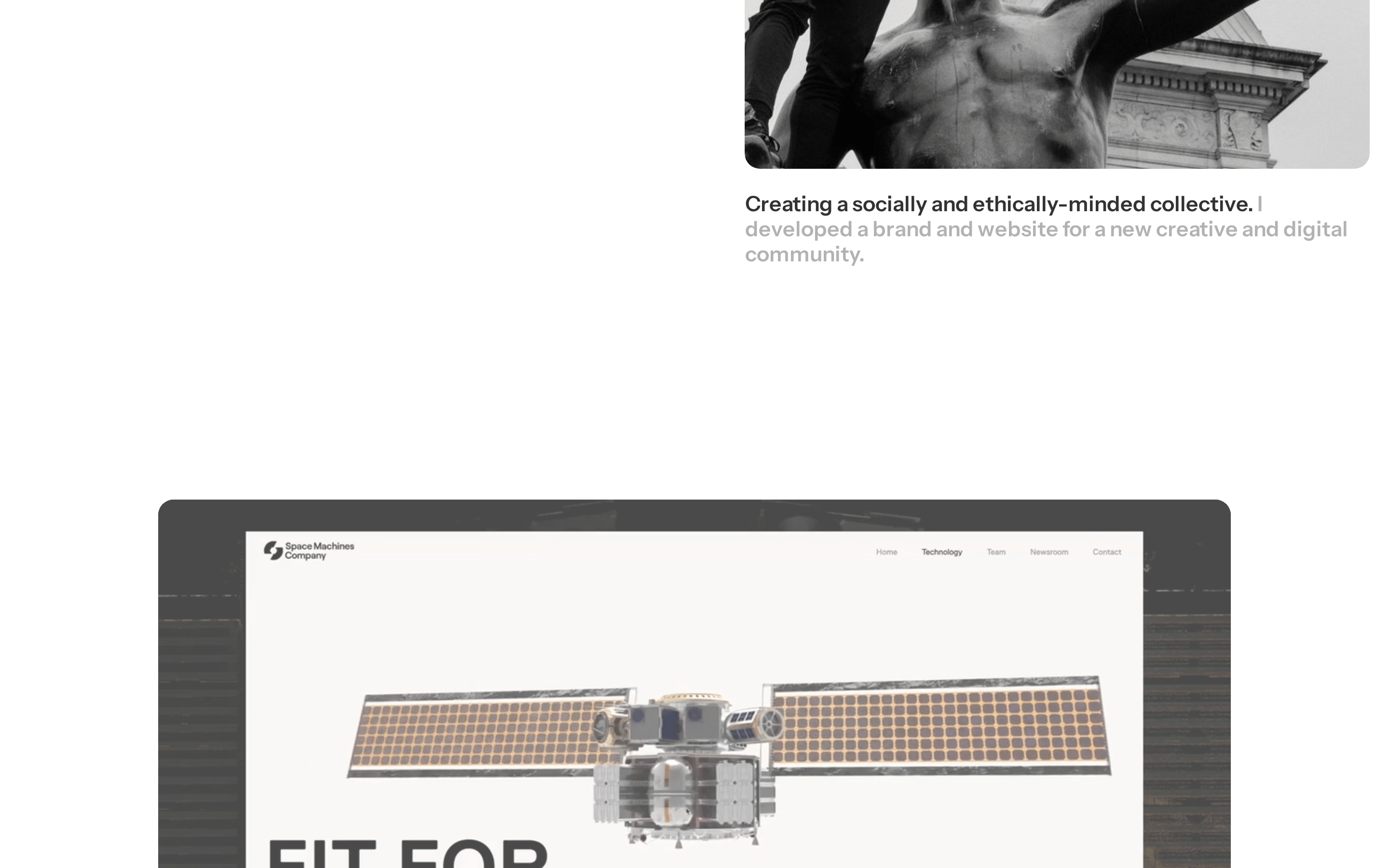
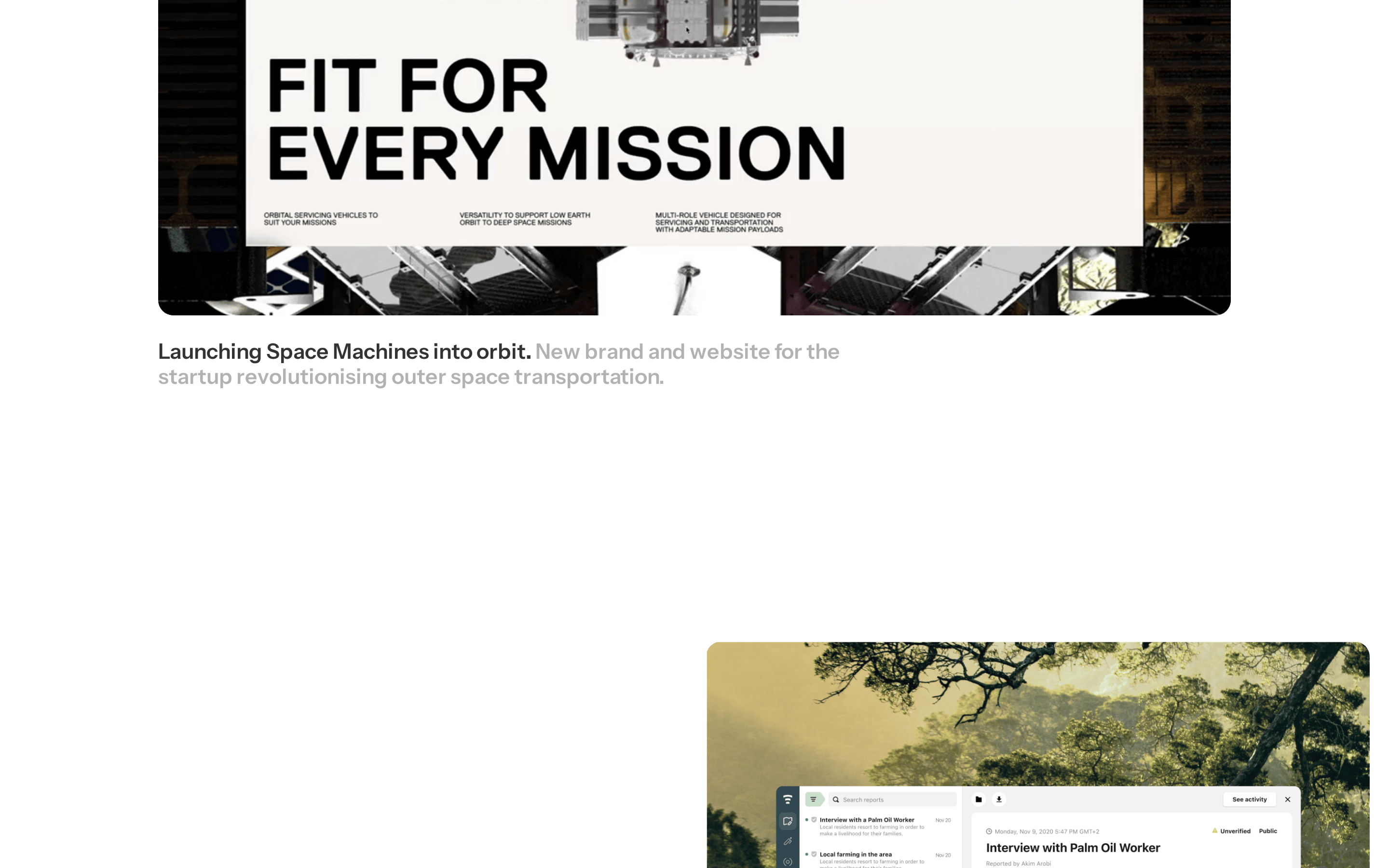
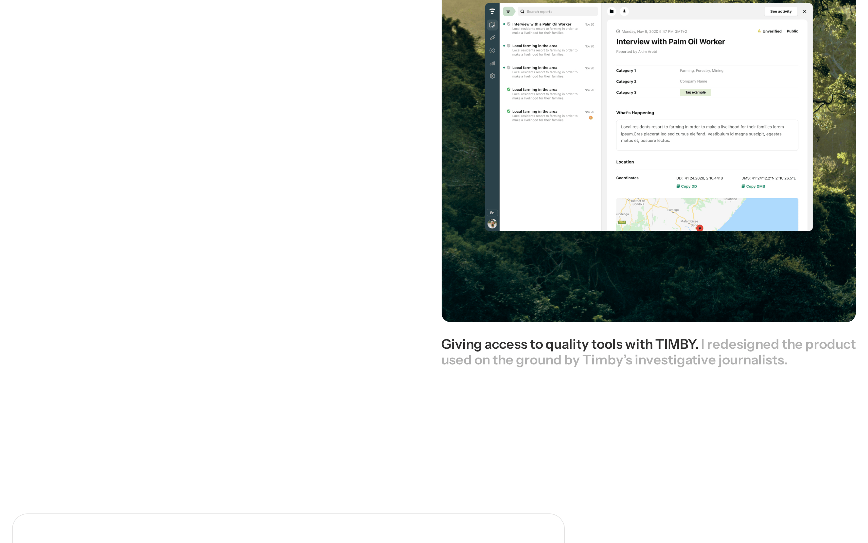
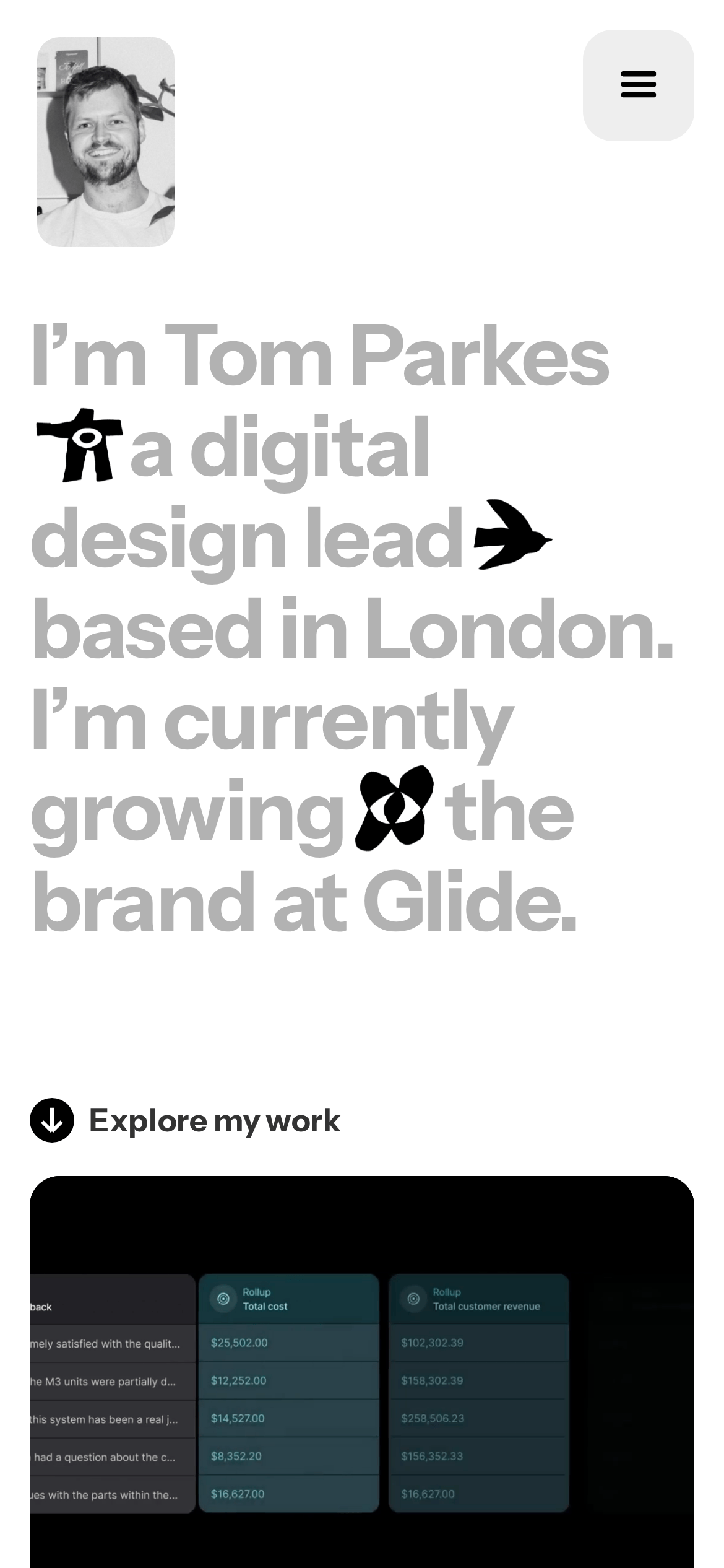
digital design lead portfolio Tom Parkes London
A clean, professional digital portfolio with bold, expressive typography.
02
Color
#333333Ink
#FFFFFFBG
#A7A7A7Muted
rgba(51, 51, 51, 1)Line
High-contrast monochrome palette relying on typographic scale rather than color accents.
03
Typography
sans-serif
04
Spacing
4px
8px
16px
20px
24px
32px
48px
120px
Generous whitespace and padding emphasize the large-scale typography.
05
Surfaces
sm · 8px
md · 12px
lg · 16px
pill · 999px
Subtle borders using primary text color, often used on cards or UI elements.
06
Layout
1280 container
12 columns
24px gutter
768 / 1024 breakpoints
Full-width hero section with left-aligned text and a top navigation bar.
07
Motion & Interaction
220ms micro
400ms small
800ms medium
cubic-bezier(0.25, 0.46, 0.45, 0.94) easing
Scroll-triggered reveals for project cards
Subtle opacity changes or cursor pointer changes on interactive elements. · Direct navigation or smooth scroll to project sections.
08
Components
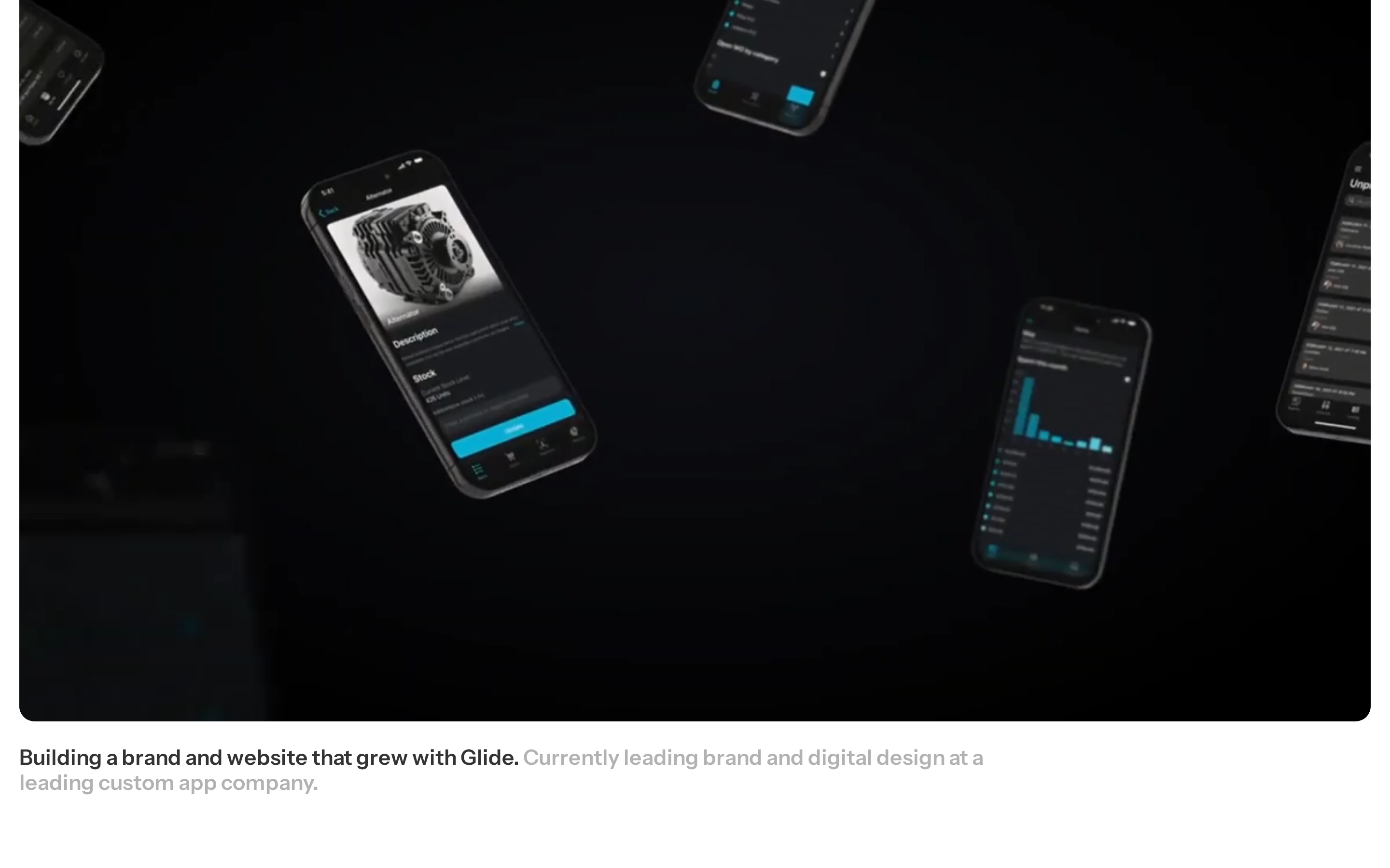
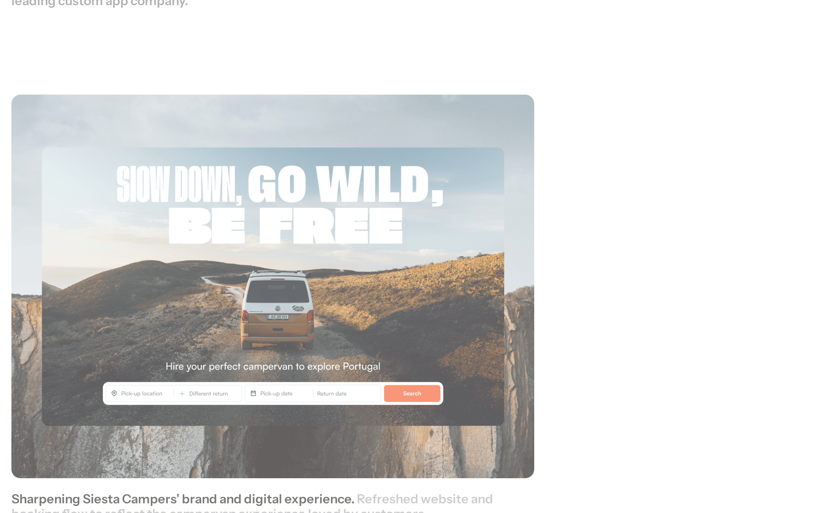
button Minimal text links or icon-based buttons (e.g., hamburger menu, 'Explore my work'). card Large, full-width image/video cards with rounded corners. hero Dominant typographic statement with inline graphic icons and a large monochrome image. 09
Voice & Don'ts
Tone Professional, confident, and direct. Headlines Large, bold, sans-serif statements using muted grey with black icons. CTAs Simple, understated text links like 'Explore my work'. Don't use colorful gradients — the screenshot shows a strict monochrome palette. Don't use serif fonts — the typography is strictly sans-serif. Don't hide navigation — the hamburger menu is prominent on mobile. Don't use small, cramped text — the hero type is massive (86px). Don't use busy backgrounds — the background is clean white. Don't use heavy shadows — surfaces are flat and clean. Avoid: Avoiding loud colors Avoid: Excessive decoration Avoid: Overly complex navigation 10
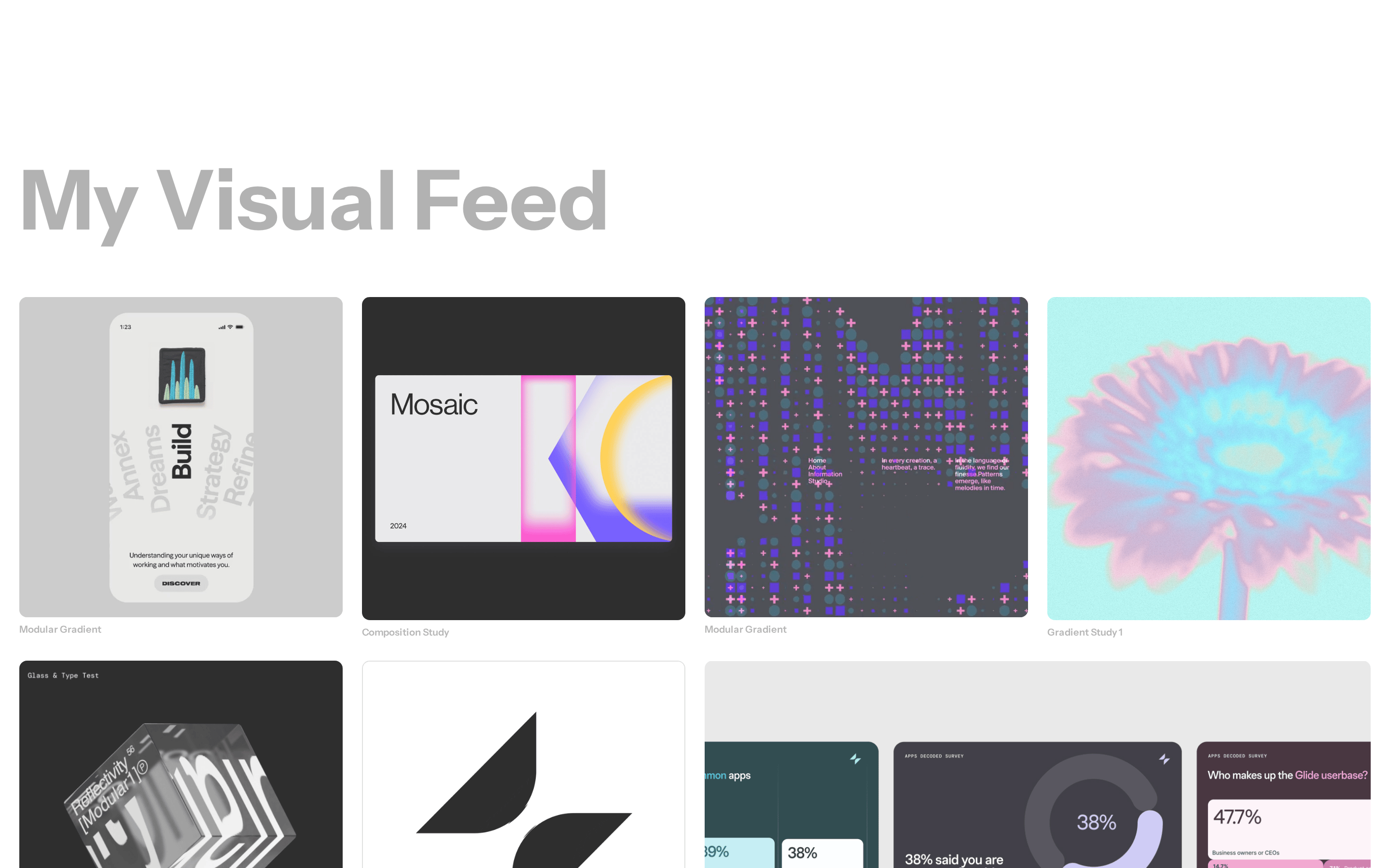
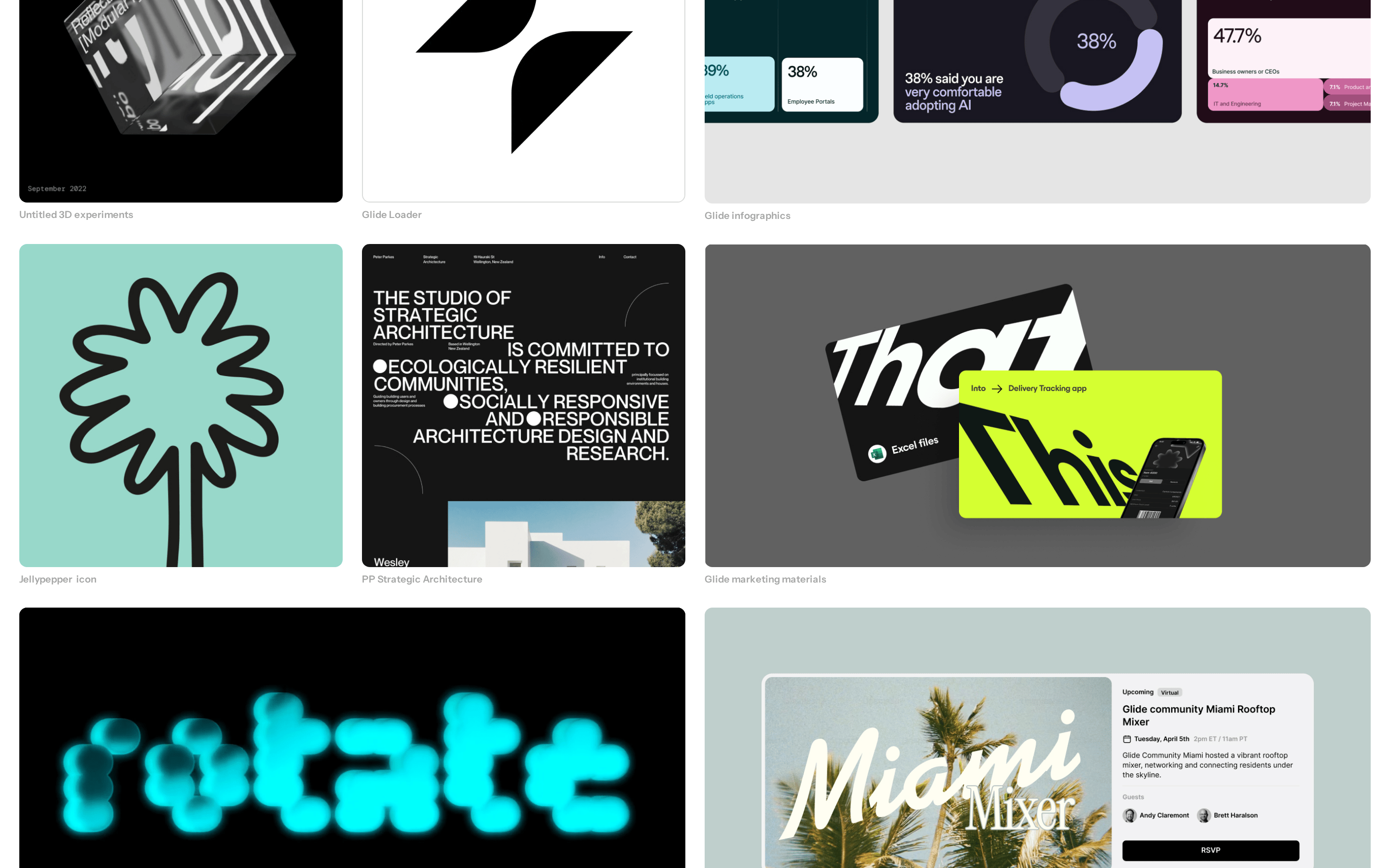
Inside the pack — real screenshots
桌面首屏(hero) 桌面滚动分段(90% viewport 步进,作为视觉证据) 桌面滚动分段(90% viewport 步进,作为视觉证据) 桌面滚动分段(90% viewport 步进,作为视觉证据) 桌面滚动分段(90% viewport 步进,作为视觉证据) 桌面滚动分段(90% viewport 步进,作为视觉证据) 桌面滚动分段(90% viewport 步进,作为视觉证据) 桌面滚动分段(90% viewport 步进,作为视觉证据) 桌面滚动分段(90% viewport 步进,作为视觉证据) 桌面滚动分段(90% viewport 步进,作为视觉证据) 桌面滚动分段(90% viewport 步进,作为视觉证据) 移动首屏 Captured from the live site · real computed styles
11
System prompt
This is a personal digital design portfolio with a clean, monochrome aesthetic. It uses a large sans-serif display font (86px) for bold statements, accented by small, high-contrast black icons. The primary colors are white (#FFFFFF) for the background, dark grey (#333333) for ink, and light grey (#A7A7A7) for muted elements. Key hex colors include #333333, #A7A7A7, and #FFFFFF. Critical constraints: Never use colorful accents, serif fonts, or complex UI patterns. The layout is spacious, relying on generous whitespace and a single-column container. Navigation is minimal, focusing on the work showcase.
More from the library en · zh-CN · zh-TW · ja · ko
OpenDesign · curated web aesthetics for AI-readable design DNA · opendesign.cc
Why we curated this: This site is a great example of how to use typography and whitespace to create a professional, high-impact personal portfolio without relying on color.