A curated library of expressive display typefaces.
02
Color
#15181EInk
#FFFFFFBG
#E5E5E5Muted
rgba(21,24,30,1.0)Line
Stark, high-contrast monochrome base interrupted only by vibrant, flat geometric accents.
03
Typography
humanist-sans
display22px · 500
body16px · 400
caption12px · 400
Uppercase transform is used consistently for labels and navigation · Letter spacing is used generously to create an airy, editorial feel · Serif fonts are utilized sparingly for specific stylistic emphasis
04
Spacing
4px
8px
16px
24px
32px
48px
64px
96px
Open and airy, relying heavily on large, deliberate white space to frame bold visual elements.
05
Surfaces
sm · 4px
md · 8px
lg · 0px
pill · 999px
Minimal to non-existent; separation is achieved through spatial contrast and flat color.
06
Layout
1440container
12columns
24pxgutter
768 / 1024breakpoints
A highly asymmetrical, gallery-like layout that prioritizes visual impact over dense information grids.
07
Motion & Interaction
100msmicro
300mssmall
800msmedium
cubic-bezier(0.215, 0.61, 0.355, 1)easing
Smooth, deliberate transitions on interactive elements · Elegant easing curves that avoid abrupt movements
Subtle visual state changes, likely involving color or slight spatial shifts. · Direct navigation or state change without aggressive visual feedback.
08
Components
buttonMinimal, purely typographic links without explicit borders or background shapes.
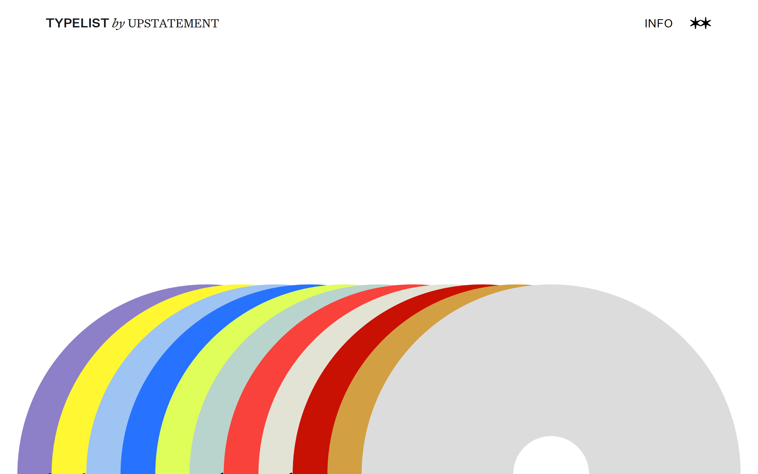
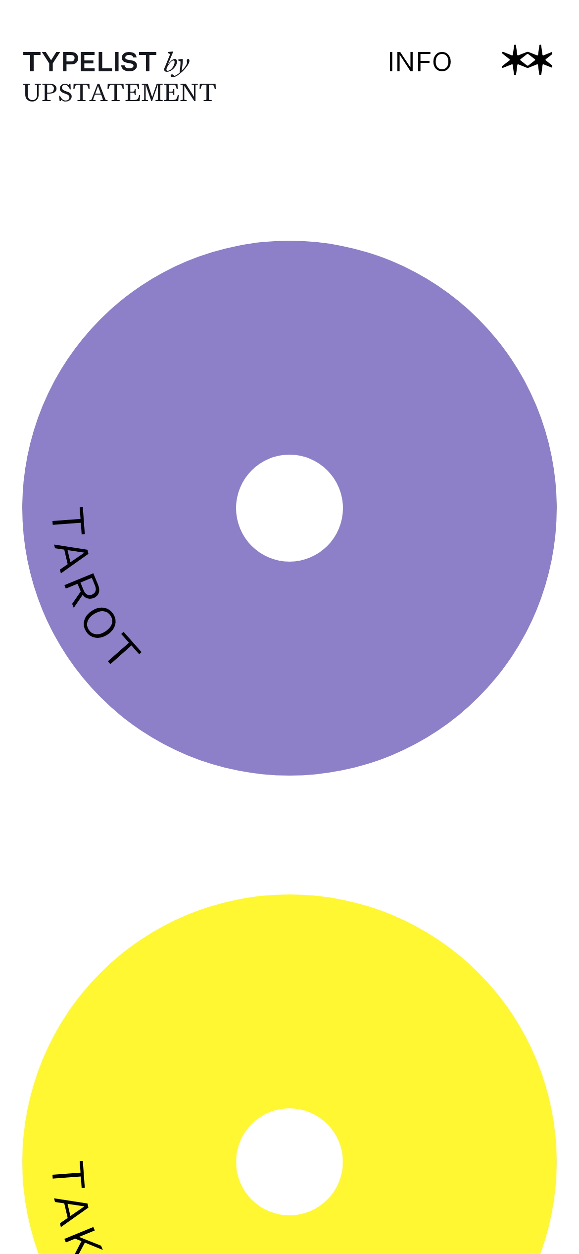
cardBold, flat geometric shapes (like large circles) acting as primary interactive units.
heroA striking, minimalist composition combining expansive whitespace with aggressive, flat geometric color bands.
09
Voice & Don'ts
ToneConfident, curated, and expert with a focus on visual impact.
HeadlinesUppercase, tightly tracked, and often geometrically integrated into the design.
CTAsUnderstated and purely typographic, relying on the overall visual rhythm.
Don't use generic UI components like standard buttons or cards — screenshot shows flat, custom geometric shapes and simple typography links instead.
Don't apply complex shadows or gradients — screenshot shows flat, solid color fields and stark white space.
Captured from the live site · real computed styles
11
System prompt
This site is a minimalist, expressive editorial showcase for typography, positioning itself as a curated gallery of display typefaces. The design DNA relies on a stark monochrome base of pure white (#FFFFFF) and near-black ink (#15181E), interrupted only by bold, flat geometric accents like vibrant purple and yellow. The primary typography categories are humanist-sans for both display and body text, characterized by generous letter spacing (2px) and consistent uppercase transforms. Critical design constraints include avoiding all complex UI patterns, rejecting dark mode or muted palettes, and maintaining expansive, deliberate whitespace instead of dense grid layouts. The interaction model is subtle, relying on smooth 0.3s transitions (cubic-bezier(0.215, 0.61, 0.355, 1)) rather than aggressive feedback.
Bring this taste to your agent
Hand your AI agent a machine-readable spec of this design — tokens, type, motion, the whole DNA.