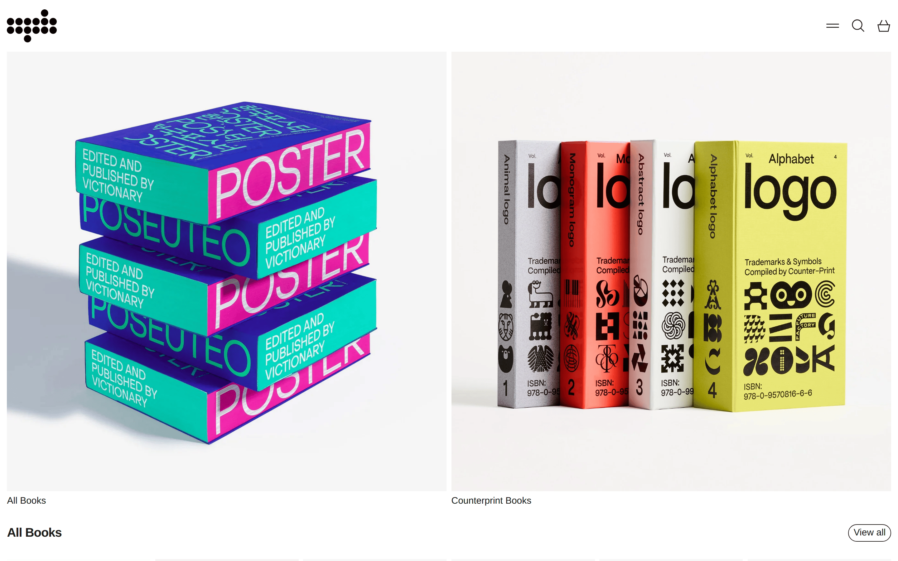
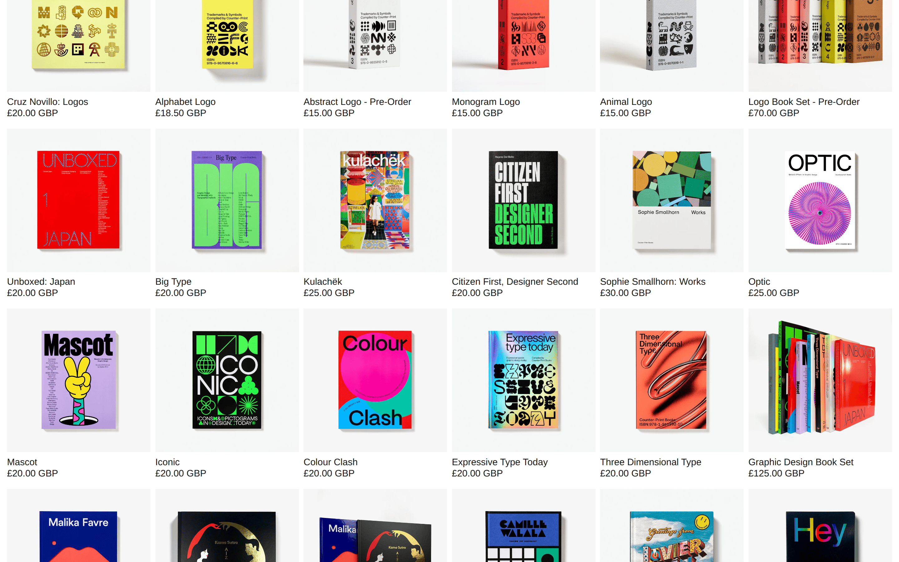
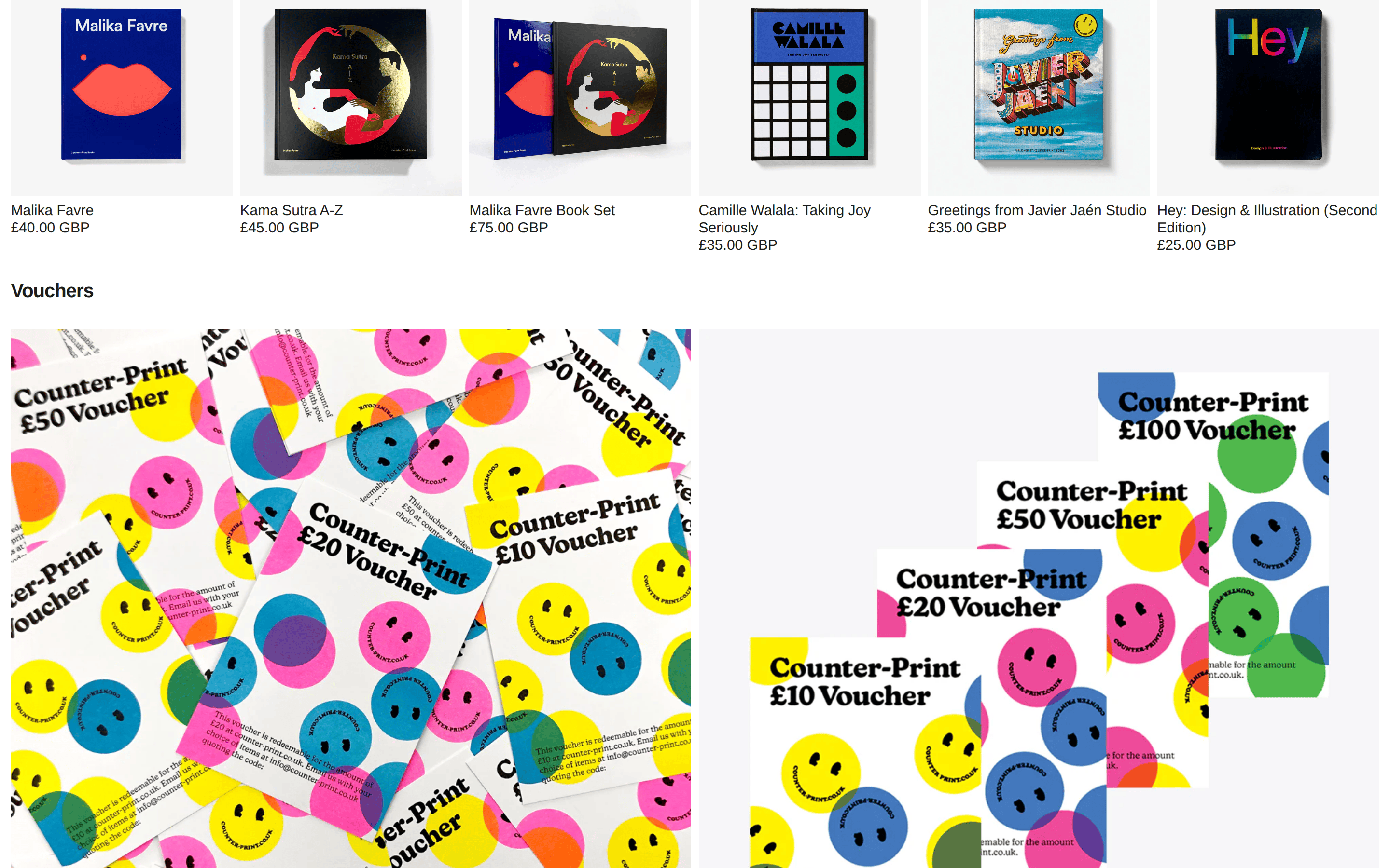
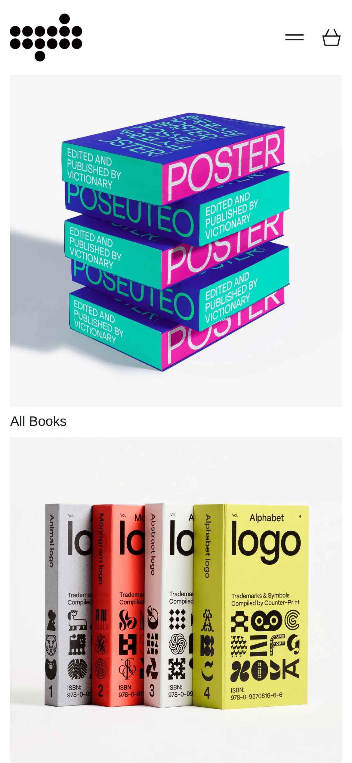
Strict monochrome canvas to let the colorful book covers serve as the primary visual interest.
03
Typography
grotesque-sans
display63px · 700
body15px · 400
Use tight negative letter-spacing for display sizes to increase impact. · Maintain a strict visual hierarchy using only weight and size, not color.
04
Spacing
4px
8px
16px
24px
32px
48px
64px
96px
Generous vertical padding separates distinct content blocks while tight horizontal gaps group related items.
05
Surfaces
sm · 4px
md · 8px
lg · 12px
pill · 999px
1px solid rgb(229,231,235)
06
Layout
1280container
12columns
24pxgutter
768 / 1024breakpoints
A simple grid-based layout that relies on large, high-quality photography to fill the canvas.
07
Motion & Interaction
220msmicro
400mssmall
800msmedium
cubic-bezier(0.4, 0, 0.2, 1)easing
Smooth opacity and transform transitions on interactive elements.
Subtle visual changes, likely opacity or transform, indicated by the transition properties. · Immediate response with standard cursor pointer feedback.
08
Components
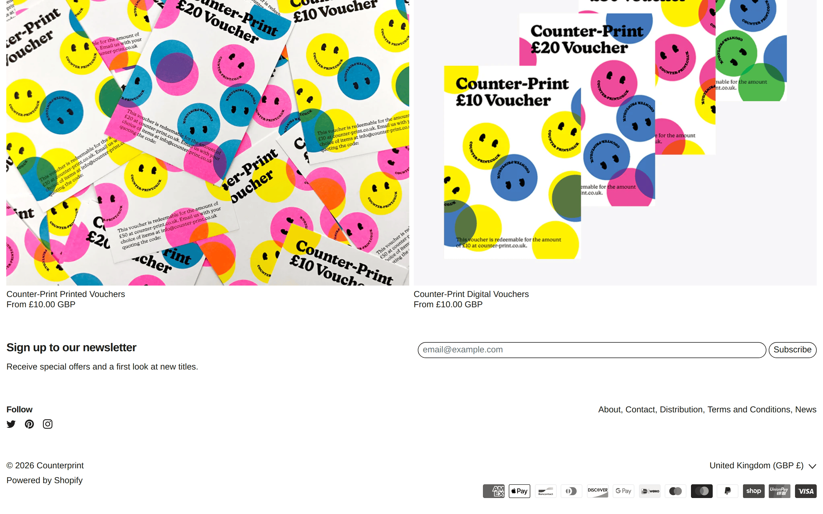
buttonGhost/Outline button with pill-shaped border-radius, used for secondary actions like 'View all'.
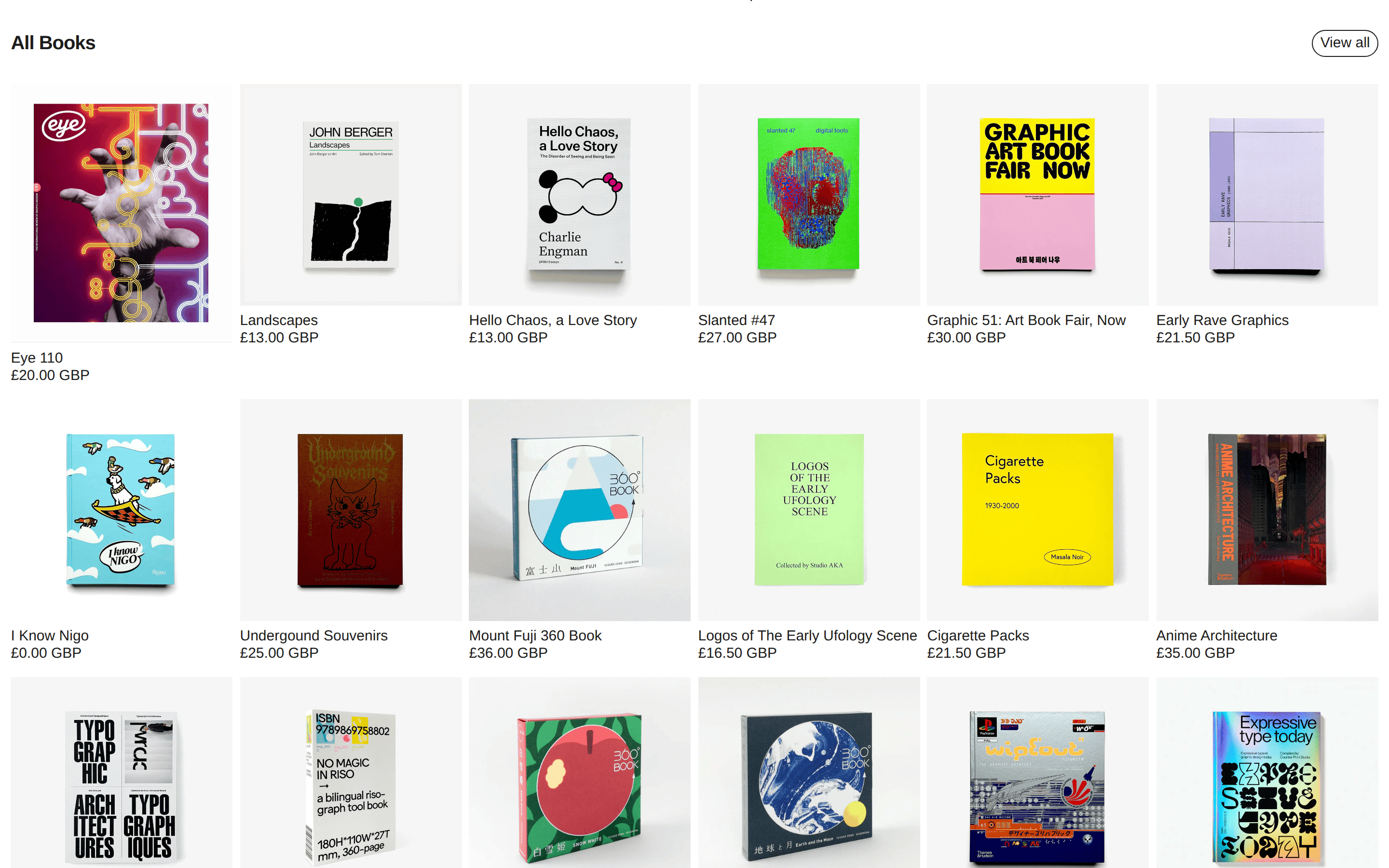
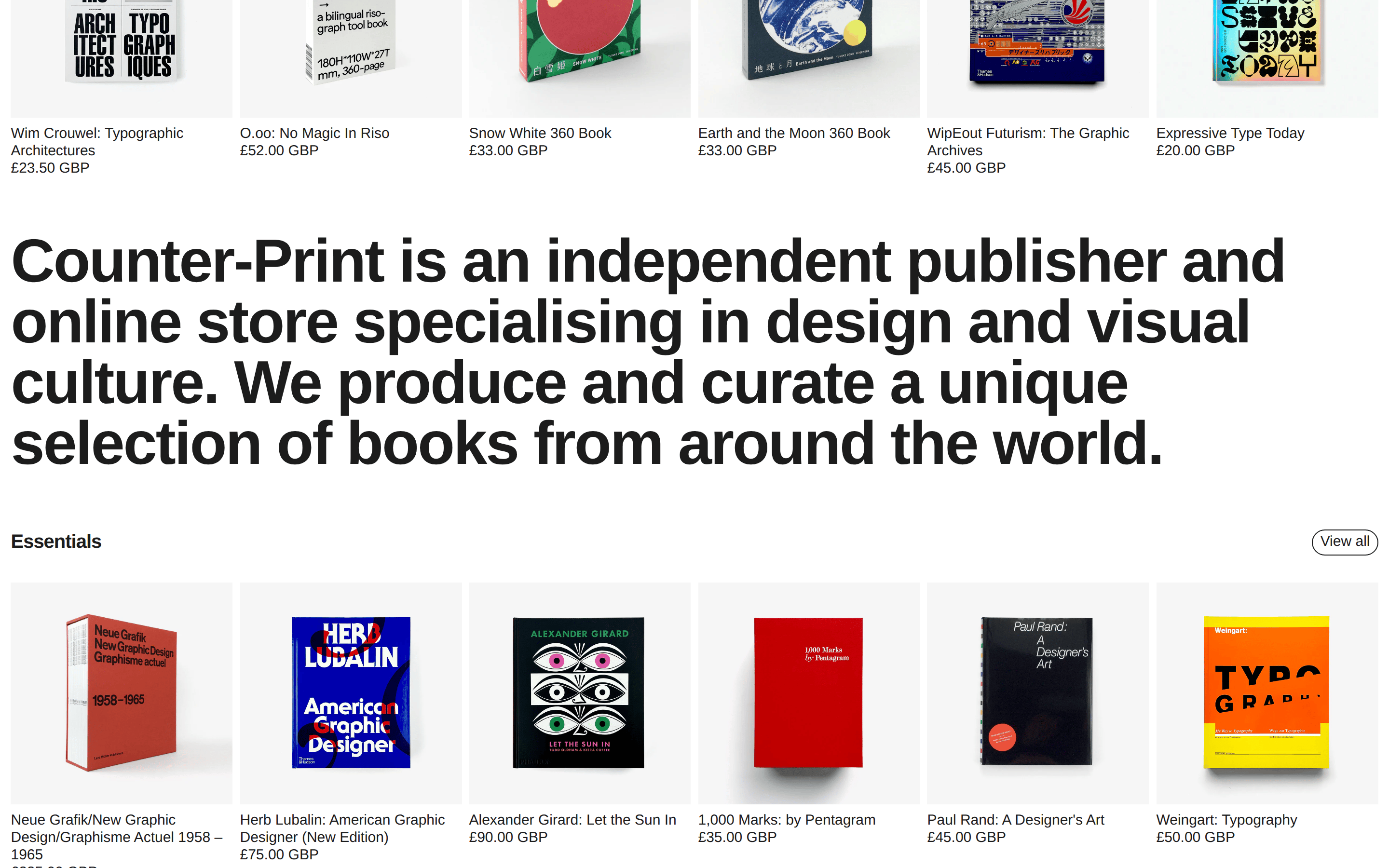
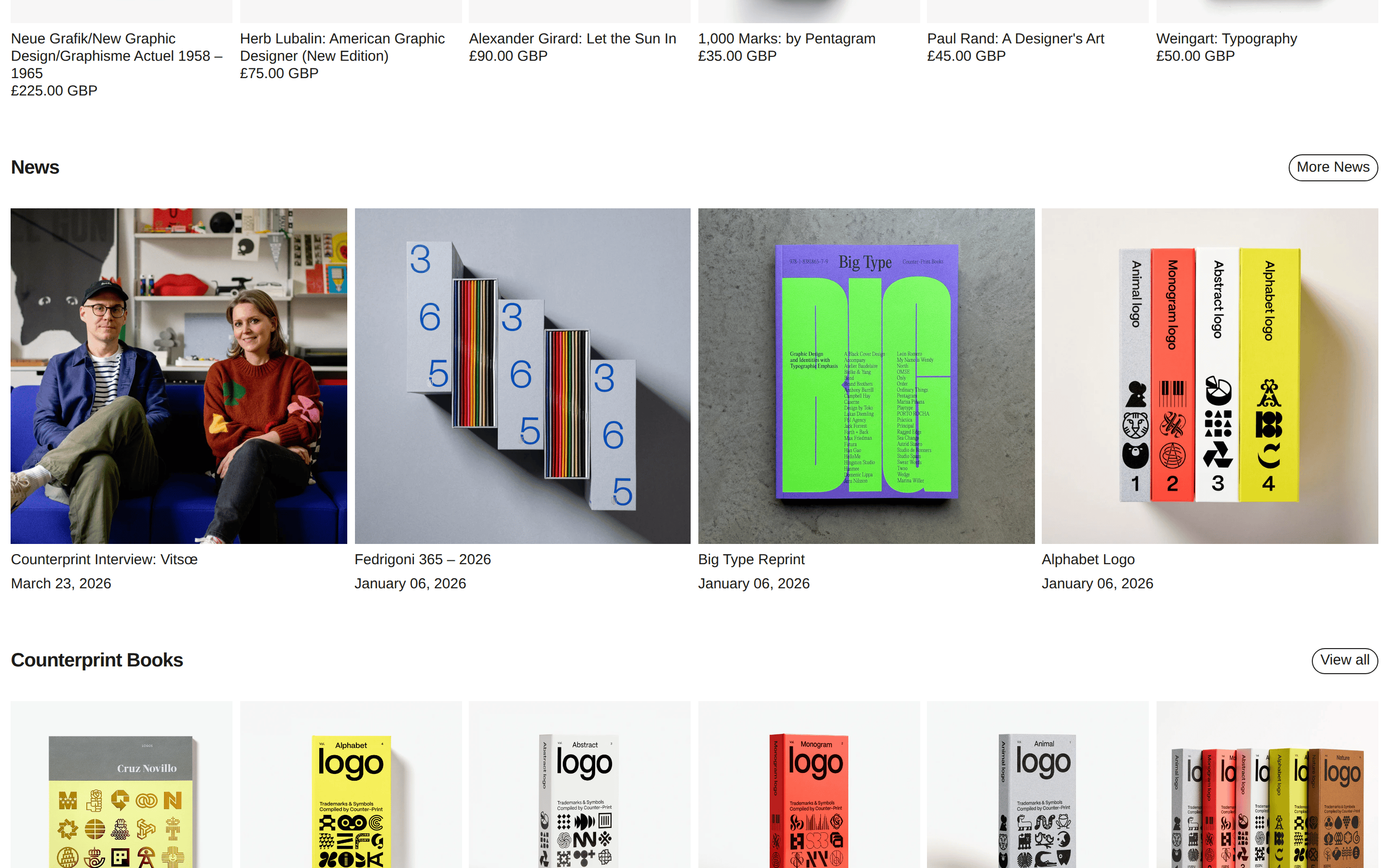
cardEdge-to-edge image cards that sit flush within their grid columns, emphasizing the product photography.
heroA two-column split layout featuring large product photography and bold, minimal text categorization.
09
Voice & Don'ts
ToneProfessional, minimalist, and highly curated.
HeadlinesBold, tightly tracked, and descriptive.
CTAsUnderstated, using clear, functional language and pill-shaped outline buttons.
Don't use decorative or serif fonts for UI elements — screenshot shows a strict geometric/grotesque sans-serif system.
Don't use bright accent colors for buttons or highlights — screenshot shows a strictly monochrome UI with no dominant accent.
Don't apply heavy drop shadows or soft glows — screenshot shows completely flat surfaces with no shadow usage.
Don't use rounded corners on primary content cards — screenshot shows sharp corners on product images and layout blocks.
Don't use justified text or dense blocks of copy — screenshot shows left-aligned text with generous vertical spacing.
Don't add unnecessary borders or dividers — screenshot uses white space and grid alignment to separate sections.
Captured from the live site · real computed styles
11
System prompt
A minimalist, premium e-commerce design for a curated graphic design bookstore. The UI uses a strict monochrome palette (#FFFFFF background, #1C1C1C ink) to ensure the colorful book covers remain the focal point. Typography relies on a clean, tight-tracked grotesque-sans (Helvetica/Arial) with bold, large-scale headers. Critical donts: never use decorative fonts, never apply heavy shadows, and never introduce a bright accent color that competes with the products. The layout is grid-based with generous padding, using ghost/pill buttons for secondary actions. Interaction patterns are subtle, relying on smooth opacity and transform transitions.
Bring this taste to your agent
Hand your AI agent a machine-readable spec of this design — tokens, type, motion, the whole DNA.