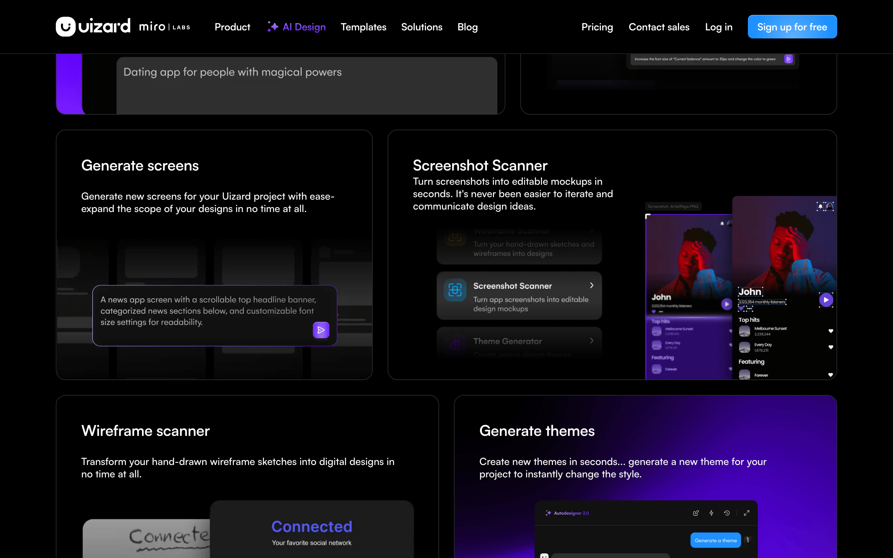
An autopilot for UI design that turns text prompts into wireframes.
02
Color
#6419FFAccent
#F5F5F5Ink
#AEAEAEInk soft
#0D0D0DBG
#171717BG soft
#080808BG quiet
#232323Muted
rgba(33,33,33,1)Line
High-contrast dark mode with a vibrant purple AI accent to signal creativity and modern tech.
03
Typography
geometric-sans · humanist-sans · monospace
display56px · 500
h140px · 480
body-lg18px · 400
body16px · 400
caption14px · 400
Maintain tight line-heights (1.1-1.15) for headings. · Use negative letter-spacing (-1px to -0.2px) for a modern, tight feel. · Prioritize clean, geometric shapes for all display typography.
04
Spacing
4px
8px
12px
16px
20px
24px
32px
40px
48px
64px
90px
A consistent 4px grid system ensures harmonious spacing across all UI components.
05
Surfaces
sm · 4px
md · 8px
lg · 12px
xl · 16px
pill · 999px
1px solid rgb(245,245,245) or rgb(33,33,33) depending on context.
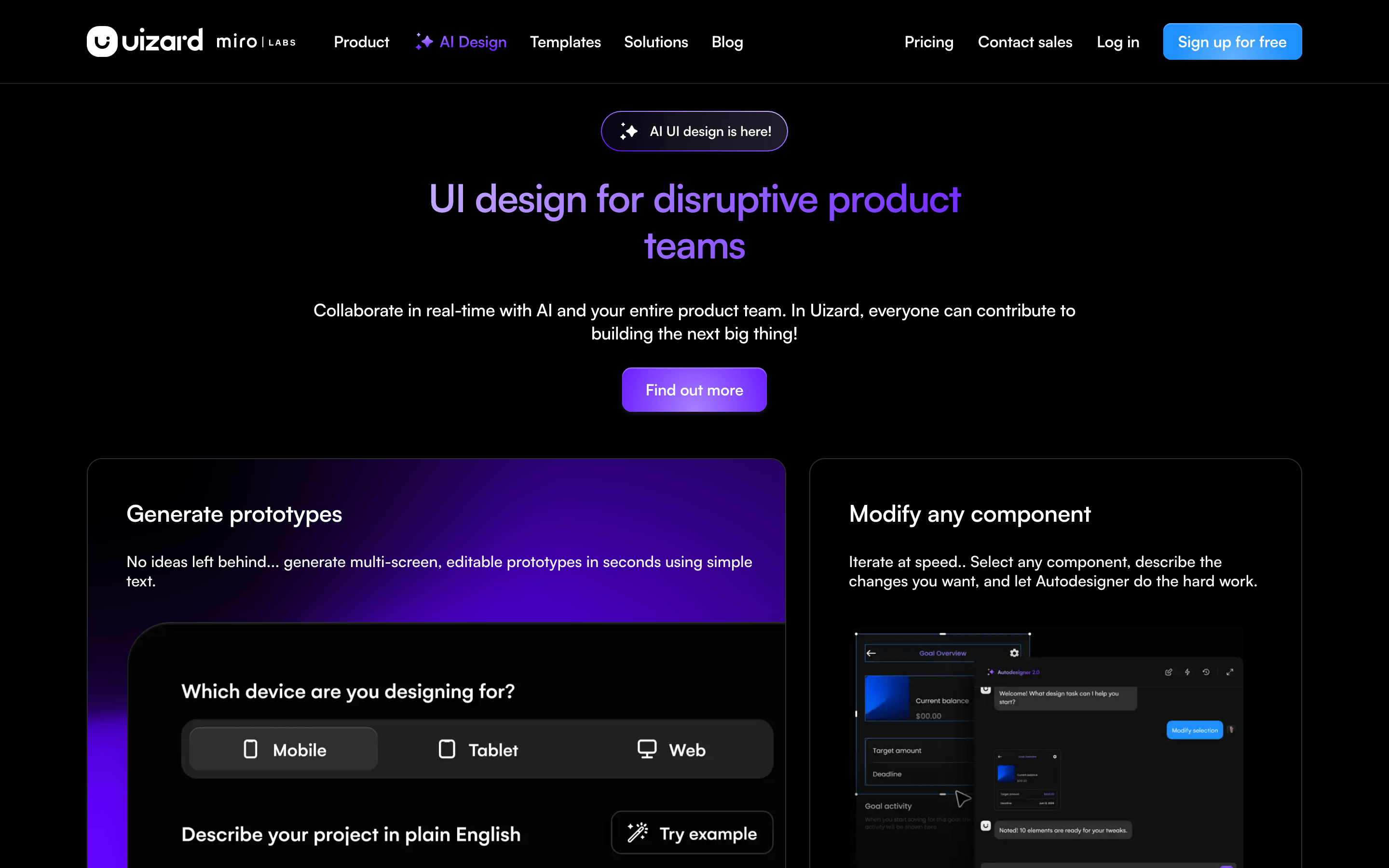
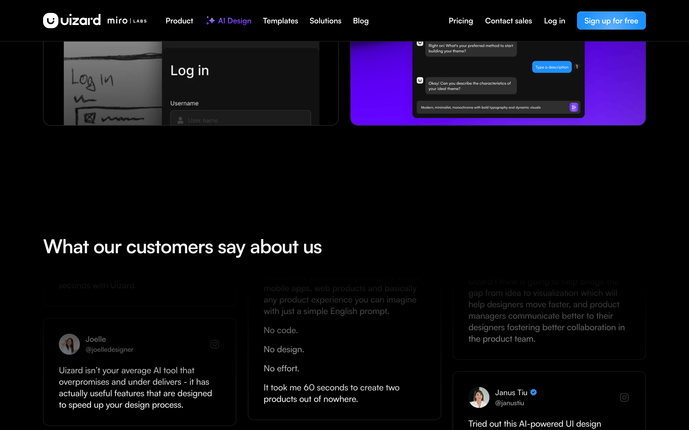
A structured grid layout centered on the page with distinct sections for hero, features, and social proof.
07
Motion & Interaction
200msmicro
300mssmall
500msmedium
cubic-bezier(0.25, 0.1, 0.25, 1)easing
Smooth transitions on background-color and opacity. · Subtle hover effects on interactive elements. · Dynamic glows and gradients that enhance the AI-centric feel.
Subtle color shifts and slight scale or glow effects on primary actions. · Immediate visual feedback through color change or inset shadow.
08
Components
buttonHigh-contrast primary buttons with pill-shaped borders and subtle purple glows.
cardRounded cards with soft borders (1px solid #212121) and deep background colors.
chipSmall, rounded labels used for status or tags within the interface.
inputClean input fields with dark backgrounds and subtle borders, often grouped with action buttons.
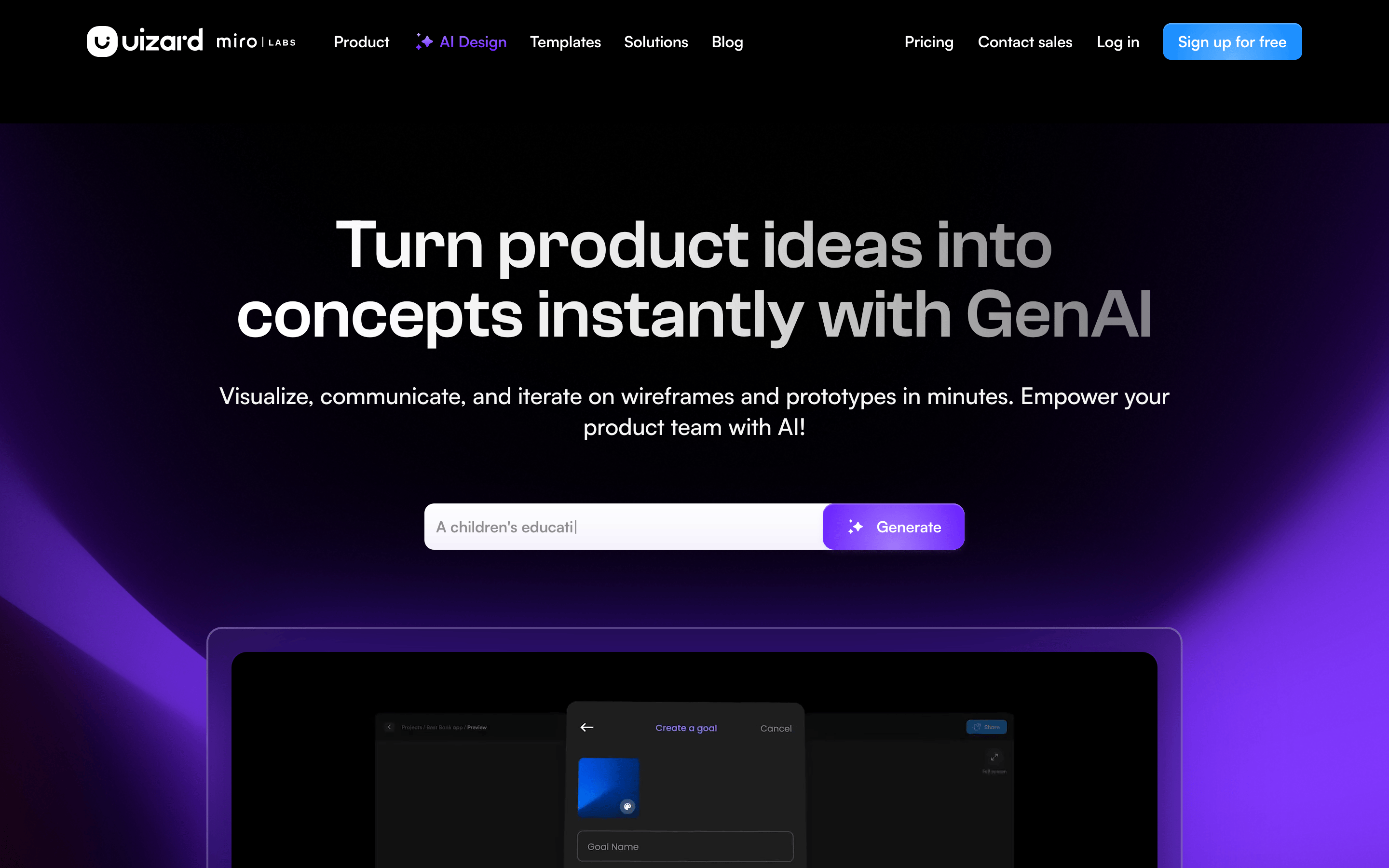
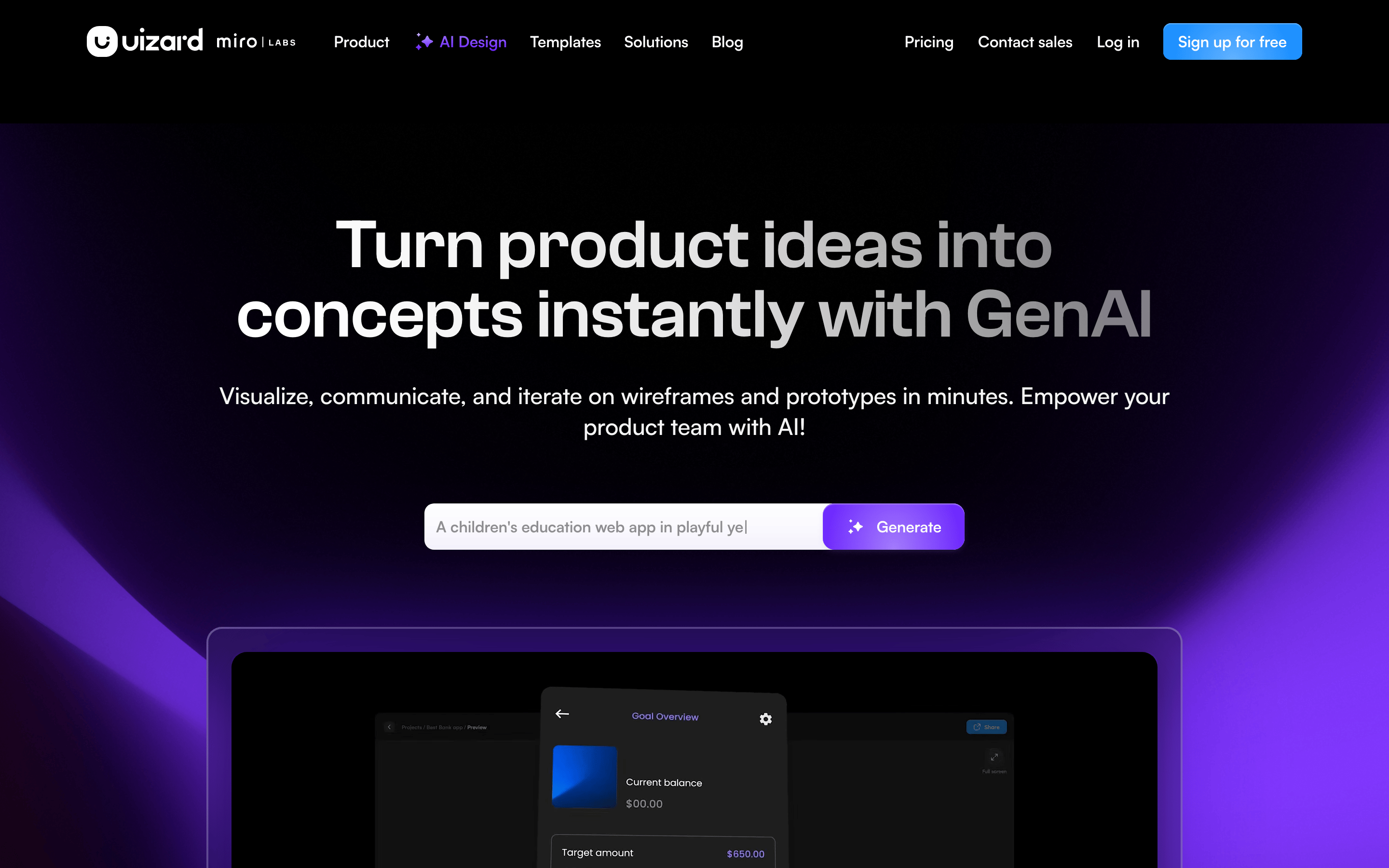
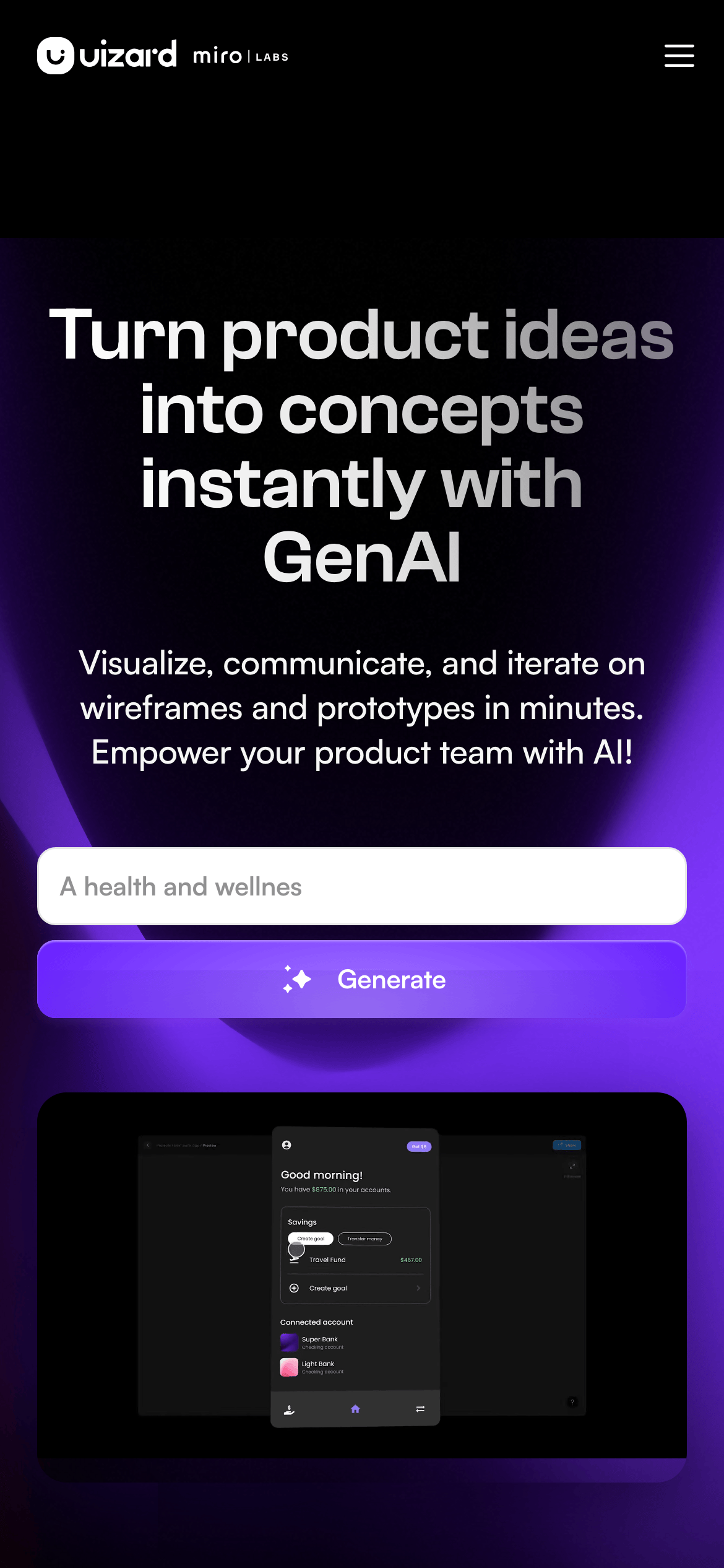
heroA dominant, centered hero section featuring a large headline, subtext, and a prominent prompt input.
09
Voice & Don'ts
ToneInnovative, empowering, and direct.
HeadlinesBold, benefit-driven statements that focus on speed and AI capabilities.
CTAsAction-oriented verbs like 'Generate', 'Sign up', and 'Explore'.
Don't use a white or light background — the screenshot shows a deep dark theme (#0D0D0D) as the foundation.
Don't use warm, earthy, or pastel colors — the palette is dominated by blacks, whites, and high-chroma purples.
Don't use serif fonts — the screenshot shows exclusively clean, geometric, and humanist sans-serif typefaces.
Don't use rounded corners smaller than 4px — even small elements use at least 4px, with many cards using 12px or 16px.
Don't use generic placeholder text in marketing materials — the screenshot uses clear, instructional prompt examples.
Don't use low-contrast text — the screenshot shows high-contrast white (#F5F5F5) on dark backgrounds for maximum legibility.
Avoid: Overly technical jargon that isn't explained.
Avoid: Passive or hesitant language.
Avoid: Excessive exclamation marks or sensationalism.
Captured from the live site · real computed styles
11
System prompt
Uizard is an AI-powered UI design tool that prioritizes speed and innovation. The visual system is built on a high-contrast dark mode (#0D0D0D background) with vibrant purple accents (#6419FF). Typography is dominated by clean, geometric sans-serif categories (display and body). Critical constraints include avoiding light themes, using exclusively modern sans-serif fonts, and maintaining high contrast for all text. The design uses a consistent 4px spacing grid and rounded corners (12px-16px) for a soft yet professional feel. Never use serif fonts or warm, earthy color palettes. The focus should always be on the 'magic' of AI-generated content, highlighted through glowing accents and bold, benefit-driven headlines.
Bring this taste to your agent
Hand your AI agent a machine-readable spec of this design — tokens, type, motion, the whole DNA.