A clean, friendly fintech interface that feels like a modern banking app but with a crypto-native aesthetic.
02
Color
#FF37C7Accent
#131313Ink
rgba(19, 19, 19, 0.63)Ink soft
#FFFFFFBG
#F9F9F9BG soft
rgba(19, 19, 19, 0.08)BG quiet
#222222Muted
rgba(19, 19, 19, 0.12)Line
A light, clean foundation with a vibrant magenta accent and high-contrast text.
03
Typography
Humanist Sans-Serif
display52px · 500
headline36px · 500
body16px · 485
label14px · 485
small18px · 485
Use the system font stack (Basel, -apple-system, system-ui, sans-serif) for all text. · Set display headline size to 52px with a weight of 500. · Set body text size to 16px with a weight of 485. · Use a negative letter spacing of -1px for large display text.
04
Spacing
4px
8px
12px
16px
20px
24px
32px
48px
64px
A 4px base grid is used throughout, with common gaps of 8px, 16px, and 24px.
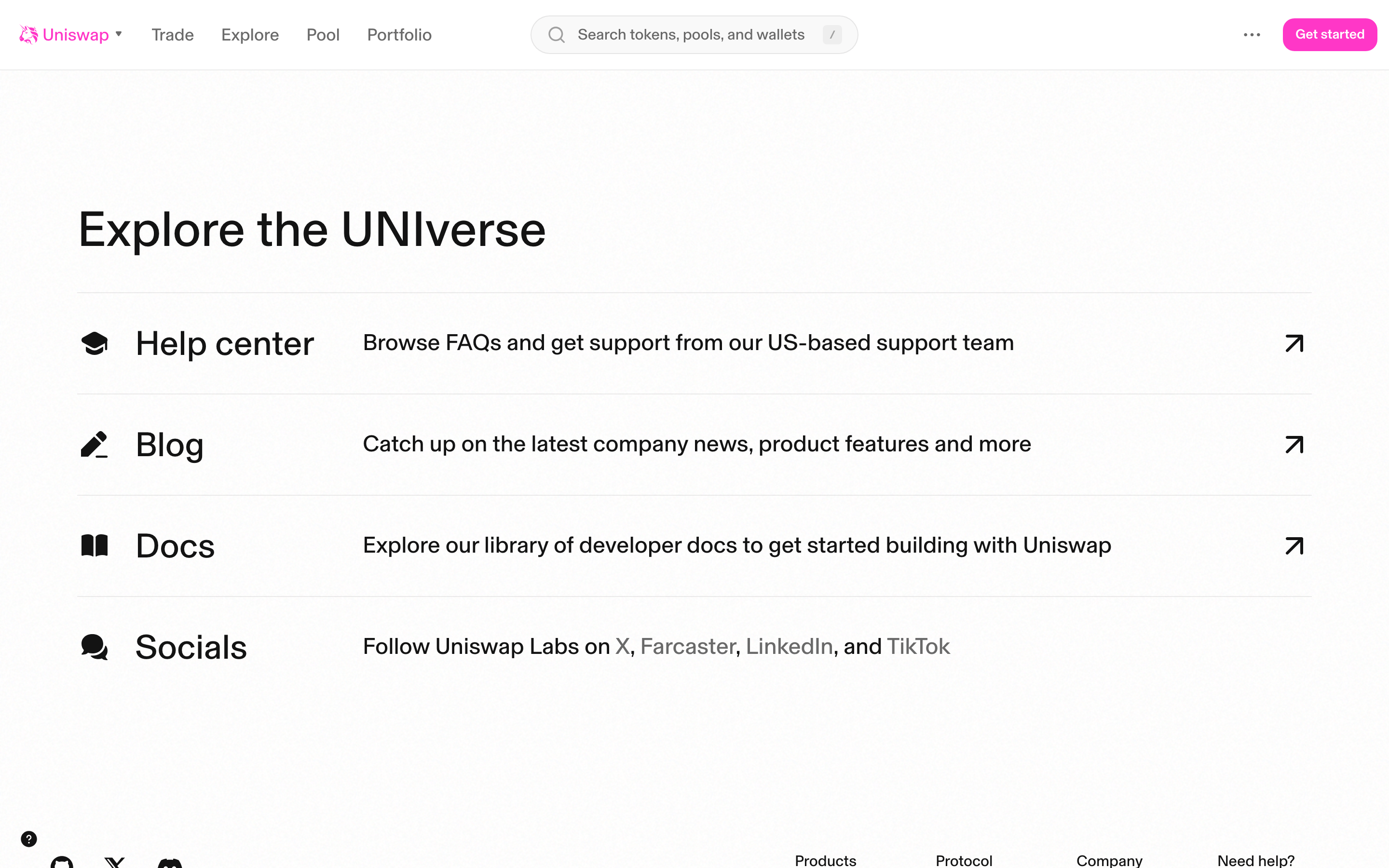
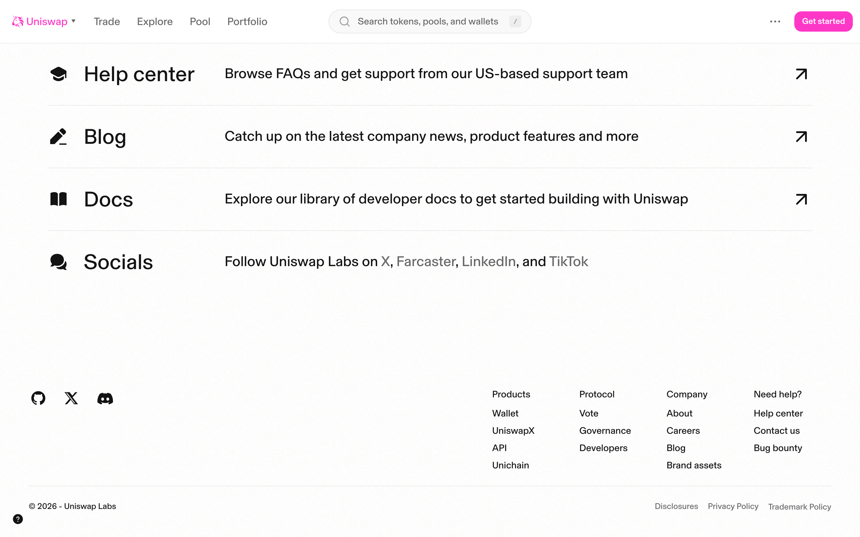
A single-column centered layout on desktop, expanding to a full-width mobile layout.
07
Motion & Interaction
100msmicro
125mssmall
400msmedium
cubic-bezier(0.34, 1.56, 0.64, 1)easing
Micro-interactions use a 0.1s ease-in-out transition. · Transformations and opacity changes use a 0.08s ease-in-out transition. · Interactive elements use a 0.4s cubic-bezier(0.34, 1.56, 0.64, 1) spring animation.
Subtle color shifts or background opacity changes on interactive elements. · A slight scale or transform effect on buttons and clickable cards.
08
Components
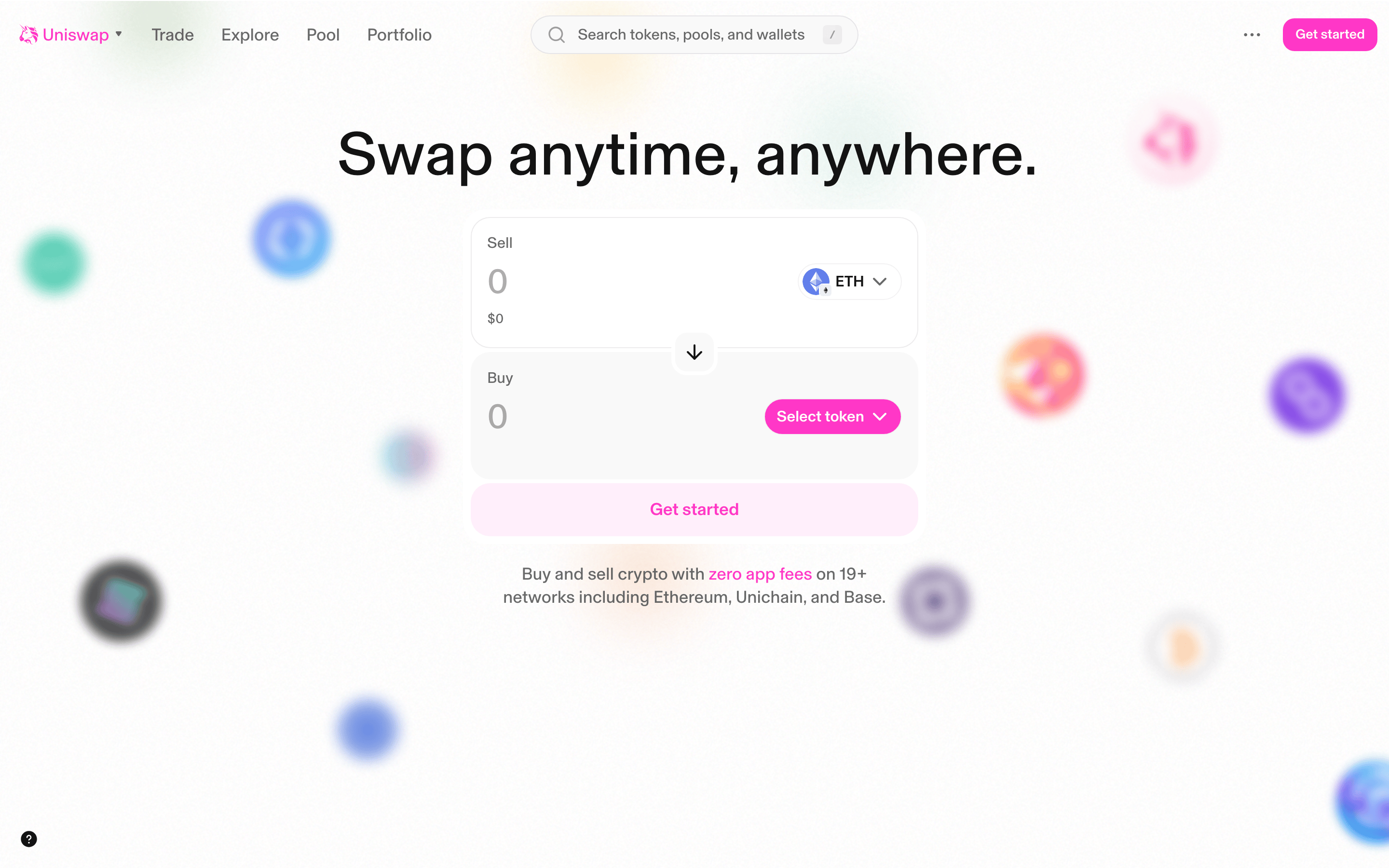
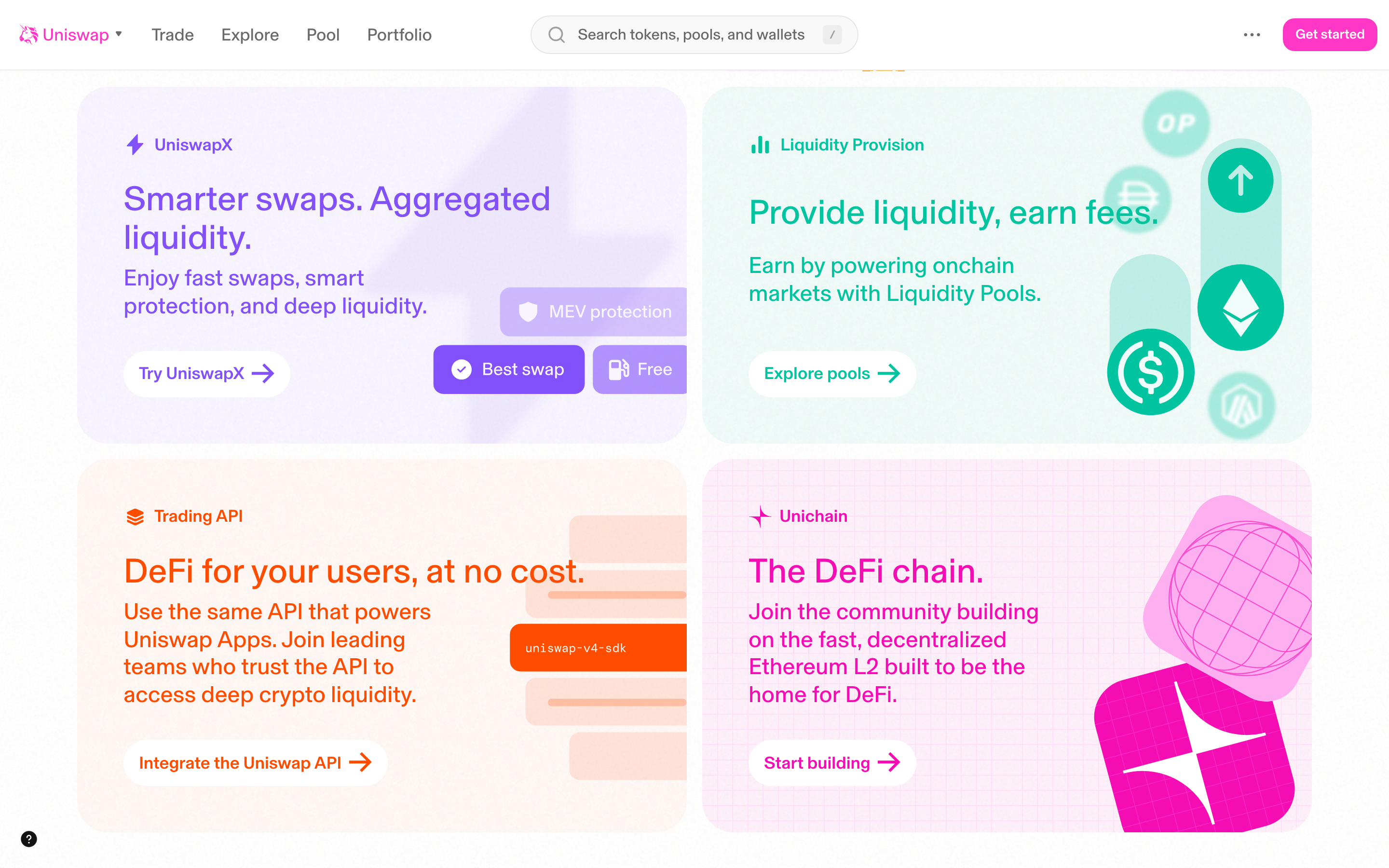
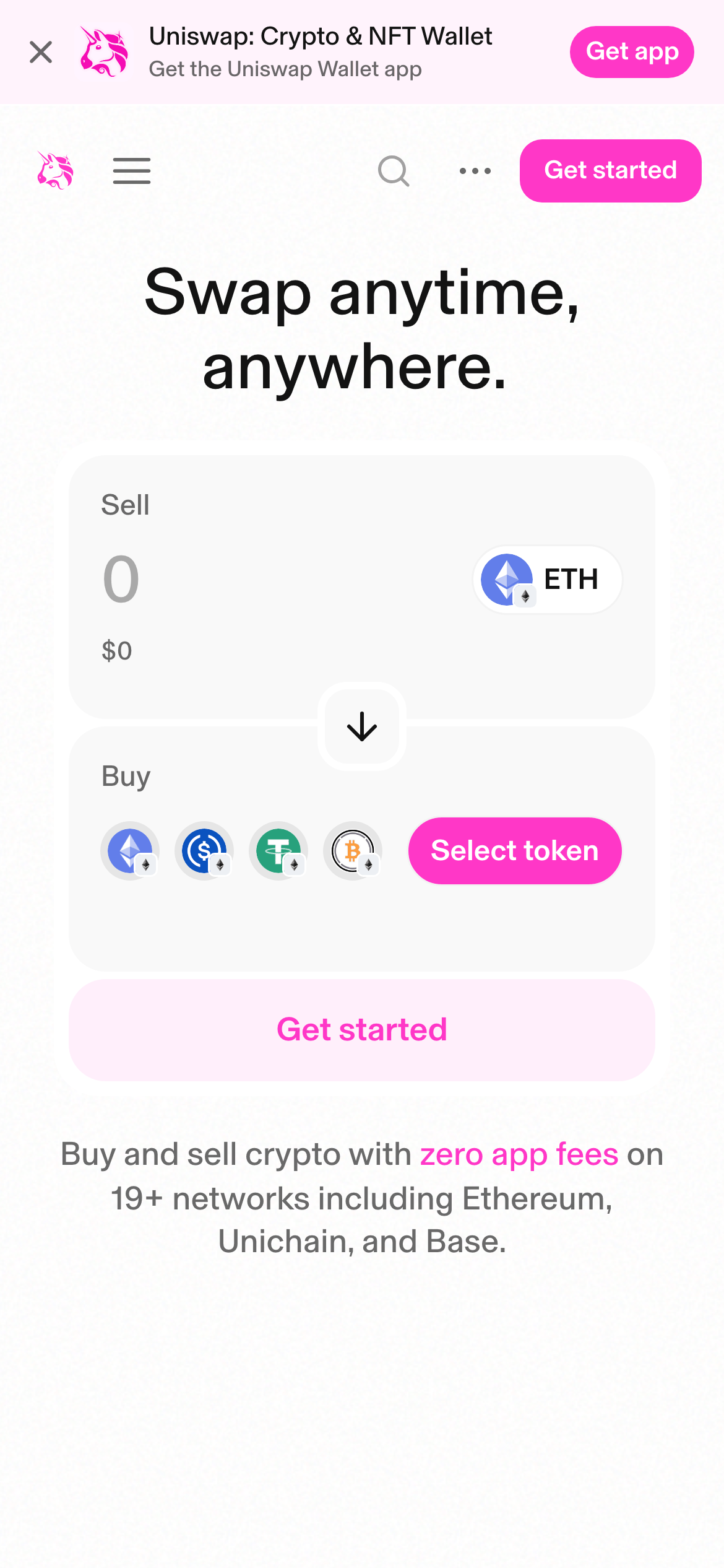
buttonPill-shaped buttons with a 32px border radius, filled with the magenta accent color.
cardCards with a 20px border radius, 12px padding, and subtle shadows or light gray backgrounds.
chipSmall, pill-shaped badges with light backgrounds and text colors matching their category.
inputLarge, rounded input fields with a 12px border radius and a light gray background.
heroA prominent, centered hero section featuring a large 52px headline and the main swap widget.
09
Voice & Don'ts
ToneFriendly, accessible, and direct, making complex DeFi concepts approachable.
HeadlinesLarge, bold, and clear, often using a single powerful sentence.
CTAsAction-oriented and prominent, using the magenta accent color to draw attention.
Don't use sharp, small border radii — the screenshot shows 12px to 32px radii on cards and buttons.
Don't use dark backgrounds as the primary canvas — the screenshot shows a predominantly white (#FFFFFF) and light gray (#F9F9F9) palette.
Don't use high-contrast dark mode for the entire interface — the screenshot shows a light theme with high-contrast text.
Don't use thin, light typography for headlines — the screenshot shows a 500 weight for 52px headlines.
Don't use a wide range of primary colors — the screenshot shows a single dominant magenta (#FF37C7) accent.
Don't use rigid, grid-heavy layouts with heavy borders — the screenshot shows soft shadows and rounded corners for separation.
Captured from the live site · real computed styles
11
System prompt
This is Uniswap, a decentralized finance platform. The design is clean and accessible, using a light theme with a white (#FFFFFF) and light gray (#F9F9F9) background. The primary accent is a vibrant magenta (#FF37C7). The typography uses a humanist sans-serif (Basel) with a display headline weight of 500 and size of 52px. Critical donts: 1) Do not use dark backgrounds for the main UI. 2) Do not use sharp corners; use generous border radii (12px to 32px). 3) Do not use thin fonts for headlines; keep them at a 500 weight. The overall feel is friendly and playful, not corporate or heavy.
Bring this taste to your agent
Hand your AI agent a machine-readable spec of this design — tokens, type, motion, the whole DNA.