Soft, warm neutrals grounded by high-contrast black text.
03
Typography
didone-serif · grotesque-sans
display90px · 400
body14px · 400
Body font is Neue Montreal, a clean grotesque sans-serif. · Display font is Saol Display, an elegant transitional serif. · Titles are frequently uppercase with tight tracking. · Body text has a slightly negative letter-spacing for a clean look.
04
Spacing
4px
8px
16px
24px
32px
48px
64px
96px
Generous whitespace around core elements, creating a focused, uncluttered layout.
05
Surfaces
sm · 4px
md · 8px
lg · 24px
pill · 999px
Thin, 1px solid borders in dark tones for subtle definition.
06
Layout
1280container
12columns
24pxgutter
768 / 1024breakpoints
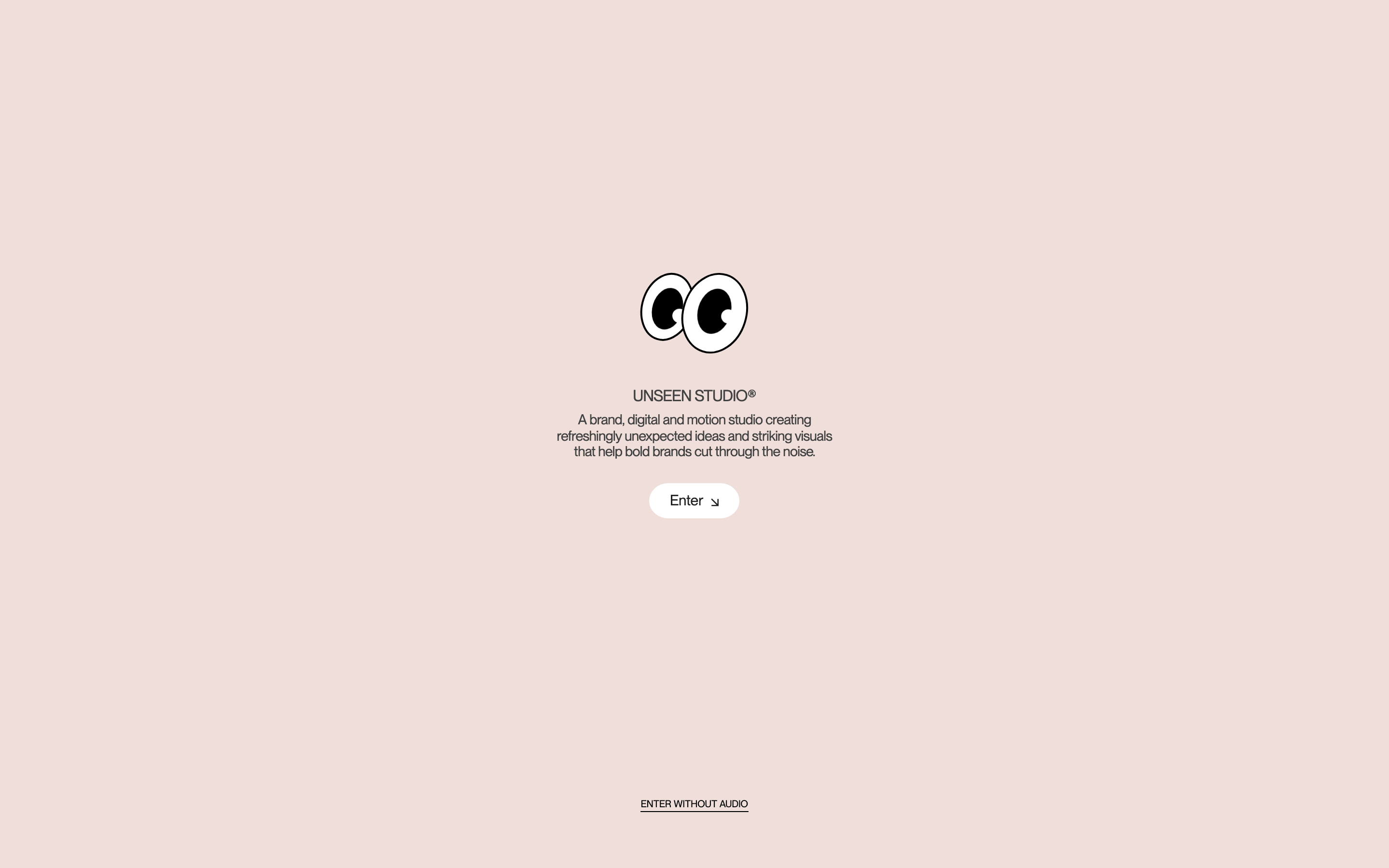
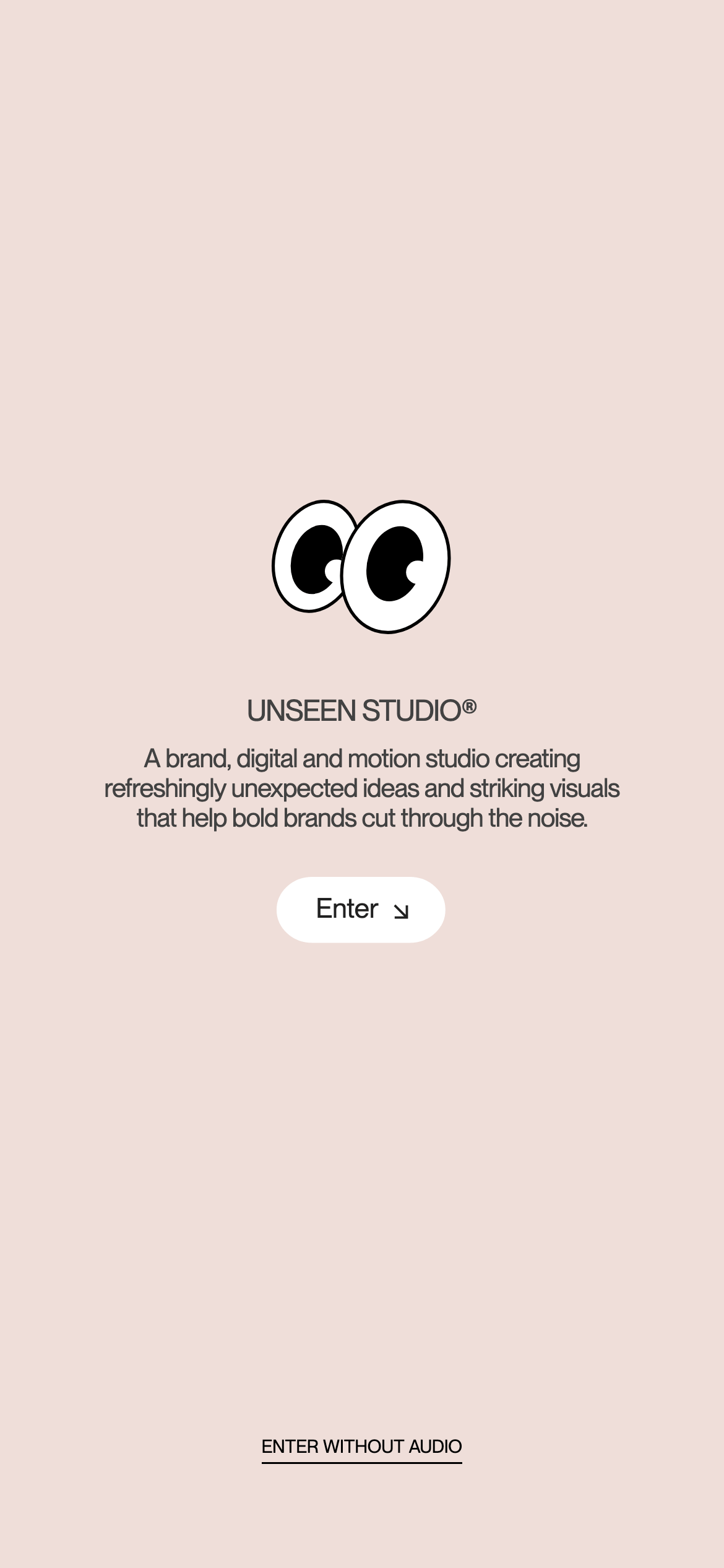
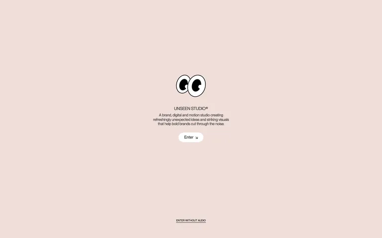
Centered, single-column layout for the splash screen with ample vertical rhythm.
07
Motion & Interaction
220msmicro
400mssmall
1000msmedium
cubic-bezier(0.16, 1, 0.3, 1)easing
Smooth, ease-out transitions for interactive elements. · Elongated transforms for primary page transitions.
Subtle scale or color transition on interactive elements. · Smooth transition to the main content upon entering the site.
08
Components
buttonMinimalist pill-shaped button with white background, black text, and subtle shadow.
cardNot applicable in the current view.
chipNot applicable in the current view.
inputNot applicable in the current view.
heroCentered content block featuring a playful illustrated logo, headline, description, and a single call-to-action.
09
Voice & Don'ts
ToneProfessional yet playful and observant.
HeadlinesDirect, confident, and often presented in uppercase.
CTAsSimple, action-oriented commands like 'Enter'.
Don't use a stark white background — screenshot shows a soft, warm beige/off-white.
Don't use a purely monochrome palette — screenshot shows a warm, desaturated pinkish-beige.
Don't use a serif font for all body copy — screenshot shows a sans-serif (Neue Montreal) for body text.
Captured from the live site · real computed styles
11
System prompt
Unseen Studio is a creative agency with a minimalist, observant, and slightly playful identity. The visual system uses a soft, warm neutral background (#F1EDEB) with high-contrast black (#212121) typography. The font pairing combines a clean grotesque sans-serif (Neue Montreal) for body text and a refined transitional serif (Saol Display) for display. Layout is centered and spacious, focusing on a single column for the splash screen. Key interactions are smooth, using a custom cubic-bezier easing. Critical donts: avoid stark white backgrounds, avoid dense layouts without breathing room, and avoid sharp corners on interactive elements.
Bring this taste to your agent
Hand your AI agent a machine-readable spec of this design — tokens, type, motion, the whole DNA.