Monochromatic with strict use of black and white, using gray only for secondary elements or placeholders.
03
Typography
geometric-sans · humanist-sans
display34px · 400
body20px · 400
small16px · 400
Titles use a mix of regular weight and italicized secondary text · Line heights are tight for headlines to create compact blocks · All typography uses a weight of 400
04
Spacing
4px
8px
16px
20px
24px
32px
48px
64px
96px
Generous vertical whitespace between content blocks creates a rhythmic, editorial flow.
05
Surfaces
sm · 0px
md · 0px
lg · 0px
pill · 999px
Thin 1px solid black lines used structurally for the top navigation and sometimes for dividers.
06
Layout
1440container
3columns
20pxgutter
768 / 1024breakpoints
Asymmetric grid layout where items are placed dynamically with varying vertical positions.
07
Motion & Interaction
200msmicro
250mssmall
800msmedium
cubic-bezier(0.4, 0.0, 0.2, 1)easing
Smooth color transitions on hover · Opacity fades for interactive elements
Text color or opacity changes slightly on hover to indicate interactivity · Direct navigation to the event or project detail page
08
Components
buttonPlain text links with a diagonal arrow icon as the primary interactive element
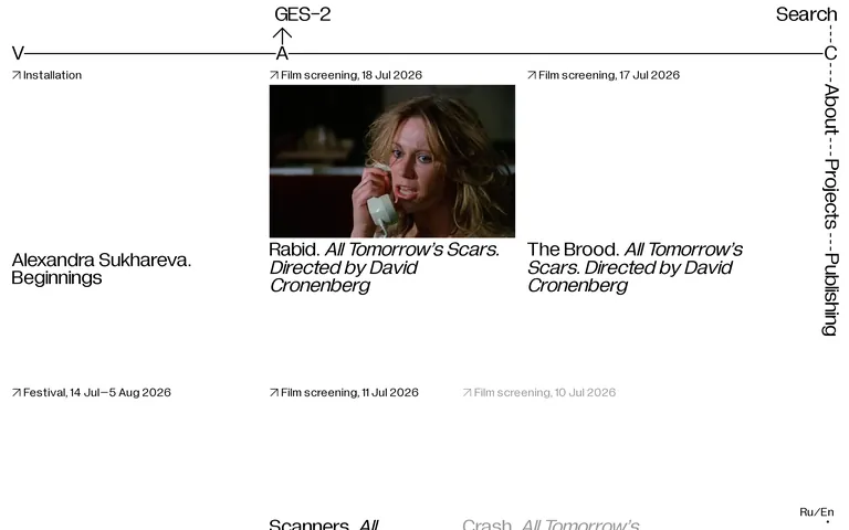
cardMedia-heavy event cards with a timestamp above, media in the middle, and title below
heroA stark, typographic hero section featuring the institution's name broken across the layout.
09
Voice & Don'ts
ToneAuthoritative, concise, and institutional
HeadlinesShort, descriptive titles often accompanied by italicized subtitles or dates
CTAsSubtle text-based links without prominent button styling
don't use drop shadows — the screenshot shows completely flat design without any depth effects
don't use rounded corners on containers — the screenshot shows sharp, rectangular elements
Captured from the live site · real computed styles
11
System prompt
A minimalist, editorial design system for a cultural institution's digital catalog. Uses a strict monochromatic palette (black #000000 on white #FFFFFF) with geometric and humanist sans-serif typography at a uniform 400 weight. The layout is asymmetric and grid-based, relying on generous whitespace and thin 1px lines for structure. Key interactions involve subtle opacity and color transitions. Critical donts: avoid drop shadows, rounded corners, vibrant colors, multiple font weights, heavy borders, and centered text.
Bring this taste to your agent
Hand your AI agent a machine-readable spec of this design — tokens, type, motion, the whole DNA.