← OpenDesign CURATED · OPEN · FREE
Virtual Plus Ex
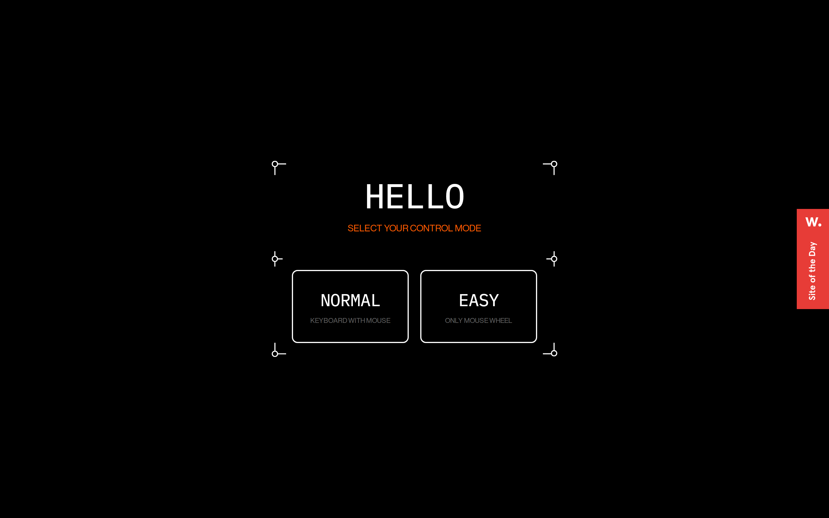
A stark, high-contrast interactive experience that prioritizes bold typography and simple, controlled navigation.
Dark Mode Experimental App UI Bold Typography Clean
01
Identity DNA
interactive minimal bold experimental immersive
A minimalist interactive gallery or showroom with a focus on user control and bold typography.
02
Color
#FF5C00Accent
#FFFFFFInk
rgba(255,255,255,0.4)Ink soft
#000000BG
rgba(255,255,255,1)Line
Strict high-contrast monochrome with a single vibrant accent for emphasis.
03
Typography
grotesque-sans · monospaced
display 60px · 500subheading 16px · 500body 12px · 500label 10px · 500All text is uppercase. · Headings use a tight negative letter-spacing. · Body text is consistently monospaced for a technical feel.
04
Spacing
4px
8px
10px
16px
24px
30px
32px
35px
36px
48px
60px
Generous padding around interactive elements, typically 25-36px.
05
Surfaces
sm · 0px
md · 10px
lg · 0px
pill · 0px
2px solid white for buttons, subtle 1px lines for decorative elements.
06
Layout
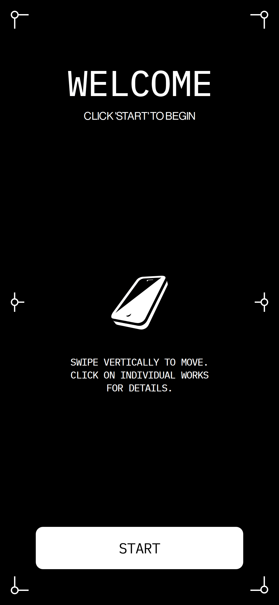
Centered vertical stack for the initial mode selection, transitioning to a full-screen scroll-based layout.
07
Motion & Interaction
220ms micro
400ms small
800ms medium
cubic-bezier(0.25, 0.1, 0.25, 1) easing
Transition on all properties for hover states. · Implied smooth scrolling or swiping based on instructions.
Implied cursor pointer and transition on interactive elements. · Primary interaction method for starting and selecting modes.
08
Components
button Large, rectangular outlined buttons with rounded corners, all-caps text, and generous internal padding. card Not visible in the provided screenshots, but implied as the main content containers. chip Not visible. input Not visible. hero Full-screen black canvas with large, centered typography and minimal decorative line elements. 09
Voice & Don'ts
Tone Direct, minimalist, and instructional. Headlines Bold, all-caps, tight letter-spacing. CTAs Clear, large, uppercase text within prominent buttons. Don't use serif or handwritten fonts — screenshot shows only grotesque-sans and monospaced type. Don't add background images or gradients — screenshot shows a solid black background. Don't use low contrast text — screenshot shows high-contrast white on black. Don't use complex shadows or depth effects — screenshot shows flat, border-only components. Don't use multiple accent colors — screenshot shows only one accent color (orange). Don't use lowercase text for UI elements — screenshot shows all text is uppercase. Avoid: Soft or playful language. Avoid: Busy layouts or multiple competing elements. Avoid: Serif or decorative typefaces. 10
Inside the pack — real screenshots
桌面首屏(hero) 桌面滚动分段(90% viewport 步进,作为视觉证据) 桌面滚动分段(90% viewport 步进,作为视觉证据) 移动首屏 Captured from the live site · real computed styles
11
System prompt
This is a minimalist, experimental interactive showroom site. It uses a stark black and white palette with a single vibrant orange accent for key instructions. The typography is bold, all-caps, and uses a grotesque-sans for headings and a monospaced font for body text, creating a technical, direct tone. Key interactions are controlled via large, outlined buttons and scrolling. Critical design rules: use only the specified font categories, maintain high contrast, avoid decorative elements, keep layouts centered and spacious, and use uppercase text consistently. Never add shadows, gradients, or multiple accent colors. The interaction model is simple, focusing on scroll and click.
More from the library en · zh-CN · zh-TW · ja · ko
OpenDesign · curated web aesthetics for AI-readable design DNA · opendesign.cc
Why we curated this: A bold example of using extreme minimalism and typography to create an immersive, controlled interactive experience.