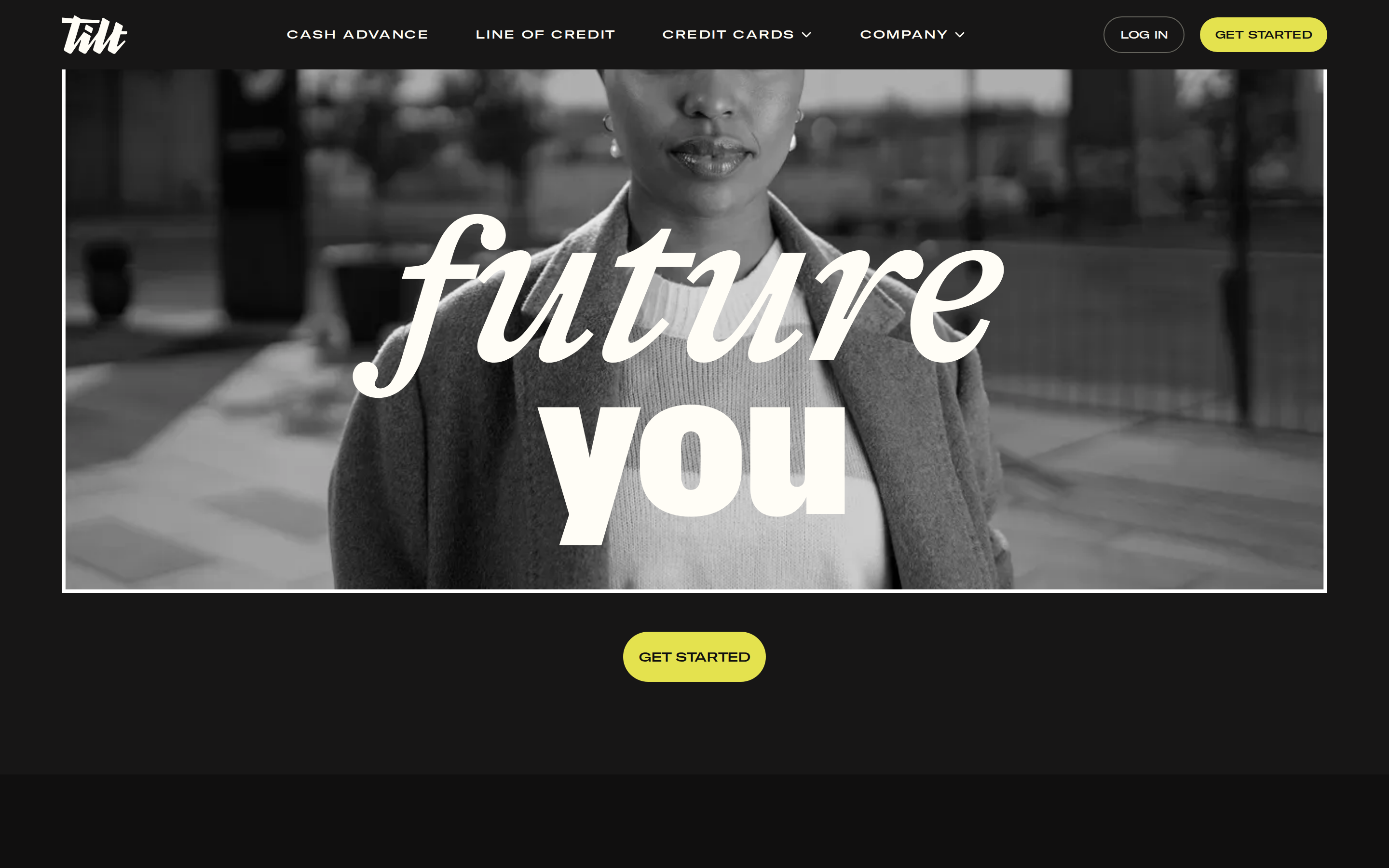
A bold, empowering financial advisor in a sleek dark suit with a bright yellow pocket square.
02
Color
#E4E24EAccent
#FFFFFFInk
#171616BG
#F7F5EFBG soft
#FDFDF6BG quiet
#64635CMuted
rgba(16,15,15,1.0)Line
High-contrast dark mode punctuated by a single vibrant, neon-adjacent chartreuse accent to draw the eye to primary actions.
03
Typography
geometric-sans · grotesque-sans
display96px · 900
heading48px · 900
body16px · 400
Use tight letter-spacing (-0.6px to -1px) for large headlines · Uppercase tracking (+1.2px) for navigation and small labels · Combine massive geometric display type with a cleaner grotesque for UI elements
04
Spacing
4px
8px
16px
24px
32px
48px
64px
96px
Generous padding around major content blocks and massive internal spacing within hero sections.
05
Surfaces
sm · 4px
md · 16px
lg · 24px
pill · 99999px
Thin, high-contrast borders (2px) separating dark hero from light sections.
06
Layout
1280container
12columns
24pxgutter
768 / 1024breakpoints
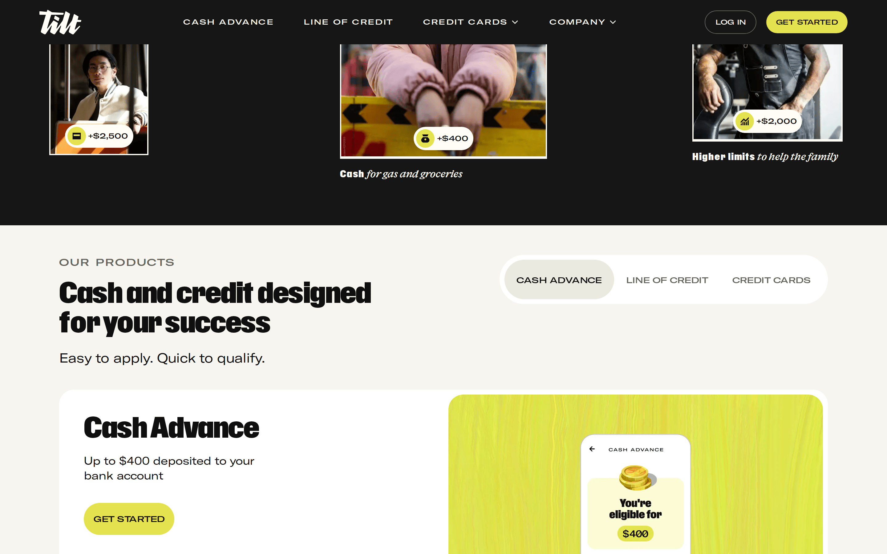
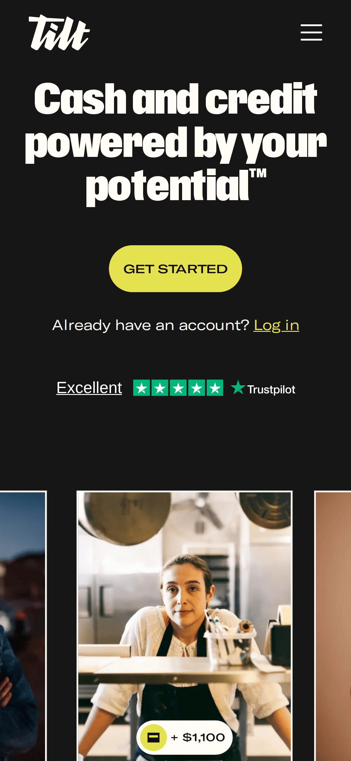
A full-width dark hero section transitions into a light, centered content area with a 3-column feature grid.
07
Motion & Interaction
150msmicro
300mssmall
600msmedium
cubic-bezier(0.4, 0, 0.2, 1)easing
smooth color transitions on hover and focus states
Smooth background color transitions on buttons and links. · Immediate response with subtle easing.
08
Components
buttonPill-shaped with vibrant chartreuse background, dark text, and bold uppercase tracking.
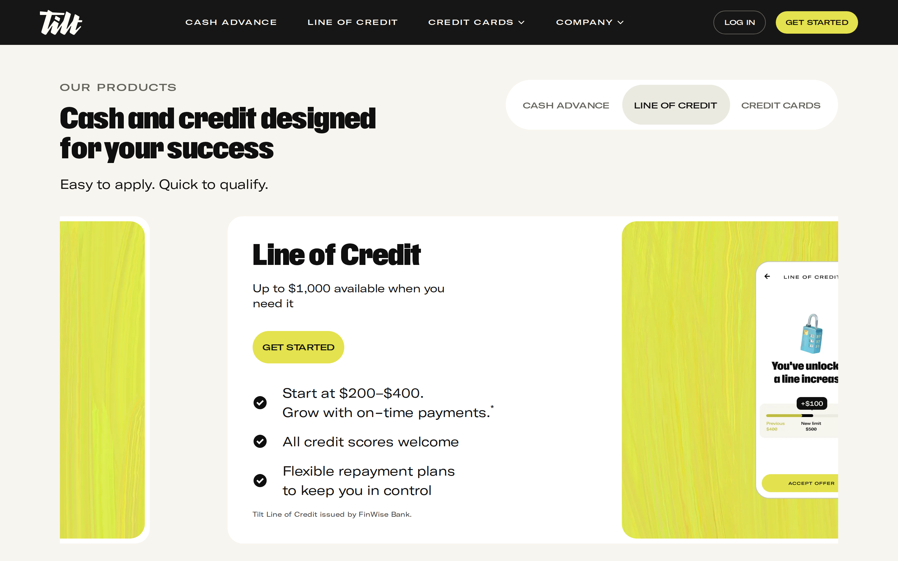
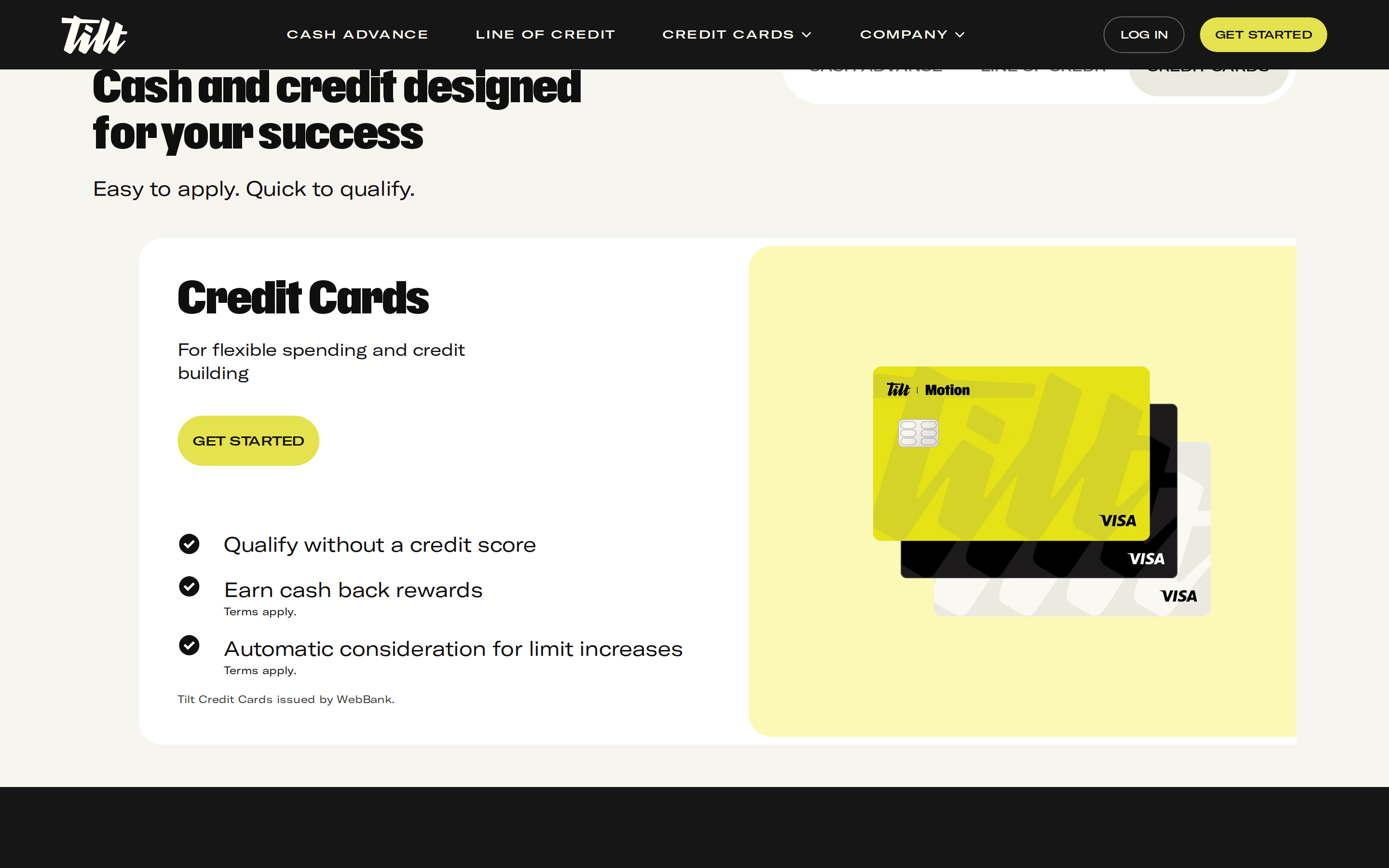
cardLight, rounded cards with generous internal padding and playful, hand-drawn illustration styles.
chipSmall floating badges with icons and text, often pill-shaped.
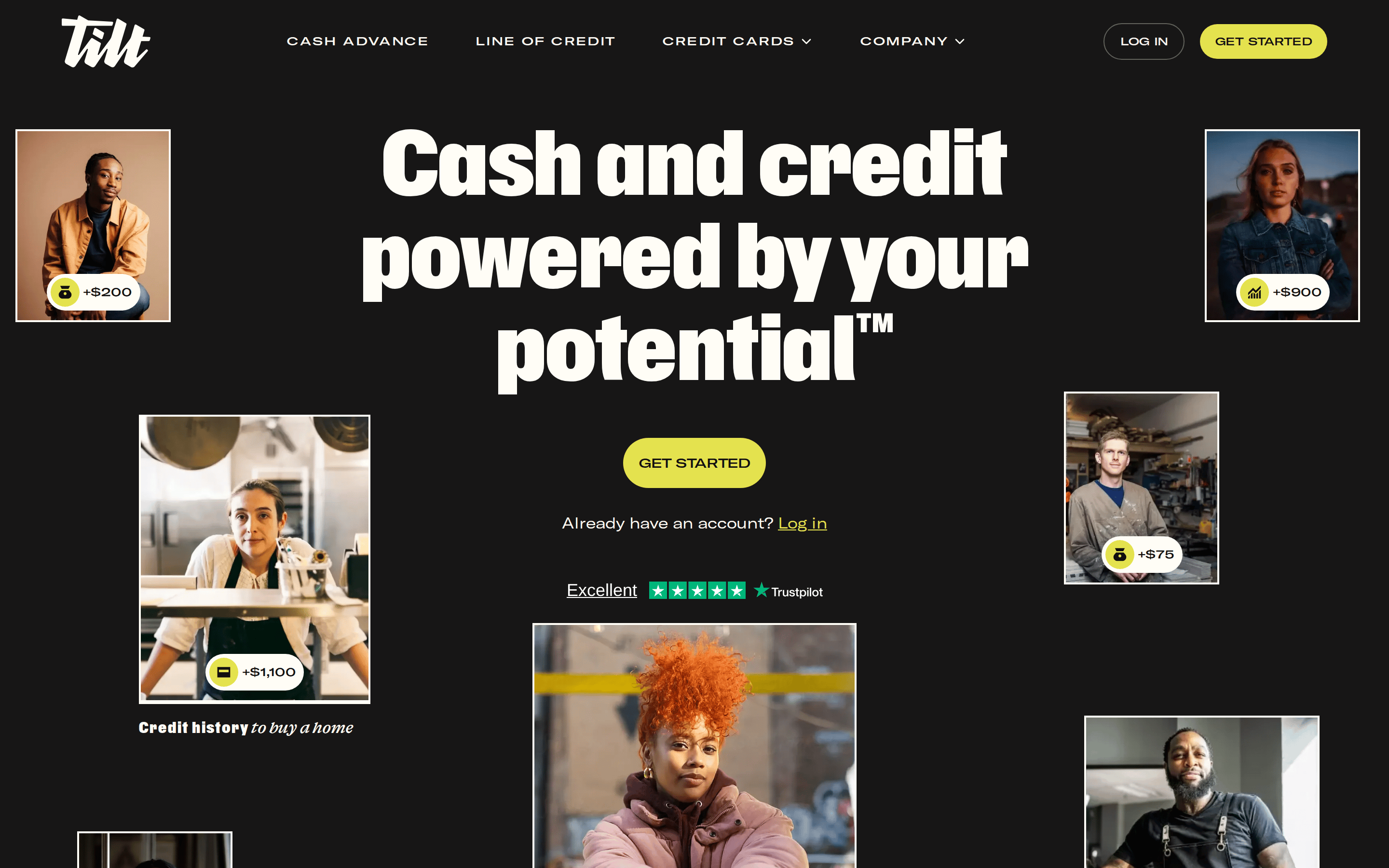
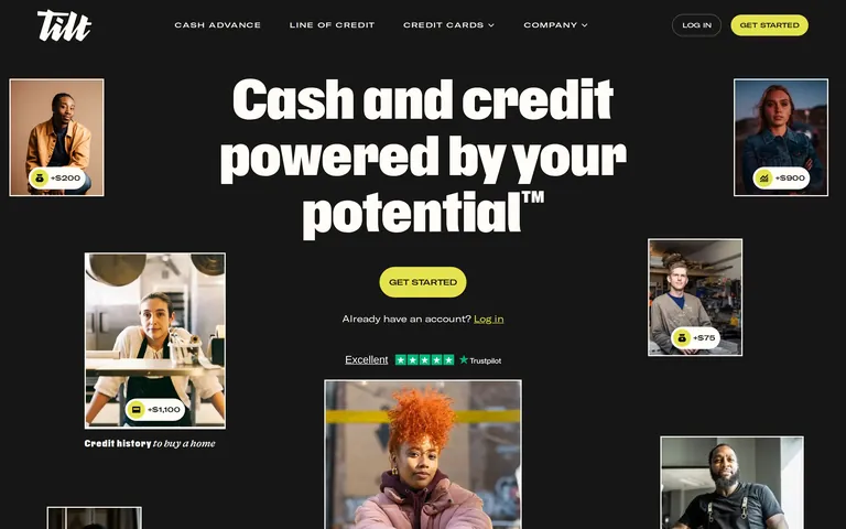
heroMassive dark section featuring a huge white headline and a floating, asymmetric collage of photographic portraits with small data badges.
09
Voice & Don'ts
ToneEmpowering, direct, and accessible, breaking down complex financial concepts into simple, relatable language.
HeadlinesExtremely bold, concise, and benefit-driven, often using trademark symbols for branding.
CTAsStrong, action-oriented imperative verbs in all caps with vibrant color.
Don't use thin, delicate fonts — the screenshot shows massive, heavy weight typography.
Don't use a complex, multi-colored palette — the screenshot shows a strict dark/white/chartreuse scheme.
Don't use sharp, square corners — the screenshot shows heavily rounded, pill-shaped buttons and cards.
Don't use small, subtle CTAs — the screenshot shows large, high-contrast yellow buttons.
Don't use dense, text-heavy layouts — the screenshot shows generous whitespace and large images.
Don't use serif fonts for primary text — the screenshot shows exclusively bold sans-serif display and grotesque body fonts.
Captured from the live site · real computed styles
11
System prompt
This is a fintech platform design system that leverages a dark mode aesthetic with a single, vibrant chartreuse accent color (#E4E24E) to guide user attention to primary actions. The typography is defined by massive, bold geometric sans-serif headlines paired with a cleaner grotesque sans-serif for body copy. The layout features generous spacing, high-contrast section transitions, and a mix of realistic photography with playful, rounded UI components. Critical donts: Do not use multiple competing accent colors; avoid thin, delicate typefaces for headlines; and never use sharp, square corners on buttons or cards. The system prioritizes a bold, empowering tone through direct language and impactful visual hierarchy.
Bring this taste to your agent
Hand your AI agent a machine-readable spec of this design — tokens, type, motion, the whole DNA.