High-contrast dark theme with a muted neutral text color
03
Typography
transitional-serif · humanist-sans
display187px · 300
heading50px · 300
body24px · 300
caption16px · 300
04
Spacing
4px
8px
16px
24px
32px
48px
64px
96px
Generous vertical rhythm with 32px base increments
05
Surfaces
sm · 4px
md · 48px
lg · 72px
pill · 9999px
No visible borders on most elements
06
Layout
1440container
12columns
32pxgutter
768 / 1024breakpoints
Large, centered content blocks with generous whitespace
07
Motion & Interaction
220msmicro
400mssmall
800msmedium
cubic-bezier(0.4, 0, 0.2, 1)easing
Subtle background-color transitions on interactive elements · Immediate visual feedback
08
Components
buttonPill-shaped or large rounded rectangles with solid color fills
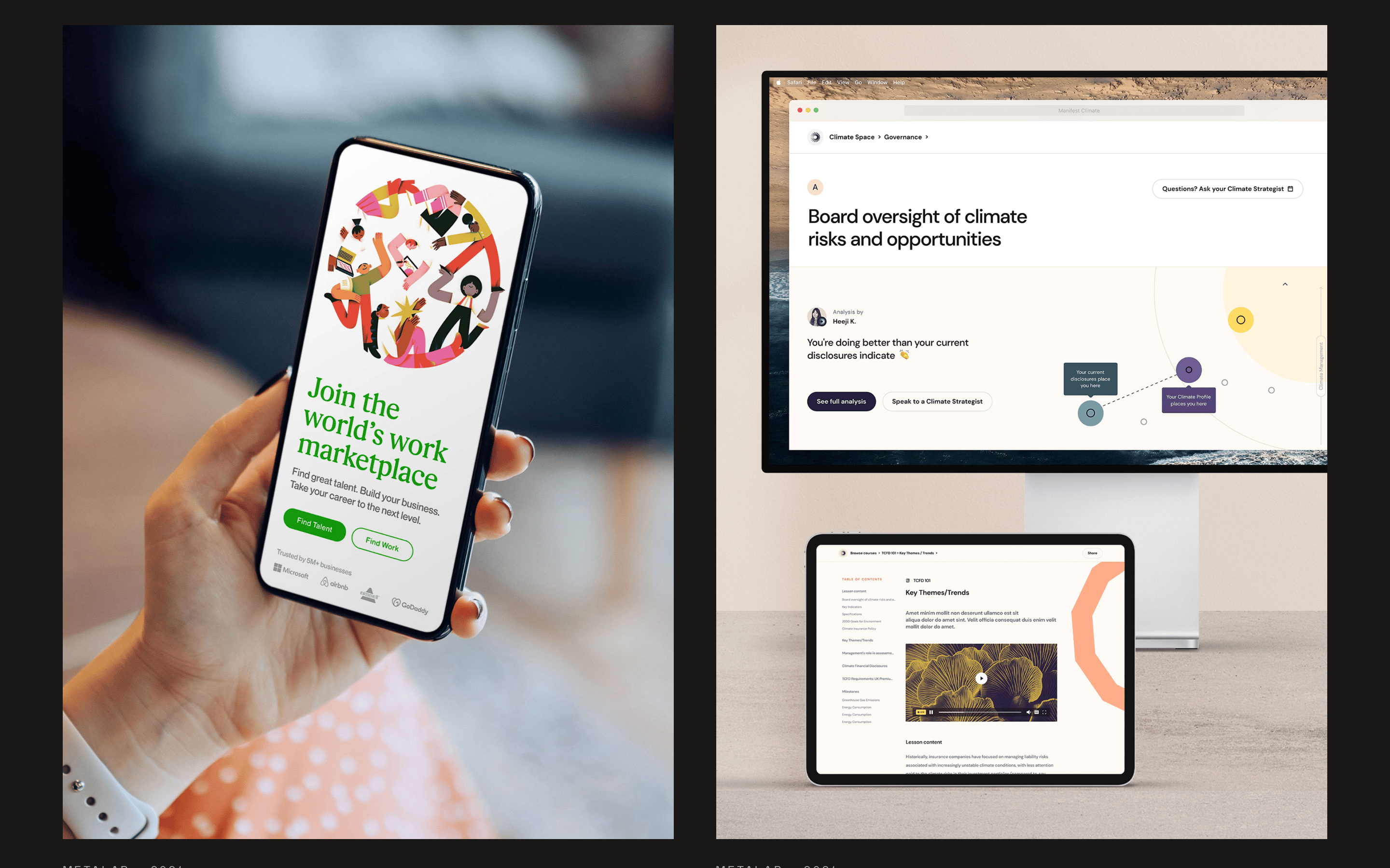
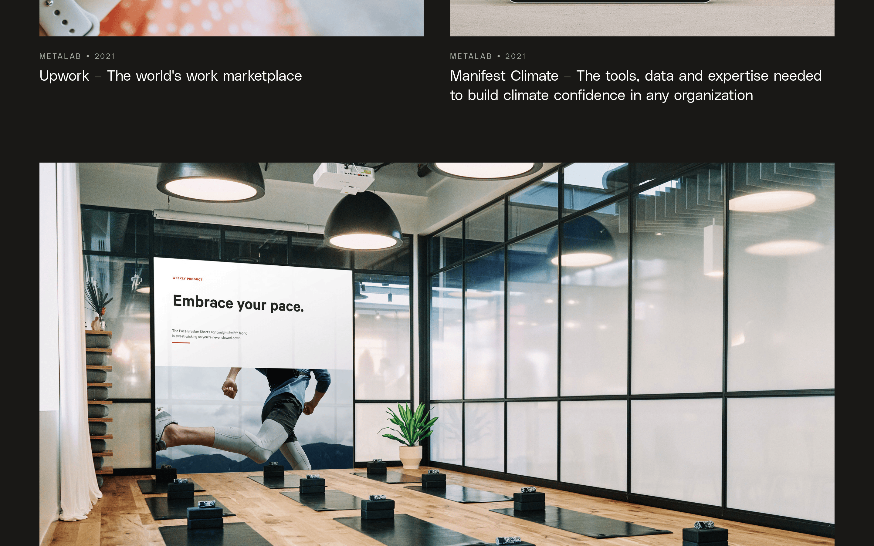
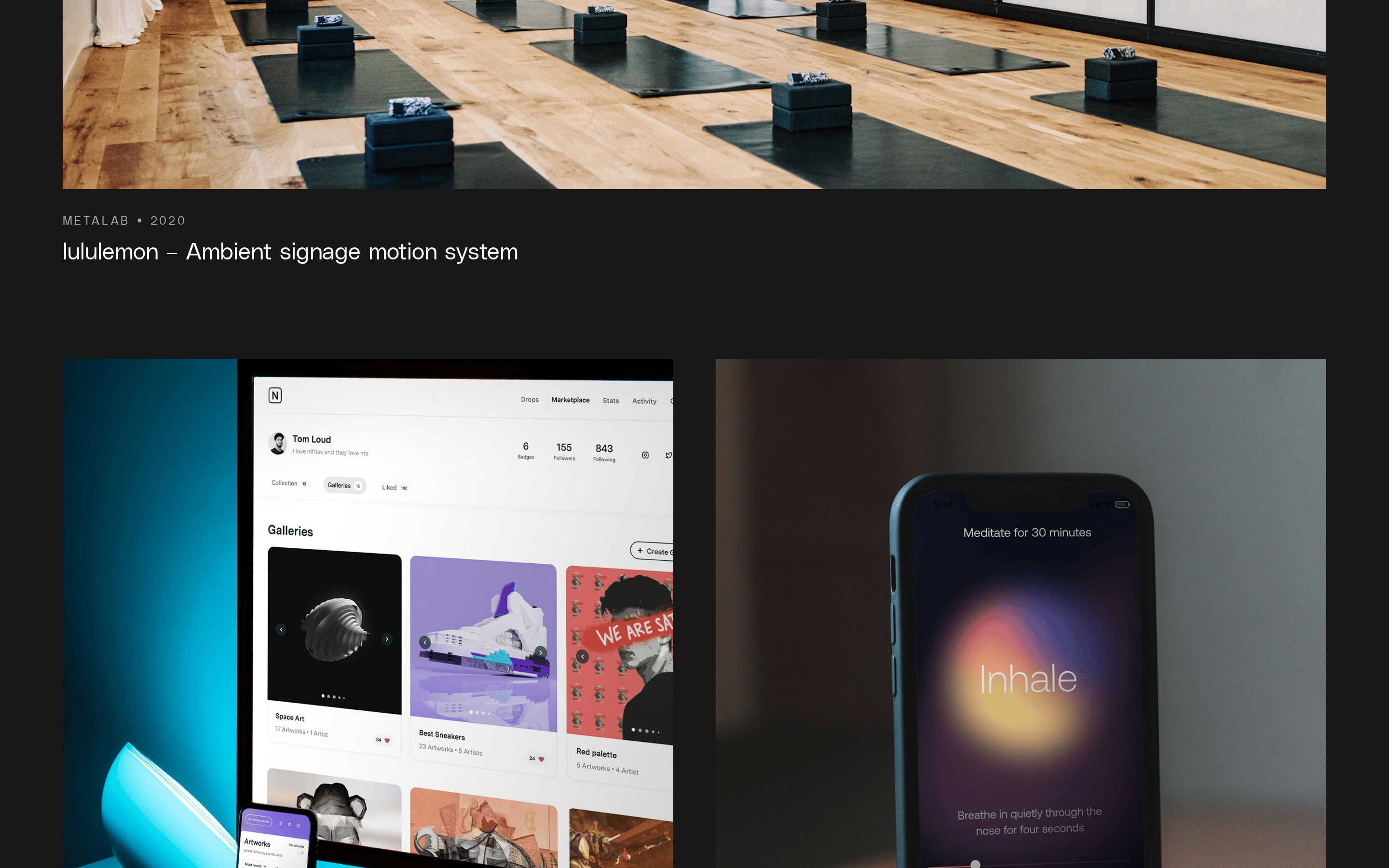
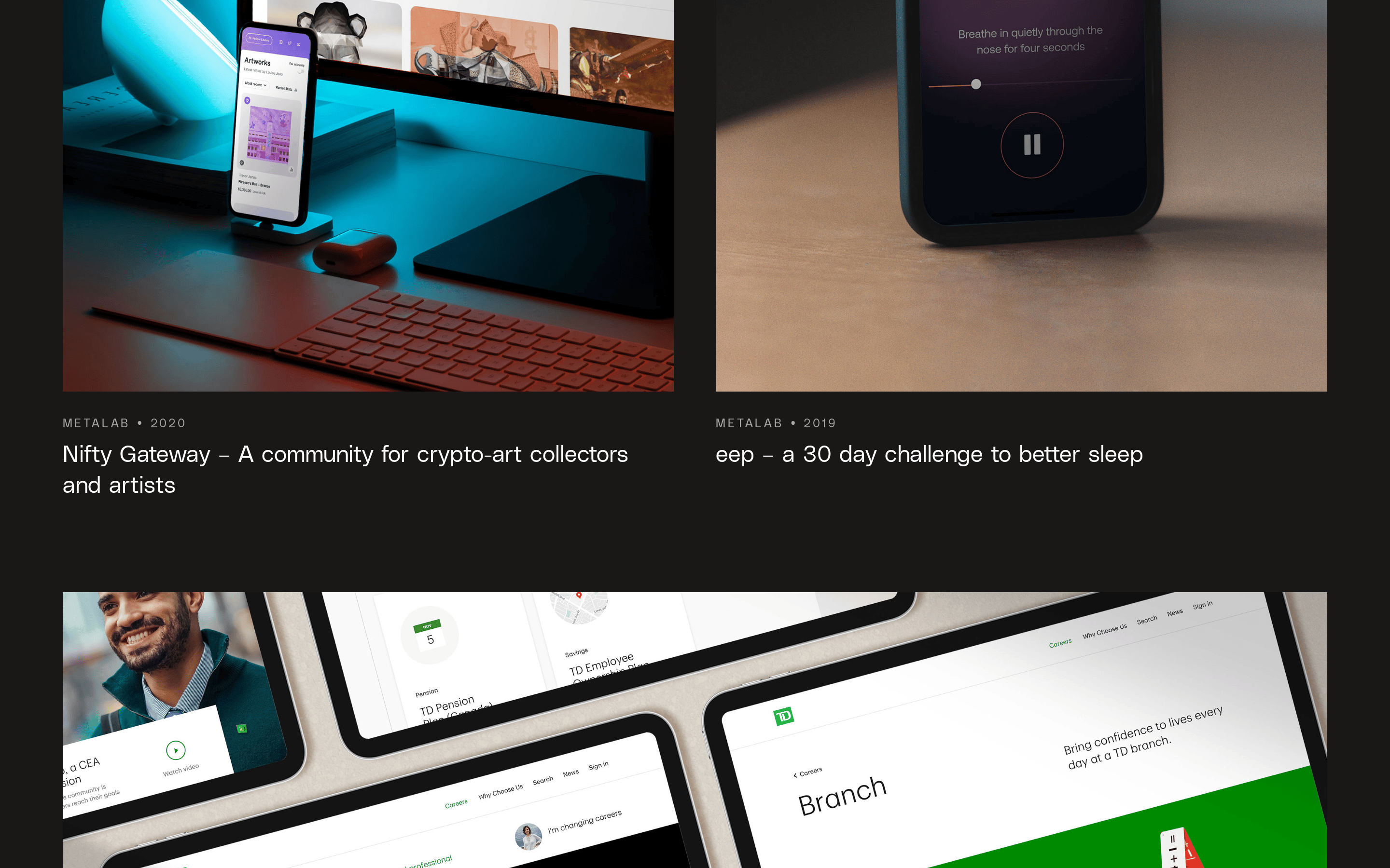
cardImage-led project cards with simple text descriptions below
chipN/A
inputN/A
heroMassive typographic hero with overlapping colored shapes
09
Voice & Don'ts
ToneProfessional, concise, and direct
HeadlinesLowercase, minimalist, and highly stylized
CTAsSimple text or icon-based calls to action
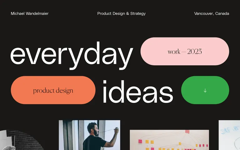
Don't use multiple competing accent colors — the screenshot shows three distinct, bold accent shapes that are used sparingly and never together as UI chrome
Don't center all text content — the screenshot shows clear left-aligned body text and descriptions
Don't use complex card borders or shadows — the screenshot shows flat, borderless image cards
Don't use small, tight typography — the screenshot shows extremely large, airy display type
Don't use a light theme — the screenshot shows a consistent, deep dark background
Don't use uppercase for headlines — the screenshot shows lowercase for the main hero text
Captured from the live site · real computed styles
11
System prompt
This is a personal portfolio for a product design strategist. Positioning is professional, refined, and focused on high-end craft. Key colors are a deep, warm off-black background (#191816) with crisp white text (#FFFFFF) and muted gray (#A9A9A9) for secondary information. The palette is punctuated by three bold, solid-color shapes: a vibrant green (#34A847), a soft pink (#FBCBCB), and a warm coral (#F27851). Typography uses a humanist sans-serif (PolySans) for UI and a transitional serif (Canela) for expressive display text, both at very light weights. Critical donts: Don't use small, dense text; don't use multiple competing accent colors simultaneously; don't use heavy shadows or borders on cards; don't use uppercase for headlines; don't use a light color scheme; don't use complex, cluttered layouts.
Bring this taste to your agent
Hand your AI agent a machine-readable spec of this design — tokens, type, motion, the whole DNA.