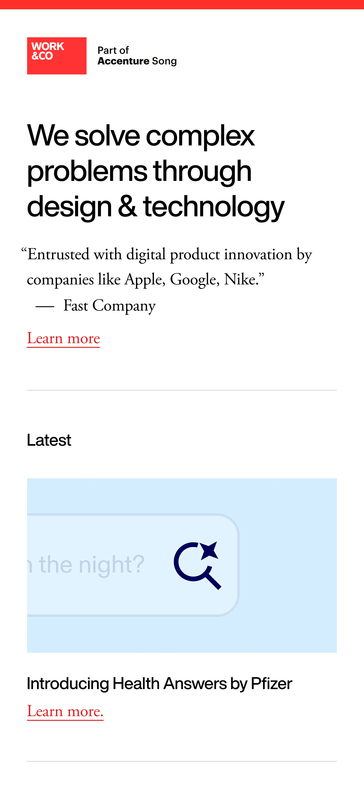
High-contrast minimalism with a single aggressive red accent.
03
Typography
transitional-serif
display56px · 500
heading36px · 400
body16px · 400
Use transitional serif for all primary text and headings. · Use sans-serif (as seen in 'Part of Accenture Song') for small utility text or specific brand logos. · Tight letter-spacing for large headlines.
04
Spacing
4px
8px
16px
24px
32px
48px
64px
96px
Generous vertical spacing with large padding (60px, 100px) between major sections.
05
Surfaces
sm · 0px
md · 0px
lg · 0px
pill · 999px
Thin 1px solid borders for separating sections.
0px -1px 0px 0px inset rgb(0,0,0)
06
Layout
1280container
12columns
24pxgutter
768 / 1024breakpoints
Asymmetrical 2-column grid (1/3 label, 2/3 content) that collapses on mobile.
07
Motion & Interaction
250msmicro
300mssmall
500msmedium
cubic-bezier(0.25, 0.1, 0.25, 1)easing
Color and underline transitions on text links.
Text color change or underline animation. · Standard pointer cursor.
08
Components
buttonText links with underline, colored in accent red or black.
cardMinimalist card with a top-aligned image and simple serif text below.
heroLarge left-aligned text block with a supporting quote and CTA.
09
Voice & Don'ts
ToneAuthoritative, concise, and understated.
HeadlinesDeclarative and slightly academic.
CTAsSimple, underlined text links (e.g., 'Learn more').
Don't use sans-serif for primary typography — the screenshot shows a heavy reliance on a transitional serif font.
Don't use multiple accent colors — the screenshot shows a consistent use of only red (#DB2223) for emphasis.
Don't use drop shadows for depth — the screenshot shows a completely flat, 2D layout with no visible shadow elements.
Don't center the layout — the screenshot shows a consistently left-aligned text and section structure.
Don't use rounded corners on cards or UI elements — the screenshot shows sharp, 0px radius corners on all rectangular elements.
Don't use bold weights for body text — the screenshot shows a consistent font-weight of 400 for standard text.
Captured from the live site · real computed styles
11
System prompt
This is a professional agency website for Work & Co, featuring a minimalist, high-contrast design. The primary palette is pure white (#FFFFFF) and black (#000000) with a single aggressive red accent (#DB2223) used for the logo and links. Typography relies heavily on a transitional serif for both display and body text, creating an editorial feel, while sans-serif is used strictly for small utility labels like the 'Part of Accenture Song' byline. Layout uses an asymmetrical 2-column grid with generous vertical padding. Key donts: never use drop shadows, never center the main content blocks, and never deviate from the single red accent color.
Bring this taste to your agent
Hand your AI agent a machine-readable spec of this design — tokens, type, motion, the whole DNA.