A high-end fashion editorial meets a digital gallery.
02
Color
#000000Ink
#FFFFFFBG
#D8D8D8Muted
rgba(0,0,0,0.1)Line
High-contrast monochrome base allowing 3D and photographic media to serve as the primary color accents.
03
Typography
transitional-serif · humanist-sans · monospaced
display70px · 300
display-lg30px · 400
body16px · 400
caption13px · 400
Headlines use a high-contrast transitional serif with tight leading. · UI labels and tags use a monospaced font in all-caps with wide tracking. · Body text uses a clean sans-serif for readability.
04
Spacing
4px
8px
16px
24px
32px
48px
64px
96px
Generous whitespace emphasizing a gallery-like layout.
05
Surfaces
sm · 4px
md · 5px
lg · 12px
pill · 9999px
1px solid rgba(0,0,0,0.1)
0px 2px 6px rgba(0,0,0,0.1)
06
Layout
1440container
12columns
24pxgutter
768 / 1024breakpoints
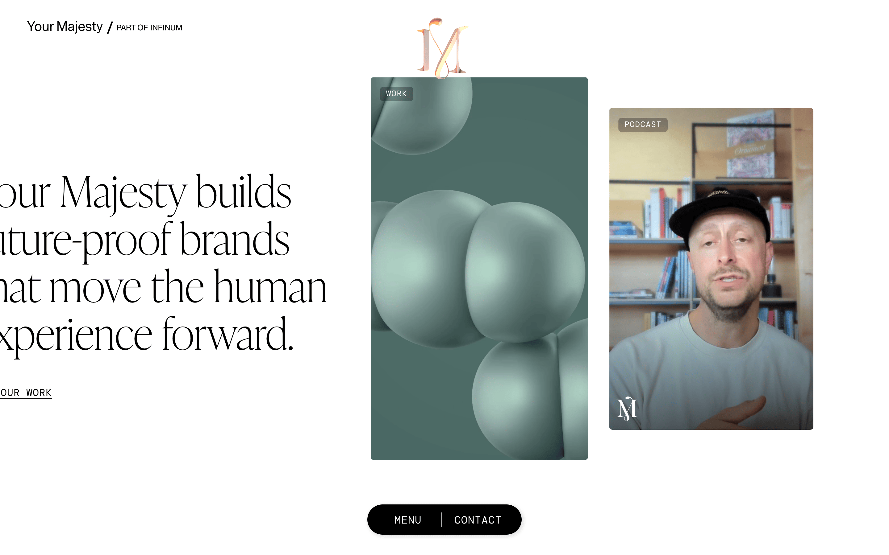
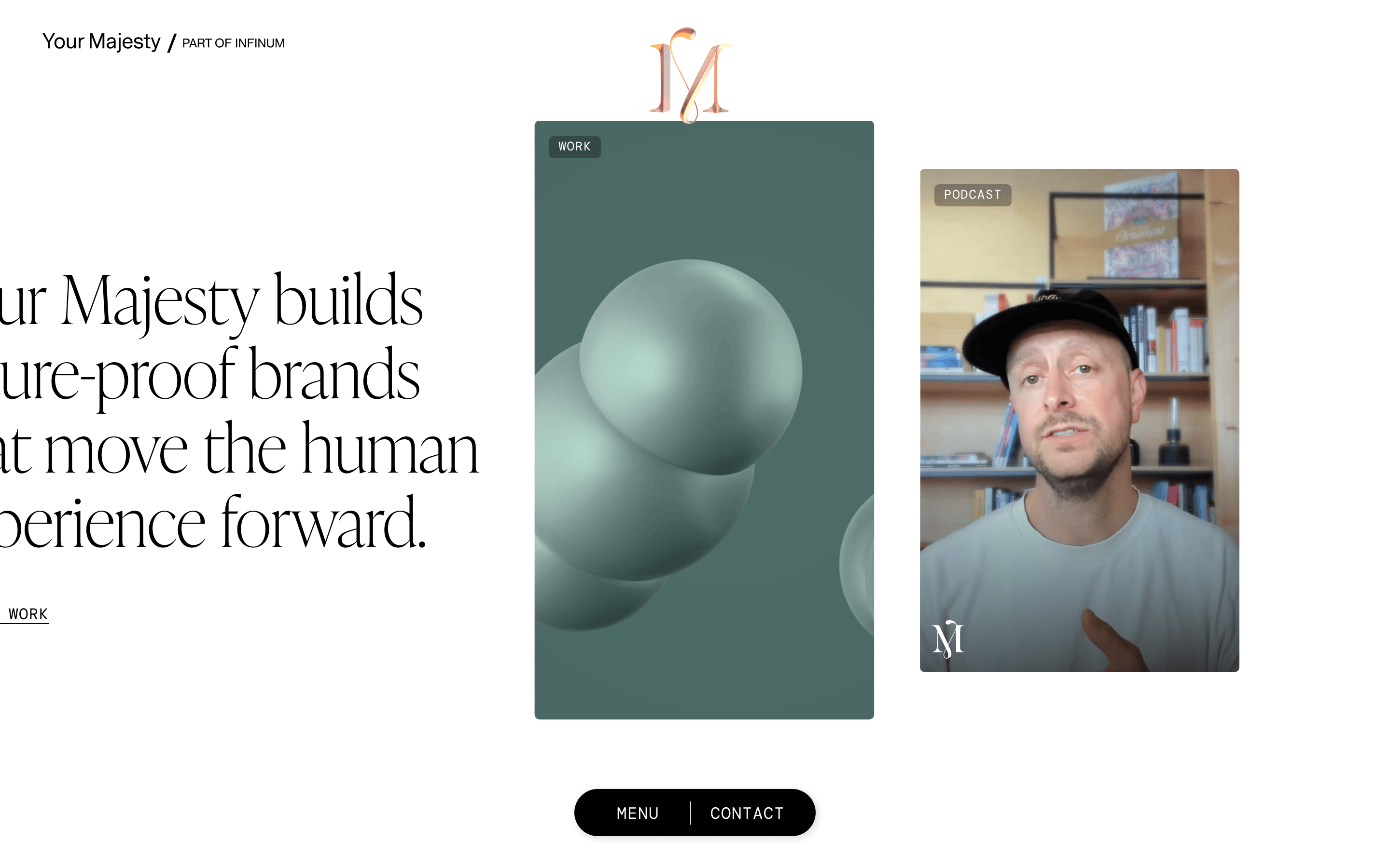
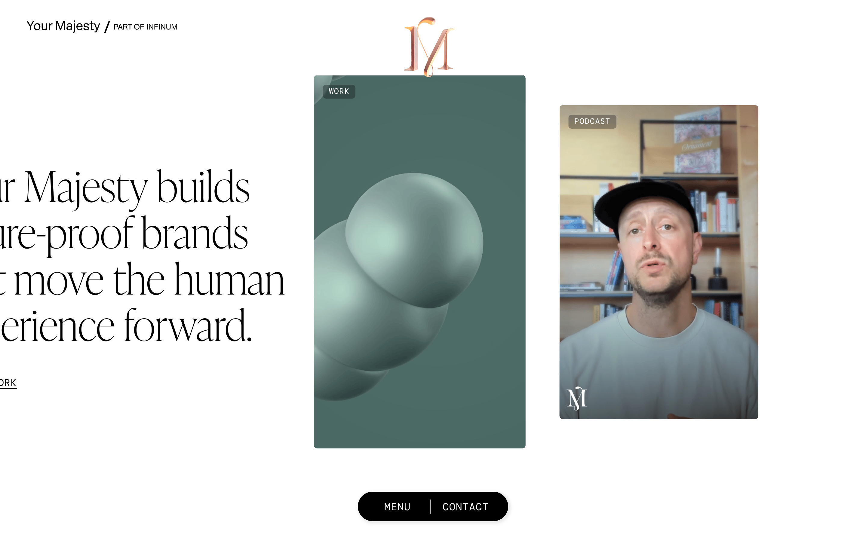
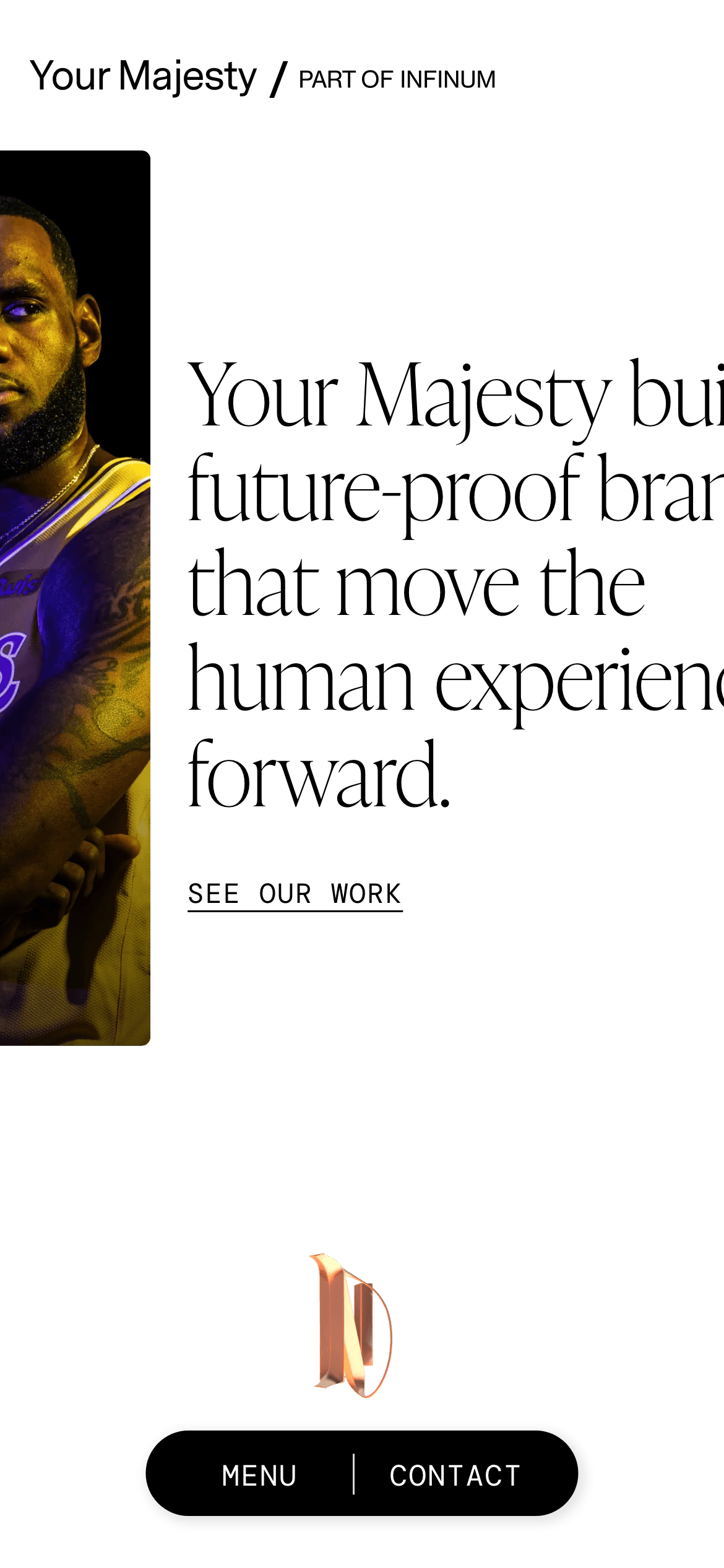
Asymmetric masonry grid with overlapping 3D and photographic cards over a wide typographic base.
07
Motion & Interaction
150msmicro
250mssmall
500msmedium
cubic-bezier(0.25, 0.1, 0.25, 1)easing
Fade-in transitions for media elements · Smooth color and filter shifts on hover
Subtle color shifts or filter adjustments on interactive elements. · Immediate visual feedback on buttons and links.
08
Components
buttonPill-shaped dark buttons with monospaced uppercase text.
cardLarge vertical cards with rounded corners, containing tags and rich media.
chipSmall rounded tags with dark backgrounds and white monospaced text.
inputMinimal inputs likely with a bottom border or light background.
heroSplit layout featuring massive serif text on the left and a dynamic media grid on the right.
09
Voice & Don'ts
ToneAuthoritative, sophisticated, and forward-thinking.
HeadlinesBold, evocative statements set in large serif type.
CTAsDirect and uppercase, often monospaced.
Don't use playful or rounded sans-serif fonts — screenshot shows elegant transitional serifs for headlines.
Don't use a busy, multi-colored background — screenshot shows a clean, stark white canvas.
Don't center-align all content — screenshot shows a strong left-aligned typographic hierarchy.
Don't use standard rectangular cards — screenshot shows slightly rounded corners (5px) and overlapping elements.
Don't use small, dense text for UI labels — screenshot shows monospaced, uppercase tags with wide tracking.
Don't introduce a bright, high-saturation accent color — screenshot relies on 3D renders and photos for color.
Captured from the live site · real computed styles
11
System prompt
This is a premium creative agency website for 'Your Majesty'. It features a high-contrast monochrome palette (#FFFFFF background, #000000 ink) that serves as a neutral stage for rich media. The typography is defined by large, elegant transitional-serif headlines paired with a clean humanist-sans body and a wide-tracked monospaced font for UI labels. The layout uses an asymmetric masonry-style grid with large, slightly rounded cards. Do not use playful fonts or casual language; maintain an authoritative, sophisticated tone. Avoid bright accent colors, instead letting 3D and photographic content provide visual interest. Ensure generous whitespace and left-aligned text blocks to preserve the editorial feel.
Bring this taste to your agent
Hand your AI agent a machine-readable spec of this design — tokens, type, motion, the whole DNA.