← OpenDesign CURATED · OPEN · FREE
A Ware At
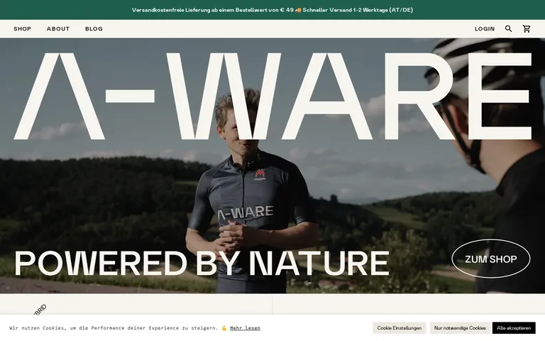
A premium outdoor and athletic brand that leverages bold editorial photography and classical typography to project a sense of natural power and refined quality.
Photographic Product Premium Clean Consumer
01
Identity DNA
natural performance premium outdoor
A premium athletic brand blending raw nature photography with refined, classical typography.
02
Color
#000000Ink
#333333Ink soft
#ECE9DFBG
#F7F5EEBG soft
#A77A41Muted
rgba(0,0,0,0.12)Line
Earthy neutrals and deep blacks, using photography as the primary source of color and visual interest.
03
Typography
transitional-serif · humanist-sans · geometric-mono
display 150px · 300heading 38px · 300body 14px · 400Use wide letter-spacing for uppercase sans-serif labels. · Use tight tracking for large display serifs.
04
Spacing
4px
8px
12px
16px
24px
32px
48px
96px
Generous whitespace with a clear 48px base for structural gaps.
05
Surfaces
sm · 8px
md · 12px
lg · 32px
pill · 999px
Minimal, mostly borderless with occasional 1px dividers or subtle underlines.
rgba(172,171,171,0.3) 0px -1px 10px 0px
06
Layout
1280 container
12 columns
24px gutter
768 / 1024 breakpoints
Full-bleed editorial photography with massive typographic overlays.
07
Motion & Interaction
150ms micro
400ms small
500ms medium
cubic-bezier(0.4, 0, 0.2, 1) easing
Smooth linear opacity transitions for UI state changes.
Subtle color or opacity shift. · Immediate feedback with linear transitions.
08
Components
button Outlined pill shape with generous padding. card Minimalist, often just imagery with overlaid text. hero Full-viewport photographic background with oversized serif typography. 09
Voice & Don'ts
Tone Confident, direct, and premium. Headlines Massive, all-caps, tightly tracked serifs or spaced sans-serifs. CTAs Spaced uppercase sans-serif, often within a pill-shaped outline. Don't use bright, artificial accent colors — the screenshot relies on natural tones and photography. Don't use tight, centered text blocks — the design favors wide, left-aligned or full-bleed typographic compositions. Don't use heavy drop shadows or 3D effects — the UI is flat and relies on depth from photography. Don't use rounded sans-serif fonts for display — the screenshot features sharp, classical serifs for impact. Don't clutter the layout with multiple UI elements — the design is highly spacious and minimalist. Don't use complex background patterns — the design uses solid earthy tones or full-bleed imagery. Avoid: Playful or casual language. Avoid: Cluttered layouts. Avoid: Bright, neon accent colors. 10
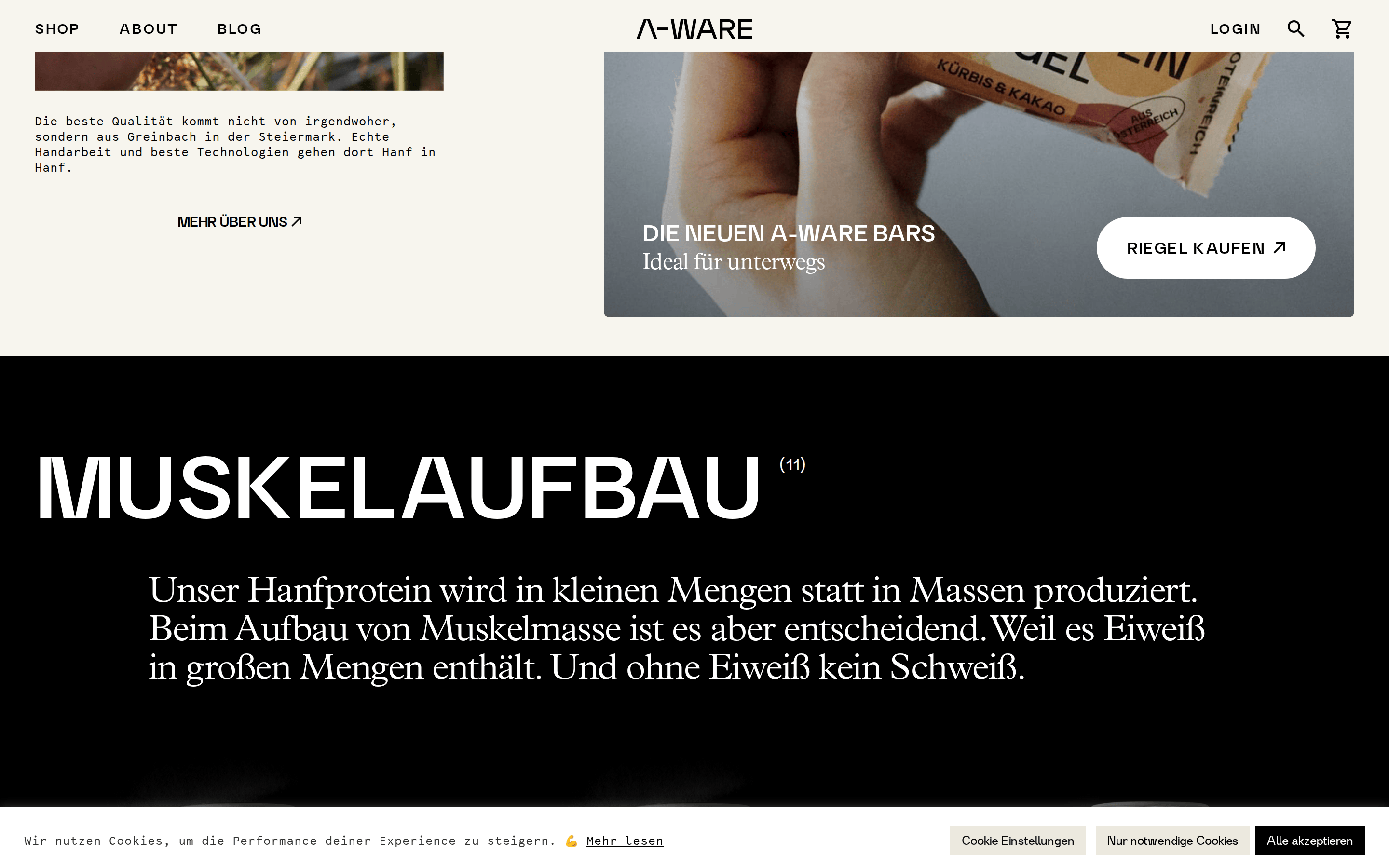
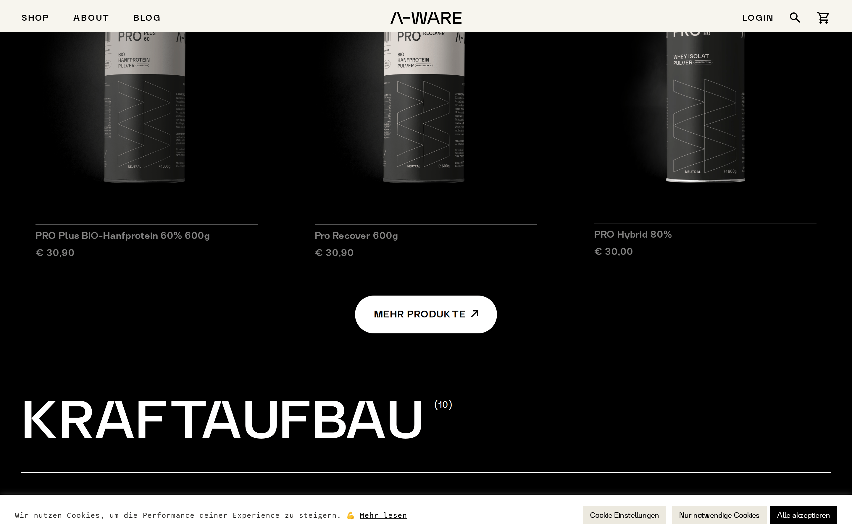
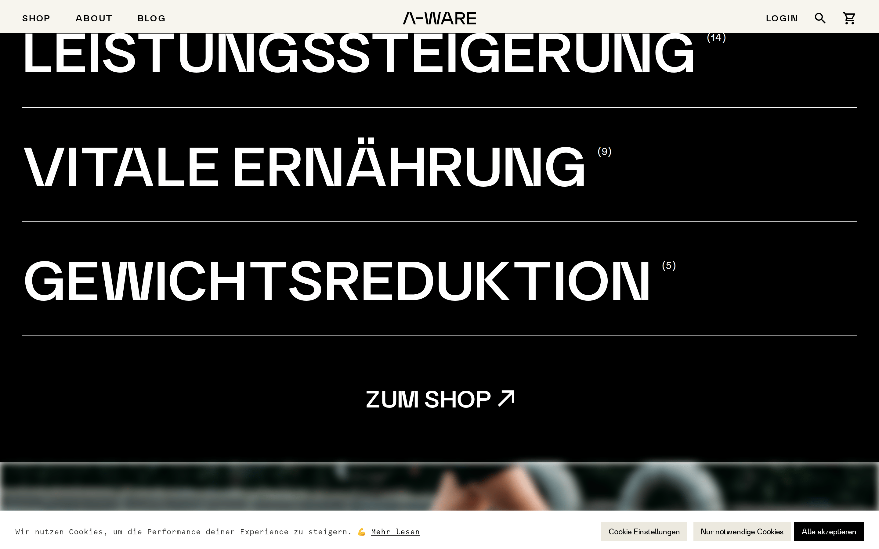
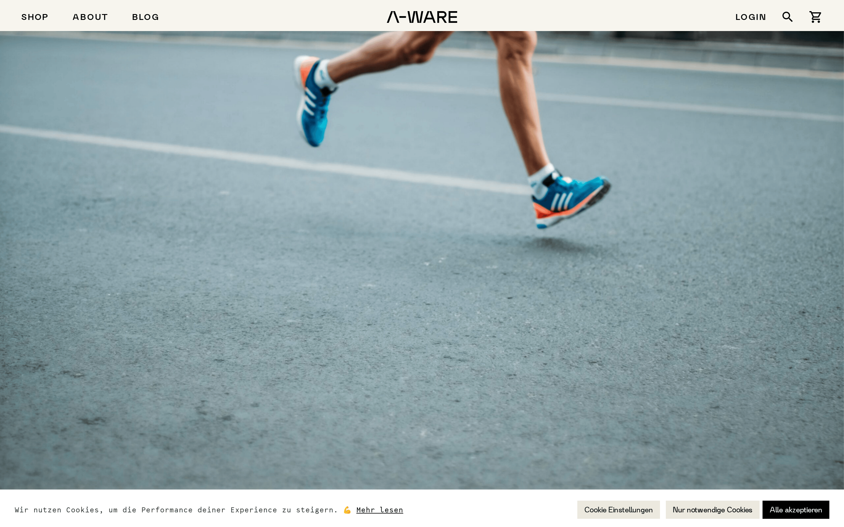
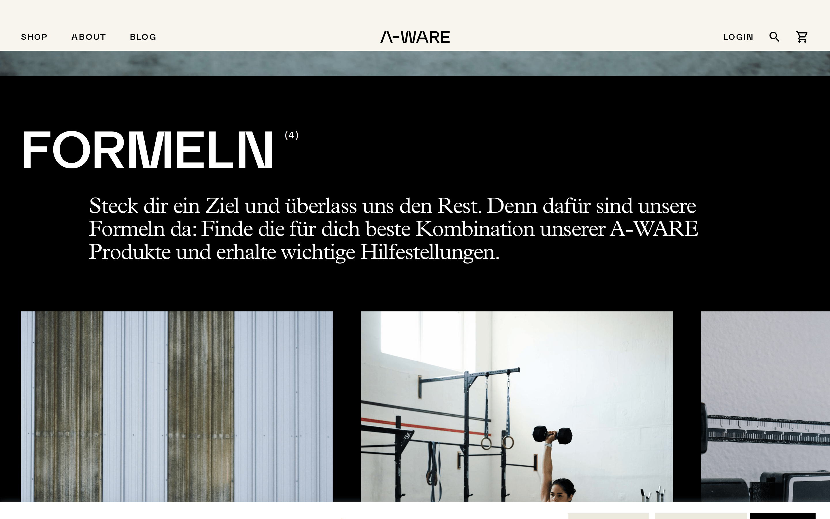
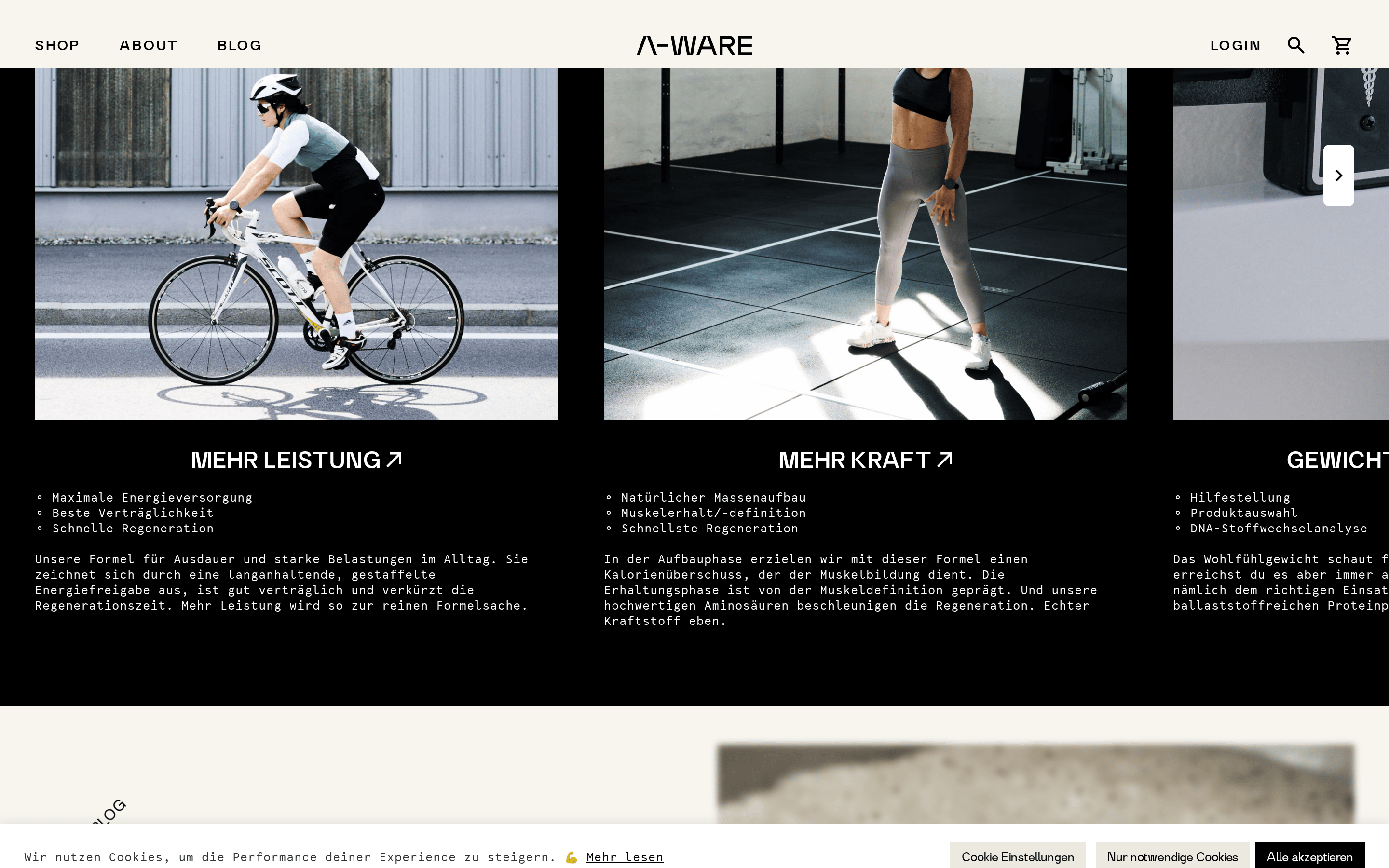
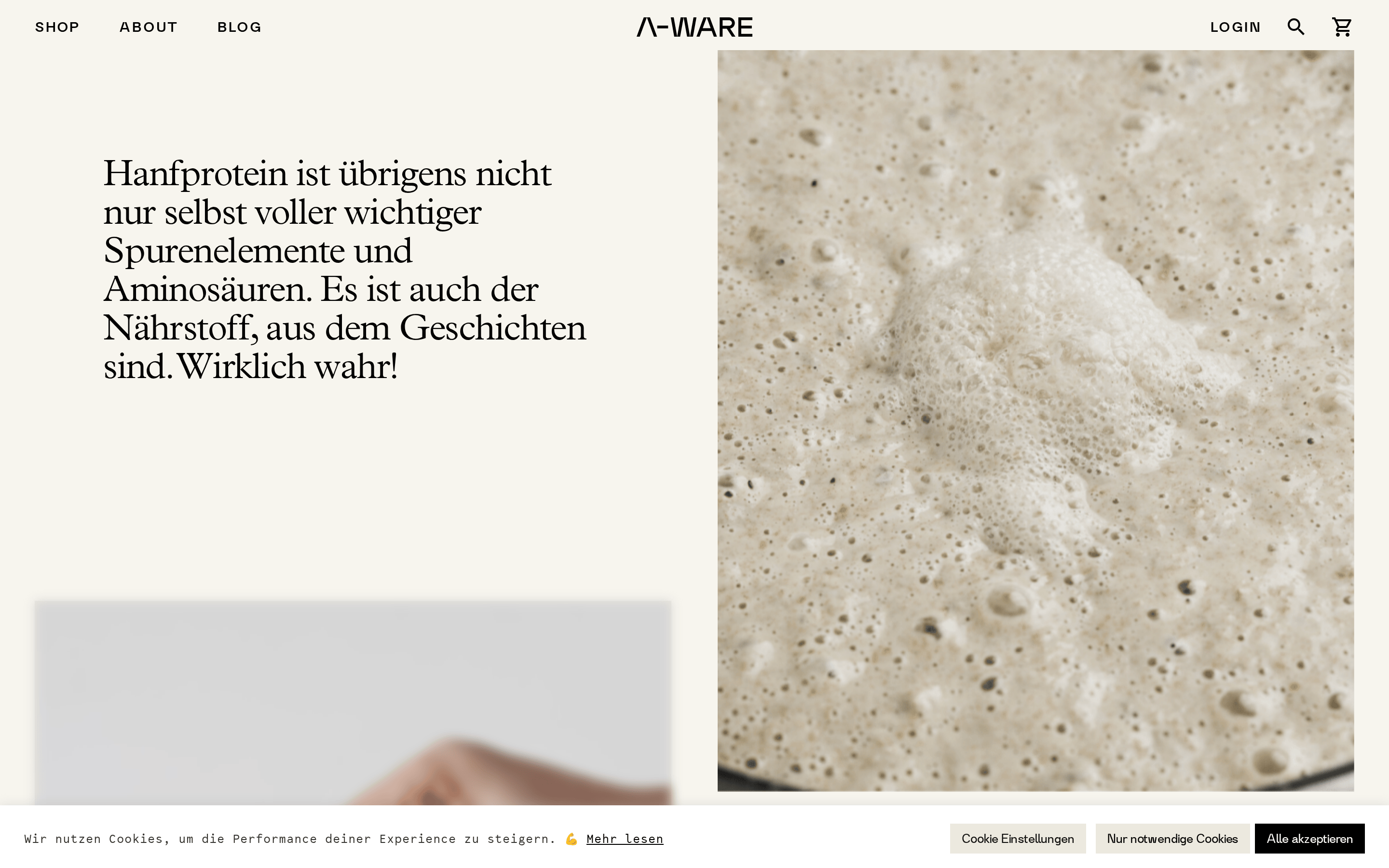
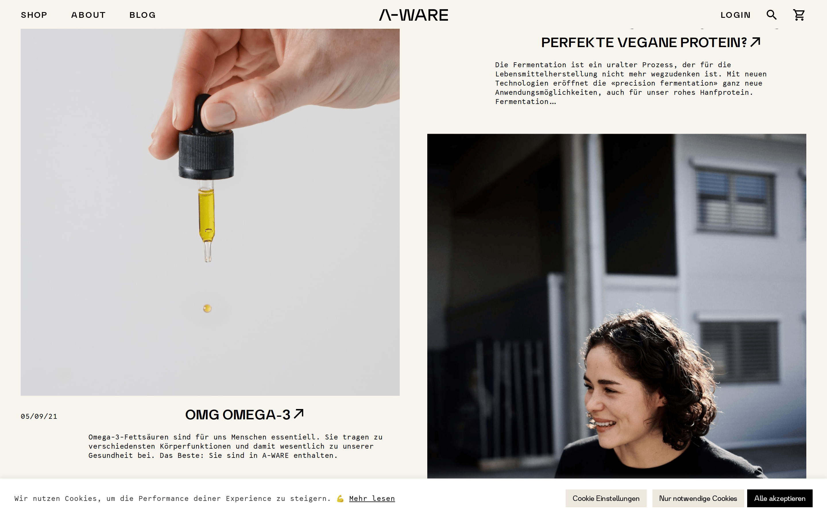
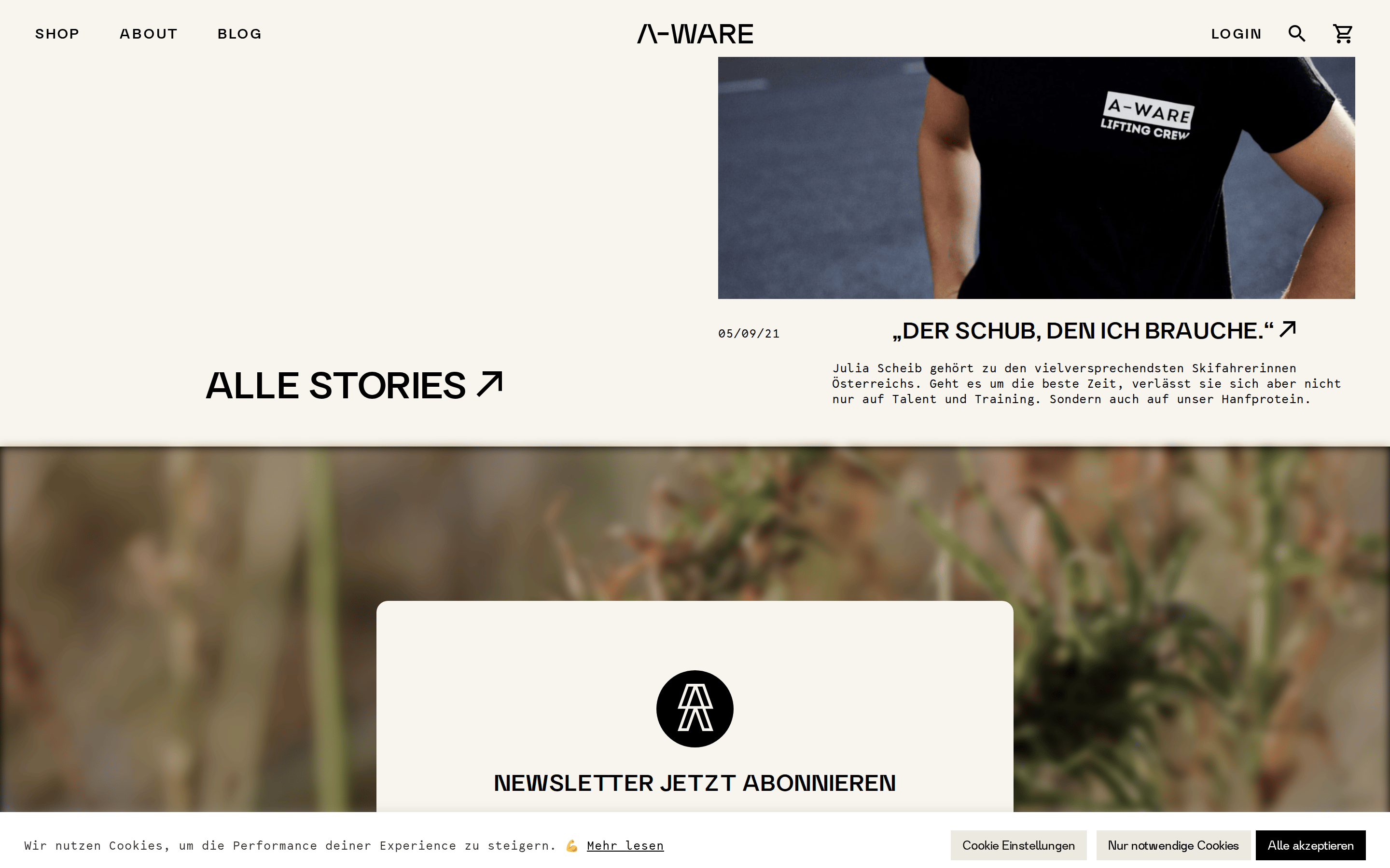
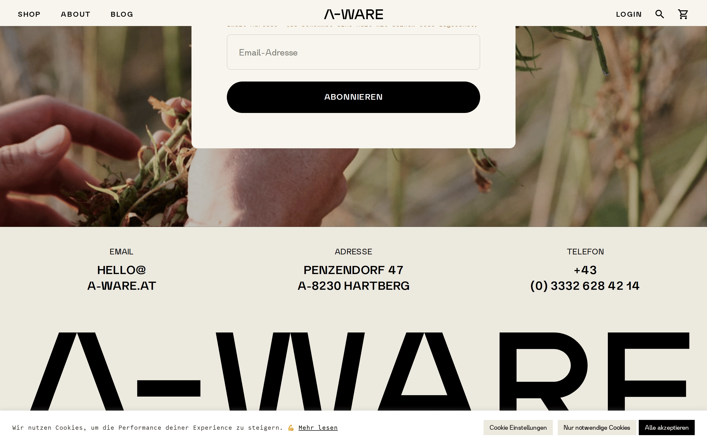
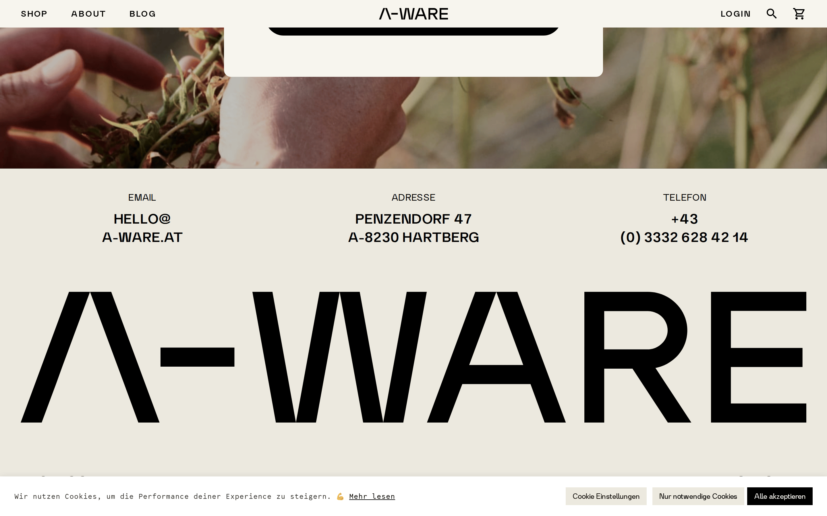
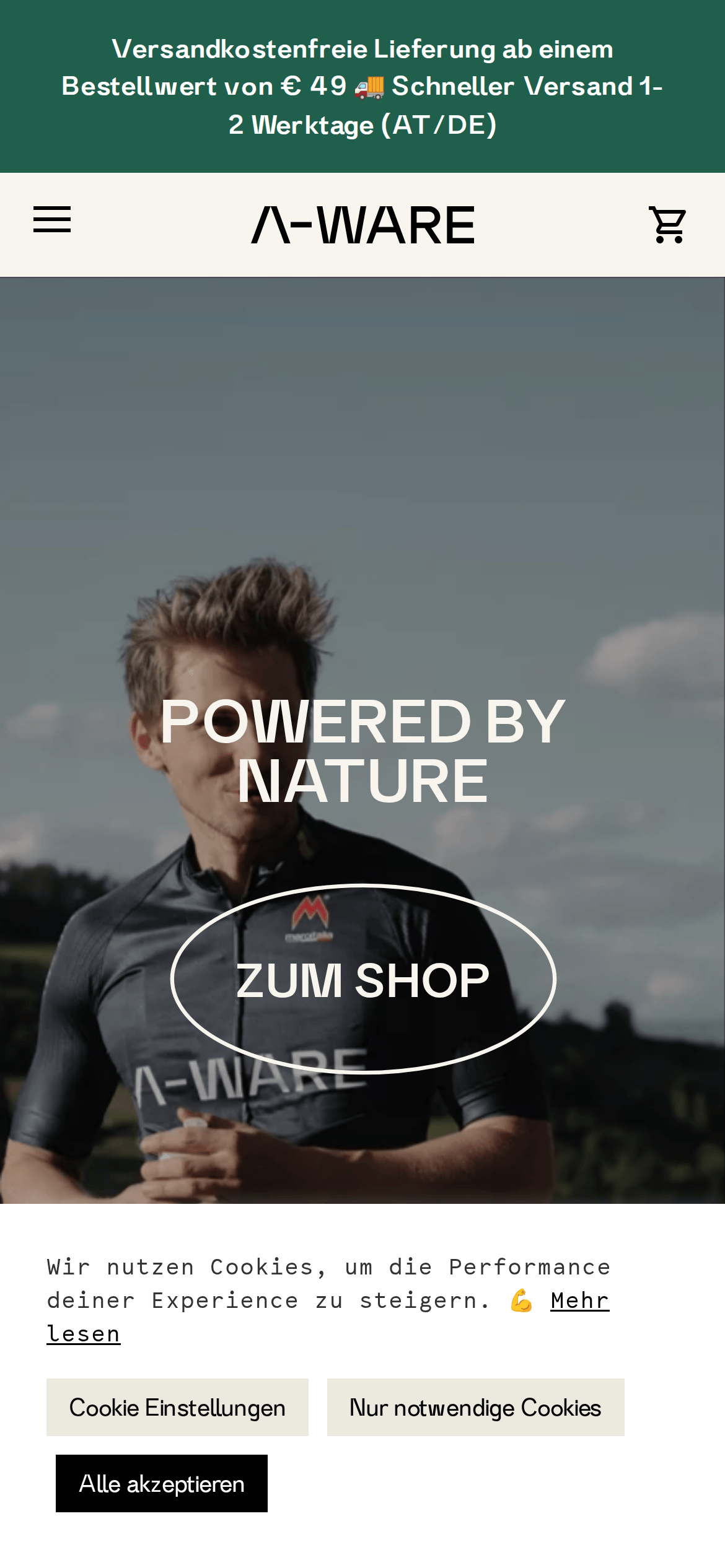
Inside the pack — real screenshots
桌面首屏(hero) 桌面滚动分段(90% viewport 步进,作为视觉证据) 桌面滚动分段(90% viewport 步进,作为视觉证据) 桌面滚动分段(90% viewport 步进,作为视觉证据) 桌面滚动分段(90% viewport 步进,作为视觉证据) 桌面滚动分段(90% viewport 步进,作为视觉证据) 桌面滚动分段(90% viewport 步进,作为视觉证据) 桌面滚动分段(90% viewport 步进,作为视觉证据) 桌面滚动分段(90% viewport 步进,作为视觉证据) 桌面滚动分段(90% viewport 步进,作为视觉证据) 桌面滚动分段(90% viewport 步进,作为视觉证据) 桌面滚动分段(90% viewport 步进,作为视觉证据) 桌面滚动分段(90% viewport 步进,作为视觉证据) 桌面滚动分段(90% viewport 步进,作为视觉证据) 桌面滚动分段(90% viewport 步进,作为视觉证据) 桌面滚动分段(90% viewport 步进,作为视觉证据) 桌面滚动分段(90% viewport 步进,作为视觉证据) 移动首屏 Captured from the live site · real computed styles
11
System prompt
A premium athletic and outdoor e-commerce brand. The layout is dominated by full-bleed, high-contrast photography of athletes in nature. The typography uses massive, tightly tracked transitional serifs for headlines (e.g., 'A-WARE') and clean, wide-spaced sans-serifs for navigation and labels. Key colors include an earthy off-white (#ECE9DF) for backgrounds, deep black (#000000) for ink, and a subtle golden-brown (#A77A41) for accents. Critical donts: never use bright neon colors, avoid cluttered multi-column layouts, and do not use playful or casual typography. The overall feel is editorial, refined, and powerfully natural.
More from the library en · zh-CN · zh-TW · ja · ko
OpenDesign · curated web aesthetics for AI-readable design DNA · opendesign.cc
Why we curated this: This site is a prime example of a premium, photography-driven brand that uses classical typography to elevate its athletic identity.