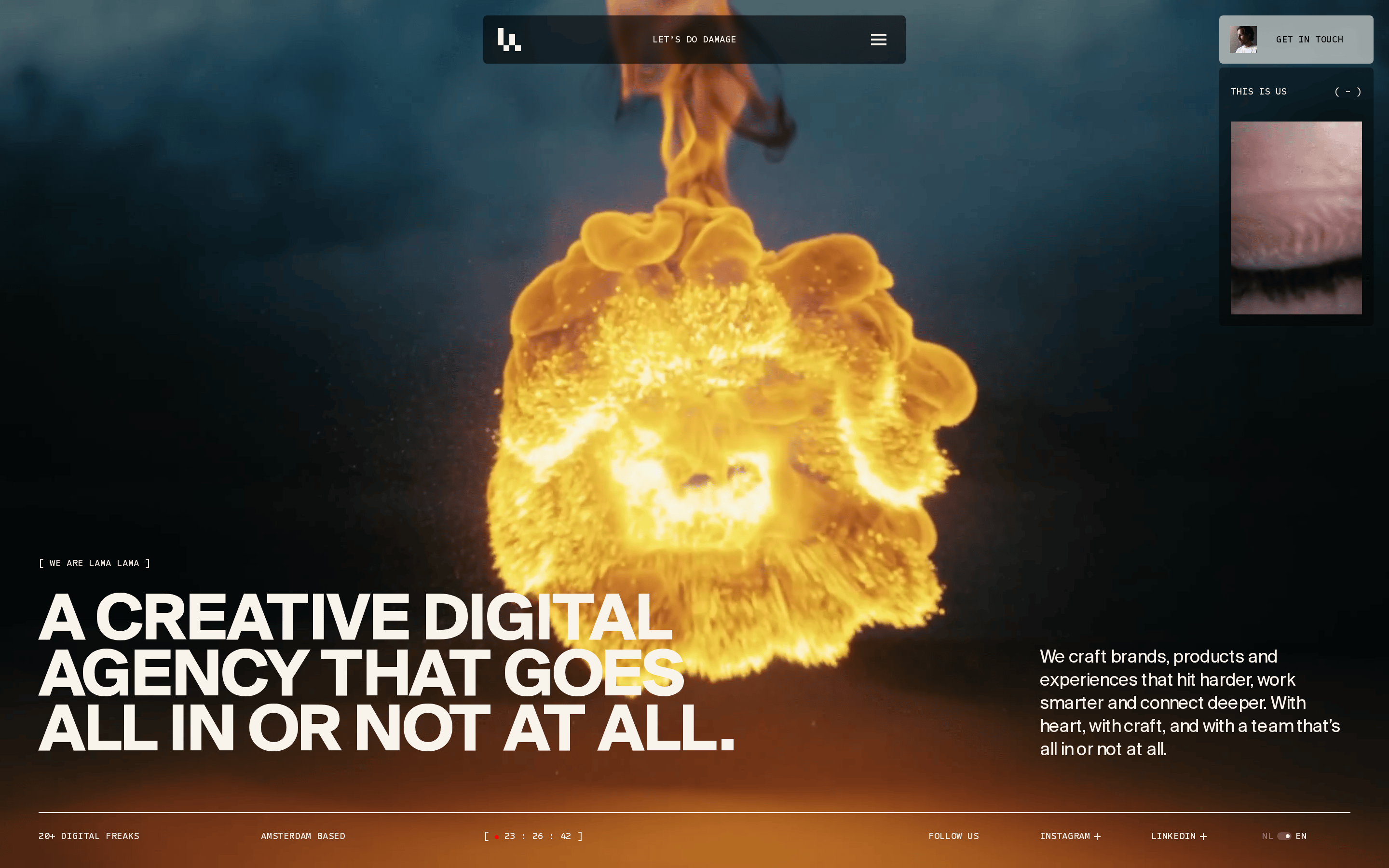
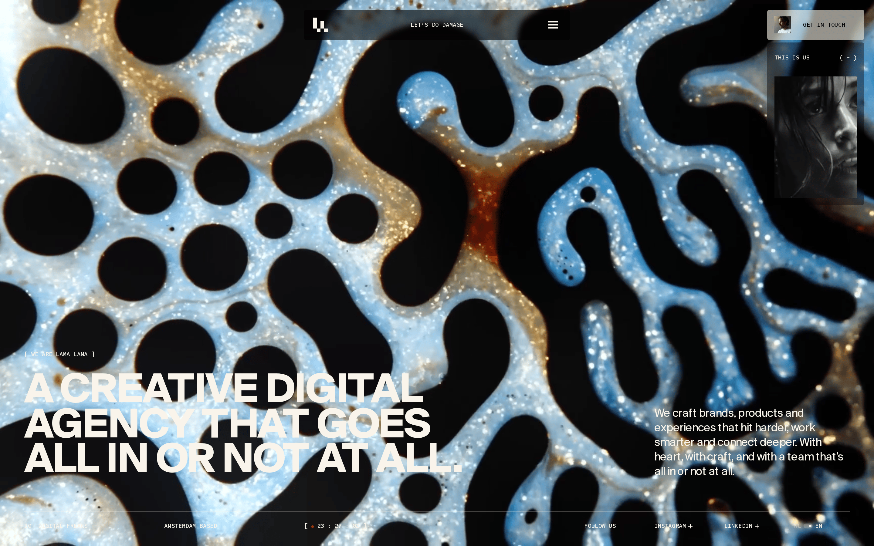
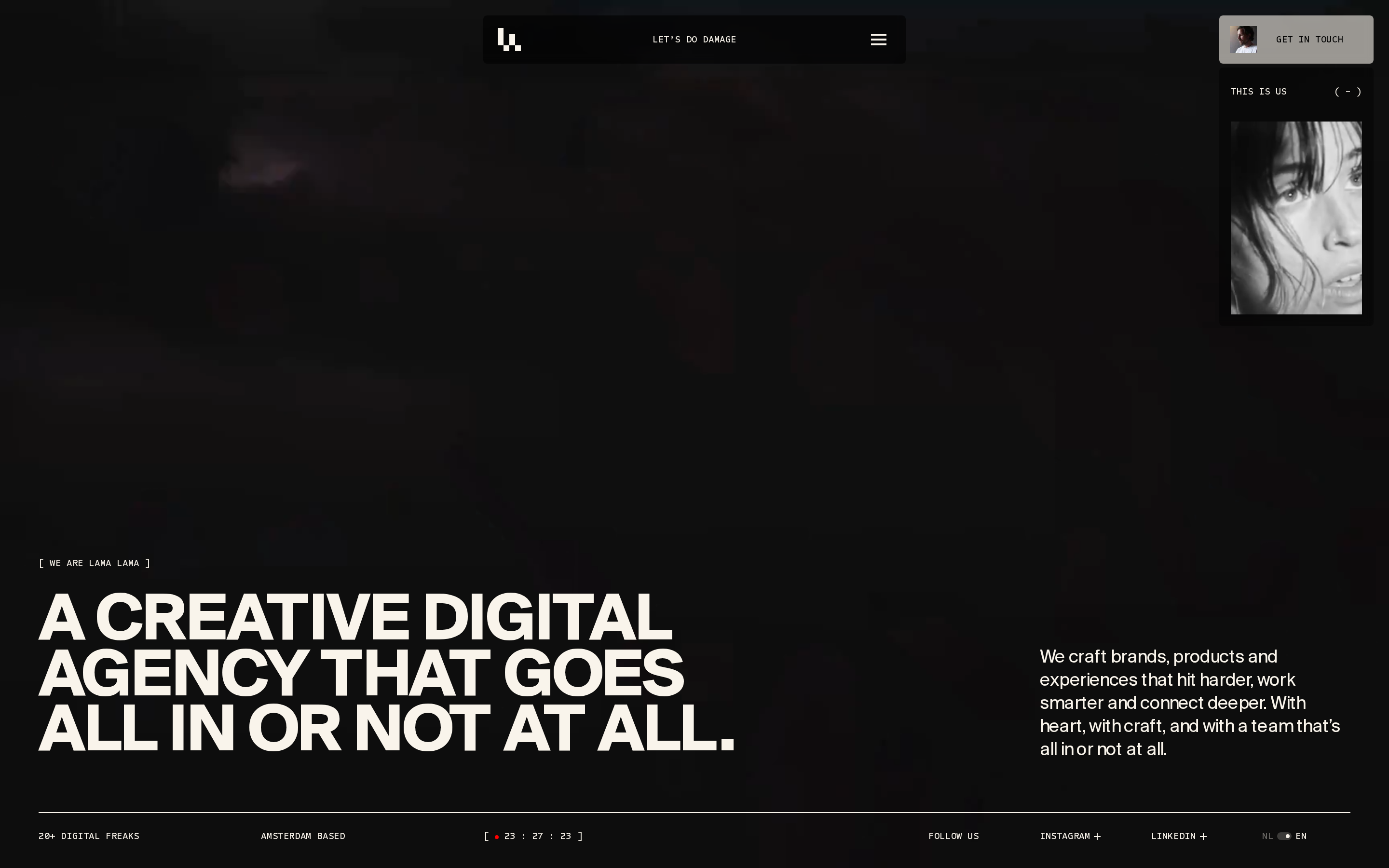
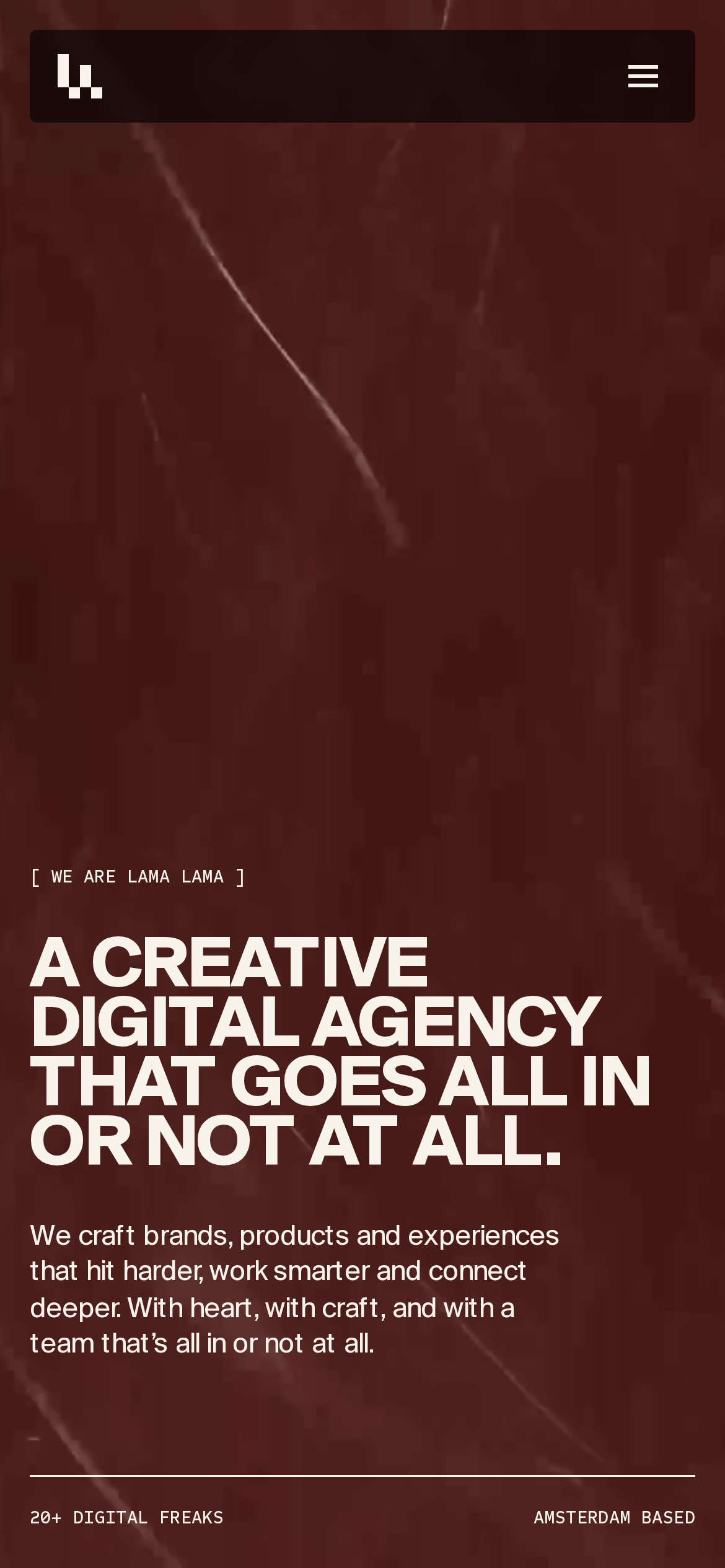
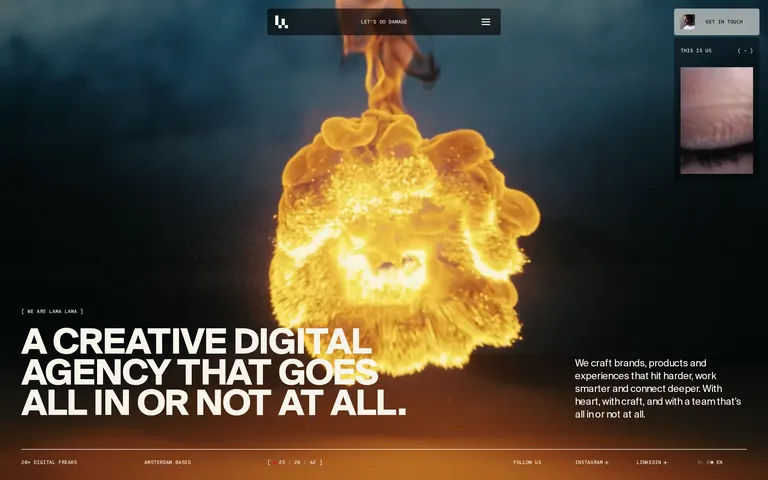
A digital creative studio that pairs high-impact photography with massive, tight-set typography.
02
Color
#f9f4ebInk
#ffffffInk soft
#010101BG
#1a1c1cBG soft
#999999Muted
rgba(249, 244, 235, 0.2)Line
High-contrast dualism: deep black backgrounds with warm off-white text, designed to make large typography and photography pop.
03
Typography
grotesque-sans · geometric-sans
display80px · 700
heading-140px · 500
body16px · 400
All UI labels and metadata use uppercase monospace-like tracking. · Headlines are strictly left-aligned with tight leading. · Body text maintains comfortable reading length at roughly 680px.
04
Spacing
4px
8px
16px
24px
32px
48px
64px
96px
Standard 4px base grid with generous whitespace to frame bold typographic elements.
05
Surfaces
sm · 4px
md · 0px
lg · 0px
pill · 9999px
Minimal 1px solid borders used strictly for structural separation, not decoration.
06
Layout
1280container
12columns
24pxgutter
768 / 1024breakpoints
Asymmetric grid with a heavy hero section, anchored bottom nav bar, and side-panel imagery.
07
Motion & Interaction
220msmicro
400mssmall
800msmedium
cubic-bezier(0.25, 1, 0.5, 1)easing
Smooth page transitions between sections. · Subtle hover states on interactive elements. · Dynamic background imagery changes.
Subtle opacity or background-color shifts on interactive elements. · Immediate visual feedback via state changes.
08
Components
buttonSemi-transparent pill button with blur or solid backgrounds for calls to action.
cardImage-driven cards with no borders, relying on photography for structure.
chipUppercase text pills used for tags and metadata.
inputMinimal border-bottom inputs for forms.
heroFull-bleed immersive section with oversized typography over cinematic imagery.
Captured from the live site · real computed styles
11
System prompt
A bold, high-contrast creative agency website featuring massive grotesque typography and cinematic photography. The design relies on a deep black (#010101) background and warm off-white (#f9f4eb) text. Display typography uses a heavy grotesque-sans category with tight leading, while body copy uses a clean geometric-sans category. The layout is strictly left-aligned, avoiding centered elements to maintain a professional, editorial feel. Key interactions include smooth hover transitions and immersive, full-bleed hero sections. Critically, avoid using serif fonts, centered text, bright neon accents, or dense, cluttered layouts. The system emphasizes 'all-in' boldness through visual impact rather than busy UI patterns.
Bring this taste to your agent
Hand your AI agent a machine-readable spec of this design — tokens, type, motion, the whole DNA.