← OpenDesign CURATED · OPEN · FREE
Loveseen
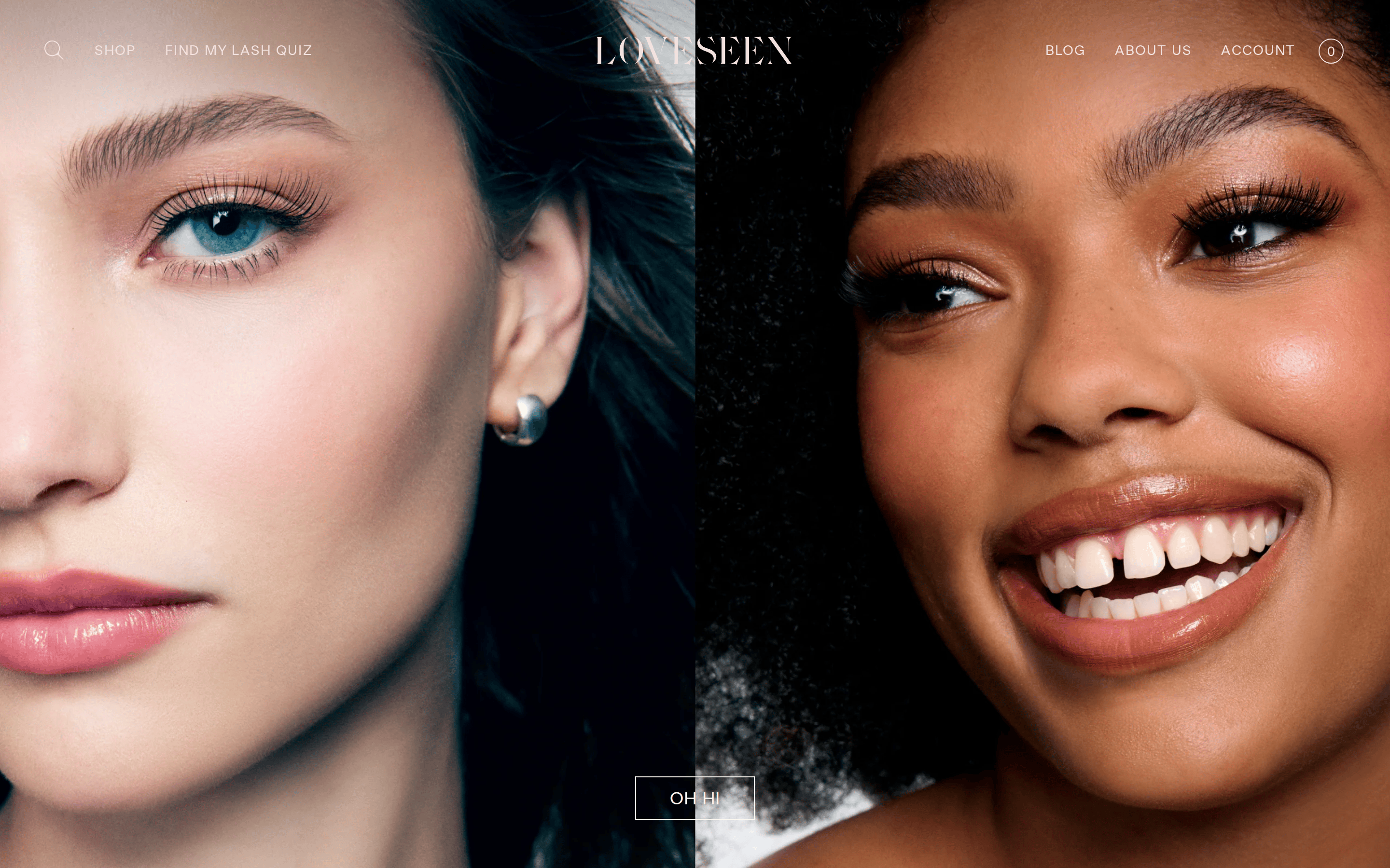
A premium beauty e-commerce site driven by high-impact photography and elegant serif typography.
Photographic Gallery Typography Consumer Calm
01
Identity DNA
luxury beauty editorial photography inclusive refined product-focused
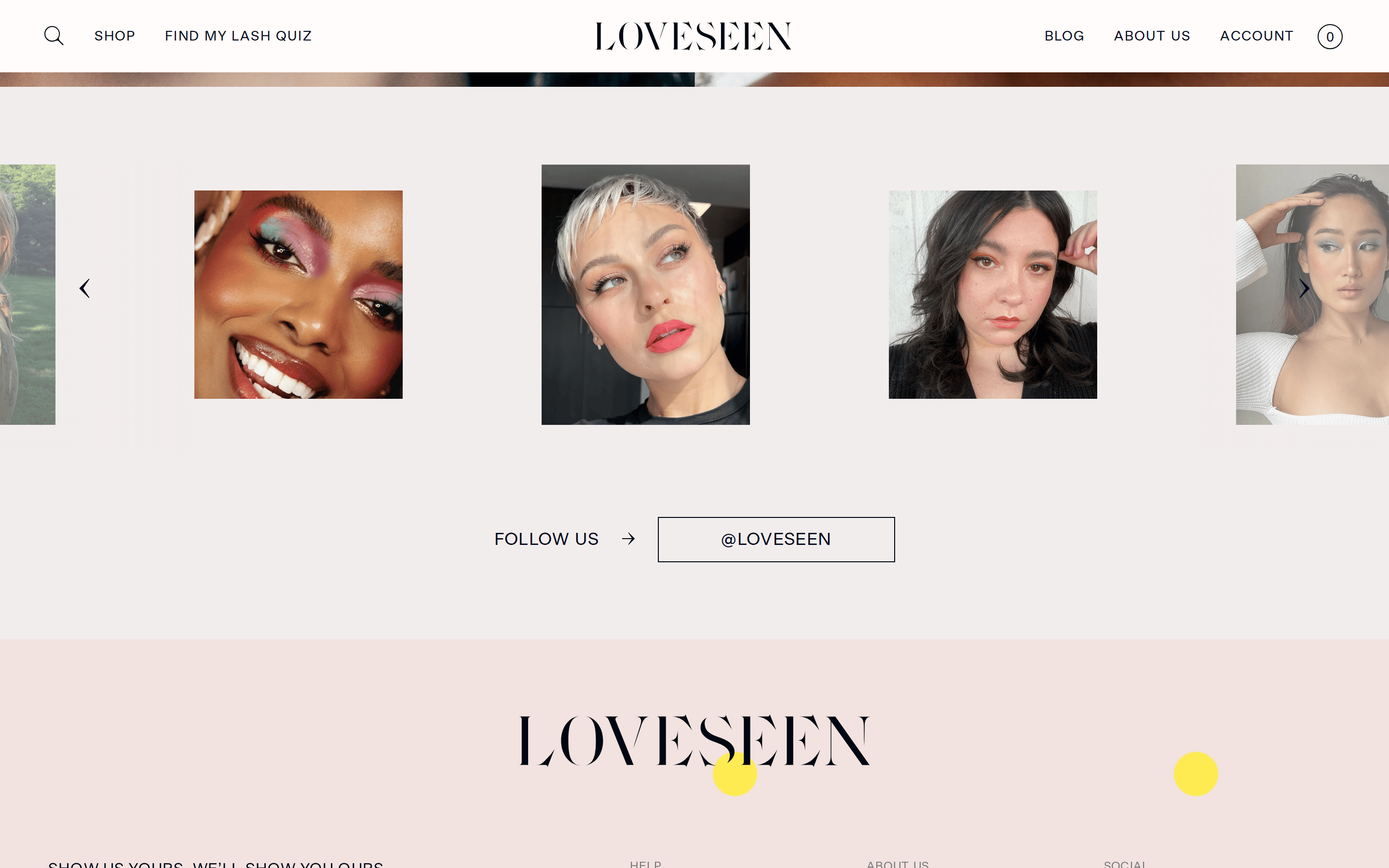
A curated gallery of beauty photography
02
Color
#00091BInk
#E0D2D1Ink soft
#FAF6F5BG
#FFFDFBBG soft
#F2EDE7BG quiet
rgba(0,9,27,0.1)Line
Warm, skin-tone inspired neutral palette that lets photography dominate.
03
Typography
didone-serif · geometric-sans
display 48px · 400heading 30px · 400body 16px · 400caption 13px · 400All-caps for navigation and UI elements · Tight letter-spacing on display type · Generous letter-spacing on uppercase UI text
04
Spacing
4px
8px
16px
24px
32px
48px
64px
96px
Generous vertical spacing between sections
05
Surfaces
sm · 0px
md · 0px
lg · 0px
pill · 999px
1px solid borders using muted neutral tones
06
Layout
1440 container
12 columns
24px gutter
768 / 1024 breakpoints
Full-bleed hero imagery followed by grid sections
07
Motion & Interaction
220ms micro
400ms small
600ms medium
cubic-bezier(0.39, 0.575, 0.565, 1) easing
fade-in · slide-up
Opacity changes and subtle color shifts · Immediate state change with smooth transitions
08
Components
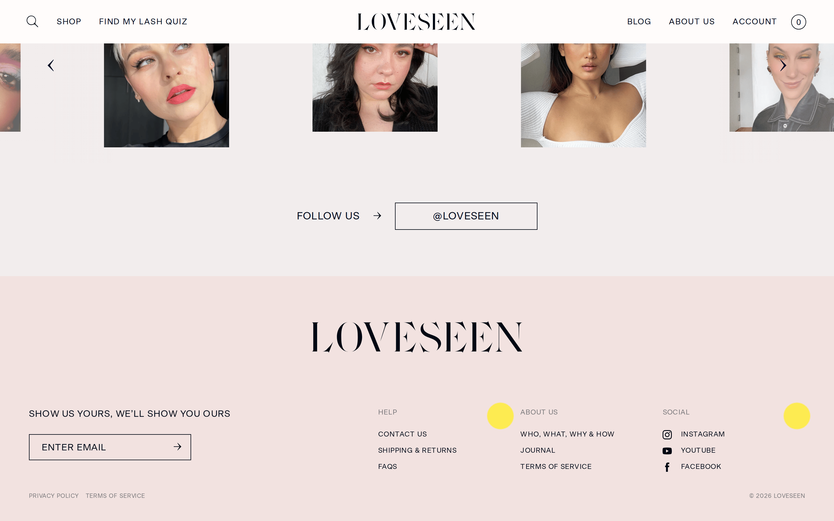
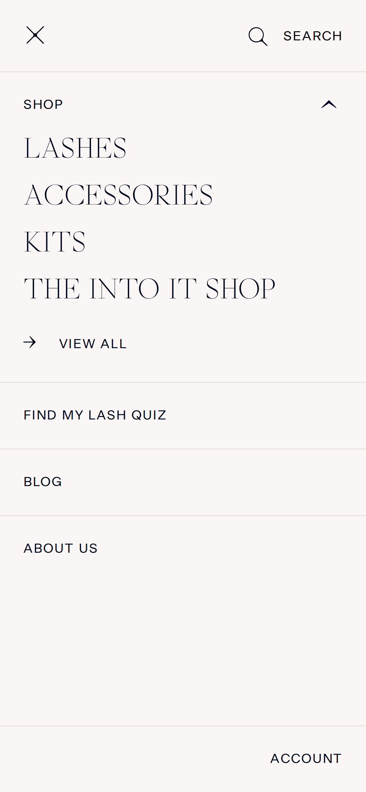
button Minimal outlined buttons with uppercase text card No visible card borders, using whitespace and imagery chip Simple outlined chips with rounded borders input Underline style inputs with minimal styling hero Split-screen photographic hero with transparent navigation overlay 09
Voice & Don'ts
Tone Confident, inclusive, and sophisticated Headlines Elegant, often using the didone serif display font CTAs Minimal, uppercase, often outlined or plain text Don't use high-chroma accent colors — screenshot shows a muted, neutral palette. Don't use heavy drop shadows or 3D effects — screenshot shows flat, clean surfaces. Don't use rounded corners on cards or buttons — screenshot shows sharp, clean edges. Don't use lowercase text for navigation — screenshot shows all-caps UI elements. Don't use bold weights for body text — screenshot shows a consistent 400 weight. Don't use busy background patterns — screenshot shows solid, soft neutral backgrounds. Avoid: Loud colors Avoid: Decorative UI elements Avoid: Cluttered layouts 10
Inside the pack — real screenshots
桌面首屏(hero) 桌面滚动分段(90% viewport 步进,作为视觉证据) 桌面滚动分段(90% viewport 步进,作为视觉证据) 桌面滚动分段(90% viewport 步进,作为视觉证据) 移动首屏 Captured from the live site · real computed styles
11
System prompt
A premium beauty e-commerce site driven by high-impact photography and elegant serif typography. The brand identity is defined by a warm, skin-tone inspired neutral palette (bg #FAF6F5, ink #00091B) that lets imagery dominate. Typography uses a didone-serif for display (GlossyDisplayWeb) and a geometric-sans for body (BeausiteWeb), both with generous letter-spacing in uppercase. Critical don'ts: Do not use bright accent colors, do not apply heavy shadows, and do not use rounded corners on UI elements. Maintain a clean, editorial aesthetic with minimal UI chrome and generous whitespace to showcase the product photography.
More from the library en · zh-CN · zh-TW · ja · ko
OpenDesign · curated web aesthetics for AI-readable design DNA · opendesign.cc
Why we curated this: A strong example of how photography-first design can create a luxurious and inclusive brand experience.