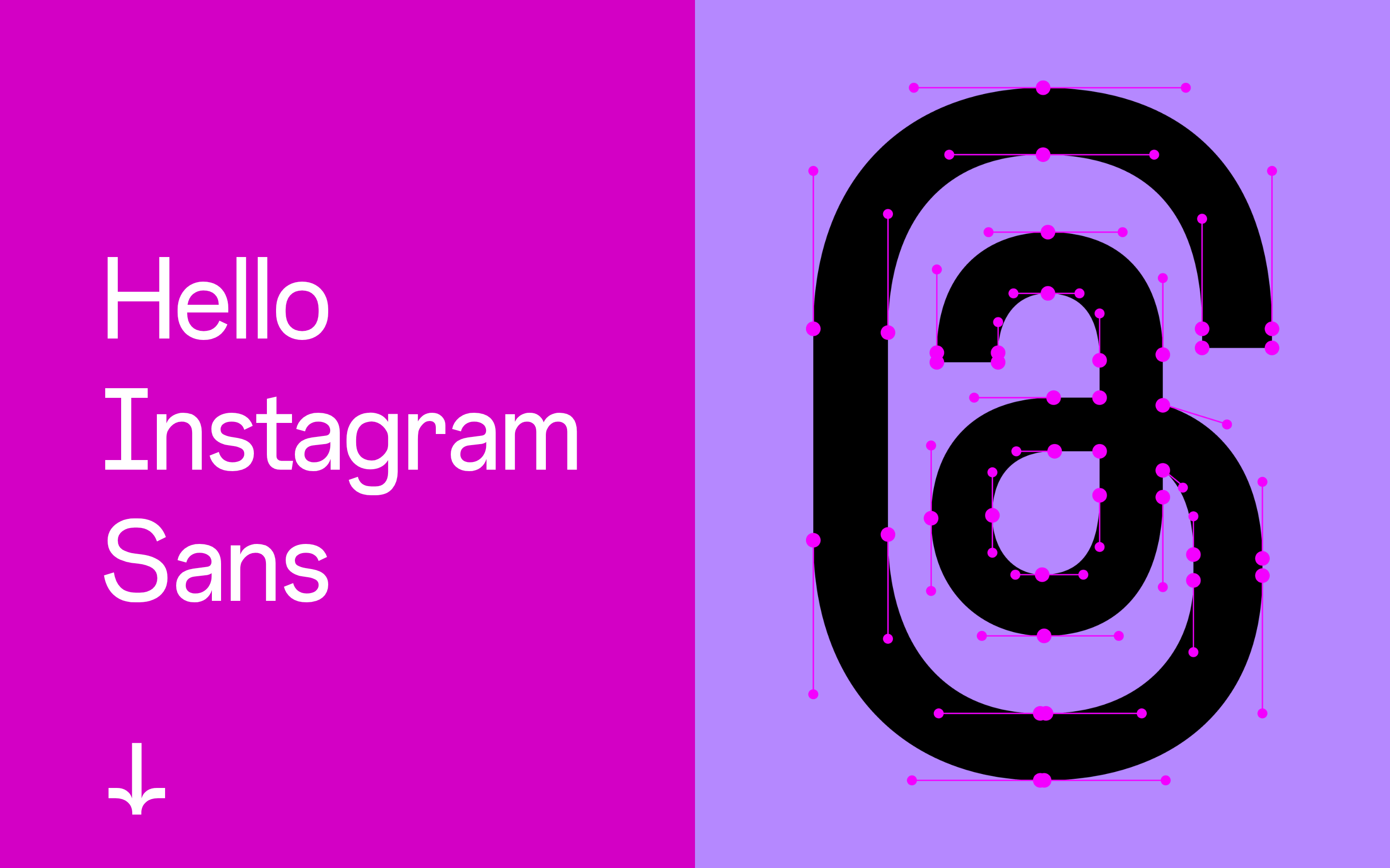
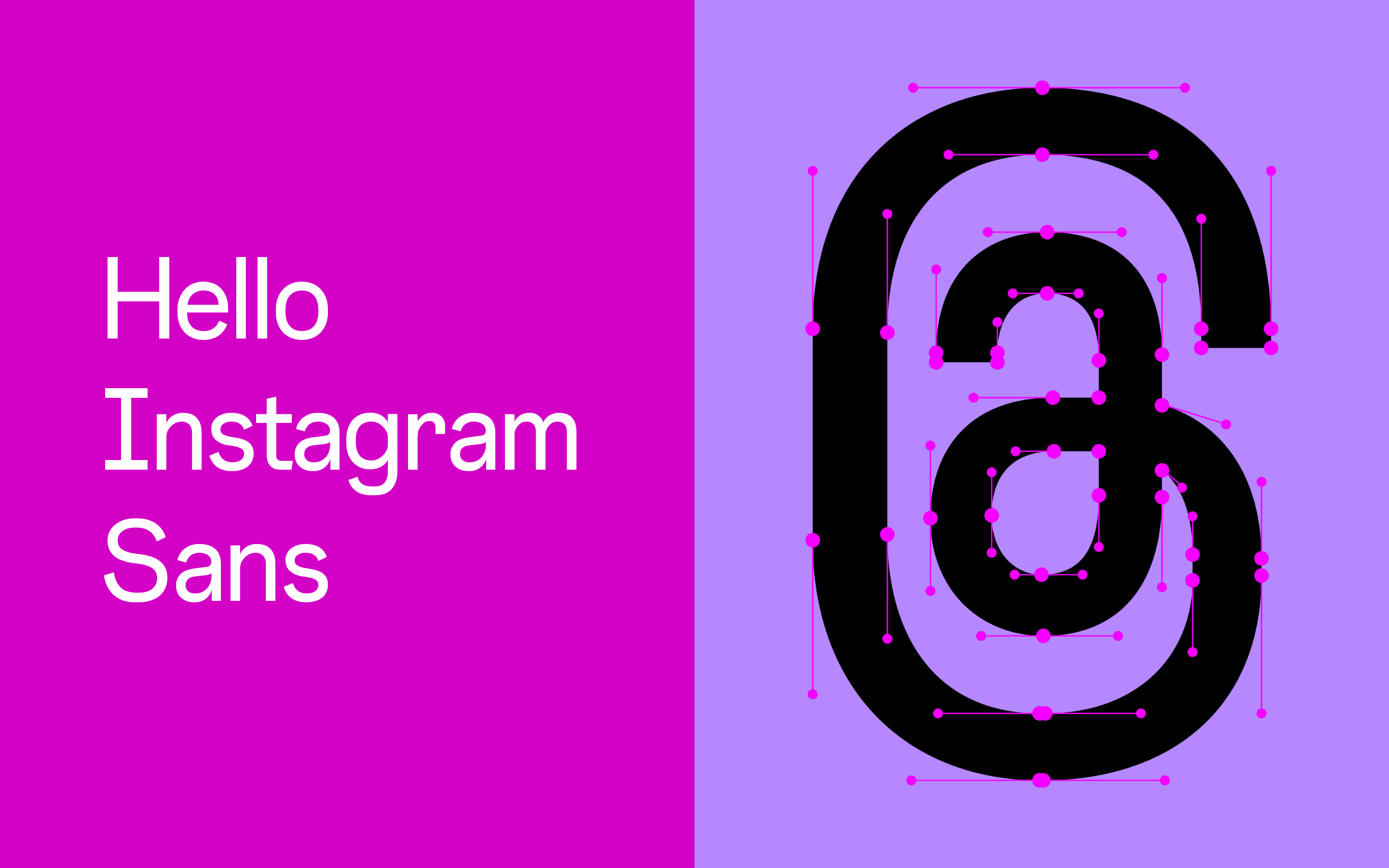
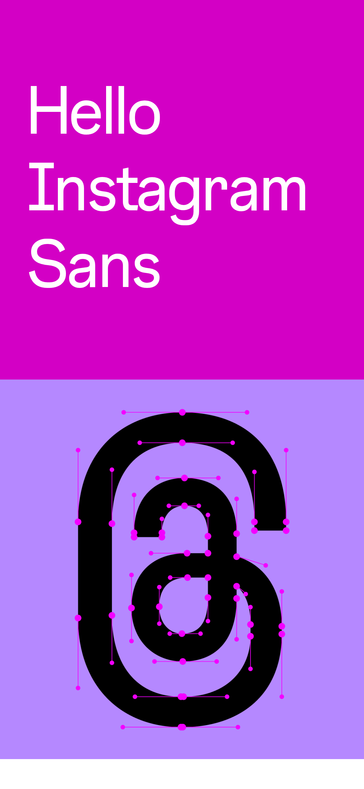
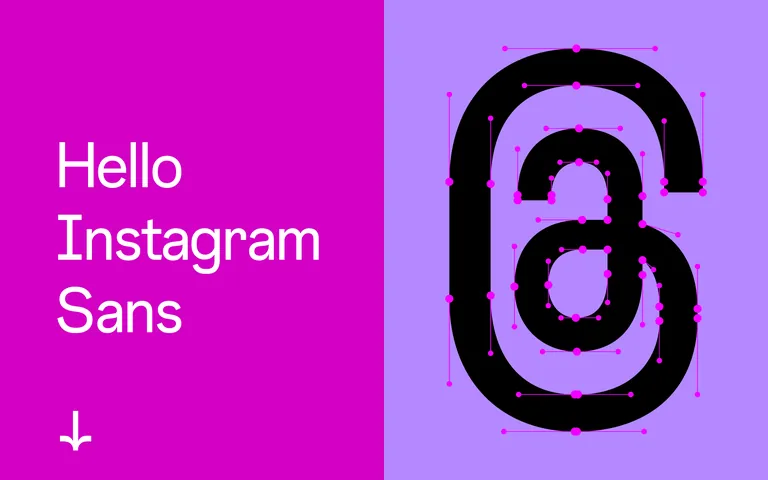
A master typography specimen showcasing a custom-designed font family
02
Color
#D300C5Accent
#1C1E21Ink
#8E8E93Ink soft
#FFFFFFBG
#D4D4D4Muted
rgba(28,30,33,0.12)Line
High contrast with vibrant accent colors against clean neutral backgrounds
03
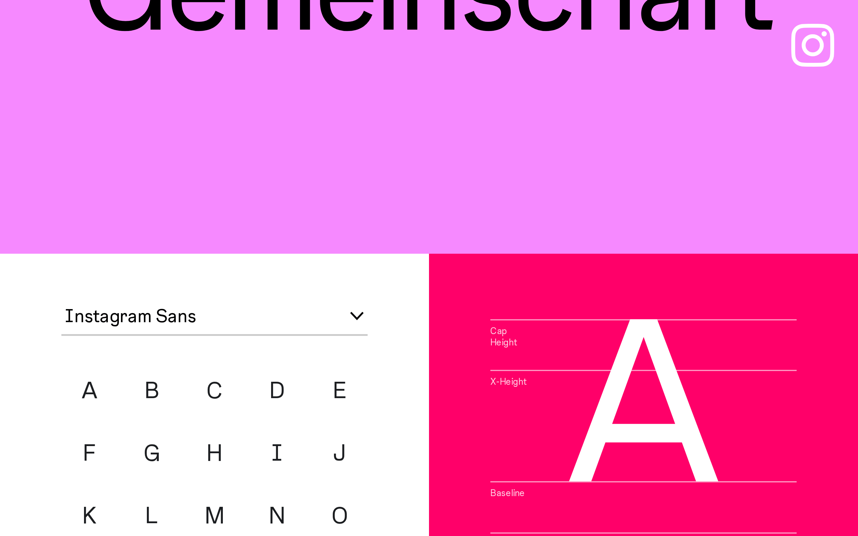
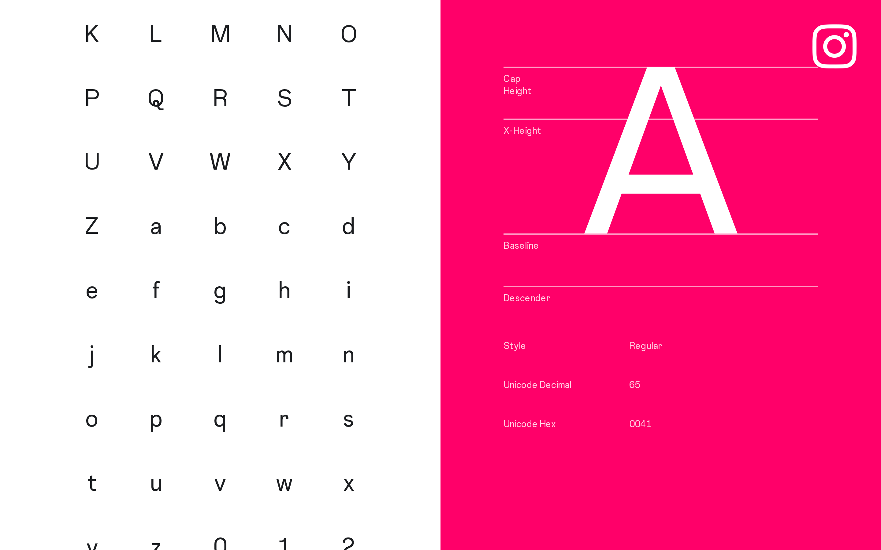
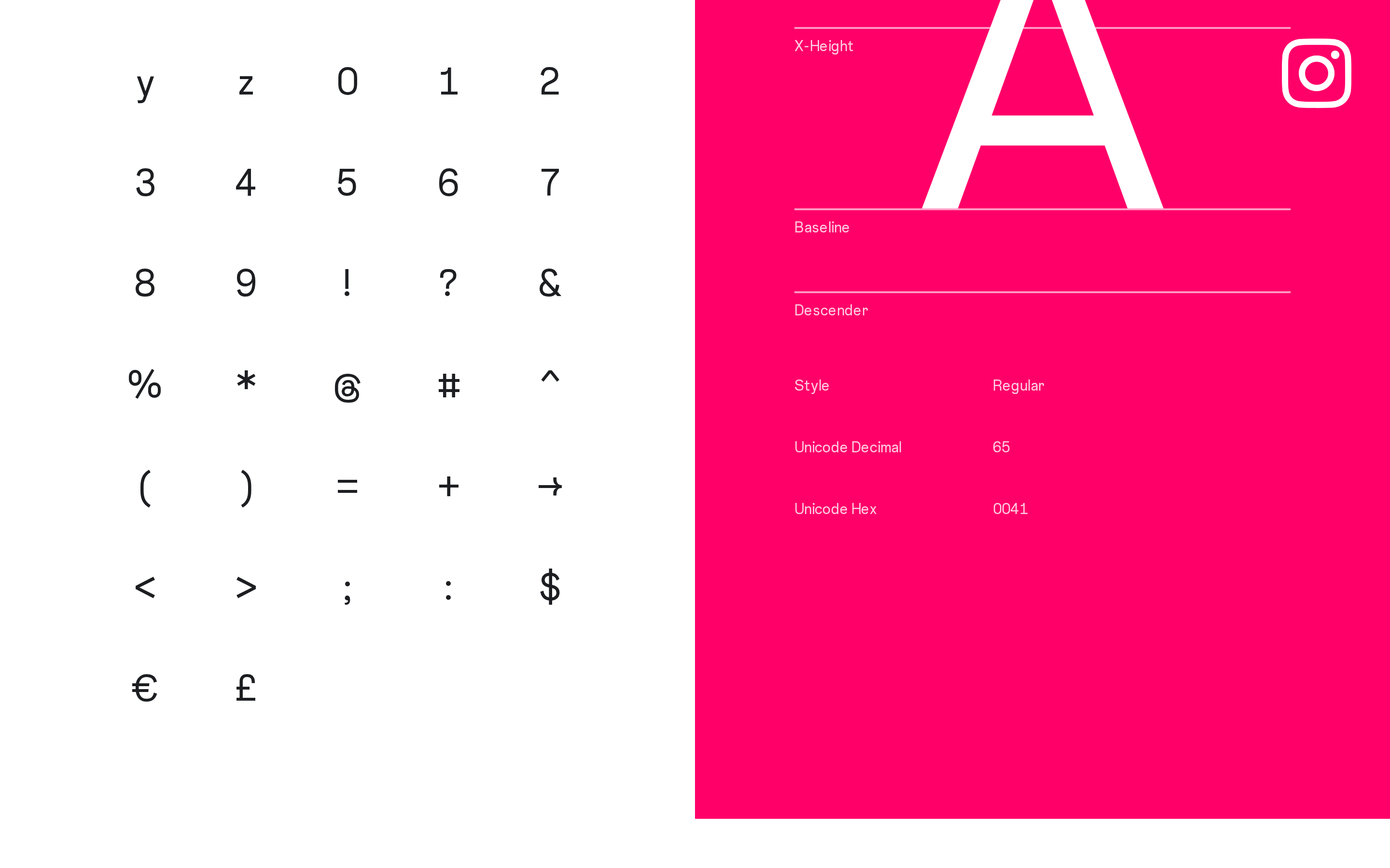
Typography
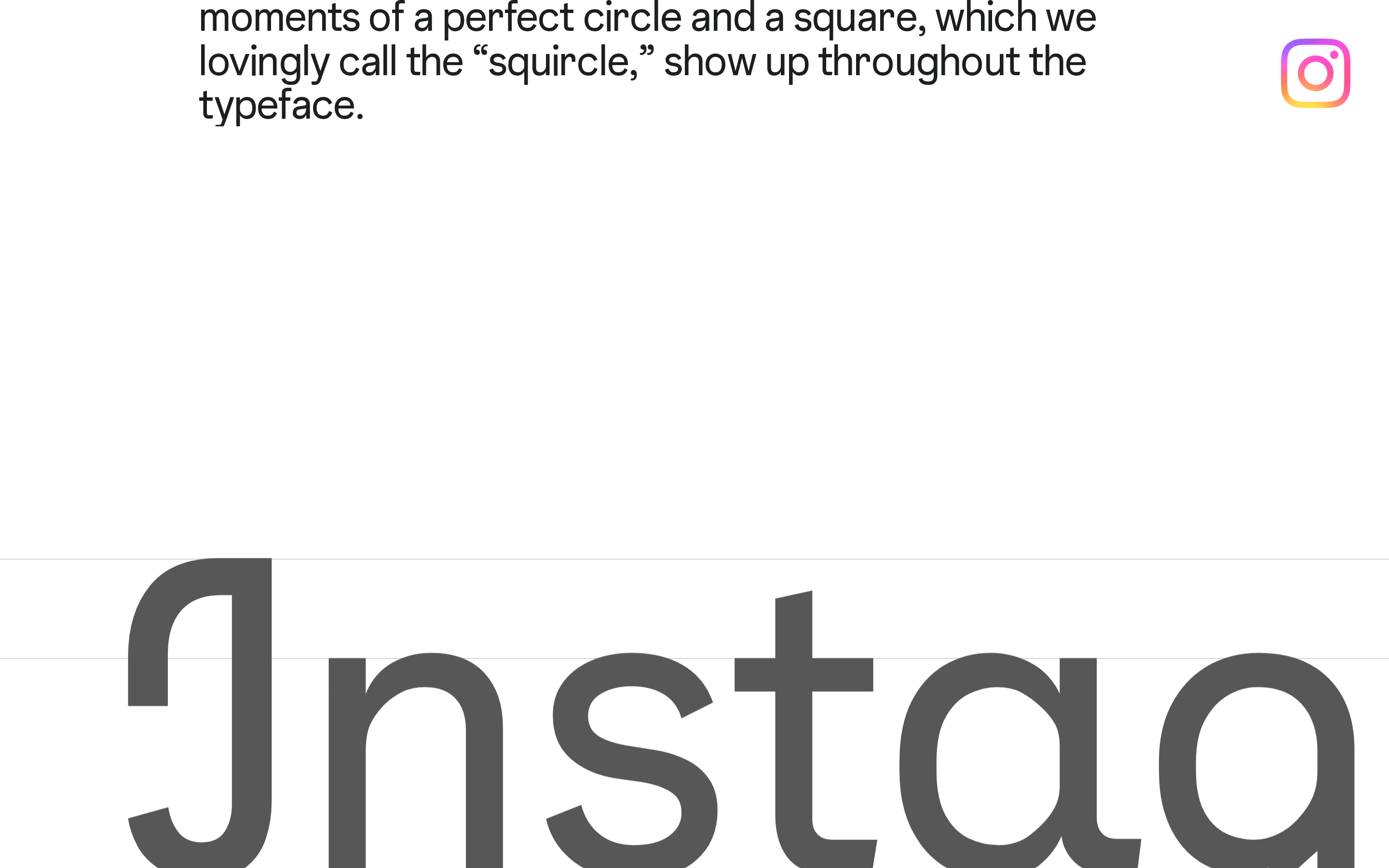
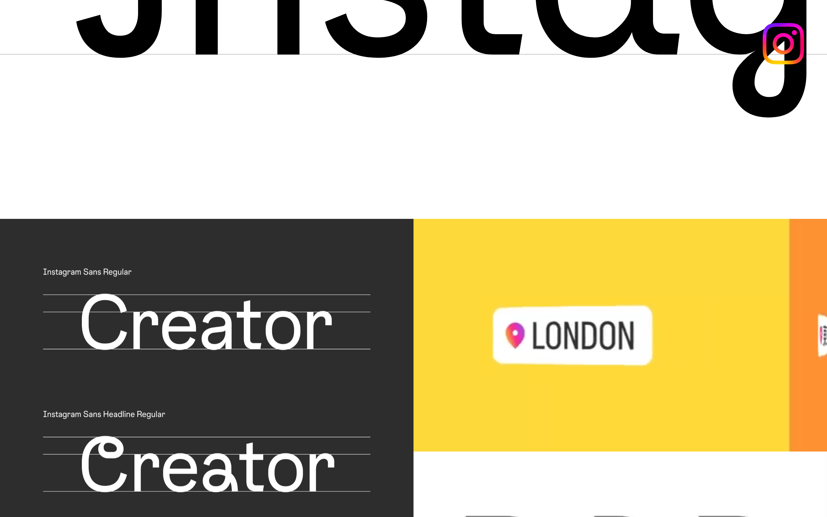
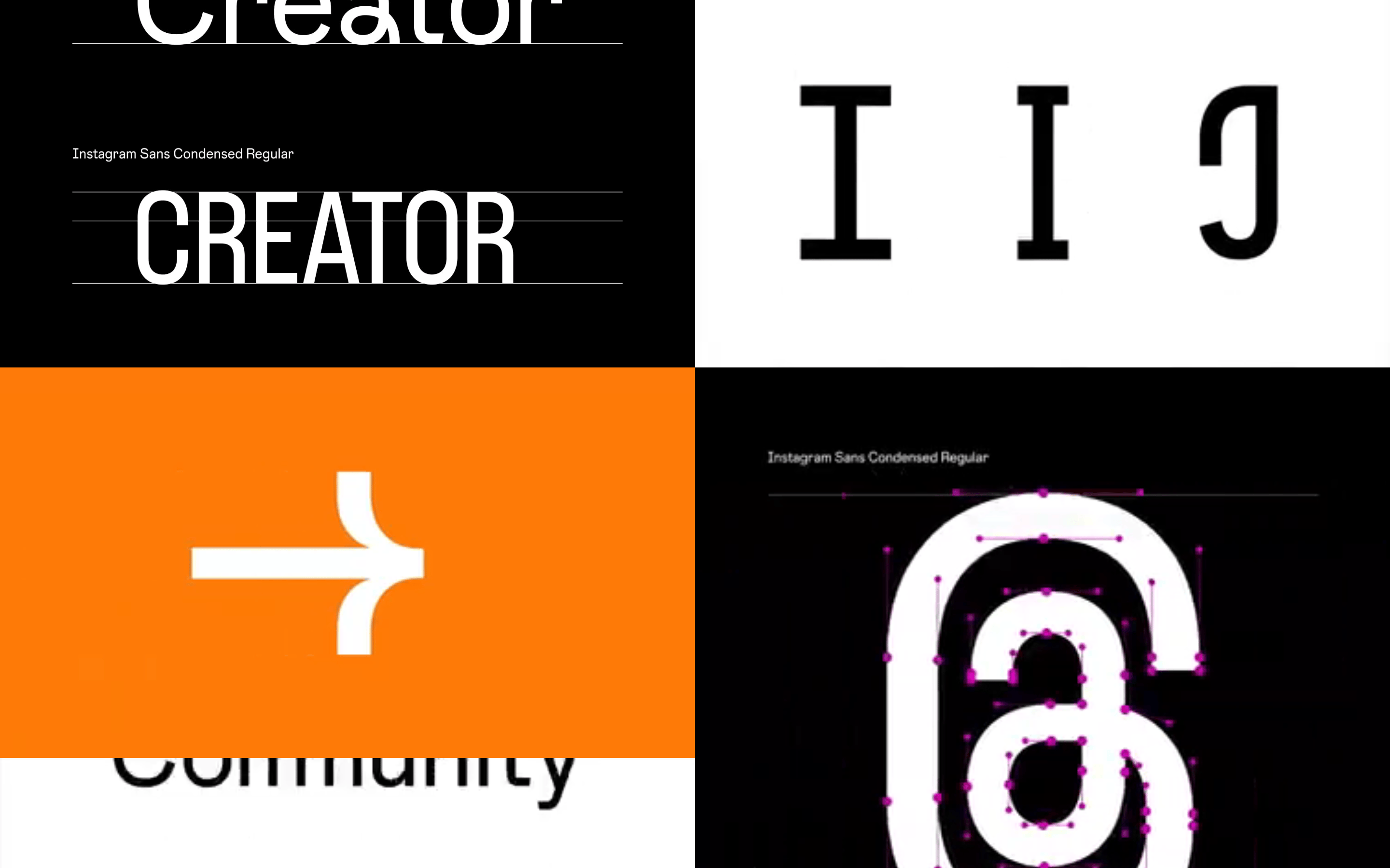
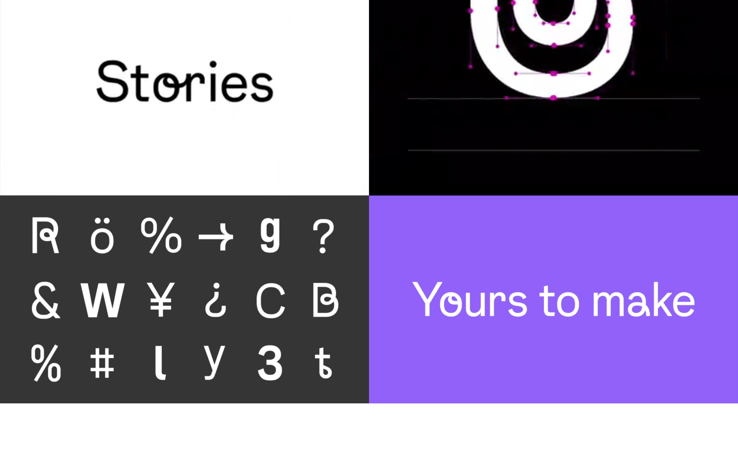
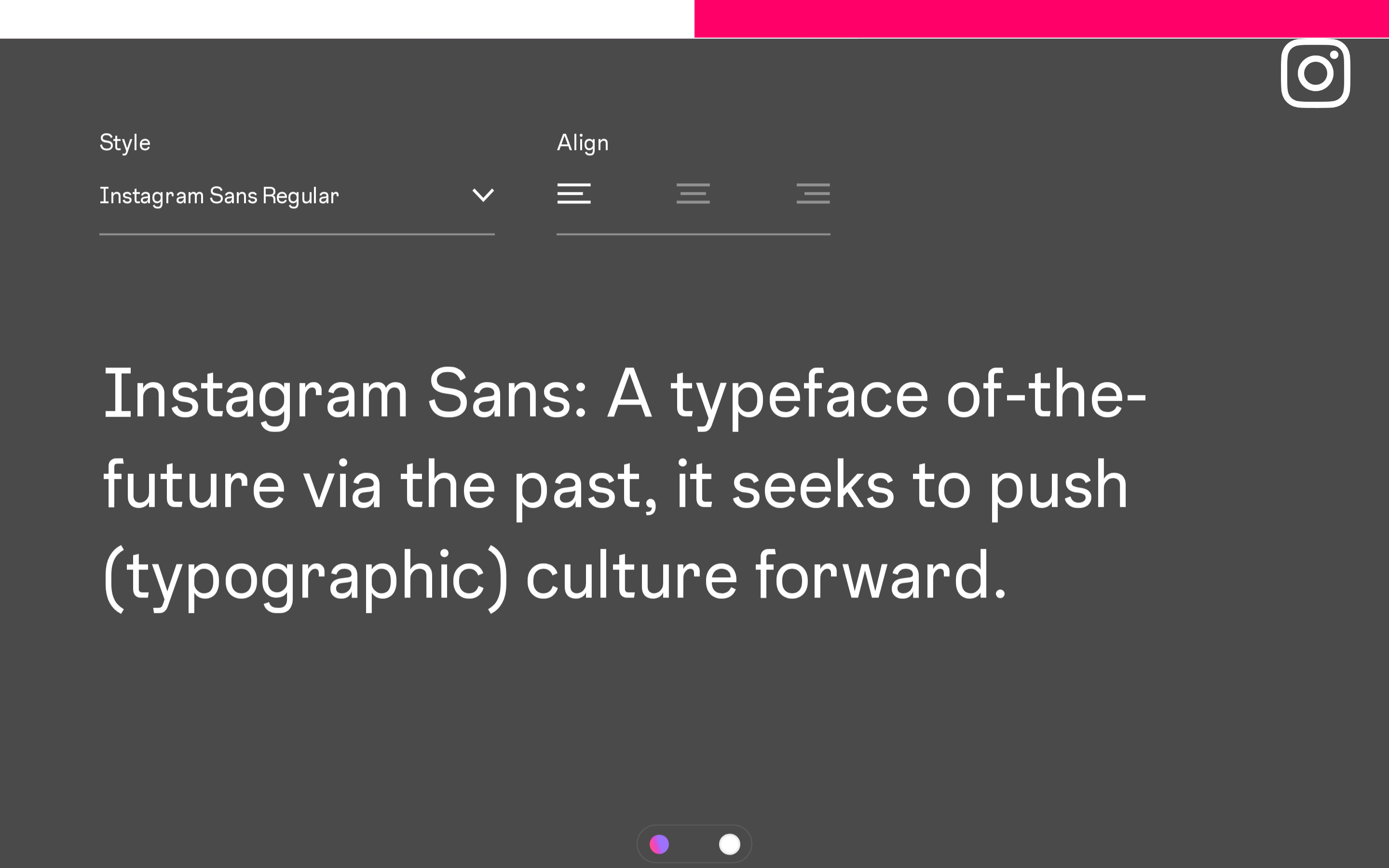
humanist-sans
display224px · 400
headline40px · 400
body12px · 400
Display type uses tight negative letter-spacing for impact · Body text maintains generous line-height for readability · Font weight stays at regular (400) throughout · Large specimens show detailed glyph construction
04
Spacing
4px
8px
12px
16px
24px
32px
48px
64px
96px
128px
Vertical rhythm maintained through consistent base-4 spacing with generous padding for large typographic specimens
05
Surfaces
sm · 3px
md · 16px
lg · 20px
pill · 36px
Minimal, using color contrast rather than borders for visual separation
06
Layout
1280container
12columns
24pxgutter
768 / 1024breakpoints
Split-panel hero with large specimen on one side, clean content blocks with generous whitespace
07
Motion & Interaction
100msmicro
400mssmall
750msmedium
cubic-bezier(0.33, 0, 0.67, 1)easing
Smooth background-color transitions for interactive states · Opacity fade-in effects with custom cubic-bezier timing · Transform animations for reveal effects
Background color transitions with 100ms duration · Transform and opacity state changes
08
Components
buttonMinimal styling with background-color transitions and cubic-bezier easing
cardClean content blocks with rounded corners and subtle transitions
chipNot prominently featured
inputNot prominently featured
heroFull-screen split layout with bold color blocking and oversized typography specimen
09
Voice & Don'ts
ToneConfident, craft-focused, and design-forward
HeadlinesShort, punchy statements emphasizing human qualities in design
CTAsMinimal, using arrow indicators rather than traditional button text
Don't use decorative fonts — the screenshot shows clean humanist sans-serif throughout
Don't add drop shadows to text — the screenshot shows flat typography on solid backgrounds
Don't use small display sizes — the screenshot shows oversized specimens at 224px+
Don't add heavy borders — the screenshot uses color blocking instead of line separators
Don't use multiple font weights — the screenshot shows consistent 400 weight only
Don't clutter with UI elements — the screenshot prioritizes typography specimens over interface controls
Avoid: Technical jargon, over-explanation, or cluttered layouts
Captured from the live site · real computed styles
11
System prompt
This is a typography-focused brand showcase for Instagram's custom typeface, positioned as a premium design resource. Key colors include #1C1E21 for ink, #D300C5 for the vibrant magenta accent, #9B8FFF for secondary purple tones, and #FFFFFF for clean backgrounds. The typeface is a humanist sans-serif category with distinctive sheared terminals and quirks. Critical design rules: maintain generous whitespace around specimens, use tight negative letter-spacing for large display text, and keep font weight consistent at regular. Don't add decorative elements that compete with the typography. Don't use dark mode backgrounds for this showcase. Don't reduce specimen sizes below display scale.
Bring this taste to your agent
Hand your AI agent a machine-readable spec of this design — tokens, type, motion, the whole DNA.